Author: CH_陈函
Unable to produce good in-car systems, mostly due to a lack of “user thinking”.
Recently, Landtu FREE released the OTA 3.0 software update.
It was a big version update full of twists and turns, undergoing multiple iterations and even complete overhauls. After actively soliciting feedback and ideas from users and incorporating their input, a version that satisfied everyone was finally produced.
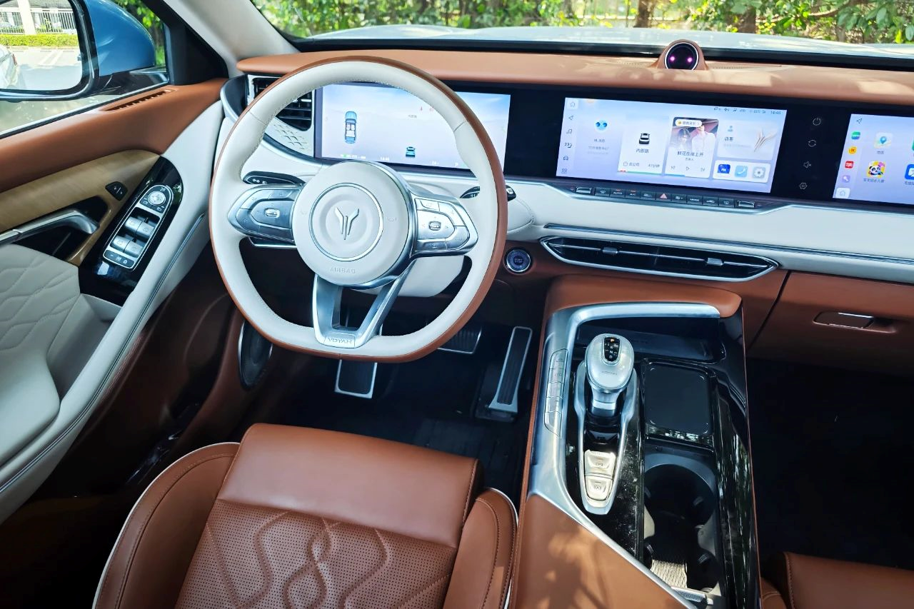
In my opinion, while OTA3.0 may not have any revolutionary new features, it marks a milestone in product thinking.
It signifies that Landtu’s cockpit and in-car interaction design has finally begun to shift from traditional “engineering thinking” to “user thinking”.
This is a crucial step in producing good in-car systems and quality OTA updates.
What has OTA 3.0 updated?
Landtu FREE OTA 3.0 includes more than 70 new functions and optimizations, with the updates mainly focusing on in-car systems. The update was fully rolled out in February. After reviewing user feedback and comments on the Landtu community, most of the feedback was praise.
Last week, I drove my Landtu FREE for three days. The brand new system can be summarized in two words: smooth and reasonable.
The smoothness is essentially guaranteed by the Qualcomm Snapdragon 8155 in-car chip, which is not only included as standard equipment in all new models, but is also provided free of charge to all existing Landtu FREE vehicle owners. Therefore, regardless of when you bought your Landtu FREE, you can enjoy the same in-car experience.
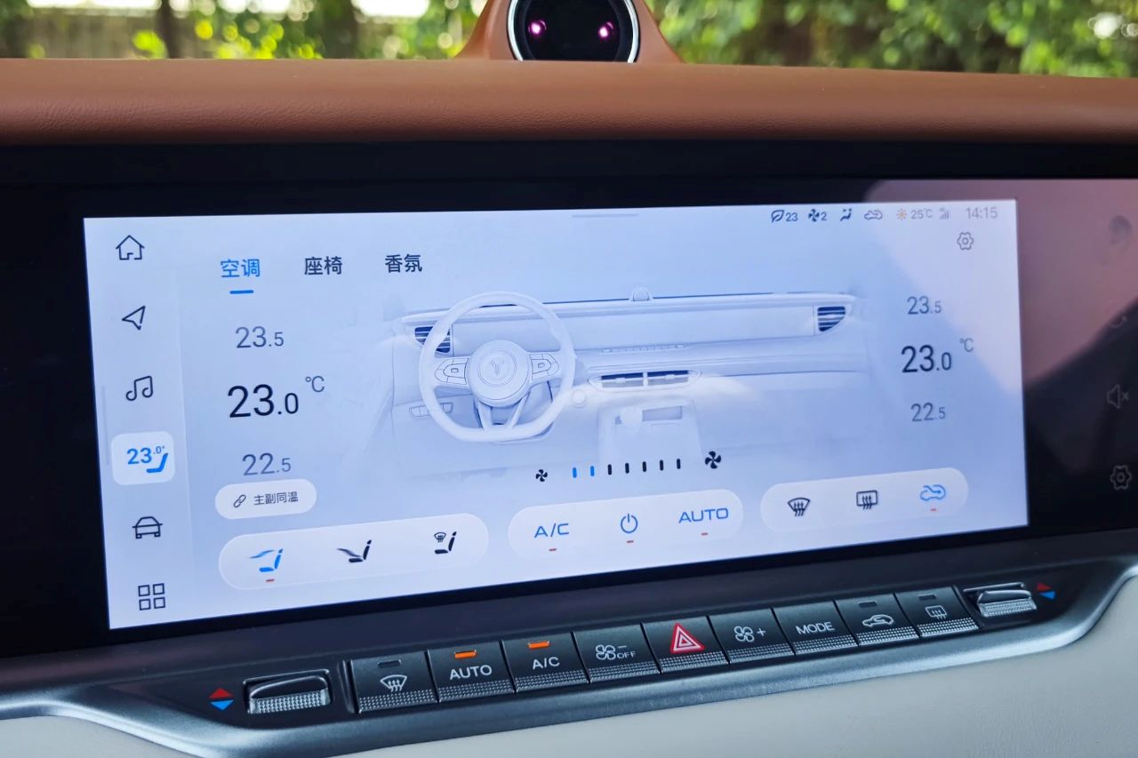
The other layer of smoothness comes from software optimization.
In addition to optimising the response speed of software and voice commands, many details have been improved, significantly enhancing the sense of ease of use.
For example, the music and video menu has been changed from horizontal scrolling to vertical scrolling, which is more in line with user habits and is more user-friendly. Personally, I especially love the addition of the option to adjust navigation volume independently of media volume, so that I can listen to music while still clearly hearing navigation instructions. The seat, air conditioning, and fragrance function menus have been merged, and air conditioning can now be accessed quickly from the DOCK bar. Changing sub-menus allows you to adjust seat ventilation, heating, and air conditioning.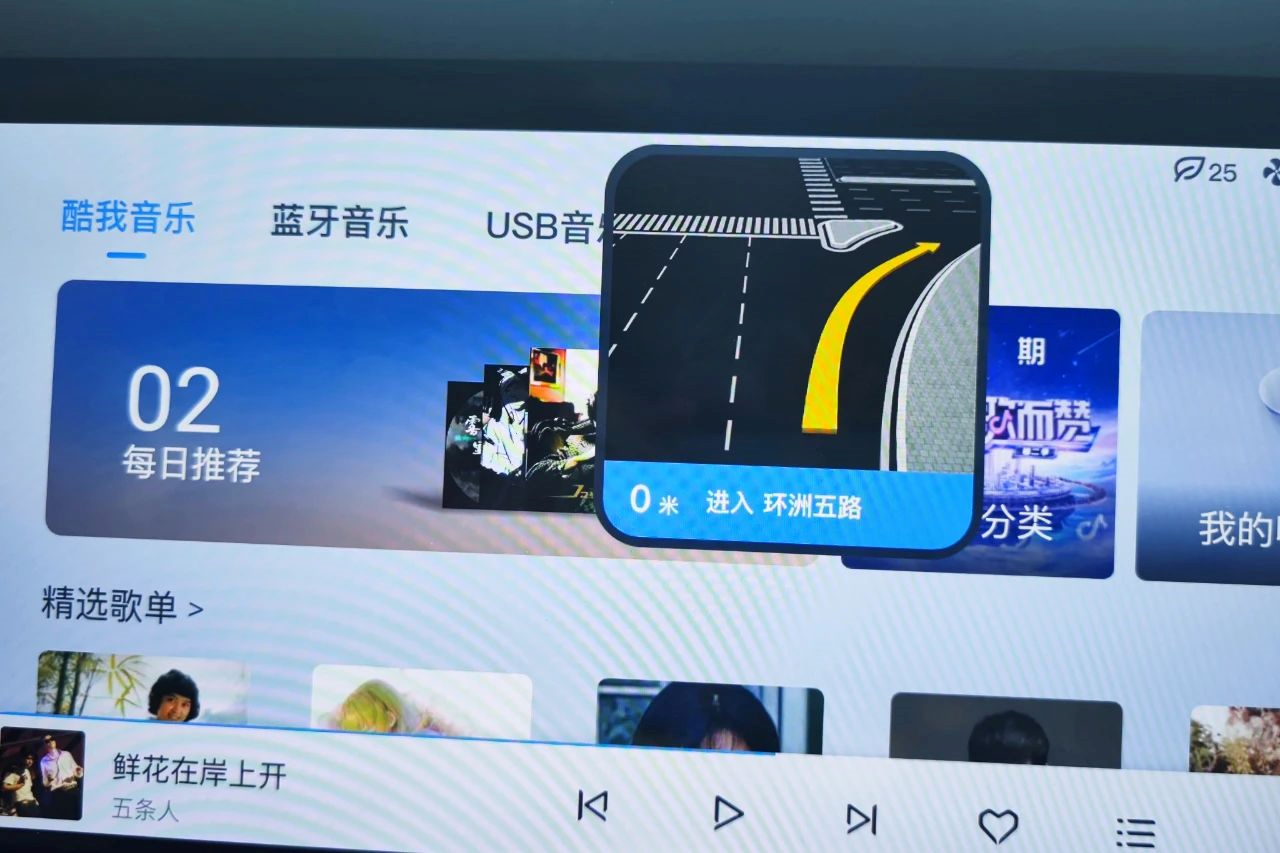
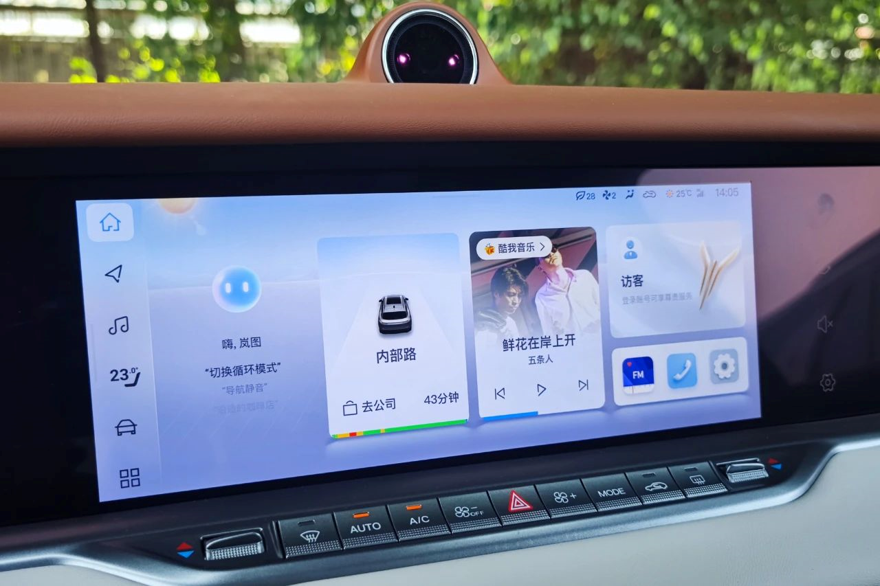
Not only that, this upgrade also introduces the “Lan Elf” function, similar to the dynamic island of iPhone. When the navigation is turned on, it will display the route in the form of a floating window and show a magnified image of the intersection when approaching. It also provides corresponding reminders for music switching, incoming calls, or when sending addresses from the phone to the car, to avoid missing important information.
At the same time, this upgrade of Lanmap FREE also adds the function of sending mobile applications such as WeChat, Dianping, and Meituan to the car, making the interconnection between the phone and the car more smooth.
Being reasonable is a deeper recognition of menu design and interaction logic.
After upgrading to OTA3.0, the car interface of Lanmap FREE no longer feels cold and rigid, but instead has a lot of humanized and reasonable designs.
For example, the multiple optimizations of the main interface. In this interface that users use most often, OTA3.0 adds dynamic information display for the navigation card, which displays rich route guidance and information without entering the navigation interface. If there is no navigation, it will dynamically display the time required to return home or go to work and can start navigation with one click.
At the same time, a sound source switching button has been added to the upper left corner of the multimedia card, and an account card has been added to display the user’s login status. Clicking it can quickly enter the personal center. The weather effect has been added to the upper left corner of the home page, and the air conditioning wind speed, circulation mode, and blowing mode have been added to the top right corner of the status bar.
After optimization, the information that can be displayed on the main page has been greatly increased, reducing the number of times users need to enter the secondary menu, and the display is clear and not messy, making the optimization very reasonable.
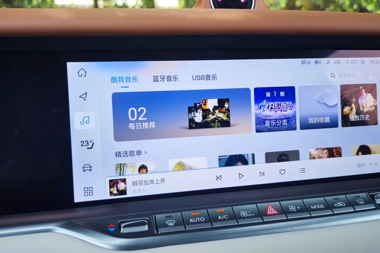 The little brain of LanTu voice assistant will no longer interfere with normal touch operations after entering the secondary menu. Instead, the voice assistant will exist in the form of a breathing light at the corner of the page.
For example, there is now an additional battery percentage display on the battery in the instrument cluster. When navigating, there is a constant reminder of the route information on the instrument cluster without the need to switch to the navigation page specifically. The information card of the instrument cluster now also supports customization, allowing the user to choose which information they need.
In addition, the optimization of the copilot screen is also a major highlight of this upgrade. Previously, the copilot screen of FREE was almost identical to the central control screen, which was clearly unreasonable.
After the upgrade, the copilot screen focuses more on audio and video entertainment. The car control menu is made into a right slide quick menu for hiding, and only one navigation menu is retained in the copilot’s frequently used menu in addition to the entertainment function. In terms of appearance and practical experience, the upgraded copilot screen is more in line with its positioning.
Moreover, the UI of the copilot screen has been completely redesigned, with richer icon colors and flat rounded rectangle icons that are more in line with mainstream electronic product interface design aesthetics. In subsequent OTA upgrades, the central control screen of the LanTu FREE should also undergo corresponding UI upgrades.
Key Transformation
The biggest difference in LanTu FREE’s OTA3.0 upgrade from the past is the deep involvement of the users and the incorporation of user thinking. It is no longer a matter of changing what is wrong or what has been criticized, but truly standing in the perspective of users and thinking about what should be done for the car system and what users need, and do not need.
Therefore, although we see that the upgrade points are trivial and there are not many major functions appearing, each optimized point can significantly improve the user experience of the car system.Lack of user thinking is the fundamental reason why many traditional automakers cannot do a good job in car networking. Despite emphasizing user-centricity, traditional automakers actually lack user thinking, at least in terms of product design.
This is because the development of traditional cars is largely dominated by engineers, with the process mostly disconnected from user needs. After the car is sold, any feature updates and optimizations are typically addressed through development and redesign of the next generation. This results in a lack of user-centricity and the failure to respond quickly to user needs.
To transition from “engineering-centric” to “user-centric,” traditional automakers not only need to change their product development processes and organizational structures but also to transform their deep-rooted mindset. This is a hurdle that not all traditional automakers can overcome.
Voyah, backed by Dongfeng Motor Group, has inherited solid car-making skills while being restricted by traditional car-making concepts. Therefore, the birth of OTA 3.0 is particularly precious as it demonstrates an emphasis on user feedback, open attitude to co-creation, and tangible actions, reflecting Voyah’s transition from “engineering-centric” to “user-centric.”
Only those who have experience with large corporations know how difficult it is to change product design and involve users in product development. However, it is the right step to take. Traditional automakers need to embrace this path if they want to succeed in intelligent cars, software, and OTA.
It is reported that Voyah will continue to increase the frequency of OTA updates, provide more channels for user feedback, and accelerate software evolution this year.
What will Voyah bring us after OTA 3.0? Let’s keep our eyes open.
This article is a translation by ChatGPT of a Chinese report from 42HOW. If you have any questions about it, please email bd@42how.com.
