Author: Qian Jialing
Who offers a better in-car experience, the Ideals L9 or the NIO ES7?

Both infotainment systems of the Ideals L9 and the NIO ES7 rely on the Qualcomm 8155 chipset and AMOLED display technology. With a smooth and responsive touchscreen interface, both systems perform equally well.
Which screen offers better comfort?
In terms of screen size, the Ideals L9 boasts a 15.7 inch display with a resolution of 34562160 (3K), while the NIO ES7 comes in at a smaller 12.8 inches with a resolution of 17281888 in a vertical orientation. Therefore, the NIO ES7’s screen is inferior to the Ideals L9’s in terms of size and resolution.

While the Ideals L9 offers more interior space than the NIO ES7, the latter’s relatively narrower center console makes the driver’s seat more spacious. However, in terms of a screen experience from within the car, the NIO ES7’s screen is comparatively weaker.
In real-world usage, both systems’ screen resolutions deliver excellent visual clarity even in bright daylight. Only during severe weather conditions like rain does the Ideals L9’s screen become noticeably more legible.
Which user interface is superior?
The Ideals L9’s infotainment system primarily employs glyphic icons filled with dark colors. This style of icon is more visually clear when the number of items is low, however it becomes visually confusing when the number of items increases, creating a heavier visual presence.
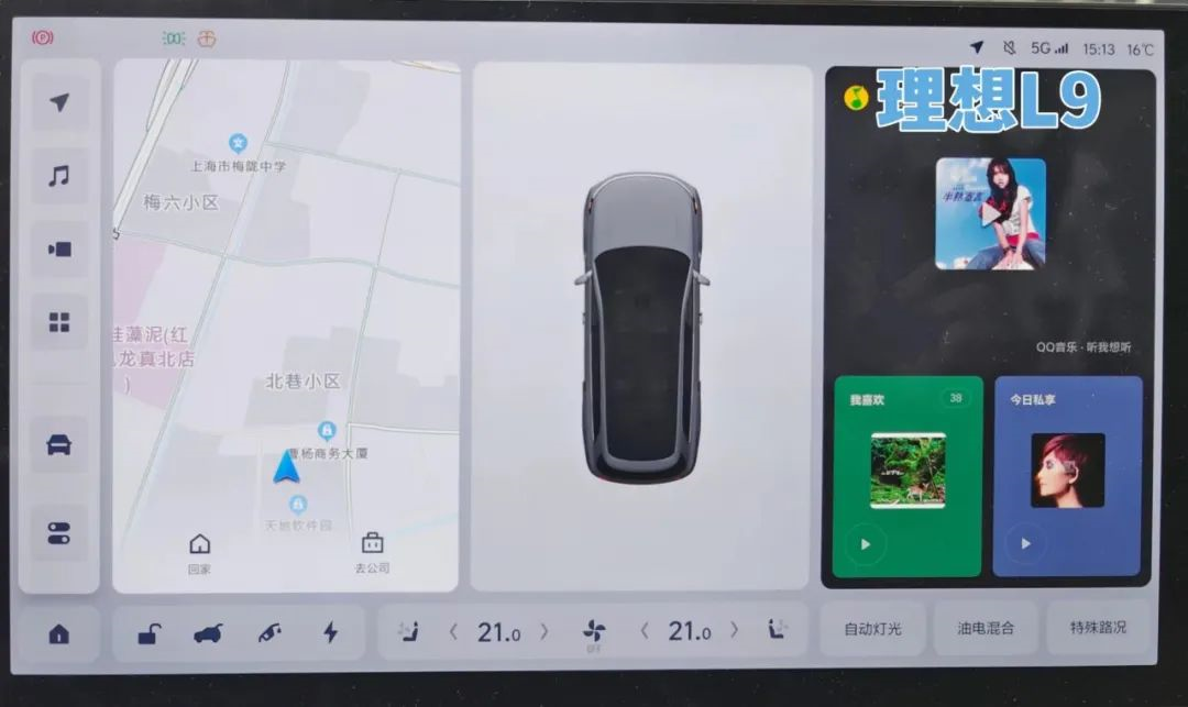
NIO ES7 uses more clear icons, with the pictographic icons outlined by lines fitting its minimalist style. Its advantage lies in its ability to maintain a clean and neat screen display even with a large number of icons.
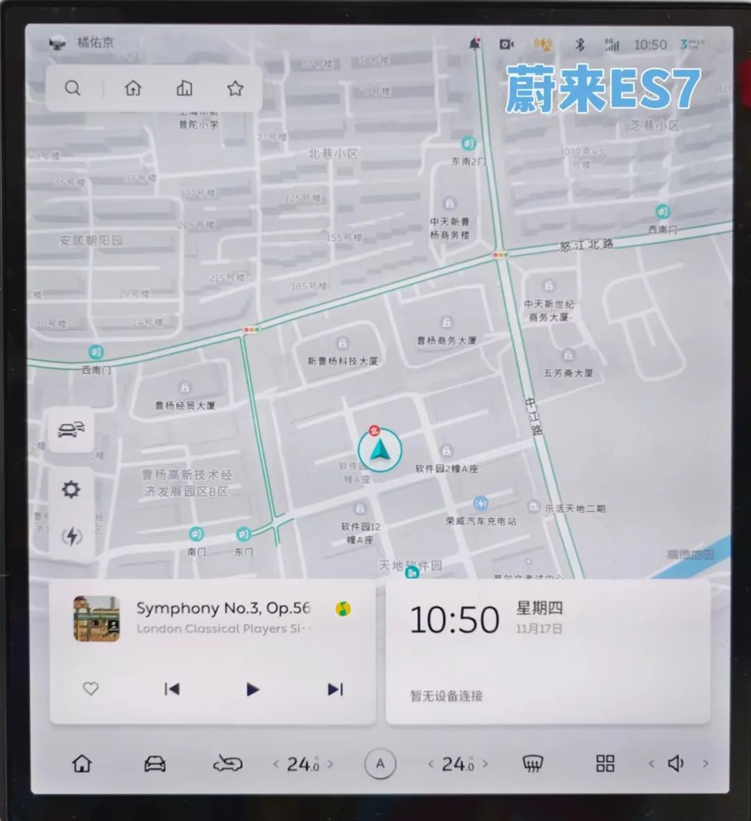
In terms of interface display, they both use a customizable card bar with rounded corners. The basic visual effect is guaranteed.
The ideal L9 adopts a card bar-based design, including main information such as weather, navigation, and music on corresponding cards. In addition to viewing by sliding the screen left and right, users can also drag the card bar to customize the order.
On the other hand, NIO ES7 overlays the small card bar on the basis of “map as interface.” The card information can display music, time, and other content.
Next, let’s take a look at the rationality of display logic. The ideal L9 uses a large size in combination with landscape display, which makes it relatively difficult to design the layout of function keys. It needs to consider the adaptation of lower-level interfaces and screen ranges.
Its central control screen main interface chose to place commonly used functions on the L-shaped dock bar, matched with the main three-column card design. At the same time, it integrates the tertiary menu and the secondary menu for display on the same newly popped-up page. For finer hierarchies, it uses a pop-up window.
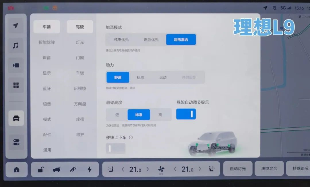
Although the functions on the dock bar are arranged from left to right according to the user’s usage habits, and the hierarchy is expanded as much as possible, the use of solid-filled pictographic icons adds up to a total of 23 function buttons, which is relatively large in number. Therefore, it is not easy to find the desired function at first glance when used.
Nowadays, many car machines are trapped in the misunderstanding of “maximizing and reducing hierarchies.” The method to make user interaction more direct is not necessarily to minimize the hierarchy. Regardless of the method, the fundamental purpose is to make it easier for users to find and operate in an orderly manner. Blindly reducing the hierarchy may instead disrupt the user’s operational logic.
If the icons on the Dock bar can be collapsed into a second level menu in the form of pop-ups, it can ensure the recognition of the large volume icons while maintaining the clean interface.
Moreover, the functional buttons on the right side of the Dock bar were originally in the form of pop-ups, which can enhance the overall consistency of operation.
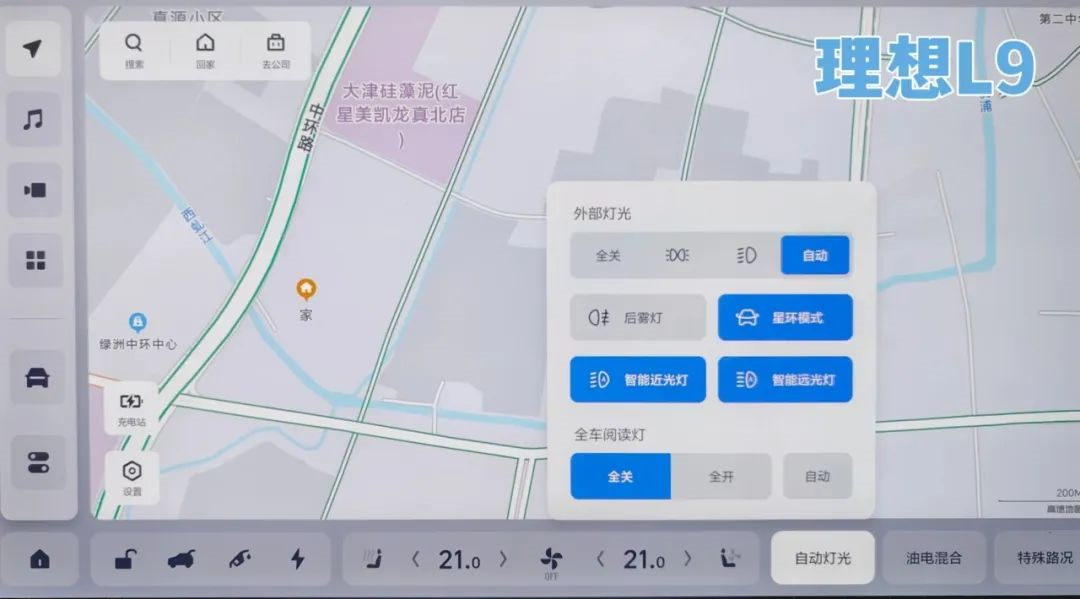
Compared to the LI ONE, the interface of the NIO ES7 gives a much cleaner visual experience. The icons are outlined in linear graphics, and there are only 15 buttons. However, its screen size and relatively square display format give it an advantage for organizing the functional buttons.
It mainly integrates the second and third level menus into the same interface, and uses pop-up form for smaller levels. NIO ES7 also integrates some shortcut functions and presents them in a side call-out bar, which supports customization.
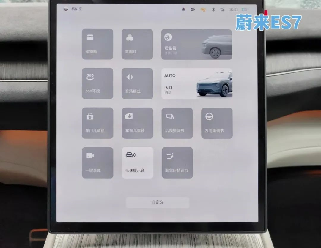
Obviously different from LI ONE, except for the pop-up form pages, the new function pages of the NIO ES7 take up the full screen.
This ensures that the font has enough size and line spacing when displaying more text, while also ensuring enough space for the key click area, making operation more precise.

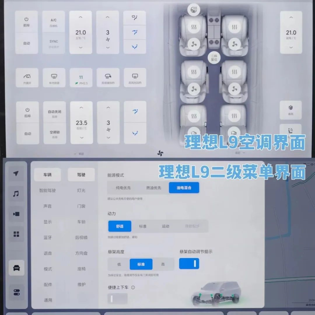
On the other hand, except for the second-level interface of the air conditioning, LI ONE does not occupy the full screen for either the pop-up or other second-level menu pages. This display format will make the fonts closer together and the icon spacing relatively smaller, causing more eye strain when viewed for long periods of time.
Translate the Chinese Markdown text below into English Markdown text in a professional manner. Keep the HTML tags inside the Markdown tag and output only the results.
In addition, the integration logic of the Ideal L9’s secondary and tertiary menus is not very reasonable. It places Bluetooth in the second-level menu, while the network is placed in the third-level menu. According to common sense, these two functions should belong to the same level.
NIO ES7 puts them in the same level, and the overall level division is also quite reasonable.

Buling also noticed that the volume adjustment button is placed on the far right of the Dock bar of the central control screen of the NIO ES7, and it also uses a pop-up display form.
In fact, personally, I feel that it is very necessary for the volume adjustment button to appear on the main interface.
Previously, Buling encountered a situation where he was sitting in the back seat of a car and wanted to immediately increase the navigation volume, but the driver was also driving and it was inconvenient to look for the corresponding button. As a result, he only increased the volume of the voice assistant through the voice interaction system, and finally Buling found the corresponding button in a very embarrassing posture after searching for a long time. (Look, the importance of physical buttons is very obvious at this time!)
Compared with the Ideal L9’s Dock bar on the right, “Auto Lights”, “Hybrid”, and “Special Road Conditions” all involve switching driving status. It may be more convenient and appropriate to integrate them into the touch screen on the steering wheel.
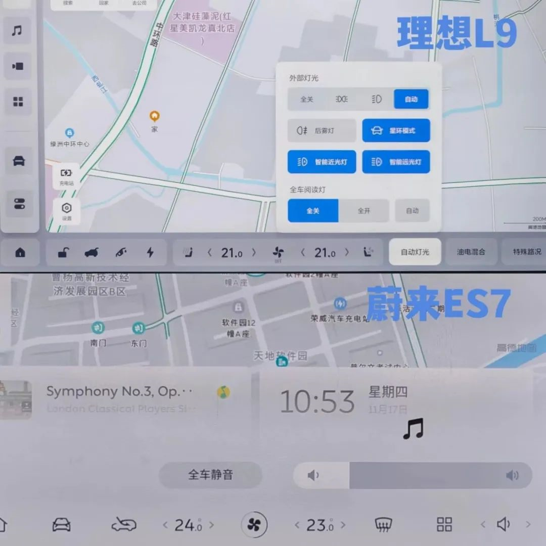
After comparison, it is not difficult to find that the functional integration of the NIO ES7 central control screen is more intuitive and easy to understand, and the user’s learning cost is very low, so the display logic of the NIO ES7 screen interface is more scientific.
Different Software Ecosystems
In terms of quantity, the Ideal L9 has 23 software applications, while the NIO ES7 has 13 software applications.

Since the Ideal L9 is equipped with an immersive audio-visual system, it not only supports in-car KTV, but Buling also found that there are nine audio-visual related software among the 23 software, similar to third-party software such as “QQ Music” and “NetEase Cloud Music,” which are quite comprehensive and very suitable for music and karaoke enthusiasts!# NIO ES7 Review
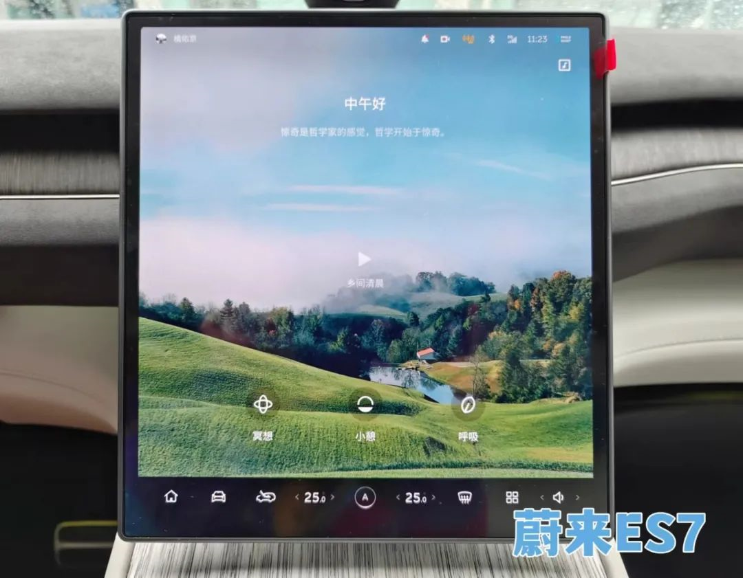
NIO ES7 doesn’t have an advantage in the number and type of software applications it offers, but there is one software that shows NIO’s pursuit of a “relaxed” attitude. Click on the icon called “Tide” and you will enter a “paradise” where you can listen to birds and meditate with your eyes closed. How beautiful!
Conclusion
Thanks to the Qualcomm 8155 chip and their respective intelligent interaction systems, NIO ES7’s voice interaction is smooth. However, who can resist NOMI’s cute expressions and music beats?
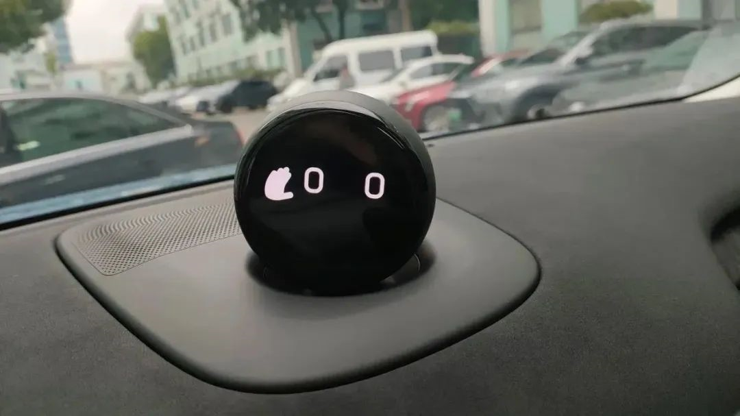
Let’s put the parameters aside, and compare car infotainment systems subjectively. People are likely to like a particular car infotainment system because they appreciate a certain aspect of it.
For example, if you want more entertainment functions, then you will like the Ideal L9; if you want easier operation, then you will like NIO ES7.
If you ask us which car infotainment system we like more, the Ideal L9 or the NIO ES7? Well, we have to admit that we are lazy people.
This article is a translation by ChatGPT of a Chinese report from 42HOW. If you have any questions about it, please email bd@42how.com.
