Author: Michelin
“Is Your Intelligent In-Car System User-Friendly?” is a dedicated column for usability assessment of HMI in-car system created by GeekCar and Thoughtworks.
For each issue, we choose a distinctive in-car product and apply the Thoughtworks dynamic usability evaluation framework to quantify and score the most practical driving functions.
Here, you can find the most objective and quantitative “usability” assessment of intelligent in-car systems.
As a usability evaluation system that prioritizes driving safety and user-friendliness, when we released the first issue of this column, a friend questioned: “Wouldn’t the ‘old car with phone’ model score higher under this system? What are the advantages of intelligent in-car systems?”

Indeed, despite the booming development of intelligent in-car systems, for many friends driving Mercedes-Benz, Toyota, or Volkswagen cars purchased years ago, CarPlay and CarLife may be the most familiar infotainment systems.
When we split the “usability” and “entertainment” aspects of the intelligent in-car system for assessment, this matching model of “old car with phone” can be compared with the intelligent in-car systems under the same standard. As for how it performs specifically, we’ll cover it today!
- In terms of software, we chose Apple, known for having “the strongest ecosystem on the planet”: CarPlay and Siri;
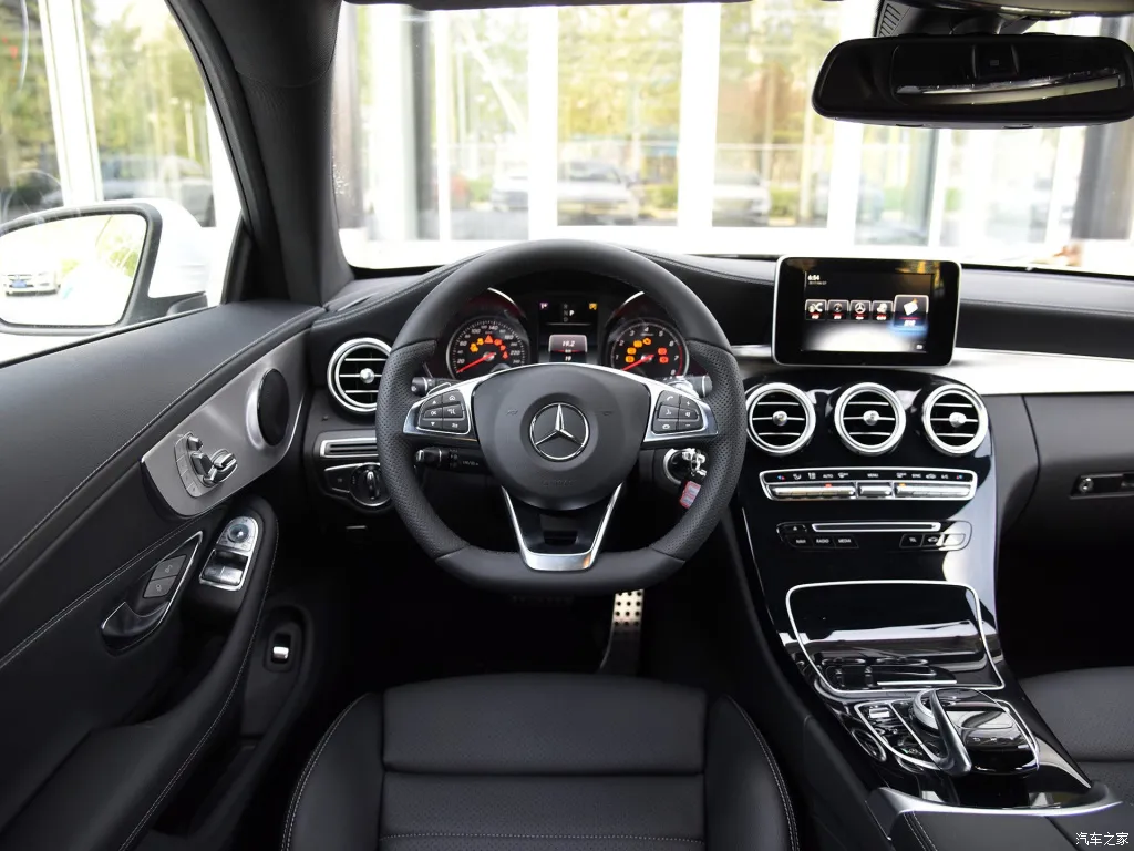
- In terms of hardware, we chose Mercedes-Benz, known as the “benchmark for traditional in-car systems”: the physical control buttons and steering wheel buttons of the Mercedes-Benz C200L.
Let’s take a look at the powerful combination of the Mercedes-Benz C200L and CarPlay and see if it’s user-friendly under the HMI dynamic usability evaluation framework.
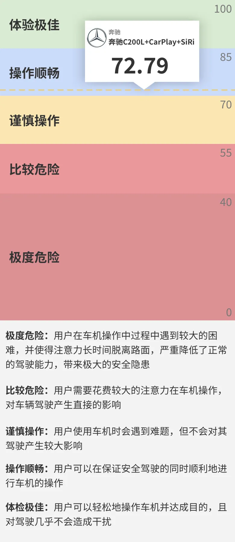
First, the results: by evaluating the 18 common tasks used in the Mercedes-Benz C200L, the overall average score for the usability of the “Mercedes-Benz C200L+CarPlay+Siri” system is 72.79 – “Smooth operation”.
Evaluation criteria
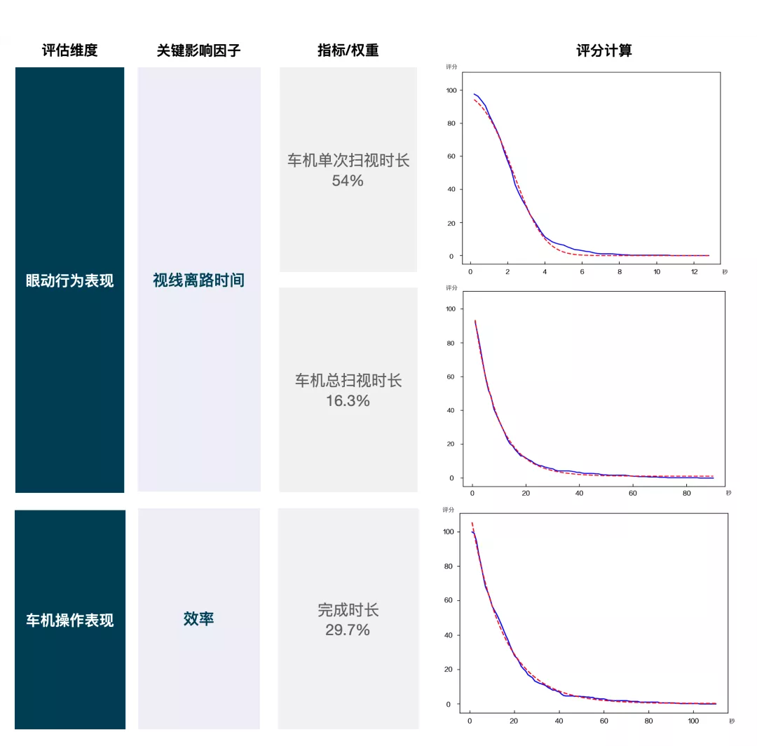
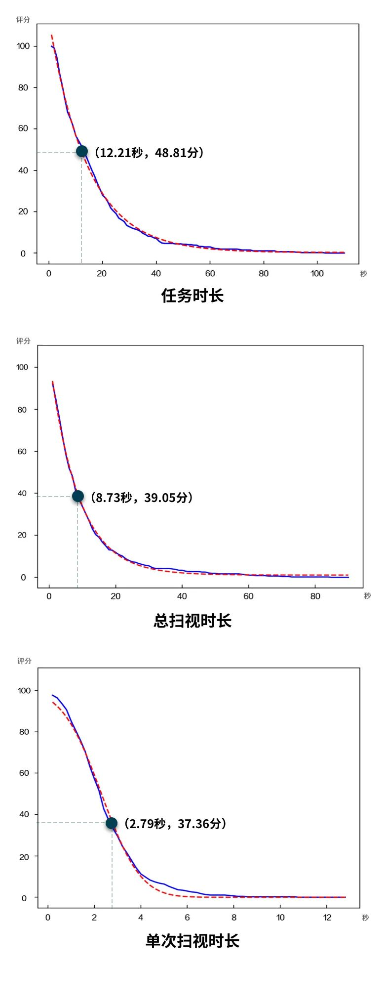
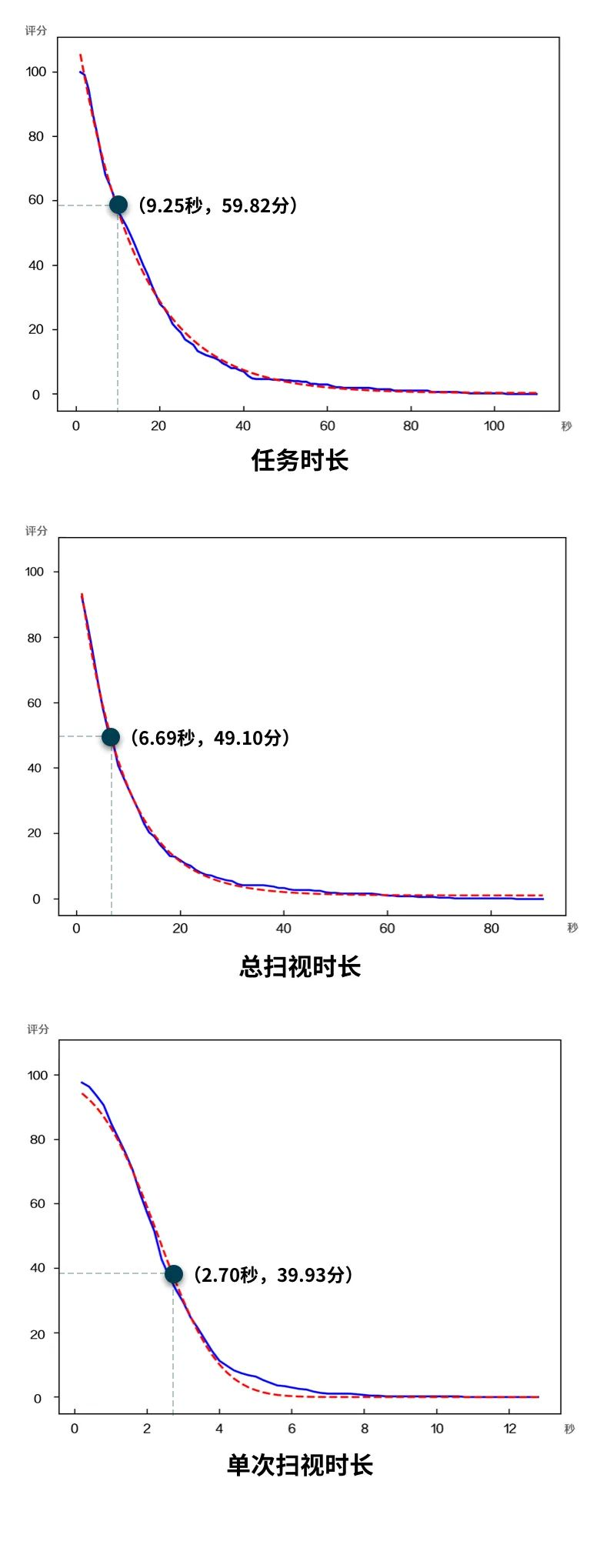
We chose voice interaction (Siri), in-car control (CarPlay + physical buttons + knob), and steering wheel physical button interaction as the interaction methods.The three major indicators that affect driving are the single glance duration for in-car systems, total glance duration for in-car systems, and completion time for in-car operations. The specific scores are obtained by fitting data from each indicator, in order to evaluate the overall usability of the HMI system of this smart cabin.
In order to ensure fairness in the scoring process, usability testing was conducted on basic operation tasks, complex tasks, and 18 tasks related to driving assistance in core driving scenarios.
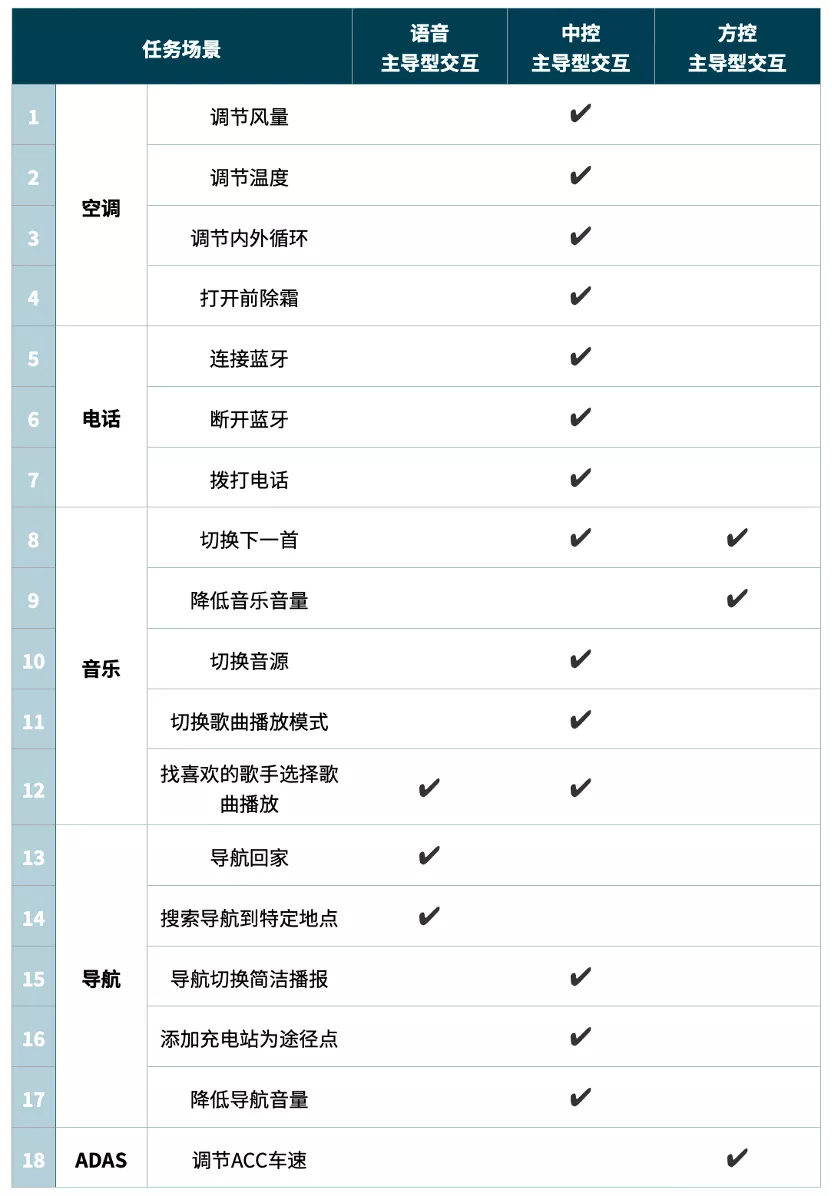
Evaluation Details
Let us take a closer look at the specific scores of the three interaction modes: voice, central control, and steering wheel control, and the performance of the 18 specific tasks.
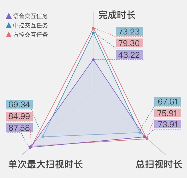
Voice Interaction (Siri): 72.27 – Smooth Operation
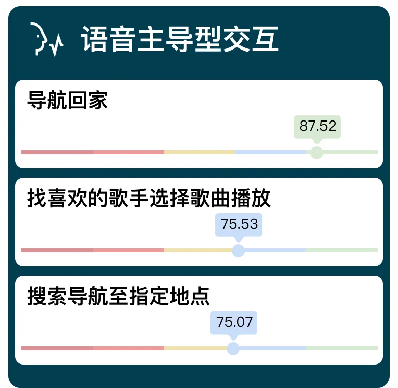
In common tasks, there are three tasks that involve voice-dominant interaction. Among them, the “Navigate Home” task has excellent user experience (87.52), while the other two tasks commonly used by drivers (selecting songs to play for favorite artists and searching for navigation to specific locations) are either barely smooth to operate or require cautious operations.
The performance of various evaluation indicators for voice interaction tasks is shown below:

In this system, Siri is used for controlling various tasks through voice interaction. Therefore, the compatibility of Siri with third-party applications in CarPlay directly affects the scores of the evaluations.
Central Control Interaction: 70.22 – Smooth Operation
 In this car entertainment system, there are 14 tasks led by the central control interaction. Overall, there is a two-tier differentiation in the score distribution of tasks: 9 tasks are above the level of smooth operation, among which 4 tasks are particularly excellent in user experience, and the central control interaction performs well. However, 5 other tasks are at a dangerous level, and the shortcomings can be said to be quite prominent. This also reduces the overall score of the central control interaction, which only got 70.22. The performance of each evaluation index of the central control interaction tasks is as follows:

The uneven performance of each task is also the “common problem” of central control interaction under the “old car + mobile phone” mode.
On the one hand, the Mercedes-Benz C200L central control area is equipped with physical buttons – control knobs. They are quick to recognize, easy to operate, and allow for precise quantitative adjustment when performing certain tasks such as switching audio sources, adjusting temperature, air volume, and indoor/outdoor cycle. These are excellent user experience tasks.
However, for tasks that are not suitable for control knob operation, the onboard small screen does not provide touch screen functionality, and the HMI screen interface design dominated by Carplay lacks sufficient consideration for driving, which may result in relatively dangerous situations when the user operates the system while driving.
Let’s take a look at where the central control mode’s shortcomings lie using two specific task cases.
Task 1: Add waypoints: 41.03 points – Relatively dangerous
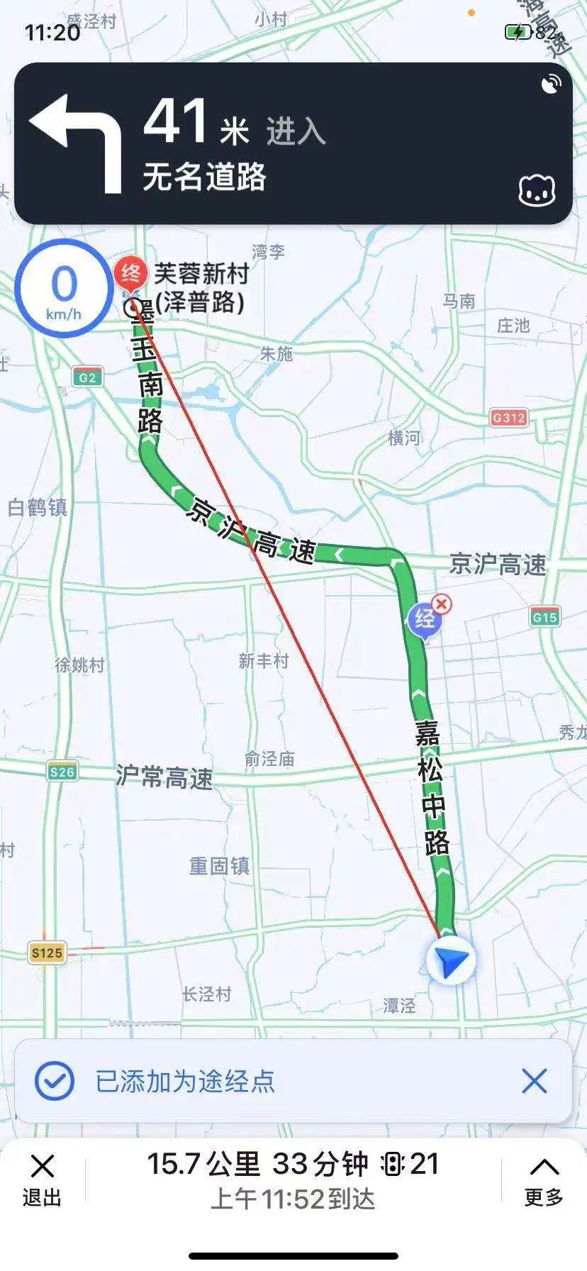
Adding waypoints during navigation, whether it’s adding a charging station as a waypoint for an electric car, or adding a gas station as a waypoint for a fuel car, is a scenario that frequently occurs while driving and directly affects driving safety and system availability.
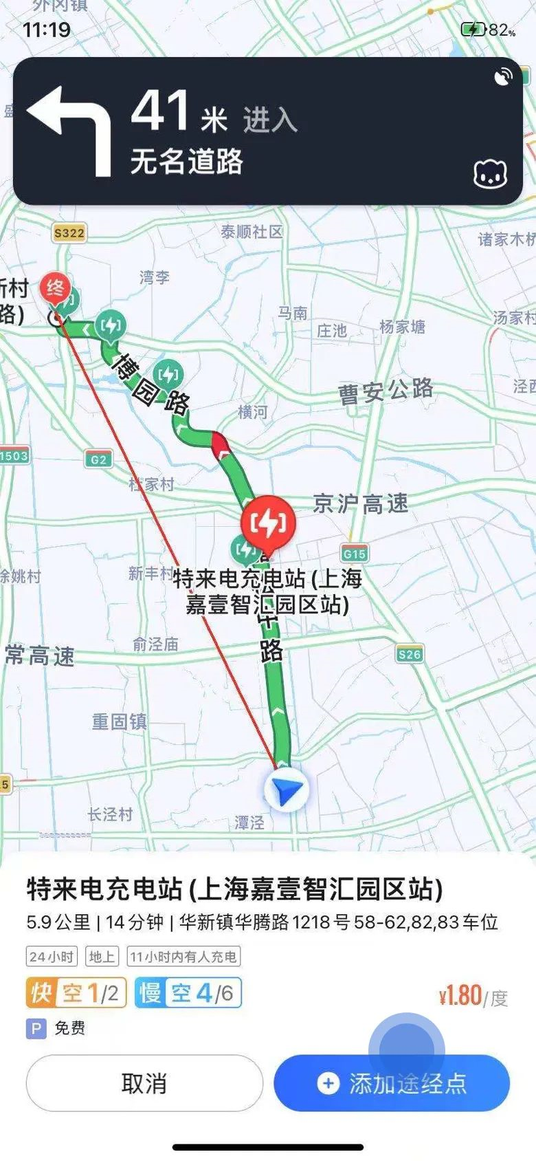
In the Mercedes-Benz C200L + CarPlay system, CarPlay’s native Amap car version arranges the “add waypoints” function on the mobile phone instead of adding them on the central control screen. A function that cannot be operated on the car’s screen but requires the use of a mobile phone inevitably results in a poor user experience. The author even wonders whether it is necessary to evaluate the “usability” of functions set in CarPlay on a mobile phone.
However, we still list the specific issues, which can help us indirectly see the shortcomings of the mode of cooperation between mobile phones and the car system.“`
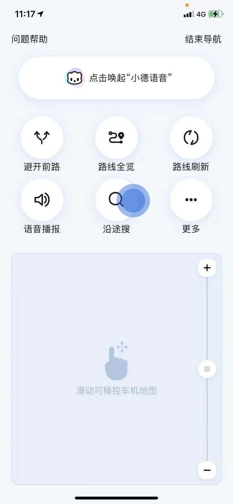
Issue 1: Small Icons and Texts, Inconvenient Charging Station Icons
Since Amap needs to search and add waypoints on mobile devices, the icons, texts, and operation logic on the mobile app are designed based on our daily phone usage habits, and the adaptability to driving conditions is not high.
Therefore, icons and font sizes under 6-7 inches screens on mobile phones are too small for driving scenes. Drivers need to invest more attention to look at icons and texts, which increases psychological burden and pressure, and has a significant impact on driving safety.
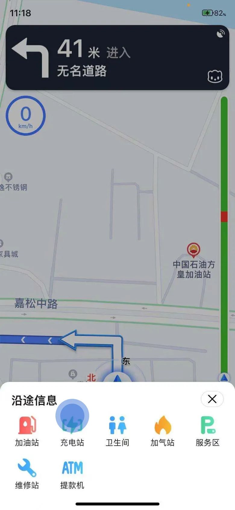
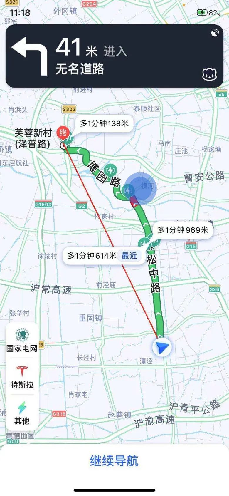
In addition, the charging stations on the mobile interface are presented in small bubbles near the route, which is not easy to view and accurately click under driving conditions.
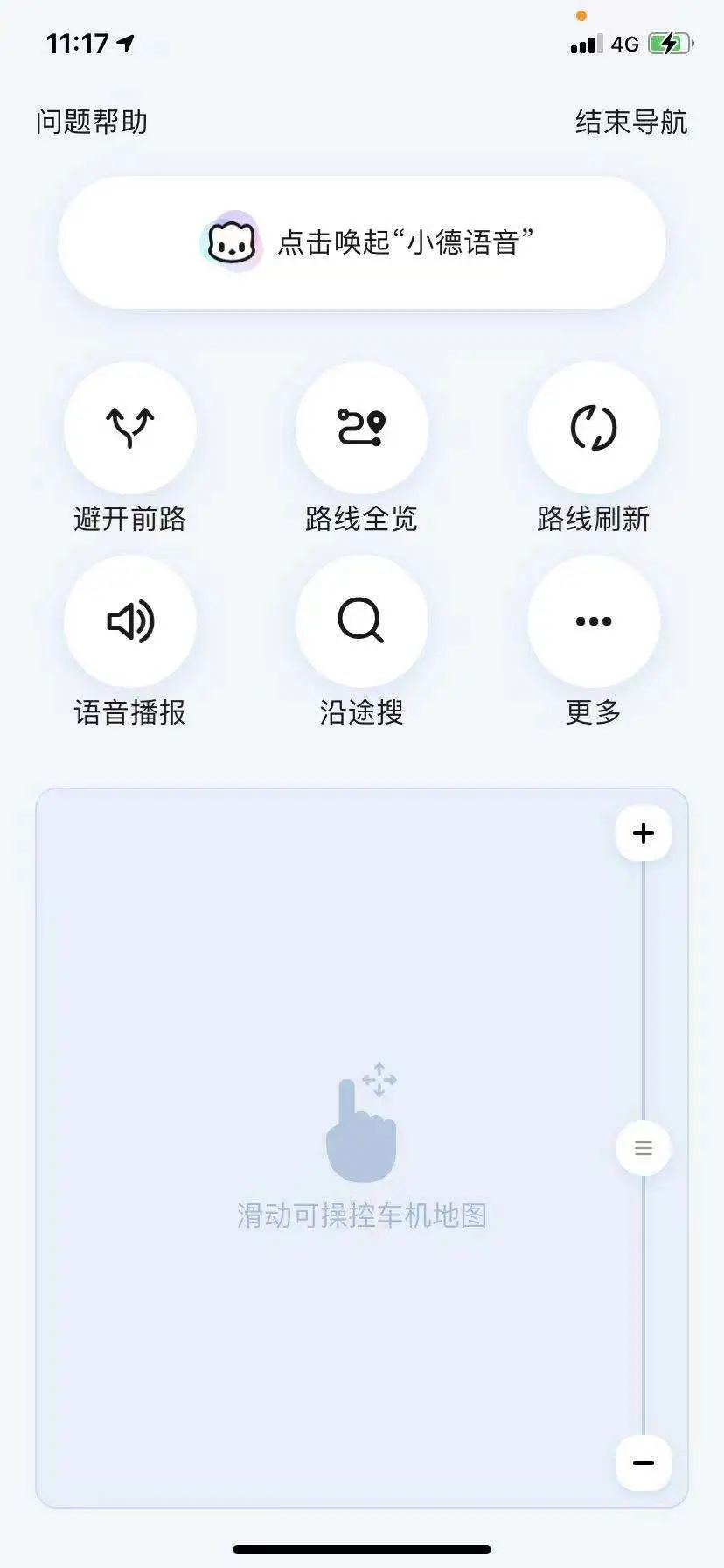

Issue 2: Long Path, Many Steps
When operating on a mobile phone, it requires 4 steps: “search along the way”-“charging stations”- “select charging station”- “add as waypoints”. Drivers need to click the screen multiple times to proceed to the next step, which leads to more screen scanning times and longer scanning time, causing potential danger.
Similar to the previous issue, compared to the car version, the mobile app is not so sensitive to the length of the operating path and the user’s scanning time. Therefore, using a mobile phone to operate while driving may encounter similar “common problems.”
“`
Task 2: Switch playback mode: 47.33 points – more dangerous
Unlike the previous issue, the “central control switch playback mode” function can be operated on the car machine using the central control knob. This issue is more about the compatibility between Carplay and the hardware of Mercedes-Benz C200L.
Problem 1: Icons are small and difficult to see
Compared to the large central screen of the new generation cockpit system, the original space of the central screen of the previous-generation Mercedes-Benz C200L is very limited. The “switch playback mode” icon of CarPlay is set in the lower left corner of the control, which is small in size and similar to the icons for sequential playback and single-loop playback modes.
Therefore, during driving operation, it is necessary to occupy the driver’s visual resources for confirmation. The score of “single glance duration” is the lowest among the three indicators.
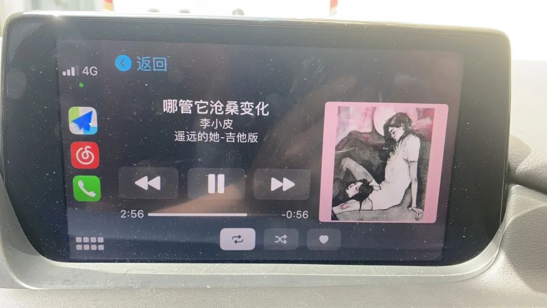
Problem 2: The knob operation is easy to miss the target control and requires multiple fine adjustments.This task is completed in combination with CarPlay by the central control knob. During testing, it was found that it is easy to miss the target control when using the knob to select the focus and cause misoperation. Even when the driver slows down the rotation intentionally, it is easy to miss the target control while using the knob.
To correct this operation, multiple left and right adjustments of the knob are usually required to make fine adjustments to accurately position the target position. However, the process of adjusting the knob multiple times will consume the driver’s visual resources when driving, which is slightly dangerous.
Problem 3: Switching operation modes
The central control knob in the cabin usually provides multiple operation modes, such as rotating left and right to adjust the selected target, or moving up, down, left, and right to change lines or adjust the target. The purpose of such settings is to make the operation of the knob more convenient. When the user wants to select the target of the next line, they only need to gently move down.
However, during testing, we found that subjects seem to prefer to use one mode of operation when performing a task. For example, when switching the play mode, users tend to continue to turn the knob to the next line rather than move it down. This leads to more items being passed and longer paths. The user also has to scan the screen multiple times to confirm whether the target is selected.
This phenomenon has also raised our thinking: Will switching modes of operation and inserting another mode of operation break the smoothness of the interaction in human-computer interaction?
Problem 4: Knob operation stuttering
During the testing process, it was found that the knob often stuttered when operating quickly, and did not have such a smooth experience.
Since we chose a model from a few years ago as the cooperating test object, and traditional brand models often have a research and development cycle of 4 or 5 years, it is difficult to avoid the problem that the hardware performance in the cabin lags behind the new products of the same period.
Steering wheel interaction: 85.41— Excellent Experience
The test results of the three steering wheel interaction tasks showed that the overall performance of the steering wheel interaction was excellent.
Except for slightly more complex tasks (switching to the next song) which are “smoothly operated”, the other two tasks are at the level of “excellent experience”.
In recent years, intelligent cabins have made rapid progress in language systems and central control interaction. In contrast, more traditional control modes and logic are retained in the steering wheel area. Therefore, as the representative of the last generation of car systems, the Mercedes-Benz C200L has more experience to play in steering wheel interaction. From the evaluation results, the score of the steering wheel interaction is the highest among the three interaction modes.## Performance of various evaluation indicators for the steering wheel control task:

Conclusion
Through the evaluation of the “Mercedes-Benz C200L+CarPlay”, we indirectly answered the question raised at the beginning of the article.
Under the evaluation system of “dynamic availability testing,” is the “old car + mobile phone” mode higher in score?
Combining past evaluations, the score of “Mercedes-Benz C200L+carplay” is considered to be average, with some intelligent cabins having higher scores, while other cabins have lower scores than the current combination.
This is because the “HMI availability evaluation” system originally focuses on driving safety and ease of operation, while the intelligent cabins are mainly for entertainment, rich ecology, personalized customization, and so on, which are not the highlights of this quantitative evaluation system.
Of course, if you are curious about the overall level of intelligence and entertainment in the cabin, please go to the neighboring “Intelligent Cabin Intelligence Bureau”, where there is a different perspective on the evaluation of intelligent cabins.
Since this is the case, why do car companies still develop their own intelligent cabin systems?
The “mobile phone + car” mode can indeed help the car make up for the shortcomings of its functions in the short term, and is a high-cost-effective option. For example, for many car models purchased four or five years ago, it is obviously more practical to match their cars with CarPlay and CarLife functions than to buy a brand-new car.
However, from the task cases listed in the article, we can see that there is still room for improvement in the consideration of the driving scenario for the CarPlay mode. Whether it is fonts, icons, or HMI layout, more consideration is needed for driving habits.
In addition, as the cabin attributes expand, there are more and more vehicle control functions inside the cabin, and the relationship between intelligent cabin software and the whole vehicle hardware is becoming more and more close. Since it involves calling hardware modules of the whole vehicle, it cannot be solved by mobile phone mapping alone.
This article is a translation by ChatGPT of a Chinese report from 42HOW. If you have any questions about it, please email bd@42how.com.
