Author: Mr.Yu
For automakers, each OTA upgrade is more practical than a grand launch event; it’s better to have a face-to-face chat with the people who matter most.
On the evening of August 31, 2021, NIO held a small-scale face-to-face communication meeting in Shanghai, featuring the latest NIO OS 3.0 version, as well as future upgrade plans and some ideas.
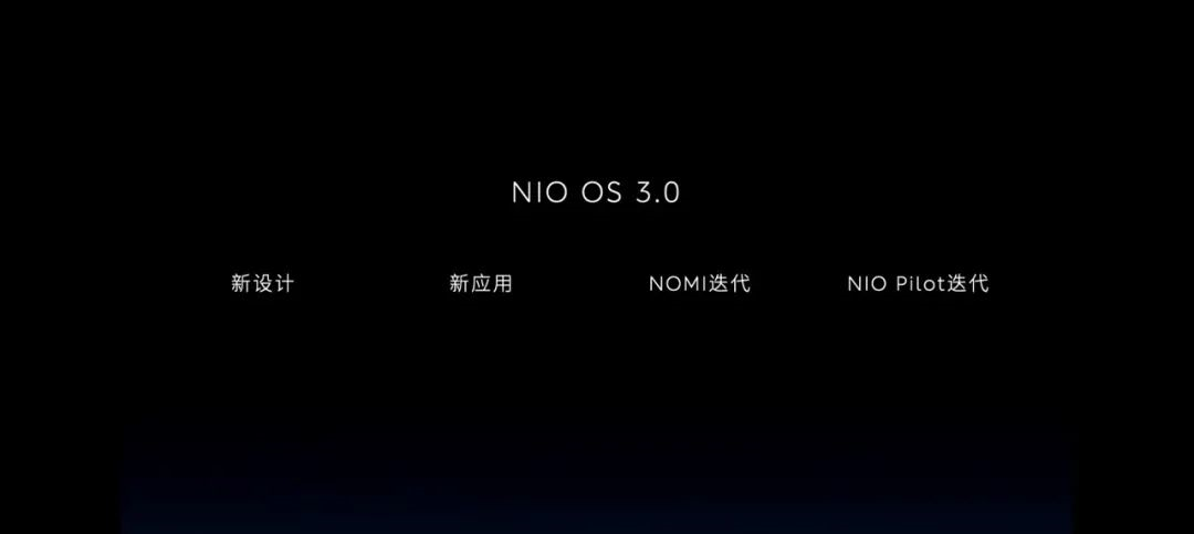
Li Tianshu, the Head of NIO Product Experience, said that the latest NIO OS 3.0 includes optimized and improved user interface and interaction design (UI/UX), in-vehicle AI “NOMI,” and NIO Pilot experience.
Starting from August 31, NIO will gradually push updates to vehicles with current versions above NIO OS 2.9.0.
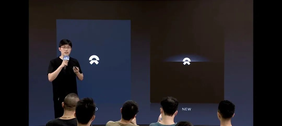
New User Interface and Interaction Design: Not Just for Looks
During the entire online livestream, we noticed that the new system remained in dark mode.
Mr. Yu believes there are two points worth noting:
- Firstly, as agreed by experts in the field of HMI design, for NIO’s design language, the interface’s “luxury feel” is easier for people to understand and accept in dark mode.
- Secondly, Li Tianshu also mentioned plans for future upgrades to include light mode. This means that the new NIO OS light mode is still under development.
Some friends may ask: why make things so complicated just to change the color?
In reality, it’s not that simple. Using WeChat’s dark mode as an analogy, because it involves many visual and cognitive issues, many elements need to be redesigned and debugged, rather than simply changing colors.
If you don’t believe it, try finding a photo on your phone or computer and invert it, and see if you feel visual discomfort like most people.
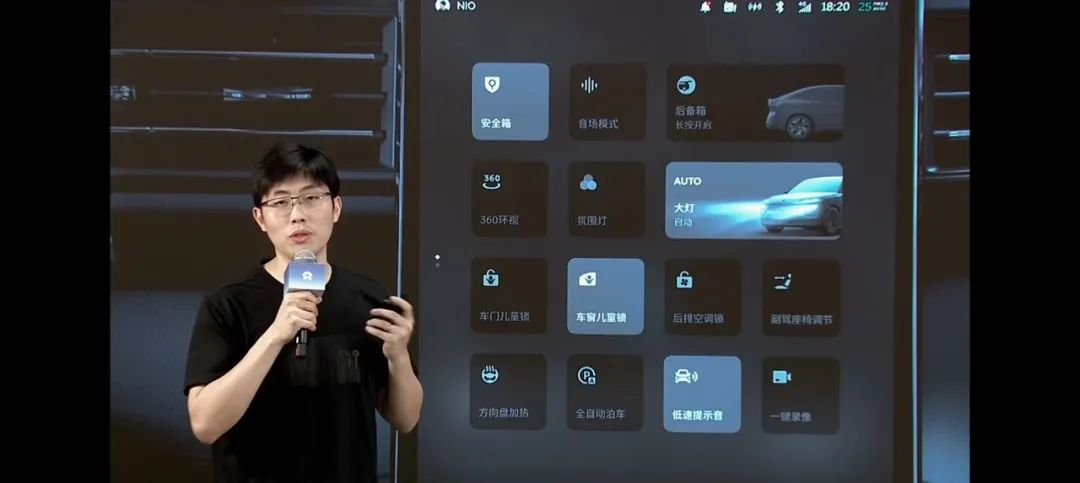
But let’s get back to the main topic. According to NIO, the new version introduces a completely new user interface and interaction design, and thoroughly updates the interface layout, interaction logic, animation effects, and overall visual elements of the central console screen, instrument screen, and head-up display (HUD), aiming to enhance the digital cockpit’s sense of technology and quality.### Central Control Screen
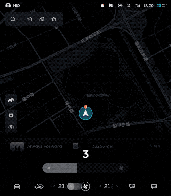
In the new version, the previous vertical address search box has been adjusted to a horizontal layout, with an additional bookmark button added for convenience. The buttons previously placed on both sides have been integrated into the “Settings” button on the left side, making the desktop more clean and organized.
In order to improve the utilization rate, the new media card is designed as a half screen, with the most commonly used functions placed within the half screen and supporting full screen pull-up.
The car control card integrates more information, such as weather and power consumption, and supports left and right sliding for customization.
A mini mode has been added to the card bar, which can be pulled down to expand the display area of the navigation map.
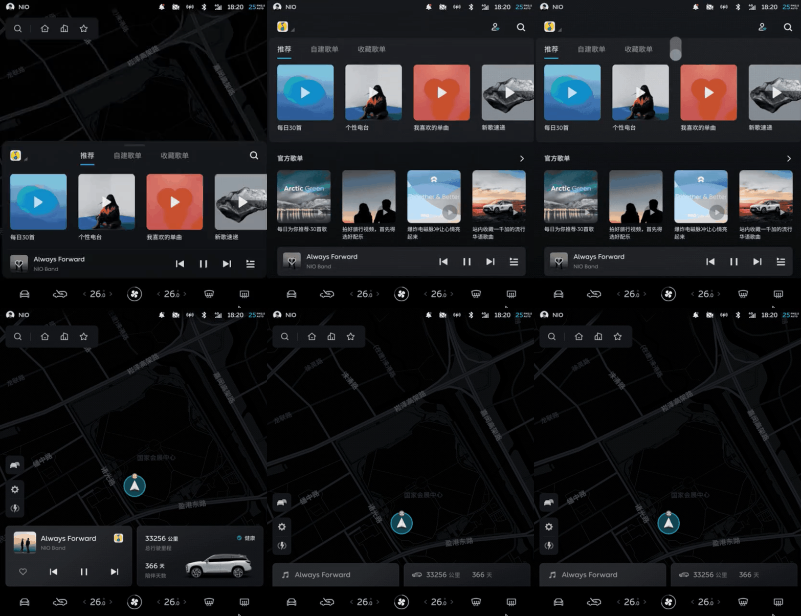
In NIO OS 3.0, multiple adjustments have been made to the bottom dock bar of the central control screen:
- A quick entry for vehicle settings has been added to the far left, and the cycle mode button has been moved to the left, with the front and rear window heating buttons moved to the right;
- Clicking and dragging near the temperature and wind speed buttons allows for quick adjustment;
- Clicking the wind speed icon or sliding up from the dock bar can access the new comfort control panel, which integrates air conditioning, seats, and perfume adjustment in a half-screen form.
Mr. Yu likes this design very much because the main interaction logic is more focused on visual and operation. It is not only convenient to search, but the interaction level is also controlled within a reasonable range. The performance of animations like switching and sliding has also increased, and the quality has been improved.
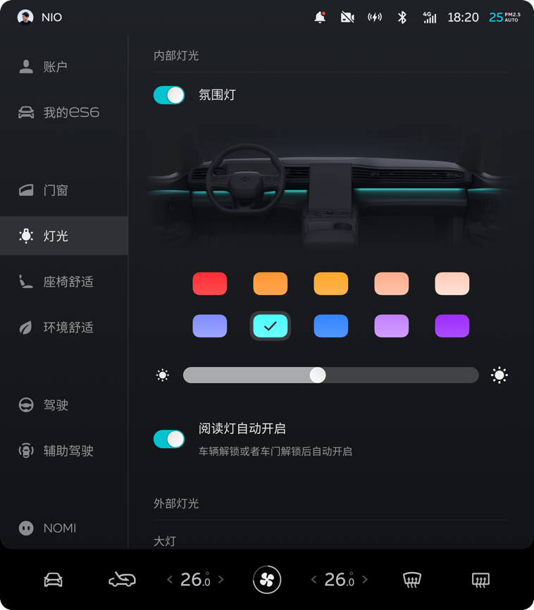
In the new settings menu, the system integrates NIO account and “My Car” information, and adjusts the submenus of some functions. Now, all switch controls are aligned on the left side for easier operation by the driver. The quick control menu on the negative one screen now supports up and down flipping, and some buttons have been removed.
Unified design elements for interaction improves both the visual aesthetics and ease of touch operation.
Instrument Panel
In terms of the instrument panel, in addition to design elements such as font and color that are consistent with the central control screen, the overall information layout has also undergone multiple adjustments.The speed, gear, driving mode, and remaining mileage are now displayed on the left side of the dashboard screen, providing more space for driving assistance visualization. The current playing media information and other multifunctional menus are still on the right side.
With the skyline moving up, the position of the car is now relatively lower, leaving more space for driving assistance visualization. All animation effects in vehicle assistance status have been redesigned. The visibility of highly attention-demanding information, such as long-term hand-off warning, has been further improved, and optimization has been made for different types of vehicles, pedestrians, non-motorized vehicles, and other target models. It can now support the restoration and display of real lane lines.
Li Tianshu said that the new dynamic simulation display effect will be clearer and finer than before, and more technological.
In the past, during our test drive of related NIO models, the “teleportation” of the display position of non-motor vehicles on the dashboard occurred. We hope that this issue can be resolved in this update.
Starting from NIO OS 3.0, the HUD of related vehicles will display more abundant content, including the road speed limit information, electronic eye information, electronic eye distance, etc., which will be displayed in the left area.
In the new HUD display interface, the right side area adds the simulation display of the lane lines under navigation status. Simultaneously, combined with the simulated lane lines, it will provide dynamic display for functions such as NOP active lane change, turn signal control lane change (ALC), Lane Keeping Assistance (LKA), and Lane Change Assistance (LCA).
In addition, the layout of the original information in the HUD has also been slightly adjusted, such as moving the assisted driving status identification and cruise speed information to the top; the progress display bar of the remaining distance of the navigation junction turn (TBT) is changed to horizontal display.
The previous car version of Baidu Maps in NIO OS did not have the “team travel” function, neither supported team voice nor could it share vehicle location in real-time. Fortunately, the NIO product team finally remembered to add this feature. The new version adds support for team travel function that can be used in both the car and the App. Users only need to enter the team mode by clicking the “double car” button on the left side of the main screen.Entering this mode, the leading member who takes the lead will be automatically recognized as the “leader” role – note that this is different from the “captain” role that created the team. The positions of all online team members will be shared in real time, and members can use in-car devices to make voice calls, supporting both intercom mode and chat mode.
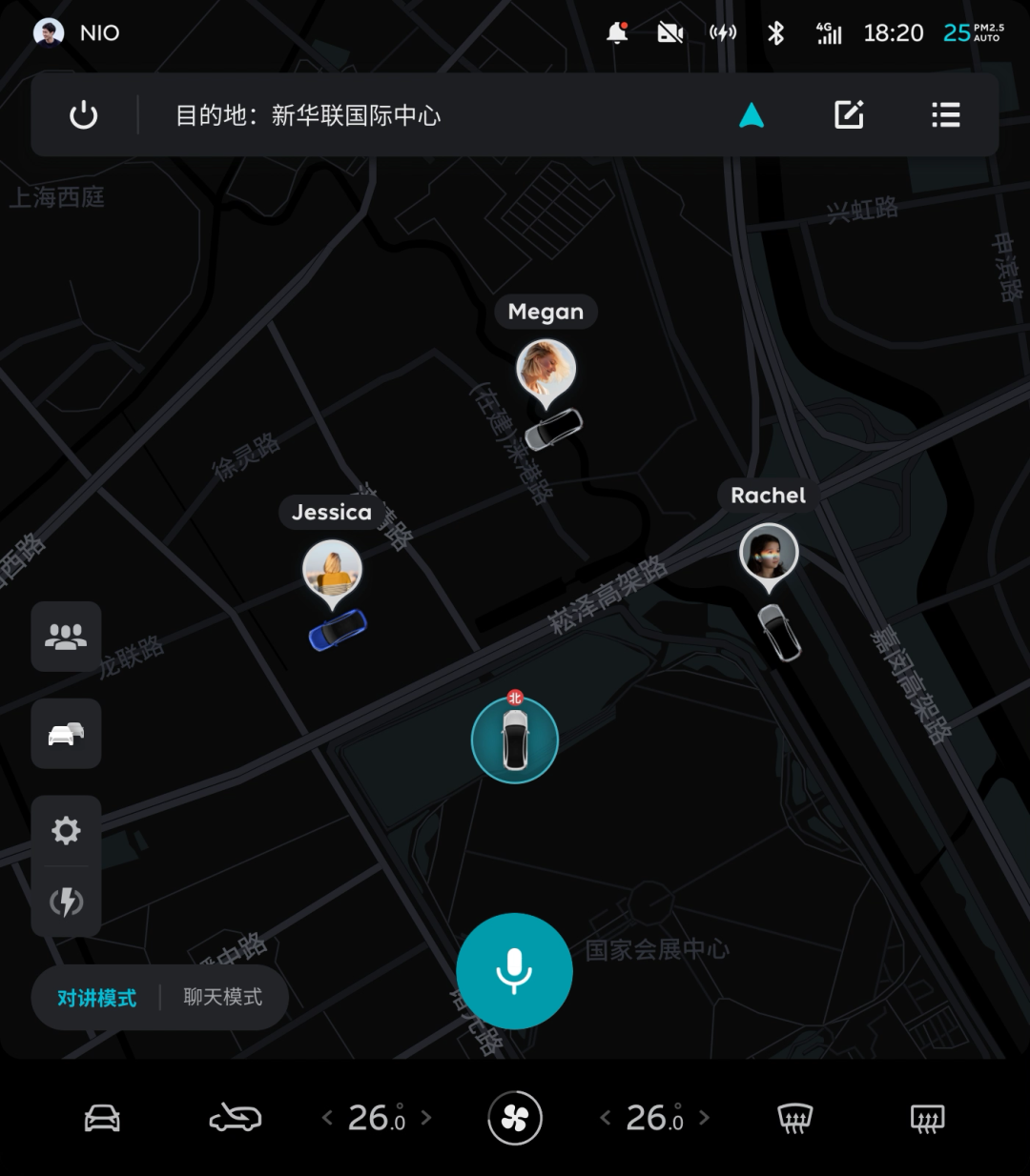
Simply put, the new NIO OS version brings the real-time location sharing feature of WeChat on the phone to the car. The most immediate benefit is that all interactive logic is still based on the NIO OS navigation main interface familiar to NIO car owners, rather than switching between different applications. The vehicle’s driving navigation and vehicle control still remain visible in the user’s view. Real-time intercom, as well as voice chat similar to WeChat voice messages, can be achieved by physical buttons on the steering wheel or icons on the center screen.
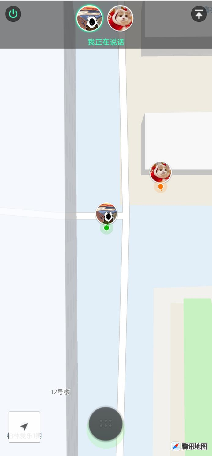
In conversations with some traditional car owners who are skeptical about smart cabins, Mr. Yu hears a common saying that they believe in-car applications are both insufficient and not user-friendly, so vehicle intelligence can be fully realized by using phone apps instead.
We must admit that the product and path are dynamic and constantly evolving. Although team travel functions are not a top priority, we can still see that the NIO product team has established a good paradigm in the process of improving the in-car experience.
You laugh at NOMI’s lack of intelligence, it laughs at human beings’ inability to see through its advantages.
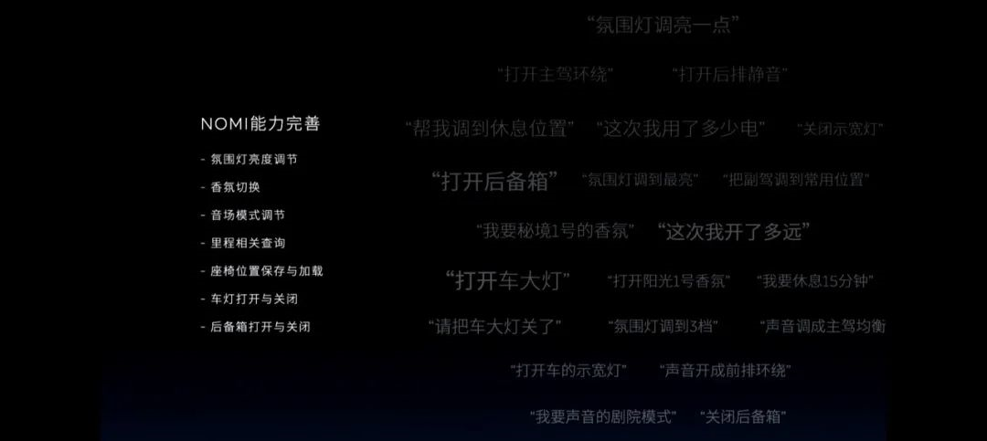
To be honest, before the NIO OS 3.0 update, Mr. Yu did not think that NOMI’s voice capabilities were particularly outstanding among other intelligent voice assistants. The lack of full-duplex, frequently used operations without wake-up, contextual understanding, and continuous conversation made NOMI’s presence in the car somewhat impractical.
According to NIO, the new version specifically improves NOMI’s recognition ability and wake-up rate, especially enhancing its response to children’s wake-up calls. Considering the differences in users’ pronunciation habits, in addition to the original “Hi, NOMI”, now it can also be awakened by saying “Hey, NOMI”.
Here we can see the attitude of the NIO voice product team, which is not to force humans to adapt to intelligence, but to actively make intelligence adapt to humans.
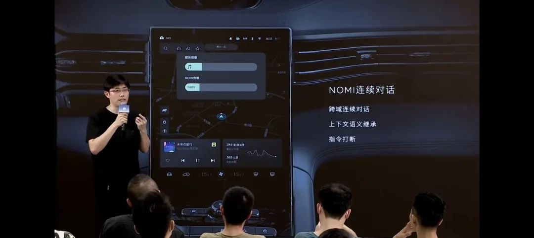
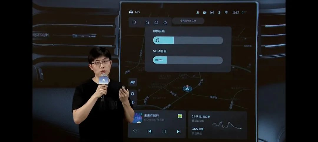
In addition, NIO also added the continuous conversation function for NOMI, which users can enable in the “Settings – NOMI” menu.When the continuous dialogue function is enabled, if there is a need to continue conversing with NOMI after a dialogue, a new voice command can be directly spoken within 20 seconds without the need to wake up NOMI again. If there is no new valid voice input within 20 seconds, the continuous dialogue will automatically exit.
The newly added continuous dialogue function supports cross-domain use, which means that after instructing NOMI to navigate, media or vehicle control-related instructions can still be given. At the same time, the continuous dialogue function supports inheritance of contextual meaning, such as saying “a little louder” directly after commanding NOMI to increase the volume, and NOMI will determine and execute the command based on the context.
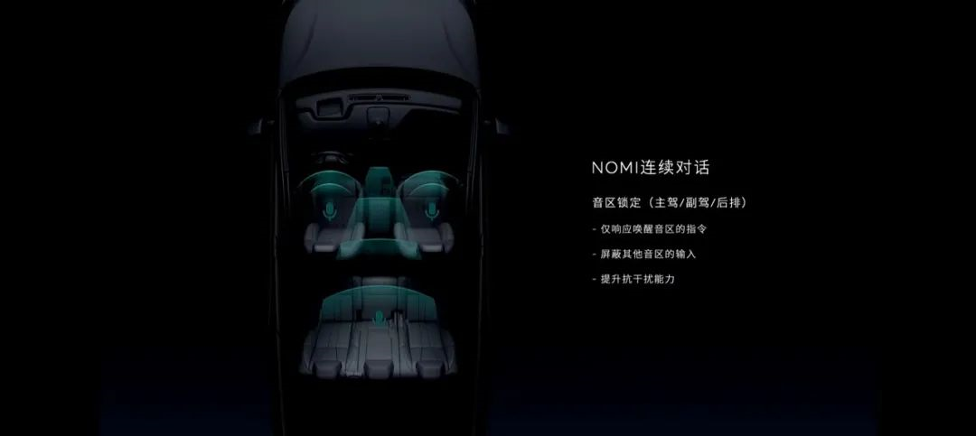
In terms of recognizing interactions in polyphony areas, for a better dialogue experience when multiple passengers are conversing in the car, the auditory zone lock will be enabled by default in the continuous dialogue mode. The auditory zone lock function allows NOMI to respond only to commands from the awakened auditory zone after it is woken up. If other passengers in locked areas want to communicate with NOMI, a new round of dialogue needs to be started by waking up NOMI again.
From these perspectives, NOMI is already much more powerful than “Xiao Ai Tongxue” in the home. It is indeed more reasonable and efficient to use intelligent speech with continuous dialogue support than to use four wake-ups and command interactions to adjust the air conditioning, or even to open the MIJIA app’s intelligent card for operation.
Many intelligent speech manufacturers boast that their AI can chat. But in reality, they must be able to perform their basic job functions before they can chat. Otherwise, the existence of intelligent AI speech in the scene is useless except as a talkative mascot. In this case, user stickiness, interaction flow, data, and iteration are not even worth discussing.
K song, meditation, and nap, suitable for all cabin movement and stillness
In other areas, we have also seen some exploration by the NIO product team into scene space.
“The Tides” is more of a product exploring the real usage scenarios within the car space rather than just an application.
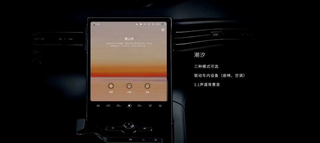 The cabin will provide a comfortable atmosphere for users to fully relax in the “nap”, “meditation”, and “breathing” modes through the integration of 5.1 Surround sound background music, seat position, air conditioning temperature, circulation mode, ambient lighting, and in-car audio with the support of a linked system.
If this feature can deliver an immersive spatial experience, the only thing that needs to be guaranteed is the overall comfortable user experience.
On the other hand, in-car KTV is an exploration of entertainment scenarios.
In the new OS version, there is also a feature called “Everyone KTV.” In addition to the massive library of 10 million songs, the feature supports screen operation for selecting songs as well as song selection via QQ Music full-screen interface and mobile scanning.
NIO’s product experience manager, Li Tianshu, said that the starting point for developing this feature was the KTV rooms we often see in commercial places that resemble telephone booths. However, the team and users all expect more of a familiar KTV box scenario, as demonstrated by customers uploading orders for the dedicated USB microphone to NIO app’s e-commerce platform in just a few minutes.
Upon seeing this, Mr. Yu suddenly realized that KTV, not being abandoned by the times as a consumer entertainment venue, has simply transformed into a pursuit of a perfect scenario, bringing it right into the intelligent cabin of a car.
Li Tianshu also reminded everyone that if the vehicle is in motion, the KTV function will only display the lyrics, and it is not suitable to sing while driving.
Emergency Driver Assistance (EDA)
In version 3.0 of NIO OS, the Emergency Driver Assistance (EDA) feature has been added. In Pilot/NOP mode, the system will continuously monitor the driver’s ability to control the vehicle by using the driver status detection camera, steering wheel torque, and other factors. If the system detects that the driver is not effectively controlling the vehicle, it will take a series of actions under allowable conditions:
- Continuously alert the driver with dashboard pop-ups, warning sounds, etc.;
- Try to wake up the driver by applying the brakes;
- Activate the hazard lights;
- Gradually decelerate and finally come to a stop within the lane;
- Automatically dial the 400 emergency number for rescue;
- Automatically unlock the vehicle doors after the vehicle has stopped.We can see that the active control level of the entire EDA function is gradually increased from the initial perception reminder, to takeover, control, parking, and calling for rescue. If the driver regains control of the vehicle during the effective period of EDA by stepping on the accelerator or brake pedal, turning the steering wheel, or turning off the hazard warning lights, EDA will exit and restore the vehicle to normal state.
Conclusion
After announcing a series of upgrade details and follow-up plans, there is another important change.
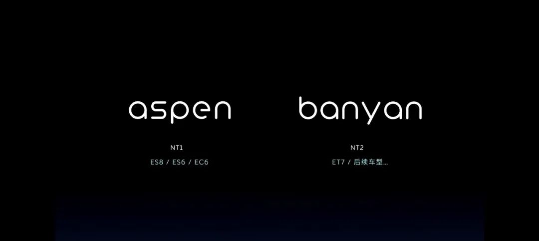
For the purpose of adapting to multi-platform projects and multi-region management, NIO will split NIO OS into independent branches and adopt a new naming system:
- NT1 platform models – The software system for the three models of ES8, ES6, and EC6 that have already been launched will be named “Aspen”, with a Chinese meaning of Populus simonii;
- NT2 platform models – The software system for ET7 and subsequent models that have not yet been launched will be named “Banyan”, with a Chinese meaning of Ficus microcarpa.
Regardless of the light mode of the new version system that has not yet been pushed, the completed dark mode, or the current system design elements of NIO, the comfortable green color is the core color. Now, in addition to aesthetics, it also carries a certain meaning.
Unlike Google, which loves desserts and names each version of Android differently, NIO uses trees to name the entire vehicle software system. It not only expresses the concept of clear sky and green environmental protection but also contains the meaning of continuous growth and iteration.

This article is a translation by ChatGPT of a Chinese report from 42HOW. If you have any questions about it, please email bd@42how.com.
