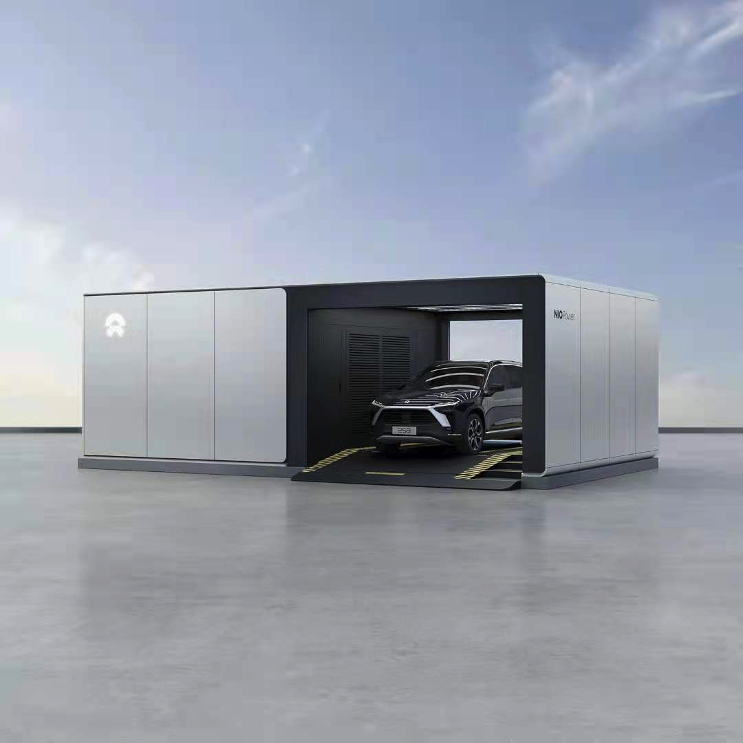
In recent months, it can be clearly felt that the deployment speed of NIO Power swapping stations is accelerating, and the phenomenon of queuing for swapping has significantly improved. So what are the underlying logic behind the deployment of NIO Power swapping stations?
Today, the “Charge on Demand” feature within the NIO app has publicly disclosed some of the logic behind NIO Power. Let’s take a brief look.
Station-to-car ratio: This is an important indicator for determining whether the resources for swapping are tight. As of the end of July, the NIO station-to-car ratio has decreased by 30% compared to April, from an average of 606 users per swapping station to 424 users.
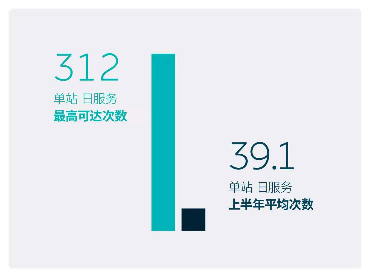
Operational efficiency: The second-generation swapping stations are designed to serve up to 312 times per day, while the average daily service times of NIO swapping stations in the first half of this year was 39.1. Therefore, there is still a large service space for swapping stations.

Waiting time: Due to more battery cycles and the scenario of not getting off the car in the second-generation stations, the waiting time for users at second-generation stations is shortened by 21.2% compared to first-generation stations.

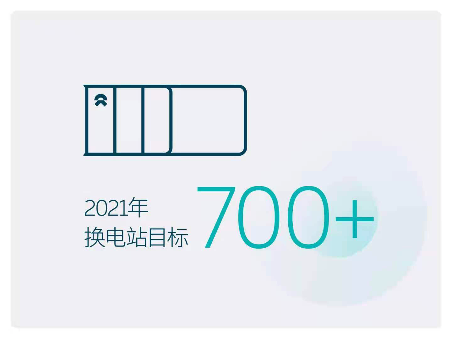
Electric-zone housing: Residential areas within a 3-km radius of swapping stations are nicknamed “electric-zone housing” by NIO users. As of the end of July, 30.86% of NIO users across the country live in electric-zone housing. In order to increase this ratio, NIO has raised its swapping station deployment target from 500+ to 700+ for the year 2021.
🔗 Source: NIO App
This article is a translation by ChatGPT of a Chinese report from 42HOW. If you have any questions about it, please email bd@42how.com.
