Author: Qian Jialing
The editor found something interesting. When we search for the corresponding mobile app of a new energy brand in the app store on our phones, we can see their one-sentence summary of their brand, so that users can more accurately understand the positioning of each brand.
Let’s take a look at how XPeng introduces their brand’s mobile terminal app:
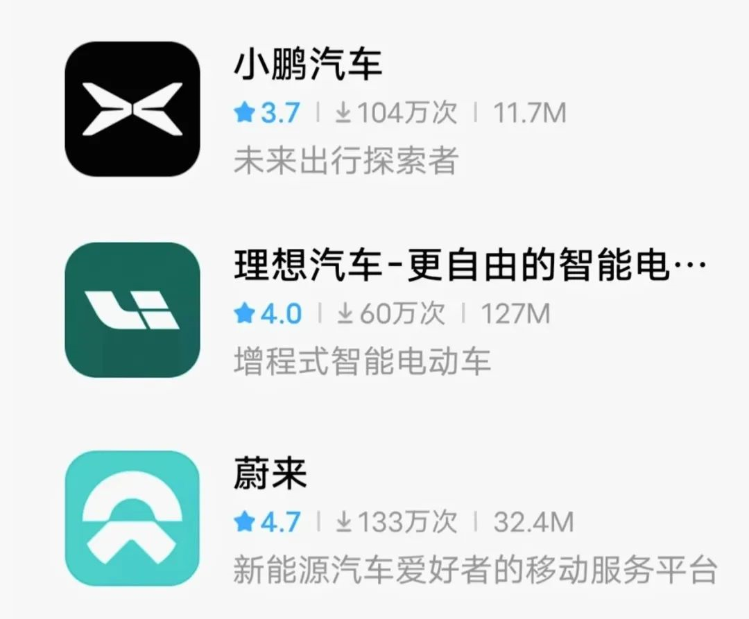
XPENG has always been emphasizing excellent service, and the operating concept of their mobile app is no exception. Their description of their brand and the logo and UI display interface of the app are also consistent with their typical straight male attributes. Meanwhile, XPeng has always emphasized intelligent driving. The description of “Explorers of Future Travel” corresponds to their logo which is already quite high-tech.
XPENG MOTOR prioritizes intelligent driving safety
What is interesting is that, unlike the other two apps, XPENG has set up a separate “XPILOT” feature page for intelligent driving in the app.

The sub-menu bar uses the form of the development timeline of XPENG in the intelligent driving field. The card bar above the function interface displays the function introduction videos released corresponding to various time points. It also records related data that can be updated in real-time. This is really down-to-earth!
The card bar at the bottom of the page displays the intelligent driving score and intelligent driving academy, deepening users’ understanding of intelligent driving safety. This is a very innovative point, which is often ignored by many companies. In contrast, other apps tend to hide the function of learning introduction deep.
As XPeng previously stated that they are planning a major upgrade to the App community, opening up negative comments, and high-level participation in multiple user exchange meetings to listen to user feedback, it can be clearly seen that the area for user communication in the XPeng app has increased significantly.
 Besides the feedback and issues related to vehicle usage on the “Discovery” page and various feature interfaces such as “Fans Circle,” “Brand Reputation,” and “Q&A,” XPeng has also opened a smart driving communication chat room for users at the bottom of the “XPILOT” feature interface to facilitate more direct and effective communication. This proves that XPeng attaches great importance to the field of smart driving.
XPeng’s Online Grass-Planting Machine?
However, in addition to a separate feature interface for smart driving, XPeng has also established a separate feature interface for G9 in the Dock bar above the “Discovery” page of the XPeng Qiche APP. It mainly provides users with dynamic and static media explanations, which can be regarded as an area for video planting for the G9 model.
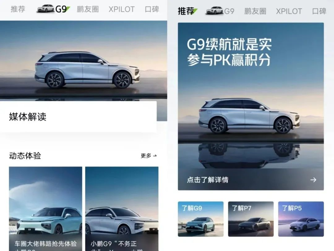
There are some problems with this page. First of all, only this feature has the G9 car model icon displayed as a prefix, and the video display format in this interface is a rectangular shape with right angles, while other interfaces have a rounded rectangle shape. Therefore, the editor speculates that because this feature interface is newly added, it has not been timely kept in sync with other feature interfaces, and combined with the unclear hierarchy classification of other functions in the Dock bar above this page, the visual effect may be somewhat confusing.
However, one good thing is that the top and largest card displayed in the “Recommendations” page is the latest G9 model currently on sale, and the other three recommended models are listed below. Scrolling down, users can find the recent events hosted by XPeng interspersed with car-related dynamic content posted by other car owners, which is very conducive to planting grass for users.
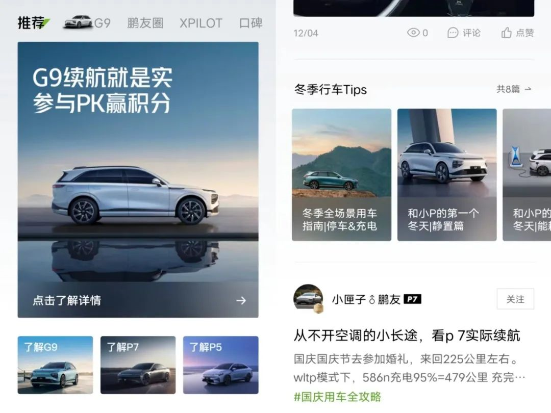
In addition, under the search bar on the “Discovery” page, the displayed search terms will be adapted according to current hot topics and seasonal changes.
 It is puzzling to the author that the “Pengyou” function interface is also present in the Dock bar below, which is mainly used for contacting official customer service and receiving official notifications, making the “Discovery” page a bit empty in comparison.
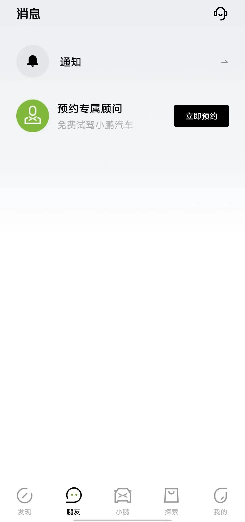
The author suggests integrating the user communication functions such as “Pengyou Circle” in the “Discovery” interface into this interface or replacing it with “G9”, while keeping the functional hierarchy synchronized so that adjacent pages appear more balanced.
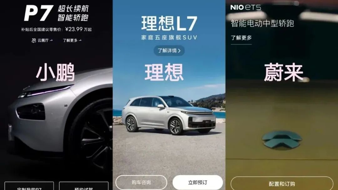
Taking a look at XPeng Motors’ “XPeng” page, it displays the models currently on sale in full-screen.
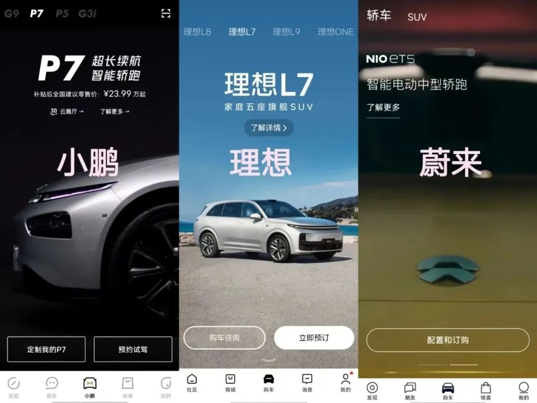
Compared to NIO and Ideal Auto, their intention for users to purchase is much stronger. Although the “Purchase” interface in the Ideal Auto app also features full-screen display with functional icons for “Schedule Test Drive” and “Order Now”, the model displays are still static images and less impactful.
Both NIO and XPeng also use full-screen dynamic display, but NIO uses the corresponding model image as the waiting interface during buffering, while XPeng’s page displays the XPeng logo and iconic black background color.
Interestingly, the model selection for the “Purchase” interface in the Ideal Auto app and XPeng Auto app is sorted in reverse chronological order by specific model, which is quite intuitive.
However, the model selection in the “Purchase” interface of the NIO app is divided into “SEDAN” and “SUV” categories, and users need to slide dynamic cards to display specific models, which is not conducive to quickly finding the desired model.
The “Explore” function interface is also well-designed, directly classifying the surrounding products into major categories based on daily necessities and vehicle products, providing detailed subcategories in addition to the large picture card bar and activity banner.And the display format of the feature selection in the major categories is synchronized with the function selection in the Dock bar above the “Explore” interface, using a green slash. The detailed categories below use green font, which is a subtle detail.

However, in terms of font display, the “My” interface may have more integrated functions compared to NIO and IDEAL, so the font is smaller and the spacing between words is denser, which slightly affects the visual experience.
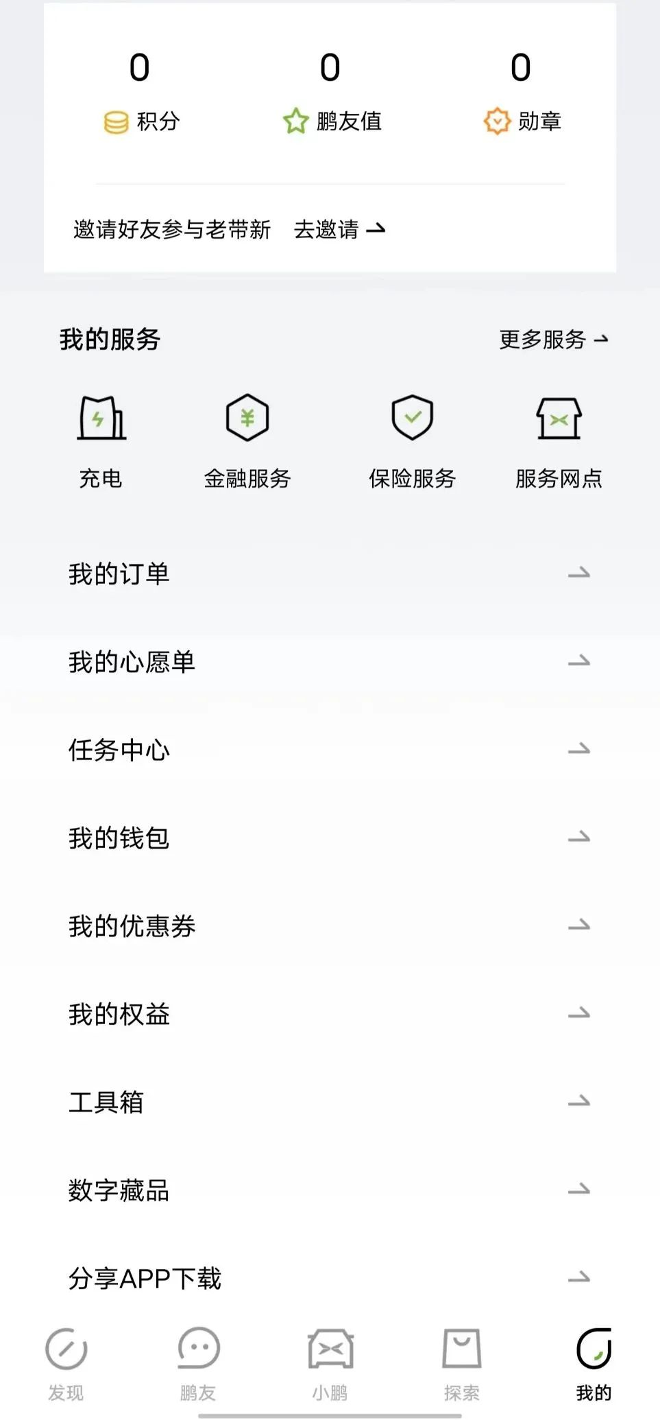
The usage process of the Xpeng APP is similar to NIO and IDEAL, but the functional hierarchy classification may not be clear enough, and the purpose of use is not clear enough. Compared to NIO’s emphasis on a warm living community and IDEAL’s pure tool attributes, Xpeng seems to lack a clear positioning in terms of intelligence, and a better plan for intelligence is needed.
Of course, the promotion of intelligent driving and the multi-level user communication area are still very good, and it will be more convenient for users to query different vehicle feedback.
This article is a translation by ChatGPT of a Chinese report from 42HOW. If you have any questions about it, please email bd@42how.com.
