Article: By Xiong Ruifeng
Do we really want to eliminate physical buttons?
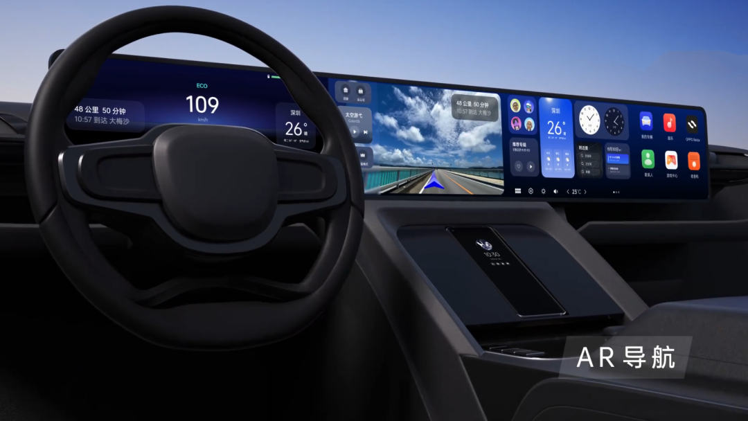
Does your car still have physical buttons? Since the rise of new forces, the new form of car interior has developed towards touch screen “arbitrariness”, and even the “opening” of a button is not planned to be left.
But recently, an “unprecedented” thing happened. Great Wall officially decided to increase the air conditioning physical buttons for the new Tank 300 series according to the product research of the users.

As soon as this move was made, two opposing arguments were immediately formed on the Internet. One group believed that Great Wall was reversing its product power in order to save costs, while the other group believed that Great Wall was truly considering from the user’s perspective, rejecting fancy designs and bringing back practical physical buttons.
Which is better, touch screen or physical buttons?
So, what is the truth? Which is better, touch screen or physical buttons?
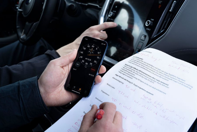
In order to find out, a professional organization overseas recently tested, including the following test vehicles:
1.Fully touch screen Tesla Model 3, BMW iX, Volkswagen ID.3, etc.;
2.Touch screen + buttons such as Volvo C40, Mercedes-Benz GLB, MG Marvel R, etc.;
3.12 models with full physical buttons, including Volvo V70 (released in 2005).

The specific testing items were four functions continuously operated at a traveling speed of 110km/h, including: 1. Turning on seat heating, elevating the air conditioning by 2℃, and turning on defrosting; 2. Turning on the radio and tuning to a specific radio station; 3. Resetting the odometer; 4. Adjusting the brightness of the instrument panel to the darkest level and turning off the center screen.
It is worth mentioning that, in order to simulate car owners as much as possible, the testers have enough time to understand the car and the car system before the test, and the entire test process does not involve the voice system, all of which are finger operations.

Through a series of test data, the most interesting thing found is that modern cars score worse than old cars, and the best performance is surprisingly from the full physical button player Volvo V70 born in 2005, which completed all functions in only 10 seconds and drove 306 meters during this period.
The models that use touch screens and physical key combinations such as Volvo C40, Subaru Ascent, and Mercedes GLB, take gradually longer to operate as the proportion of physical buttons decreases, with times of 13.7 seconds, 19.4 seconds, and 20.2 seconds respectively.

Interestingly, despite having a combination of buttons and touch screen, MG Marvel R still took the longest time at 44.9 seconds (slowest overall) and travelled the longest distance at 1372 meters.

In addition, for the touch-only models, Tesla Model 3, BMW iX, and Volkswagen ID.3 took 23.5 seconds, 30.4 seconds, and 25.7 seconds respectively.

Analyzing the above data, it can be seen that a layout with purely physical buttons has significant advantages. It not only takes up the shortest amount of driver’s time but also maximizes driver attention and driving safety.
Regarding the touch screen + button combination, it can achieve excellent test results with a reasonable touch screen system operating logic, while complex logic only results in a “terrible” user experience, as shown by MG Marvel R, which took three times longer than the fastest model due to seemingly simple operations.

Furthermore, the performance of pure touch screen models is determined by the operating logic of the system, just like the combination screen models. However, looking at the times, most of them are slightly slower than the other two types of interactions, especially in the air conditioning setting section, where multi-level logic wastes a lot of time.
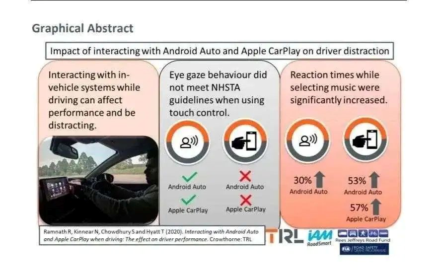
Is touch screen really dangerous?According to another survey conducted by overseas media, the normal reaction time of drivers while driving is generally about 1 second; if driving after drinking lightly, the reaction time will increase suddenly by 40% to 1.4 seconds.

At the same time, if the driver uses pure touchscreen to operate the vehicle settings, the reaction time to road conditions will increase by 55% to about 1.6 seconds due to their gaze being moved away from the windshield to focus on the screen options.
In other words, using pure touchscreen while driving is even more dangerous than drunk driving.

However, from another perspective, if we consider the combination of buttons and touchscreen as a matrix model, buttons are more valuable for some single-step and relatively fixed functions (such as air conditioning), but touchscreen seems to be more efficient for target opening and multifarious functions (such as multimedia entertainment).
Is it Cost-effective to Use Buttons?
Returning to the original question, is it cost-effective to use buttons again? This idea is completely wrong.
As we all know, with the addition of various standard equipment such as multimedia, reversing images, and radar, the touch screen has become a necessary manufacturing cost for every vehicle. However, if we integrate the originally button-controlled functions into the screen, won’t we be able to save the cost of buttons?

For example, suppose the original cost of buttons is 500, and the LCD screen is also 500. The comprehensive manufacturing cost is 1000. If we replace it with a 600-value larger screen and eliminate the buttons, the cost of 400 is saved (the comprehensive cost is only 600).

Moreover, in fact, the manufacturing cost of a button is even more expensive than that of the screen.It’s not an exaggeration. Through interviews with some car parts suppliers, I learned that designing a physical button for the interior not only involves production cost but also incurs immeasurable R&D costs. In the R&D process, a lot of communication, molding, tactile feel, sensitivity, durability, and wire harness verification are required, which all come at a very high cost (of course, some brands are excluded).
On the other hand, central control screens only need to purchase universal size screens from a few screen manufacturers, and display drivers and other programs are also provided by screen manufacturers.
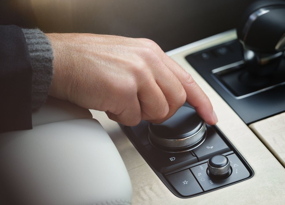
Although physical buttons increase the cost, their convenience is also worth it. Currently, besides Great Wall’s announcement of adding buttons on the Tank 300, Mazda also announced last year that it will eliminate large touchscreens in all future car models and return to small screens + physical buttons.
Final Thoughts
Regarding the above argument, car manufacturers are aware of it. They have also introduced a series of new technologies, such as gesture sensing controls and voice controls, but the actual experience is far from satisfactory. Compared with the voice system that takes several seconds to develop, it is better to return to “reliable” physical buttons that only require a fraction of a second.
I can responsibly say that physical buttons will never disappear in the future, but will appear in a more simplified, integrated, and artistic way.
Lastly, who do you think has a better future in car touchscreens and physical buttons?
This article is a translation by ChatGPT of a Chinese report from 42HOW. If you have any questions about it, please email bd@42how.com.
