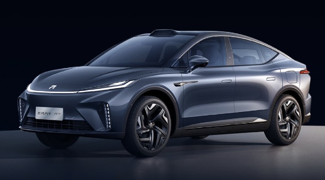
Today, Flyinova officially released the UI design video of the new in-car system RISING OS, which is expected to be launched on Flyinova R7. Flyinova R7 has attracted a lot of attention for its high cost-effectiveness, and the design of the car interface is also one of the important factors that determine the soft power of Flyinova R7.
Reasonable Layout of Main Interface
Flyinova RISING OS has a simple and round design style, inspired by the Kepler planet, emphasizing “the integration of more natural landscapes of planets into the genuine and elegant rational design, and demonstrating the romantic aesthetic of technology.”
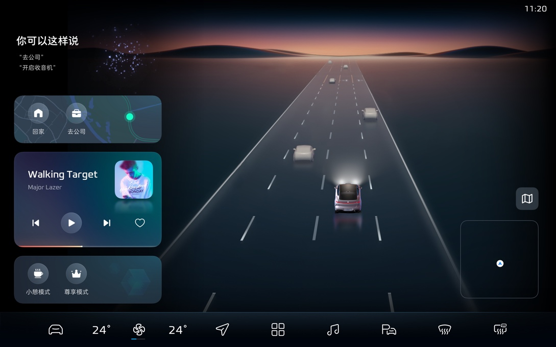
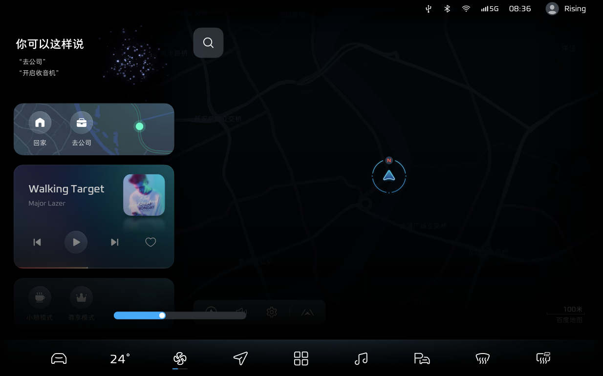
Let’s take a look at the RISING OS interface directly, disregarding the official publicity rhetoric. In terms of layout, the common form of bottom Dock bar + right map + left quick card is used.
Flyinova calls the left quick card “Widget Custom Component,” which can be selected to show or hide by oneself.
- Swipe right with two fingers to pull out the floating layer on the left side and keep the floating layer on top.
- Quick cards can be customized to set common functions, easily control music playback, navigate to common places, and wake up smart scene modes without entering the application.
- Swipe left with two fingers to hide and enter the map/immersive audio and video state.
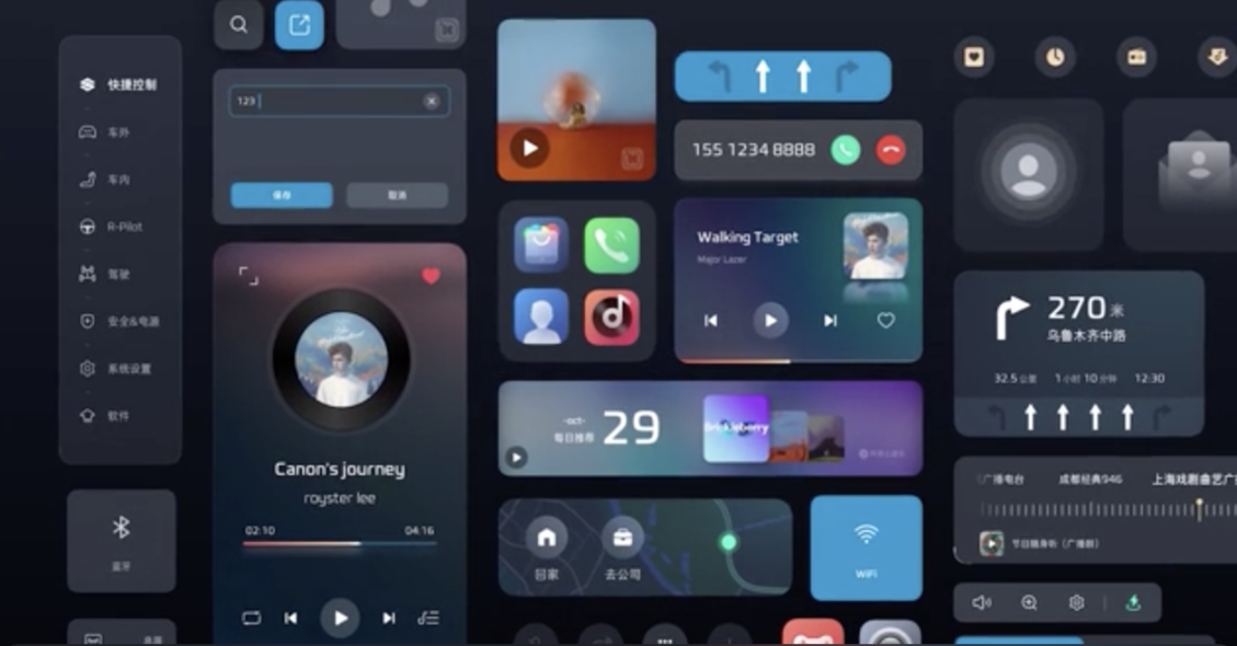
In terms of the visual design of the card:
- The matte texture of the background of each interface, combined with the functional information above, makes the sense of hierarchy more distinct from far to near, and it can also easily read important information in a multi-interface environment.
- The restrained use of card color, excluding the basic black, white, and gray color schemes in the system settings, and only using blue based on the brand theme color to highlight key information.

As for the Dock bar at the bottom:
- The features from left to right are: car control settings, air conditioning preset temperature, air conditioning wind speed, navigation, app interface, music, 360° panoramic video + automatic parking, front windshield defogging, rear window defogging + outside rearview mirror heating
- Always at the top during driving: it always exists at the bottom of the central control screen in driving state, showing commonly used vehicle controls to ensure driving safety and convenience.
- The navigation and music buttons can be dragged and replaced on the application interface.
- Long press the second button (temperature) or the third button (wind speed), and a long rectangular floating window appears on the top layer. You can adjust the temperature or wind speed by sliding left or right without entering the air conditioning interface.
Clear and Concise Negative Screen
In this new release of RISING OS, a quick control for the negative screen has been added.
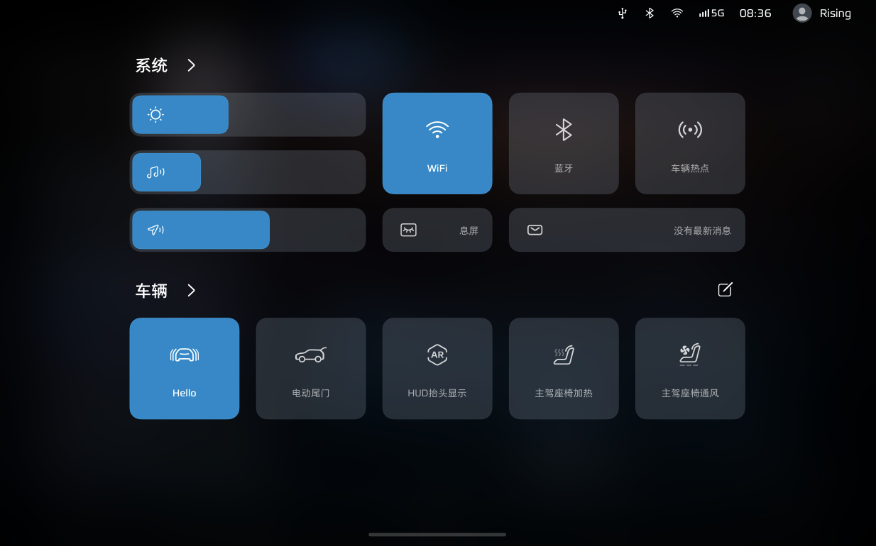
- Pull down from the top of the screen to bring up the interface, similar to the iPhone operation method.
- The system is mainly used for setting up the main functions of the central control screen, such as brightness, sound, microphone volume, Wi-Fi, Bluetooth, standby screen, music playback cards, etc.
- The vehicle control interface allows users to customize commonly used functions, making it convenient to control the vehicle.
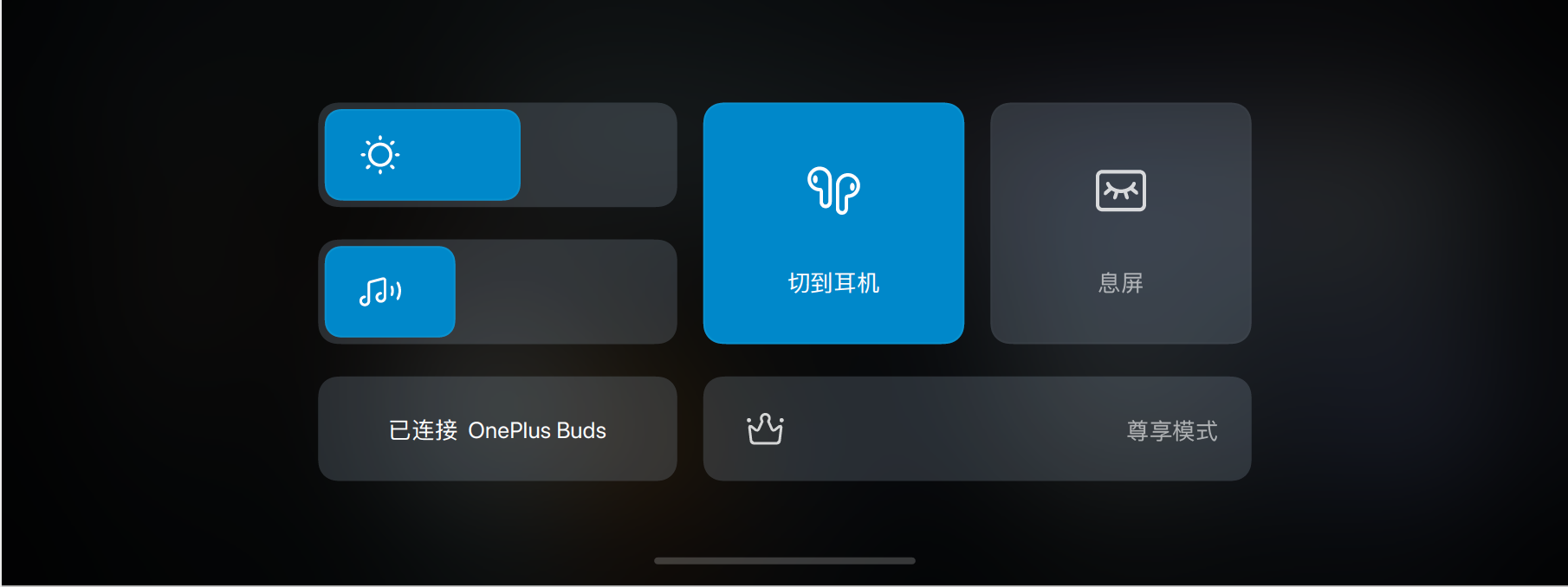
The front passenger screen also has the negative screen feature.
- It can adjust screen brightness, volume, standby processing, and has independent Bluetooth connectivity control functions.
- It also has the “luxury mode” function, which is convenient for adjusting seats, leg supports, foot supports, and related operations.
Familiar Instrument Interface
As for the instrument, there is a familiar taste of the horizon elements, similar color matching, and similar layout. Through the guidance of color and light and dark, a driving scenario with a sense of space is restored, and the visual focus of the screen is always on the road.
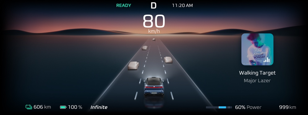
The vehicle’s basic information is presented in icons at the bottom with the speed displayed above it, and the navigation information is intuitive on the right side.
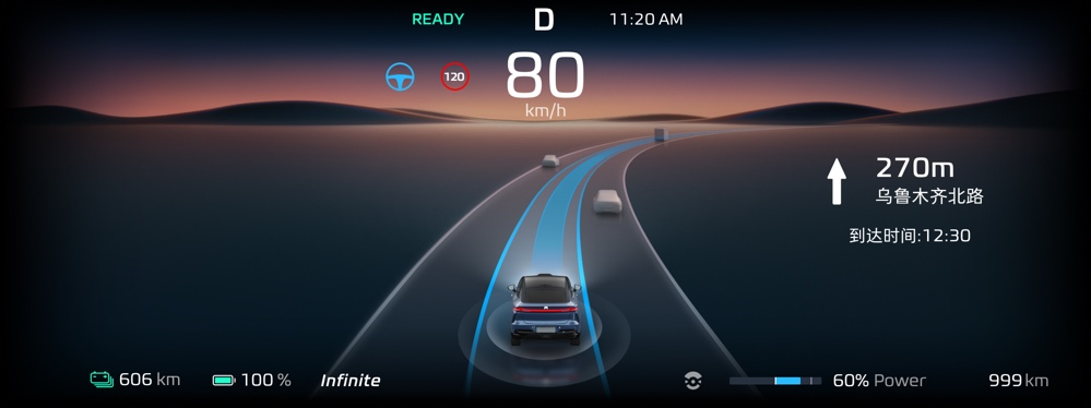
At the same time, visualized assisted driving information can also be displayed in real-time, with different colors differentiating levels of danger. When the distance is too close and a collision may occur, the corresponding direction will flash red to enhance the warning.

Currently, the information disclosed in this video is not quite plentiful, but from these limited pieces of information, we can see that the car machine interface design of the FEi Fan R7 has made considerable progress compared to before. In plain terms, it has become much more refined, and in terms of functionality, adopting the most popular interface layout nowadays also avoids errors. How satisfied are you with the debut of FEi Fan R7’s car machine?
This article is a translation by ChatGPT of a Chinese report from 42HOW. If you have any questions about it, please email bd@42how.com.
