“The More Screens, the Smarter the Car?”
When it comes to the concept of “smart cockpit,” most car manufacturers seem to focus on the central display screen installed on the console. The latest designs include multifunctional single screens, large curved screens, and triple screens that include entertainment options for the co-pilot. Even bolder designs, such as the use of a functionally-designed circular screen in place of a traditional steering wheel, are now commonplace. It appears that the trend is the more screens, the smarter the car.
At the Guangzhou Auto Show last month, many exhibitors showcased new cars with even higher standards of interior design than previous models. However, despite the overall diversity of style, many interior design strategies consisted of simply increasing the available screen display area at a reasonable cost, making it one of the most significant selling points.
Although various car manufacturers can customize the packaging of their screens to perfection, they still fall into the following three categories:
Single Screen Design
This type of design is most easily understood by looking at Tesla’s design. Its large screen interface is considered “cool, cutting-edge, and stylish” by younger car buyers but may be frustrating to older customers who find it confusing and have difficulty using it as it replaces all traditional dials and knobs with touchscreen controls. The appereciation or criticism of this type of display design depends on the age of the consumer.
Traditional Design
This design has a front-facing dashboard with gauges and dials like old fuel vehicles, and replaces the center console with a large touch screen that integrates the air conditioning and other physical buttons into the display. It is represented by automakers such as BYD and GAC. At least the design can still provide a sense of security with a physical dashboard.
Comprehensive Design
This driver and co-driver design includes multiple entertainment options that center around a large touch screen console that can span across the entire front dashboard. Although it’s entertaining, the display risks being distracting to the driver. New high-end intelligent electric cars designs frequently adopt this type, as we have seen with the Lanswi Dreamer, Salon Mechalon, and the Joylong MIFA 9 at the Guangzhou Auto Show.## The Layout Concepts of Intelligent Electric Vehicle Central Control Screens
The three layout concepts presented above basically cover the design concepts of current intelligent electric vehicle central control screens. Without a doubt, its degree of homogenization is comparable to other aspects. However, fortunately, the performance of each manufacturer in terms of screen design, fluency, operability, and reflection control during driving differs significantly.
As for which layout is the most practical, it is a matter of personal preference based on consumer demand for intelligent vehicle systems. From a functional perspective, there is currently no phenomenal application to fully support dual, triple or more screen configurations. It can be said that they just link the originally independent screens together. Therefore, the fluency and operability of the screens in practical use are the only factors that determine the rating of these multi-screen configurations.
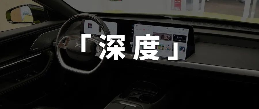
This is where the very human-centric design of the HiPhi X by Human Horizons comes in. The HiPhi X features an irregular triple screen layout. While the instrument panel remains in front of the steering wheel, the central control screen does not adopt a flat design due to the position of the instrument panel. Instead, it is angled slightly outward from the center, which makes it easy for the driver to operate, being within reach and close to the line of sight, while also minimizing screen reflections.
Finally, regarding the third screen in front of the passenger seat, it is primarily for entertainment purposes. It is positioned at the same height as the instrument panel while also being a certain distance away from the passenger seat to reduce eye fatigue during prolonged use.
Therefore, when screen functionality is at the same level, the details of human-centered design may be the key to the development of multi-screen configurations, rather than blindly stacking screens together and calling it a selling point.
Meanwhile, the battle among screen suppliers has intensified amidst the homogenization of screen quantities.In the current in-car systems, it can be said that Android is in a monopoly position, and the world-renowned technology company Qualcomm has transformed its mobile chips from a few years ago into the “smoothest” car-grade chips currently available. That is the Qualcomm 8155, whose performance is equivalent to the Qualcomm 855, the processor of the Xiaomi 9 four years ago.

Of course, with the continuous increase in the market share of Android, Qualcomm’s market share is naturally irreplaceable. Its progress in the development of car-grade chips directly affects the performance of the most advanced car entertainment systems, which can be understood as a monopoly.
It can be seen that in this era of large screens and multiple screens, software and hardware are equally important, but these are weak points for major car manufacturers, whereas they are strengths for mobile phone manufacturers. This also explains why so many internet technology companies have joined the automobile industry.
This is the law of demand and response in different eras.
This article is a translation by ChatGPT of a Chinese report from 42HOW. If you have any questions about it, please email bd@42how.com.
