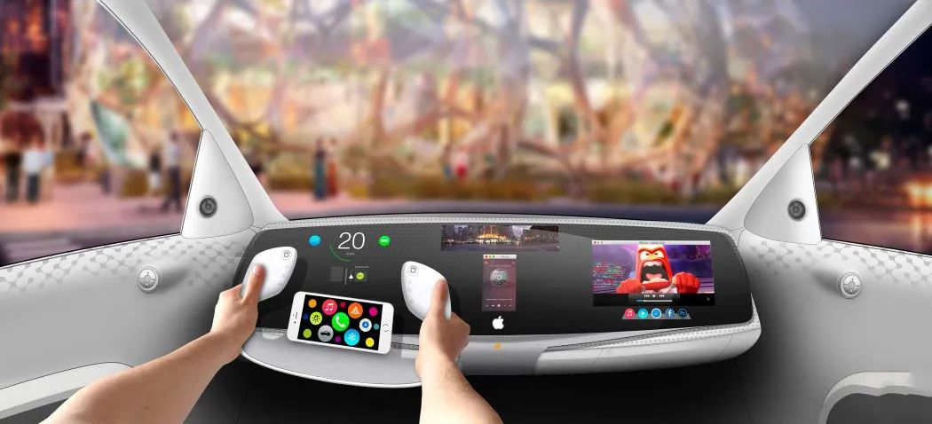
Intelligent Cockpit of Apple Car
Author: Leek Box
Editor: Mr.Yu
I don’t know when it started, but whenever we talk about intelligent cockpits, some friends always leave comments in the background with similar opinions:
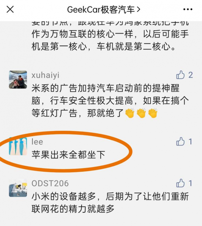
Since you always think that Apple’s car will dominate the market once it comes out, why don’t we take a look at what kind of surprise Apple’s cockpit design language can bring to the world?
First of all, let us make it clear that we do not promote any party, nor will we show off concepts to confuse others. What we want to share is not only a rational analysis based on an understanding of Apple, but also the corresponding expectations for its design.
After reading today’s text, you can share your insights in the comments.
As we all know, Apple recently updated iOS 15 and presented new interaction methods. The launch of Tesla Model S Plaid also showed us Tesla’s new exploration in car interaction.
So, what special features will Apple’s on-board system have?
We believe that Apple’s positioning of the car system will be completely different from any traditional car manufacturer or new energy brand we know. Apple will emphasize its utility rather than its intelligence. In the introduction of its products, Apple always uses extremely short titles to highlight the product features, rather than lengthy lists of specifications, making the product have clear “tool feeling”.
We will use several keywords to explain this concept.
Coherence
Apple’s former chief designer, Jony Ive, has mentioned the word “Coherence” several times, which is the most intuitive experience that Apple has conveyed to consumers over the years.
Apple’s “Coherence” is reflected in several aspects:
Consistency of external image
Starting from the iPhone, everything Apple does is closely related to the screen, and this trend is becoming more and more obvious. With strong control and pursuit of details, Apple tirelessly presents unique industrial design and graphic design to users, even if most consumers cannot perceive them clearly.
Because of this, consumers can recognize “Oh, this is an Apple product” even if they don’t see the logo when they see Apple’s products.
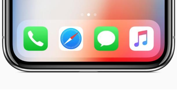
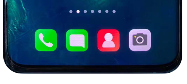
This consistency is not purely for the sake of consistency but is, in fact, based on mathematical principles.
At the same time, this also explains why, even on the same road, Volkswagen gives people a sense of homogeneity, while Porsche conveys classicism and heritage.


Consistency Across Devices
From iPhone to iMac, from iPad to Apple Watch, Apple still maintains good consistency across different screen sizes. This consistency also allows Apple CarPlay to appear coordinated and not out of place on the cabin screens of major automobile brands, even on larger screens like in the car.
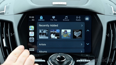

Apple’s consistency is intuitive and concrete. We have every reason to believe that Apple’s cars will maintain good consistency in appearance, interior design, and user interface, even to a stunning degree.
In terms of cross-device capabilities, Apple’s leadership is evident. As long as you are logged in to the same Apple ID, you can “paste” content that you copied on one device directly onto another running device. Syncing personal data like music and photos is even easier.

As one of the representative capabilities of Apple devices, Apple has no reason not to apply this to its own cars.
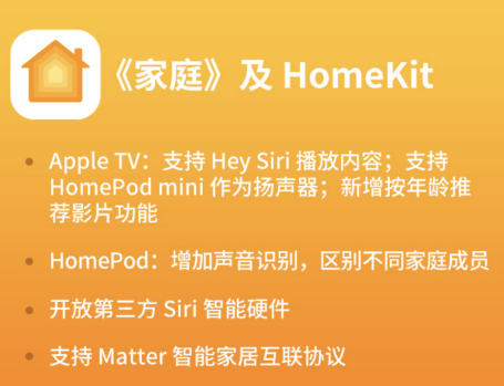
By using the same Apple ID, you can unlock the vehicle through Face ID or use the keychain as a starter, unlocking the entire Apple HomeKit IoT ecosystem including the vehicle. Siri can also act as a housekeeper, helping you wake up and control your devices in your home at any time. The Apple Wallet in iOS 15 will soon support adding driver’s licenses, identification cards, and various NFC access cards.
Do not underestimate these details. It is precisely these incremental changes that accumulate over time and form the experiences that change our daily habits today. It is like how people no longer regard monthly tickets for public transportation as tools, but more like a collection of memories and time.
Having said that, we can ask again: Will the owner of an Apple car still need a key in hand?
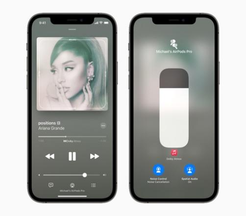
On the other hand, Apple Music streaming can be played seamlessly between HomePod, AirPods, and Apple cars, among other devices. For example, an exciting web podcast radio program can accompany you from home to the car, and then from the car to the phone, “sharing” the same progress bar.
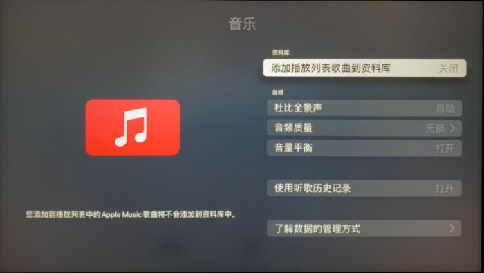
Moreover, as an independent, enclosed space, the car provides a better playing environment for Dolby Atmos, which has been supported since iOS 14.6.
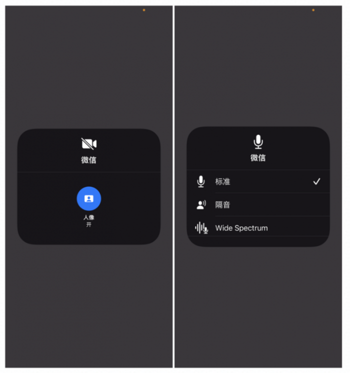
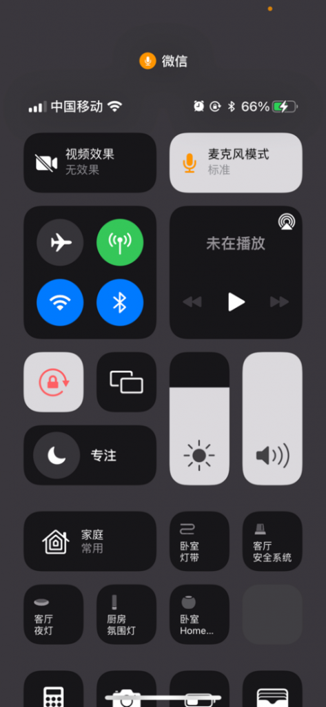
iOS 15 introduces independent control buttons for video and microphone modes, allowing for global control of video and audio. Users can choose whether to enable portrait mode and whether to need microphone noise reduction, which will be further optimized in the car.
Inevitable & Affordance
Inevitable & Affordance are two somewhat dry concepts in design psychology that we won’t go into detail about here.
We all know that Apple has always been committed to creating “instinctive” interactions that form simple muscle memory effects, allowing every new user to “quickly and magically” master the interaction.
This quick and easy operation gives users a sense of trust, which then forms habits and dependencies. It makes people feel like “this is how it should be,” and even feels familiar the first time they use it.
If you have any doubts, just think back to the earliest unlock action on the iPhone, which is the best interpretation of this philosophy.
Speaking of which, let’s summarize the understanding of this philosophy between traditional console manufacturers, Tesla, and Apple:

From the keyboard to the mouse to the touch, Apple gradually moves input actions that were difficult to handle to simple and easy-to-use interactive operations. This is a simulation of moving from mechanical control to perceptual control of the real world.
Speaking of this, Mr. Yu recalls that more than one colleague who uses a MacBook will almost always respond with a puzzled look when asked why they don’t use a mouse: because the touchpad is more convenient.
Apple’s control logic does not simulate real-world feedback, but rather operation feedback. Apple’s operation methods are different between different devices: iPhone focuses on one-handed operation, iPad focuses on dual-handed multitasking operation, and iMac and MacBook are centered on touchpads for multi-gesture operations.

In the case of using hands as the means of operation, Apple still designs interactive operations based on different screen sizes and device functions, and all of this seems natural.
Apple’s interactions are based on the stimulation of human perceptual experience, especially after the introduction of linear vibration motors. The mechanical feel when adjusting the alarm (vibration + sound), the damping vibration sensation after long press, the tapping sensation when Apple Watch rings… all feel so “natural,” everything is like a feature that should have existed.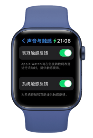
The AR walking navigation feature in iOS 15 Maps left me impressed and amazed, saying to myself: “This is what navigation should look like!”
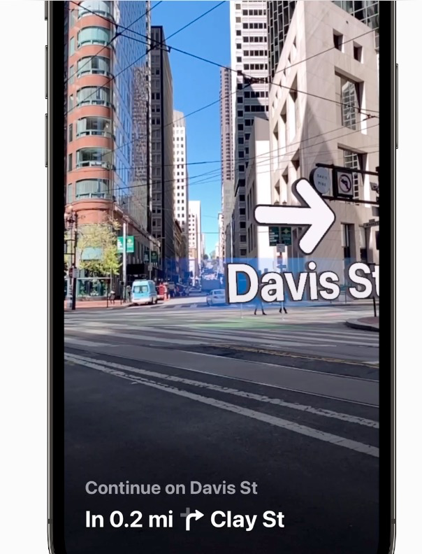
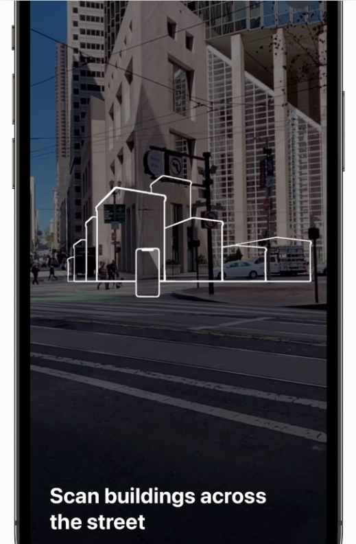
Imagine yourself in an unfamiliar street environment where your Apple car scans the surroundings and generates a 3D navigation view, which is more user-friendly than the traditional flat pseudo-3D navigation. Would not it enhance the driver’s perception of the map experience?
In those moments when you are lost in a crossroads or cannot decide which lane to take and your rear car keeps honking at you with high beams, making you more nervous and irritable, will these enhanced spatial perception designs make you feel relieved?
It can be seen that we will continue to experience this kind of affordance design in Apple cars, such as the new shift and park function, which will be more “natural”. Another example is the more reasonable placement of the phone, instead of the variety of phone holders, or the so-called wireless chargers. Also, there is more natural haptic feedback, involving other areas besides tapping the screen.
Qualisign Symbolization
Traditional product design is almost based on functionalism. It first has to serve a purpose or have some value before being designed into new products.
In the process of social development, many functional products have been symbolized, such as bags. Now, many meaningless mini bags and pendant bags have emerged. At this point, even the “bag” that serves as a container has become an accessory.
These are strong cognitive concepts left by the physical mimetic world.
In the digital age, people need to change their existing perceptions. For example, from a carter driving a horse-drawn carriage to a driver operating a car, and then to a pilot operating a plane. It seems that people are performing actions such as moving forward or turning, but in fact, the mechanical transmission structure is gradually abstracted and developed into simple instructions.
On the road to gradually achieving autonomous driving, and even unmanned driving, humans will gradually get rid of the inertia of driving operation. As the slowest evolving consumer industry, the design of cars has accumulated inertia over the past 200 years. For example, the steering wheel and instrument panel occupy space and form a system with other components.It is regrettable that only companies like Tesla, that are against convention, dare to say no to their own existence.
Starting with the iPhone X, Apple gradually shifted its physical design to behind the content, weakening the physical design form and even affecting other industries. The purpose of a TV has evolved from being a window that connects the world through TV signals to becoming a screen, and has even “retreated” into the wall. The existence of a “TV” has gradually become symbolic, and its original meaning is gradually being replaced by other smaller devices.
Although the physical form has disappeared, the internal form can still exist. When the internal form disappears, the corresponding tangible disappears as well. When the external form and the internal form are connected through function, the external form is always fixed and the connection between the external form and the internal form is as clear and precise as a mechanical structure. When the function loses its connection between the external form and the internal form, the relationship between the external form and the internal form will lose its unity.
The intangible future does not mean that the external form will no longer be important. On the contrary, the external form will be more important than ever, more important than the tool era of functionalism, because once it is not valued, the relationship between the external form and the internal form cannot be formed, and the object will become formless.
In this age of complex and abundant information, being formless means being quickly forgotten. Starting from the external form in the design process will become more ineffective, regardless of how many existing or semi-existing forms we have in our vocabulary. People won’t just pay for a new shape. Therefore, we need to look at design from a structured perspective, and componentization or platformization may be a feasible path. This may also be one of the reasons why Apple has frequently contacted the new American brand Canoo before.
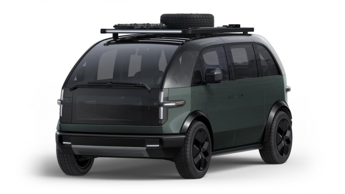
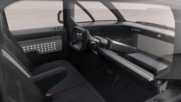 Based on the symbolized information age, the increasing frequency of information being pushed to users has become a widely discussed problem. Apple has introduced the Focus mode in iOS 15, which has gained a lot of attention. Perhaps in the future Apple car, it will appear in a more rational form.
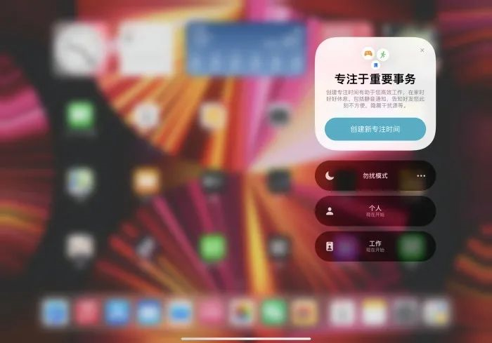
The iOS 15 system provides “Personal,” “Work,” “Sleep,” and “Do Not Disturb” modes based on common usage scenarios, and clicking the “+” at the bottom can add more modes, including different preset scene modes such as “Driving” and “Gaming.”
Imagine, when we drive a car, the Apple car will automatically activate the corresponding driving mode for you, cancel unnecessary information push, enhance navigation, weather, and other information, and even decide whether to answer video or phone calls based on the closeness of the caller’s relationship with you.
Conclusion
GeekCar has always welcomed bold speculations, even wild imaginations.
What we admire are the great reformers who have pushed the progress of the times throughout human history. Until the Apple car is truly launched, we will not stop analyzing and speculating, because our curiosity and excitement about the Apple car cabin will never be calmer than anyone else’s.
As we all know, the smart cabin has always been a topic that GeekCar geek cars closely follow and cultivate, just like our two seasons of “Wonderful Car Intelligence Bureau,” which has gained industry attention and has also enabled us to meet many friends who are interested in smart cabin.
We hope that this small start today can make friends who are interested in smart cabins return to the curiosity and enthusiasm for cabin experience.
This article is a translation by ChatGPT of a Chinese report from 42HOW. If you have any questions about it, please email bd@42how.com.
