If Apple relies on the deep integration of iOS to bind users and Xiaomi makes Mi Fans follow through MIUI, then the in-vehicle operating system of future intelligent vehicles will become one of the most core competitive strengths, even a decisive one for brands.
Are intelligent cars really “intelligent”?
“Intelligent” has become the most mentioned word in the automotive industry in 2020, but only a few car companies can truly achieve it, most of them can only be partially intelligent, or even just think that they are intelligent. The so-called intelligence, from the four aspects that users perceive the most, namely the in-vehicle operating system, voice interaction, assisted driving, and content ecosystem, unfortunately, there is currently no intelligent car that can achieve comprehensive intelligence.
Someone joked that if a car has the ideal in-vehicle system of ONE, the interior workmanship of NIO, the voice assistant of XPeng, and the assisted driving of Tesla, it will become a dream car. Today, we will take the in-vehicle system of the ideal ONE and talk about it in detail.
When users first come into contact with the Ideal ONE, they will feel a world of difference compared to traditional car companies’ operating systems. After ten months of deep use of the Ideal ONE, it can be said with certainty that the Ideal in-vehicle operating system is the most user-friendly and practical among all mass-produced cars of car companies currently available. If you don’t believe it, let me tell you why.
What should a good in-vehicle system look like?
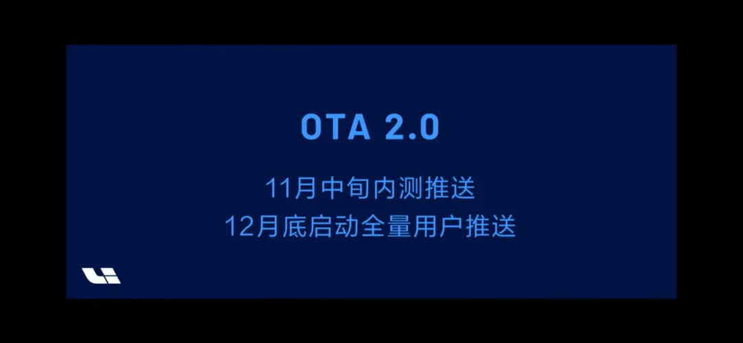
On November 1st, the Ideal Automobile Autumn Communication Conference released the OTA 2.0 version, and there were many highlights on the in-vehicle system side. I think that a good in-vehicle system should achieve the optimal solution in four aspects, namely aesthetic appearance, clear at first glance, logical clarity, and quick access. After being influenced by traditional car companies’ “heavy special effects and light interaction” for many years, the in-vehicle system that is so close to the usage habits of mobile phones will undoubtedly receive praise.
Aesthetic Appearance
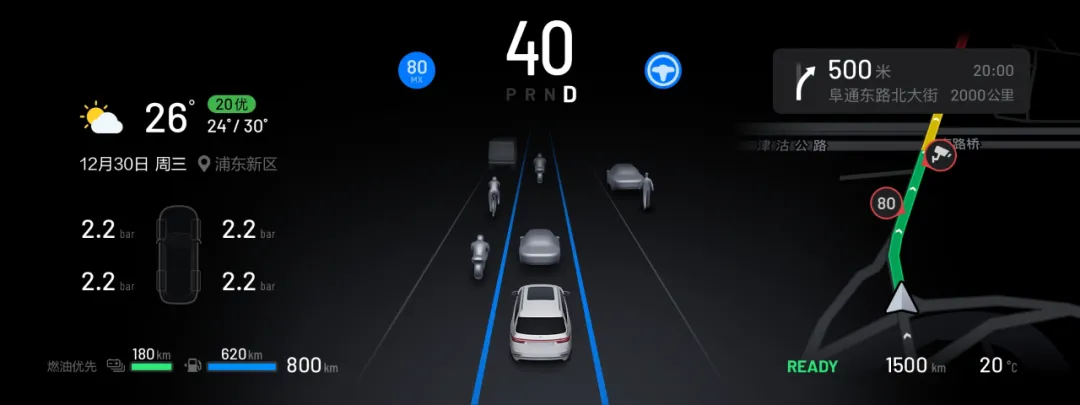
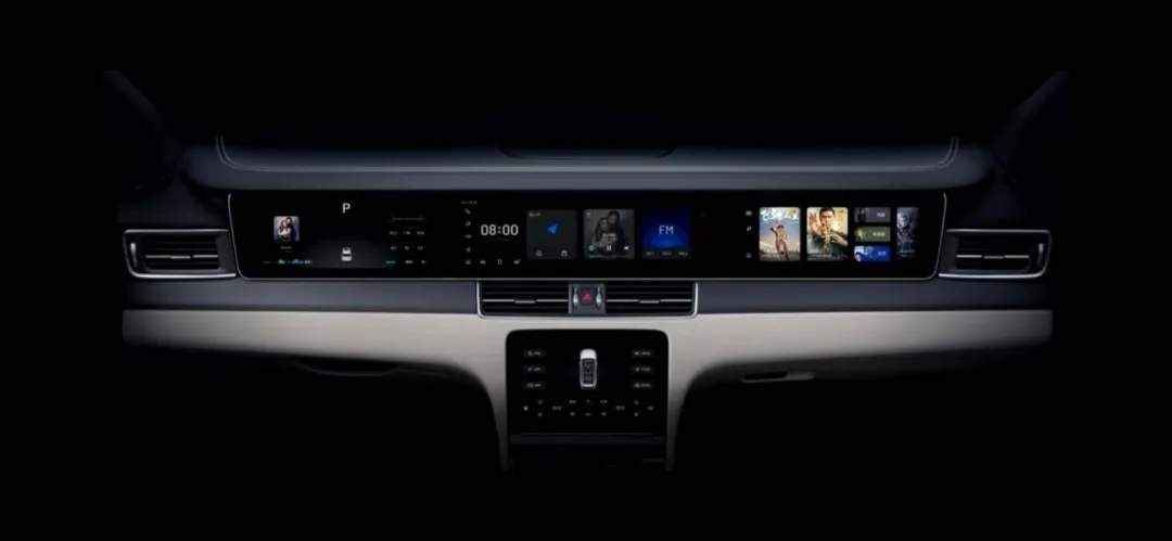
The information on the main driving instrument screen has been rearranged.If the UI style of the first generation of ideal ONE car machine is like a handsome engineer, then version 2.0 has given him a new haircut, trimmed his eyebrows, and put on fashionable glasses. The round corner design of the card, the new interface of the air conditioning screen interior map, and so on, all reflect a simple and advanced sense, which is not easy to achieve. The simpler something is, the harder it is to do.
Clear at a glance
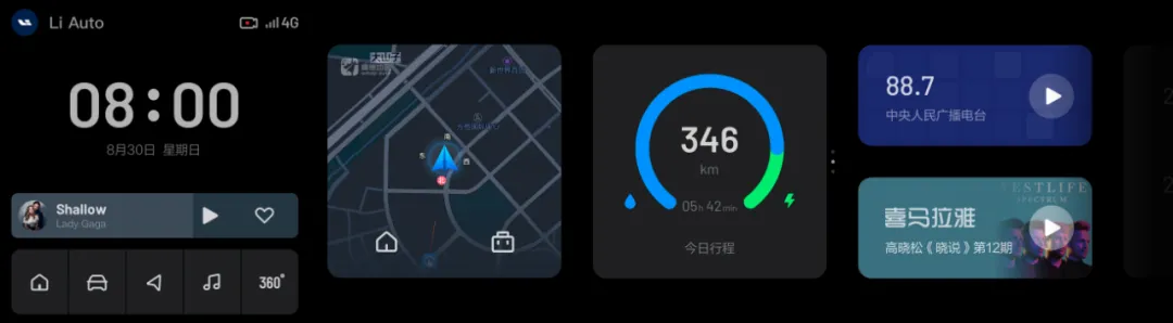
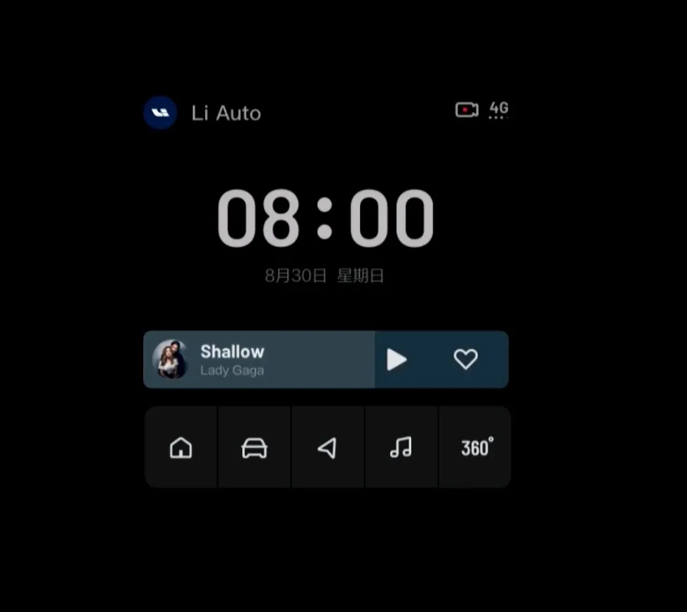
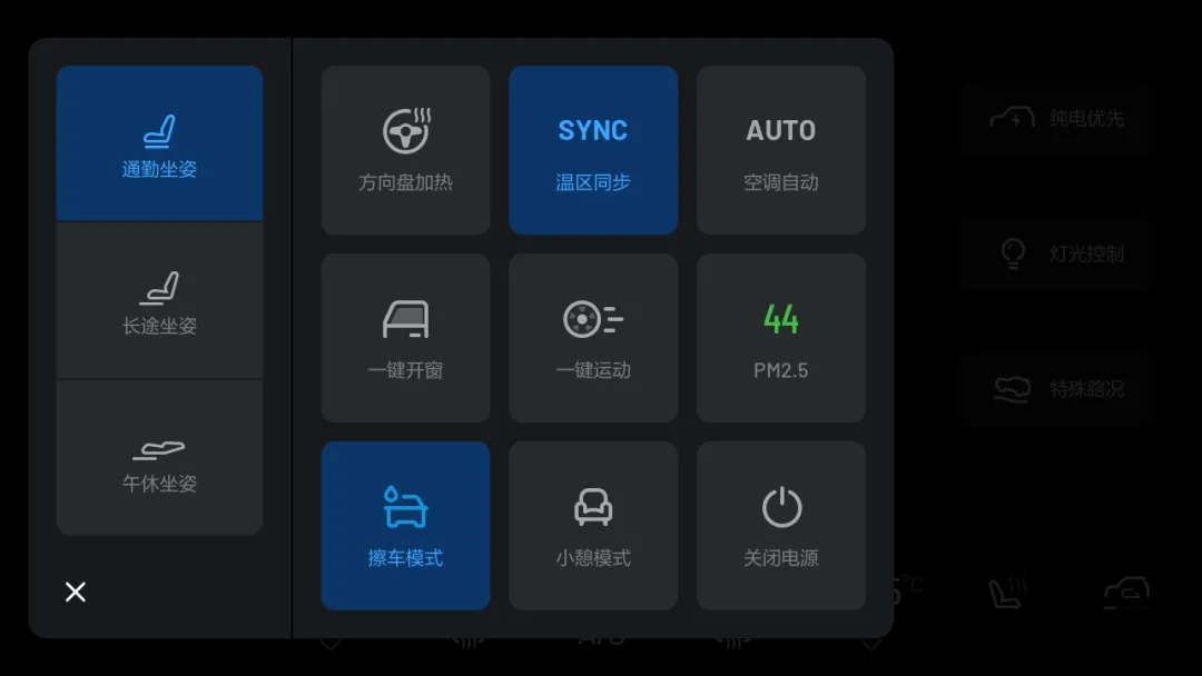
The four large screens of the ideal ONE are the highlights. What’s more important is the four-screen interaction, which allows the driver to see the partition of the car machine at a glance. The information screen of the main driver, the central control screen, the air conditioning screen, and the entertainment screen all have their own duties and cooperate with each other.
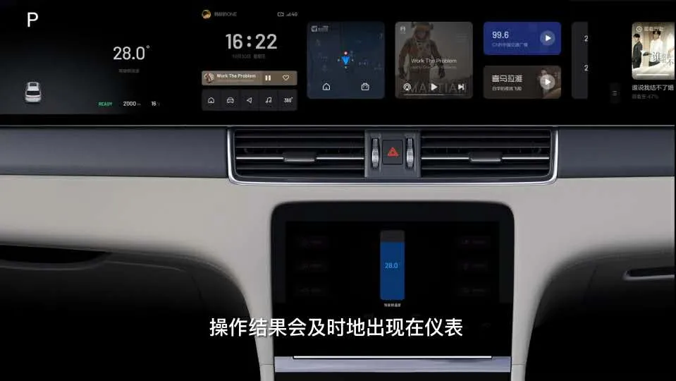
Surprisingly, the new version has a multi-screen linkage function. Taking manually touch screen to adjust the air conditioning temperature as an example, in the old version, when sliding to adjust the temperature, the driver needed to look down at the air conditioning screen, while in version 2.0, the temperature setting changes will appear directly on the main driver’s information screen, which improves driving safety and adds a sense of intelligence.
Clear Logic
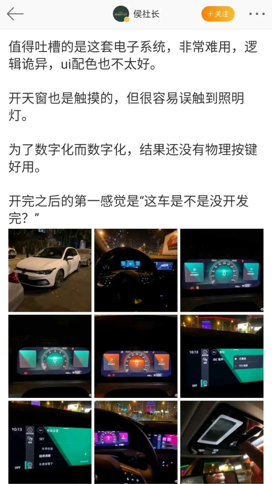
This is a Weibo post from a big V about the Volkswagen Golf 8 car machine, which is Volkswagen’s latest flagship product. As former owners of the Golf 6 and 7 generations, we agree with the criticism from this big V. Common functions are hidden too deep, the main interface is confusing, and there are too many levels of sub-menus, leading to constant clashes between the driver and the car machine.
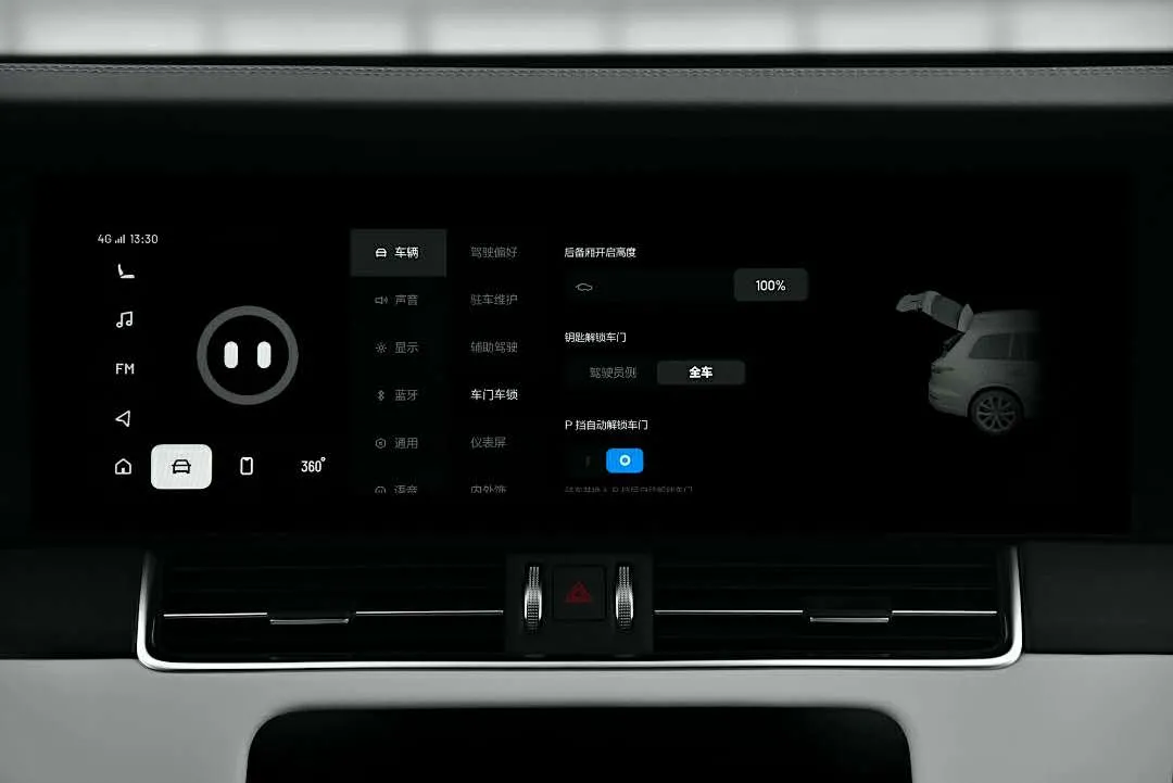
In the ideal car machine menu, the classification of functions is very reasonable. Even if the most complicated “vehicle settings” interface is opened, there are at most two levels of menus, which greatly improves the efficiency of user understanding and enables them to quickly find the desired functions.
Quick Access
Quick access has two meanings. One is that the car machine operates quickly, and the other is that the user’s fingers accurately press the screen. Because it uses the current top-of-the-line car-level chip, the Snapdragon 820A, the ideal car machine has good fluency, and there is almost no stutter during use.
The most important thing to press the screen accurately is that the button area of the screen should be wide. The broader the operating area, the more accurate the instruction is, and the ideal car machine perfectly realizes this. Any button area is large enough, and there will never be a small icon displayed on the screen asking you to click and expand the menu.
At the product launch conference, Li Xiang said that his idol is not Tesla’s Elon Musk, but Apple’s Steve Jobs. The ideal style of the car’s entertainment system does carry some homage to iOS. The more similar the car’s entertainment system is to a smartphone, the lower the user’s learning cost will be. Realizing seamless switching and quick access, just like the dropdown menu function, is something that every car owner is familiar with.
Why can the XPeng P7 make a good entertainment system?
Not every new car manufacturer can make an easy-to-use entertainment system. It depends on the level of investment of the car company in software development, whether it is self-developed, whether or not they have experience in software development operation, and if they deeply understand user needs. These are all crucial.
Proficient in using big data
When Li Xiang was in charge of Autohome, he was good at using data, and even demanded that his team use data models to interpret every task, which is the good genes of an internet company.
As an example, in this version upgrade, the quick access buttons on the central control interface were simplified by removing the “FM” and “Phone” buttons, which were the least frequently used according to user data. This makes the quick access display more clear and efficient.
Actively integrating user wisdom
In traditional car sales models, there is a 4S store between the manufacturer and the car owner, making it difficult for user’s voice to reach the development team. The new car manufacturers have one major characteristic, that is, communication between the manufacturer and the user is relatively smooth, and app-based submissions of all types of suggestions by users allows the “masters” to fully display their wisdom.

In the 2.0 version upgrade, many functions were ideas given by users. For example, the multi-screen linkage for the air conditioning temperature adjustment was inspired by a hand-drawn sketch from a car owner.
Breaking free from the shackles of physical buttons
In the four-screen area of the XPeng P7, there is only one dual-hop light button that is a physical button. The rest is all screen. When it first hit the market, this layout was controversial, and I even felt that high-frequency functions such as air conditioning adjustment and seat heating could be achieved through physical keys. However, after several rounds of OTA updates, I found that only the screen can break free from the shackles of physical buttons and make everything possible.
 Translate the Chinese Markdown text below into English Markdown text in a professional manner, keeping the HTML tags inside the Markdown, and only outputting the results.
For example, the usage rate of the heated steering wheel button in the lower left corner of the air conditioning screen was not high. This time, it was upgraded to an expandable menu style that popped up with 12 shortcut function keys, once again improving the efficiency of use.
So, while others are still savoring the damping feel of a certain button, touch control is already interpreting new vehicle interaction methods.
The R&D Team Polished with Care
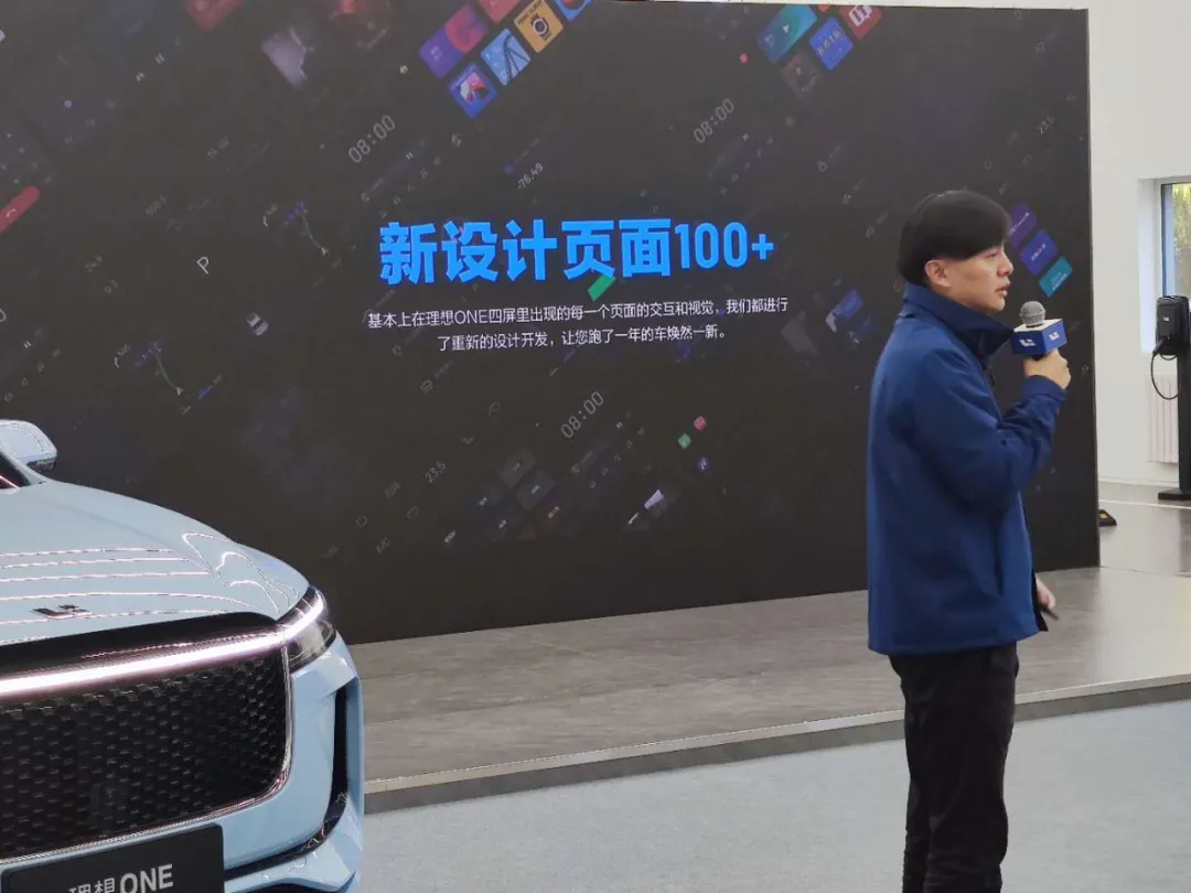
At the launch event, there was a communication that left a deep impression on me. Fan Haoyu, who is responsible for the development of the vehicle entertainment system at IDEAL Automotive, said, “Basically, for every interaction and visual display that appears on IDEAL ONE’s four screens, we have undergone redesign and development to make your car new again.”
This sentence moved the old car owners at the scene, and more importantly, it was a fulfillment of Li Xiang’s initial promise. According to the third-party media’s poll results, the owner’s satisfaction rate for this OTA 2.0 upgrade has reached 95%.
Click on the video for a more intuitive understanding:
Returning to the beginning of the article, just as Apple cannot be without iOS and Xiaomi cannot be without MIUI, in the future of all things connected, the vehicle entertainment system is a matter of success or failure for car brands. So, as an intelligent car, how is IDEAL ONE’s auxiliary driving, voice interaction, and content ecology doing? Sorry, until we achieve the best performance in these aspects, please continue to accept everyone’s criticism and motivation.
This article is a translation by ChatGPT of a Chinese report from 42HOW. If you have any questions about it, please email bd@42how.com.