When the BYTON M-Byte with a 48-inch large screen just emerged, there were many questions from the public: Can it be mass-produced? How safe is it? Will there be glare? Will it affect driving? With such a large screen that cannot be touched, how do you use it?
Here is a clear trend: as the BYTON M-Byte gets closer to mass production, people’s questions about this car are constantly changing, gradually shifting from “Can it be produced?” to “How is it to use?”
The mass-produced version of the BYTON M-Byte was officially unveiled at this year’s Guangzhou Auto Show. The large screen also officially revealed its mysterious veil to the public, and I was one of the first to experience it carefully.
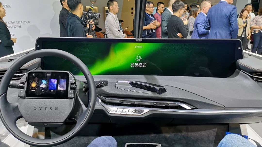
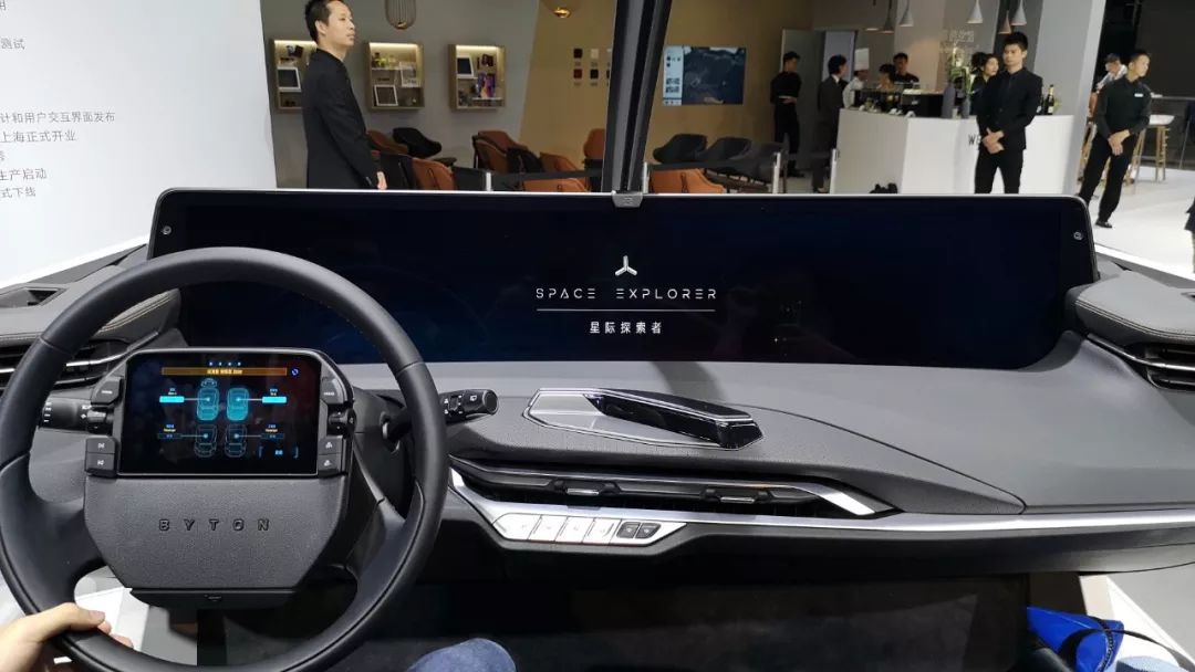
My first impression after experiencing it was shocking! The screen is so large that the camera on the phone could not capture all the information on the screen.
In terms of operation, there are many innovative features on this BYTON large screen. However, compared with other car machines, using it has a certain learning curve. Thanks to BYTON’s innovation, it brings us a new interactive experience.
Before introducing it, let’s make it clear that the BYTON M-Byte in this car machine is already in its final form in terms of hardware. However, the displayed content is not the final version, and many functions have not been opened. Before mass production, BYTON engineers will make many adjustments based on user and media feedback.
Therefore, the car machine content and operating logic shown in this article were at the end of November 2019. After the functions are improved, we will experience the M-Byte again.
Now let’s begin the static analysis.
Does the large screen block the field of vision?
The BYTON landscape screen with a fish shape has a size of 48 inches. This is a complete large screen without any splicing process, and the supplier is the well-known brand BOE. There is no doubt that this screen is the largest in size among all mass-produced cars.
First, let’s answer the first question: Will such a large screen block the driver’s field of vision?
No, compared with other vehicles that use a horizontally mounted large screen, the height of the upper edge of the M-Byte screen is not much higher. The screen mainly goes down and invades part of the space of the central control panel. Moreover, compared with the screens of most car machines, the BYTON screen is farther away from the front row passengers, so visually it does not affect driving vision and is convenient for reading.
One more thing to mention, this is also a curved screen, so the driver can clearly read the contents on the right side of the screen when looking at it from the driver’s seat.
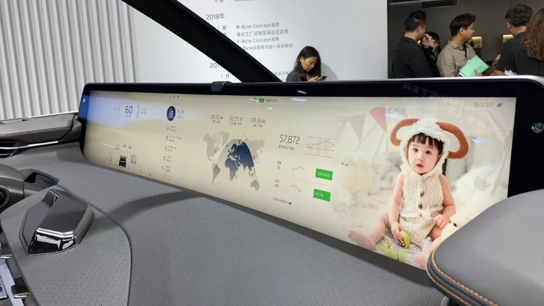
Is the large screen too bright?
As we did not test the screen in a completely black environment, we cannot directly answer this question.We found that there are two display modes for the BYTON vehicle’s infotainment system, white and black, and the screen brightness is dynamically adjusted according to the external light.
If the driver still feels unsatisfied, the brightness of the three screens in the front row can be manually adjusted in the settings.
Regarding how to operate this large screen, traditional touch operation is not suitable due to the screen’s large size and distance from the first-row passengers. This is also the second biggest controversy of this large screen.
There are two conventional ways to operate a vehicle infotainment screen, touch and button. In touch mode, what you see is what you get, and after being educated by touchscreens for 10 years, this mode of operation is not difficult to use.
Button control mode has a long-standing history, each button has its specific mission, and commands are sent by following the icons on the button.
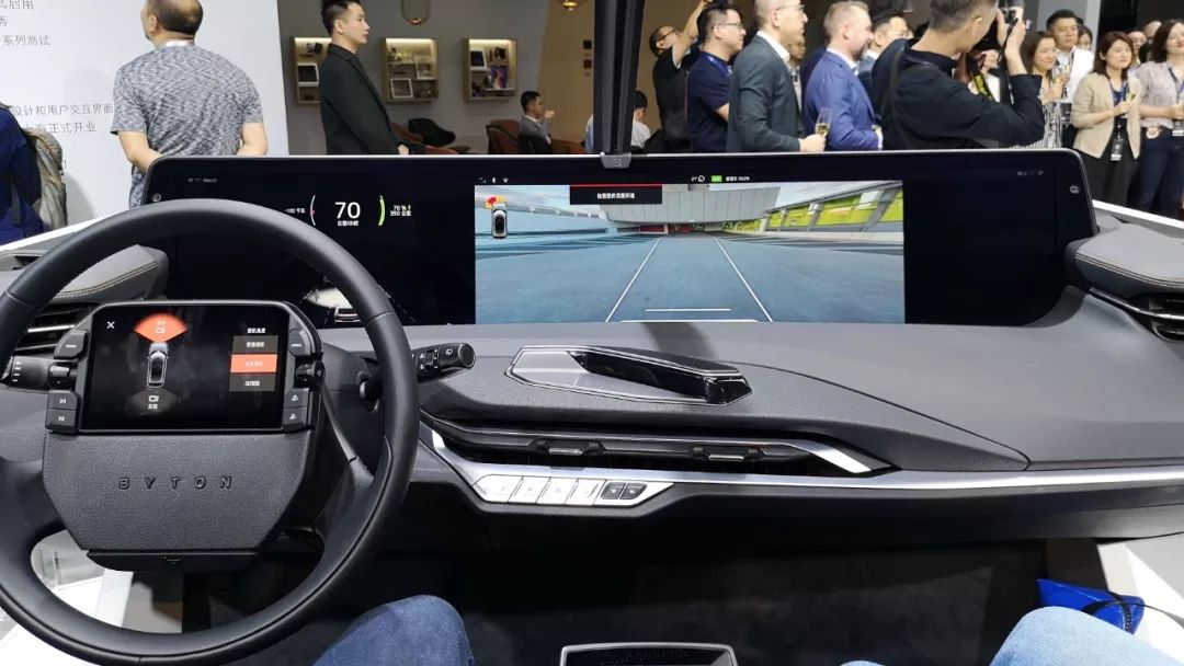
BYTON’s solution is to use screen-to-screen control, supplemented by gesture control and voice control. There are screens on the steering wheel of the vehicle, and in the middle of the main and assistant seats; front-row passengers can control this 48-inch screen through these two screens.
The gesture recognition unit is located on the top of the car roof.
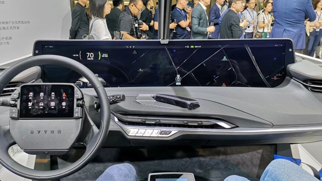
Regarding the content of the infotainment system, the default interface of the BYTON large screen can be divided into five areas.The left one-third of the dashboard is based on the QNX system, and the display content is very concise. The upper part mainly displays the vehicle driving information, and the lower part displays auxiliary driving visualization information. From the demonstration video, we can see that the M-Byte can not only recognize vehicles behind the body but also distinguish between cars and trucks. I am also looking forward to the Baidu M-Byte’s driving assistance capability.
Although the area of this area is large, and the displayed content is also clear, due to the screen position, in the normal sitting position, the upper edge of the steering wheel will partially cover the content in the middle of the screen. The hardware layout has been fixed, so to avoid this problem, we can only avoid the area where the steering wheel blocks through the display.
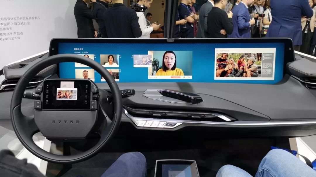
The right-hand area can be divided into 4 sections. The system is based on Android and users can customize the display content according to their needs, including multimedia, navigation, news, calendar, stock, sports information, wallpapers, etc. If you don’t want to display too much content, you can also turn off all of them.
How does the control screen feel to use?
This screen is the core of large-screen interaction.
The usability and display content are two broad issues that can be discussed separately.
Most of the main driving operations are on the steering wheel screen, and controlling the screen through the screen is similar to controlling the mouse with a touchpad. The current Mercedes-Benz MBUX car machine can also use the same method to control the content of the large screen, only the touchpad position is slightly different.
Placing the screen on the steering wheel brings two benefits:
First, the driver can control the car machine with a simple operation without leaving the steering wheel. Even if the steering wheel is left, the distance is very close, so the safety of vehicle driving is slightly improved (in theory).
Secondly, the area of this screen is not large, and the driver does not need to operate the screen in mid-air like other car machines located in the center console. Instead, they can place their hands on the top of the screen for touch control, which greatly improves the accuracy of clicking.
(During driving, the interior of the car is in a shaking state, so the mis-touch rate of operating the touch screen in mid-air is very high. There are two ways to reduce the mis-touch rate. The first is to enlarge the single button, so that even slight shaking caused by finger movement can press the desired function. The other is to operate by holding the frame, which is what BYTON does.)
In addition, BYTON still retains physical buttons for multimedia control and auxiliary driving control.
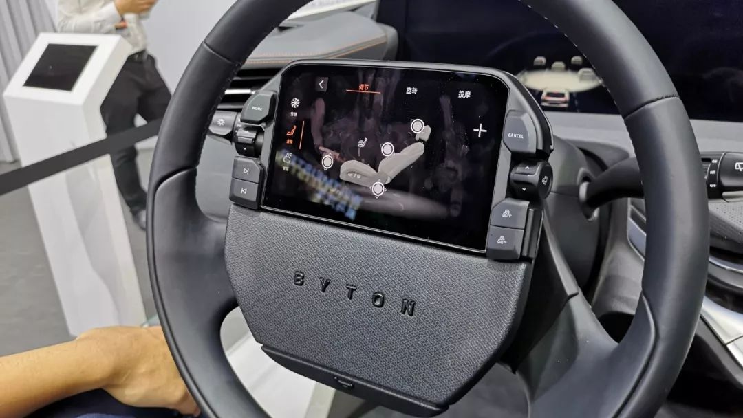
There are also two disadvantages:
Firstly, in order to prevent the screen from being affected by the rotation of the steering wheel, the central area of the steering wheel of BYTON is fixed. Therefore, many people may feel uncomfortable when they first use it, and they may not even know which direction they have turned after several turns.
As a driver of the original Citroën Sega, I want to say that this is not a problem. You will get used to it after driving for a few more times.
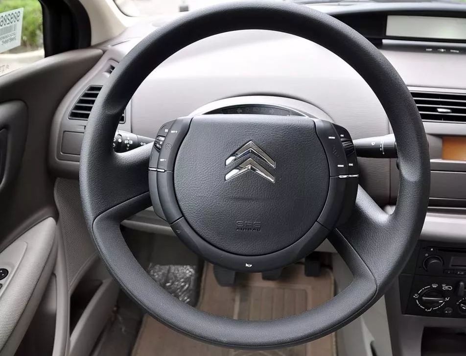
Secondly, because the screen occupies the original position of the safety airbag, the safety airbag is forced to move downward, and the central position of the steering wheel has to accommodate a screen and a safety airbag. On one hand, the visual experience is not very good, on the other hand, the size of the steering wheel has also increased accordingly.
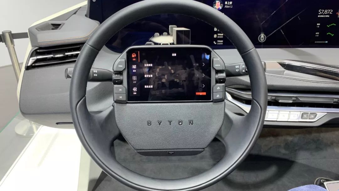
The screen in the middle area is more for the use of the front passenger, but for the front passenger, the position of the screen is not very reasonable. On one hand, it is not convenient for viewing, on the other hand, the screen is located at the left hand position of the front passenger, which makes it inconvenient to operate.
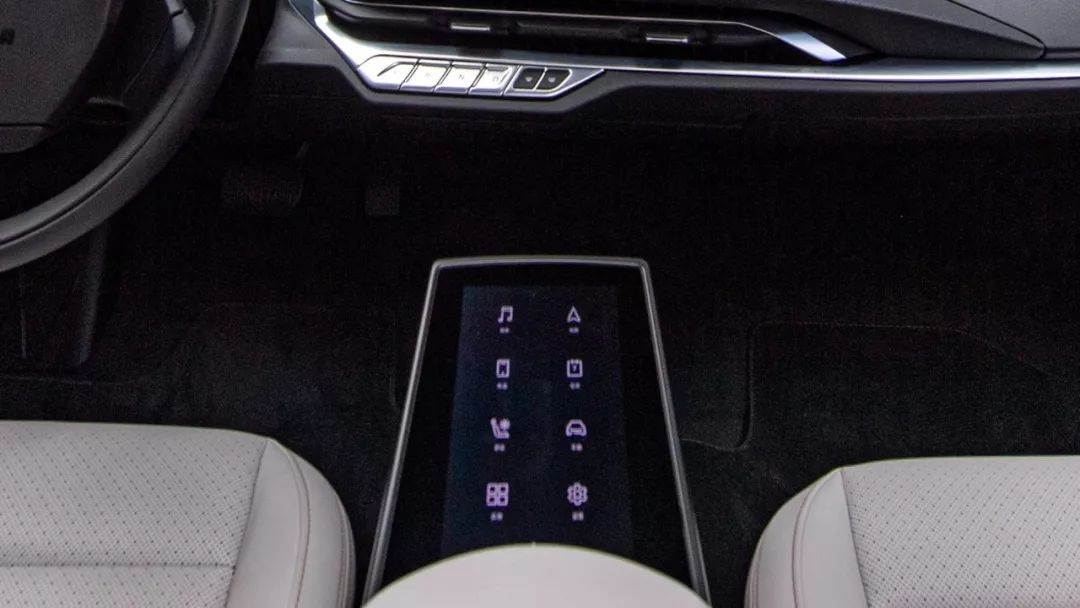
Taking the screen on the steering wheel as an example, there are two pages of buttons in the main interface. Through these function keys, the 48-inch screen can be linked. Media and navigation, which are most frequently used by everyone, are located in the upper left and upper right corners of the screen. For the driver, they can reach them without leaving the steering wheel.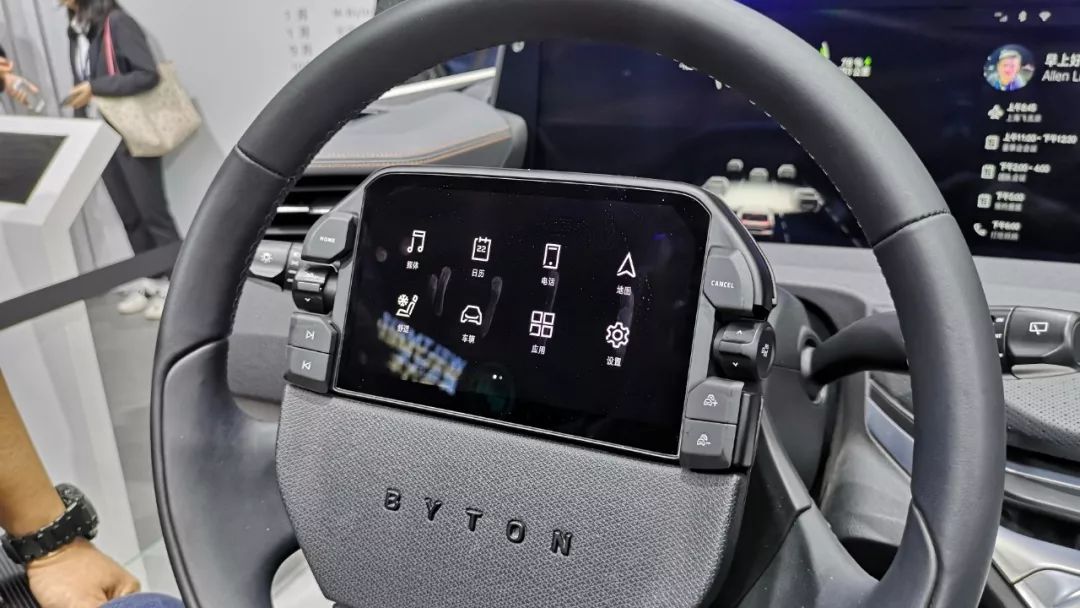
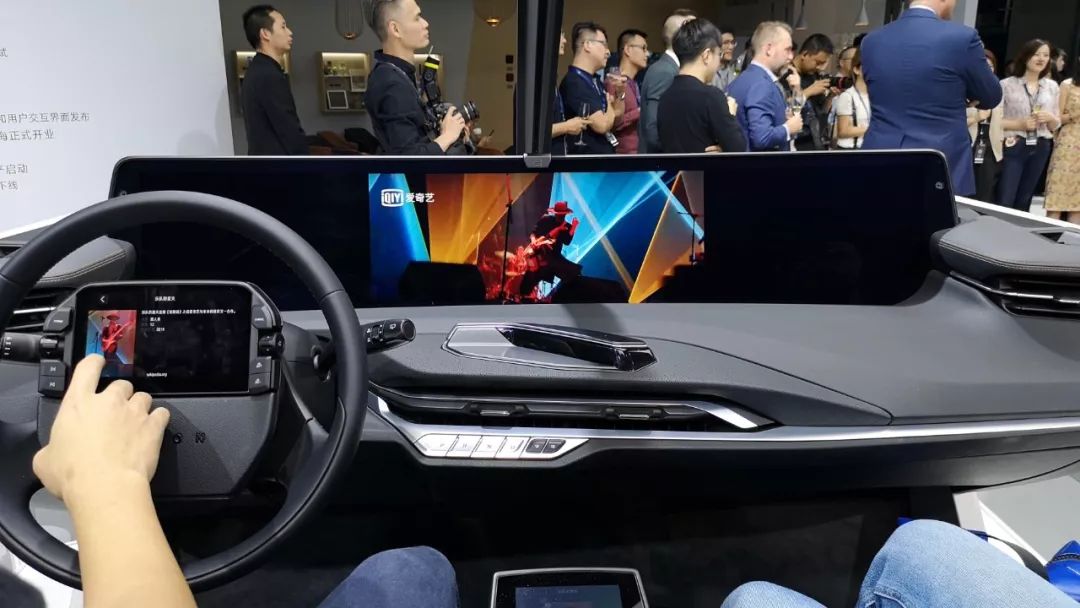
When it comes to media, after entering the menu, a touchpad will appear in the center of the screen with sub-menus on both sides.
Compared with other car systems, although the large screen of BYTON cannot be touched, they have moved some touch content to this screen. In the early stage, operations such as opening multimedia and selecting playlists can be completed independently on this screen. I think that transplanting these operations to the small screen can improve the user experience. As mentioned above, it does not require stretching out your hand, and the accuracy of clicking is higher.
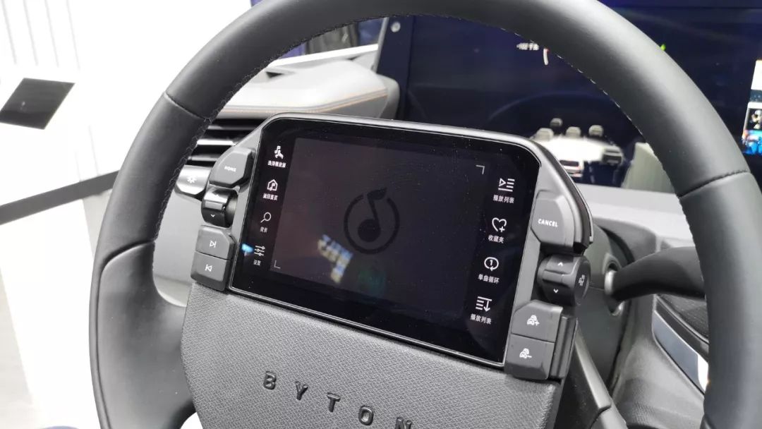
After selecting the multi-level menu, then it is time to use the small screen to control the large screen.
Under this status, 80% of the area of the screen is touchpad. The remaining operation is to select a song to play in the current playlist. This can be achieved through gestures by sliding and clicking.
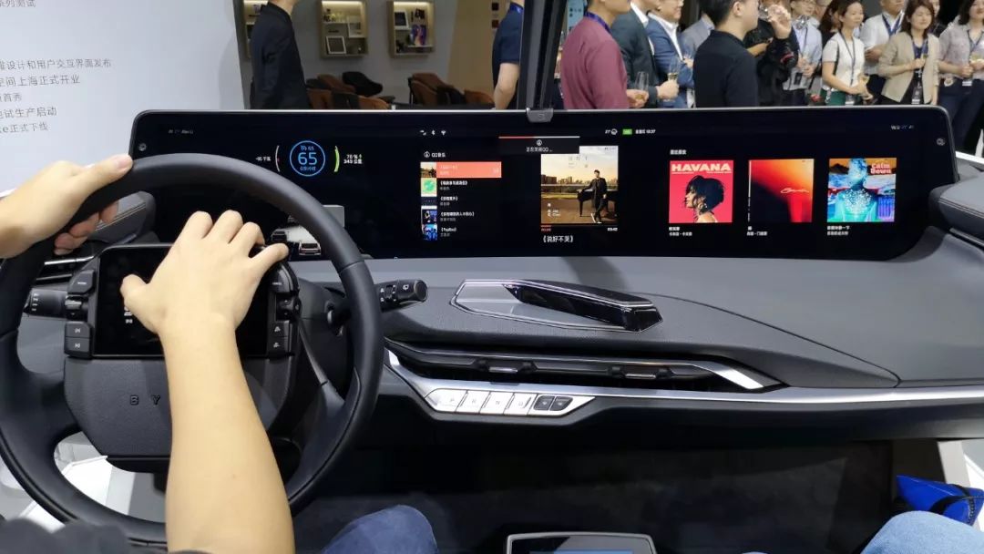
There is not much inconvenience during the static experience, but there is a lack of feedback during the operation. It is difficult for the driver to determine how many grids have been slid in total or whether they have been clicked at all.
Regarding this, the official said that since the screen does not have a pre-installed vibration module, force feedback cannot be achieved. However, in reality, there is sound feedback during the sliding process, but it is just hard to hear in a noisy environment.
In addition, because this control screen needs to bear a lot of sliding gestures, it would be more convenient to operate if a matte film is added, and there will not be too many fingerprints left.
As for how to return, currently, the menu hierarchy in this screen has a maximum of only two levels, and you can return by pressing the Home button in the upper left corner of the steering wheel.
Lastly, to sum up, from the current functions that are open, controlling the screen through the screen is not as difficult as we imagined, and in some experiences, it is even better than the existing car system experience. However, for users, it requires a certain learning cost. For example, exiting this function through long-pressing the function button, realizing the full-screen display of the function through double-clicking the function button, and returning to the initial setting through double-clicking the Home button. These operations may be difficult to discover in the exploration process, and you may only know after learning it once when buying the car.Currently, Byton has limited functionalities available for its in-car system, and it is only a static experience. Therefore, it is difficult for us to come up with a definitive conclusion about whether it is convenient or inconvenient to use. However, after experiencing it, I am looking forward to seeing how it works in real-life situations.
According to the official announcement from Byton, their factory in Nanjing has been fully operational, and the first prototype has already come off the production line. The M-Byte is expected to be officially launched in mid-2020.
Conclusion
What makes new EV manufacturers most attractive is that they are not constrained by heavy burdens and can imagine some disruptive things with creativity, turning them into reality and infusing new vitality into this slow-growing industry. The large screen of the Byton is one such example. And, based on this feature, the interior space of the car is also filled with a lot of imagination space.
At the very least, I haven’t been stunned by a car’s interior for a while.



This article is a translation by ChatGPT of a Chinese report from 42HOW. If you have any questions about it, please email bd@42how.com.
