From this Tuesday, 2020 Ideal ONE officially began to push V2.1.36 version OTA.
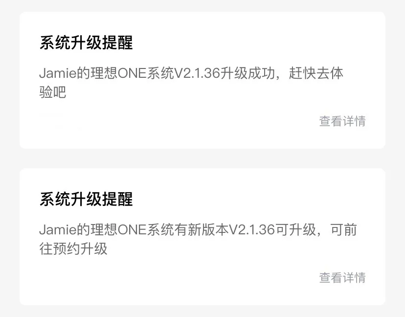
From a time perspective, it has been exactly two months and one day since the last upgrade.
According to the feedback from the owner group, as of this Friday (June 4), owners who purchased their cars in January of this year have also received OTA updates.
Old car owners who haven’t received it yet don’t need to worry. The update package will still be completed within a week in the order in which the cars were delivered.
Regarding this OTA, I have a lot of suggestions and opinions to share, so I accidentally wrote more than 5,000 words.
Of course, I am just an ordinary user, and I’m no expert on car systems. I’m sure many of the things I talk about are wrong, so please bear with me if there are any professionals reading this. 🙂
Instrument display
The instrument display has added a heading card, which can display the current driving direction, attitude, altitude, and extender water temperature.
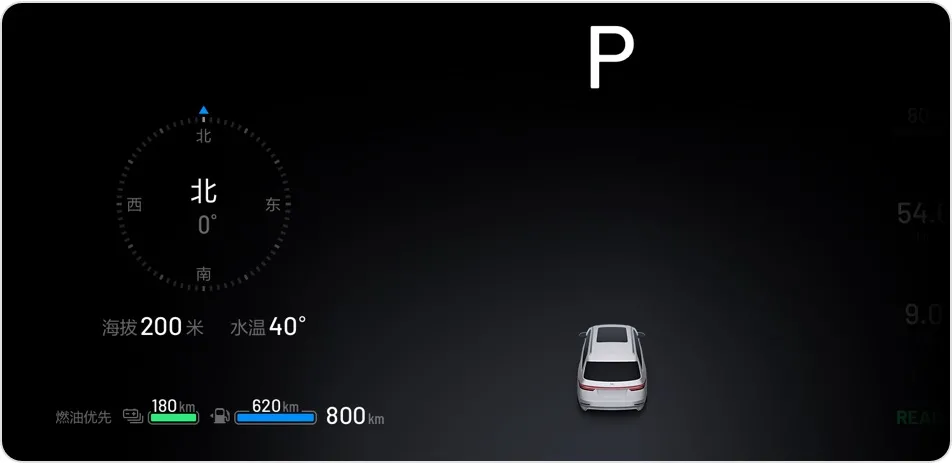
Although the Ideal ONE is positioned as a family car, it cannot be denied that the dads among the owners will always have a heart for outdoor adventures. This can be seen from the overwhelming number of travel stories about Tibet in the Ideal APP community.
Therefore, I think it would be better to make the heading card more “off-road.”
For example, on the basis of the existing content, we can add the display of the vehicle’s latitude and longitude, as well as environmental information such as air pressure. We could even consider showing the altitude and air pressure changes over the recent journey.
In addition, the heading card also adds the display of the extender water temperature. There is no sense of violation in displaying this information when using fuel.
However, in the case of pure electric priority, displaying the extender water temperature seems to be meaningless.
Moreover, even if we are using pure electric priority, the extender water temperature displayed on the card will also change. According to the current weather conditions, after long-distance driving, the water temperature will rise by about 10℃.
Hypothetically, it should be due to the connection between the battery coolant and the extender coolant through the thermal management system, which is causing this change.
So, I think it would be more accurate to display the extender or battery temperature separately on the card according to the type of energy being used.
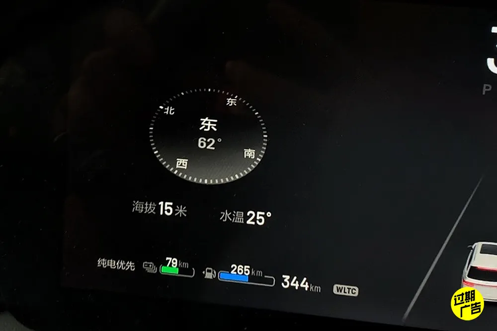
The compass on the heading card will have a compressed animation in case of sudden vehicle acceleration and deceleration.The compressed animation appears a bit stiff and may be mistaken for a bug at first glance.
Unfortunately, despite the need, the time display was not added to the instrument panel in this OTA update.
There is a common scenario where many car owners like to watch movies on the center console screen while waiting for their children outside the school. With a time display on the instrument panel, owners wouldn’t have to take out their phones to check how much time is left.
Currently, the time is displayed on the top left of the center console screen and there is also a clock display on the left side of the screen. If time is also displayed on the instrument panel, then there will be three time displays in close proximity, which may seem redundant.
I suggest swapping the outdoor temperature display on the instrument panel with the time display on the top left corner of the center console screen. The demand for checking outdoor temperature is not as high frequency as time, so it wouldn’t matter if it is displayed in the top left corner of the center console screen. Consider adding the interior temperature display on the top left or right of the entertainment screen on the passenger side as well.
Center Console Screen
There are two main changes to the center console screen. Firstly, two new clock faces have been added to the ideal co-pilot position.
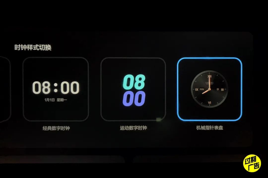
The two new clocks include a sports digital clock and a mechanical pointer clock, both very different from the overall UI style of the car.
It is speculated that this may be in preparation for adding two new styles of interface themes for in-car displays that are sports and luxury themed.
In addition, the rightmost of the center console screen now displays lunar calendar and future weather information. I wonder if car owners use this information frequently?
Speaking from my own habit, this information is a bit too hidden and I hardly ever swipe the screen to the right to check the weather or look for the interior temperature.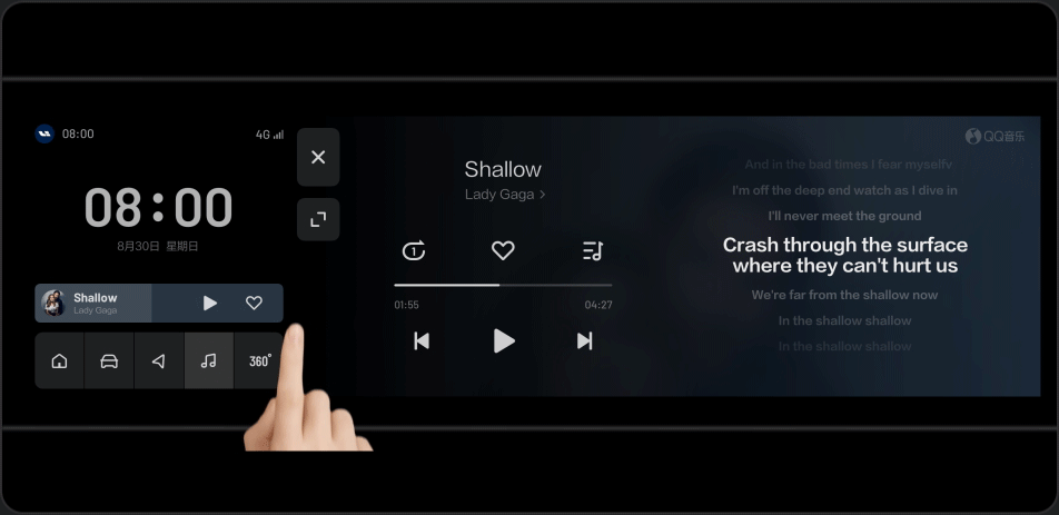
QQ Music has added the full-screen lyric feature. It’s embarrassing that more than one friend has asked me if I turned on the old people’s large font mode of LI ONE while staring at the huge lyrics on the screen. 🙂
Function Control Screen
Next is the function control screen (air conditioning screen).
First, I praise the new logic of “Intelligent High Beam”. Now, when the “Intelligent High Beam” is turned on, the driver can manually turn on the high beam and keep it on.
At the same time, it seems that the triggering conditions of the intelligent high beam have also been relaxed. The high beam can be automatically turned on on suitable night highways, no longer in an almost unusable state as before.
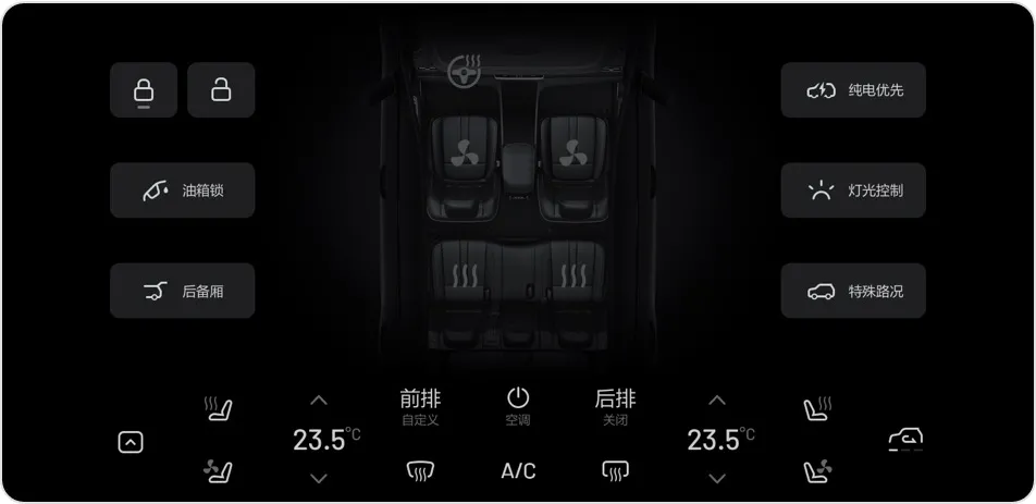
In addition, the display of the internal and external circulation of the air conditioning has finally returned to the main screen from the secondary menu.
In version 2.0 of the car machine, the display of internal and external circulation was placed in the secondary menu. Due to the inability to directly see the internal and external circulation status, it often happens that the inside of the car is foggy in winter before realizing that the internal circulation is turned on.
From the perspective of convenience of use, this design is really difficult to understand.
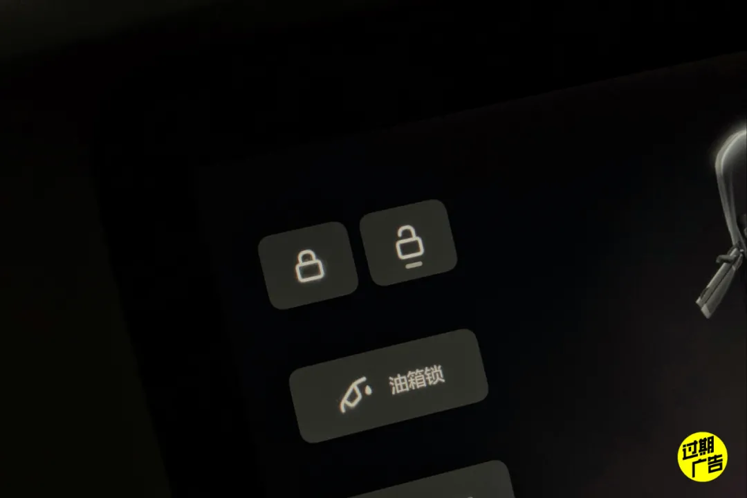
The car door lock button has also changed from a switch to two switches of “Lock / Unlock Independent”.
The previous “Lock / Unlock in One” car lock button, when the car doors are locked, the screen will show the unlock status as long as any door is opened by a passenger.
But except for the door that has been opened, the other doors are actually still locked.
Therefore, in this case, it is more troublesome for the passenger outside the car to open other doors to get things.
The driver has to press the car lock button twice on the function control screen. The first press locks the door that has been opened, and the second press unlocks all the doors of the car. After this operation, the passenger outside the car can finally open the door.
After changing to the “Lock / Unlock Independent” button, the operation logic will be clearer. Click the corresponding switch directly to unlock or lock.
However, the lock and unlock buttons now have no obvious difference in appearance, and only use a small horizontal line at the bottom to indicate the door lock status, which is not easy to distinguish the car lock status at a glance.
Of course, there are also car owners who still prefer the “Lock / Unlock in One” car lock button, and feel that it’s unnecessary to change it to the “Lock / Unlock Separately” buttons at great lengths.They believe that if the logic is changed to “the locking status will still be indicated on the screen unless all doors are unlocked”, the issue mentioned above can be resolved.
In the scenario where a door has been opened by a passenger and all other doors are still locked, the driver can double-click the car lock button on the functional control screen to change the functionality logic to unlock all doors with the first click, and lock all doors with the second click.
The reason behind this change is that the majority of people do not actively lock their doors in most scenarios, but instead rely on the “speed-linked locking function” to automatically lock their doors. Therefore, the priority of unlocking the doors can be increased.
Now, let me turn on my critique mode for the new steering wheel heating switch:
The new steering wheel heating switch is simply too ugly!
The 2.1 version air conditioning screen erases the steering wheel in the physical cockpit diagram, and forcibly adds a virtual steering wheel heating button in its place.
In terms of practicality, it is indeed better than the previous version’s placement of the steering wheel heating button on the right side of the screen. However, in terms of aesthetics, it is a complete failure.
As an ideal car with leading car UI in the industry, the final presentation of this solution is unacceptable to me.
Since upgrading to version 2.0 software, the functional control screen has been receiving various criticism from car owners. I think the root of this problem is because the quick menu entry was not handled well.
In my opinion, the button layout of the functional control screen in version 1.4 is the best in terms of practicality and aesthetics among all versions.
However, after upgrading to version 2.0 software, due to the addition of the quick menu entry “occupying” the original position of the steering wheel heating switch, other functional buttons are affected which led to a series of subsequent problems.
Therefore, I suggest an immature solution, which is to restore the button layout of the functional control screen for the steering wheel heating, seat heating, and seat ventilation to the layout of version 1.4.
At the same time, change the quick menu entry to display the control menu by swiping down from the top of the screen like the co-pilot entertainment screen control center. I personally think that this solution will be better than the current version.In addition, now you can directly click the switch on the virtual cockpit to control the seat ventilation and seat heating, and get instant feedback. This change has indeed made it more practical.
However, as a result, the seat heating / seat ventilation buttons on the air conditioning screen are now duplicated.
I am not a designer, but from a regular user’s intuition, I think this handling method is a bit strange. There is still room for optimization in the overall button layout.
One more thing I almost forgot, now the heated steering wheel, seat ventilation/heating status will be remembered for a short time of 20 minutes after getting off the car.
You don’t have to manually turn on the heated steering wheel, seat ventilation, and heating again when you get back in temporarily. However, if the memory time can be further extended, such as to 2 hours, it would be even better.
Regarding the function control screen, I have one last experience to add. Many buttons on the function control screen are used by car owners every day. For these high-frequency operation buttons, think twice before making changes.
Unless there is an extremely sufficient reason, try not to make changes if possible. If you overturn and relearn it when it is almost forming muscle memory, it will be a bit troublesome.
Regarding the “ideal classmate” and other related voices:
After the self-developed engine was updated, the most intuitive feeling about the voice is that the voice of the “ideal classmate” has changed. I guess there must be many car owners, like me, who are not quite used to the current voice.
The previous “ideal classmate” sounded more lively, and now it has become much calmer. I miss the cheerful “Here I am~” every time I hear the “ideal classmate” response before.
In terms of use, there is one change that deserves special praise: the logic of whoever wakes up is listened to again.
After a certain seat is awakened, other passengers’ words will be automatically shielded. In the future, you will no longer have to worry about being interrupted by other passengers making phone calls or mischievous children while using voice commands.
This logic that once existed in the early version of the Ideal ONE software has come back. At the same time, the seat that can wake up the “ideal classmate” can also be customized.
In addition, when using the “ideal classmate” voice navigation, you need to pay special attention to whether the navigation address is accurate.
Compared with the previous Tencent Dingdang version of the “ideal classmate”, there is still a gap in the search ability of the navigation address in the current version of the “ideal classmate”.
For example, assume that I am using the “ideal classmate” to navigate to “Ideal Automotive” in the parking lot of Daxing Airport. The top search result may be the nearby “Ideal High School”.
I have to say the complete navigation destination, “Shunyi District Ideal Automotive”, in order to get the correct address list. (Not all addresses will encounter this situation, but it is easier to make mistakes compared to previous navigation)
And if I navigate to “Ideal Automotive” in Shunyi District, the result displayed will be the correct address, and I won’t be led astray to the nearby “Ideal High School” near Daxing Airport.
In addition, there are some changes related to the sound in this OTA update:Automatically Lower Volume When Opening Doors. For me, this feature is essentially non-existent since, following my habits, I usually set the music volume in the car between 25% and 30%.
However, at the moment, this feature won’t lower the volume when it is set below 30%. I personally think that the volume reduction trigger limit can be lowered even more.
In addition, I believe that some car owners may not like the volume reduction when opening doors, so is it possible to consider making this feature a switch so that the car owner can decide whether to enable it?
Moreover, since the volume is reduced when opening the doors, could you also consider lowering the music volume when reversing the car? Of course, this feature would be best if it can be enabled or disabled as decided by the car owner.
Forward Collision Warning Chime. The forward collision warning chime feels more advanced and has a sci-fi feel to it. It is very good.
Silent Locking Chime at Night. This feature is friendly to car owners with open parking spaces. They do not need to worry about disturbing their neighbors when they return home at night. They can set the quiet time in “Settings-Vehicle Settings-Car Door and Locking”.
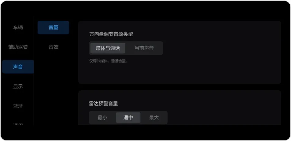
Steering Wheel Volume Controls Adjust Media and Call Volume Only. This feature is mainly to avoid situations where adjusting the volume of music may also inadvertently affect the volume of navigation instructions.
Improved Karaoke Microphone Latency by 25%. After OTA, the current karaoke microphone latency is almost imperceptible. However, let me ask, have your microphones been lying in the storage room at home collecting dust for a long time? 🙂
Some Other Changes
Bluetooth Key. Congratulations to Android users! The phone key function is finally here for all phone models. After self-pairing, phones running Android 8.1 and above can use the phone key.
As an iPhone user, I have been using the phone Bluetooth key since upgrading to version 2.1. In most cases, I can unlock the car door without feeling through the Bluetooth key.
However, on average, I still encounter 3-4 unlocking failures every week. Specifically, when I arrive at the car door, the welcome light on the door handle does not light up, and I need to wait one or two seconds before opening the door.
Wiper Logic Optimizations. When the wiper is set to “High” while driving, it will automatically reduce the speed to “Low” when the car is stopped.This improvement is definitely praiseworthy. When it’s raining heavily and the car stops at a traffic light, the car will no longer sway left and right with the windshield wiper. Of course, if the logic of the automatic windshield wiper could be smarter, that would be even better.
In addition, I hope to add the function that the windshield wipers will automatically slow down to the “interval wipe” mode when the car is stopped under the “low speed” mode during driving.
The efficiency of the range extender system has been improved. Under the NEDC test cycle, the fuel consumption of standard and winter modes has been reduced to the same level as the eco mode. For those who previously set the fuel prioritization to “eco mode”, please note that it may be changed to the standard mode by default after the OTA update.
The exit logic of the adaptive cruise control has been optimized. After following the preceding car under the adaptive cruise control, the gear lever, gear shift, and unfastened seat belt will exit the adaptive cruise control and activate the AUTO HOLD.
I encountered a similar situation last year. After the adaptive cruise control followed the preceding car, I wanted to take off my coat after unfastening my seat belt, but the car started to release the brake and move forward. Fortunately, I noticed it in time and stepped on the brake to stop the car.
When writing this, I checked the chat records and found that I gave feedback to the Ideal team at the first time when encountering the situation mentioned above. Well, let’s just say that I also contributed to the improvement of this function. 🙂
In conclusion, this V2.1.36 OTA is the first separate OTA for the 2020 Ideal ONE after the release of the 2021 version (which comes with the 2.1 version software). Just like the psychological state of the elder child in a two-child family, the old car owners are also worried that the 2020 Ideal ONE’s OTA will no longer be taken seriously with the launch of the new version. Therefore, it’s important to pay attention to the feelings of the old car owners as well.According to my understanding, except for the difference in ADAS, OTA updates for the 2020 and 2021 models of the Ideal ONE are generally synchronized.
However, I have noticed that many previous owners seem to be unaware of this fact. During the moment of “transition from old to new,” old users especially need more confidence from the official source.
Although Ideal Auto is regarded as a “manly car maker,” I believe there is still room for improvement in their user communication, to make it more empathetic toward their customers. 🙂
For example, although the official announced the hardware upgrades of the 2020 Ideal ONE, many car owners still have their own requests for hardware upgrades in the Ideal APP community.
As an ordinary car owner, one may not have a thorough understanding of car manufacturing and may even think that a hardware upgrade is a straightforward matter.
If there could be a technical salon conducted by the engineers of Ideal discussing what kind of work the official has done to promote hardware upgrades, what problems they have encountered, why it wasn’t feasible to achieve hardware upgrades such as external discharging of the battery, I believe it would be an excellent opportunity to educate and eliminate misunderstandings between Ideal Auto and its customers.
Lastly, as usual, I would like to pose the question: When will the dashboard display both the pure electric driving range and the battery level simultaneously?
This article is a translation by ChatGPT of a Chinese report from 42HOW. If you have any questions about it, please email bd@42how.com.