A few days ago, I wrote a lengthy discussion on whether the Mach-E is worth buying, comparing it to the Tesla Model Y. If you haven’t read it yet, you can check it out on my homepage. Today, I will talk about the advantages and drawbacks of the Mustang Mach-E, starting with its design that was not mentioned last week (you might be wondering if I will mention any drawbacks, but you’ll find out after reading this).
How to Give a Pure Electric SUV a Wild Attitude
As I mentioned before, the Mustang Mach-E underwent a transformation from a conservative MAV design to a rebellious Mustang emblem bearer at the beginning of its development. Since it has the Mustang emblem, it cannot be designed in a way that might bring shame to its predecessors. I will briefly point out a few design features, but for more details, you can judge for yourself by seeing the actual car whether they count as advantages of the Mach-E.
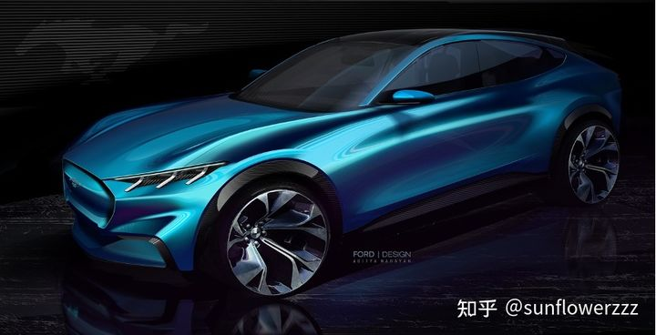
Firstly, there is the design posture. The initial design moved from a front-wheel-drive posture to a native rear-wheel-drive design, which caused a significant change in the entire car platform. The “Dash-to-Axle” distance, which refers to the distance from the front wheel center to the firewall (seen externally at the front end of the front door) that is commonly mentioned in the gasoline car era, has been significantly extended. The track was also adjusted accordingly to accommodate the muscular feeling that is necessary for the Mustang emblem.

As a result of this change, the Mach-E has the classic proportion of a long hood and a short front suspension of a native rear-wheel-drive platform, which is consistent with more than half a century of Mustangs, achieving the design charm of past two generations of retro-designed Mustangs— the fifth-generation S197 and the sixth-generation S550—on the all-new pure electric platform, GE1.
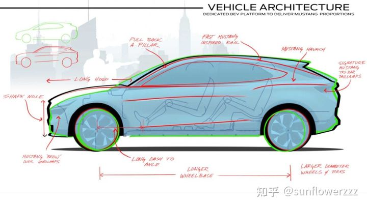
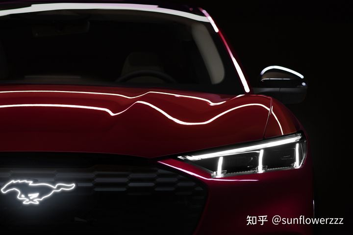
At the same time, the front of the car is raised to reflect the classic front face of the Mustang—an aggressive shark mouth that devours everything.
The changes in these two exterior design proportions also bring practicality to the space inside the Mach-E. Firstly, the extension of “Dash-to-Axle” ensures that the foot space on the outer side of the front row will not be invaded by the position of the wheel package like in other cars where the front wheel is closer to the passenger compartment. Secondly, with the longer and taller front, the front trunk space, which is one of the significant advantages of electric cars, can also be maximized.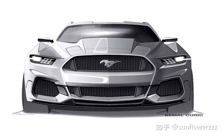
In addition, the enclosed grille, which has already been widely accepted as a native design for electric vehicles, has also been treated differently on the Mach-E. The enclosed part on the inside of the grille is not continuous with the outer sheet metal. It is also raised and widened to better match the larger proportions of the Mach-E. While the grille is closed, you will find that this face does not look out of place on the gasoline-powered Mustang. This is further proof of the common essence shared by the design languages of the two vehicles.
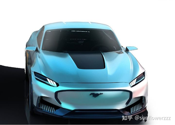
Beyond proportions, there are several classic design elements that have been passed down. Let’s start with the lights.
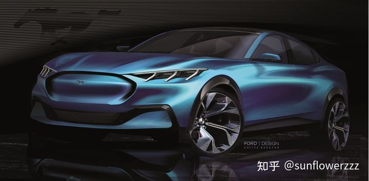
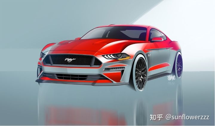
As the most eye-catching part of the front face, the headlights continue the design details of the first-generation front face interpretation that was demonstrated on the sixth generation Mustang.
As a response, the taillights also adopt the classic Tri-Bar three-bar design.
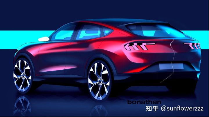
Previously, the international market version of the gasoline-powered Mustang belonging to the sixth generation lost its sequential lighting effect and switched from a fully red design to a fully white inner chamber due to differences in global ECE and North American federal regulations.

In the newly designed Mach-E, this problem has been replaced by sequential taillights that comply with both North American federal regulations and global ECE requirements.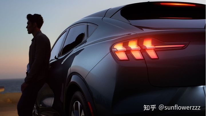
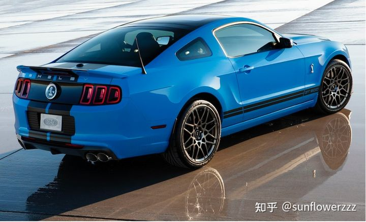
There is also a point in appearance, that is the Grabber Blue paint of the GT First Edition limited edition.
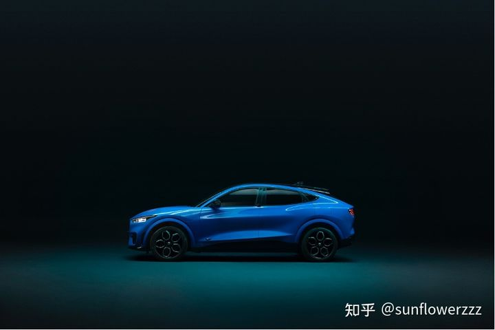
This is a classic color with a rich history, which was born in the 1969 version and was originally designed for the high-performance versions GT350 and GT500 of Mustang that year. It became optional for the entire series from the 1970 version. This color was discontinued after the 1970s, and it was not until the fifth-generation Mustang and the 2017 version of GT350 / GT350R that it was reintroduced. It can be said that this color represents the pride of Ford’s performance family.
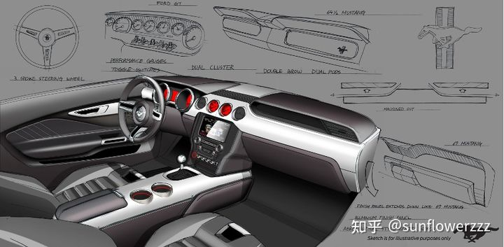
In the interior, the classic Mustang twin-brow instrument panel design is continued. In the two pictures below, which are the rendering of the Mach-E and the sixth-generation petrol version of Mustang, you can see the connection between them.
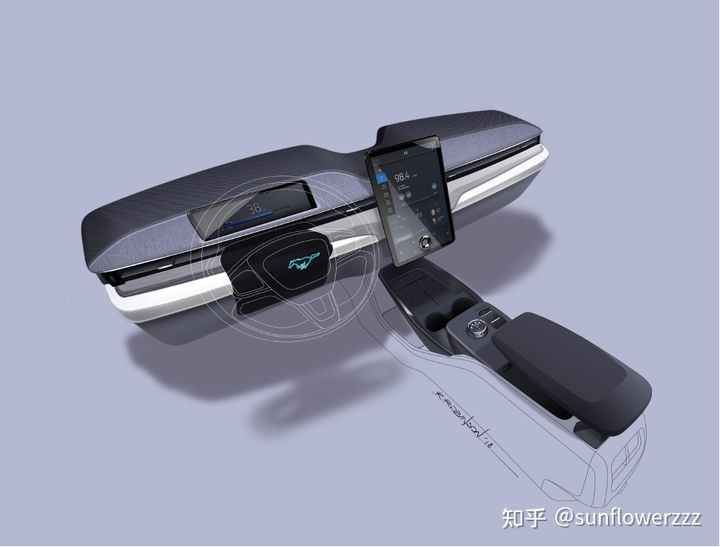
Above the Mach-E’s instrument panel, there is an integrated Full Dash audio system co-designed by Ford and B&O. This audio system, which won the iF Design Award, was inspired by B&O’s consumer soundbar products, and its design and functionality are integrated.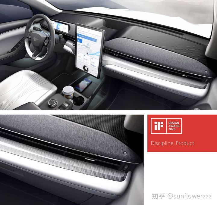
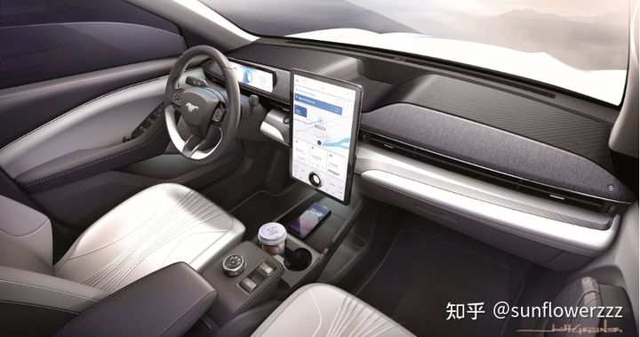
Unlike Model 3/Y, the driver’s side instrument panel of Mach-E has been retained, using a compact 10.2-inch widescreen display coupled with a 15.5-inch touchscreen in the center console as the source of technological and futuristic feel inside the car, with a relatively simple and restrained design that does not feel too abrupt;
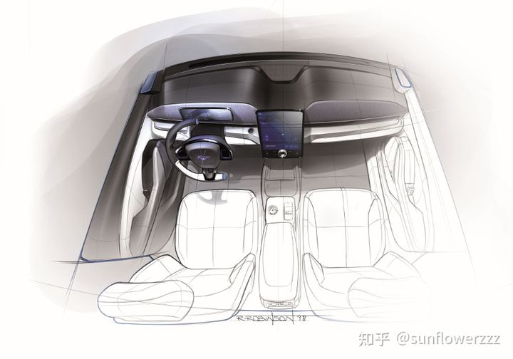
The armrest position below the center console fully utilizes the advantages of the pure electric platform, with a large storage compartment below and a space for integrating smartphone wireless charging above;
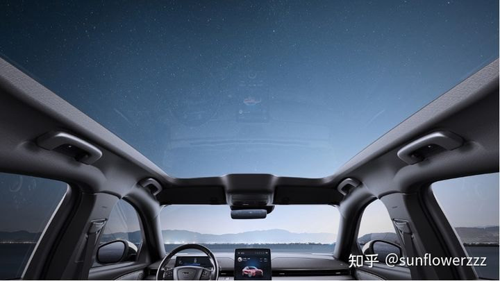
Above the cabin is the panoramic skylight mentioned in my previous answer, which uses Low-E indium tin oxide film to shade, meaning it is both transparent and not exposed to the sun.
Before discussing the advantages and disadvantages of the Mach-E, I will repeat the user-centered design, driving control, and driver assistance functions that I mentioned in my previous answer to avoid people not seeing it.
User experience thinking from a century-old car company
Almost at the same time as the Mach-E project’s transformation, Ford has internally started a user experience-oriented product design model. Products developed under this model include the new generation flagship pickup truck F-150, the reincarnation of the rugged off-road Bronco, and the European Ford small SUV Puma. F-150 features include flat front seats, foldable shift levers, a small center console table, and a vehicle-mounted generator in the trunk, all based on real pain points in the practical use of the product and improved from existing hardware designs which ensure functional problem-solving while maintaining reliability and being recognizable to old car owners. This is a user experience thinking from a hundred-year-old car company.On the Mach-E, these considerations are based on the new product features of purely electric models, the user pain points caused by existing designs of other products in the same class, and the mature design concepts of Ford’s own engineering team:
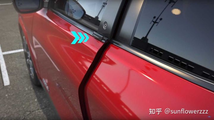
- Hidden door handles, but not the kind that are popular on all new cars.
On the Mach-E, Ford has designed a small circular button on all four doors that resembles the previous iPhone HOME button. When pressed, the mechanical structure inside the door extends inward to open the door at a certain angle, making it easy to open even with coffee cups in both hands. The strength with which the pillar automatically opens the door has been tested in the harsh winter of the five Great Lakes region and winter testing in Norway, ensuring that the common hidden door handles are not frozen due to frost and cold.
(A typical “innovation result of the new trend of car production in cold regions,” a big fog)
- The phone can act as a key, but you don’t have to take out your phone when you’re close to the car.
In addition to physical keys, the Mach-E can be unlocked with a phone key. Ford’s phone key was not introduced early, but its features were well considered: low-power Bluetooth BLE 4.2, 9 Bluetooth antennas throughout the vehicle, supporting pairing with 4 phones, and basically no difference to the physical key in terms of functionality. When the phone is near the vehicle, the whole car can be unlocked without taking out the phone, and it also supports functions such as keyless entry, keyless start, and automatic locking when leaving the vehicle.
- The front trunk is large, but it’s not just about the trunk size.
In the initial design, Mach-E’s front trunk was not strictly designed to target specific competitors. The Model S and Model X have respective capacities of 59.6 L and 187 L, and the smaller Model 3 is slightly smaller than the S. The Model Y, based on the Model 3, had not yet been released. Therefore, Ford’s engineering team started from fully exploring the potential of an all-electric platform and set the Mach-E’s front trunk space at 136 L, while the Model Y released at almost the same time was 100 L (measured by a third-party scanner).
At the same time, Ford’s engineering team did not stop at just front trunk space. Instead, they fully exploited the usage scenarios of the front trunk. Considering previous usage of the trunk, because it’s connected to the rear seats, it’s usually difficult to place damp or wet items that may need cleaning. The front trunk of the Mach-E is isolated from the cabin and is a perfect storage location for such items. Ford’s engineering team designed a washable, waterproof inner panel for the front trunk of the Mach-E, as well as a detachable water outlet at the bottom and a removable storage compartment divider.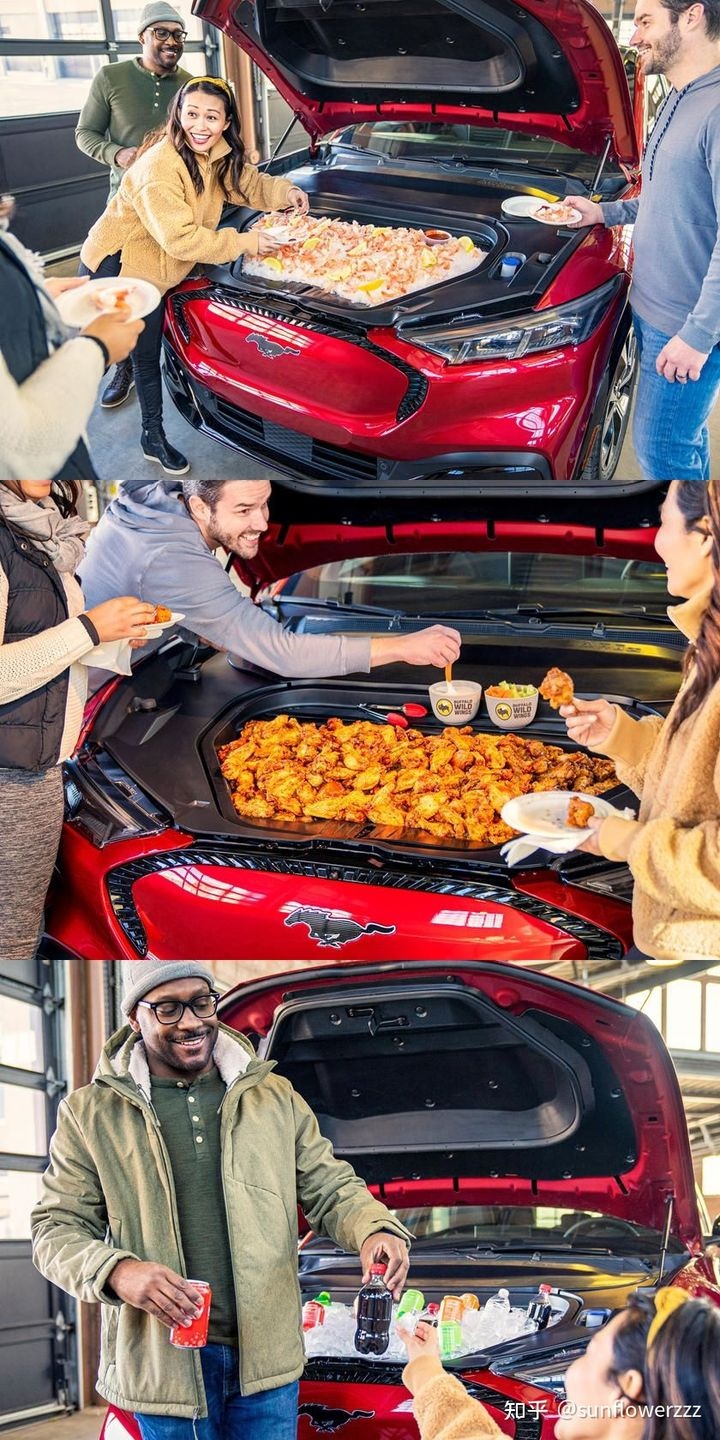
- The touchscreen is large, but the screen interaction does not stop at the touchscreen;
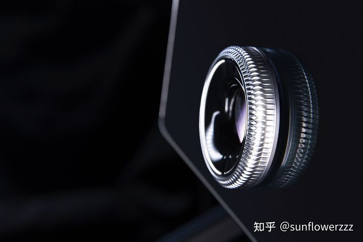
To address the pain point of unfriendly blind operation of the large screen interaction, Ford’s interior engineering team carefully created a hardware knob on the 15-inch vertical screen of the center console. The name of the knob was mentioned at the launch conference – “Magical Floating Knob”. It is recommended for friends who can touch the real car to study how to add a knob to a bare screen.
- The windshield and panorama sunroof have heat insulation coating.
To address the concerns that the panoramic sunroof design in the car interior is afraid of being exposed to the sun and the temperature rises due to the sun’s exposure in the car in summer, Mach-E has built-in additional coating for the windshield and the panorama sunroof.
The front windshield is a triple-layer IRR silver coating. As the windshield, it needs to ensure both visible light transmittance and reduce solar energy transmittance, both of which perform better than many high-priced aftermarket films.
The panoramic sunroof is made of Low-E indium tin oxide film deposited by chemical vapor deposition method, and its visible light transmittance and solar energy transmittance are also far ahead of aftermarket films.
- The roof has a sleek curve, but the interior space is not cramped because of it;
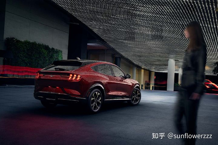
Since it wears the MUSTANG logo, the classic Fastback sloping design cannot be lost. Ford’s designers and engineering departments fully utilized the two-tone roof to create a visually sleek curve while taking into account the head space in the rear seats.
These experience points are just part of the Mach-E’s overall user experience design. More highlights are left for everyone to experience in person on the actual car.
Whether you want to drive carefully or not, everything is taken care of.
For friends who want to drive, Mustang Mach-E can provide the leading driving and handling feel in this price range. It is difficult to explain this subjective feeling, so let’s give an example.
The team that builds Mustang Mach-E’s driving and handling is not an ordinary engineering team, but Ford Performance High Performance Team, who has built Mustang GT350, Mustang GT500, F-150 Raptor, Focus RS and other well-known high-performance models. As for the actual performance, wait until there is a test drive car, and everyone will know after trying it.
By the way, the foreign media who have tried it all praised the driving feel.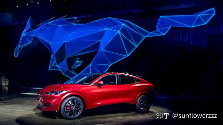
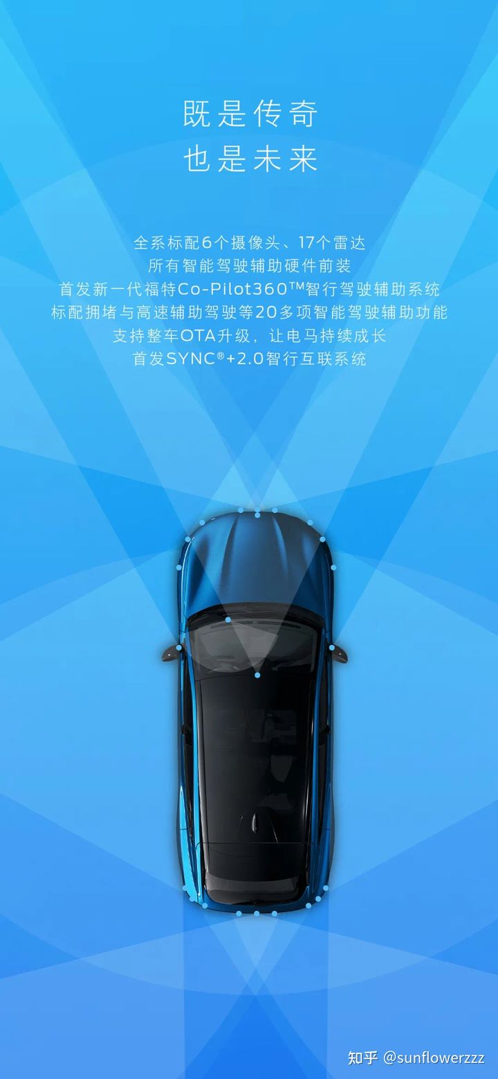
For those friends who don’t want to drive (with quotation marks), they are definitely considering the Mach-E, which is designed to compete with Model 3/Y. The assisted driving hardware is standard, with 6 cameras and 17 radars as standard for the whole series, and all intelligent assisted driving hardware is installed in the front.
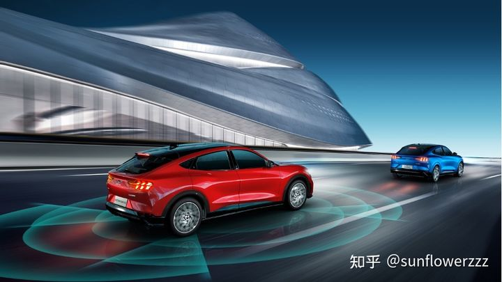
In terms of software, the Mach-E is standard with the L2 level Ford Co-Pilot360 Professional Package: including more than 20 intelligent driving assistance features, especially the full-speed range assisted driving function for congested and high-speed mode driving, which is similar to the Model Y without FSD.
At the same time, the Co-Pilot360 Intelligent Driving Assistance Upgrade Package can be selected, which includes the BlueCruise Active Driving Assistance function. Theoretically, it can be completely hands-free driving in specific areas. However, due to national legal regulations, this operation is not recommended.
However, as a relatively conservative traditional automaker, Ford’s assisted driving functions still need to be verified by real car experience.
Conclusion
As I mentioned in my previous answer, wearing the MUSTANG logo is only the appearance of the Mach-E. In order to create a powerful pure electric product, Ford has fully prepared for the Mach-E’s interior, including range, power, acceleration, space, styling, interaction, and assisted driving. The Mach-E has evolved comprehensively, taking the performance of this product to a new level of emotional charm:
-
0-100km/h in 3 seconds, and the introduction of a high-performance team to ensure driving control
-
EPA estimated range of 300 miles+ (North American version, 600 kilometers+ for domestic version)
-
The in-car interaction (Sync+) and assisted driving functions (CoPilot360 & BlueCruise) have reached the leading level in the industry
-
The entire vehicle’s electronic and electrical architecture supports FOTA, and the software experience can be upgraded during the product’s lifecycle
After writing this article, it seems that there are not many shortcomings mentioned. It’s already very long, I’ll update it when I have time.
This article is a translation by ChatGPT of a Chinese report from 42HOW. If you have any questions about it, please email bd@42how.com.
