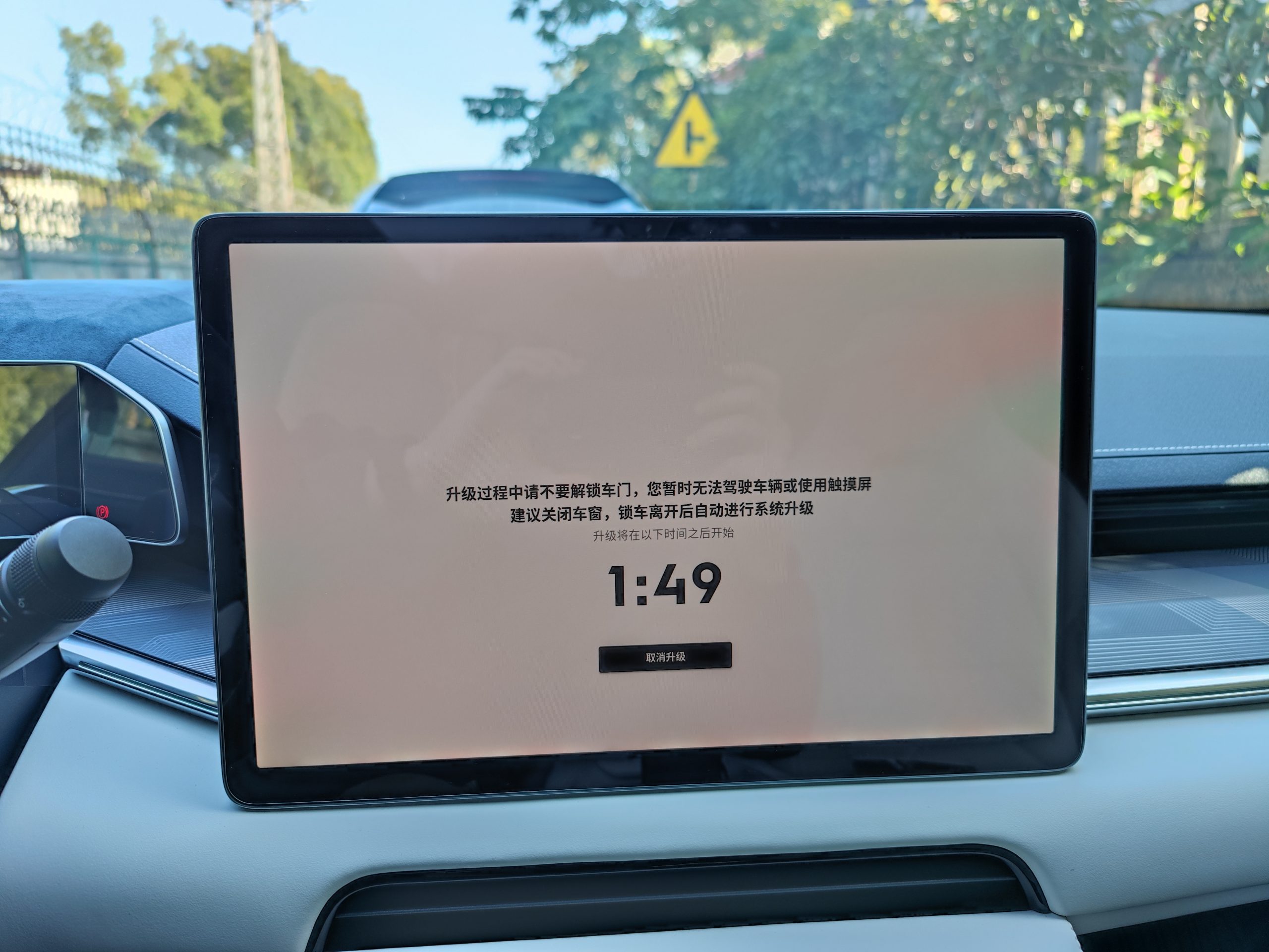
The OS 4.0 version is a “brand new” version. Without further ado, let’s get to the point. The UI interfaces of the center control, dashboard, and HUD have undergone significant changes.
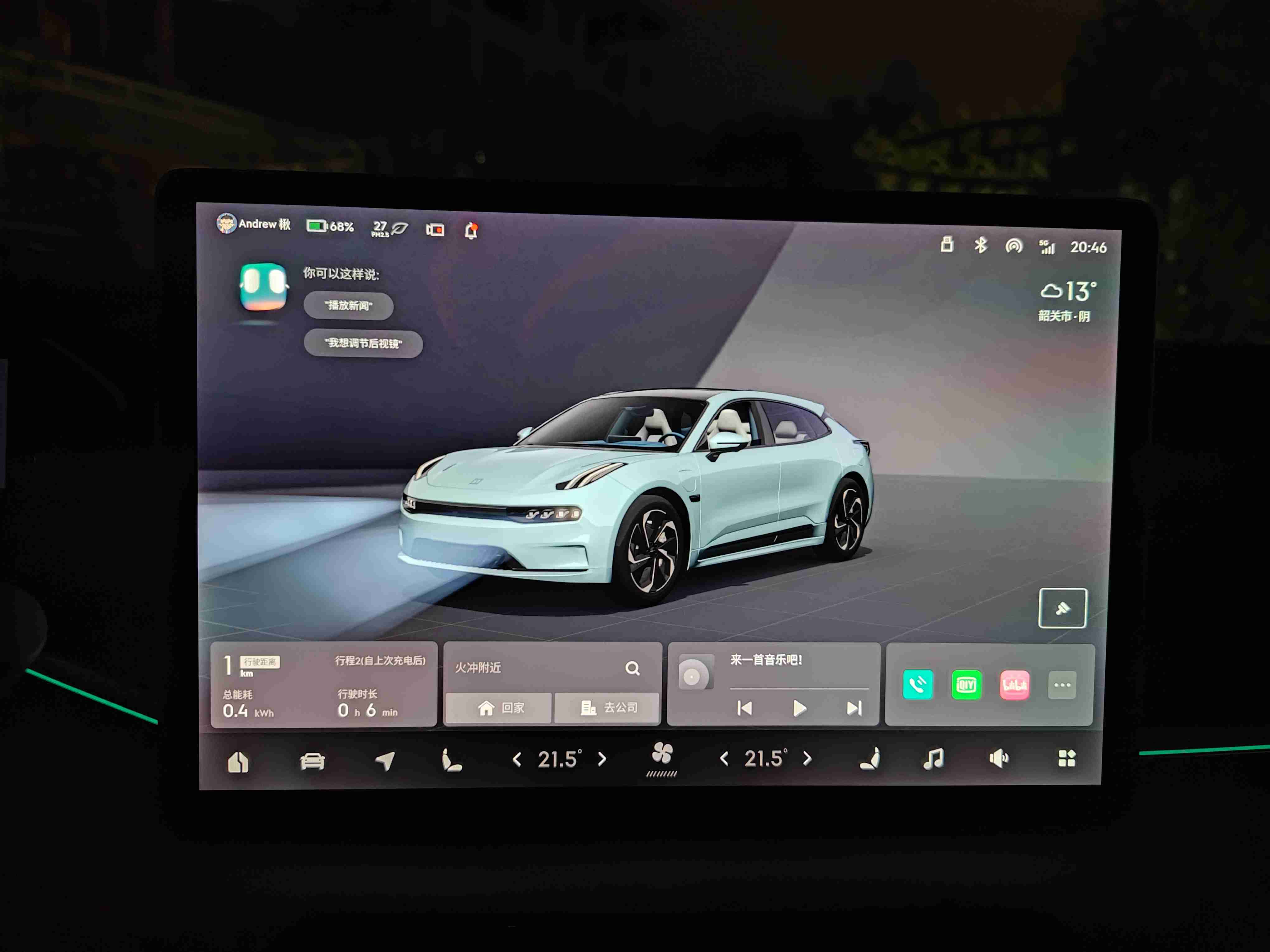 The center control has been changed from the original 3.0 card-style layout to the current one, with a huge 3D vehicle model on top that can rotate 360 degrees. Doors, charging port covers, trunk doors, and rearview mirrors can all be operated directly on this interface. The top status bar and user name are placed in the upper left corner, making it more convenient for users to change the seat position when getting into the car. The outside temperature is now displayed on the dashboard, rather than on the center control. The bottom is a small card-style layout with energy consumption, maps, multimedia, and three commonly used customizable apps. The navigation bar at the bottom has not changed much, but the logo has been added to the home icon. The ventilation and heating functions of the front seats can no longer be opened and closed by sliding a finger, and must be accessed through the air conditioning page, which is a usability regression. The temperature of the air conditioning can still be adjusted by sliding. The vehicle settings page is similar to 3.0, with only the addition of the display of the EVA, date, and week at the top of the page.
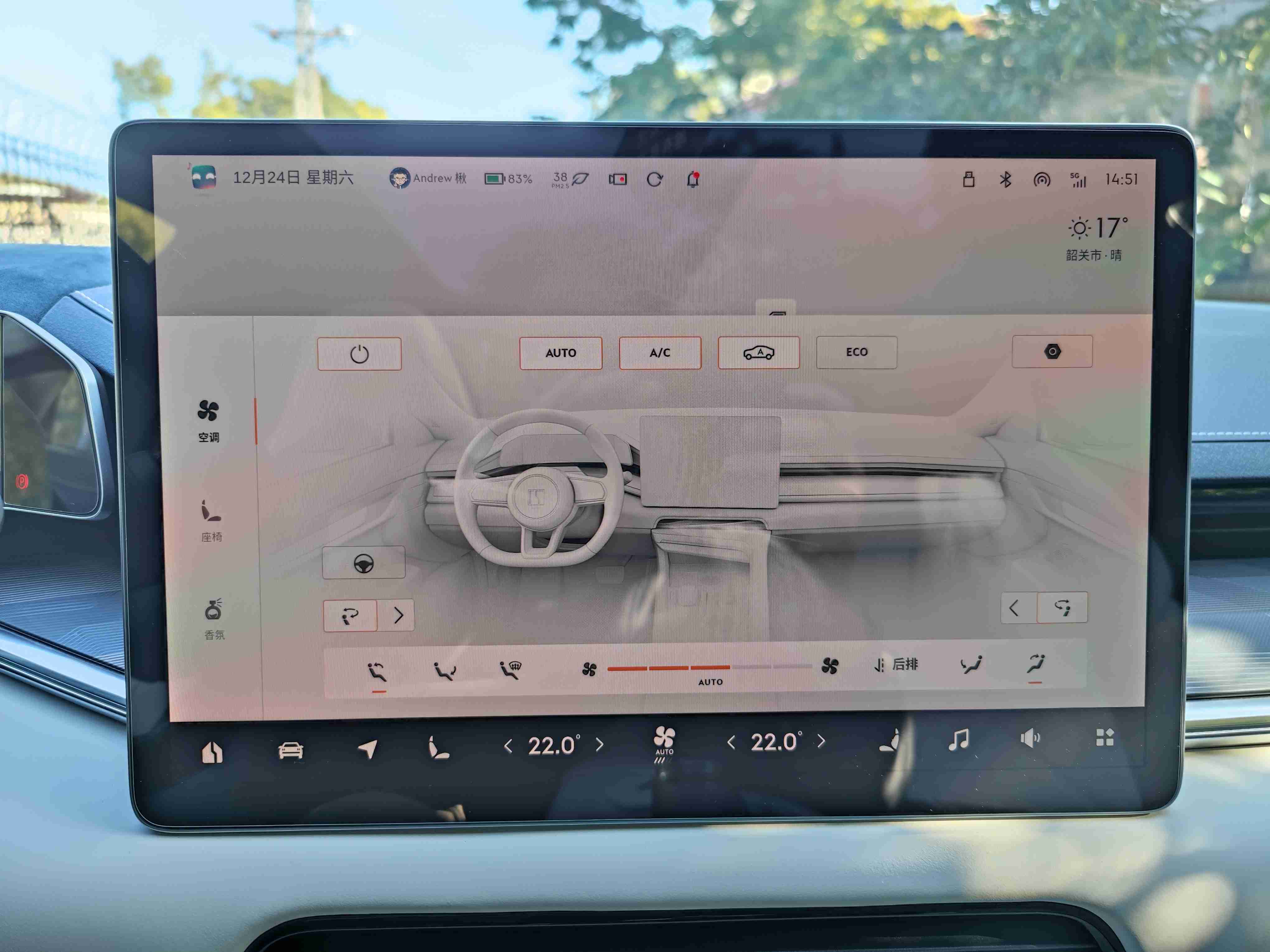 The air conditioning control interface has also undergone significant changes, from full screen to a 3/4 screen, and a return button has been added. The air conditioning, seats, and fragrance are controlled by individual pages, rather than the previous integrated design. The fragrance is now displayed in a pop-up window. The color of the dynamically blown air has finally been corrected to gray, as it used to blow purple air, which felt like it was blowing toxic gas. The operation logic is correct, with the fan speed adjusted to AUTO mode when the AUTO mode is activated. However, the ECO mode is not linked with the ECO mode of the driving mode. Even when the vehicle is in ECO driving mode, the air conditioning still operates in normal mode. To switch to ECO mode, you need to do it manually. Although, I still don’t understand the meaning of the ECO mode in ECO, whether it is used to disable PCT electric heating to achieve power saving or not.
The fragrance system now has a dynamic effect, which gives a refreshing feeling, which is very good.
 The function of automatic switching between black and white theme modes has been added, which is nice.
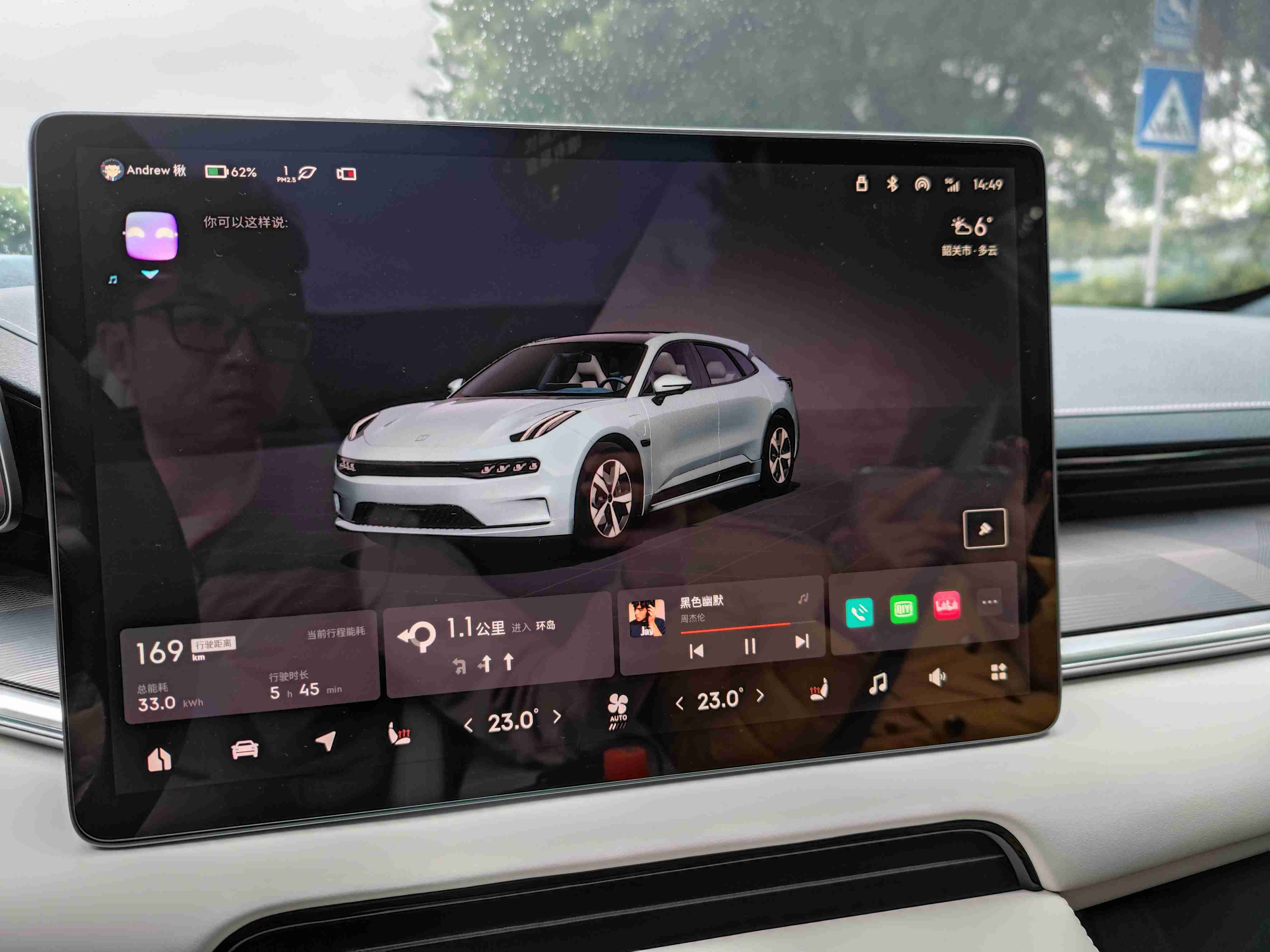 The username is placed in the upper left corner for easier access by users to adjust the seat position.
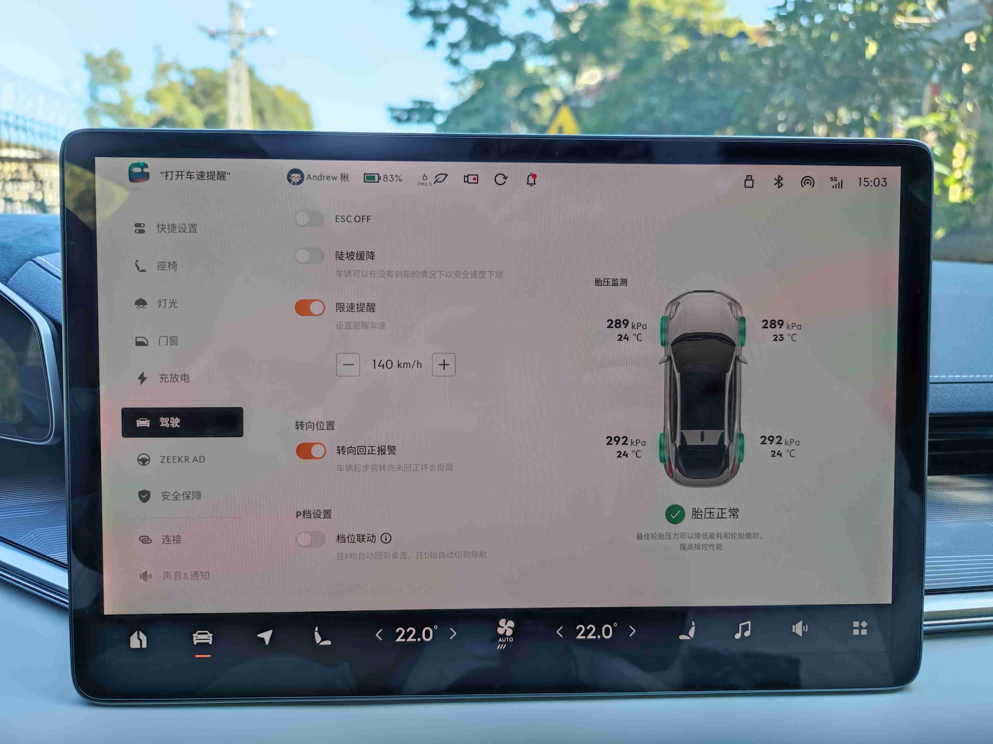 Switching to drive mode D will directly link to the high precision map in Gaode (Chinese equivalent of Google Maps).
Suggestions for improvement: 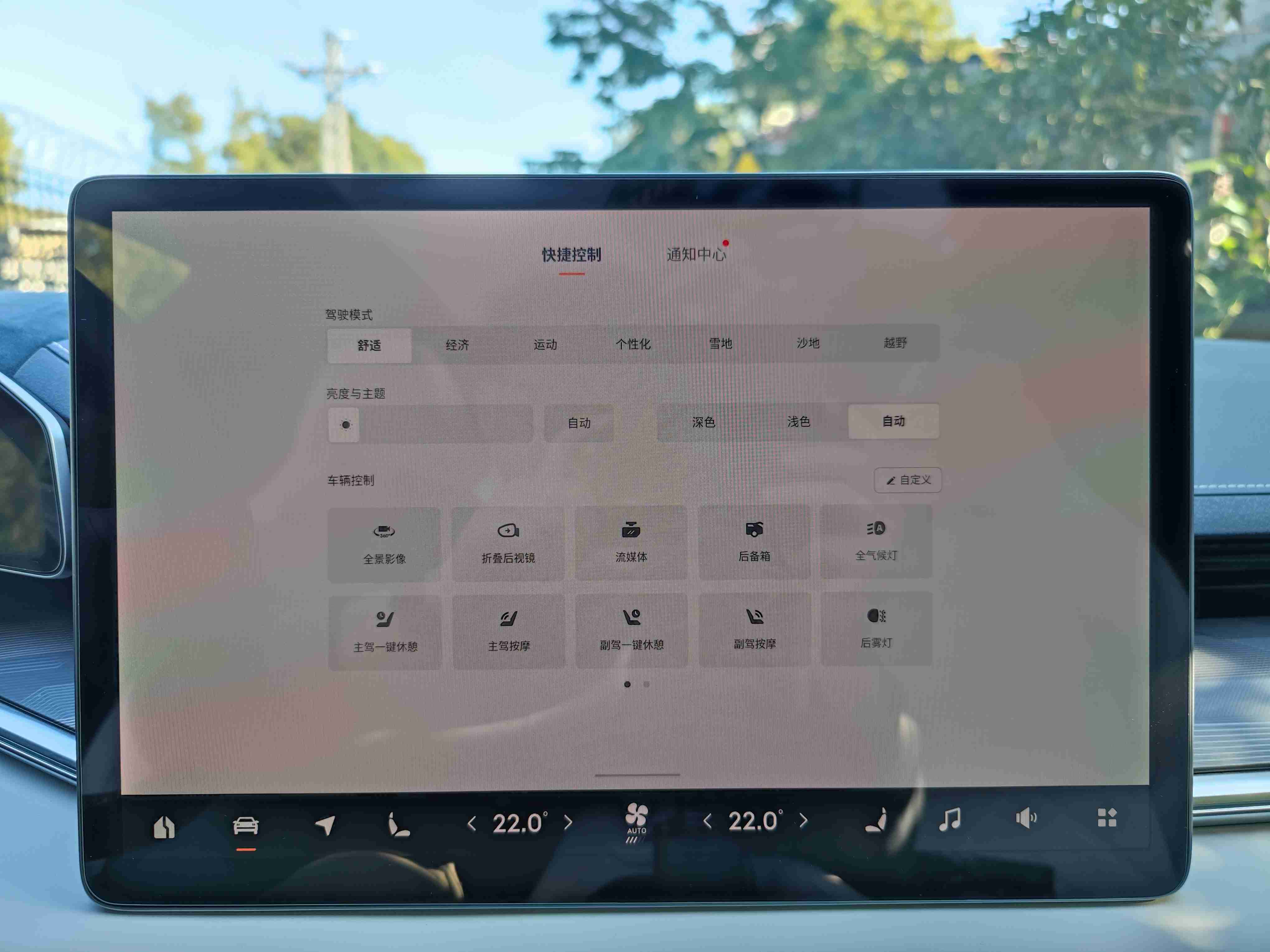 1. Integrate a shortcut icon for panoramic imaging in the blank space of the car model on the homepage. Previously, the 360 panorama display was in the bottom left of the central control, which was easy to access. With version 4.0, accessing the 360 panorama display is more complicated, either by voice command or by pulling down the shortcut settings from the top. Therefore, I have placed the panoramic image in the top position on the shortcut settings and accessed it by pulling down with my finger.
- Could the buttons for ventilating, heating and sliding the front seats be added?
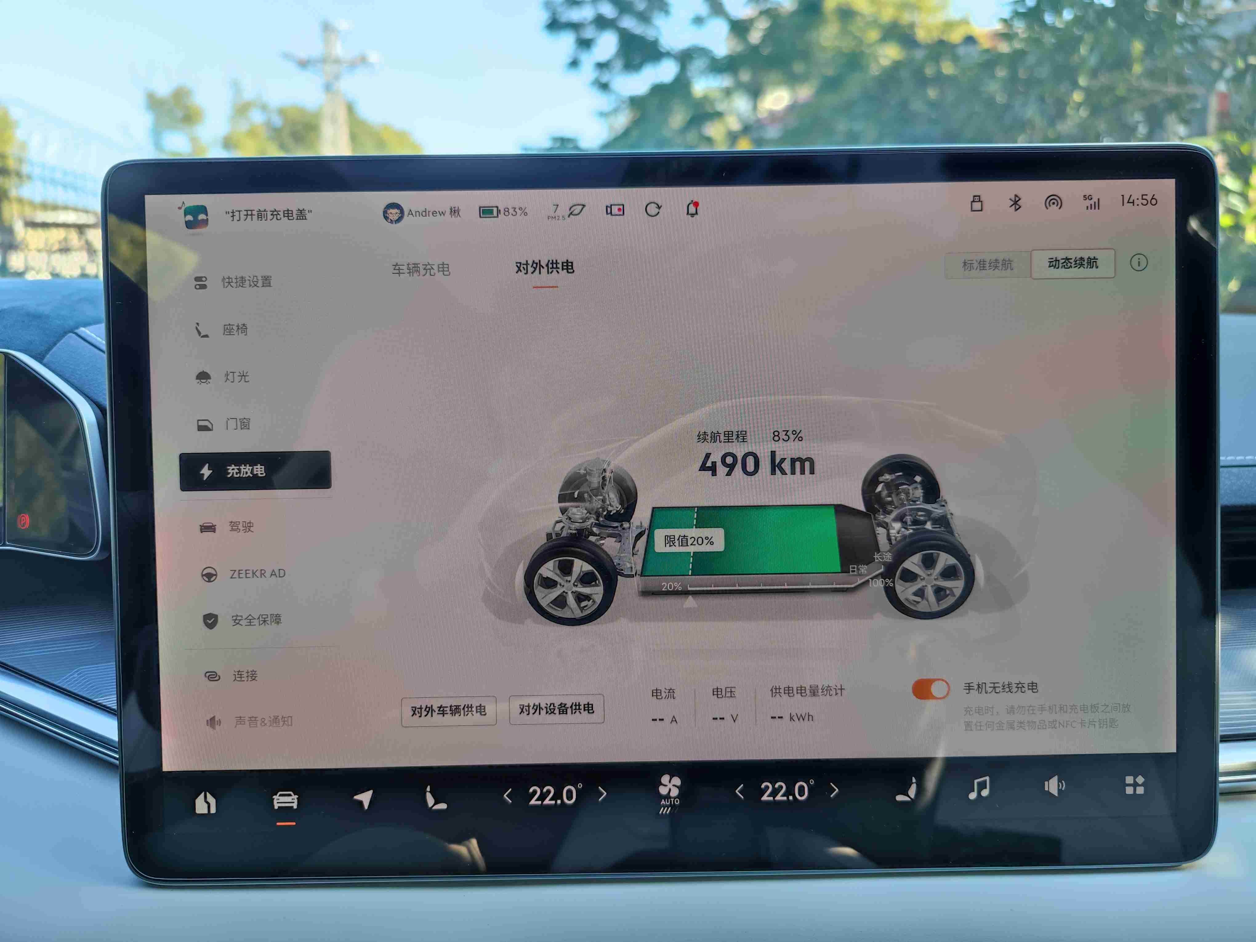
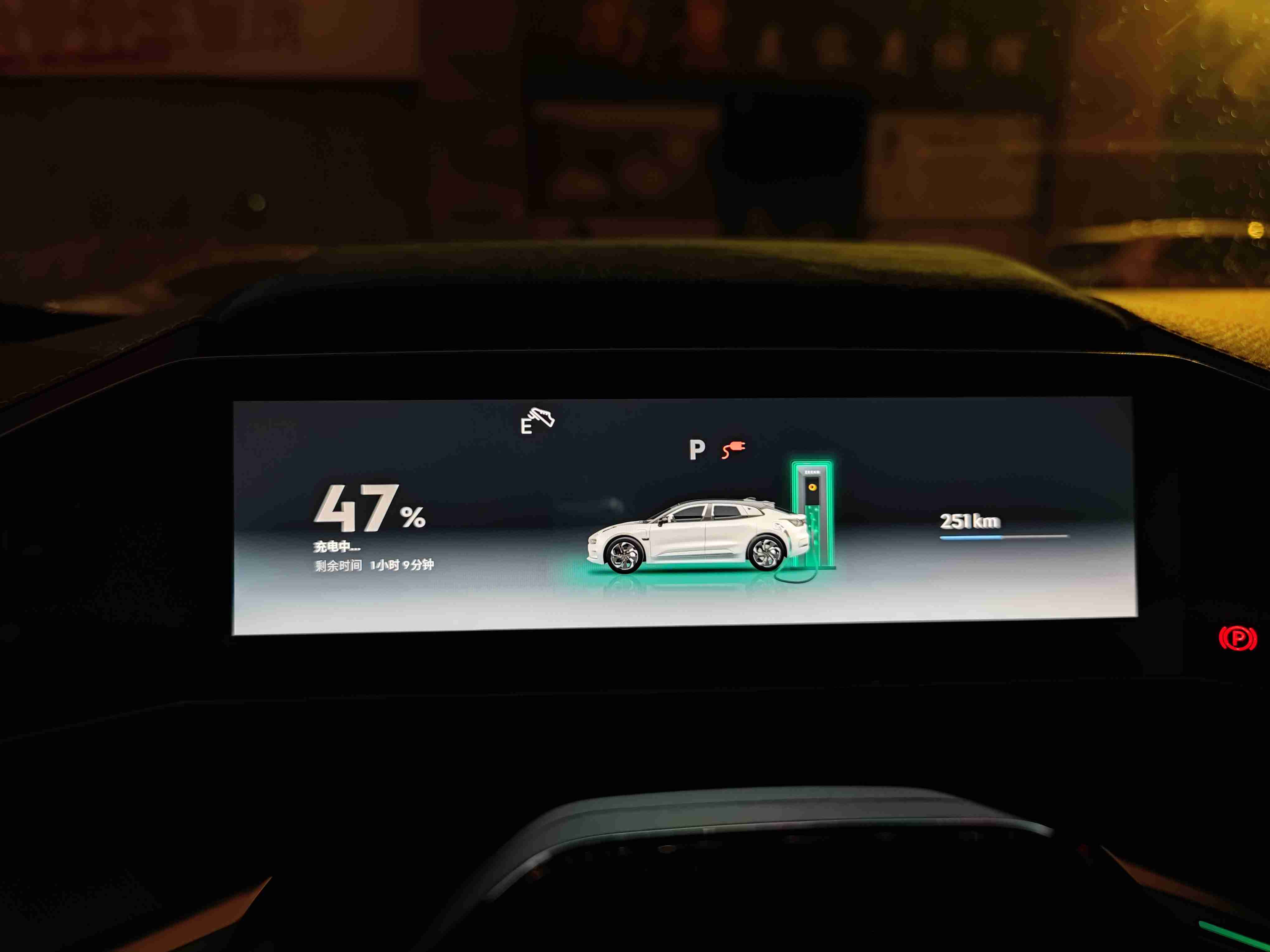 3. The charging interface currently displays voltage and current. It would be helpful to also add the current charging power to save users the trouble of calculating power with the formula P=UI.
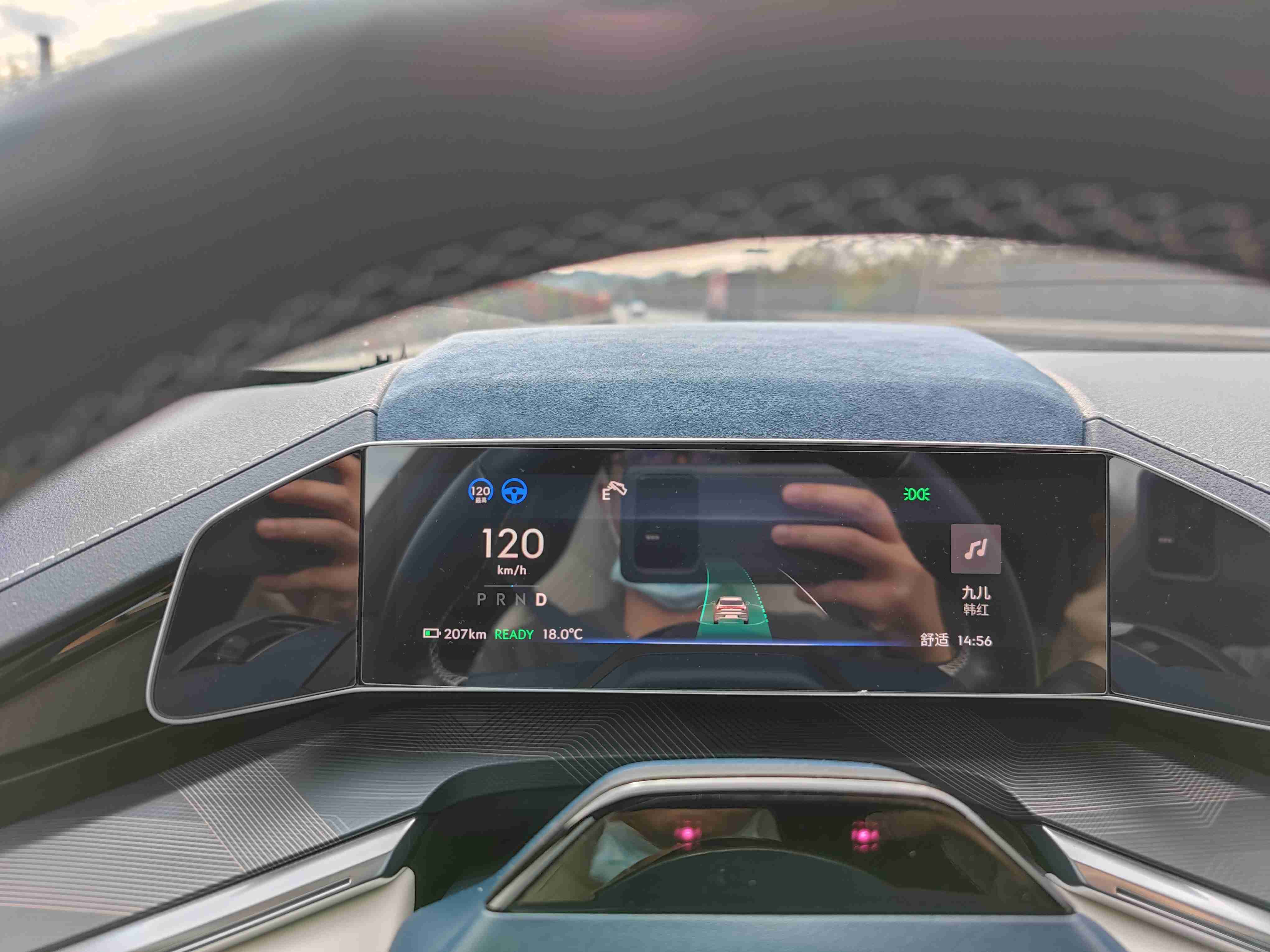 After discussing the central control system, let’s talk about the changes in the dashboard. The changes in the dashboard are significant. When the UI was updated, it felt familiar, and then I realized that it resembled NIO’s dashboard. I personally don’t mind borrowing ideas from other companies to enhance product design. In recent years, both IOS and Android have become more similar, haven’t they? The current dashboard displays road information for the advanced driving assist system in the C position. The white color indicates the system is turned off, and blue indicates that it is in use, and the displayed speed corresponds to the set speed. The light icon is in the upper right corner, similar to previous versions. From left to right, the display shows the current speed, energy status, and gear position. The upper right displays belt and door status. Press INFO to switch between multimedia, total mileage, and mileage 1, 2. In the lower left, the available range is displayed, followed by READY (power battery start-up prompt), exterior temperature and, in the lower right corner, the driving mode and time display. The charging interface has become more intuitive, displaying even more information than before.
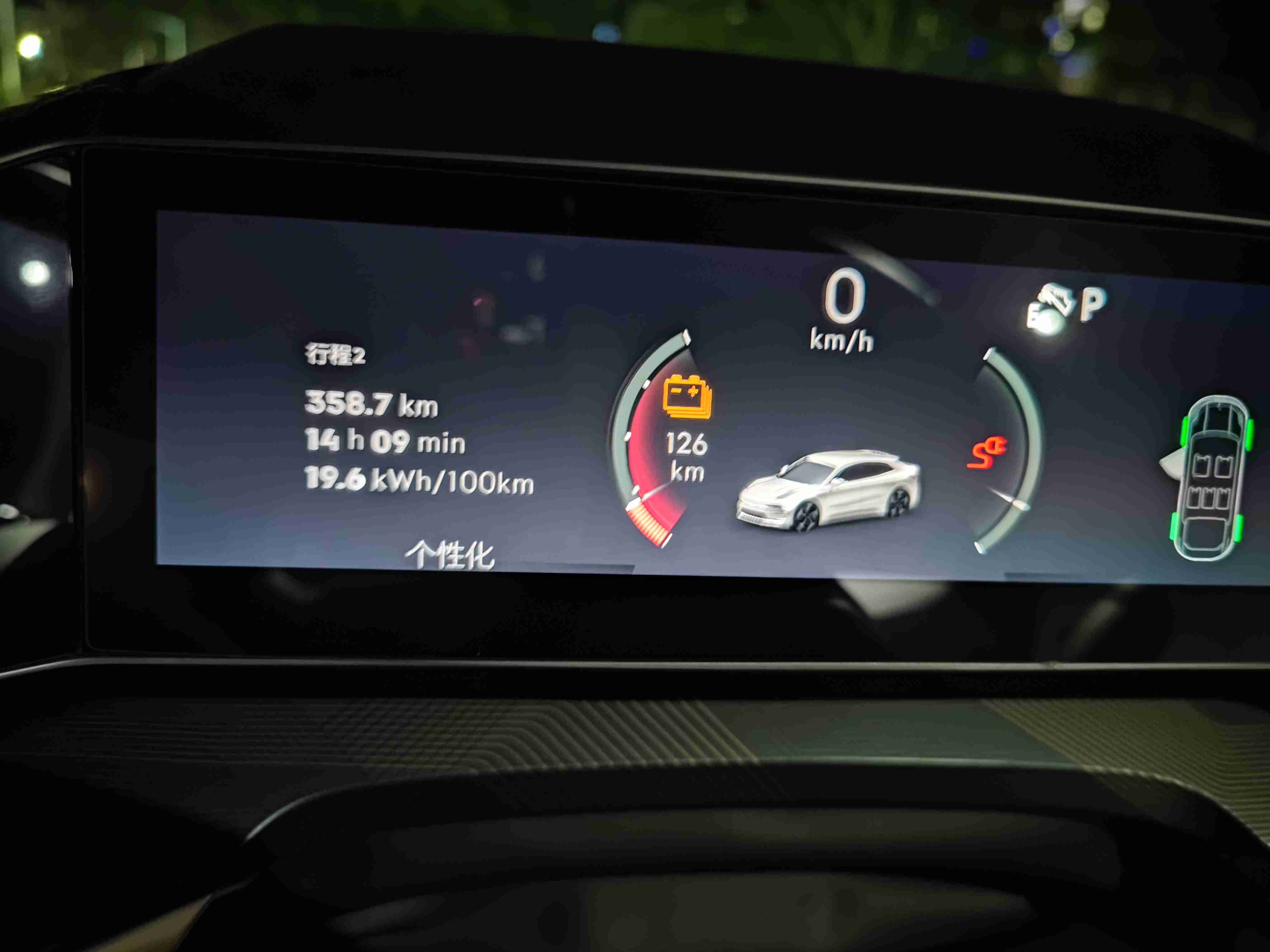
 The charging interface is more intuitive than before. Comparing before and after, the changes to the entire charging interface dashboard are significant.
Areas for improvement:
-
Can the display of gears be directly shown as the current gear, without having to display PDNR on the dashboard and occupy space?
-
The energy bar in the current version is made too thin and small. Although the output and recovery are distinguished by color, can it be changed directly to a digital form? Use positive power for output and negative power for recovery.
 3. When LCC is not turned on, can the speed icon of LCC not be displayed since it has no actual meaning when not in use?
- It is suggested to add an icon for automatic windshield wipers on the dashboard, with the recommended location being beside the light icon. I often forget whether I have turned on the automatic windshield wipers.
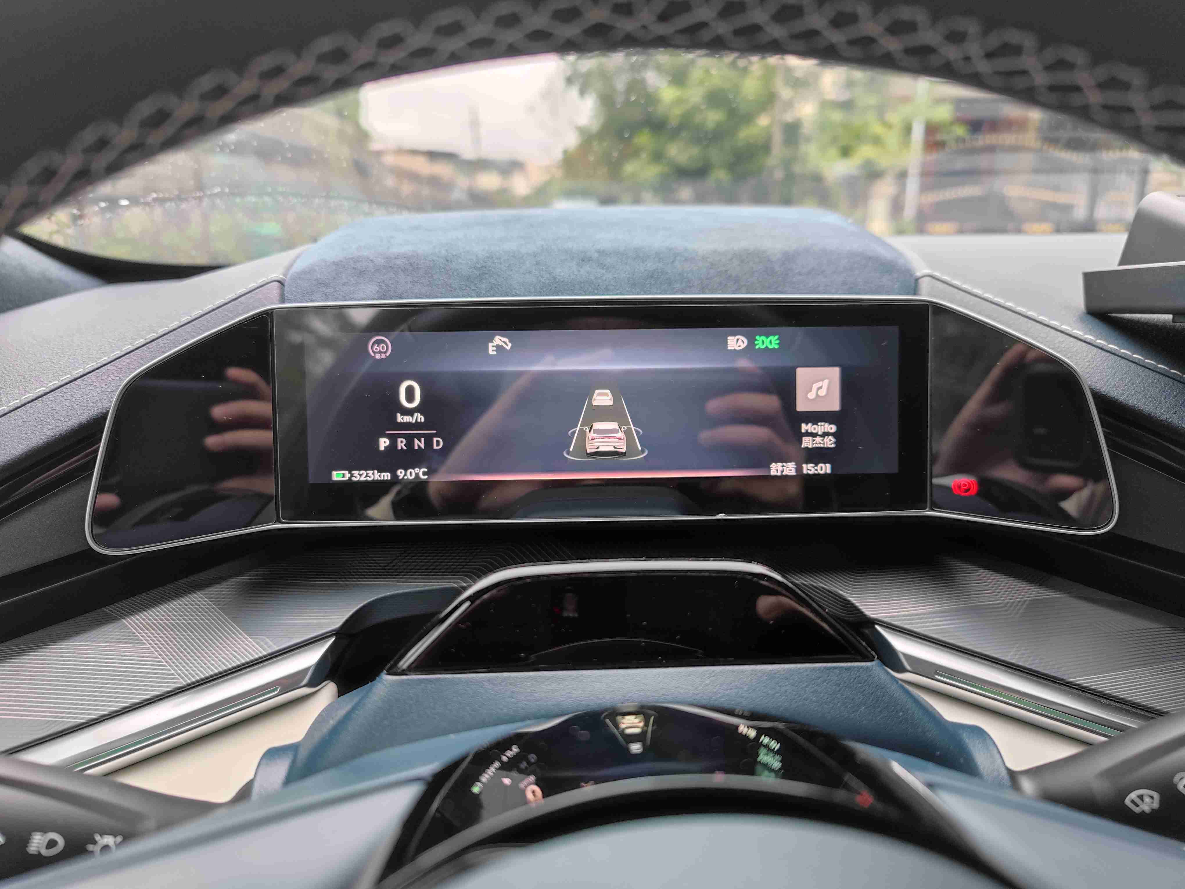 5. The multimedia does not display album cover lyrics, and the mileage display has a solid black background, which looks very abrupt.
-
In the off-road mode, the vehicle’s horizontal and tilt angles in the lower right corner are too small and difficult to read while driving.
-
The interface changes between different modes are not significant, making it easy to confuse which mode one is driving in.
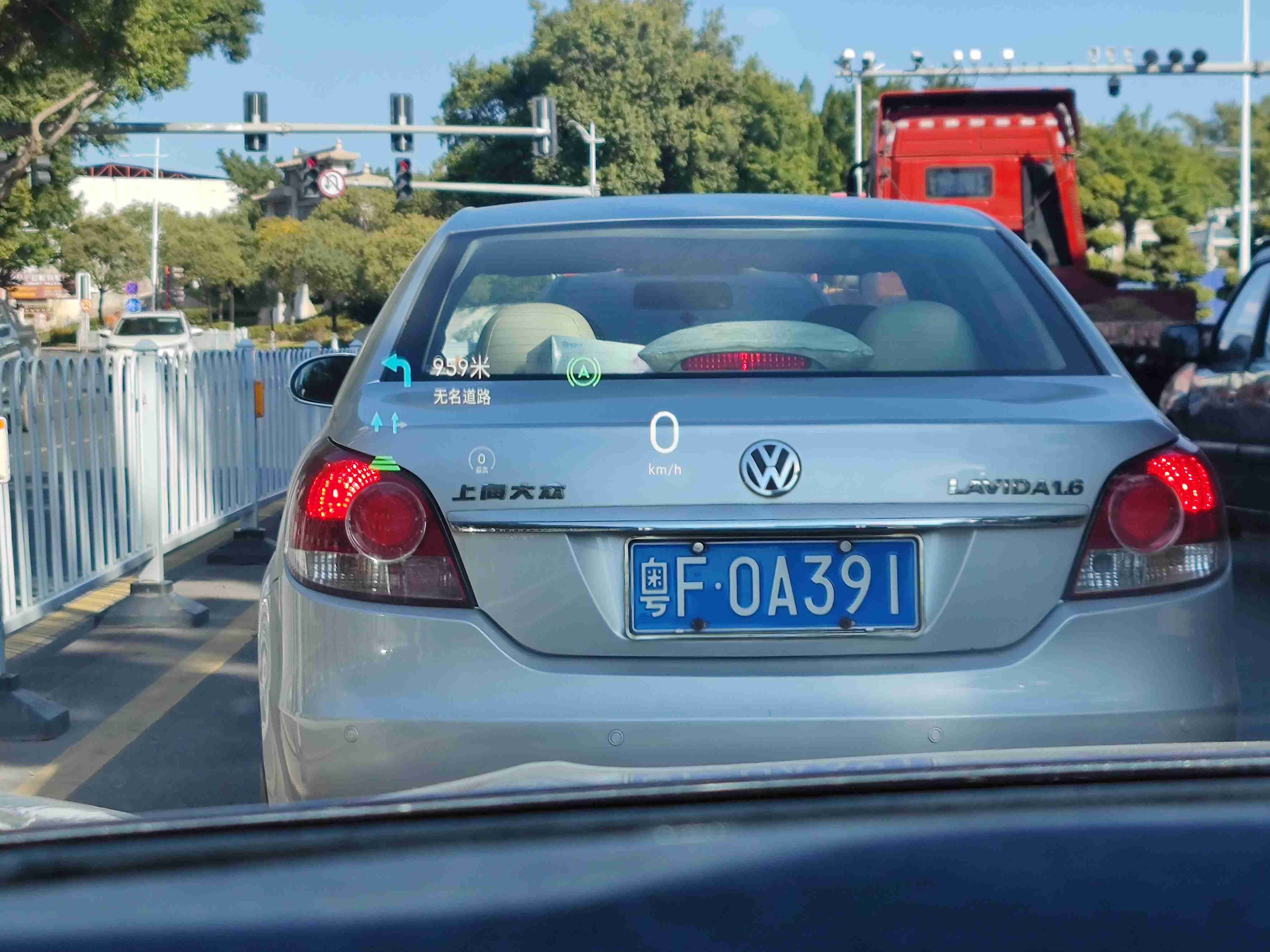 In terms of HUD, my first impression was that the speed font became larger. The problem is that the LCC speed icon displays throughout the journey, just like the dashboard. When not in use, it is gray; when in use, it is blue. If exited halfway, the speed icon will appear gray. When a vehicle ahead is detected, regardless of whether LCC is turned on, the distance icon will appear, but it will not change as the distance shortens, only showing that there is a vehicle or not. The navigation information is more comprehensive and visually appealing, which is commendable.
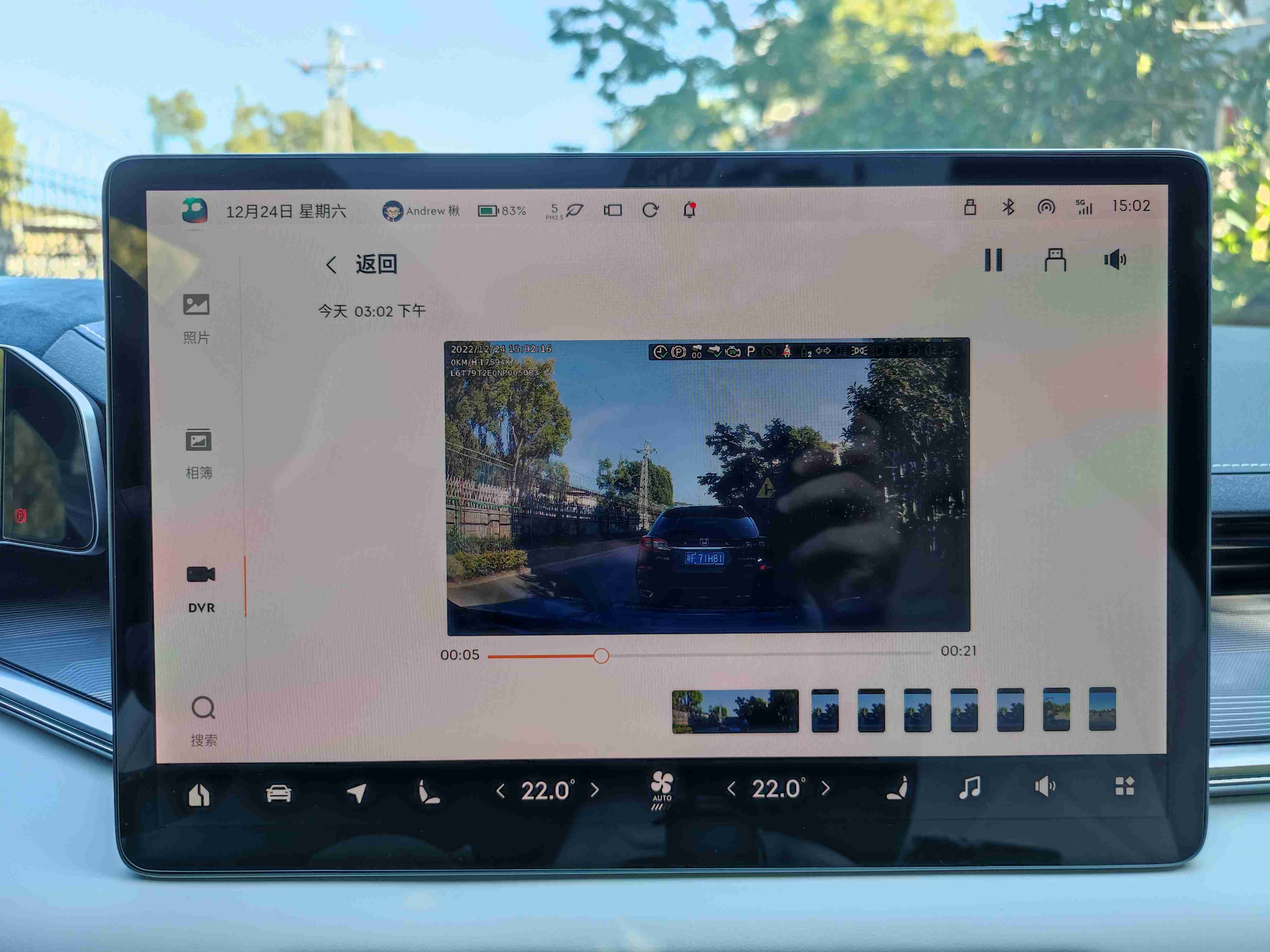 In this version, the driving recorder can directly import images to the U disk without the need to pull out the card from the glove box.
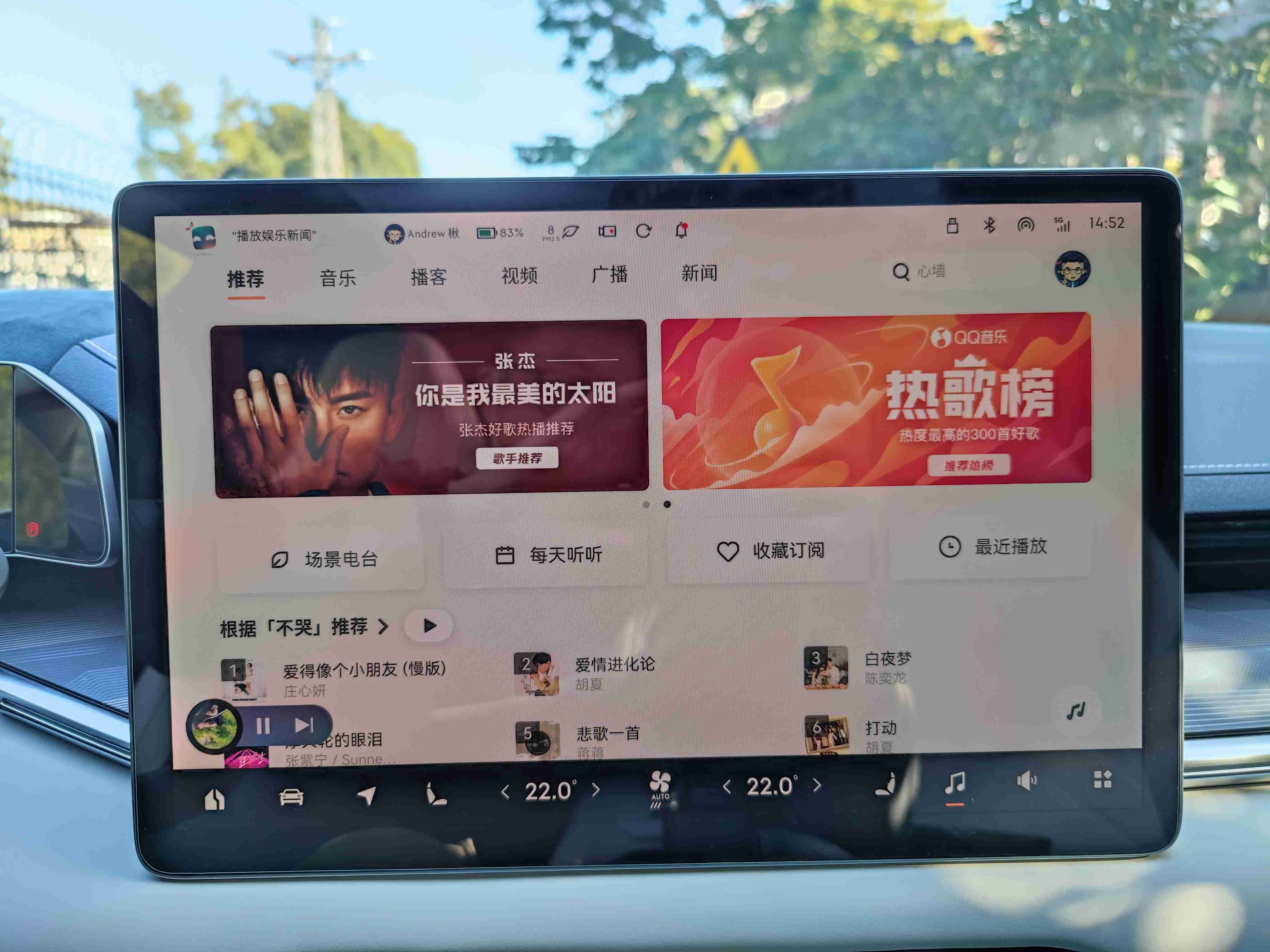 AIQUTING has also been upgraded with this version. The UI interface has also undergone major changes. I found that the personalized FM of the scene radio is actually the previous personal FM. It will push the songs you like based on big data, and it will directly call your favorite songs. The songs in the QQ music collection can be found in the collection subscription.
I even found YAMAHA’s exclusive area in AIQUTING, which is very cool.
Some minor changes that I don’t care about:
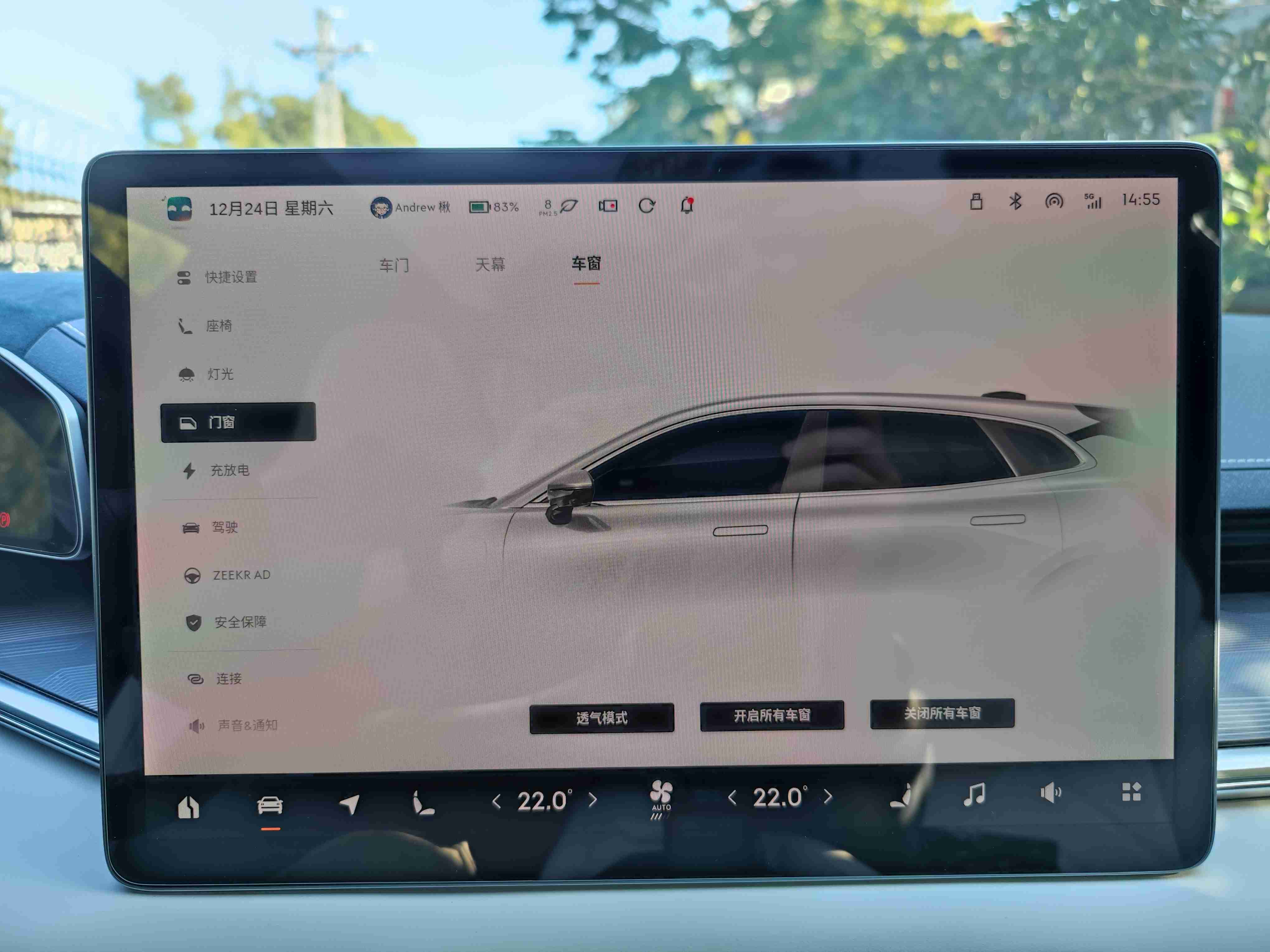 1. In the vehicle control window interface, the window size cannot be adjusted by sliding your finger.

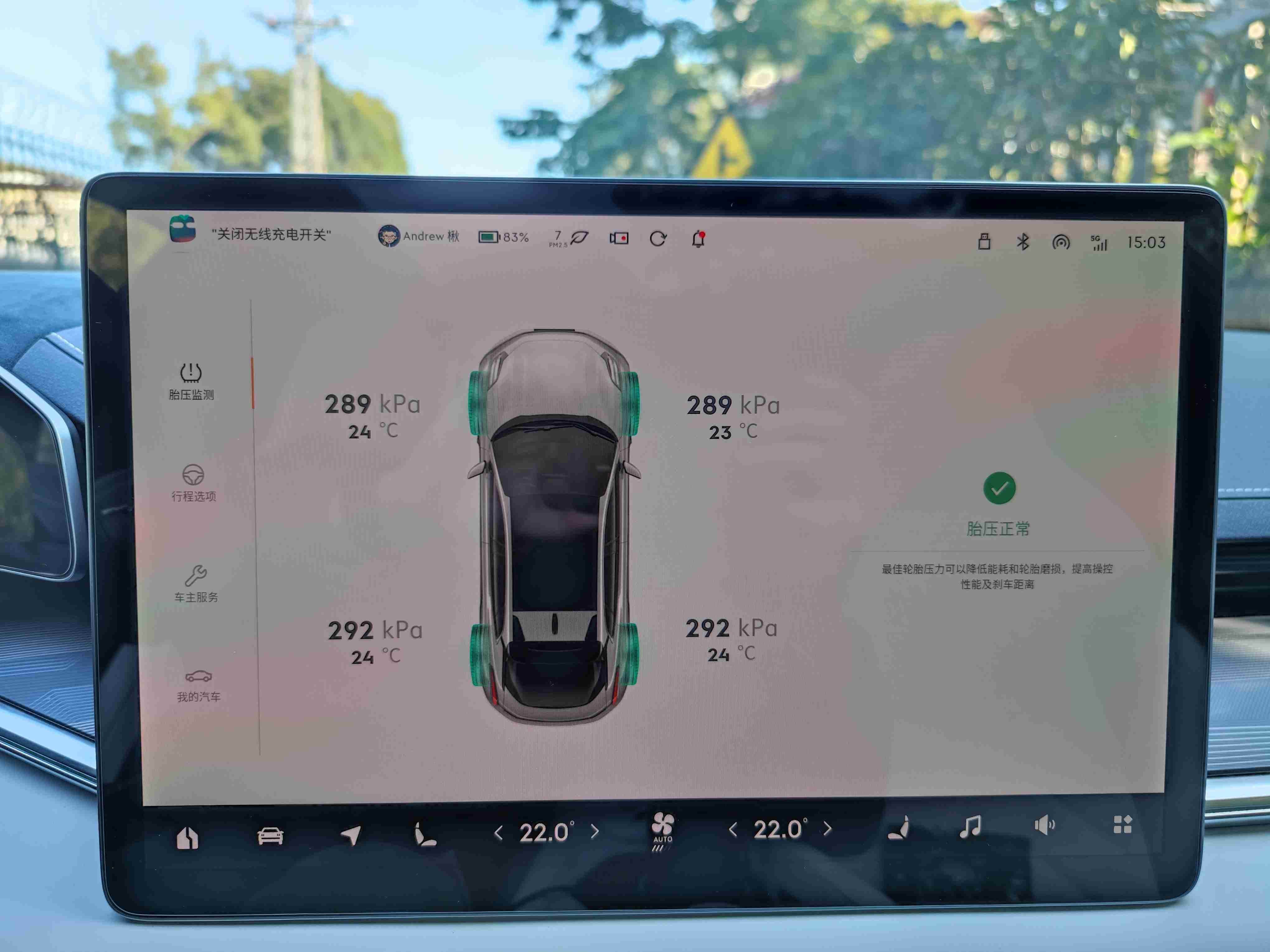 2. In the vehicle control-driving options, you can see the tire pressure value. My car’s tire pressure monitoring system can also see the tire pressure value, which may be redundant.
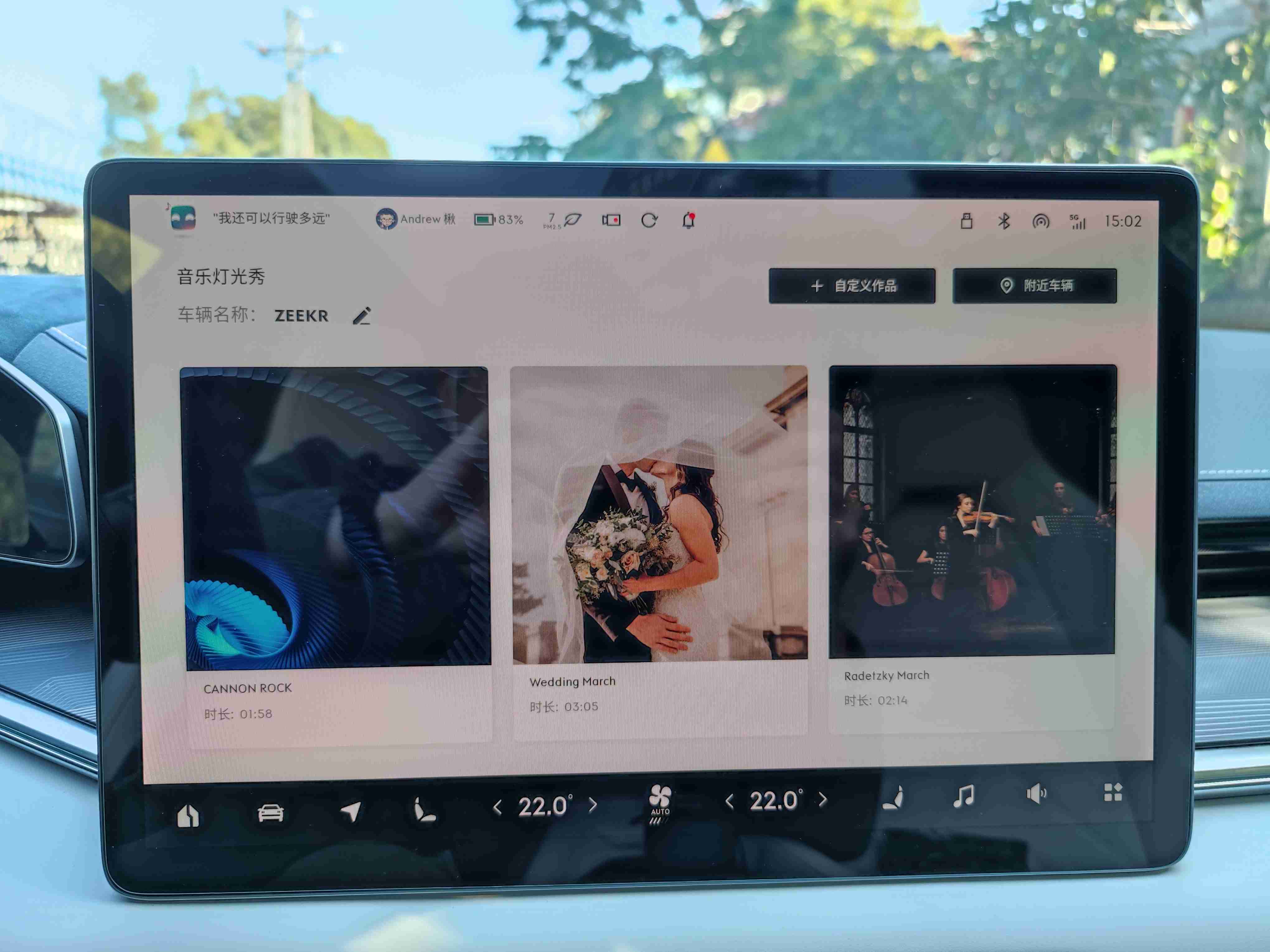 3. A march, “Radetzky March”, was added to the Music Show. Let’s try it out with friends at the next party.
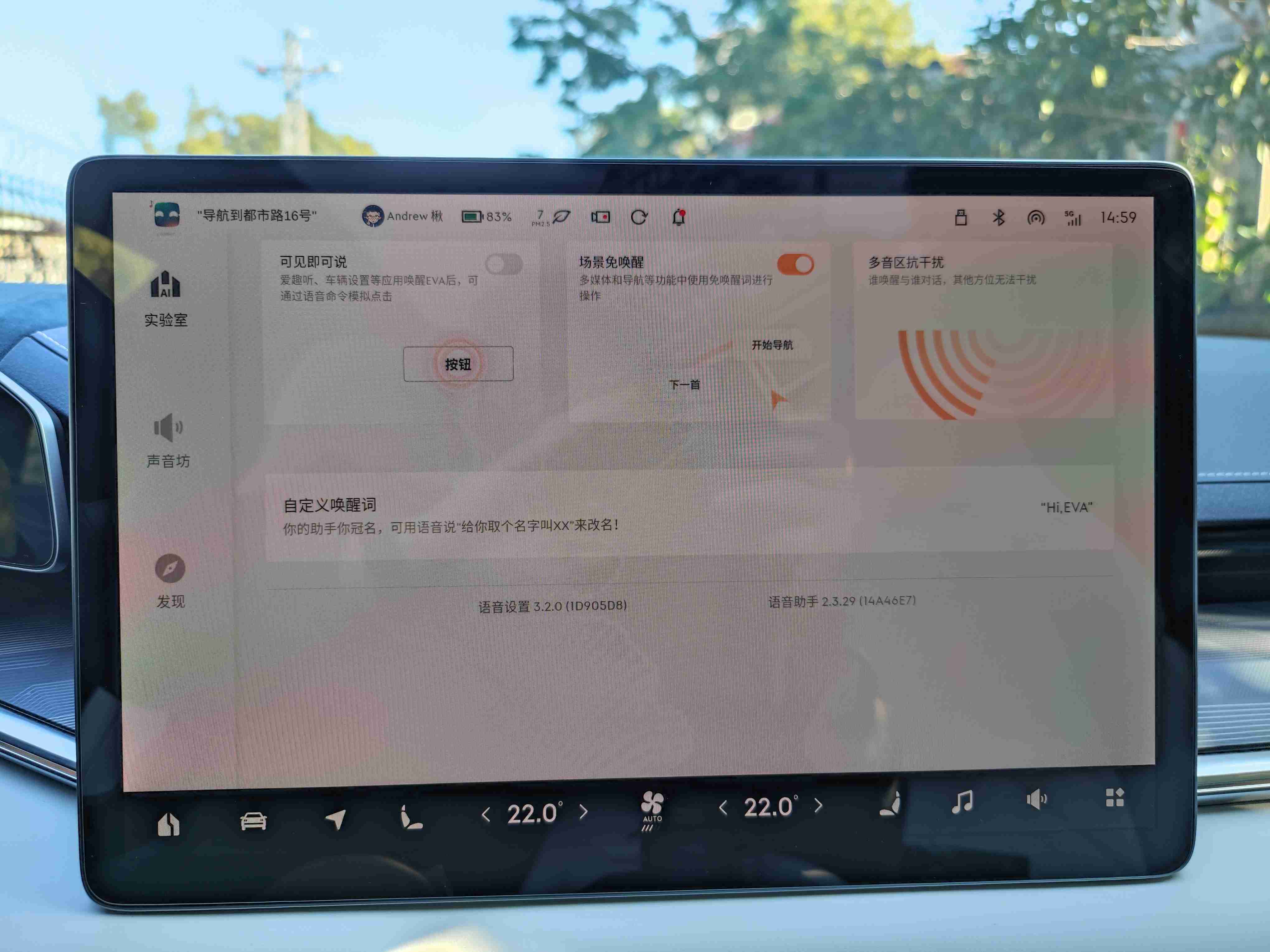 4. The “visible and speakable” function in the EVA voice still requires a lot of effort. The false operation rate is relatively high. I forgot what I said when chatting with others while waiting for parking in the car. Suddenly, the trunk was opened and directly scared me. This function has been permanently put into the cold palace.
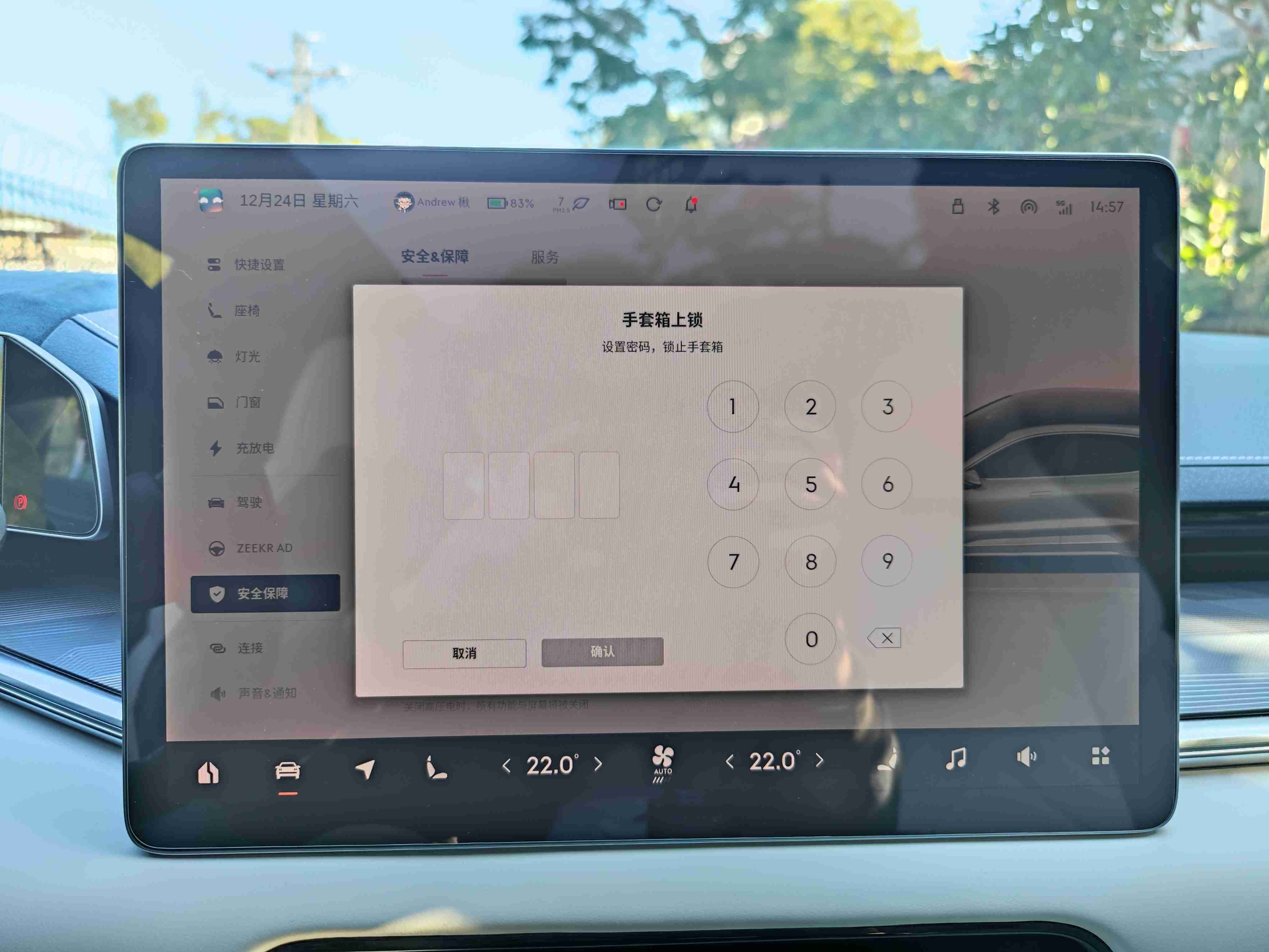
- The glove box password is no longer one-time use. Once you activate this feature, it will be permanently valid, regardless of whether you park for a long time or restart the car.

-
I didn’t quite understand how to customize the Music Show feature, and I have always selected the Music Show option for the ambient lights. After the update, I tried sliding the color bar but it didn’t seem to work and I couldn’t operate it.
-
The electric door has indeed been optimized. It will no longer open a gap and pause before continuing to open, but will smoothly open to the maximum position as long as the system recognizes that there are no obstacles.
-
The seat massage mode can now be retained. After the car system enters deep sleep or is restarted, the massage mode will not return to the default wave mode, but the intensity can be selected by the user.
-
The link between the convenient entry and exit seat and steering wheel is finally working properly. The situation where the seat moves but the steering wheel doesn’t is no longer happening.
-
The memory seat function is a bit strange. Most of the time, it can automatically adjust to the correct position as long as it recognizes the user’s face. Occasionally, it still malfunctions. My solution is to select the second memory group when this happens, and then switch back to the first group.
Rome wasn’t built in a day. I never expected that JIMI would make such a big change to the interaction interface on the first anniversary of delivery, which means that old users have to pay the cost of learning again. As the first version after the big change, I am satisfied as an old car owner. I see the sincerity of the official team. I hope that they will always stick to their original intention, carefully listen to user feedback, and implement good and actionable suggestions in future updates. Let’s create a better JIMI together.
This article is a translation by ChatGPT of a Chinese report from 42HOW. If you have any questions about it, please email bd@42how.com.
