Article written by Zheng Wen
Edited by Zhou Changxian
In 2012, Tesla delivered the first batch of signature Model S P85 in the United States, which surprised people not only with its nearly $100,000 price tag but also with its 17-inch vertical touchscreen center console.
This tablet-like center console takes control of all functions such as air conditioning, in-car entertainment, rearview mirrors, lighting, wipers, etc. Aside from the physical switches required by regulations such as emergency lights, there are hardly any physical buttons in the car interior.
People exclaimed, can a center console be designed like this? Some people think that it is a huge mistake as it is a design that is abrupt and poses a driving safety hazard. Meanwhile, some people think that it is the most significant embodiment of automobile “smartization” and shines with the spirit of geeks.
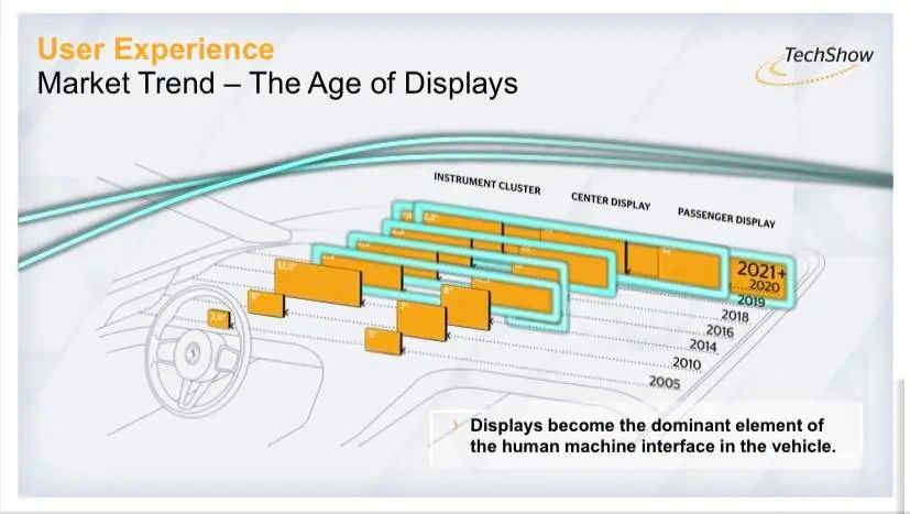
Tesla single-handedly set off a massive trend. Since then, whether you like it or not, the trend of glass cabins has become more and more intense, and debates have never stopped. It gradually evolved into two factions: the “multi-screen” faction and the “no-screen” faction.
At the market level, the voice of the “multi-screen” faction soon became the mainstream in the market. OEMs are racing to launch “big screens” and “multi-screens” products to catch up with the trend of “smartization.”
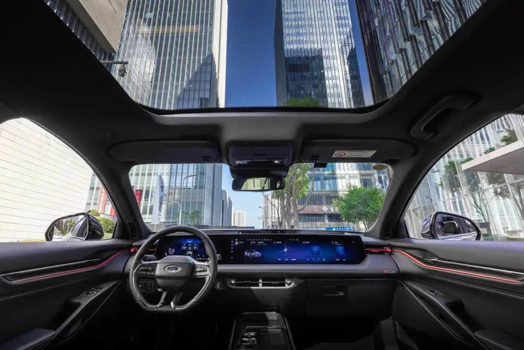
At the same time, addressing issues such as misoperation, poor experience caused by screen sensitivity, driving safety hazards caused by the inability to operate blindly, and a bunch of problems such as car machine freezes and voice recognition that resembles “intellectual disability” are being continuously resolved by the industry through methods such as optimizing processor chips, updating screen materials, and simplifying the UI interface.
One
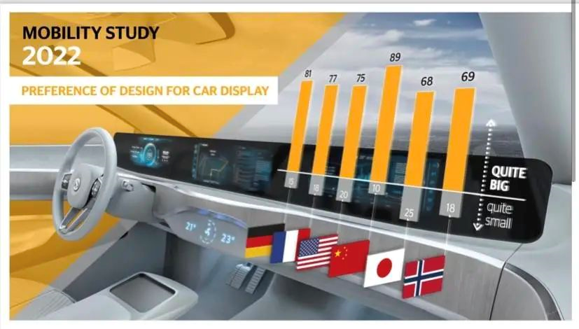
This year, Mainland Group conducted a survey on the acceptance of ultra-large screens. Thousands of users from six major countries in Europe, America, and Asia participated. The survey showed that regardless of the country, all users like large screens, and it is more prominent in the Chinese market. The survey also showed that the display screen will develop towards the direction of large screens or multi-screens in the future.
In fact, the market is flooded with “multi-screen” products. For example, the three-screen central control of Mercedes EQS is 56 inches and 1.41 meters long, with a 12.3-inch interactive screen installed in each front seat; Weima R7 comes with a 43-inch wide-color three-sided screen; the Voyah FREE also comes with three 12.3-inch three-sided screens…
 This summer, with the soaring temperatures, the “multi-screen” faction’s carnival has reached a new high. The Ideall L9 is equipped with five interactive and interconnected screens, including the HUD + steering wheel instrument panel screen, the central control copilot dual screen, and the 15.7-inch rear OLED entertainment screen, in an attempt to meet consumers’ demands to the utmost.
In an interview program, He XPeng, the founder of XPeng Motors, said, “I am firmly against having many screens in cars. The basis of having many screens is that there are many people in the car, but for a car, how much time and how many people are in it multiplied by a ratio, using different screens, input-output ratio, there is not much value.”
According to He XPeng, having many screens in the car consumes a lot of power and affects the vehicle’s endurance. This statement timely reduced the temperature of the “multi-screen” faction.
In addition to the reasons mentioned by He XPeng, another undeniable fact is that a large amount of information needs to be processed and displayed in increasingly fashionable, interconnected, and future automated driving vehicles. However, not all of the displayed messages are necessary at the moment, and some information may even lead to distraction and endanger driving safety.
Foreign research has shown that a large amount of information displayed can cause information overload and distract drivers. The Times invited the executives from the five best-selling American automobile companies to discuss how to prevent driver information overload caused by distraction in today’s intelligent era.
As it turned out, the executives refused to be interviewed, which was a bit awkward.
As a staunch supporter of the “no-screen” faction, at the NIO Day at the end of 2021, NIO founder Li Bin stated that the ultimate goal is to eliminate screens in the car and replace physical screens with AR and VR glasses. In fact, Audi, Mercedes-Benz, Porsche, and other automakers are also leaning towards the AR/VR development direction.
The panoramic digital cockpit PanoCinema released by NIO ET5 has applied AR/VR devices to the car end for the first time, but it only achieves the viewing experience combined with the cabin entertainment system in a stationary state.
Li Bin told the media that NIO had reservations about using the central control screen in 2015, but due to the immaturity of various technologies at that time, they were forced to return to the central control screen route.# 何小鹏 and Li Bin
One is outspoken, the other is bold and imaginative, but neither has come up with a dazzling solution. Li’s words inevitably fall victim to ridicule: “Don’t easily define the products that you have never even used.”
Two
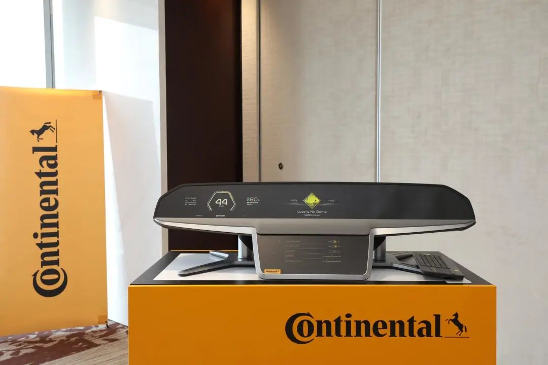
In the summer, the mainland group seems to have ignored the industry’s debate and quietly presented a new product concept: ShyTech displays.
“Our ShyTech display heralds the beginning of a new era. It is a microcosm of the future cockpit: digital, immersive, and concealable.” said Hua Lanchao, head of user experience at the China division of the mainland group’s UX business unit.
Strictly speaking, ShyTech is still a large screen, but it tends to be “screenless” from the fusion of minimal interaction and design sensibilities. Behind this concept lies the idea of simplicity and clarity.
At the beginning of the design process, the mainland group’s developers asked themselves two key questions: although the display is very large, how can they prevent sensory overload of vehicle passengers and drivers? And how to deal with those unused display areas in some situations?
The solution of the ShyTech display is to make the display and control screens disappear magically beneath the surface of wooden or leather appearances through streamlined design, displaying information only at the best visual quality when needed. As potential interference is actually hidden, ShyTech display enhances user-friendliness and safety for driving.
The surface design of the display can simulate the appearance of the dashboard area. Depending on the configuration, it can be a wooden panel, a carbon fiber panel, or a leather-covered panel. It not only looks like these materials but also feels like them. Moreover, the screen can be placed in almost any position inside the car.
In this way, the mainland group realized a minimalist and pure interior design that retains only the necessary elements, solving the problem that large displays with no content are difficult to coordinate with the design of the cockpit.
Specifically, this means that the gauges, navigation, or other display information on the dashboard “looks like they’re made of a whole piece.” Although the menu on the touchscreen is always available, the display and control on the screen will only be activated when the hand approaches. At the same time, you can also activate the screen by voice control or a brief touch on the surface of the screen.
“This can achieve cool and simple interior design, which can simultaneously integrate a large number of new features without giving passengers and drivers a headache.” said Hua Lanchao.In addition, this system includes a special backlight design and combines LCD panel and decorative surface to display content with ideal brightness and sharpness under every lighting condition, from dazzling sunny days to rainy days. The sharp display of the screen also leaves a deep impression on people due to its high contrast value. It is reported that this kind of display screen will be put into mass production in 2023.
However, the effect of the production application of this solution in terms of resolution, clarity, error rate, smoothness, and others still needs to be observed.
Hualan Chao stated that the demand for screens in the Chinese market is still quite diversified at least from the current observation, and there is no absolute mainstream direction in terms of functionality and styling.
“I personally don’t like big screens or too many screens. I prefer a design with a sense, just like a living room that feels warm and modern when sitting in it,” he said, “Everyone has different styles, and if you like this kind of feeling, you don’t need to have many screens.”
Finally, let’s talk about a point that few people pay attention to. Li Bin previously revealed that the car central control screen with the widest black border, which was most criticized and reflected the most from NIO automobiles, is currently the No.1 complaint.
Of course, this design is not beautiful because it is caused by the requirements of the car level. In response to this situation, Yu Daohe, the Chief Engineer of the User Experience Group of Continental China, told “Outing Hundred-People Conference / AutocarMax” that the continent has optimized the screens from a technical point of view through direct purchase of screen modules for mass production applications, and the frame border has been reduced to less than 1 centimeter.
In addition to the ShyTech display screen, the Continent Group has also proposed other innovative solutions, such as the smart privacy display screen. With a gentle touch of a button, the light distribution can be switched, making the content invisible. As a result, dynamic display of vehicle information can be achieved, which can be displayed in privacy mode or in a mode visible to everyone.
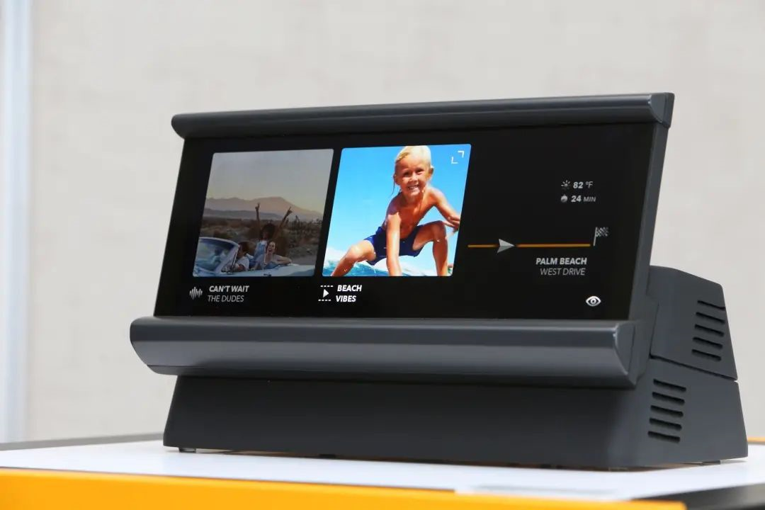 According to the introduction, in the exclusive mode, the light emitted by the exclusive screen enters the driver’s field of view by less than 1%. The product will be launched in 2024.
In conclusion:
Zhang Junyi, the director and partner of Aurora Consulting, said that the industry is still in its early stages of development and has not yet formed true industry standards and final forms.
Yu Geelyang, the user experience designer of Fairy Bean Intelligence, boldly judged that the future of smart cockpits is data-driven screenless interaction. “What is the best interaction? The UI interface is invisible, and the AI UI based on data-driven is the best when it disturbs lightly and comes and goes.”
Undoubtedly, the debate and practice between the “multi-screen” and “screenless” factions will continue, and it will only be judged by time and verified by the market which side the balance will tip toward, or what kind of balance will be achieved.
This article is a translation by ChatGPT of a Chinese report from 42HOW. If you have any questions about it, please email bd@42how.com.
