Translation
Title: The Return of Physical Keys: the Story of Changan Tank 300 and the Smartphone
It seems that few people realize that the so-called full-touchscreen smartphones in their hands also have at least three physical keys.
In the area of the car’s center console, touch operations have invaded overwhelmingly, and physical keys have been defeated. This has become an undeniable rule over the years. Those who question this are the vested interests and old diehards who obstruct human beings’ entry into the new era; those who do not follow the trend are like Stephen Elop’s predecessors who want to do the second.
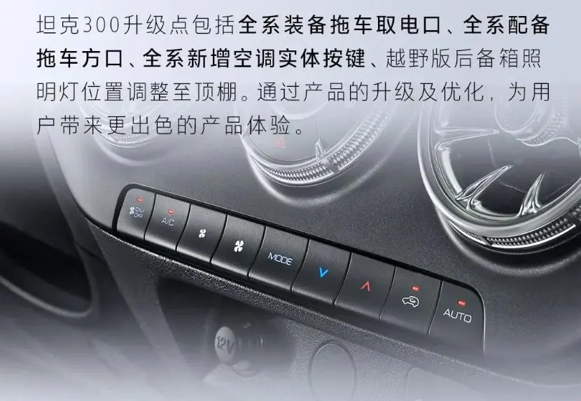
In September of this year, new cars flooded the market, and even the annual minor update of the Tank 300 went unnoticed among them. Normally, annual facelifts are not worth mentioning, but this time, it is said that the new Tank 300 was specially equipped with a row of physical air conditioning keys in response to customer demands and requests. It will even provide retrofitting services for old car owners.
The move is minor, but this is probably the first example in mainstream car models in China that moves from full touchscreen to physical buttons in reverse.
Smartphones Haven’t Killed Physical Keys
Today’s mainstream consensus, whether it is considered conservative or innovative, almost always assumes the same premise: touchscreens and physical keys are a pair of mutually exclusive conflicts, just like what smartphones experienced in the past. However, the addition of physical keys to the Tank 300 has not affected the central control screen at all…
Although I, Aohu, have always regarded the comments that simply and rudely compare cars and mobile phones as shit, regardless of how influential their supporters are, since we have to draw analogies, why don’t we do it more comprehensively?
The full-touchscreen smartphone, which is widely regarded as the “reference system for car entertainment development,” has now matured and aged to the point of being a sunset industry. However, the lock screen and the three physical keys for increasing/decreasing volume are still solidly on almost every smartphone, and the iPhone even insists on having an additional mute switch.
Perhaps many “smartphone analogy enthusiasts” in the automotive industry do not know that since the birth of the first generation of iPhone in 2007, there have been multiple attempts to eliminate physical buttons on smartphones; however, these attempts have all ultimately failed.
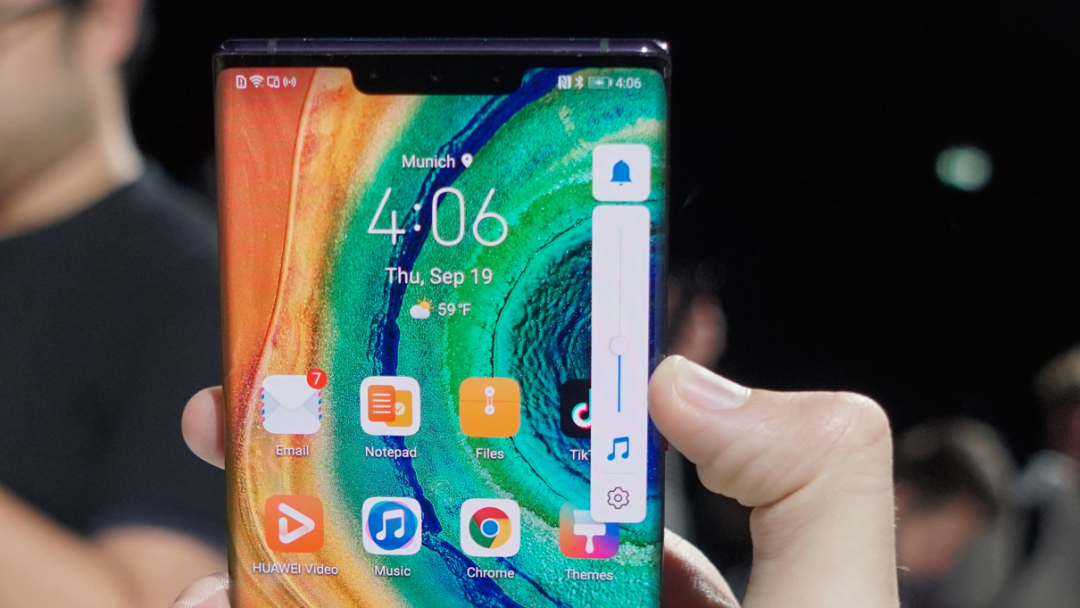
The most well-known of these is the Huawei Mate30 Pro, which “innovatively” eliminated the physical volume keys in 2019 and replaced them with a virtual touch volume bar. As a result, its poor practicality was widely criticized, and the design without physical volume keys ended with the first generation and has not appeared in Huawei phones since.Removing the Meizu Zero, which has no physical buttons, when it comes to the broader consumer electronics field, Apple introduced the Touch Bar for the MacBook Pro in 2016. However, in 2020, the ESC key was separated as a physical key, and when the mold was replaced in 2021, the Touch Bar was abandoned entirely in favor of physical F keys.
Therefore, do we still need to use digital terminals to explain the development of car infotainment systems? Sorry, even digital terminals have just experienced a transition from “looking beautiful” full-touch-screen to a normal, rational, and balanced return.
That means, even if we force the comparison between cars and phones, using a symbol representing “an analogy can be drawn without analyzing specific problems,” (under the above assumptions) intelligent phones have never given a signal of “full touch screen can take care of everything.” Even if we must find a signal, this signal should be the exact opposite instead:
If a touch screen phone, which is much more mature and powerful with linear motors and allows 100% attention from users without jeopardizing their safety, cannot eliminate all physical buttons, then why should we expect car infotainment systems to do so?
The logic of the intelligent phone does not support such an expectation. Thus, denying this irrational comparison, we can explore the differences between the touchscreens of car infotainment and full touch screen phones independently. The answer may be complicated, but one of the decisive factors is simple: car cockpit design never requires maximizing the display area in the entire physical space, while phones do.
To put it in simple terms, the benefits brought by the full-screen smartphone are far greater than making the entire car central control panel into a screen. With intelligent phones, each additional inch of display area in a palm-sized device brings a qualitative change in user experience (so the remaining physical buttons are all on the side), whereas the car’s central control screen cannot occupy the entire cabin, and the space occupied by a row of physical buttons has little impact on screen display.
All of this is relatively easy to understand.When it comes to reality, you will easily find that hardly any fully touchscreen models in the automotive industry can accommodate a row of physical buttons. Even for a giant screen design like Model 3, if a row of buttons is added around the screen, even if the corresponding screen display area is directly reduced, the negative impact on the screen display and functions is almost negligible.
The intelligence and user experience of intelligent cockpits naturally require large-sized touch screens as the foundation. However, when the touch screen area has reached more than a dozen inches, whether it is 14 inches or 15 inches, it has no impact on the real user experience of the intelligent cockpit.
To be blunt, today’s intelligent cockpits may need to reflect on themselves. Is the lack of that one and a half inches of screen space really the bottleneck for the intelligentization of the car? If you remove all the physical buttons and give you a touch screen one inch larger, what can today’s intelligent cockpits do?
Purely fictional life and death
At this point, it is necessary to repeat the words at the beginning. Physical buttons and touchscreen operations have never been mutually exclusive replacement relationships. There is no one who opposes full touch screen and hopes to replace all 14-inch touch screens with 10086 physical keys. The spatial layout of the car cockpit is far from a tense situation where you have to choose between two.
Do not be kidnapped by the mainstream tearing arguments on the market, as if acknowledging full touch screens cannot accommodate physical buttons, and as if calling for physical buttons means giving up large touch screens. There is no pressure of swords and bows between these two operating modes, and what we are discussing is not “large touch screens or physical keys”, but “large touch screens (whether or not) plus physical keys”.
Voice recognition is often reflexively seen as a reason to abandon physical buttons. But referring to smartphones, who would leave the lock screen button unused and instead shout “Hey Siri, lock the screen for me” for no reason? When the co-pilot answers the phone, you cannot summon a voice assistant to mute the stereo in 0.3 seconds; when the rear seat falls asleep in music, you cannot use voice to lower the volume of the vehicle without disturbing others.
Voice assistants are sometimes effective supplements, but not the ultimate “solution to all problems.”

So the question is, since all existing non-touch screen operating methods, including voice and even gesture, cannot replace touch screen operation in all scenarios, in the objective context where the reintroduction of physical buttons has little impact on large screens and intelligence, is it necessary to reconsider setting some physical buttons? This is the proposition we want to discuss.Assessing the benefits of physical buttons must be considered. As it is known, physical buttons have theoretical advantages over touch screen operations in terms of being less error-prone, allowing for blind operation and reducing attention transfer, thereby providing convenience and safety benefits during driving.
In August of this year, the Swedish media “Vi Bilägare” published a test result in which they took some vehicles traveling at about 110 km/h and recorded the time it took for the driver to complete a series of functional operations during the recording period. This test was not specifically for full touch screens, and some models have physical buttons or touch controls outside the touch screen.
As a control group, the old car Volvo V70 without a touch screen system, the driver completed four operations only by physical buttons in 10 seconds. While most new cars equipped with touch screen systems (not necessarily full touch screens) took 20-30 seconds, the MG Marvel R with the largest touch screen was the worst performing, taking 44.6 seconds.
Similar tests have been conducted before. In a 2020 research report, the UK charity organization IAM RoadSmart found that the reaction time of drivers to road conditions increased by 57% and 53% respectively when using Apple CarPlay and Android Auto touch operations. Choosing CarPlay and Android Auto, the two major universal systems, was to avoid the interference of different car machines on the test results.
What is more alarming is that IAM RoadSmart found that completing an operation actually consumes 12 seconds of a driver’s attention, while the driver’s subjective perception is only 5 seconds. According to the test results, taking out a phone to send a text while driving is safer than using a car touch screen. People’s intuition about the safety of touch screens is not groundless.
Touch screens, compared to physical buttons, undoubtedly require more energy from the driver, occupy attention on the road, and objectively have a negative impact on driving safety. However, it does not mean that we should sacrifice the intelligent future brought by large touch screens for absolute safety.Actually, it is possible to greatly reduce the risk of operating a touch screen while driving by designing a limited number of essential physical buttons, thereby diverting the attention of operating the entire car’s system to an acceptable level. However, physical buttons cannot be randomly arranged; the most reasonable function settings need to be scientifically identified in order to enhance rather than reduce safety.
For consumers, the addition of a small number of physical buttons almost does not require any loss from a gain-loss perspective, as it has little or no impact on the vehicle’s intelligence or the size of the central control screen. However, the benefits obtained greatly enhance the safety and convenience of daily high-frequency operations.
Anti-trend Solution that Exists Long Ago
The new Tank 300 is the first example of a trend in reversing an entirely touchscreen-oriented design. However, if you glance through today’s gallery of automotive models, from traditional car manufacturers to new players, from fuel vehicles to electric vehicles, there is little novelty in the combination of touchscreen and physical buttons in interior design. The difference is only in the quantity and category of physical buttons.
Full-touchscreen solutions often dominate the market with the mistaken perception that they are the current trend. From the perspective of car manufacturers, minimizing physical buttons is desirable. Interior design can be easily streamlined, and ergonomic considerations for physical buttons can be assigned to UI design; reducing movable components improves supply chain management and after-sales service; responding to consumers’ preferences for technological innovation earns a name for taking user opinions seriously.
Touchscreen technology has always been an effective cost-cutting method, including touchscreen display and touch-sensitive buttons. Honda has designed two versions of interior control for the Fit, a high-end touchscreen version, which we are familiar with in domestic versions with several touch buttons on the screen’s side, and an overseas version featuring physical buttons and knobs, which appears to be more nostalgic to us.
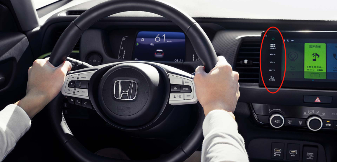
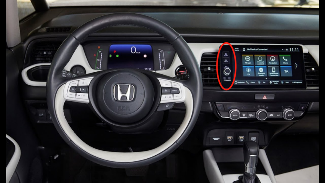
This difference is also the result of global automotive manufacturers responding to different regional consumer preferences. However, as the price positioning arrives at models such as the Civic and the Ziyoujian, with higher-end models, the domestic version has adopted physical buttons and knobs, which are consistent with the overseas version. It can be easily imagined which of these two operation modules has higher or lower costs.
The most “conservative” (relative to the current trend of full touch screen) hybrid solution, such as the GAC Trumpchi GS8, has only two physical switches (excluding hazards) located beneath the central touch screen: automatic air conditioning and front windshield defogger. These two physical buttons coexist with the central control touch screen.
These two physical function keys are obviously the decision made after weighing and screening in extremely limited space. The air conditioning switch belongs to a high-frequency operation, while the windshield defogging is obvious: when the windshield is fogged up, it is better not to distract the driver to find the defogging switch in the touch screen system.
Admitting that the maximum display area of the large touch screen needs to be maximally retained, the spatial arrangement of physical buttons usually has at most a row of less than 10 (not including the central console, gear lever, skylight, and other areas). So, if you want to pick some functions out of the touch screen system and assign them to physical buttons, the main considerations when selecting functions should be twofold:
The first is high frequency, such as air conditioning switch and volume adjustment; the second is urgency, such as mute key and air conditioning defogging. The former doesn’t need much explanation, the frequency of use is high, and the cumulative convenience brought by physical buttons is greater; more importantly, the latter, although the frequency of use is not high, once needed, the driver’s reaction time is very short, which is more prone to panic and mistakes, that is, the single convenience advantage brought by physical buttons is greater.
In the previously mentioned Vi Bilägare’s test research, except for the old car V70, the best-performing Volvo C40 and Dacia Sandero, the total use time of the four functions is only about 3 seconds more than V70’s 10 seconds. Both of these models have a large touch screen and a small number of physical button operations, and the touch screen UI design is also relatively simple and clear.

Drivers who have never driven vehicles with physical buttons (whether it is full or partial) may not be able to understand the inconvenience of relying solely on touch screen operations or realize how much extra attention they have to pay when operating through touch screen. But this does not mean that the corresponding inconvenience and risks do not exist.
It is precisely because there are still certain problems with the full touch screen, people have been looking for ways to make up for it. For example, touch vibration solves the feedback problem, and sliding operation partially solves the positioning problem, but as long as the science fiction touch screen technology that can create tactile differences does not exist, the advantage of physical buttons requiring less attention, that is, the advantage of blind operation, will continue to exist.
It seems that Toyota’s introduction of the Yaris and its large-screen navigation instead of VVT-i as a breakthrough point more than ten years ago began to embed the tone of “screen is precious” deeply into our genes. The following mobile internet and smartphones further confirm this preference setting. Once the screen is seen, the genes are activated.But the trend of single full touch screen has been loosening for years. Adding physical buttons is a trouble for car manufacturers unless there are enough users calling for it. Therefore, the fact that Tank 300 has actively added physical buttons and promoted them can prove that the real need for physical buttons is gathering again, so that car manufacturers are motivated to take actions.
The world will not always move forward in one direction, otherwise, blindly running with eyes closed would be enough to reach the end. The trend of touch screen and intelligent cockpit cannot be reversed, but at least at this stage, abandoning physical buttons completely and relying only on full touch screen and voice control has come to a point worth discussing and considering.
Of course, we are not discussing the opposite extreme: cutting off the touch screen and switching to all physical buttons. Rather, it is about whether it is necessary to “welcome back” a small amount of physical buttons into the currently politically correct intelligent cockpit without physical buttons, and whether a more diverse and complex central control screen operation method will better meet the overall interests of consumers’ pursuit of intelligent needs and safety and convenience.
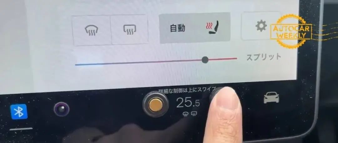
(The picture shows a Japanese consumer adding a physical button accessory to a Tesla Model 3.)
This article is a translation by ChatGPT of a Chinese report from 42HOW. If you have any questions about it, please email bd@42how.com.
