Deng Simiao from the passenger seat temple
Intelligent Car Reference | WeChat Official Account AI4Auto
Indeed, blindly pushing for large screens and eliminating physical buttons is not scientific.
After testing, a well-known Swedish automotive magazine has directly concluded that physical buttons are superior to touch screens.
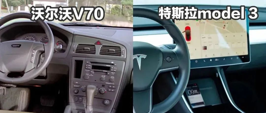
The 2005 model year Volvo V70, which is full of physical buttons, takes the lead.

It surpassed several well-known contenders, including Tesla Model 3, Volkswagen ID.3, and Mercedes-Benz GLB.
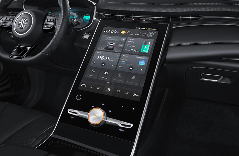
The most miserable car is SAIC MG Marvel R, which took three times longer than the first-place winner to complete the same task.
So, is the arrival of touch screens simplifying things, or increasing the dangers of driving?
Are Physical Buttons Superior to Large Touch Screens?
Let’s take a look at the test results. Under a driving speed of 110km/h, 12 different cars completed four tasks in succession, with the following times:

And during this period, the distance each car traveled was:

Overall, the best-performing vehicle was the Volvo V70, which doesn’t have a touch screen and used 10 seconds to complete the tasks, while driving 306m.
This means that the driver only needs to spend a little time while driving to achieve the goal, making it more conducive for the driver to focus and concentrate.
The worst-performing car is SAIC MG Marvel R, which took a whopping 44.9 seconds and drove 1372m.
The only car that only has a touch screen, the Tesla Model 3, came in 6th place with a time of 23.5 seconds and a distance of 717m.
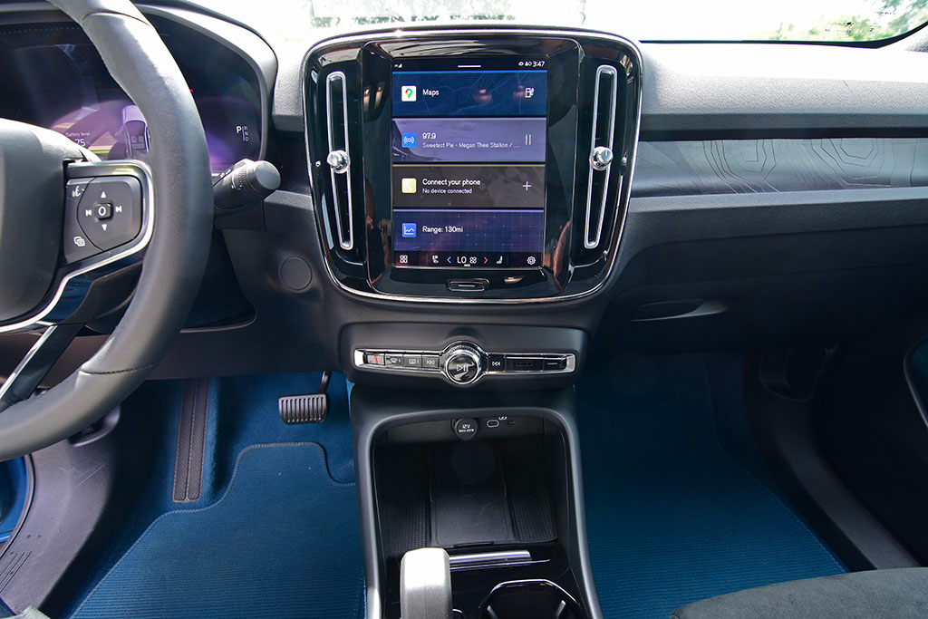
The remaining nine car models all use a combination of touch screen and physical buttons. The top two models are Dacia Sandero (a Renault sub-brand) and Volvo C40, which used 13.5s and 13.7s, respectively, ranking second and third.
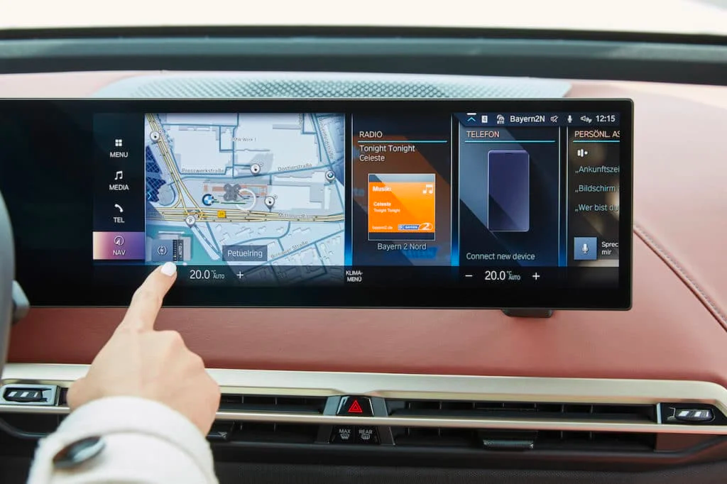
 The BMW iX ranks second to last among 12 models, taking 30.4 seconds to complete and covering a distance of 928 meters.
The Swedish automotive magazine Vi Bilägare conducted this study to investigate two main questions:
Firstly, is touch screen really better than physical buttons?
Secondly, does touch screen make driving less safe?
It should be pointed out that drivers had enough time to familiarize themselves with the car and infotainment system before the test, and the entire process was operated manually without voice interaction.
The four consecutive tasks were:
-
Turn on the seat heater, increase the air conditioning temperature by 2 ℃, and turn on the defrosting function;
-
Turn on the radio and tune to the specified station;
-
Reset the trip meter;
-
Adjust the instrument brightness to the darkest and turn off the center console screen.
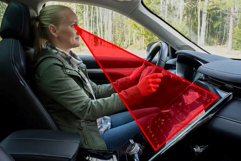
In addition, they also tested from another aspect, which was the angle at which the driver’s visual line deviated downwards to see the bottom of the screen.
Mercedes GLB only required a downward deviation of 20°, while some cars reached 56°.
After the evaluation, the magazine came to two main conclusions:
On the one hand, they didn’t completely deny touch screen, and they believe that concise and clear screen UI design combined with physical buttons are more friendly and safe for drivers.
They also added that certain functions are much easier to operate with physical buttons.
On the other hand, buttons also have design flaws, such as the unlit buttons on the Volkswagen ID.3 and Seat (a Spanish car brand) Leon, which are hard to see at night, and can affect driving safety.
Does Touch Screen Bring Driving Dangers?
With the development of smart cars, touch screens seem to become more and more common, and even radical.
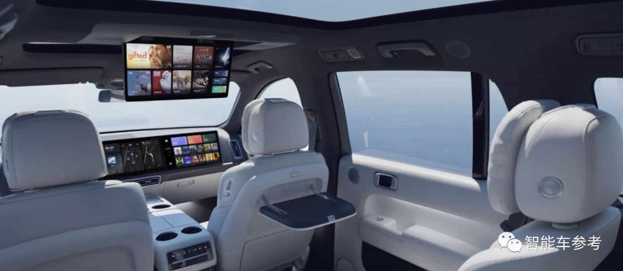
Netizens have various opinions on this, mainly divided into two attitudes:
Firstly, some netizens believe that cars are first and foremost vehicles before entertainment devices.
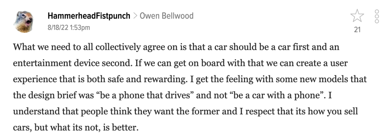
They believe that there is a way to achieve both safety and intelligence:Some features can be completed autonomously by cars, such as temperature adjustment, screen brightness control, etc., without the need for additional human operations. In addition, if some functions on the screen are not needed by the car owner, it would be better if they could be deleted by themselves.
Physical buttons also have certain benefits. You know their fixed positions and feel, so you don’t need to look away to find them every time.
Some optimistic people have linked touch screens with autonomous driving:

The car touch screen is becoming more and more like a mobile phone. These entertainment functions make the driver unable to focus on driving. If this continues, it will be necessary to increase the development of auxiliary driving functions, which can help the driver in some cases (so that the driver can take the opportunity to play).
Some netizens try to think from the perspective of car companies why they use less physical buttons:

Unfortunately, compared with physical buttons, developing touch screens is more cost-effective. For various functions, they don’t need to consider too much at the beginning because software upgrades are available later.
Some netizens have questioned whether a car really needs to be so intelligent?
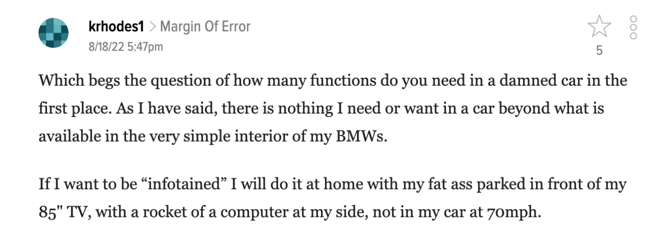
If I want entertainment and leisure, I will sit in front of my 85-inch TV at home, place another computer on the right side, instead of sitting in a car driving at 110 km/h.
In fact, the doubts of netizens are reasonable. A road safety study report in the UK pointed out that when using touch screen to operate CarPlay and Android Auto and other systems, the driver’s reaction time to the road situation will increase by up to 57% and 53%, respectively.
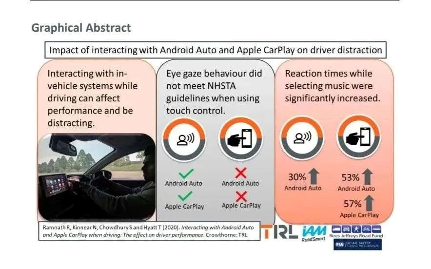
Even when using voice interaction methods, like Siri, the reaction time will increase by 36% and 30% respectively.
Under normal circumstances, the driver’s reaction time is about 1 second. If driving under the influence of alcohol, the reaction time will increase by 12%; if using marijuana, the reaction time will increase by 21%.
Comparing with these, driving with touch screens is even more dangerous than drunk-driving and drug use.
Correspondingly, to solve these potential problems, experts, technicians, and scholars have proposed the following countermeasures:
In an article published in The Economist magazine, researchers call on car safety agencies to develop criteria to limit drivers from using programs and applications on in-car screens that excessively divert their attention.

Researchers also suggest that developing voice interaction is a safer alternative.
Apple, Google and Samsung have proposed a skeuomorphic UI design, mainly composed of haptic feedback and confirmation.
By enhancing different haptic and touch gestures and interactions with components such as switches, sliders, and scrolling selectors, better experience is provided for drivers.

This means that although the driver clicks on the touch screen, they can experience a physical button-like feeling, thereby reducing distraction.
Gong Zaiyan, a PhD in Vehicle Engineering at Tongji University and head of the Human-Vehicle Relationship Laboratory, agrees with the view presented by the Swedish magazine earlier.
He classifies the problem of buttons and large screens as a matrix model. He believes that for situations with fewer steps and a very closed objective (such as adjusting air conditioning temperature), some carefully selected buttons are valuable.
However, for functions with more steps and a very open objective (such as calling contacts, atmosphere light setting, etc.), voice and touch interaction is more efficient.
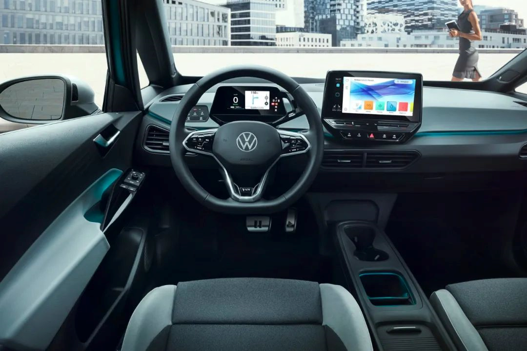
This is how he describes the future of physical buttons and touch screens:
Buttons will not disappear in the future, but will be presented in a simpler, integrated, and artistic way. Large screens will evolve from simple touch to intelligent recommendations.
After all these discussions, do you prefer touch screens or physical buttons? Why? Do you have any better suggestions?
— End —
This article is a translation by ChatGPT of a Chinese report from 42HOW. If you have any questions about it, please email bd@42how.com.
