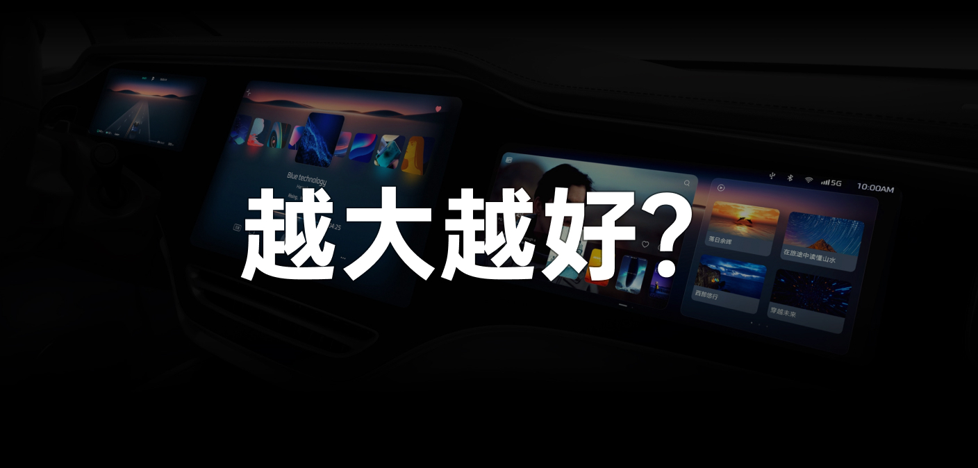
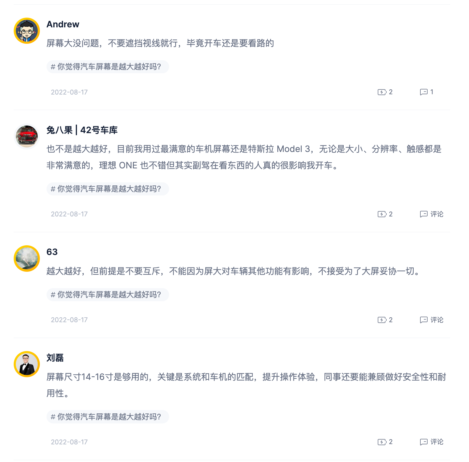
Yesterday, the topic of “Is bigger always better when it comes to car screens?” sparked a heated discussion on Weibo and our app. As a car company, RisingAuto also participated in the discussion and shouted the slogan “Screen Overlord”.
Whether RisingAuto deserves the “Screen Overlord” label or not, we’ll address that later. Within this topic, opinions on “big screens” were mixed.
Some people believe that “bigger is always better.” Jobs said that 3.5 inches is the most suitable screen size for a phone, but the most popular iPhone 13 Pro Max now has a 6.7-inch screen. Compared to ONE’s 10-inch secondary screen, L9’s 15-inch secondary screen is clearly superior. As long as the operating system and security are the same, big screens are really attractive.

Some netizens even recalled the big screens of Chinese car manufacturer BYTON in the past.

Of course, there are also those who firmly oppose big screens: “I firmly dislike a bunch of large screens in the center console. To be fair, the music and navigation features that I use most frequently while driving can be used just as easily by plugging in a phone cable, and it might even be more smooth. How long can a car’s big screen remain smooth?”

Many people also analyzed our needs for screens in a rational manner.

Regardless of whether people approve of “big screens,” the most realistic situation is that new forces like XPENG prioritize big screens, traditional car companies like Mercedes-Benz and BMW prioritize big screens, and even the pioneer of infotainment displays Tesla has added a rear seat screen to the Model S on top of its dashboard and central display.
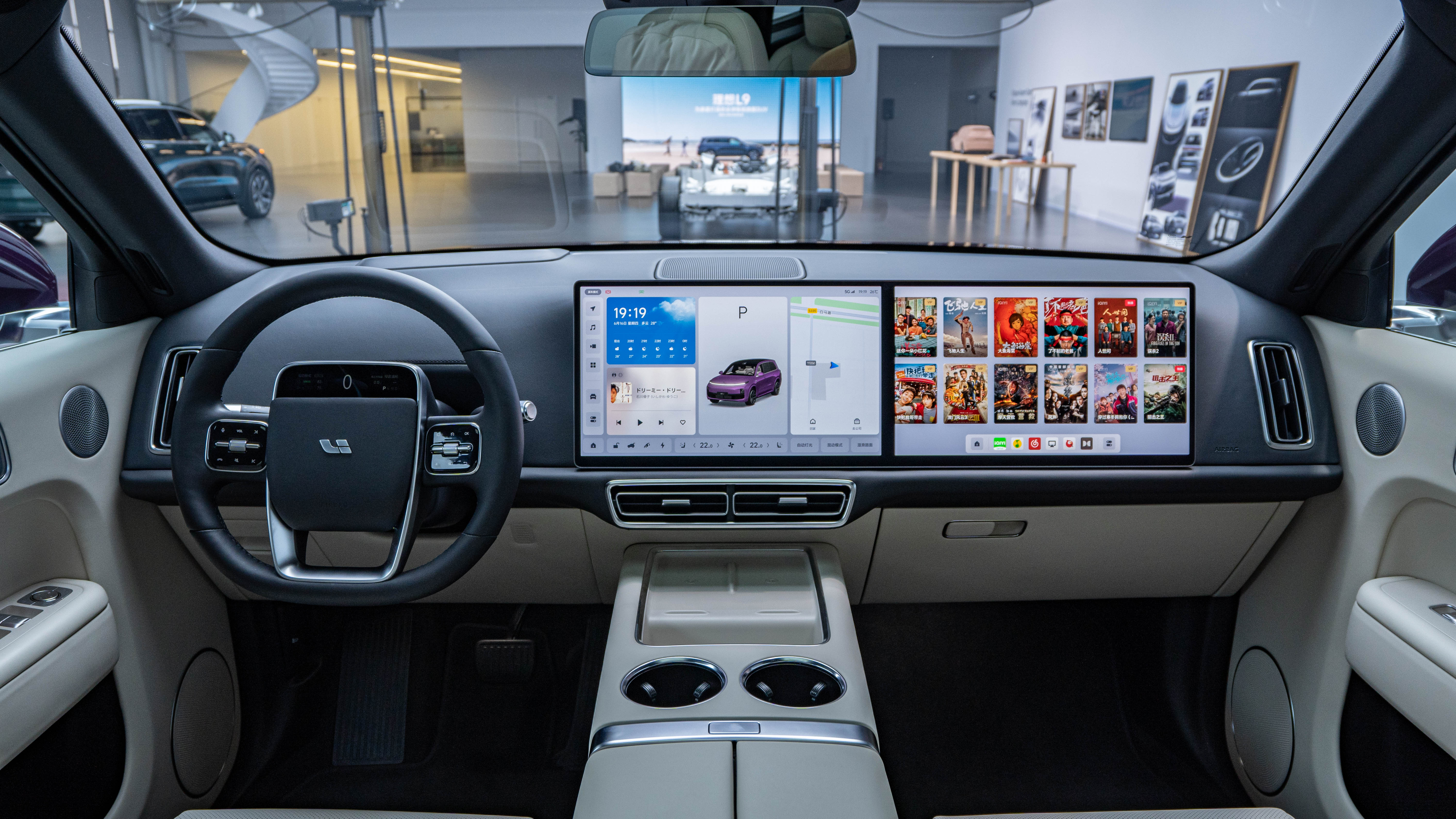
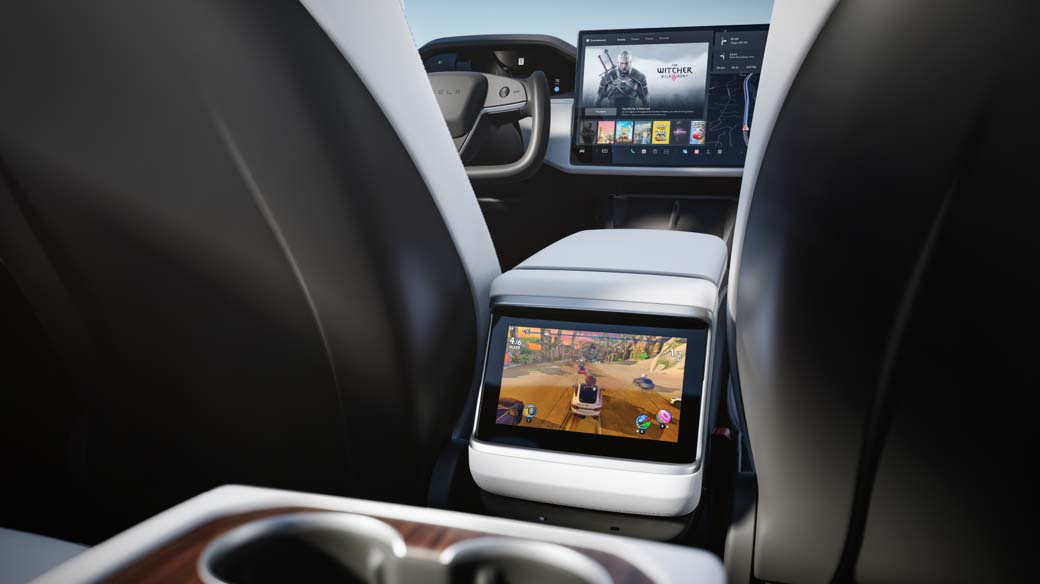
From the earliest single center console screen to two screens in the center console and front passenger positions, and then on to three screens in the back seat, not only have screens in cars become larger, but the number of screens has also increased. This is a clear trend in development.
What is more worth discussing here is: what kind of screen do we need?However, before analyzing what kind of screen we need, we must first clarify a point: do we really need a large screen in the car?
Does the car really need a large screen?
The answer is affirmative.
Setting aside the car, let’s first focus on the furniture in our home. Twenty years ago, the only adjustable function of a refrigerator was its temperature, and the washing machine had only a few functions such as capacity selection, washing, rinsing, and spin-drying.
In such a background, we only needed a few buttons and indicators to satisfy the needs of human-machine interaction.
But as functions increased, washing machines and refrigerators have also had a dozen or even dozens of functions. The few buttons and indicators of the past cannot possibly accommodate these functions, so we have also seen screens appearing on refrigerators and washing machines.
Returning to the car, the reason why screens began to replace buttons is the same. Physical buttons can no longer accommodate the increasingly rich car functions, so the appearance of screens is inevitable.
Moreover, another reason for the inevitable appearance of screens is the “explosion of information display” demand.
Whether it’s navigation, video or assisted driving visualization, information needs to be displayed to passengers through a medium, and vision is the most direct and fastest way for humans to obtain information.
Research shows that 83% of human information comes from vision, so screens are the best way for cars to convey information to people.
And after screens became the main part of the interior, due to the ever-changing display methods of screens, the changes in interior style will also switch between luxury and technology with the car’s UI.
Having clarified the necessity of a large screen, let’s talk about what kind of screen and cockpit we need.
What kind of screen and cockpit do we need?
First, we can sort out the demands of “drivers” and “passengers” according to different roles, and also divide them into “driving” and “parking” states based on the vehicle’s usage environment.
From this, we can combine the “driving requirements of the driver,” “driving requirements of the passenger,” and “parking requirements of the passenger” into three dimensions.
Driving requirements of the driver
The demands of the vehicle cabin for the driver during driving are the first to be met. A simple review can reveal that the demands mainly focus on four dimensions:
- Display of vehicle-related information;
- Adjustment of vehicle-related settings;
- Navigation;
- Multimedia.
On traditional car models, we obtain vehicle information through pointer-type gauges and indicators, adjust vehicle settings such as air conditioning and seats through physical buttons, use a phone to satisfy navigation needs, and use a CD or Bluetooth to meet multimedia needs.
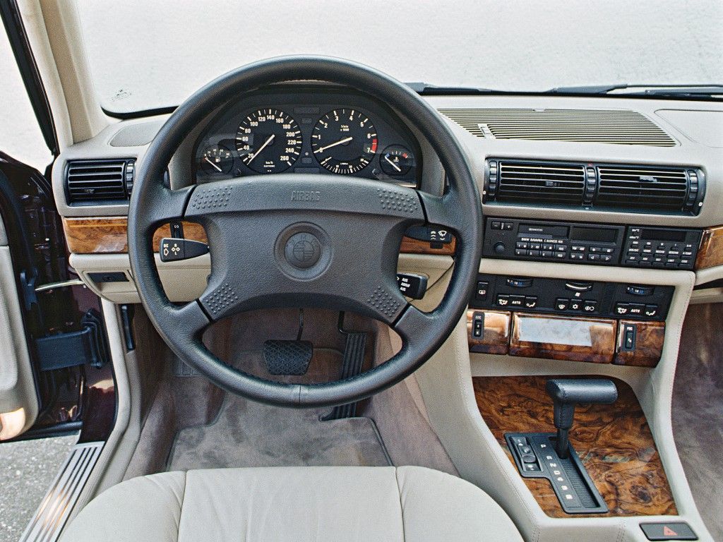 In 2016, when the first wave of large screens appeared, pointer gauges and indicator lights were replaced by LCD screens, which still displayed pointers and had not changed the way information was presented, just changed the carrier.

Although the infotainment screen has become huge, the physical air conditioning buttons were removed, and the previous one-step operation became a three-step operation, which decreased efficiency instead of increasing it.
While the infotainment screen now supports navigation, it is not the mainstream navigation application for Amap or Baidu, and it is inconvenient to operate with a rather cumbersome interface, and map updates are not as timely as those on mobile phones.
Moreover, in order to meet the requirements of the vehicle regulations, the screen resolution is not high, the border is wide, the screen brightness is not high, and the fluency is poor.
Obviously, none of the manufacturers have figured out the purpose of “large screen” and no one has a good impression of “large screen” in such a background.
After the emergence of new players in 2020, researchers discovered the conflict between humans and the screen and resolved them one by one, and finally the “large screen” began to be recognized.
In 2022, new players started to launch second-generation products, raising the competition in the cockpit to a new level, which is commonly known as “internal competition.” It is at this point in time that traditional brands also began to play their cards, offering an opportunity for us to see where everyone is focusing on at this time.
Information display related to vehicles
In order to make it easier for drivers to read information during driving, HUD and AR-HUD, which do not require drivers to look down to obtain vehicle information, have become the mainstream development direction of current car companies.
Mercedes-Benz provides a 77-inch AR-HUD on the all-new S-Class that not only carries all instrument display requirements, but also combines navigation display with AR function.
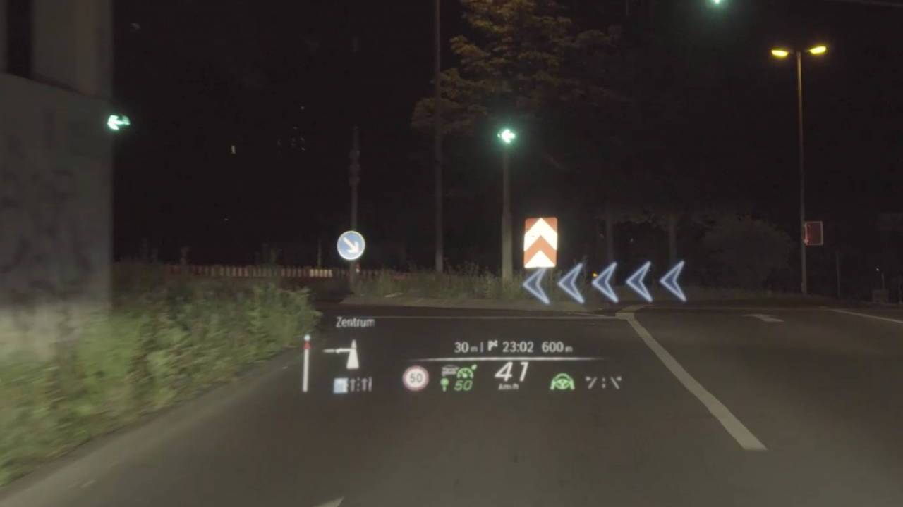
Ideally, the L9 radically removed the instrument panel and replaced it with a HUD with a display area of up to 13.35 inches.
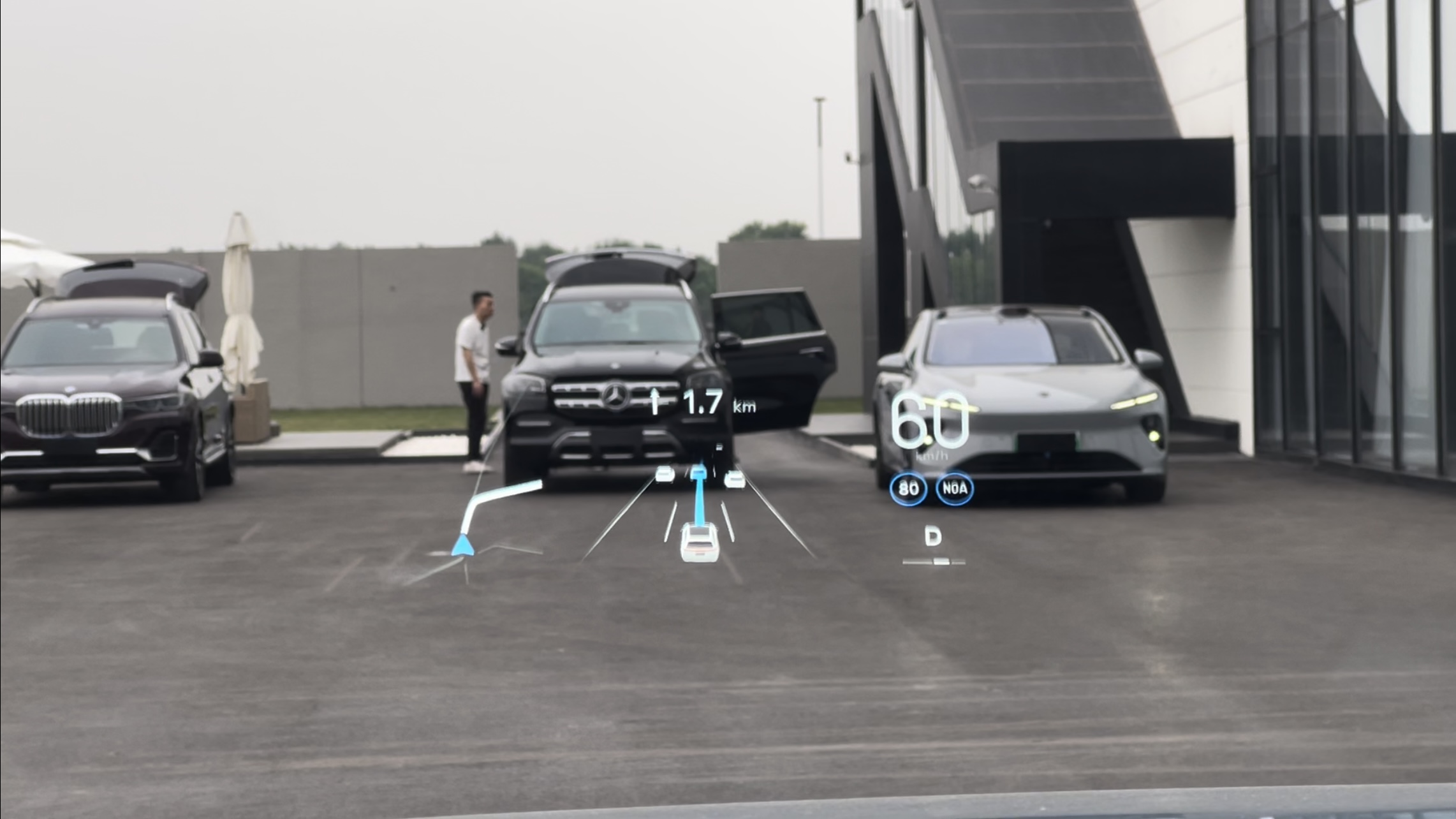
FAW Besturn made the first launch of Huawei’s AR-HUD on the R7, and this screen is not to be underestimated. First of all, its maximum field of view is 13°*5°, which is wider in the interface range and richer in content compared with Mercedes-Benz EQS and IDEAL ONE L9.
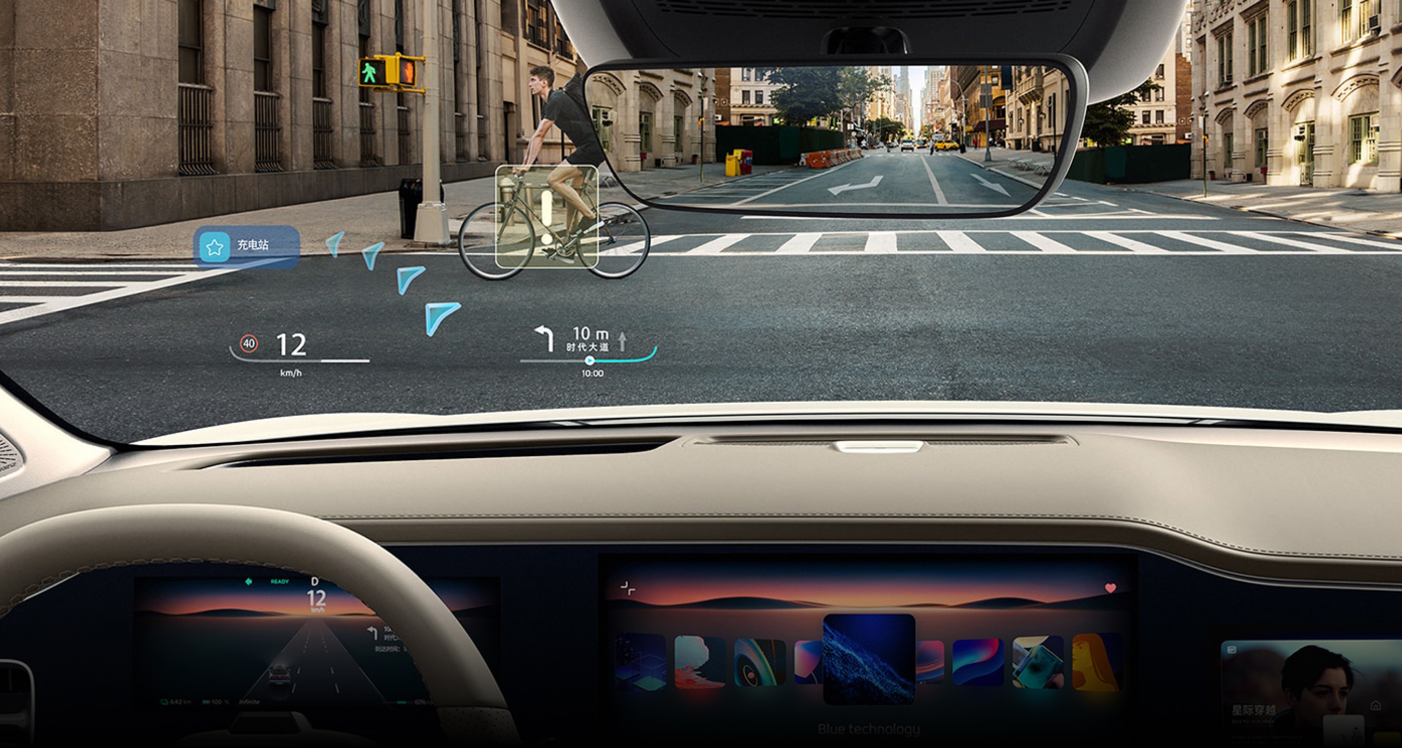 Meanwhile, in addition to displaying information in an intuitive and efficient way while driving, the AR-HUD can also present a huge 70-inch screen in parking scenarios, as shown in the Feepower demo video, and can even be used to watch movies.
However, after actually using the AR-HUD, I found that although the content displayed is rich enough, an overabundance of content during nighttime driving can also result in road obstruction. Before thoroughly solving this problem, the combination of instrument panel and AR-HUD is still the best option.
Vehicle-related Adjustment Settings
Firstly, when we discuss the operation of the car’s large screen, there is one fundamental difference between it and a phone or pad’s large screen; when using a phone, all of your attention can be focused on the phone. But in a car, the primary goal is driving.
In such an environment, there is inevitably a lot of “blind operation,” and one clear point is that “well-designed physical buttons” are more convenient than “well-designed touch operations.”
We do not reject physical buttons, but the reason for getting rid of them in the car has also been mentioned – physical buttons cannot accommodate the increasing number of functions.
Therefore, getting rid of physical buttons while ensuring the convenience of vehicle-related adjustments has become a problem that must be solved in the current cabin design.
The current train of thought is also clear: one is to retain the necessary physical buttons, and the other is to replace touch operations with voice commands.
In terms of retaining necessary physical buttons, we can see that most car companies, such as XPeng, Ideal, NIO, and Cadillac, have retained basic seat and window adjustment physical buttons.
But there are also some over-corrected options, such as Volkswagen’s ID. series driver’s side only retaining a set of window control buttons, and if the rear window needs to be adjusted, a touch button needs to be used to switch; the NETA S even canceled the physical buttons for seat adjustments.
In terms of replacing touch operations with voice commands, Ideal, NIO, XPeng, and Feepower have all launched “visible and speakable,” “continuous dialogue,” and “multitone voice” to enhance the user experience with voice commands, which is also a major trend at present.
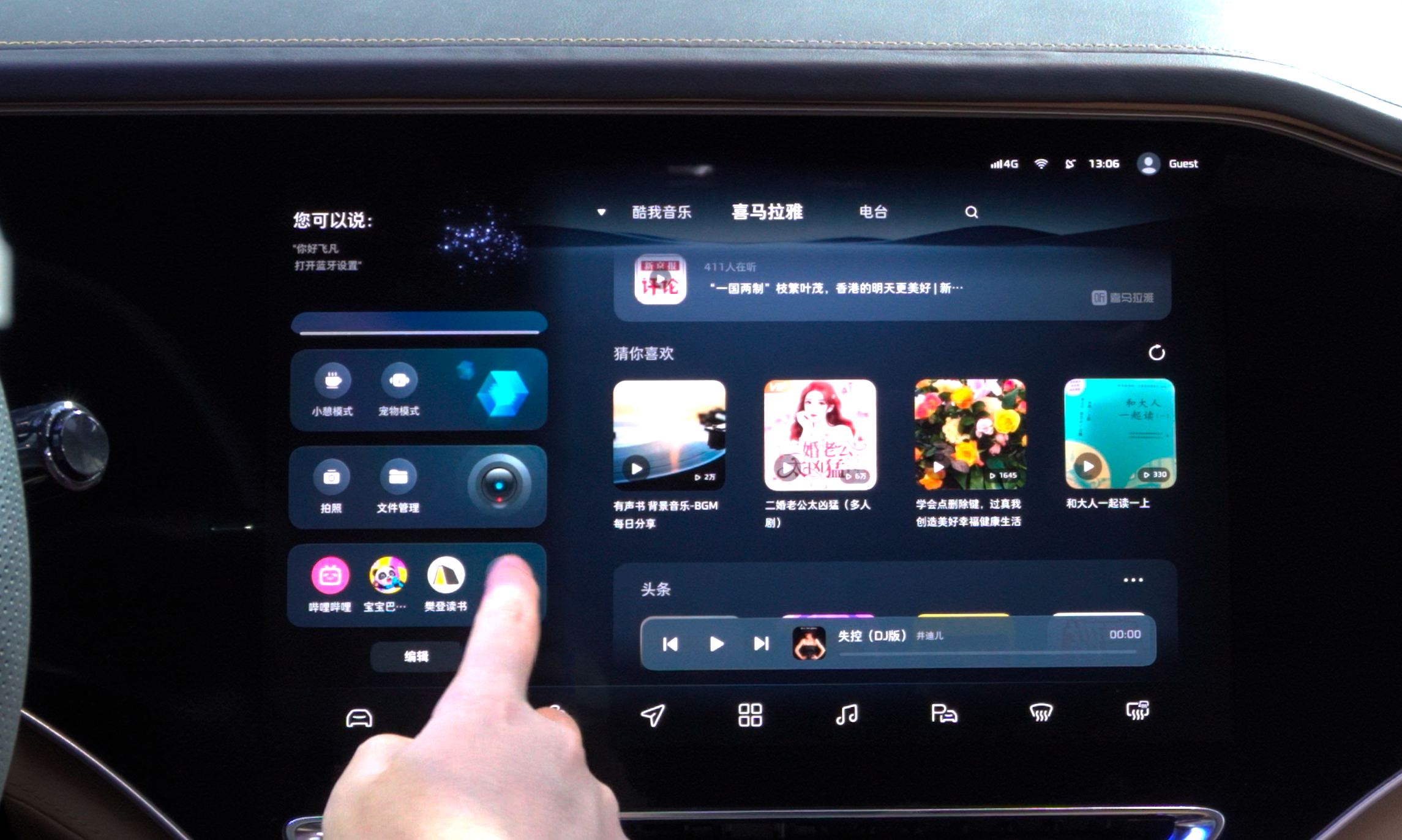
Unfortunately, traditional car companies such as Volkswagen, Mercedes-Benz, and BMW have not done well in this area. If the relevant “matching” is not updated, they will not be favored by users even with large screens.
In addition to voice commands, another key point is whether the UI design of the car’s system is easy to operate. There will be a fundamental difference on this point between car and phone.
Taking a simple example, on a phone, a button can be relatively small, and as long as it can be clicked, it will suffice. However, on a car’s system, it must be designed as large as possible to ensure accuracy when clicked during trips.Translate the following Markdown Chinese text into English Markdown text, in a professional way, preserving the HTML tags inside Markdown, and outputting only the corrected and improved parts, without writing any explanations.
“And on a cellphone you may set 4-6 layers of menus, but it’s fine for some functions to be hidden deeper. However, all commonly used functions in a car must be displayed within 2 layers of menus, because every additional click during a trip means an increased risk.
That’s also why navigation is set to the desktop and commonly used functions are designed in the first-level Dock on good car systems.
Passenger needs while driving & passenger needs while parked
We’ll combine these two needs, since the goal is the same. As a passenger, with no driving task, the primary need is entertainment.
When the ES8 was released by NIO in 2018, it introduced the concept of “Queen Seat,” which increased the adjustable range of the seat backrest, and added footrests and leg rests, making passengers more comfortable.
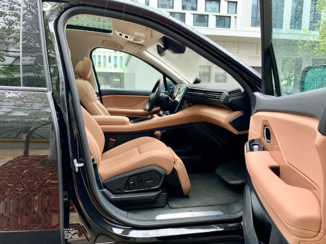
In 2019, Ideal added a passenger screen to the ONE model, designed to meet entertainment needs during the journey. As we’re entering 2022, we can see more and more car companies adding passenger screens.
However, once more and more models have passenger screens, the new issue is differentiation. This is where we can see how the car industry is being overly competitive.
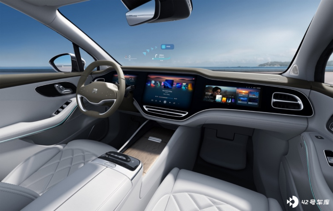
Ideanext added a larger screen and even added a rear screen, while the FLYING-POWER R7 added “Queen Seat” and seat massage as well as the passenger screen, making it not only able to meet entertainment needs but also more comfortable to sit in. After being connected to the central control screen, passengers using the passenger screen can set navigation and synchronize it to the central control screen.
It’s Not Just About Function
Above, we mainly focused on the functional discussion, but it’s also worth noting hardware iteration.
In the ET7, NIO brought mini-LEDs into the car’s cabin for the first time, and the Ideal L9’s driver-assisted safety screen, Cadillac Lyriq’s car system, and FLYING-POWER R7’s instrument screen were also upgraded to mini-LED materials.
Taking the FLYING-POWER R7 as an example, the maximum brightness of mini-LED can reach 1,000 nits, equivalent to the latest iPad Pro. To quote Apple, “mini-LED can present bright highlights, subtle details, and deep blacks.”
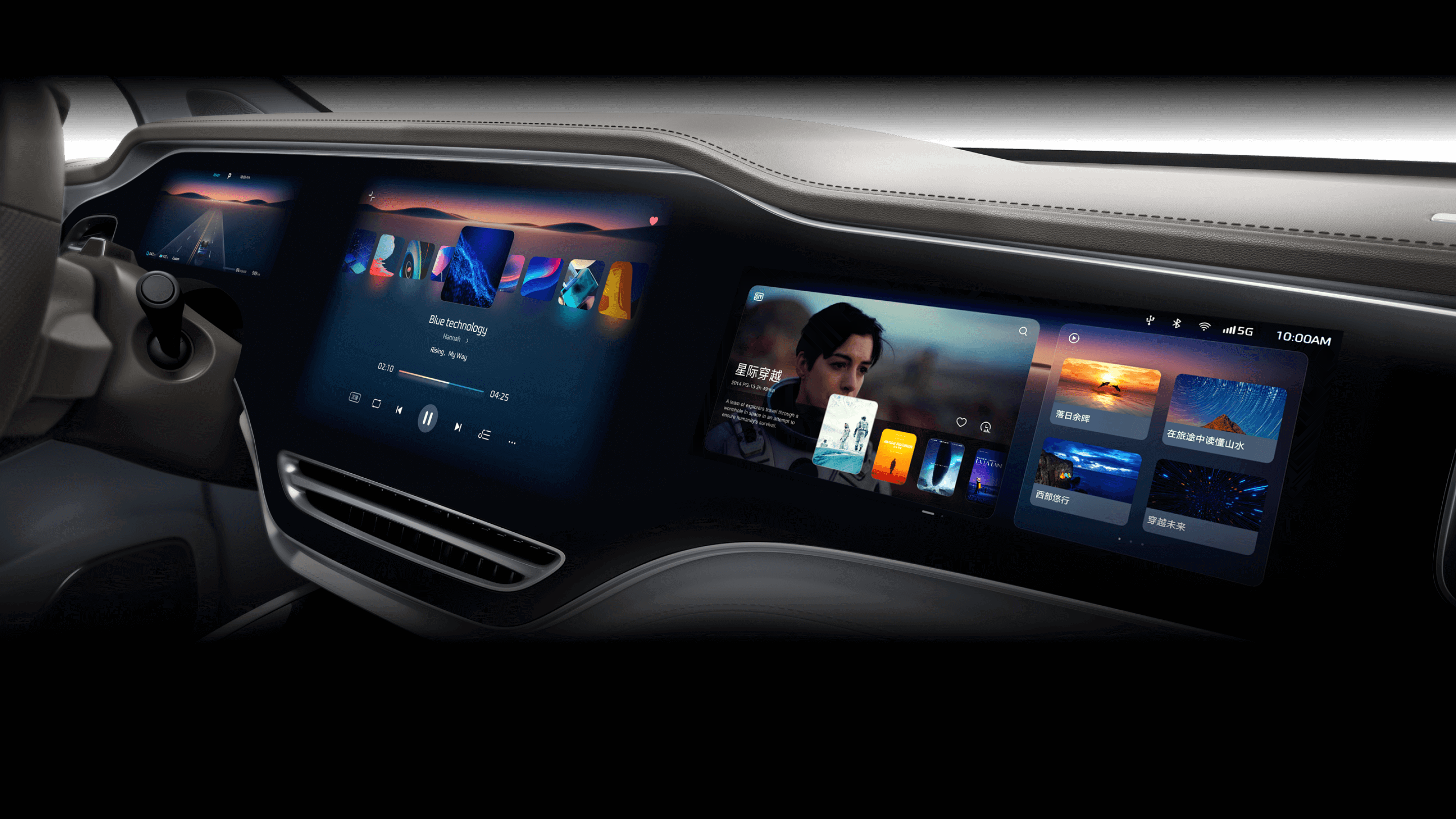 “# Higher brightness means the Flyfun R7 can display the instrument panel clearly even in direct sunlight without additional shading.
Meanwhile, it is clear that the following characteristics exist in the head models released this year:
- Larger displays;
- Narrower bezels;
- Better screen quality;
- Improved infotainment chips;
- Better audio experience.
This year, Ideal, Nio and Flyfun all introduced OLED screens into their cabins, resulting in significantly narrower bezels that align with consumer-grade displays. The screens also have better viewing angles, higher brightness, and better color expression.
The benefits are obvious, such as minimizing gray-out when displaying black screens during night driving, and providing a better viewing experience when watching movies and TV. As automakers value in-car entertainment more, consumers are paying increasing attention to color performance on their infotainment displays.
According to suppliers, mini-LED and OLED screens are about to take off in the industry.
Conclusion
While we discuss the advantages of larger displays, it is more important to understand the current state of in-car displays and experience them first-hand.
Last year’s surge in intelligence led to the integration of lidar in a large number of new cars. This year, the continued push for smart capabilities has resulted in better quality large screens in cars.
From the automaker’s perspective, this is clearly a painful transition. However, from the consumer’s point of view, this is not necessarily a bad thing.
As for the Flyfun R7, which is tagged “The Screen Tyrant,” it is an example of a “new traditional automaker brand.” In terms of hardware, Flyfun R7 is undoubtedly among the top tier. Also, its user interface has a fresh look and feel that is consistent with the Flyfun brand. As to its usability, we need to wait until we test-drive the car to give an accurate assessment.
This article is a translation by ChatGPT of a Chinese report from 42HOW. If you have any questions about it, please email bd@42how.com.
