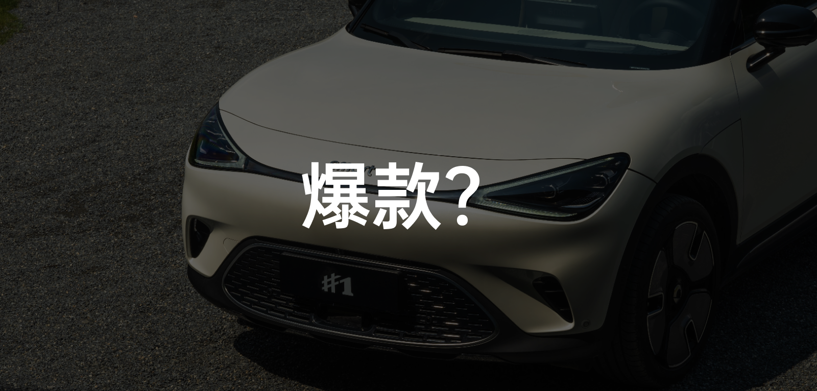
Delivery of smart #1 is now scheduled for next year, and sales are far beyond the manufacturer’s expectations, with the potential to become a popular model. Ensuring quality and improving production capacity to shorten delivery time is a happy yet challenging task for a carmaker undergoing a full brand rejuvenation.
Of course, what I’m concerned about is how it feels to drive and use this car. After my fastidious colleague Laienhart participated in the global debut and placed an order, and now considers switching to the BRABUS version, I became curious about the magic of this car. On August 16, I flew to Lijiang, Yunnan to participate in the road test of smart #1, and had in-depth discussions with Yang Jun, the smart Vice President of R&D and the so-called “Father of smart #1”.
Here’s a brief summary of previous events: On June 6, the smart #1 was officially launched with three basic configuration versions: Pro+, Pure+, and Premium, priced between 194,200 and 239,200 yuan (2023). On August 1, due to the rise in raw material prices, smart officially announced a price increase of 5,800 yuan for the top-of-the-line Premium version, priced at 245,000 yuan. Then, on August 15, the BRABUS version of the smart #1 was officially unveiled externally and internally, and the actual shots and related information can be found here: smart #1 BRABUS version officially unveiled! Can you guess how much it will sell for? (with actual shots of interior and exterior).
A Transformation but with Familiarity
When I first saw the smart #1, although the appearance had been completely redesigned and the size went beyond the scope of the original smart fuel products, smart #1 still retained the brand’s charm, even though it was transformed with its badge displayed.
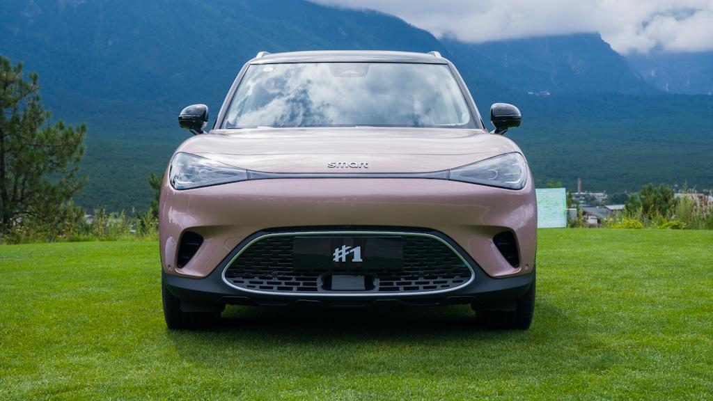
The rounded lines are the main feature of the car’s design. When looking at the front, most people will notice first the Y-shaped daytime running lights and the grinning circular trapezoidal sunken grille below.
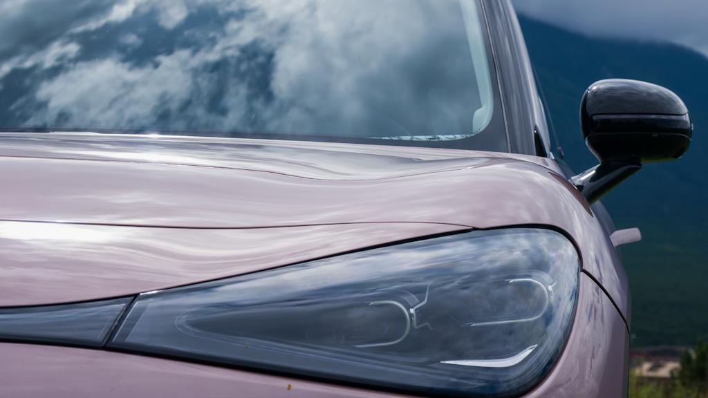
However, it’s the extended hood that creates a dynamic impression, and the bulging muscle line extending from the corresponding headlights is the source of true strength.
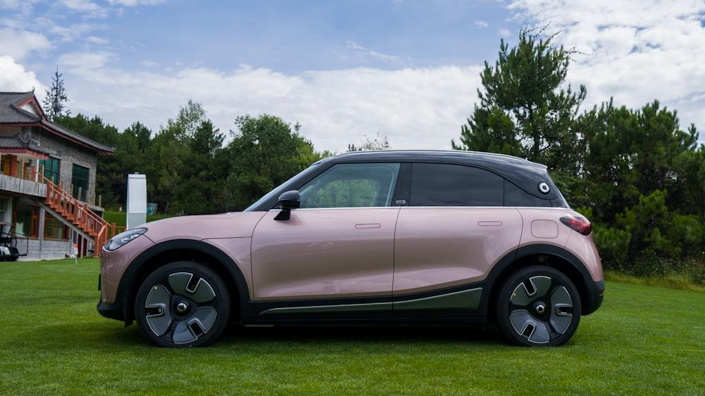 Coming to the side of the smart #1, the keywords given to me are “compact” and “minimalist”, which are built on the foundation of rounded design.
Visually, the smart #1, with a length of 4,270mm and ultra-short front and rear overhangs, especially its rear wheel arch almost cut into the tail, creates high expectations for the compact SUV’s interior space.
The front fender of the smart #1 is atypical, as the hood must be extended to perfectly display the protruding lines of the front face, occupying most of the fender’s space. In addition, the hidden door handle, frameless doors, and black suspended roof design make the side color matching look very simple and clean.
The C-pillar of the smart #1 is surrounded by the black roof at the rear, reducing the overall angle of the tail together with the flat shoulder line. The addition of the smart logo further accentuates the visual focus of the side at the tail.
Of course, there is also an unignorable detail on the side, which is the “Styled By” logo on the B-pillar, with the Mercedes logo intentionally added instead of letters. It should be noted that the European version of the smart #1 does not have this design, which shows how finely the smart #1 has grasped the Chinese consumer psychology.
The tail light design echoes the Y-shaped daytime running lights of the front, and the smoked black design creates a combat atmosphere when not illuminated. When lit up, the effect is truly “glorious,” with a strong Mercedes style.
In fact, from the side, it can be seen that the car has undergone intense contraction after the C-pillar, but the rounded design under the tail lights from a rear view gives the impression that the rear of this rear-wheel drive car is exceptionally robust.The only concern is whether the considerable shrinkage in size will affect the space of the second row or the trunk. Smart #1 has chosen to prioritize the former, which means emphasizing the performance of the second row space. From actual experience, the performance of the second row space is good.
After adjusting the driver’s seat according to my body size (179 cm height and 75 kg weight), the legroom in the rear row is about one fist high. Thanks to the vehicle’s height (1,822 mm), which is even higher than mine, the headroom also performs at about one fist high.
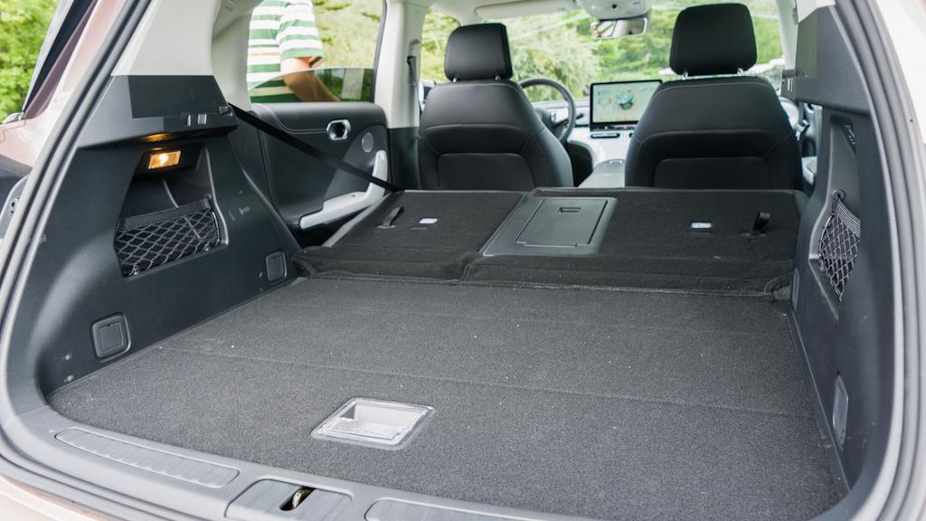
When opening the trunk, the overall size matches expectation, considering the space reserved for the second row. There are quite a few configurations that “steal space” and enhance practicality, such as mesh pockets on both sides, 4/6 folding seats, passageways spanning the rear row, and deep storage space under the cover board. Even the backrest angle adjustment of the rear seats has been set to comfortable angle and “storage” angle respectively, maximizing the flexibility of the trunk space.
Interior with a touch of luxury?
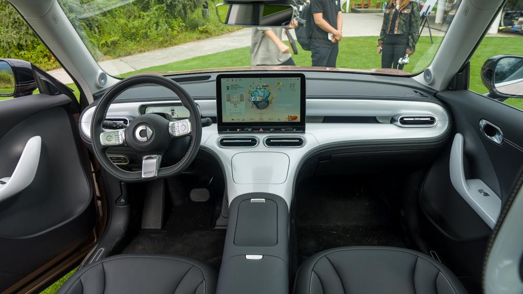
Overall, Smart #1’s product positioning still leans towards “petty bourgeoisie.” You can take a look at the pictures and feel whether Smart #1’s interior meets your definition of “light luxury.”
The appearance inherits the charm of Smart, which has not only attracted the attention of existing Smart owners who are looking to upgrade, but also received a lot of praise. However, the aesthetic of the interior and exterior integrates as one. If the exterior design is recognized by everyone, the interior design becomes the second test of aesthetic appreciation.
My overall feeling is: the atmosphere has a sense of style, the shape is not exaggerated, and it retains the essence of Mercedes-Benz interior design.
There is not a single straight line in the entire cabin, and they are all curves with uniformly rounded angles, such as the lines of the air outlet and the whole center console, which are very harmonious.
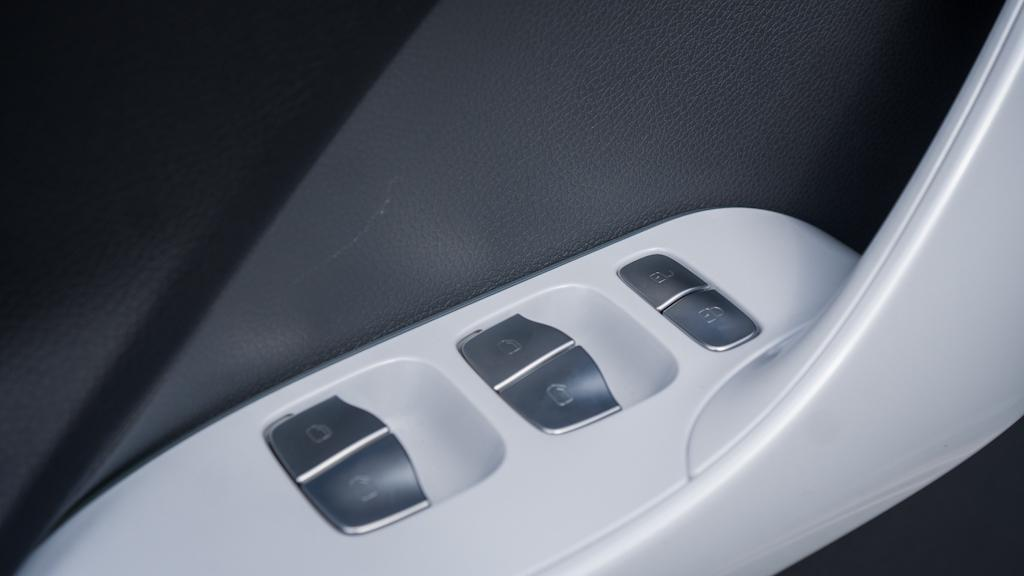
In addition to the design, there are some practical details that are quite exquisite in texture. For example, the damping force of the air outlet knob, the damping and touch feel of the metal window control button, the damping of the cover board, and even the slight damping of the opening button of the armrest box, etc.
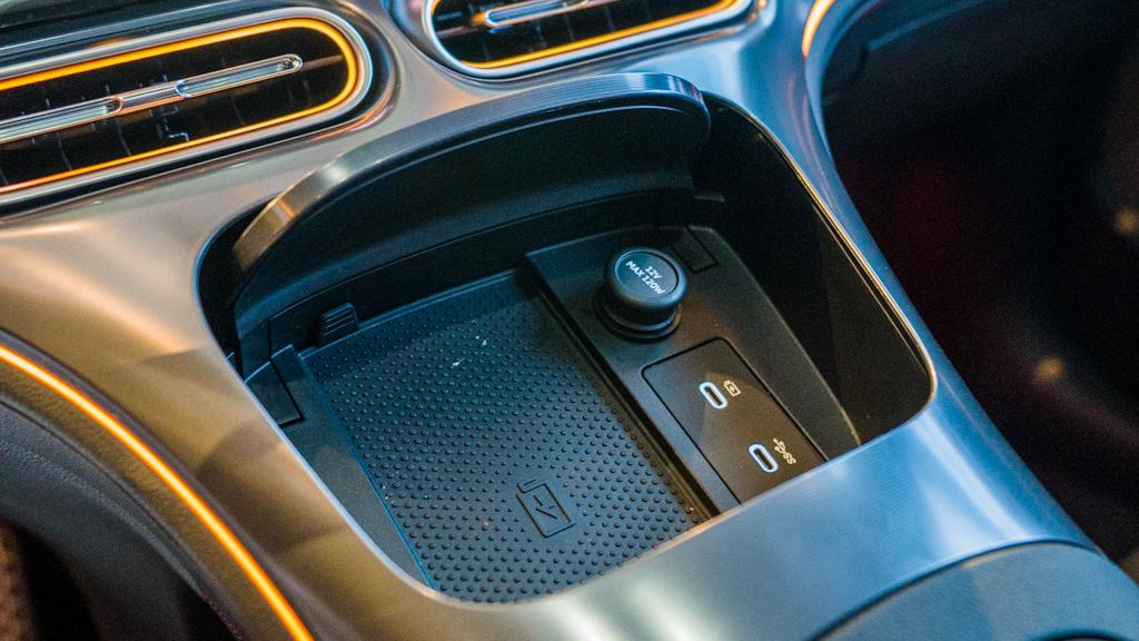 Actually, on the right side of the wireless charging board with a maximum power of 15W, there are two USB Type-C ports, one of which is connected to the Switch game console of the car’s hidden Easter Egg. This is almost not promoted by the official, of course, I think there are many highlights of the car machine that I will talk about later.
The application of material for smart #1 is both economical and practical. First of all, where the parts of our body can touch and our vision is very close, soft plastic materials or special process materials are used, which are definitely not hard plastics.
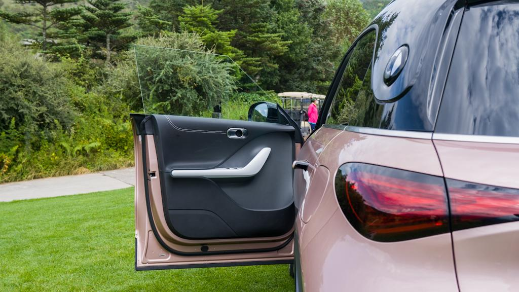
In fact, the application of these hard plastics is very low-key, such as the lower part of the door panel and the two sides of the armrest box. Even in the armrest box position, where our knees will hit, smart #1 also thoughtfully added soft material coverings, and they were added synchronously on the left and right sides.

The exclusive color for the top-level Premium model in the interior configuration, “Touching Gold”, was once questioned by the users whether it is plastic or not. But in fact, this material is indeed metal, and the process is even more expensive than wire drawing. Before I saw the real car, I suspected that this color would look a little tacky, but the actual feel is still very good. The only small problem is that it needs to be wiped frequently, otherwise it is easy to get all kinds of oil stains.
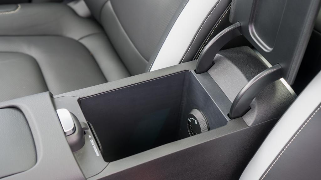
Interestingly, the central armrest box of smart #1 has an air-conditioning outlet. We can even adjust the air outlet to achieve temperature control, and we can toss a few bottles of drinks in it to cool or heat them.
Many people are not very clear that there is a slot in the front wall of the armrest box specifically for charging the charging card. Because in terms of charging, Chinese people use mobile phones more, so smart #1 considers the usage scenario of European users, who need to swipe the charging card.
Men all say it is good to drive
The driving performance of smart #1 is indeed good, forming a very interesting contrast with its “stupid and cute” appearance, which is a rear-wheel drive car that is serious inside and outside.
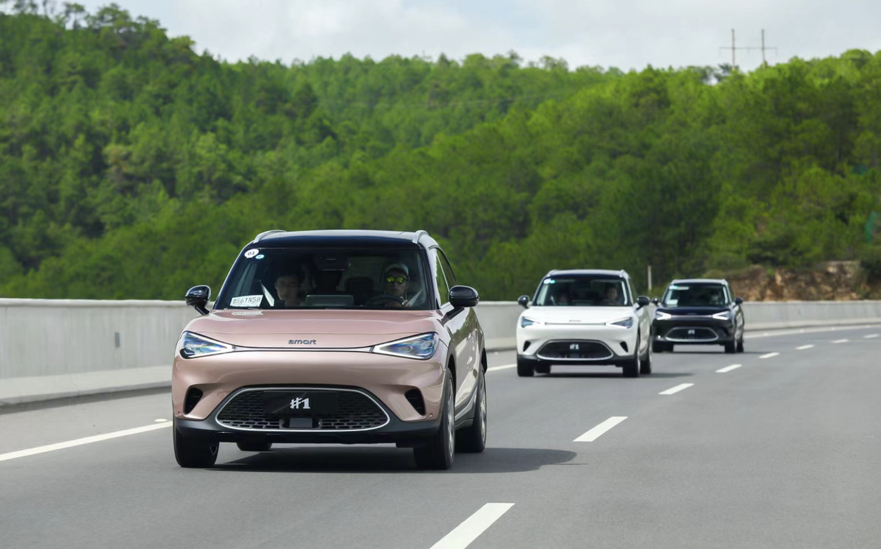
My first impression when driving the car was: transparent.This term refers to the visual sensation, as I can see all the information ahead at a glance, which is related to the high seating position of SUV and the flat center console. This is mainly due to the 9.2-inch “fish-shaped” instrument panel.
You will find that this stripe-shaped instrument panel seems to be very similar to the Extreme E E01 and Lotus Eletre. But don’t imagine, this is purely customized by Smart for a “transparent” vision.
Smart #1’s rear-wheel drive single motor can achieve a maximum power output of 200 kW and a peak torque of 343 N·m. The accelerating time can be as fast as 6.7s, which is not very fast among the electric cars I have tried, but it is already fully capable of meeting daily needs.
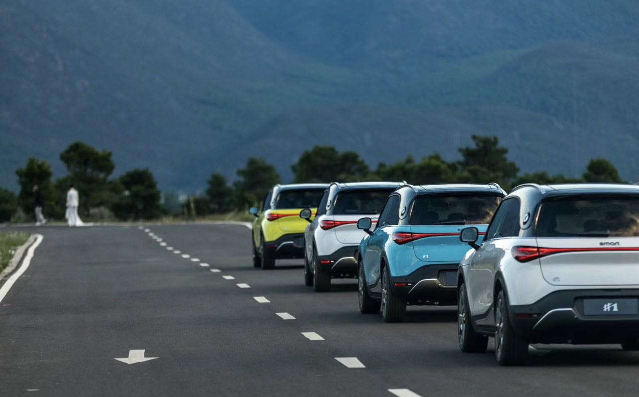
Smart #1’s driving mode is divided into Eco, Standard, and Sport modes. Regardless of which mode, the throttle response is very linear. Specifically, there is a slight delay at the beginning of the pedal in Eco mode, while the response in Sport mode will be much faster.
The overall braking feel is also very good. In a picky attitude, I found that when following a car and repeatedly lightly tapping the accelerator pedal and then braking to a stop, the final stop feel is a bit abrupt. This problem is due to the adoption of the CRBS kinetic energy recovery system, and the connection between the motor braking and mechanical hydraulic braking is still perceptible.
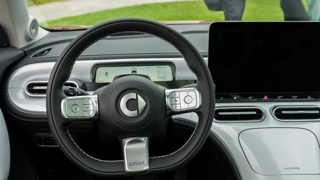
The grip of the steering wheel is good, with small bumps set at the three and nine o’clock positions where the big thumbs can comfortably grip. There are three steering modes, namely Comfort, Standard, and Sport. In Comfort mode, the steering feel is the lightest, even girls can easily turn the wheel in place without using too much force.
The damping in Standard and Sport modes is progressively heavier than in Comfort mode. I prefer to use Sport mode most of the time. Of course, these three feel modes can also be associated with the three driving modes mentioned above, or can be set by oneself.
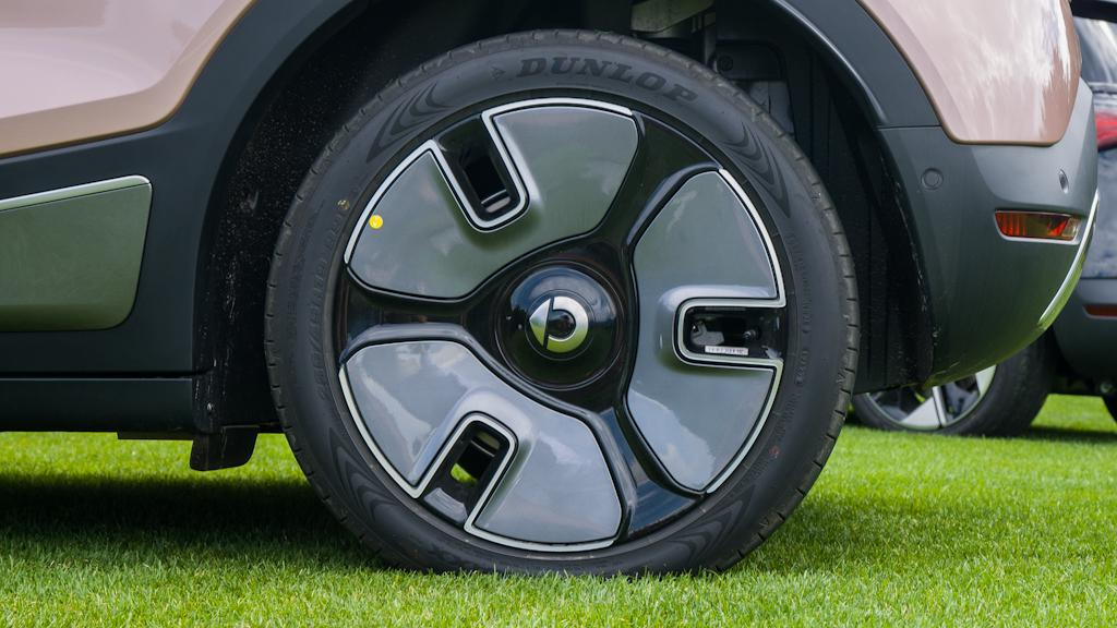
The front MacPherson and rear five-link suspension structure coupled with the 235/45 R19 tire specifications exhibit very good support in the bends of the mountain roads in Lijiang. There was a moment when I doubted whether I was driving a sedan.
The suspension can filter out the vibration of the fine road surface, instead of rigidly transmitting all information like Model 3, Smart #1 also retains a certain sense of road feel.When facing a large speed bump or a single bump, the vehicle’s floating is also small. The vibration will be resolved in two or three undulations after the vehicle has passed.
Smart #1 has created a “German flavor” with good support, fine “screening” filtering, and quick resolution of speed bump bounce during cornering.
Overall, the driving experience of Smart #1 on daily roads is outstanding, with almost perfect coordination between the throttle, brake, steering, and chassis. So I think this car is not only suitable for women, but also very likable for men, like me.
Buried In-car Entertainment?
Yes, as the subtitle of my article says, I think Smart #1’s in-car entertainment system is extremely creative. This refers to the fact that compared with new forces such as XPeng, IDEAL, and NIO, Smart #1’s “Inspiration Planet” Smart OS in-car entertainment system has brought me a completely different new experience!
Smart #1’s in-car entertainment system has a size of 12.8 inches in a horizontal layout, using LCD material, and the screen resolution is 1,920×1,080, reaching 172 ppi.
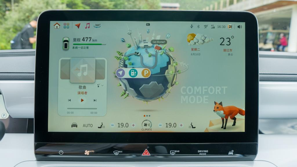
The first surprise is the “earth” in the center of the screen.
When I first got my hands on it, after confirming that this was the main interface, I began to feel the uniqueness of this in-car entertainment system. Because the main interface of most single-screen in-car entertainment systems is map-based, this seems to have become a “tradition” of in-car entertainment systems.
Then, following the arrow’s guidance, I rotated the earth to the back, and the background changed accordingly. The key point is that the rotation animation details are very delicate, and in fact, this is reflected in the entire in-car entertainment system. For example, when the menu bar App is opened and restored, it will align with the original position. It is not that I am making a big deal out of it but too many in-car entertainment systems with mechanical temperament have been seen before. So when I saw such delicate motion effects, I was a little excited.
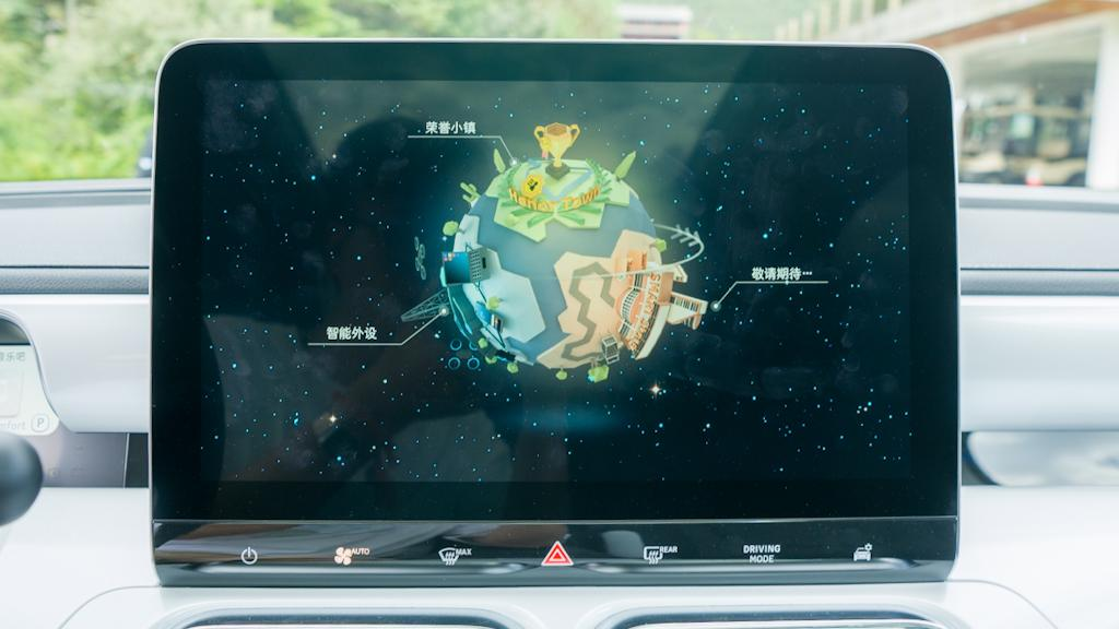
Many functions are buried behind the earth’s back, such as games, voice, and connectivity, which require the long-term effort of the software team in the later period. The creativity and ideas brought by this earth are very interesting. I can think of things like birthday reminders, seasonal reminders, and seasonal changes, and so on.
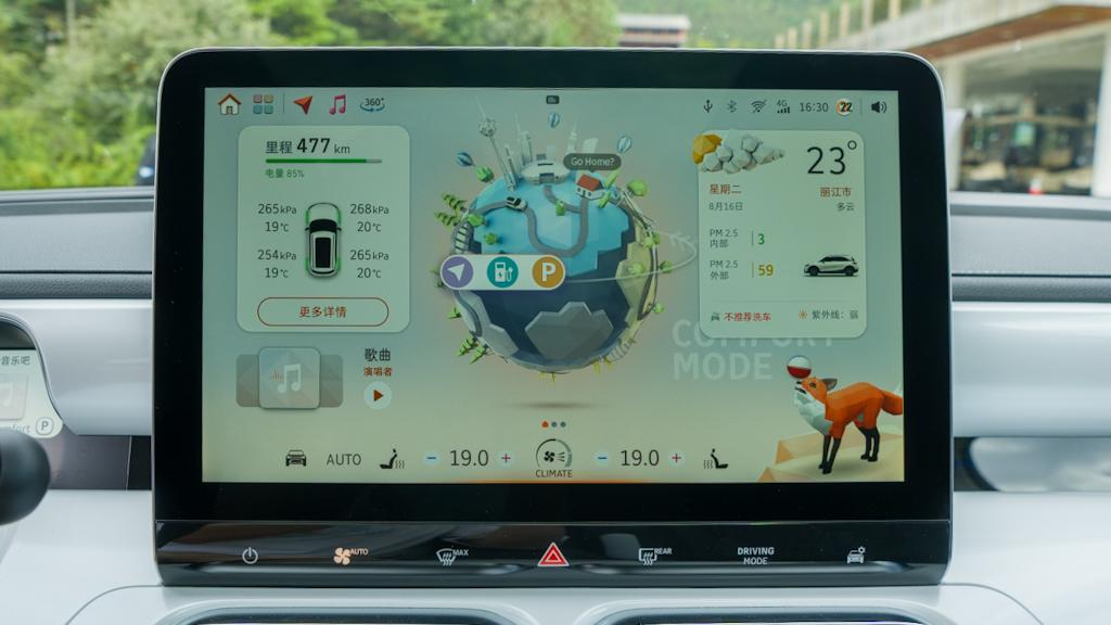
The second surprise is the “card,” or you can understand it as a desktop widget on smartphones.
In terms of content, Smart #1’s card components are currently displayed on the left and right sides of the earth.The left side offers more features such as multimedia, phone, tire pressure and range displays, and I suggest that smart should include real-time power display to make it more versatile. Because many people would like to see the regenerative braking or power output in real-time.
The right side, however, only displays weather information, and its content is relatively simple.
In terms of presentation, the small cards on the left side can be zoomed in and out by a single click, and double-clicking will open the corresponding app interface. Even on the multimedia card, users can swipe to switch songs. Even better, users can switch audio sources without having to open the app.
When the navigation starts, returning to the home screen will also display a navigation small card under the Earth.
While the weather small card on the right side appears to have simple content, its delicacy is superb. During my study of the car system, the weather in Lijiang changed frequently, and the car system weather small card also changed dynamically with the weather. When entering the app, the user can click again to fully expand it just like the apps on the left side.
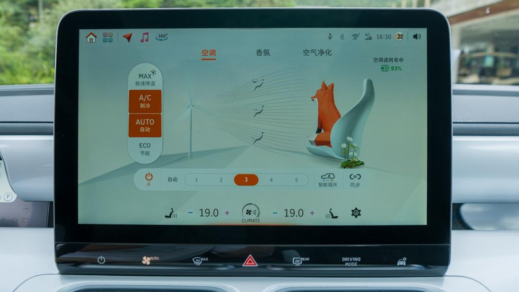
The third surprise is that all entrances are clickable with interactive animations.
This can be seen in the function of expanding and entering the corresponding app, but it is not surprising to this extent.
The smart #1 car system’s status bar at the top, such as USB, Bluetooth, account, etc., can all quickly call out some operations. As for displays such as time, which do not require quick access to functions, they have created a magnification display and increased information content callout operation to unify the entire interaction experience of the status bar.
This system’s completeness, creativity, and functionality have fully met the requirements of the official 1.0 version, and I believe that many of the smart’s official promotions have not fully demonstrated the highlights and delicacy of this car system. However, for people who pay attention to this car, this car system is definitely a hidden surprise.
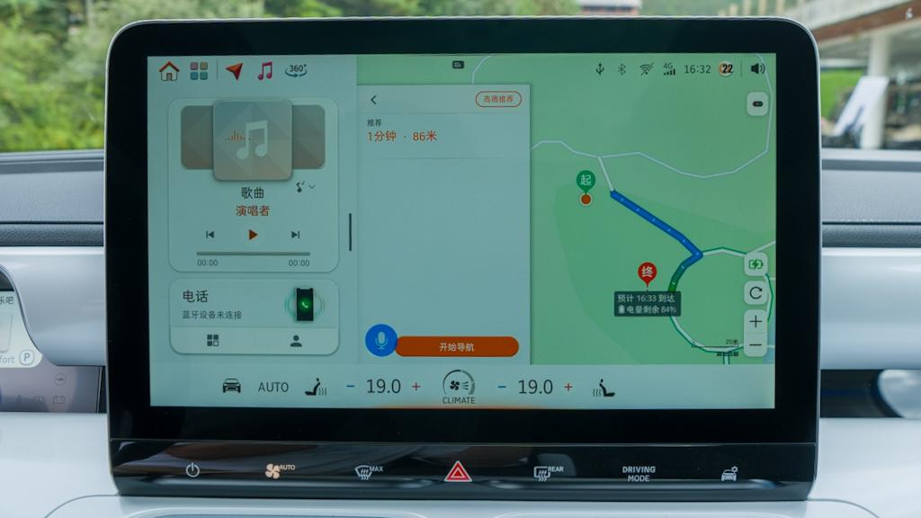
The fourth surprise is split-screen.
Yes, you heard it right. The smart #1 car system supports split-screen.
Currently, split-screen contents can only be summoned by double-tapping from the left border in the navigation interface, and dragging to the right with two fingers will trigger the split-screen mode.
The content displayed on the split-screen is currently limited to the multimedia and phone categories.
In other words, this car system can display a navigation small card on the home screen for guidance, and it can also display a split-screen in the navigation interface. This degree of freedom reflected in the car system has given me great pleasure, although it takes a lot of effort from the team.
The fifth surprise is voice recognition.The current test drive car has achieved continuous voice control, visible voice recognition, and wake-up-free functions. It can quickly respond to tasks such as changing songs and audio sources, navigation, and even split-screen. I’m not so surprised by the functions it can achieve, but rather that at this stage, its performance is already very impressive. It’s not just usable, it’s actually user-friendly.
Of course, we are very meticulous, so I also proposed some visible iterative suggestions to the official team:
-
The App menu interface is relatively sparse and can be improved by enlarging the App icon size.
-
The car’s start-up time is a bit long and needs optimization.
-
The main interface’s globe should be a smooth and seamless, non-level rotating style.
After I arrived in Lijiang on the 15th, I spent a couple of hours chatting about the exhibition car’s infotainment system with smart’s team. I could feel their dedication to this system, and several team members were very careful in both input and listening.
Honestly, I couldn’t help but wonder: both are using Yikatong, why is smart’s infotainment system #1 so smooth and complete in the pre-delivery state? The key is that the exhibition car I tested had never experienced bugs like freezing or slowness.
Community User Concerns
In this section, I will address some of the questions raised by the community regarding smart #1:
Regenerative Braking
The current regenerative braking system for smart #1 has three levels: weak, standard, and strong. While there isn’t an option to turn it off, the regenerative braking at the weak level is barely perceptible.
However, the current E-Pedal mode doesn’t have enough intensity or response time in my opinion. Since this mode attempts to control the vehicle’s longitudinal movement through a single pedal, it feels like regenerative braking is operating at the highest power level when the intensity and response time are off.
I have already shared this issue with smart, and they are seriously considering it. They also need to consider feedback from users after delivery to make a comprehensive judgment.
Range Performance
I tested the Premium version with SiC power, and the CLTC range is 560 km, which is 25 km more than the Pro+ version without SiC under CLTC conditions.
During a journey of about 95 km, the energy consumption was 13.9 kWh/100 km, which I personally think is very good, especially considering my complex driving conditions:
-
Three adults and some luggage onboard;
-
70 km on the highway and several uphill road sections;
-
Traffic congestion (entering and exiting service areas);
-
Outdoor temperature around 25 degrees Celsius, with the air conditioning at 22 degrees Celsius along with the music playing normally;
-
I frequently switched driving modes, with Sport mode being used more often.
Driver AssistanceMany people are asking about the level of assistance of smart #1’s advanced driver assistance system (ADAS). Based on my test drive on the highway, the basic functions performed stably overall. However, the road conditions and scenarios I drove in were not comprehensive enough, so this is only for your reference.
The perception hardware of smart #1’s ADAS system consists of 1V5R (1 camera + 5 millimeter-wave radars), which is a solution from Veoneer.
The functions that can be realized include lane-keeping + adaptive cruise control (ACC), automatic parking, and automatic lane-changing (with turn signals).
Firstly, the ADAS system can be activated through the button on the left side of the steering wheel (of course, it needs to be set up in advance).
In practice, the lateral control ability of lane-keeping is relatively strong, to put it simply, it is very accurate.
The ACC’s ability to follow the car in front is also relatively stable. After I activated it on a dual-carriageway and briefly took control of the lateral movement by turning on the turn signal, the ACC still worked normally, and even the braking force was gentler than when I was driving myself. The system can resume within 10 seconds after stopping and needs to be reactivated by the accelerator pedal.
Smart #1’s lane-changing with turn signals is very interesting. Firstly, this function integrates with some high-precision map data, so on a highway with good signal, the lanes will be displayed in green on the dashboard to remind you that a lane change can be performed.
In practice, I found that the ADAS system’s response to turn signals is more rigorous. When driving at about 100 km/h, it requires a clearance of about 100 meters in the target lane before changing lanes. The steering angle is also relatively small, and the process is relatively gentle.
In addition, there is a small feature of smart #1 for monitoring blind spots, which will be displayed as orange dots on the heads-up display, which is quite innovative.
During the test drive, I also found some scenarios that the ADAS system did not cover:
- Smart #1 was slow to respond to stationary buses entering the lane and required manual intervention.
- The system cannot recognize cones.
Conclusion
How to create a popular car model? I think this is the ultimate question for all car manufacturers.
After my test drive of smart #1, I saw their answer to this question unfold:
A car model without horizontal competitors, a cost-effective price, a very consistent experience in actual use, and the team’s wholehearted dedication to the product. Especially when I asked the accompanying test driver, Yangjun, a question, he said:“`
This car has been developed by our team for three and a half years from scratch, with no room for excuses or evasion.
I would like to follow up with a statement from Zhang Mingxia at the banquet:
Our marketing team took over this product from the engineering team. We are one team and we will continue to improve it.
The core indicators for a hit product are “value for money” and positioning, which have been presented in detail in this article. However, it is the team that is the underlying reason for this result. How to create a hit product is only half answered here at Smart, the other half being delivering and providing long-term service to users. Let us wait and see.
Related Reading
Why I think men would also like smart #1?
“`
This article is a translation by ChatGPT of a Chinese report from 42HOW. If you have any questions about it, please email bd@42how.com.
