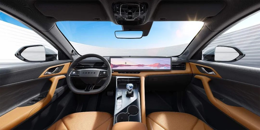
The Screen Trend in the Automotive Industry
Author: Xiaopangzi
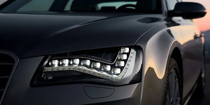
There used to be a brand that loved to play with its headlights and was affectionately called “Light Factory” by everyone. Nowadays, with more and more brands and models researching car lights and with the increasing number of functions that are being smartized, we are also seeing more and more “Light Factories”.
What about now, in the era of smart cars, what new trends are emerging?
Answer One: Screens
How many types of screens are there now on the dashboard console? We have seen: one screen, two screens, double screens, three screens, screens with vehicle control, and screens with safety driving interactions. There are also consoles with a large central screen, and screens with features for everything…
We’ve even seen rotating screens, screens that move up and down, screens that move separately from side to side, and even those that move side to side horizontally…
Of course, there are also screens that are capable of “moving up, down, left, right, spiral ascending to the sky…”
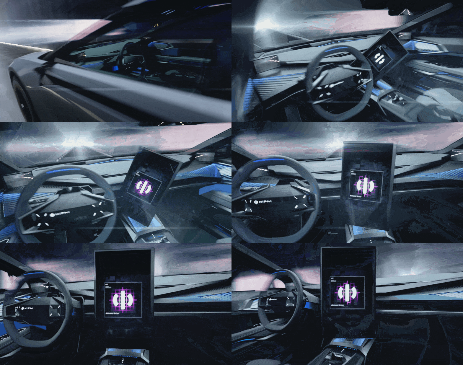
No matter how many screens there are on the center console or how they are interconnected, as long as they remain fixed there, they are considered a relatively rational design for the cockpit. But when the screens move, it seems to bring a different feeling and experience. Or, let me ask: with the current level of technological capability, is it really necessary to have such interactive design?
I took a quick look at the car models with “movable” screens, and found that there seems to be one manufacturer who is particularly fond of this concept – SAIC.
Is a Moving Screen Cooler?
First, let’s talk about the meaning behind making the screen “move”. The benefits are nothing more than:
- Interaction
- Ceremony
- Technology
In terms of cockpit interaction, screens should be designed to improve interaction convenience, compensate for interaction limitations, and expand interaction situations. The sense of ceremony associated with the car is generally based on the brand positioning and the human care given to users, which enhance the user’s experience through small details. As for the sense of technology, that is more of a “mysterious” feeling…
After all, having more screens is technology; linking screens is technology; changing the appearance of screens is technology; and even having moving screens can be called technology…
Let’s start with a particularly representative product: IM L7. As a new car brand created jointly by SAIC Group, Zhangjiang High-tech and Alibaba Group, the first mass-produced model is the IM L7.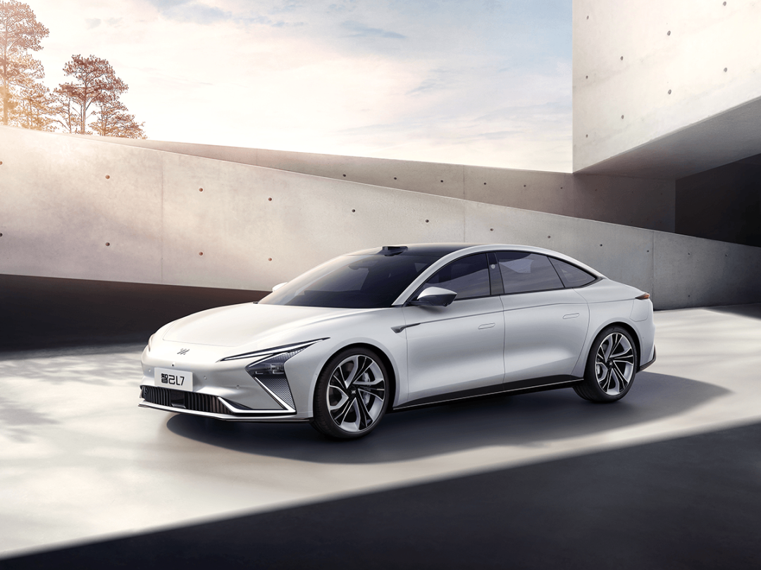
The IM L7 cockpit is equipped with a “adjustable screen + central screen” solution, and the adjustable screen also adopts a left and right segmented design.
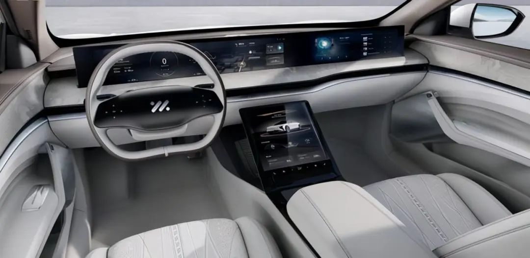
The left instrument panel and the central control screen are one screen, and the right passenger entertainment screen is another screen. The two screens can be adjusted separately in different scenarios, but they cannot be completely retracted.
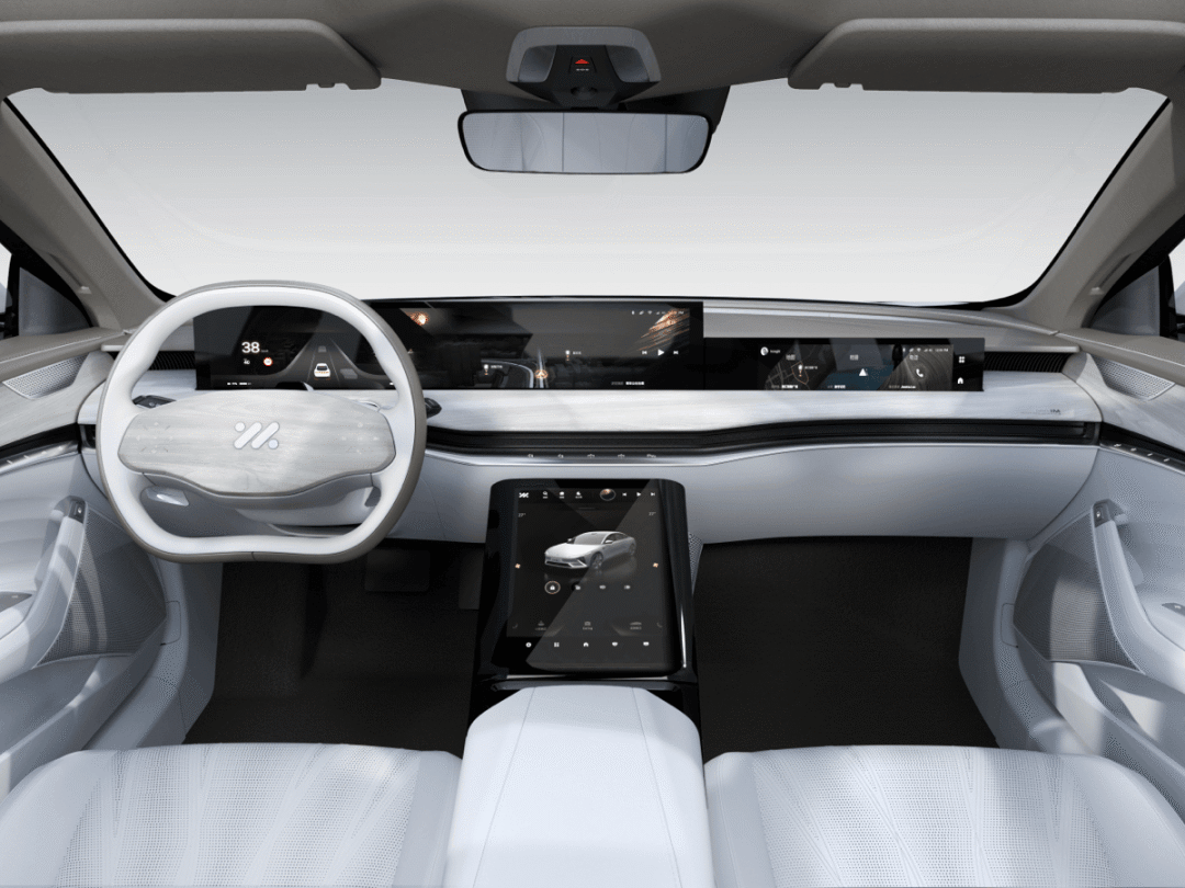
There are several scenarios for the lifting of these screens:
-
Firstly, the instrument control double screen and the co-pilot entertainment screen can be controlled separately for lifting.
-
Secondly, in the IM sports car mode, all screens will be lowered.
The association between screens and driving modes has actually been around for a long time, and the most conservative approach is to switch the theme color of the screen displayed according to different driving modes.
In my opinion, the most iconic design that “makes screens move” associated with driving modes is McLaren.
Taking the McLaren 720S positioned as a sports car as an example, the McLaren 720S is equipped with a flip-type instrument panel that displays only dynamic driving information such as gear position, speed and engine speed after flipping. It allows the driver to obtain the opportunity of “redline” only through the corner of his eyes and timely shift gears in conjunction with the sound of the engine while driving on the track.
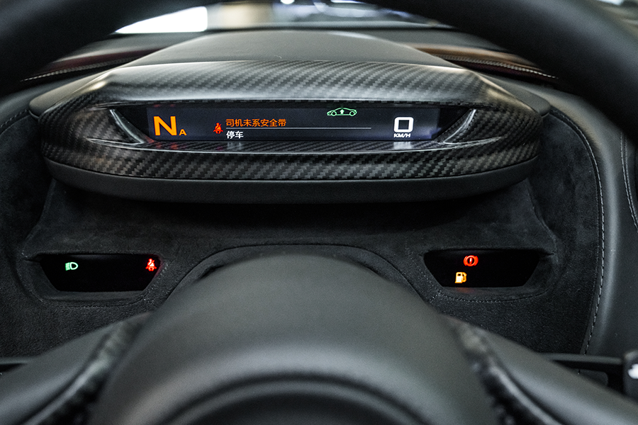
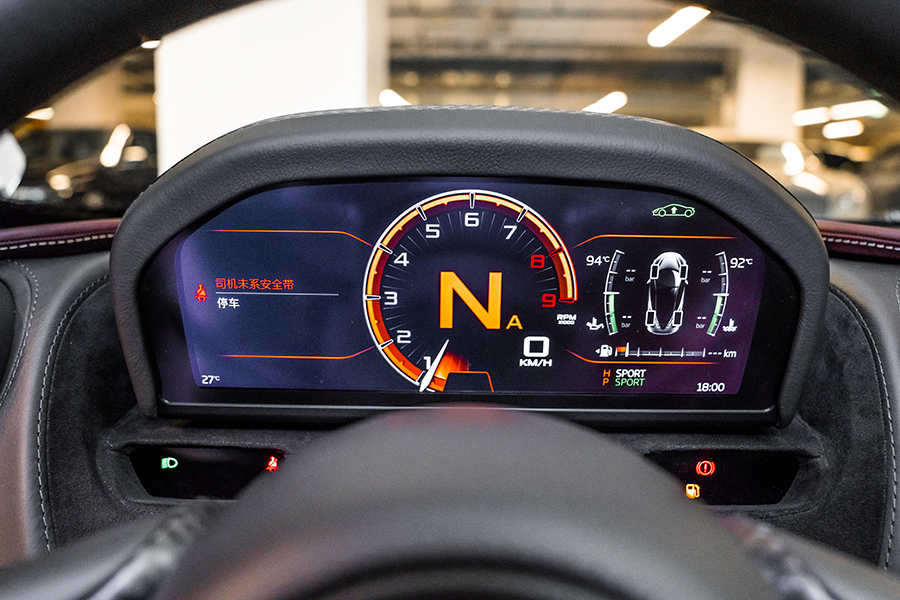
Therefore, the significance of this flip-type instrument panel is to allow the driver to obtain the status of the vehicle without “direct observation”, and to more directly and focus on driving the vehicle “in extreme situations”.
In IM sports car mode, all screens of the IM L7 will be lowered and only display dynamic driving-related information such as speed, G value, tire pressure, and “circuit lap time”. It seems to have the same initial intention of McLaren’s design, allowing drivers to better obtain information during dynamic driving. However, the HMI interface design of IM L7 in IM sports car mode is quite complicated, making it difficult for drivers to obtain information without deliberately observing the screen.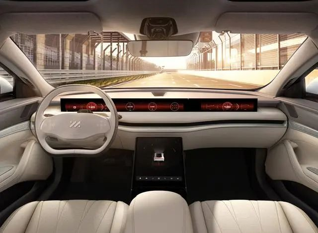
And on the smart electric vehicle Zhiqi L7 which does not require observing the motor speed nor shifting, the screen lift function in the IM supercar mode brings more of a ceremonial feeling. However, will anyone really take the Zhiqi L7 to the racetrack and clock circles?
In daily use scenarios, I understand that the lift screen of Zhiqi L7 gives users more freedom. The driver and passenger can choose to lift or lower the screen according to their needs. However, in terms of interaction, cost, and structural stability, this design actually does not have much practical significance.
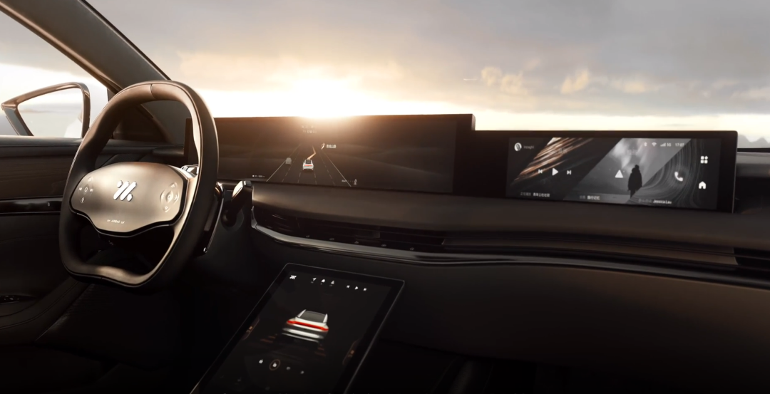
In terms of visual perception, because the “left and right divided lift” interface must be vertical, in order to ensure strong consistency in the whole system whether the screen is lifted or lowered, the screen of Zhiqi L7 is made into an extremely square and floating style, which creates a strong contrast with the rounded lines inside the car.
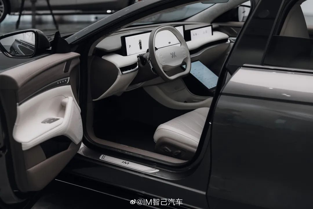
The most rational design solution is a large enough but non-obstructive triple screen or whole-screen scheme, which can ensure functional interactivity, reduce some costs, and improve stability. At the same time, it can also be integrated with the cockpit overall design by doing styling on both the left and right sides of the screen.
However, what is lost in this way is the “ceremonial feeling and sense of technology”, which perhaps is the real significance of this set of lift screens appearing on Zhiqi L7.
Therefore, in evaluating this set of screens, some words often appear such as: sports, technology, cool… but we rarely see anyone evaluating it in terms of practicality and convenience of interaction.
Hey, remember to give a “thumbs up”!
After briefly discussing Zhiqi L7, SAIC has recently launched another type of car with a moving screen: the all-new SAIC Roewe RX5. This time, it is neither a rotating screen nor a lift screen, but a sliding screen that can move horizontally on the central control panel.
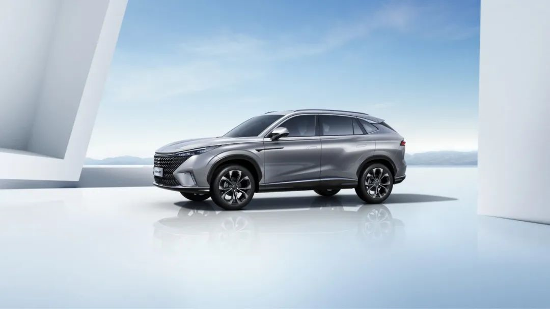
I seem to have figured out a little bit about the product manager’s thinking:
The cockpit is equipped with a passenger entertainment screen, either a triple screen or a single screen penetrating the central control panel. It seems to be quite expensive, while the SAIC Roewe RX5 is only selling for over ten thousand.
But they also want to balance the functionality of the passenger entertainment screen while keeping the cost low and maintaining a sense of technology. What to do?Ding, ding, ding… screen sliding!
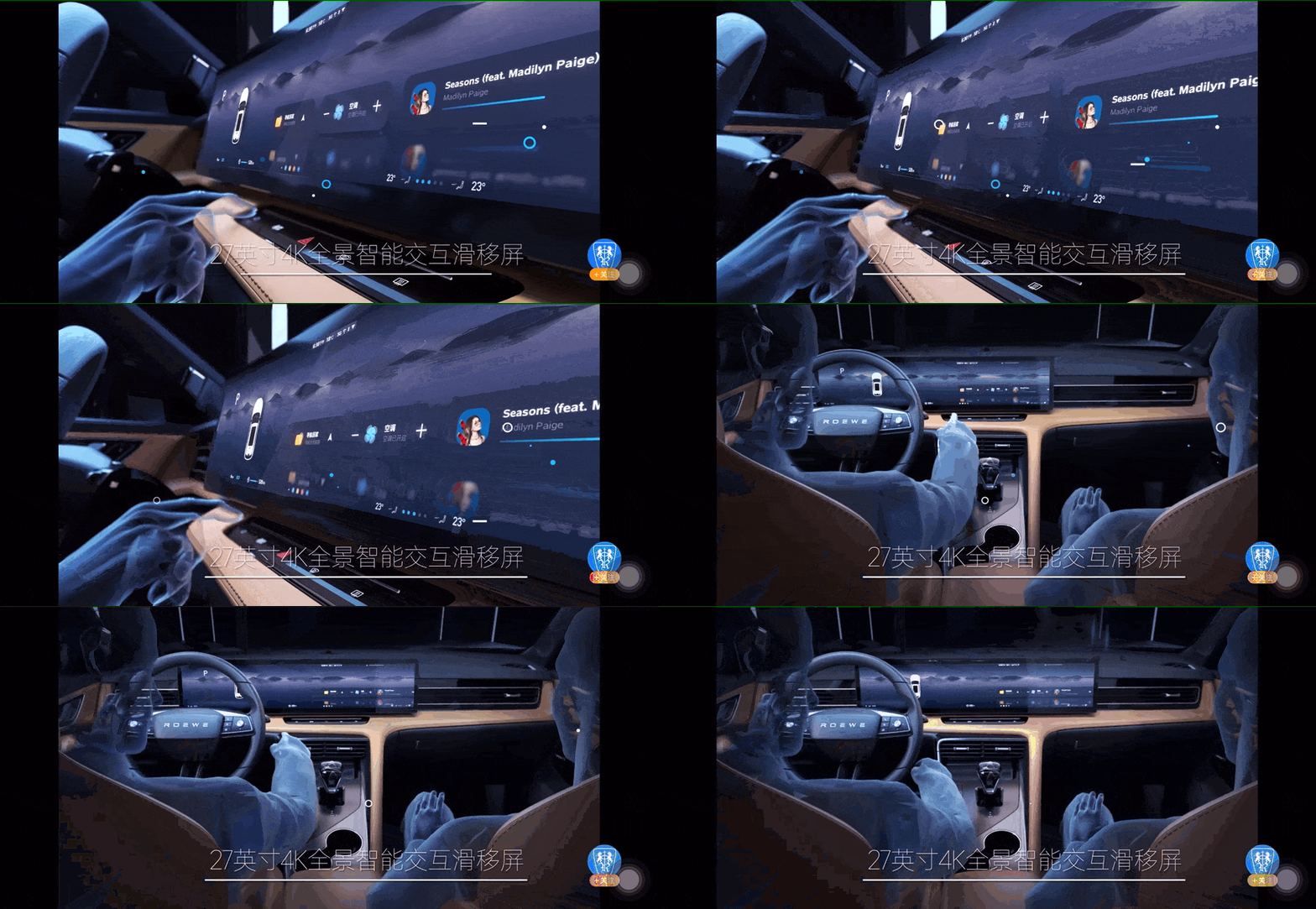
After the launch of the sliding screen on the SAIC Roewe RX5, a new version was introduced called the sliding good screen edition. Let’s talk about a few “good reviews” first:
As a pre-sale price of 135,900 yuan SAIC Roewe RX5 sliding good screen edition, it has a 27-inch whole screen and a resolution of 4K. For a vehicle in this price range, the screen size is large enough and the resolution is high enough. At least in terms of the screen’s visual effects, the SAIC Roewe RX5 sliding good screen edition has shown its sincerity.
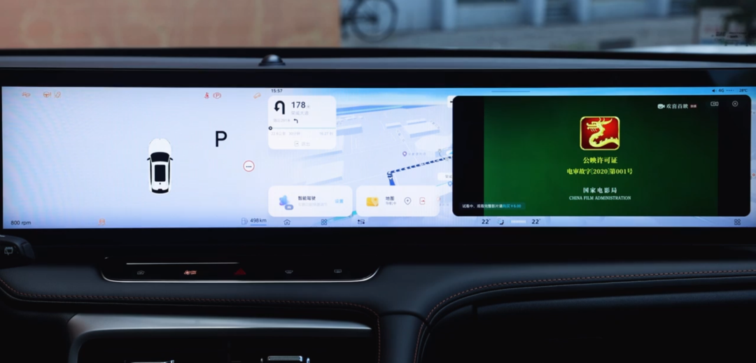
But let’s take a closer look at the scenarios where this screen is used. The RX5’s sliding screen can be used for three screen functions: instrument, central control, and co-pilot entertainment screen by sliding left and right.
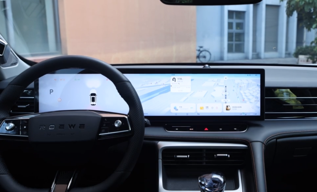
When the screen is on the left, the sliding screen will function as a combination of instruments and central control, which is currently one of the more mainstream layout schemes. Combined with the Zebra Morpheus intelligent cockpit system, it is also a good cockpit solution.
However, when the RX5 sliding screen enters the intelligent mode, the screen will slide to the right. At this time, the sliding screen will function as a combination of instruments, central control, and co-pilot entertainment screen.
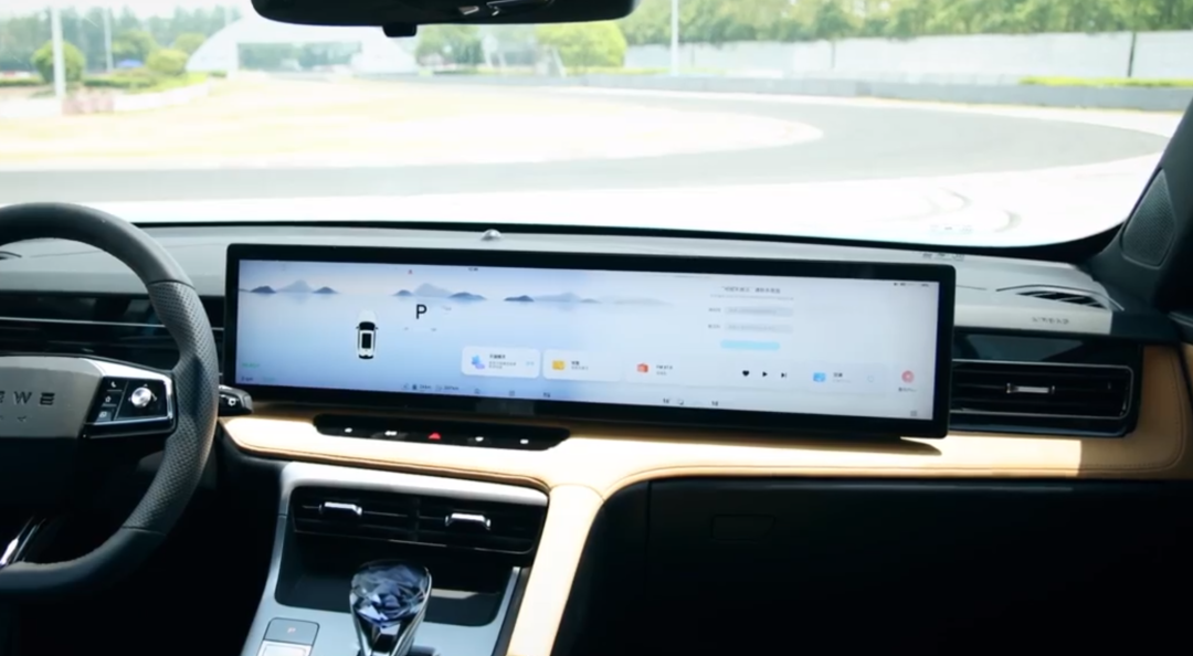
The layout of the screen at this time is similar to that of the L9, but when it comes to how to ensure that the driver obtains driving information, the L9 provides a solution through safe driving interaction screen and HUD.
As for the safe driving interaction screen, there are currently very few models that interact through a steering wheel screen. However, looking at the current configuration of the RX5, the entire series does not come with HUD configuration. Therefore, at this point, the driver’s way of obtaining information is more similar to the solution found in the Tesla Model 3/Y.
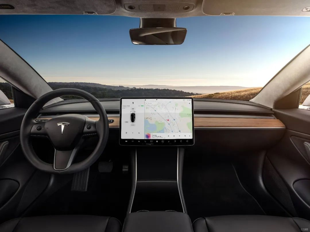
However, on the RX5, the interaction area of the “central control screen” at this time is further to the right than that of the Tesla Model 3/Y, in an unreachable and awkward position for drivers and forward-reach for co-pilots.
In SAIC’s definition of this screen, it also states:In smart mode, the driver can slide the screen to the passenger side for use by the co-driver. Not only can the co-driver enjoy the entertainment functions provided by the screen, but also “assist the driver in operating the screen and the vehicle”.
I believe that as the development and transformation of car cabins and the trend of caring about the co-driver, it is an inevitable trend to give more expansions to the co-driver in various scenarios for car use. However, the design concept that should be followed in the first place is “driver-centric”.
Giving the driver better control over the vehicle’s driving, setting related permissions and information retrieval mechanisms to ensure the interaction safety during vehicle operation, and giving more entertainment scenarios to the co-driver, rather than letting the co-driver also participate in the driving scene.
Like the Zhi-Ji L7, the design of the sliding screen is obviously facing greater challenges in terms of interaction and structural stability compared to more rational fixed screen layout plans.
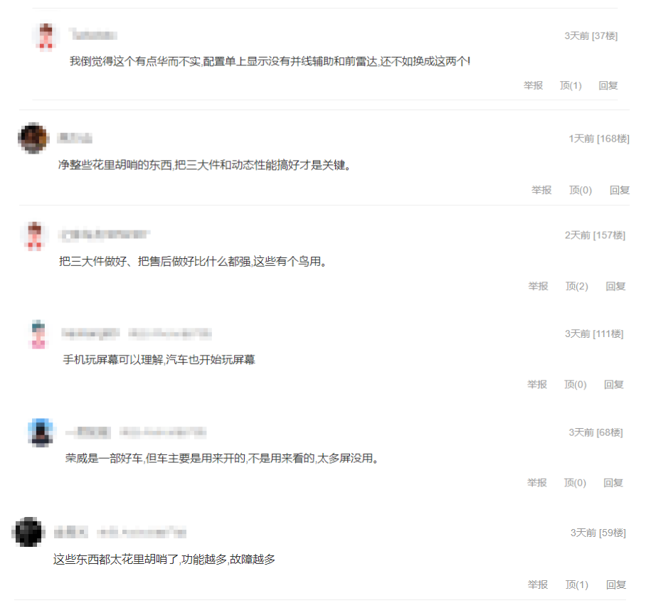
Moreover, even the Roewe RX5’s sliding screen version seems not to have received much praise from netizens:
Is the trend of movable screens the trend of cabin development?
In addition to the Zhi-Ji L7 and the Roewe RX5, many other brands have introduced movable screen cabin products.
For example, in the BYD Tang and the WM EX5, although their screens can rotate, neither the landscape nor the portrait orientation has any impact on the driver’s screen interaction. In the landscape mode, the size of video playback can be better adapted.
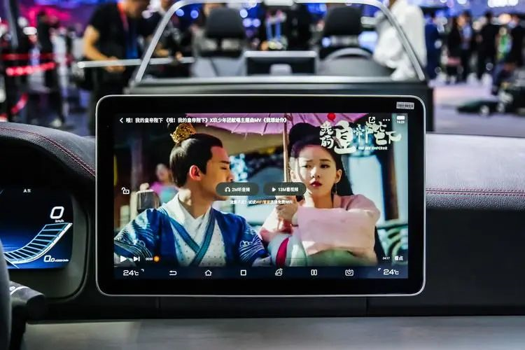
However, due to the aspect ratio of the screen, it still does not adapt sufficiently well to video playback for the Zhi-Ji L7 and the Roewe RX5.
Overall, whether it is a rotating mechanism or a horizontal moving track, making the screen move requires extra mechanical structures such as motors, limiters, etc. Although the durability of these components has significantly improved with technological advances, the probability of malfunction still increases over time.
I briefly search for it on Taobao and found a lot of repair parts such as flip brackets, center console screen hooks, center console screen slider, lifting screen cable, lifting motor gear, lifting motor assembly, and lifting screen assembly for the 2017 Audi A8L retractable screen. Even though it’s only been 5 years since the release of this car model.Actually, I’m not against the design of a moving screen in the cabin. In some cases, a moving screen can provide supplementary interactivity for the cabin, but there are several prerequisites: if the screen is going to move, it must move well and truly able to improve the user experience and convenience. At the same time, we still need to face the technical difficulties of “vulnerable parts” in terms of service life.
In addition, many people believe that rather than having a moving screen, it is better to use these costs in more practical areas.
So, do you want a moving screen in your cabin? Will a moving screen be the development trend of the cabin?
This article is a translation by ChatGPT of a Chinese report from 42HOW. If you have any questions about it, please email bd@42how.com.
