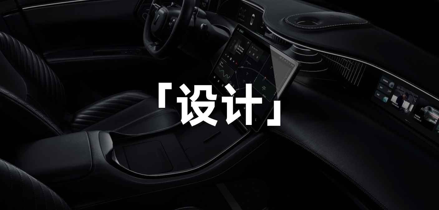
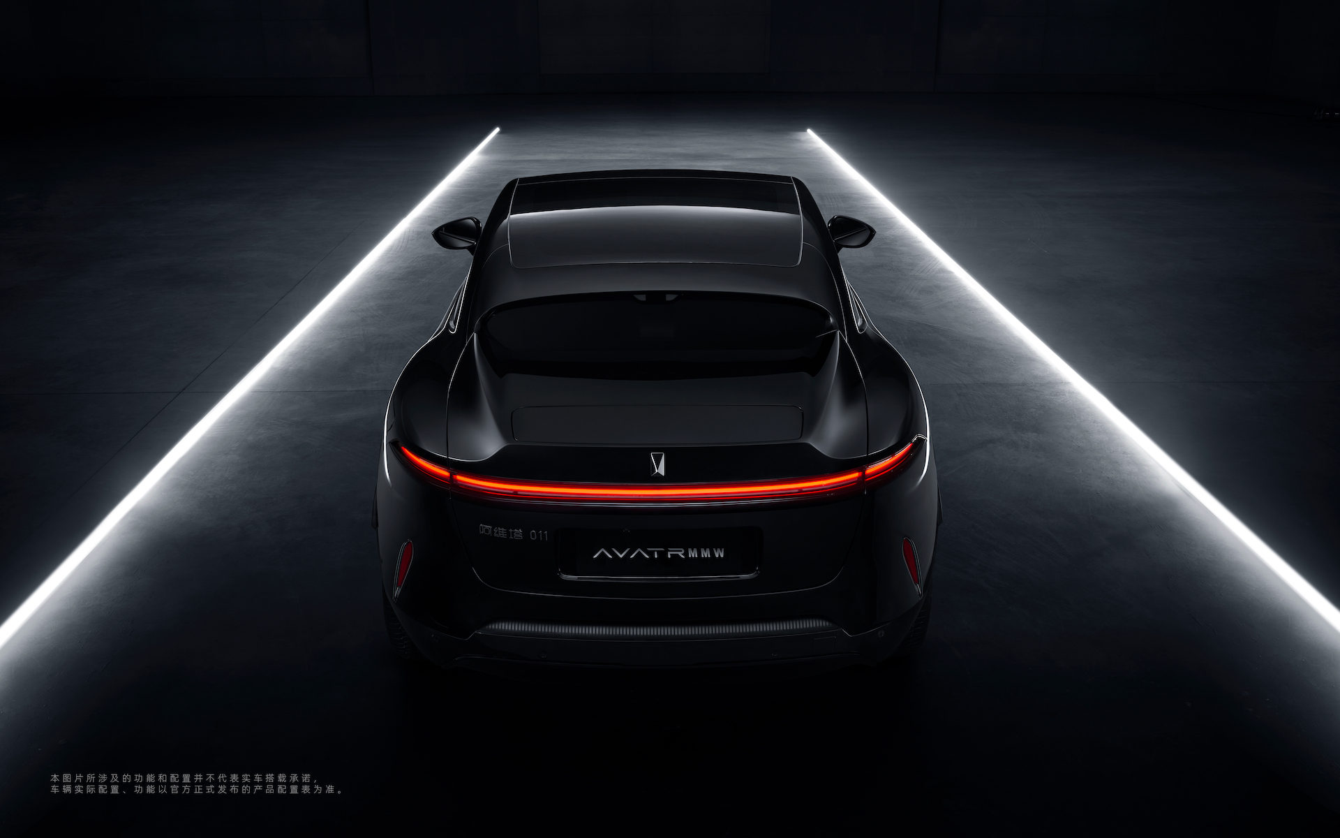
Last week, Aviar unveiled its first model, the limited edition 011, which was co-designed by Matthew M. Williams and Aviar’s Chief Designer, Nader Faghihzadeh. There will only be 500 of these cars produced worldwide.
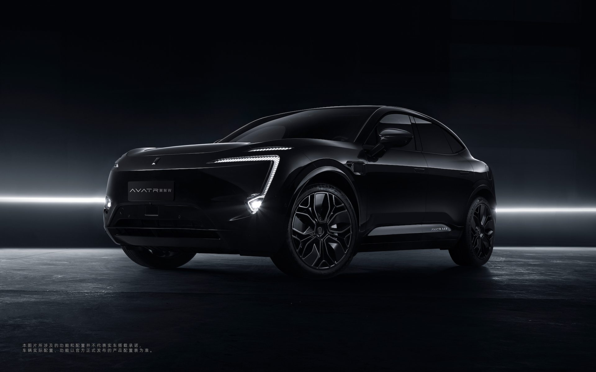
Many people have already discussed the well-known designer in detail last week, so I won’t go into it any further. However, after looking at the pictures released this time, I discovered that the interior details of the Aviar 011 are very rich. This is also the first time the interior of the Aviar 11 has been revealed. As the class representative, let me highlight some of the key points (the 011 is the name of the limited edition, while the production model is called the 11).
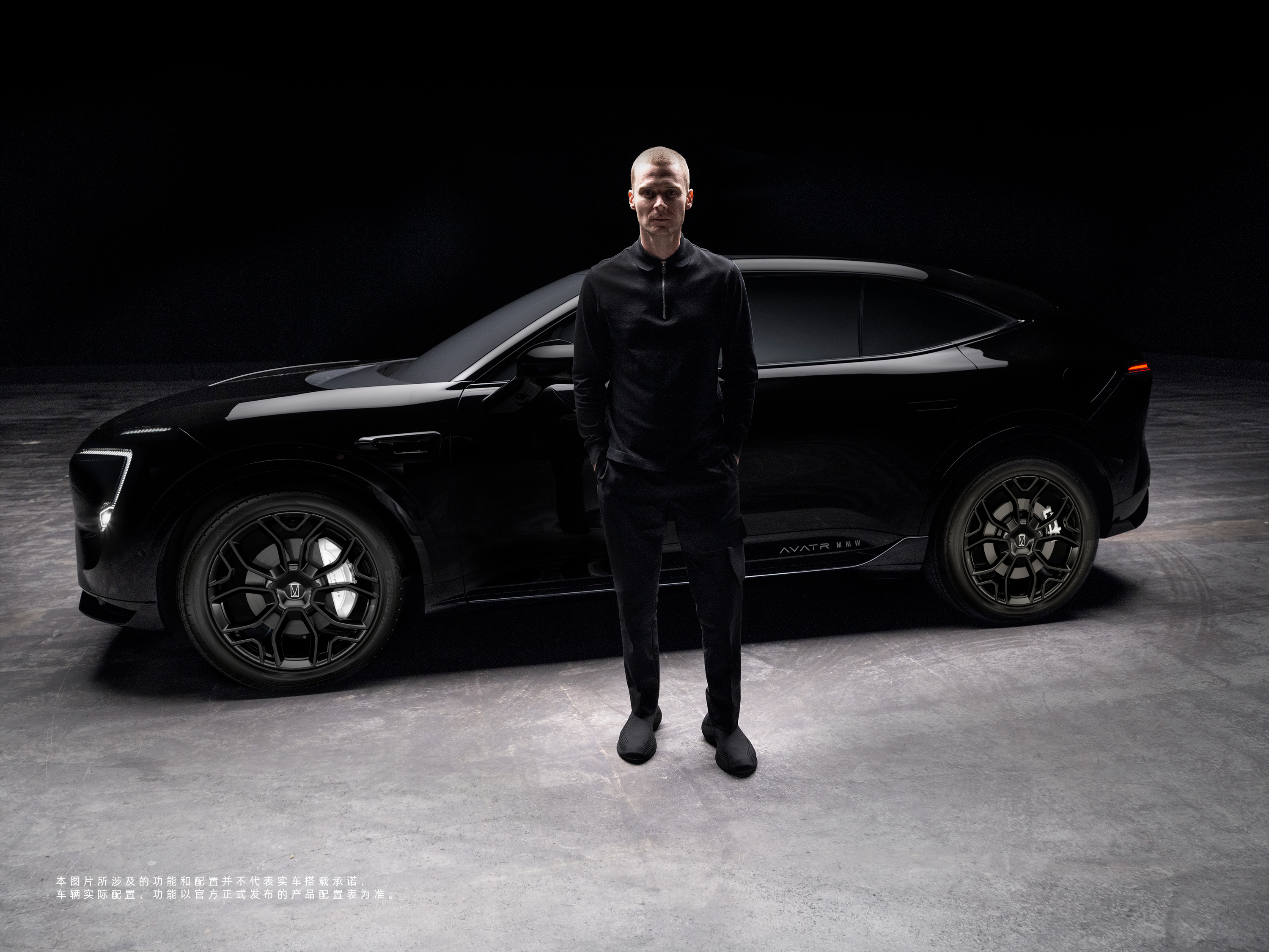
Design + Materials + HarmonyOS Car System = The Most Powerful Cabin?
With screens gradually becoming the focus of the cabin, interior design is also becoming increasingly boring.
The larger screens largely limit the creativity of interior designers. In other words, in the era of large screens becoming the main part of the interior, the requirements for interior design are becoming higher and higher.
Unfortunately, after seeing the interiors of many newly released cars recently, they have become uninteresting, even giving the feeling of just designing the interior casually and then adding a large screen to it because that’s all that matters.
It wasn’t until I saw the interior of the Aviar 11 that I remembered that there is still such a thing as interior design for cars.
As for whether the design is overly-designed or simple, elegant or mediocre, everyone has their own standards. What matters most is what you personally like.Let’s take a closer look at the details of the Avita 11 interior from top to bottom.
Mainstream 3-screen layout
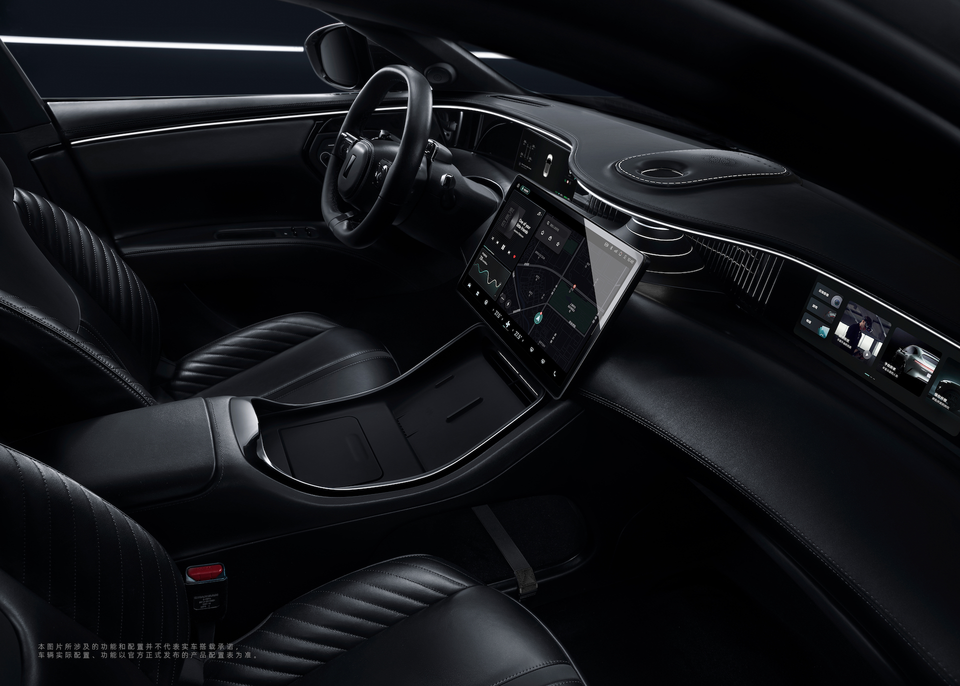
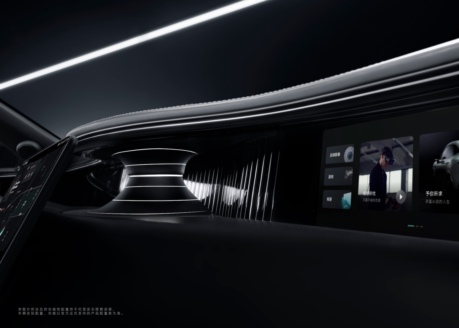
As can be seen from the picture, the Avita 11 also adopts the 3-screen layout, with not only the conventional instrument panel and center console screen, but also a passenger screen.
The entire interior is designed symmetrically, centered on the center console screen, with the instrument panel and passenger screen blending seamlessly into the interior.
Instrument Panel
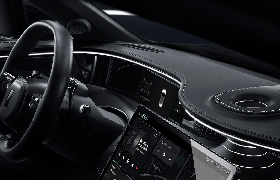
The official size of the instrument panel has not been disclosed, but it appears to be around 15 inches, with a floating design and a reasonable border width.
I have repeatedly emphasized before that the screens inside the cabin must be in landscape mode, on the one hand, the line of sight during driving only needs to move left and right, which is more convenient and safer than the up and down movement in portrait mode; on the other hand, the entertainment experience in the car will also be better.
However, using a landscape design will largely occupy the position of the air outlet, and if the air outlet is placed in a more biased position, it will affect the cooling efficiency in summer or the heating efficiency in winter, so how to let the horizontal screen and air outlet coexist is a new problem that has emerged in this era of cabin design.
We can see that the air outlet styles of the Tesla Model 3, XPeng P7, and NIO ET7, which use landscape design, are not quite conventional, which is a brand new design for the large screen.
The Avita’s air outlets are located under the screen, harmoniously integrated with the entire interior design, but the air outlet area is relatively small, and it is unknown whether the area behind the screen is another type of air outlet.
The in-car system has always been a weakness for traditional automakers, but thanks to their partnership with Huawei, Avita’s system uses the Huawei HarmonyOS for its operation and system, which allows it to compete head-on with new EV players in the software arena.
In terms of system fluency, because there is no real car experience yet, it is still an unknown, but looking at the Qoros M5 with the Huawei HarmonyOS system, both the animation effect and the fluency are not too bad.In addition, from the picture, there has been a good optimization in the layout of the car’s UI, which is to make navigation the desktop of the car’s system.
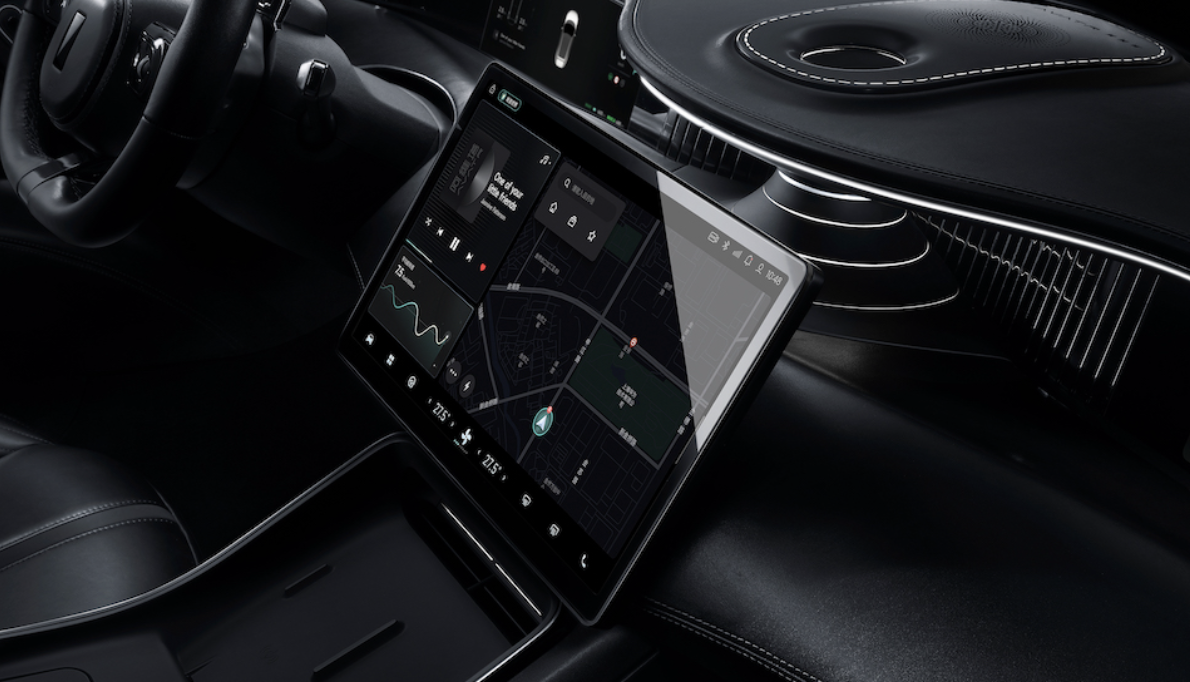
Currently, there are two mainstream methods for the car system: one is similar to the Avita 11, which makes navigation the desktop; the other is the WENJIE M5, which uses a logic similar to that of a mobile phone to display main apps in the form of cards on the desktop.
Personally, I prefer the approach of using navigation as the desktop, because before achieving full automatic driving, navigation is the most frequently used and important function of the car system. By displaying it on the desktop, one operation can be reduced every time it is used, and there is no need to wait for the software to start up like opening a new application.
But behind this, it requires better algorithms and more powerful hardware for the system, as navigation as the desktop requires real-time updates which place a great demand on the system’s computing power.
Moreover, from the previously exposed parameters, the screen resolution of this screen is 1920*1080, the hard disk is an exaggerated 256 GB, and the memory is also an exaggerated 16 GB, so in terms of hardware, Avita 11 will certainly not be inferior.
Instrument screen and co-pilot screen
Avita 11’s instrument screen and co-pilot screen adopt a symmetrical design, which has the advantage of visual beauty. However, for the co-pilot, the size of this screen is slightly smaller, and the actual usage experience may be slightly worse than the car models that use larger screens.
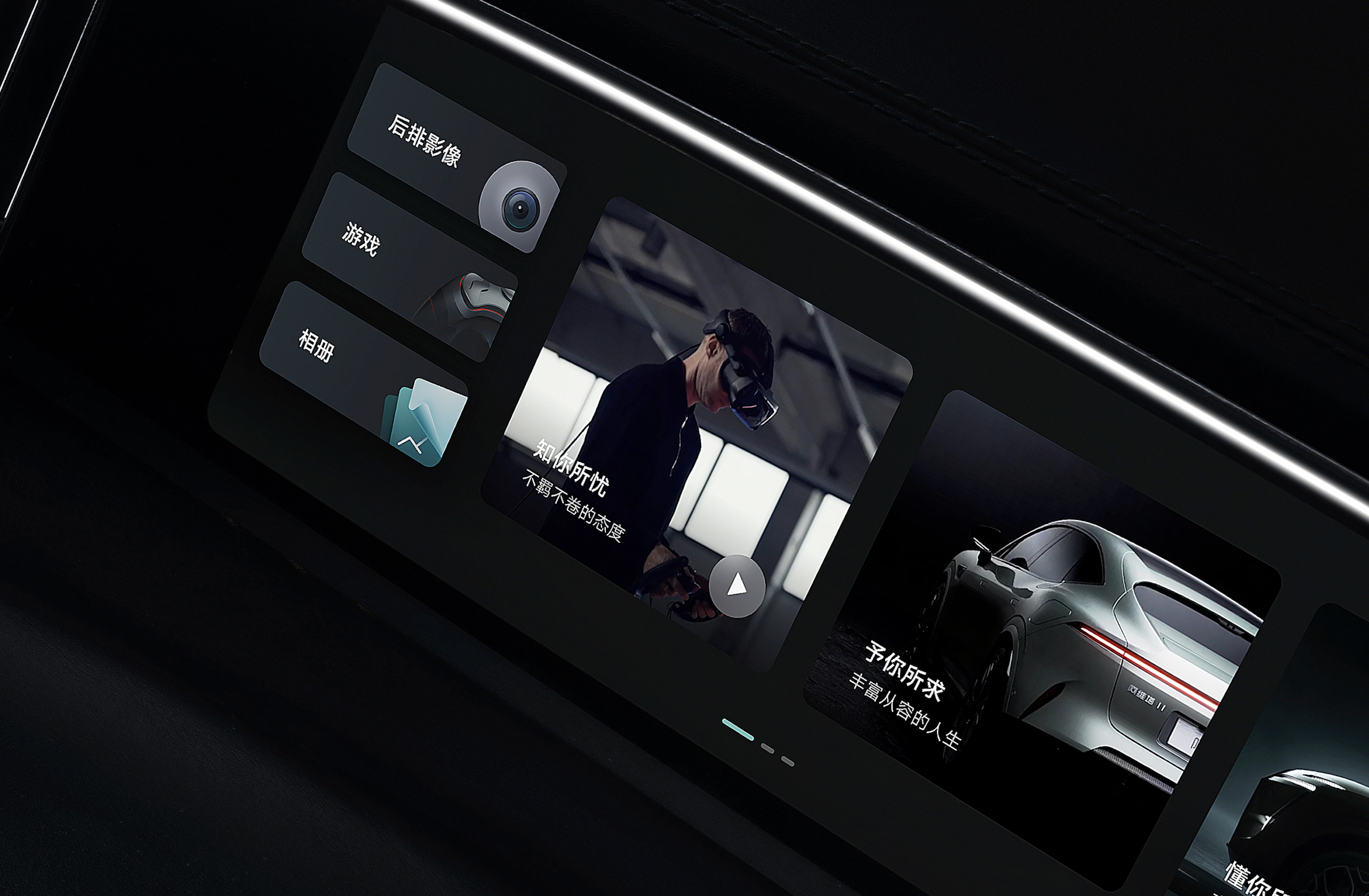
From the function buttons shown in the picture, Avita 11’s co-pilot screen also supports gaming. At the same time, the image of a young person wearing a VR device in the picture also suggests that Avita 11 may have VR functions, which is of course just speculation, whether it will be announced in the launch event is yet to be seen.
A few details about the steering wheel
The design of the Avita 11 steering wheel is very sporty, with full leather wrapping and a large space above, and the visual center is relatively low, with the core purpose being to avoid obstructing the view of the instrument panel as much as possible.
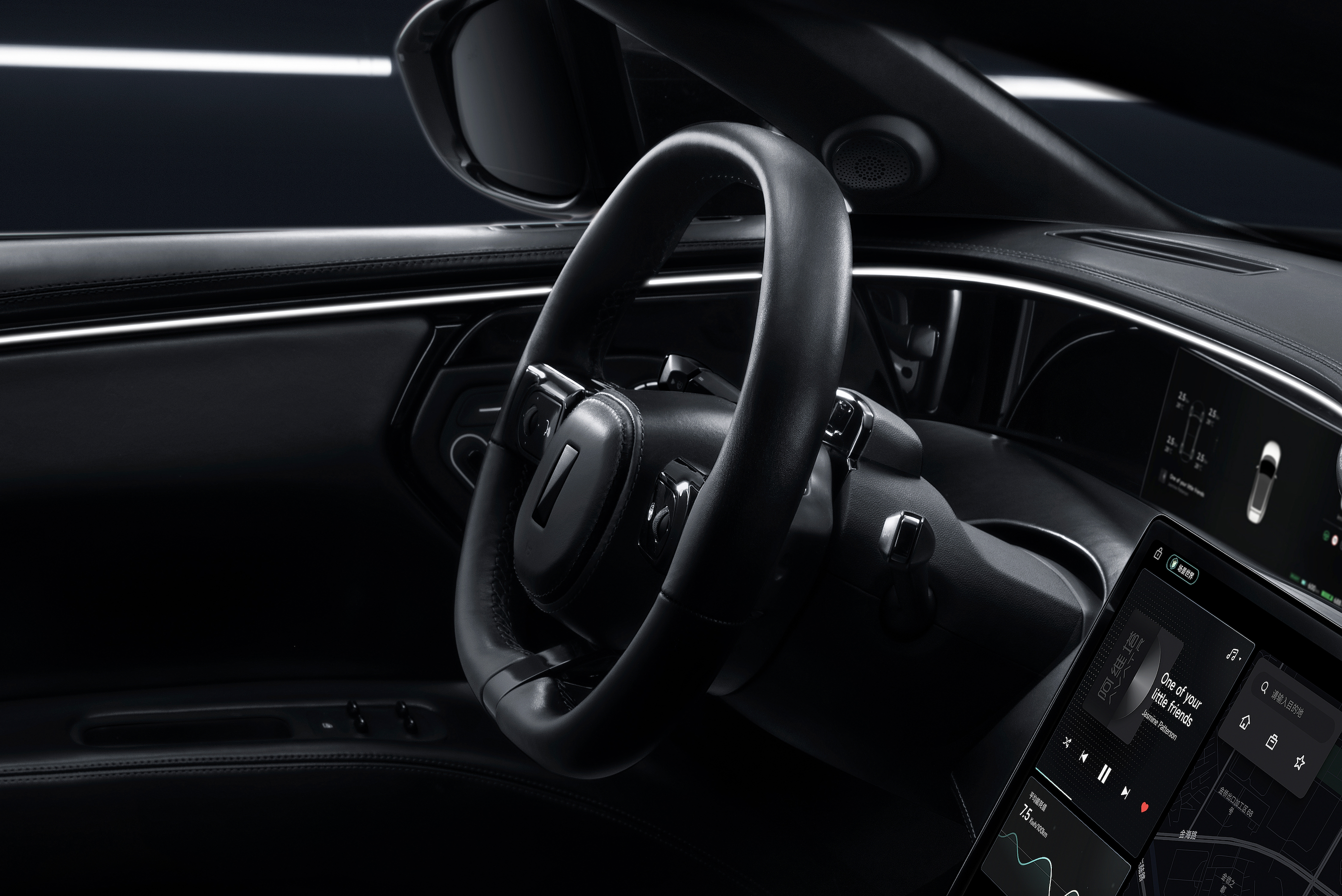
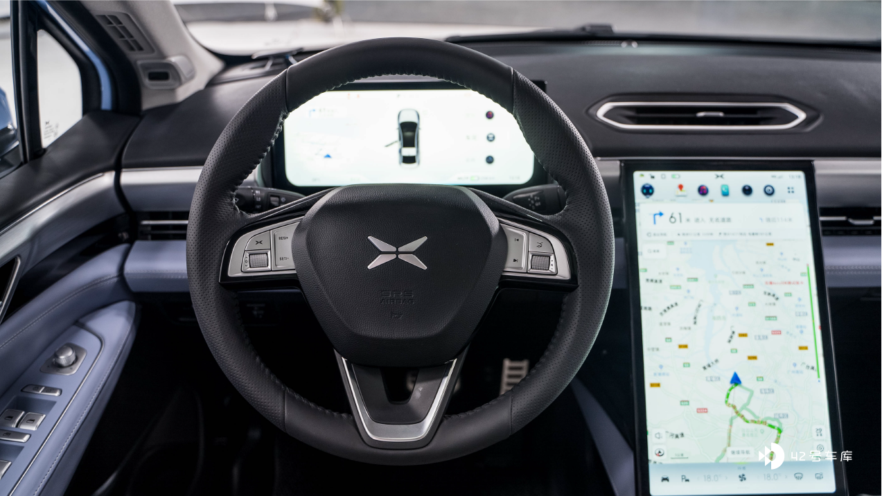
With the trend of large instrument screens, many car manufacturers are frantically increasing the size of the screen, but at the same time ignoring the design and size of the steering wheel, resulting in the steering wheel obstructing the instrument panel to some extent.The dashboard size of XPeng P5 reaches 12.3 inches, but the steering wheel design is inherited from G3, resulting in obstruction of the dashboard no matter how the steering wheel is adjusted.
The newly released BMW i3 also features the iDrive 8 display, but the steering wheel is inherited from the 3 series design, which may cause obstruction.
It seems that there will be no such problem on the WmAuto Aiwatta 11.
Moreover, the buttons on the steering wheel are very simple, mainly consisting of two rollers on the left and right, and the rollers are made of metal. This design is very similar to that of Tesla.
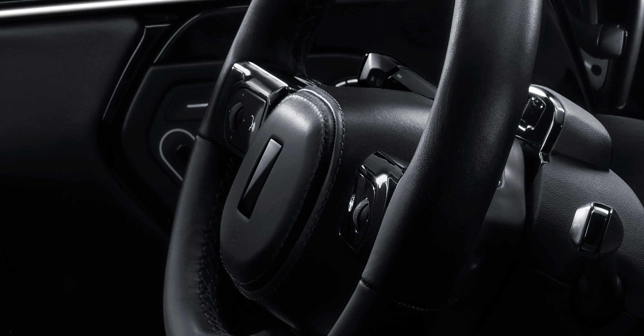
Rollers are easier to locate than a single button when operated blindly, so this design can greatly ensure the convenience and efficiency of blind operation, and there is no binding with a single function key. These two rollers, with 10 buttons in total, can be freely arranged according to the screen needs.
When it comes to designs similar to Tesla’s, the first reaction of many people may be “copying”. However, in my opinion, the most important thing is not whether it is a copy, but whether it is practical. Since someone has already found a correct answer, there is no need to give up the correct way to avoid copying. The truly good design will ultimately converge.
Several noteworthy details
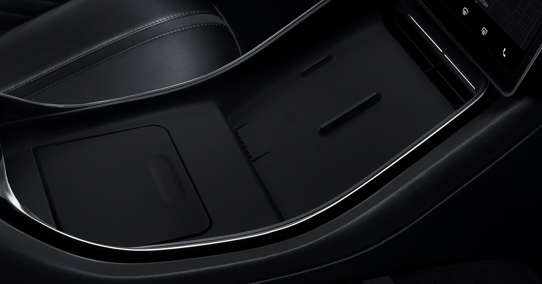
- The air-conditioning vent and the mobile phone wireless charging area are located below the screen. It is worth mentioning that wireless charging for mobile phones has active heat dissipation, which is a pain point that almost all users have encountered.
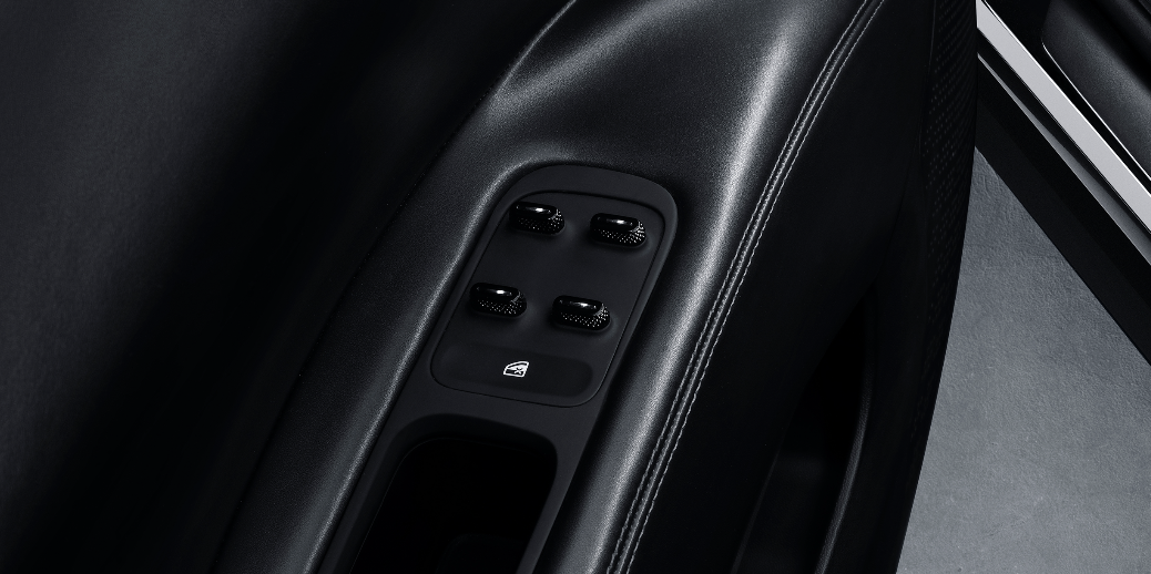
- The window control uses similar lever operations as Nio ET7.
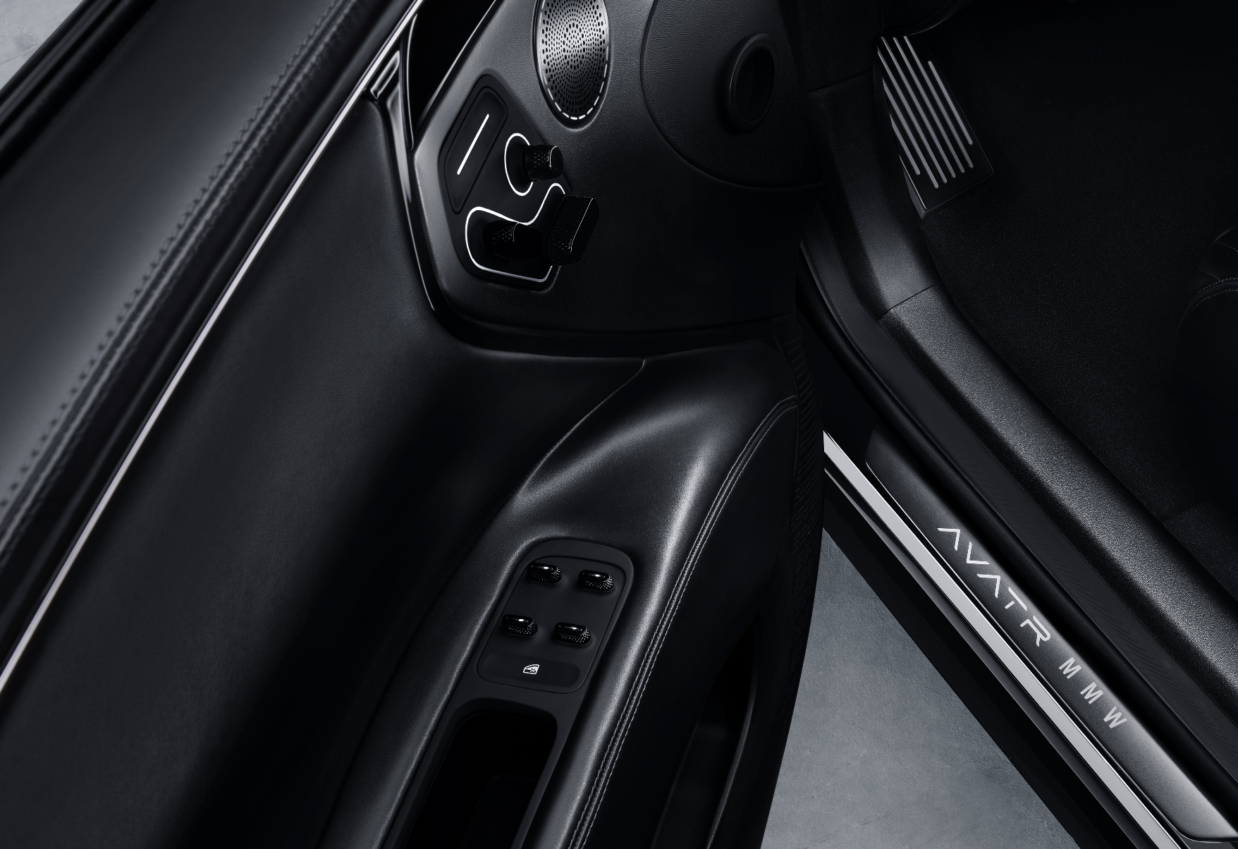
- The seat adjustment buttons are located on the door panel, and the physical adjustment buttons for rearview mirrors are also cancelled.
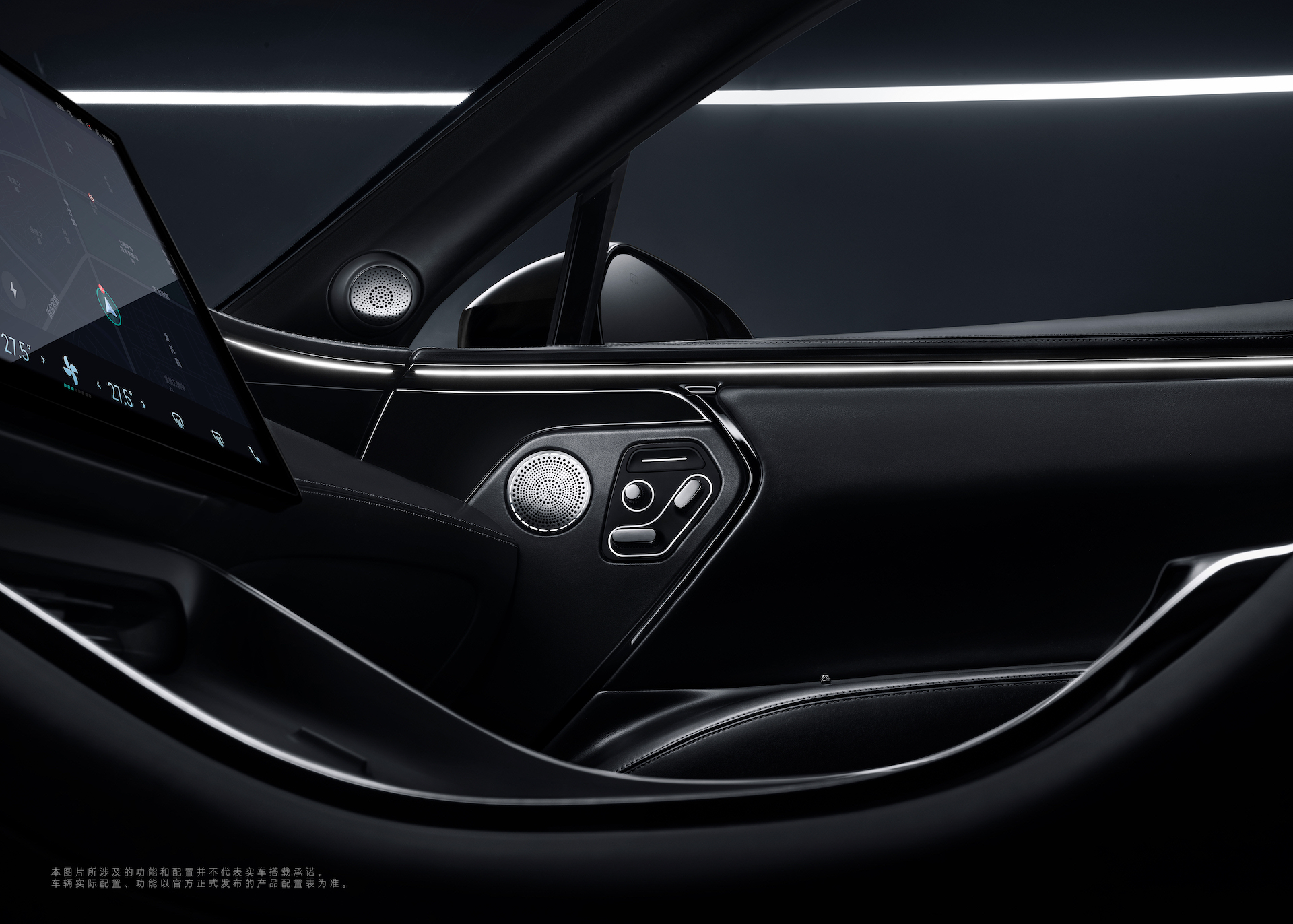
- A ambient light runs through the entire center console, extending to the end of the doors on both sides, giving a hugging feel.
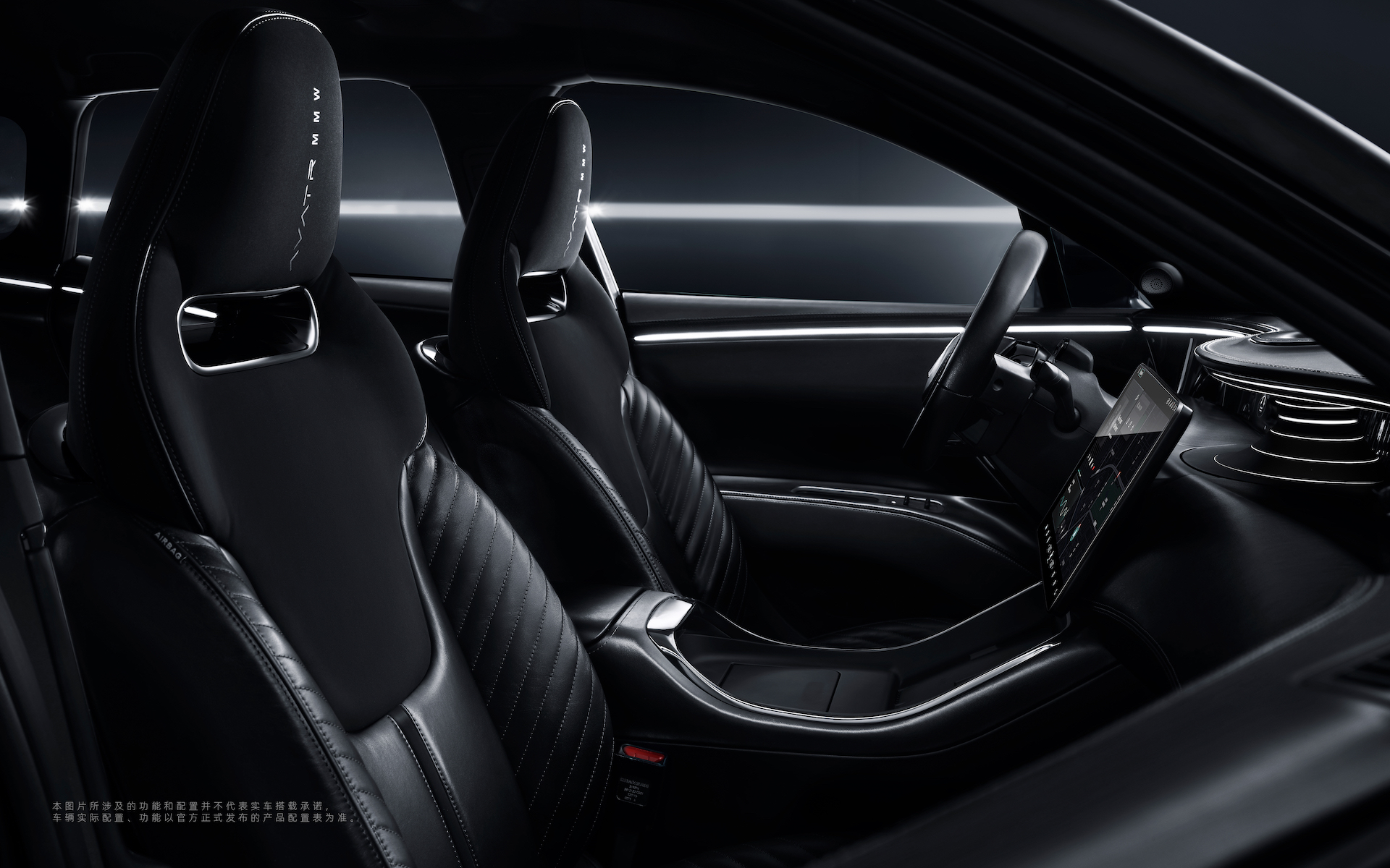
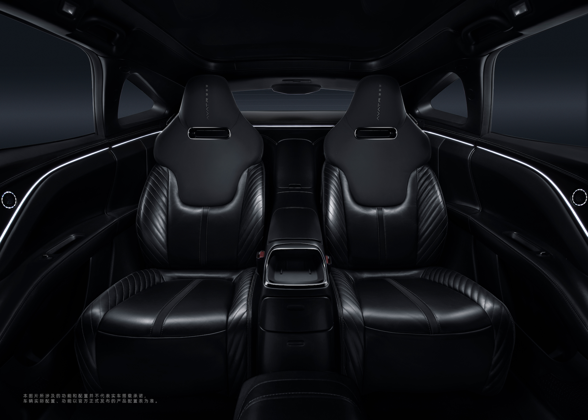
Take a look at the back seat, isn’t there a feeling of Mercedes Maybach? This is not to praise the luxury of the Avita 011, but rather the feeling of a sedan in the back seat. From the previously leaked white body, the Avita 11 is actually a three-box car body, but it is made into an SUV, so the shape of the car space is different from that of traditional SUVs.
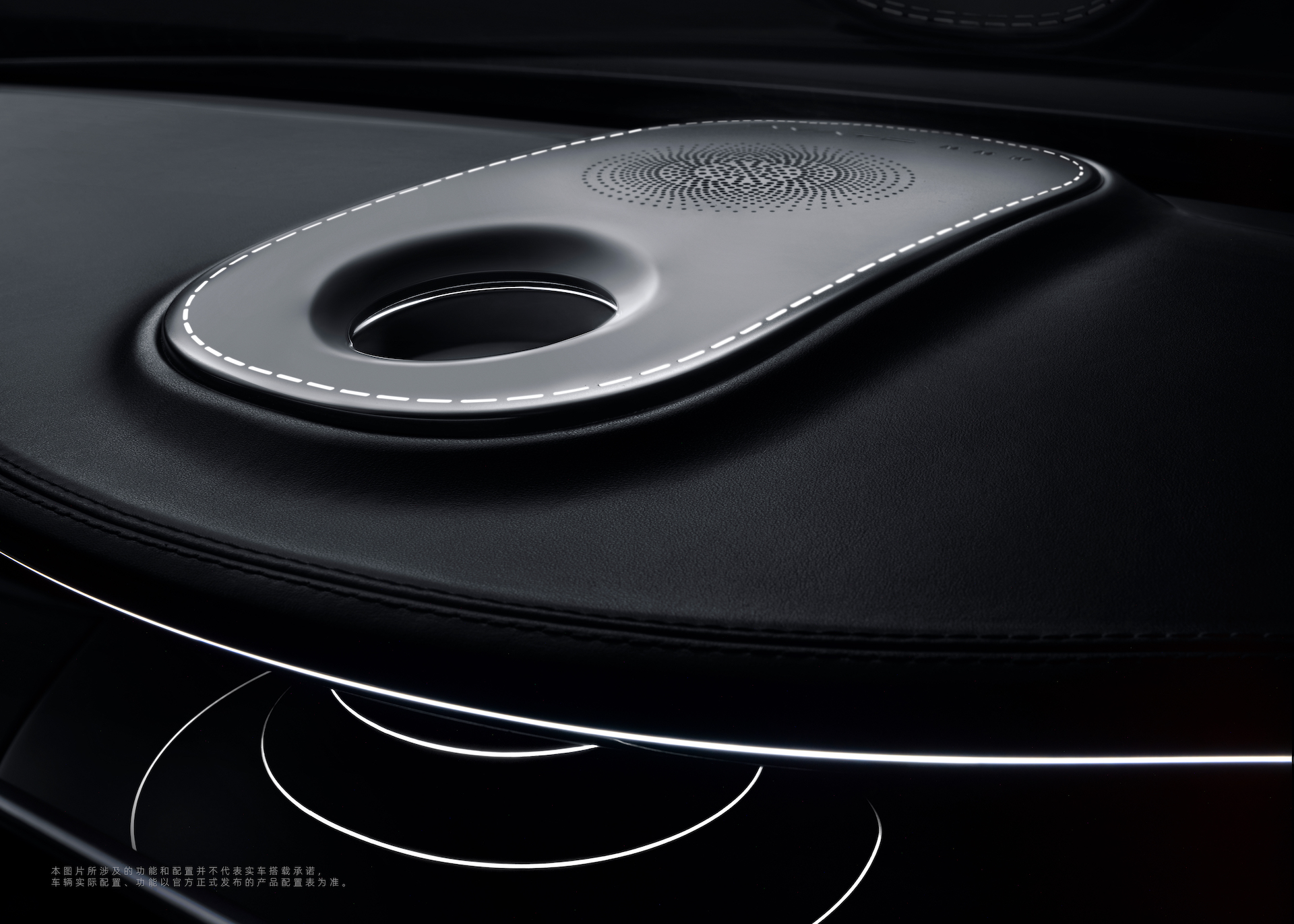
- Judging from the number of speakers in the car, the sound system of the Avita 011 should not be too bad.

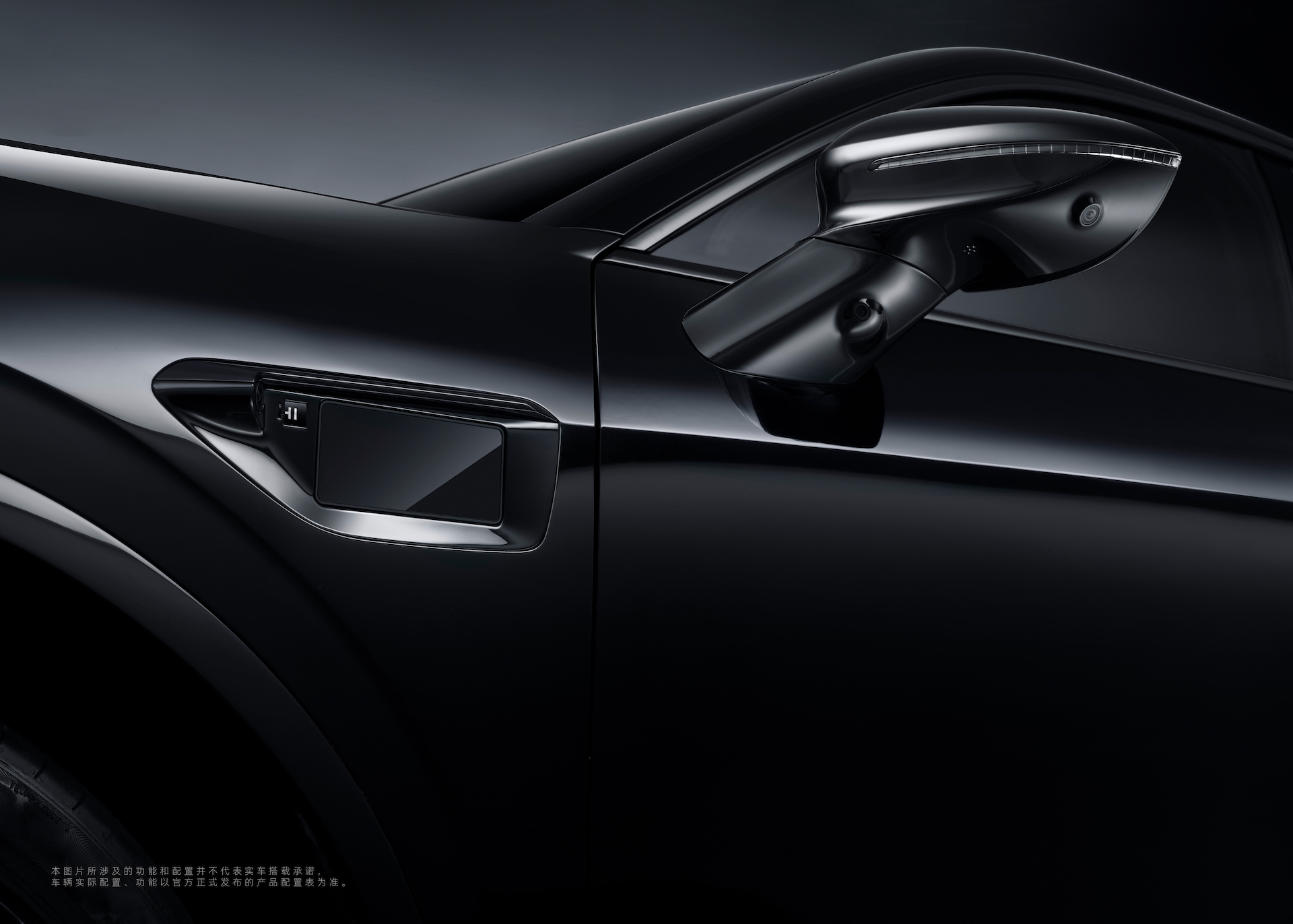
- The Huawei HI logo appears for the first time in black;
- The logo on the wheels is designed in a floating style, with the wheels being 22-inch forged wheels and the brakes being four-piston calipers produced by Brembo;
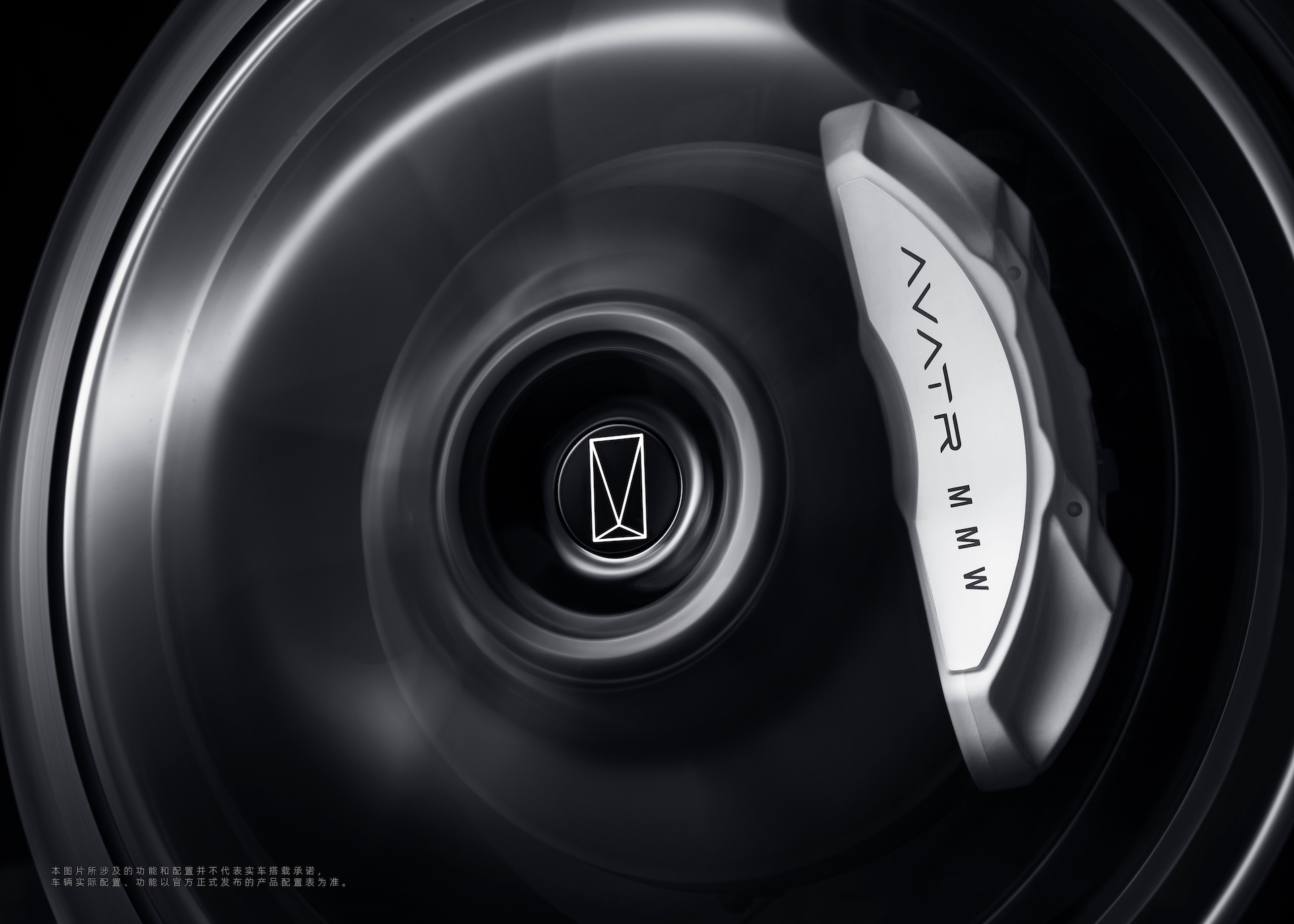
Finally, I’ll take a guess on the price. The design models of the AVISTA 011 should be priced at around 500,000 to 600,000 yuan, while the regular models will come standard with Huawei ADS assisted driving, so the price should be over 400,000 yuan.
As a “new” force entering the market in 2022, although slightly late, AVISTA’s association with CATL and Huawei makes it a highly anticipated brand. Starting in June 2022, a large number of high-end pure electric SUVs will be delivered, and we are going to see a face off between the competitors. Finally, welcome to download our “车库 App” to learn about the latest new energy information, and if you want more immediate communication, click here to join our community.
This article is a translation by ChatGPT of a Chinese report from 42HOW. If you have any questions about it, please email bd@42how.com.
