The content of this article is sourced from 42how and has been translated by ChatGPT
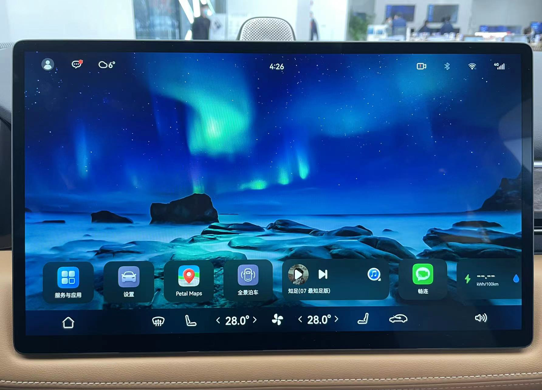
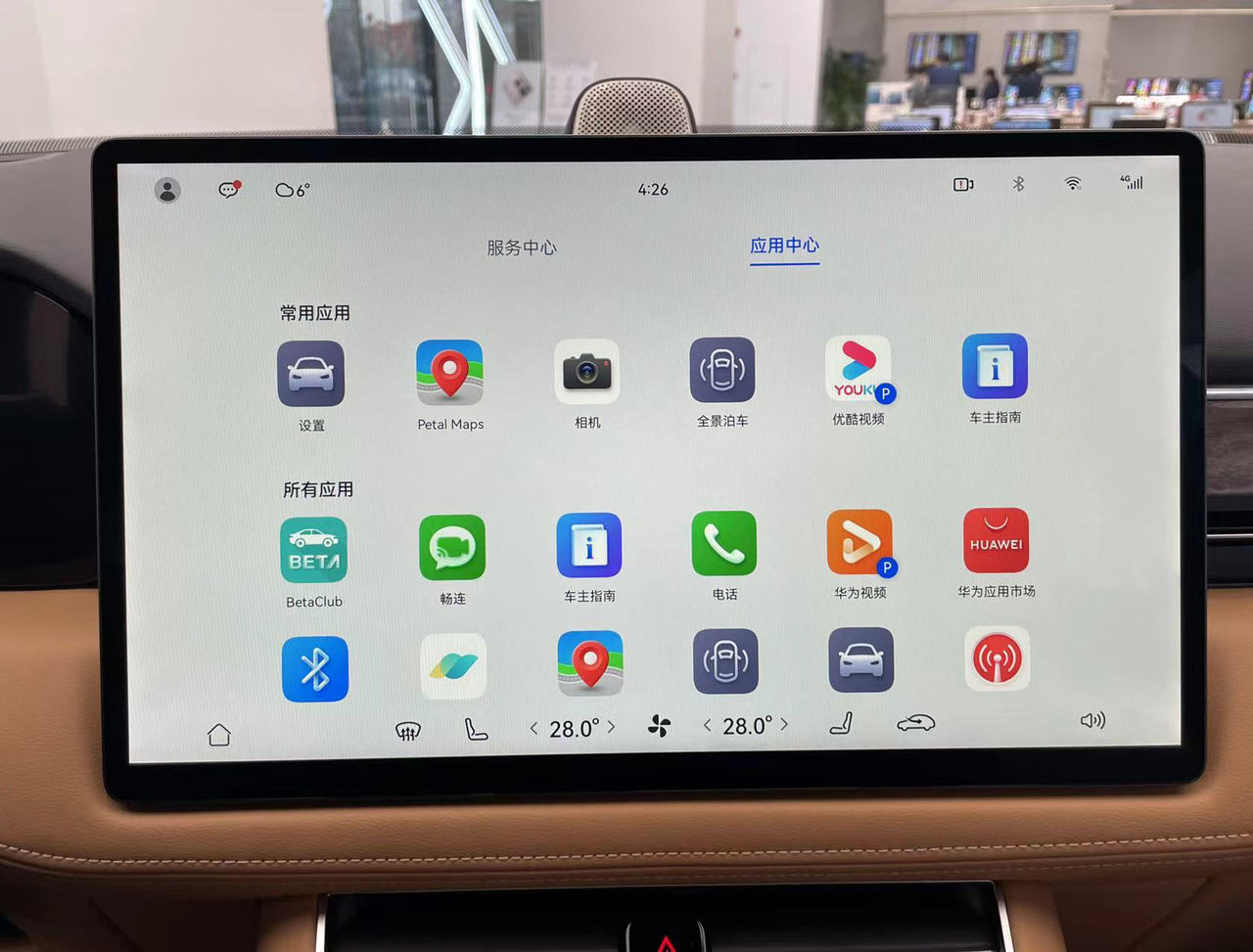
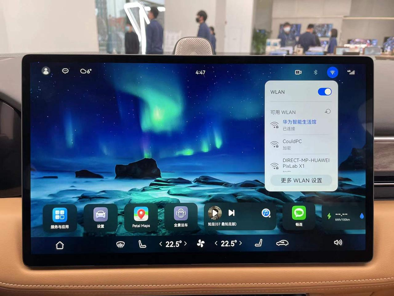
When you first see the AITO AITO M5 on-board computer, you’ll immediately notice that it’s different from other competitors. It’s rare to find a car machine that leaves so much blank space on the main interface, with less than 40% of the effective display area showing useful information, while the rest is occupied by wallpaper. Covering the air conditioning controls on the bottom control panel, it looks no different from a tablet computer interface.
A true “big tablet” for the car
In a relatively limited scenario like a car cabin, no one should be staring at the wallpaper on the car machine screen while driving. The layout design of most car machines is geared towards serving driving needs, with maps and music functions placed prominently on the main interface, and some even using the map directly as the background of the main interface, as Tesla, NIO, and XPeng all do.
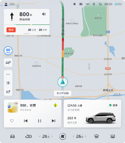
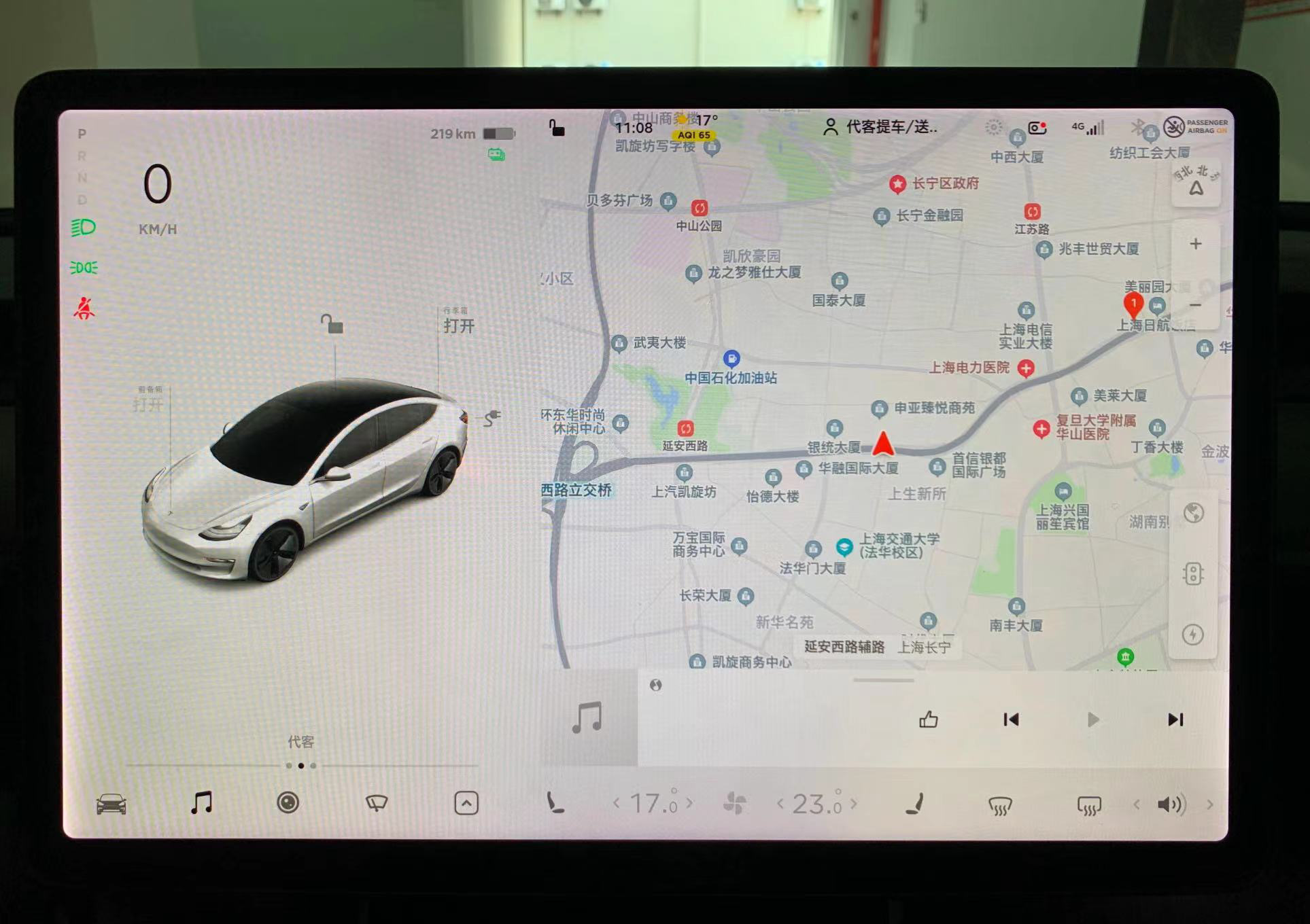
But the layout of the AITO AITO M5 requires an extra step to open the map app for navigation compared to other car machines. So why does Huawei want to add steps for users? Perhaps it’s related to Huawei’s definition of this screen.
In Huawei’s view, this screen is not just a traditional car machine display, nor is it just a control panel for adjustment functions, but an important entry point for the HarmonyOS ecosystem.
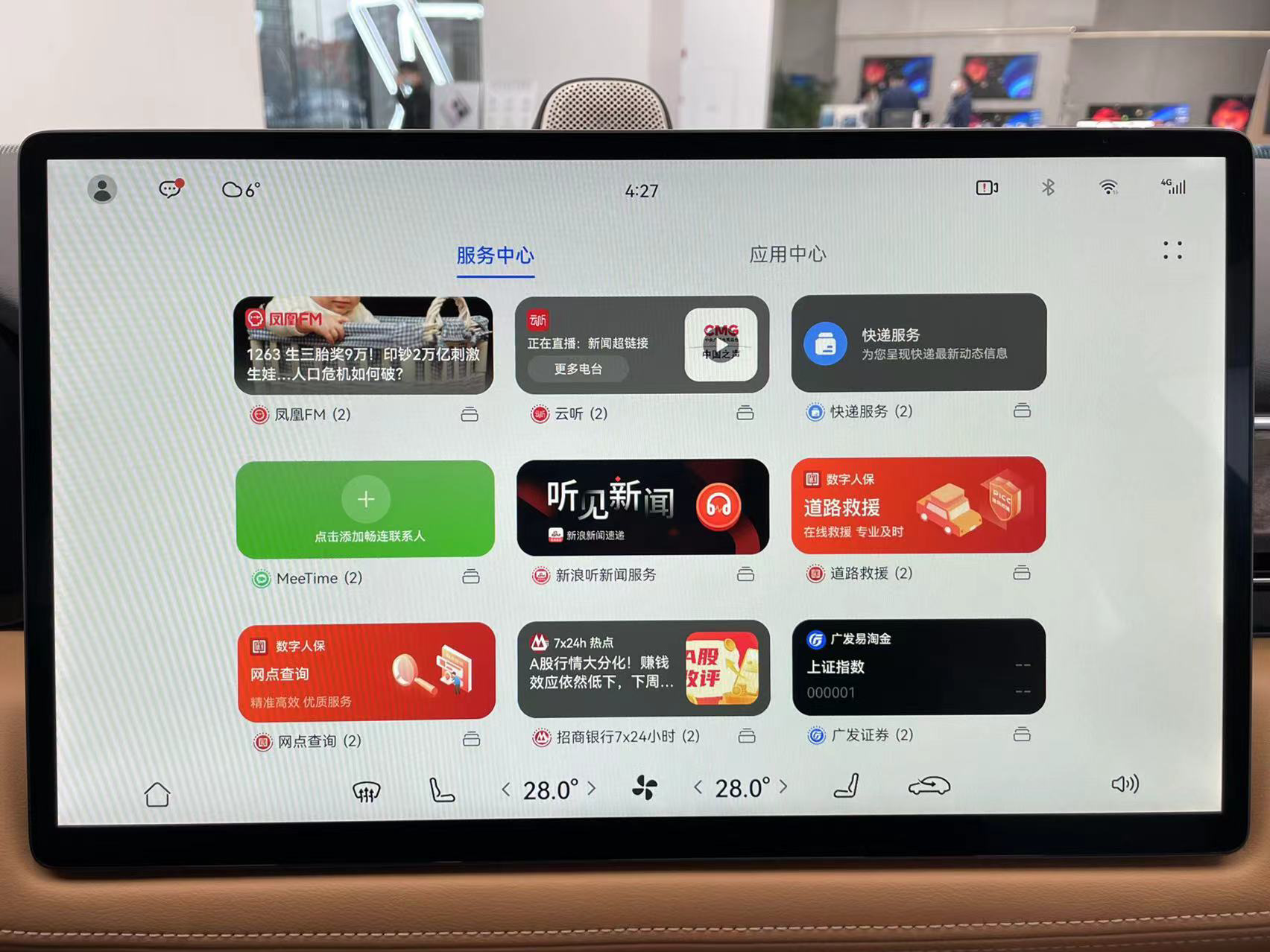
Huawei hopes that this screen can rely on the HarmonyOS ecosystem and user accounts to meet all user needs in the car. Huawei wants you to not only use this screen for navigation, music, and video, but also for operating smart homes, ordering food, reading news, making video calls, viewing PowerPoint presentations, calling roadside rescue, checking stocks, checking weather, and more.
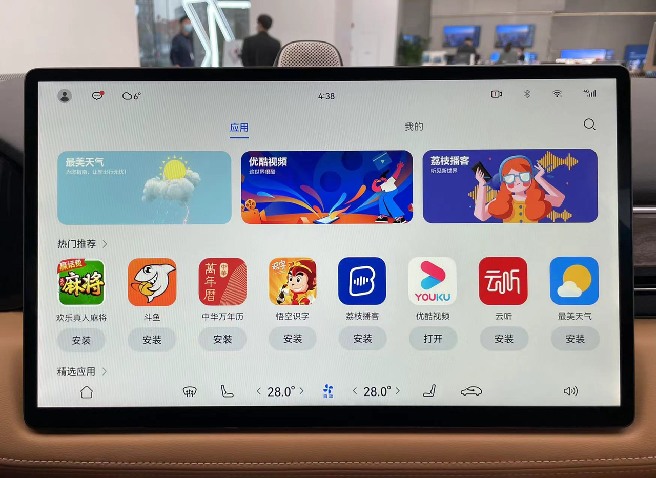 To implement so many features, it is not realistic to rely solely on Huawei’s own app, so the Hongmeng car app store may have the largest number of third-party apps available for car navigation. In addition to apps, there are also many service cards available for users to choose from, which cannot be seen on other car navigations.

When a screen needs to support so many functions, it is not reasonable to let the map and music occupy most of the main interface space. In other words, this layout design has reserved “seats” for future apps that will be available in the app store.

Coincidentally, in the V11 version of the car navigation software that Tesla pushed on Christmas, users can pin their commonly used apps to the dock for quick access. In the future, as more and more third-party apps are available for car navigations, the dock may gradually become mainstream.
“Fake Split-screen” that Cannot be Operated
When driving, it is often necessary to perform other operations while checking the navigation. To meet this demand, Huawei directly brings the split-screen function from tablets to car navigations. When navigation is turned on and another app is opened, the screen will automatically split into two parts to display the map and the other app.
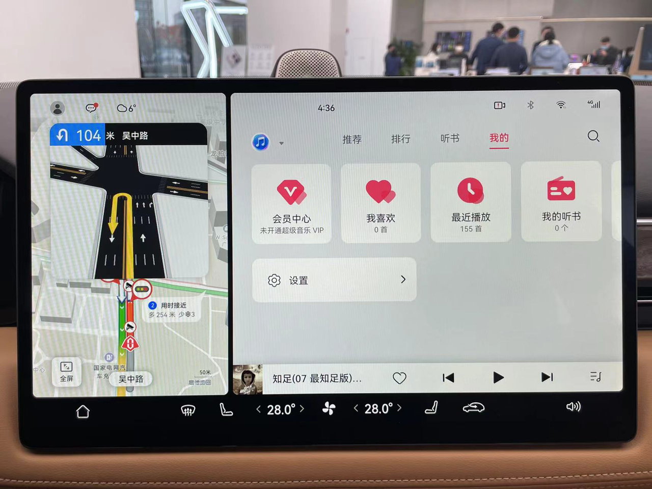
However, for some reason, the map app cannot be operated in split-screen mode. You must click the full-screen button in the lower left corner first to control it. This is very inconvenient and loses the original intention of simultaneous operation with split-screen. Since the current version is not yet a production version, it is still unclear whether this is a bug or a design flaw.

Compared with other car navigations’ simultaneous display schemes, the advantage of split-screen is that it can display almost any application at the same time, except for the “P” icon, which means it can only be opened when the car is in P gear. Almost all applications can be opened in split-screen.
For example, you can make video calls while driving and share the car interior and exterior views by directly calling the car’s internal and external cameras.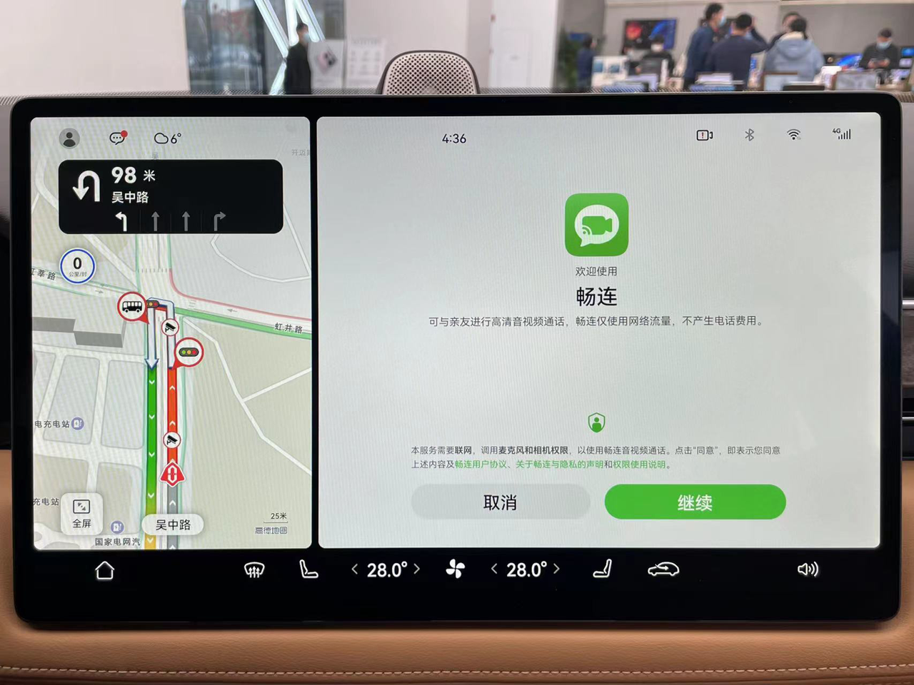
The split-screen function divides the screen into two rectangular areas, with the screen ratio in full-screen mode and split-screen mode corresponding to tablet and mobile phone respectively. Developers only need to make minor modifications to the UI layout originally adapted to mobile phones and tablets to apply it to the in-vehicle system, greatly reducing the workload of app adaptation.
Clear Privacy Management Items
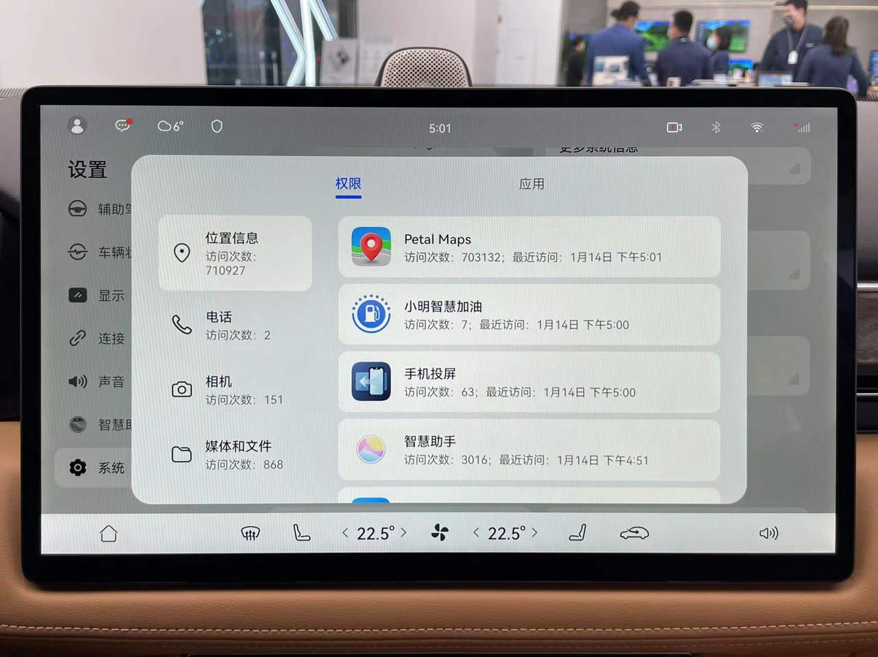
While enjoying the convenience brought by smart cars, we are also taking on the risk of privacy leaks. The location information left by navigation usage, the image information captured by in-vehicle cameras, the contact information and conversations inside the vehicle obtained by connecting to mobile phone Bluetooth, all of which, once revealed, can cause unimaginable consequences. With the increasing number of third-party apps on in-vehicle systems, a complete permission management system is urgently needed.
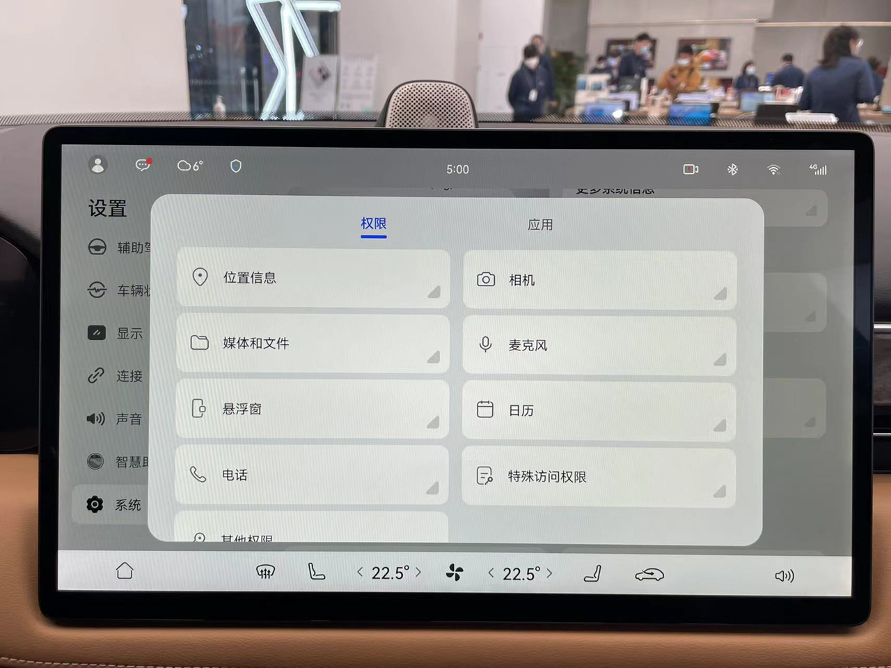
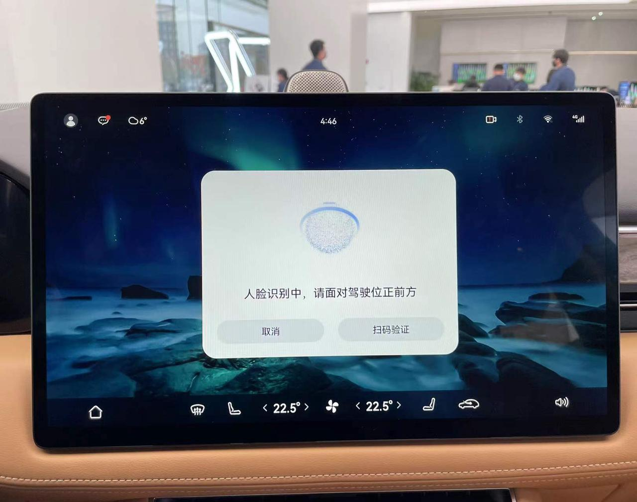
This permission management system on the AITO Wench M5 is very similar to the one on Huawei phones. It includes a wide range of permissions that can be monitored, including the most concerned ones like location, camera, and microphone. Clicking on the option will show all apps that can use that permission in an intuitive way.
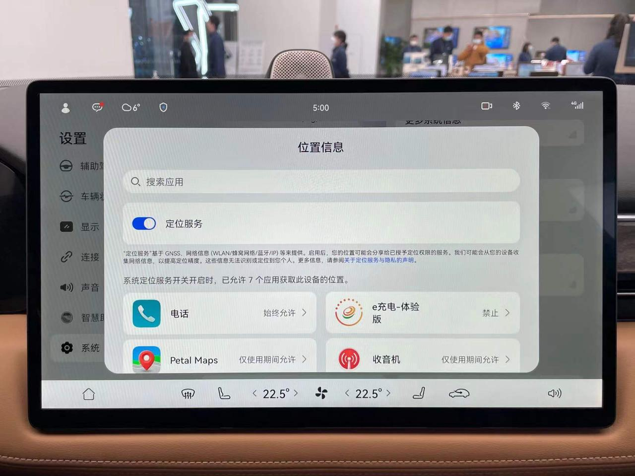
In addition, you can also set the way each app uses permissions and view the number of times and duration of permission usage.
Make Every Middle-aged Person Know How to Use the In-vehicle System
In fact, there are many loyal Huawei users among middle-aged and elderly people, who not only have strong purchasing power, but also have high loyalty to the Huawei brand. The AITO Wench M5 is priced at around RMB 300,000, and Huawei has also put a lot of effort into teaching this group of consumers how to use the in-vehicle system.
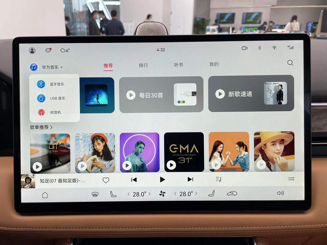
Several official Huawei app interfaces adopt a layout almost identical to that on mobile devices, and even the vehicle settings page has a strong Huawei flavor – all items are clearly categorized under different primary columns, and the most commonly used switches are designed as easy-to-click squares on the first page of the settings.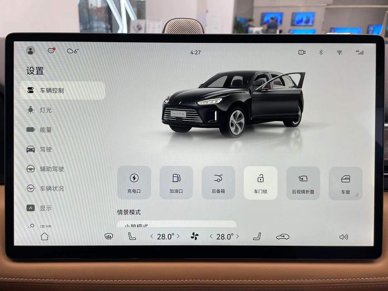
For uncommon options, Huawei provides annotations and illustrations to minimize the understanding cost.
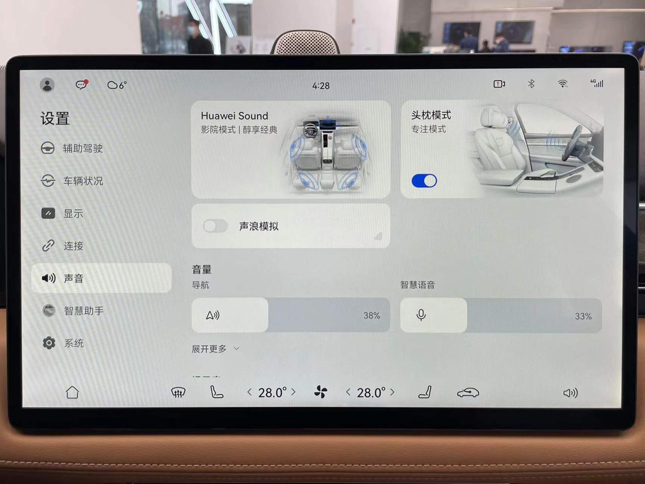
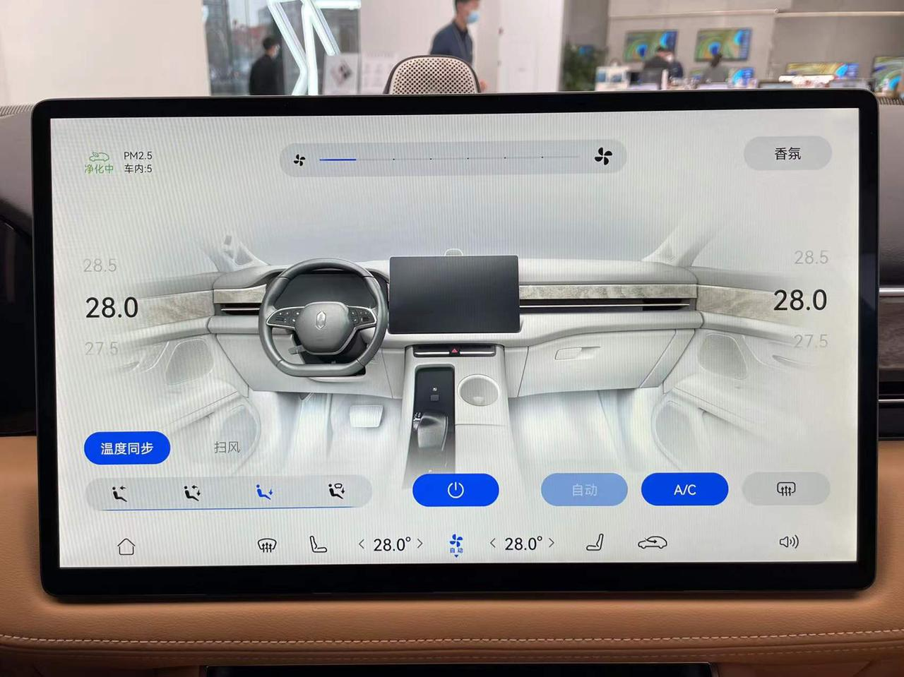
The 3D model and Chinese buttons of the air conditioning interface can also help first-time users quickly understand its operation logic.
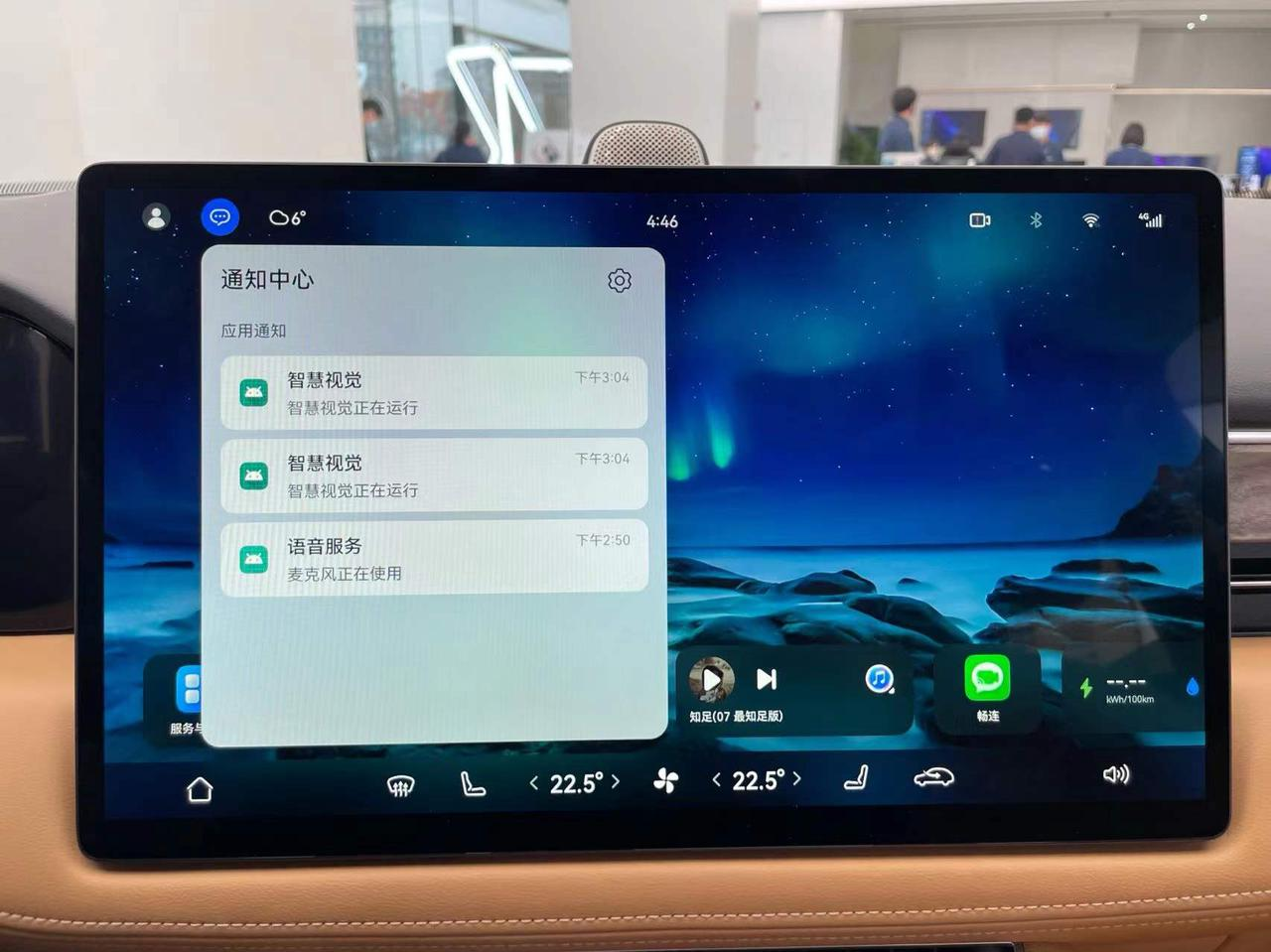
All icons at the top are interactive and can be quickly set by clicking on them.
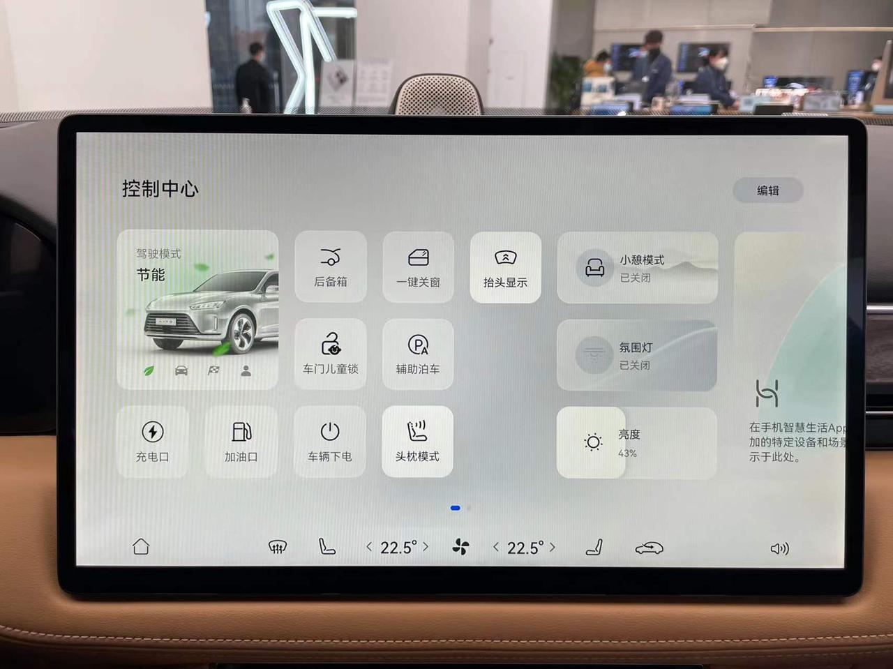
Scrolling down to the right opens the control center, which contains multiple quick settings buttons and controls for Huawei’s Smart Home.
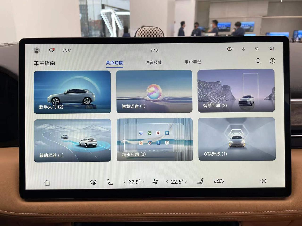
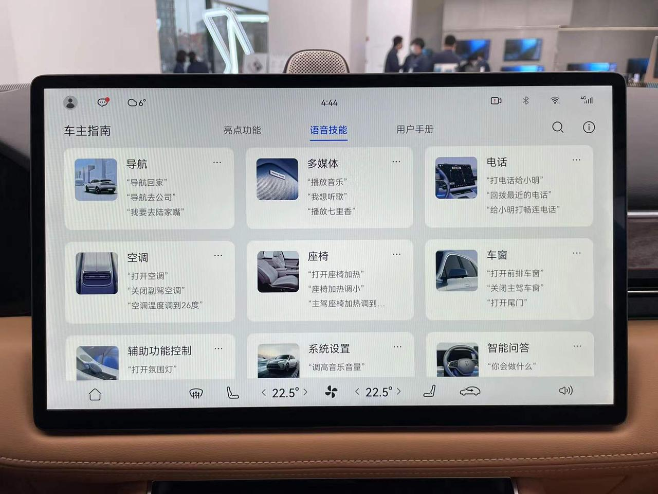
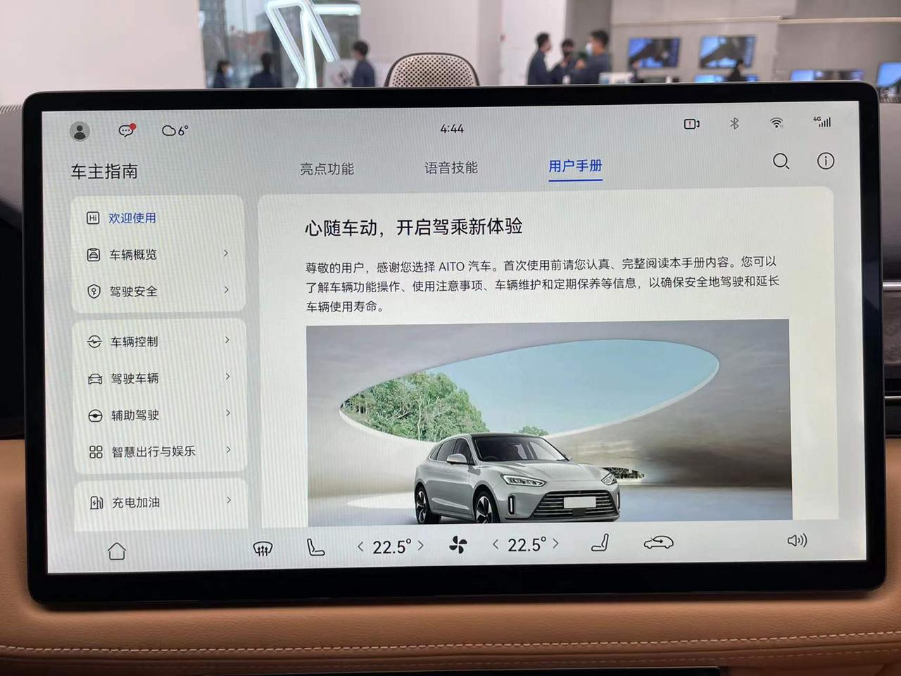
For those novice users who have no experience with smart products, Huawei has also built a Car Owner’s Guide App into the car, which fully explains the operation methods and highlights of the car machine.
Summary
After experiencing the HarmonyOS car machine on the AITO WENJIE M5, I saw Huawei’s different thinking on the layout of car machines compared to other car manufacturers. The vast majority of manufacturers choose to ensure absolute efficiency under driving scenarios, with maps, music, and vehicle information, the three most critical pieces of information when driving, occupying the main area of the main interface. Huawei’s choice is to balance different usage scenarios and turn map, music and other functions into apps that are opened only when needed.
This is also the fundamental difference between HarmonyOS car machines and other car machines.These two layout methods represent the different current situations of the two sides. Compared to the powerful smartphone-originated ecosystem of HarmonyOS, the atomization services introduced by the HarmonyOS system allow users to use services without installing an App. This running method is very suitable for platforms such as car machines that most developers do not specially adapt to. On the other hand, car companies such as Tesla and XPeng do not have as many developers’ support and are completely dependent on themselves to build core functions. Therefore, there is no need to leave so much entrance space for third-party Apps on the interface layout.
Currently, the importance of the car machine ecosystem has not yet been demonstrated, and consumers’ requirements for car machines are still limited to basic functions. However, in terms of device attributes, compared to smartphones, car machines have absolute advantages such as larger screens, better audio-visual effects, and more accurate satellite positioning. Under the premise of more and more abundant car machine functions in the future, introducing third-party developers is also the only way for each automaker. AITO Qianjie M5 has already given its answer on how to balance and control the quality between first-party services and third-party services.
