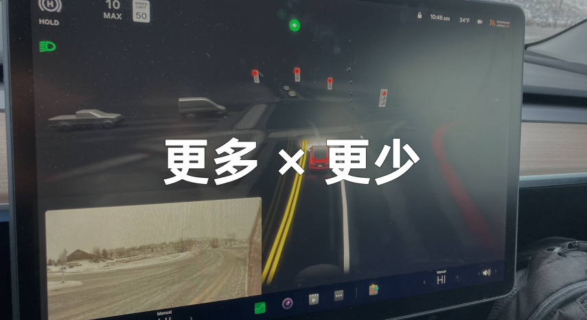
On the evening of December 23, 2021, local time in the United States, Tesla officially began to push the Christmas car system update in the United States. Tesla’s “annual reservation project” has been carried out for many years. With the increase of Tesla’s market share and the further emphasis on intelligence in the market, this year’s attention is different from the past.
Compared with the “re-layout” of Tesla’s car system UI in last year’s Christmas update, Tesla’s Christmas update in 2021 can be said to be a phased reconstruction of the car system interaction.
What’s new?
There are two specific version numbers for Tesla’s 2021 Christmas version car system update. For most ordinary users, it is 2021.44.25.2. For those users who have obtained the FSD Beta internal test permission, it is 2021.33.25.5. The latter includes the FSD V10.8 assisted driving software update in addition to the car system content.
However, Tesla has not yet opened the relevant FSD Beta test in China, so this Christmas update we received is still about the car system. Below, we will quickly review the contents of this update in the order of the system update instructions.
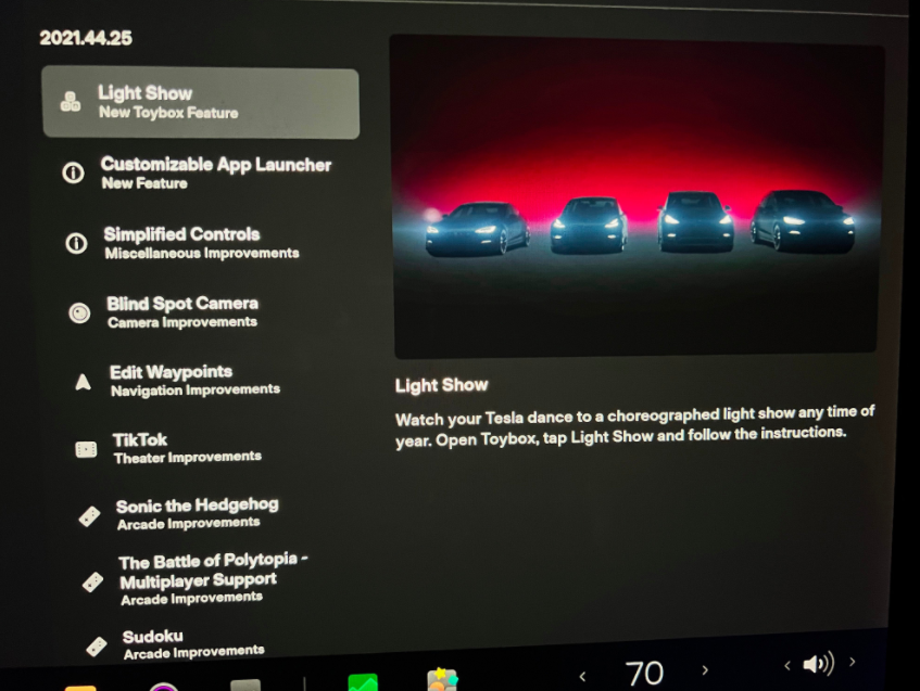
Light Show
The first item in the Christmas car system update is the “Light Show” in the ambiance group function. People have seen this function on the old version of Model X. After opening the corresponding function in the system’s toy box, the vehicle will start to play Christmas songs and perform light dance performances with the car lights.
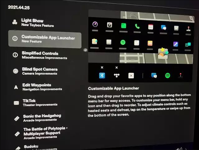
Custom Application Start Bar
The new version of the car system’s application launch bar now supports freely dragging the order of apps, and you can customize deleting or adding related apps from the application menu.
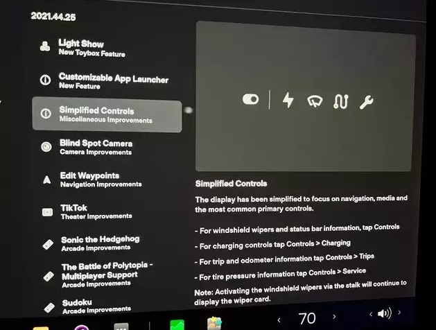
Simplified Vehicle Control Buttons
The information displayed on the central control screen is more focused on navigation, multimedia, and commonly used functions after the update. The original vehicle settings have been simplified. Clicking on it will no longer pop up a complete setting menu, but instead will stretch out a small area to display the shortcut icons of commonly used settings.
Turning Blind Spot Display
The turning blind spot display function is added. After enabling this function in the Autopilot settings, when the user uses the turn signal, the rear-view ADAS camera on the vehicle’s fender will automatically display the real-time image of the corresponding side of the vehicle on the central control screen.## Navigation Waypoints
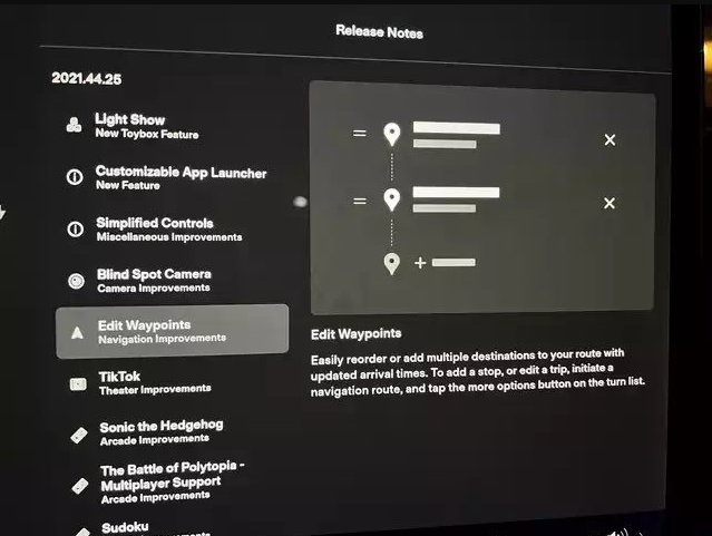
The car navigation system now has a feature to add waypoints. Click the “add” button on the central screen to set a stopping point in the route.
App and New Game Updates
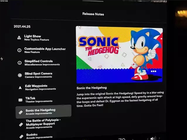
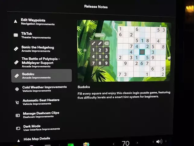
Improvements have been made to the theater mode in the car’s TikTok app, and the game “Low Poly War” now has a multiplayer mode. The car also added two new games, “Sonic the Hedgehog” and “Sudoku”.
Cold Climate Optimization
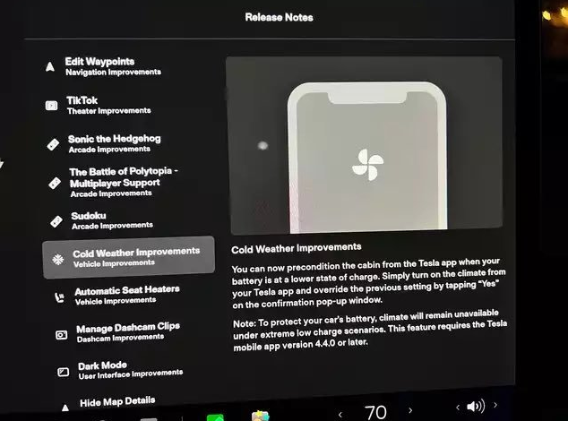
After the update, the remote air conditioning feature can now be used when the car has a lower battery level. However, in extreme low battery situations, remote air conditioning still cannot be activated. This change requires the use of version 4.4.0 or newer of the Tesla mobile app to be implemented.
Automatic Seat Heating
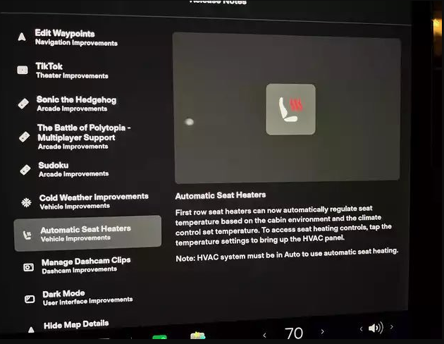
The front seats of the vehicle can now be automatically heated in automatic air conditioning mode. The seats will automatically adjust based on the cabin temperature and air conditioning temperature setting.
Dashcam File Management
The path for deleting dashcam files has been optimized. To delete dashcam video files, go to the safety options in the control menu and select the dashcam option.
Night Mode
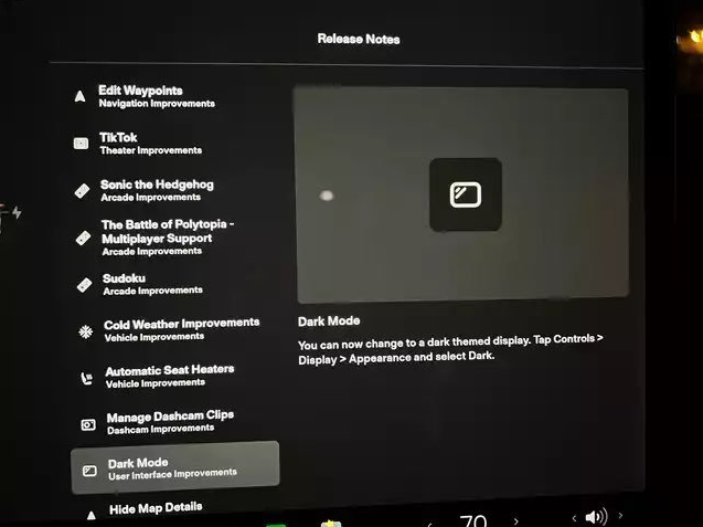
A manual night mode feature has been added to the display settings in the central control.
Hidden Navigation Information
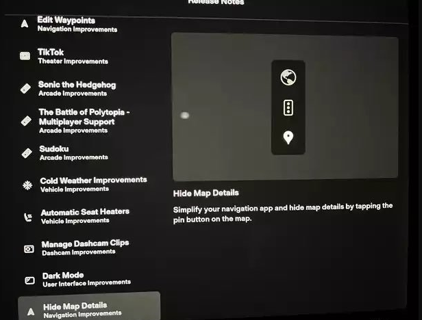
Detailed information in navigation mode can now be collapsed by clicking the hide icon.
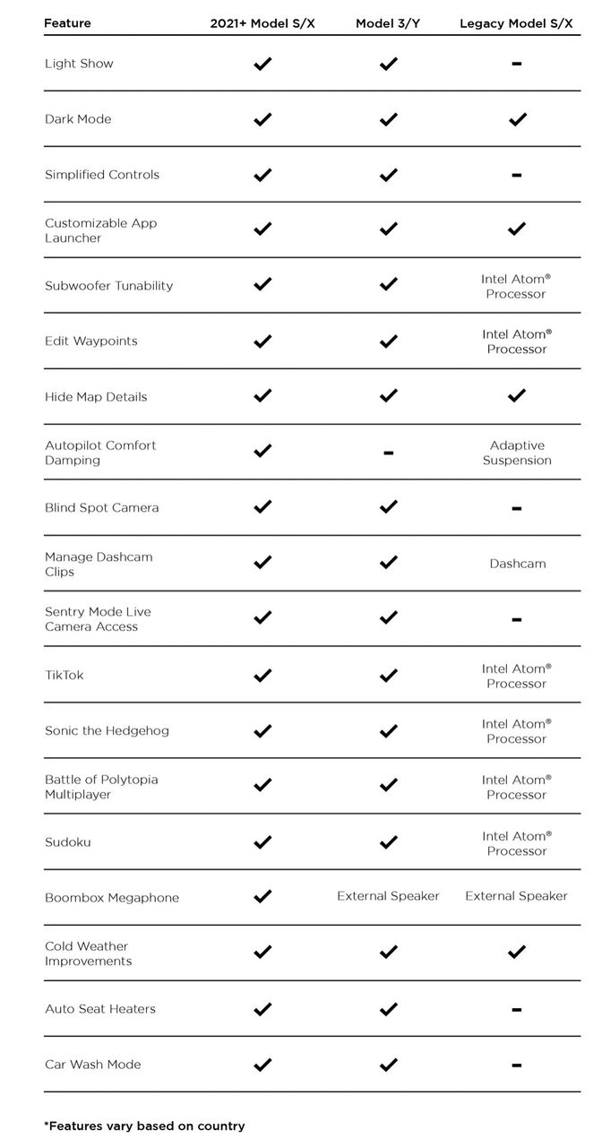
Other Special UpdatesThe special part of this update is that the content updated is not completely the same for different models, hardware, and even different regulations in different regions. For example, the updated feature “Megaphone” is added to the Model S and 2022 Model Y.
This feature can use the car horn as a speaker when the vehicle is parked, playing the voice issued by the user, and can also achieve voice-changing effects.
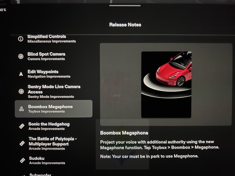
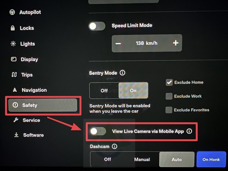
If you look closely at the picture above, you can also see that the top row of the “Megaphone” update has received the monitoring authority update for some models.
After the update is completed, as long as the user enables the permission in the security setting, the user can view the real-time monitoring screen of the Sentry mode on the mobile device.
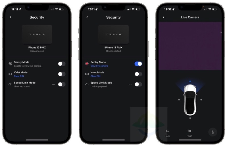
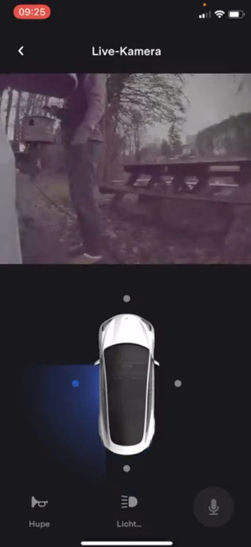
On the mobile page, it can be found that in addition to the monitoring function being implemented, Tesla also opens three operations to users, from left to right, they are honking, flashing lights, and remote voice broadcasting. Therefore, for the abnormal alarm alerts pushed by the Sentry mode, users can directly remotely warn suspicious persons through the above methods after the update.
Some users also found that the matrix LED headlights equipped with the new Model 3 can project the English letters of TESLA in this light show.

The updated Model S/X has specially added a car wash mode, in which the car door and window will automatically close, the automatic wiper will also be stopped, and in the automatic car wash scene with a conveyor belt, users can choose to enter the coasting mode to shift the car into neutral.
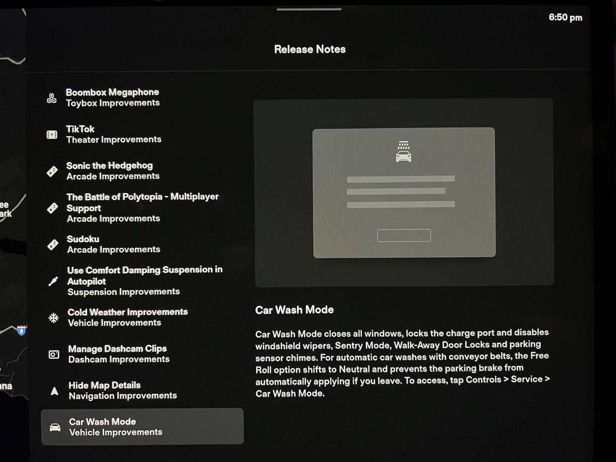
For the S/X models, this update also adds the option of “automatically adjusting the air suspension to comfort mode under AP status”.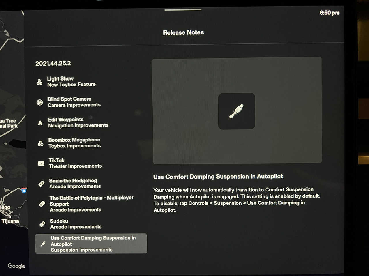
However, it should be noted that the Christmas car software update has different contents for different car models, hardware versions, and regulations in different areas. Whether the Sentry Mode remote monitoring and voice playback functions can be available in China remains to be seen after the push.
Besides functions, what did Tesla change?
The touchscreen used in Tesla Model 3/Y is a typical and special one in smart electric cars. What makes it typical is that the central control of the touchscreen uses a 15-inch screen with a nearly 16:9 aspect ratio and a resolution of 1,920 × 1,200. The reason why the vertical height of the screen is not 1,080 will be explained later. The size and proportion of the screen are familiar and normal for many people who use PCs, so when this screen appears in a car, it feels more familiar than screens with special ratios.
The special feature of the screen in Model 3/Y is that it not only serves as the central control of the vehicle, but also as the instrument cluster. Therefore, the human-machine interaction pages of Model 3/Y have a clear block division in terms of layout.
Tesla’s three-zone display
Looking back at the early version of the Model 3/Y screen, it is not difficult to find that Tesla had already divided the screen into three major sections, including:
- The side close to the driver is the vehicle information display area, with a display area of 580 × 1,080;
- The right side is the main content display area, with a display area of 1,340 × 1,080;
- The bottom is the permanent Dock bar, with a display area of 1,920 × 120.
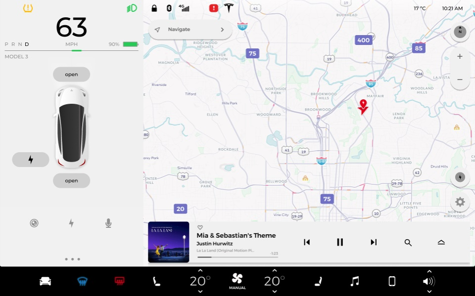
Therefore, if the Dock bar part is removed, the two areas above the screen are of a 1,920 × 1,080 resolution, which is a standard 16:9 aspect ratio and fully compatible with full-screen video playback. Thus, Tesla has already considered the Dock bar as a fixed independent area in terms of hardware size of the screen.On the entire Dock, there is plenty of space between adjacent icons to ensure easy operation for each touch function. However, upon closer observation, the icon arrangement was relatively centered, and the temperature adjustment for air conditioning and volume control in the top-level menu of the Dock followed the inertial logic of physical buttons for up and down adjustment.
In the vehicle information display area, Tesla used the power output indicator bar as a dividing line. Above this line are traditional automotive industry “instrument information,” displaying information including the gear position, speed, range, headlight status, tire pressure status, and other warning icons in an area only the size of a phone screen.
At that time, most electronic instrument panels in the industry used analog display styles, using enormous instrument panels to display speedometer and tachometer like mechanical instruments. However, the meaningful numbers and icons for the driver could have been displayed with less screen space.
Therefore, Tesla’s information display philosophy from that time was to “merge similar items” and try to group similar information together to increase display density and information acquisition efficiency.
Below the power output indicator bar, the area at rest controls the locking of the front and rear covers and doors. During driving, it displays the vehicle’s visualized auxiliary driving UI and auxiliary driving status information. Further down, it displays the blind spot camera, energy consumption, and voice.
The content display area on the right side has navigation as its background, and there is a multi-level multimedia playback menu that can be pulled up. After clicking on the vehicle icon, the vehicle’s settings menu will appear. At that time, the entire settings menu for Model 3 only had eight items, and the Autopilot menu only had three rows of settings.
Tesla’s three-zone display is still one of the most valuable case studies in vehicle system layout since its release. It reasonably and efficiently divides control hierarchy and information display areas, making full use of the entire screen display area while ensuring the convenience of information acquisition and interaction.
As time goes on, Tesla’s vehicle system continues to add new features and applications. The content in the settings page becomes denser, and with the improvement of autonomous driving capabilities, Autopilot has become a more frequent feature used in driving. The combination of these two factors has led to changes in the layout of Tesla’s vehicle system.
The core of fine-tuning: priorityImprovements have been made on the Dock in terms of ease of use, including the arrangement of icons using an “equidistant layout”, utilizing the space on both sides of the Dock, bringing the vehicle settings button closer to the driver, and the volume setting closer to the passenger. In addition, the volume and temperature adjustments on the Dock have been changed to a left-right sliding motion, which offers a larger touch surface compared to the previous up-down sliding motion.
The valuable first-level display seat on the Dock has been adjusted, with the front and rear defogging buttons moved from the left to the right, the phone icon removed, and the music moved to the left with a separate icon for the secondary menu.
The key to Tesla’s adjustments is prioritization, specifically the importance and frequency of usage corresponding to demand.
The decision to remove the phone icon and retain the two defogging buttons is based on the frequency and importance of usage. The former is a low-frequency, unimportant entrance to demand, while the latter is a low-frequency, yet important demand. Fogging of the car window affects driving visibility; if defogging cannot be quickly activated in this case, it will undoubtedly affect driving safety. Therefore, it is necessary to keep it in the first-level display, but obviously, the frequency of use of the defogging function is not as high as that of the multimedia, so Tesla has moved it to the right side of the Dock, considering the user’s screen touch hotspots.
Similarly, in the driving information display area, Tesla also considers the priority of information display. Since last year’s Christmas update, all lighting and vehicle status information icons have been merged into a row at the far left of the screen, with similar information arrangement logic, making the left side of the screen the vehicle’s “status bar”.
Moreover, with more space at the top, the entire visual UI has been lifted, but an expanded rectangle area is accompanied by both horizontal and vertical directions, so the visual UI has also expanded to the right.
It can be seen that in Tesla’s values, as long as information is not missing, the visual UI can squeeze driving information and maps.
The premise of this Christmas car machine update is actually still the addition of vehicle applications and new features, as well as the improvement of assisted driving capabilities, but this time it has been much more significant.
The updated S/X model earlier this year had already indicated that Tesla was beginning to prioritize entertainment in the system. Most recently, the domestic Model Y Performance has been equipped with an AMD new cockpit suite with enhanced CPU and GPU performance, which basically reaches a consensus on the follow-up ideas of the 3/Y and S/X models.It is not difficult to predict that more applications and games will be added to the Tesla infotainment system in the future, which also indicates that the frequency of using the application menu will gradually increase, requiring more convenient entry points to reserve potential changes.
As expected, Tesla has made major changes to the Dock bar, which is the most representative of its priority concept. Except for vehicle settings, air conditioning temperature settings, and volume adjustment, all remaining space is reserved for the custom application launch bar.
It is worth noting that three buttons have been removed from the top-level display menu in this update, which are the seat heaters for the driver and front passenger as well as the AC button.
To accommodate these “stowaway” buttons on the Dock bar, Tesla has come up with some clever ideas. Although the air conditioning settings page seems to have been removed, it has actually been integrated with temperature adjustment. The automatic seat heating linked with automatic air conditioning reduces the need for manual seat heating, so it makes sense for it to be placed in the second-level display menu of the Dock bar.
Although the front and rear defrost buttons have been left out of the top-level display menu, without automatic functions, they have been given a precious position in the second-level menu of the Dock bar. Compared to the original convenience, their convenience has decreased slightly but it is not particularly serious.
The vehicle settings icon has been simplified this time and only a few shortcut entries are available when clicked. Making this change brings about the difference that the vehicle settings menu will not pop up completely, blocking the entire content display area, and thus obscuring the navigation and multimedia information.
This setting is reminiscent of the one-layer drop-down status bar on current Android phones, which shows the top row of the most commonly used switches, while still retaining information display in the notification bar.
The vehicle settings page has also undergone a major change in this infotainment system update. The original menu-style layout has now shifted towards a rectangular card-style UI. This greatly improves the horizontal space utilization of the quick control menu. Multiple switches can be placed in a single row, and the entire page can display more shortcut settings. With the larger area of the icons in the new layout, it no longer requires such a high level of operational accuracy, making it more user friendly.The new control panel in the Tesla’s latest car computer looks a lot like the one in mobile electronic devices. However, it is integrated into the settings page instead of being a top-floating window on the first layer or occupying the entire screen. It appears more like a virtual keypad panel tucked away in a secondary menu.
What I find strange is that the “X” exit button in the upper-left corner has been removed in the current version of the car computer’s settings page. To exit this page, you can now click on the “X” button, tap the vehicle settings icon, or drag the gesture bar at the top of the settings page downwards.
My take on this is that the new car computer’s settings menu has expanded to 13 items, and vertical space is already quite limited. If the “X” icon is retained without obstructing the clock and weather display, it may have a certain impact on the layout.
Customizable Visual UI with Adjustable Scale
The environmental awareness of FSD Beta has significantly improved under surround view visualization, and the corresponding visual UI display area has increased by several times. At this point, it is difficult to display the full visual UI content without zooming in the driving information display area.
Therefore, Tesla added customizable drag-and-drop capabilities for driving information in the Christmas update. When the user drags the driving information display area to the far right of the screen, the result is the full-screen display shown in the figure below.
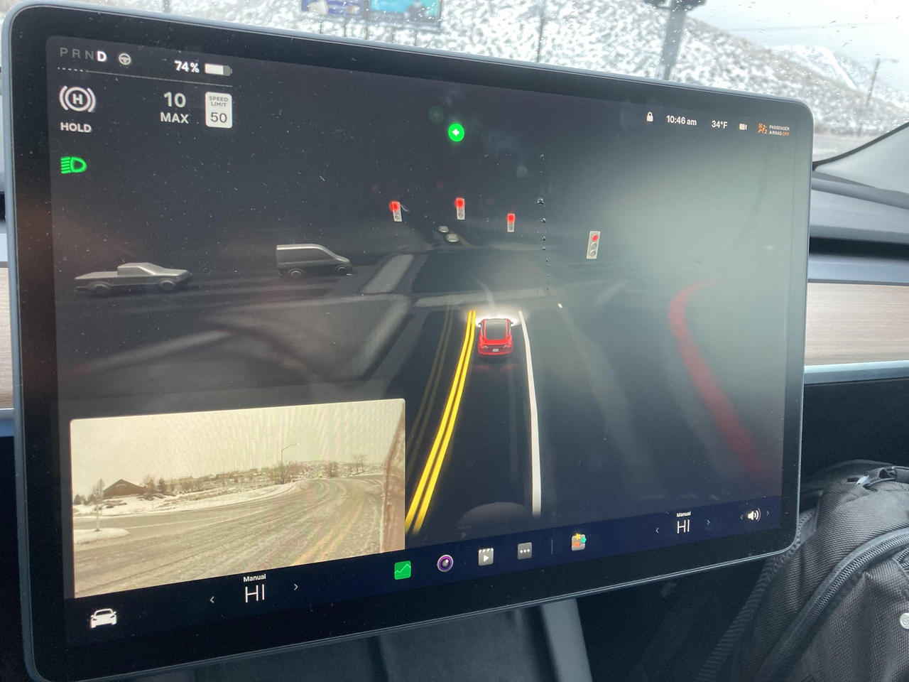
As mentioned earlier, Tesla believed that visual UI could squeeze content display areas, but in this version, Tesla even allows visual UI to completely cover the content display area. In this case, only the navigation indication is displayed, and the map information is no longer visible.
Although there are missing information issues with this type of display, it is still possible to create a visual UI version of 3D navigation from a top-down perspective in a full-screen visual UI.
However, for visualizing road information, it is difficult to achieve super-long-distance display with visual UI, so I believe that Tesla is likely to include a “mini-map” navigation display in full-screen visual UI in the future.
On the other hand, if the capability of FSD Beta becomes strong enough in the future, once the destination is set before departure, navigation mapping will become less important, and the priority of navigation maps will be reduced.
Final Thoughts
When I saw that Tesla had integrated seat heating into the automatic air conditioning, it reminded me of a saying: “True technology should make you feel that the technology does not exist.”
“Technology” in the world of smart cars translates to “convenience,” and on the car computer, it means efficiency, information transmission, as well as interactive implementation efficiency.The biggest feature of touch screen interaction is that it can display and interact in countless ways. All pixels on the screen can become the building blocks of virtual buttons, and anything can be erased and restarted.
The design and interaction concept of Tesla’s in-car system adhere to the value of accommodating the most functions while ensuring efficiency and experience. However, it is difficult to balance the two within a limited screen size.
Most traditional car manufacturers sacrifice interaction efficiency and experience and cram a large number of functions into the system. The menus are complicated, and many functions may never even be used after the car is sold. However, simplifying the hierarchy does not mean displaying all content on a single level, or else it would be no different from a tablet or phone’s desktop.
In order to achieve a balance, Tesla employs both addition and subtraction in their in-car system. Tesla’s addition cultivates users’ habits and predicts their future needs, for example, the continuously expanding visual UI and the increasing number of derivative functions under the open electrification architecture.
However, the subtraction on Tesla’s in-car system is more worthy of attention – challenging users’ established habits while minimizing discomfort and even enhancing their experience. After this year’s Christmas update, more people are expected to have a deeper understanding of this.
This article is a translation by ChatGPT of a Chinese report from 42HOW. If you have any questions about it, please email bd@42how.com.
