Translation
Author: Michelin
As the “two legs” of intelligent vehicles, autonomous driving and intelligent cockpit have recently taken two different paths. Autonomous driving is competing in the “depth” of various technologies in order to achieve the common goal of how to implement L3 and L4; while for intelligent cockpits, car companies are trying to defeat each other with “breadth” by providing richer functions as possible.
Looking at the new car models launched in 2021, the cockpit is no longer satisfied with just more and bigger screens, basic functions such as navigation, voice control, and music playback. Instead, car connectivity, seamless switching between mobile phone and vehicle, even singing karaoke, playing games, and social interaction inside the cockpit have become the selling points that attract consumers.
As users are attracted by these new and technological functions, they also face a problem: before L4 arrives, human still plays the absolute leading role in driving and safety remains the top priority.
If these full-featured and technologically advanced functions and rich ecosystems give intelligent cockpits ten or even hundred times of credit, then safety is the “1” in front of countless “0s”. Without safety, all intelligence will be in vain. Moreover, are these new interactive methods, rich functions and ecosystems really useful after being equipped in cars?
With these doubts, we want to take a “reverse” perspective and evaluate the most basic needs of car infotainment systems – safety and ease of use – from the driver’s point of view.
Therefore, GeekCar teamed up with Thoughtworks, using the Thoughtworks HMI Dynamic Usability Evaluation System to evaluate the most practical functions when driving as much as possible, and to quantify the evaluation results and give specific scores. Regardless of whether a car infotainment system is geeky, innovative, full of technological sense, or breakthrough, the standard we evaluated is: whether it is easy to use under the premise of ensuring safety.
In the first issue, we will evaluate the “usability” of the car infotainment system of the new force representative Li Xiang ONE.
Why rate “usability”?
“Good” or “not good” usability may sound like a subjective evaluation. How can we make subjective feelings as objective and quantitative as possible?
With this question, we will explain the evaluation rules through Q&A.
Q1: What are the indicators for quantifying the “usability” of a car infotainment system?A:
To evaluate the usability of a car infotainment system from the driver’s perspective, there are two primary principles to follow: first, whether it affects driving, and second, whether the operation is smooth and seamless.
Following these two principles, Thoughtworks has comprehensively established four dimensions and twelve evaluation indicators, including the performance of main driving tasks, visual behavior performance, software task performance, and subjective feeling.
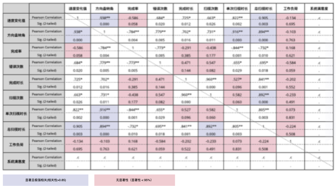
After actual tests, we deleted indicators that have little impact on the driving experience and finally confirmed the car infotainment system usability evaluation system while driving as follows:
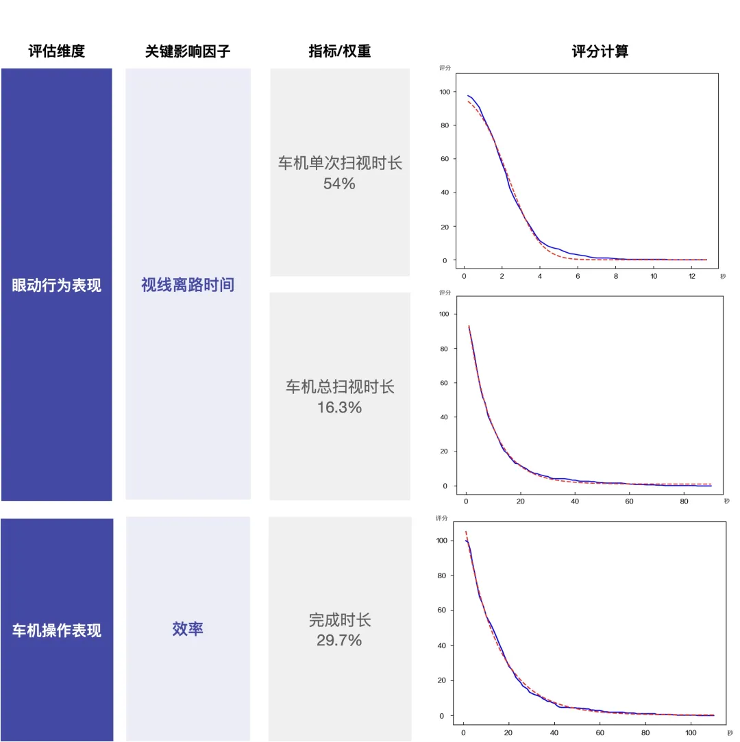
The three major indicators quantifying car infotainment usability are: the single glance duration, the total glance duration, and the time to complete an operation.
Q2: Which interactive methods are evaluated?
A: This evaluation includes the currently popular interactive methods in the cockpit: voice interaction, touch interaction, and physical button interaction (including buttons, levers, and knobs).
For novel interaction methods such as gesture interaction, multimodal interaction, and emotional interaction, many cockpits are still in the initial trial phase. To ensure fairness in scoring, we will experience and give feedback, but these methods will not be included in the usability rating.
Q3: Which tasks need to be evaluated?
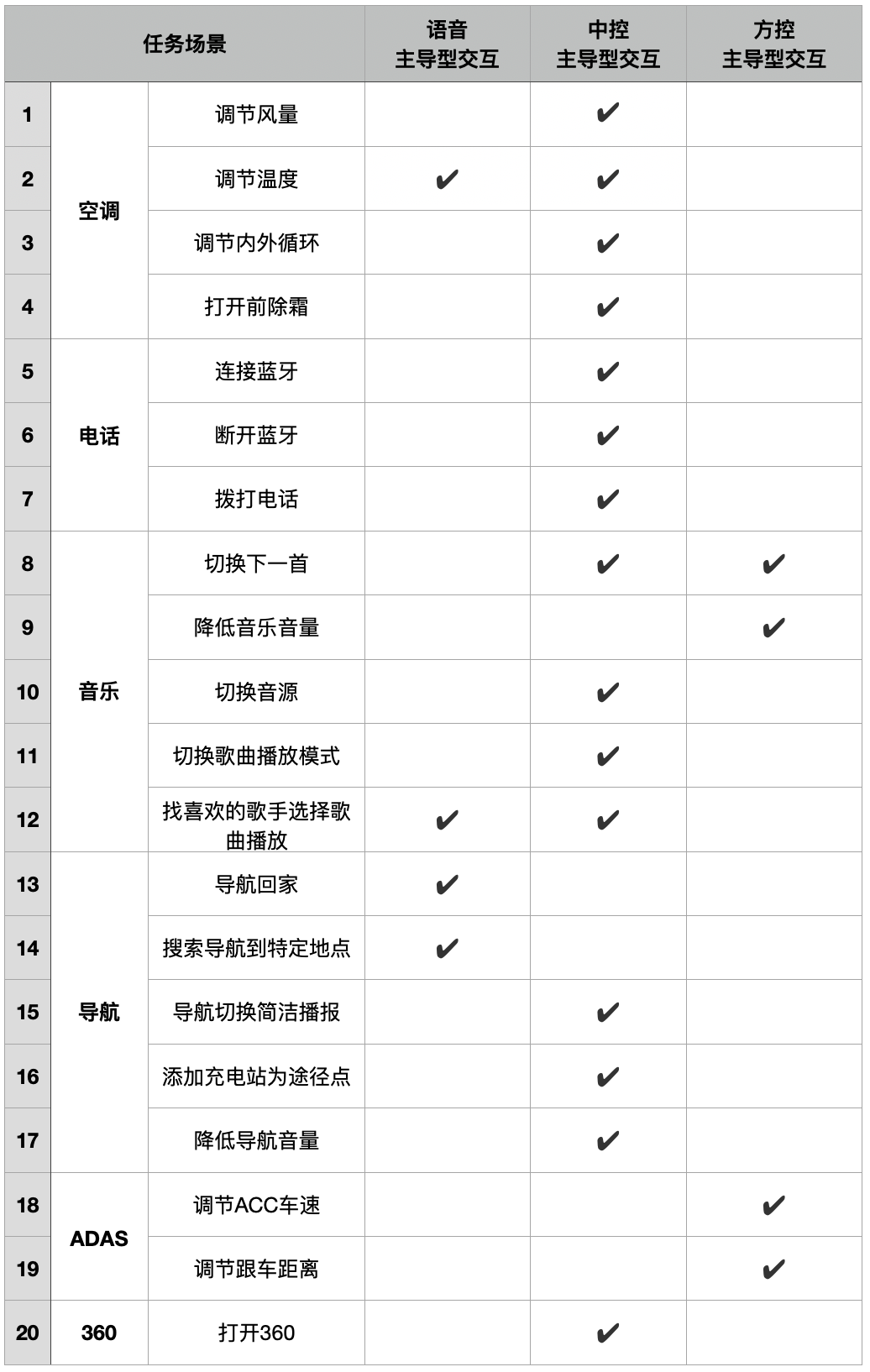
A: The five common infotainment scenarios used by drivers are air conditioning, Bluetooth, music, navigation, and driving assistance.
This usability test includes 20 typical tasks selected from these five scenarios. Each task uses different dominant interaction methods to ensure that the tasks and interaction methods evaluated between different car models are the same.
Q4: How to score the evaluation?
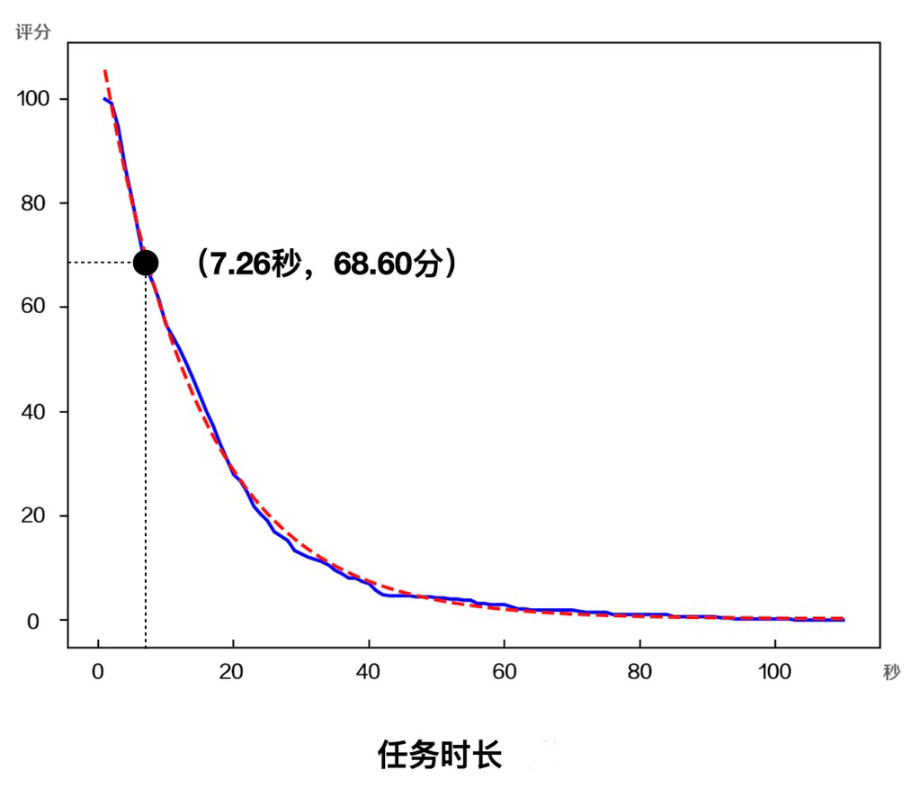
A: According to a large amount of real car test data analysis, we perform a mathematical fitting of the evaluation indicators (such as off-road gaze duration and task completion time) to obtain the probability distribution curve of each indicator.
Using the diagram curve as an example: The horizontal axis represents the time required to complete this indicator, and the vertical axis represents the score. The point (7.26, 68.60) represents that completing this indicator in 7.26 seconds exceeds 68.60% of tasks of the top 4 automakers in the industry, so the score is 68.60 points.
 Translate:
In order to calculate the total score of a task, the scores of the three indicators for each task are weighted.
To obtain the overall score for the car system’s usability, the total score of the 20 tasks is averaged.
Q5: How can we ensure the fairness of the scoring?
A: It is important to ensure fairness when scoring the car system.
According to the principle of controlling variables, when evaluating different car models, factors other than car models should be kept as constant as possible. All car models adopt the same measurement framework: three major evaluation indicators, 20 evaluation tasks, three major interaction methods, and mathematical fitting curves used for scoring. In addition, evaluation operators have a group of expert users to simulate the level of skilled car owners with more than six months of operating experience. The average of multiple evaluations is taken each time to minimize human interference.
Scoring Example
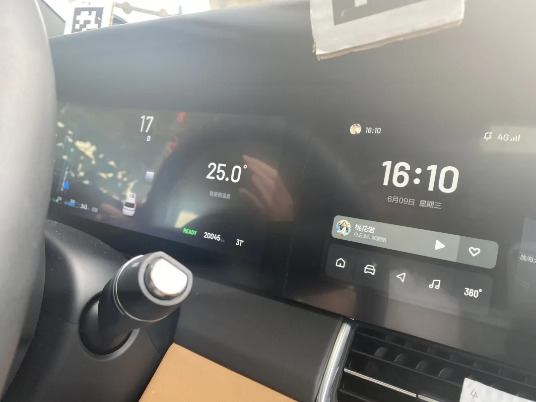
The ideal ONE cabin has a total of 4 screens: dashboard, multimedia screen, co-pilot entertainment screen, and car control screen. The interaction modes that the driver will use while driving are: voice interaction, screen touch, and multi-functional buttons on the steering wheel.
Among them, a characteristic function in the ideal ONE car system is the blind operation to adjust the air conditioning temperature and air volume. Swipe up/down in the middle area of the car control screen to adjust the air conditioning temperature; swipe left/right to adjust the air conditioning air volume.
Now, let’s take the “blind operation to adjust air conditioning temperature” as an example to see the specific evaluation process.
Task: Adjust the air conditioning temperature to 23 degrees using the central control.
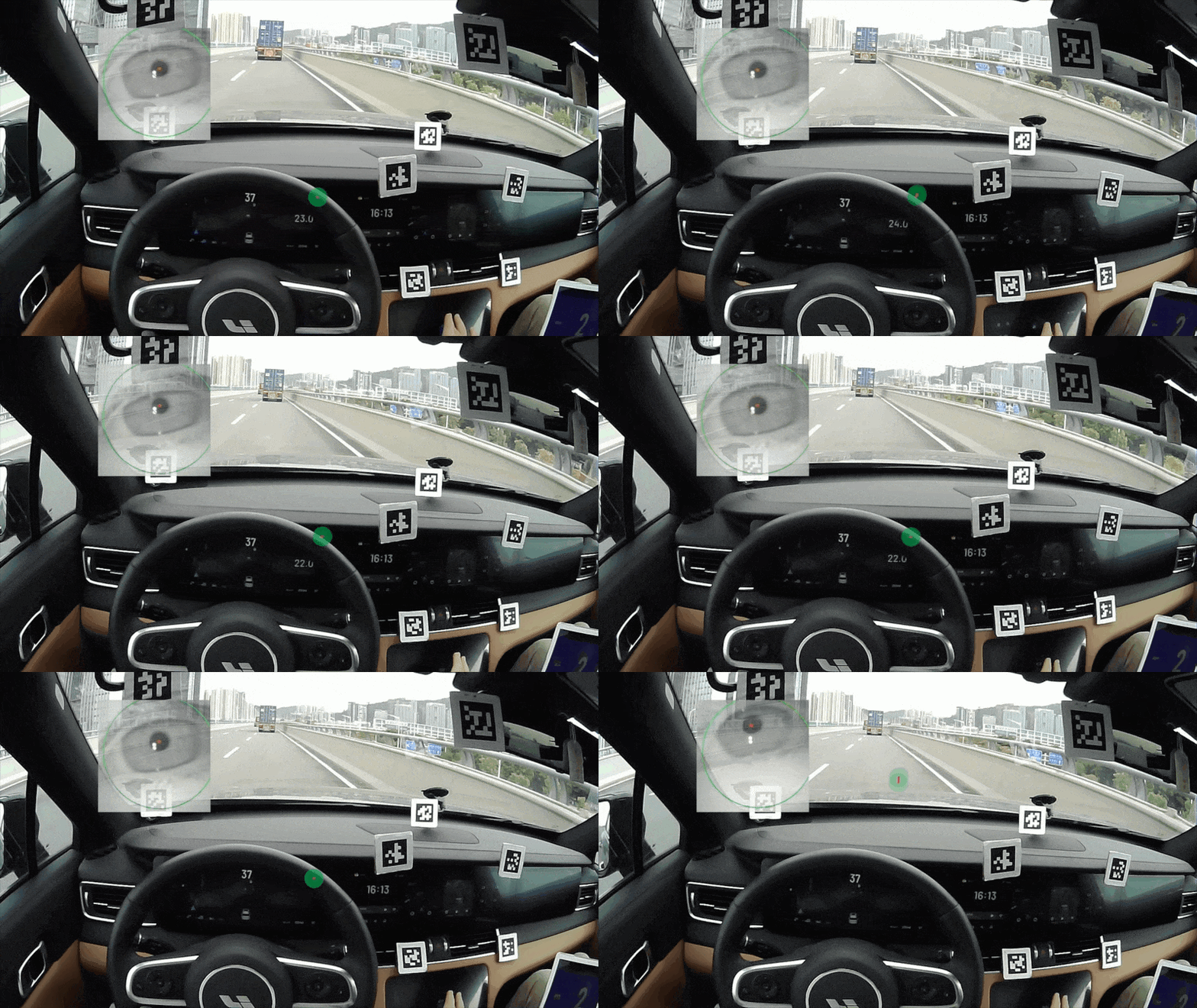
Three indicators were measured by marking several special positions in the cabin and using an eye tracker: time to complete the task was 6.24 seconds, total scan time was 4.21 seconds, and single scan time was 1.95 seconds.
Putting the three indicators into the fitted curve, the score for each indicator is obtained: task completion efficiency is 73.60 points (better than 73.6% of the tasks on the market), car system single scan time is 63.02 points (better than 63.02% of the tasks on the market), and total scan time is 64.94 points (better than 64.94% of the tasks on the market).
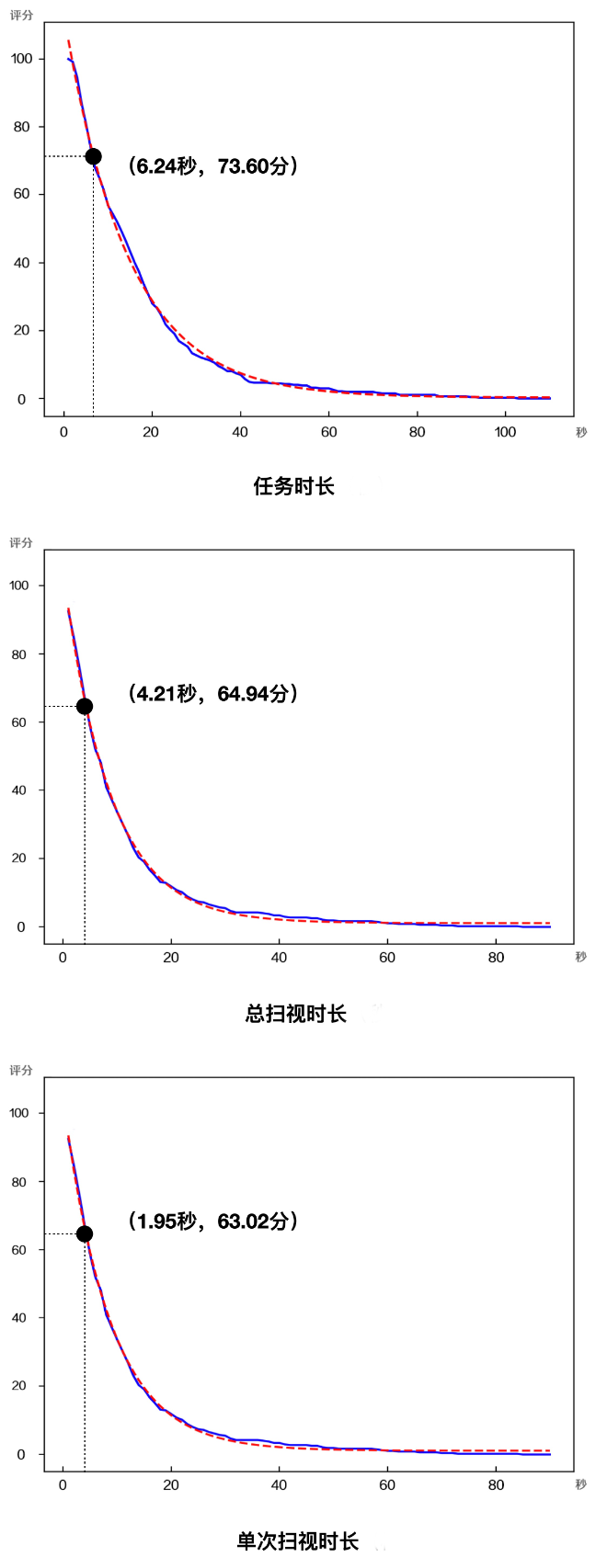
Finally, the score for the task of “adjusting the air conditioning temperature” is calculated to be 66.48 points – handle with care.
Although Ideal ONE is equipped with a “blind operation” function for adjusting air conditioning temperature, according to the testing process and results, blind operation is not precise enough to adjust the air conditioning temperature and air volume.
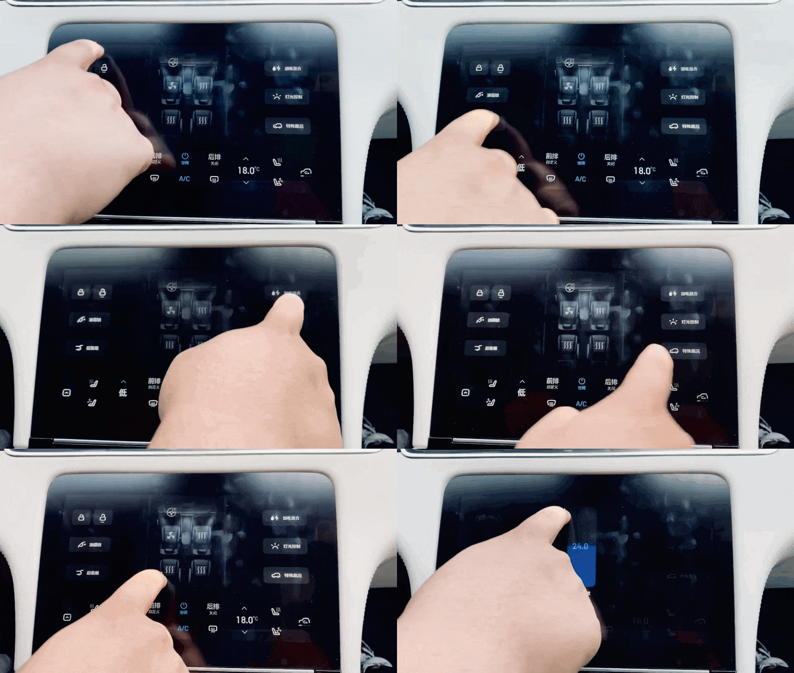
Issue 1: Need to scan the area without buttons on the car control screen.Translate the following Chinese Markdown text into English Markdown text, in a professional way, retaining HTML tags inside Markdown and only outputting the result.
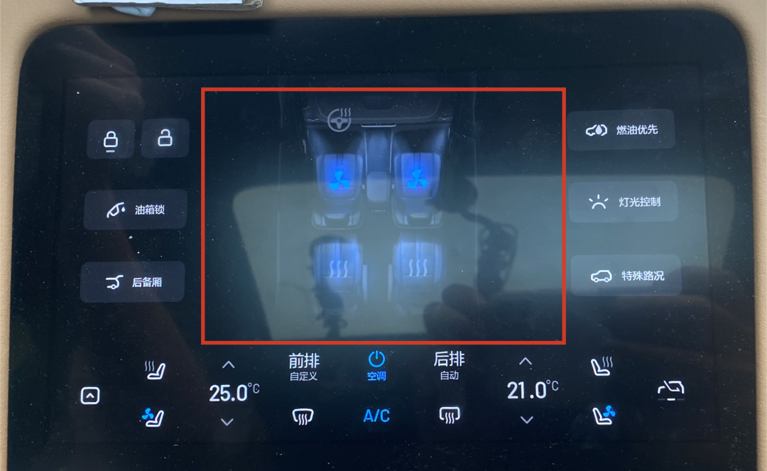
The screen layout is in the shape of the Chinese character “回”. Users cannot adjust the air conditioning because the function icons area is situated around the screen and thus, they need to look down, confirm the location of the touchless area, and then adjust the temperature.
Issue 2: Difficult to Adjust Precisely
When users perform vertical sliding operations, the air conditioning value changes “silky smooth”. However, it is difficult to accurately adjust the desired temperature, as it is easy to make it too high or too low, causing users to glance at the dashboard for a prolonged period to make corrections.
If blind-hand gestures are accompanied by sound and vibration feedback, or if AR-HUD displays the temperature on the windshield, users may be able to accurately adjust the temperature without looking at the dashboard.
Issue 3: Delayed and Disappearing Dashboard Feedback
a. When users adjust the temperature using the touchless area, it takes 1 second for the dashboard to display the numerical feedback. Therefore, auditory feedback and visual feedback are not synchronized, causing users to stare at the dashboard for a prolonged period, which poses a risk.
b. The numerical feedback on the dashboard will disappear when users pause their operation. If users want to check the temperature value, they need to continue sliding to adjust the temperature again, and the numerical values will appear slowly.
Evaluation Results
Using this method, we tested 20 frequently used task scenarios and obtained scores for each task under different interaction methods:
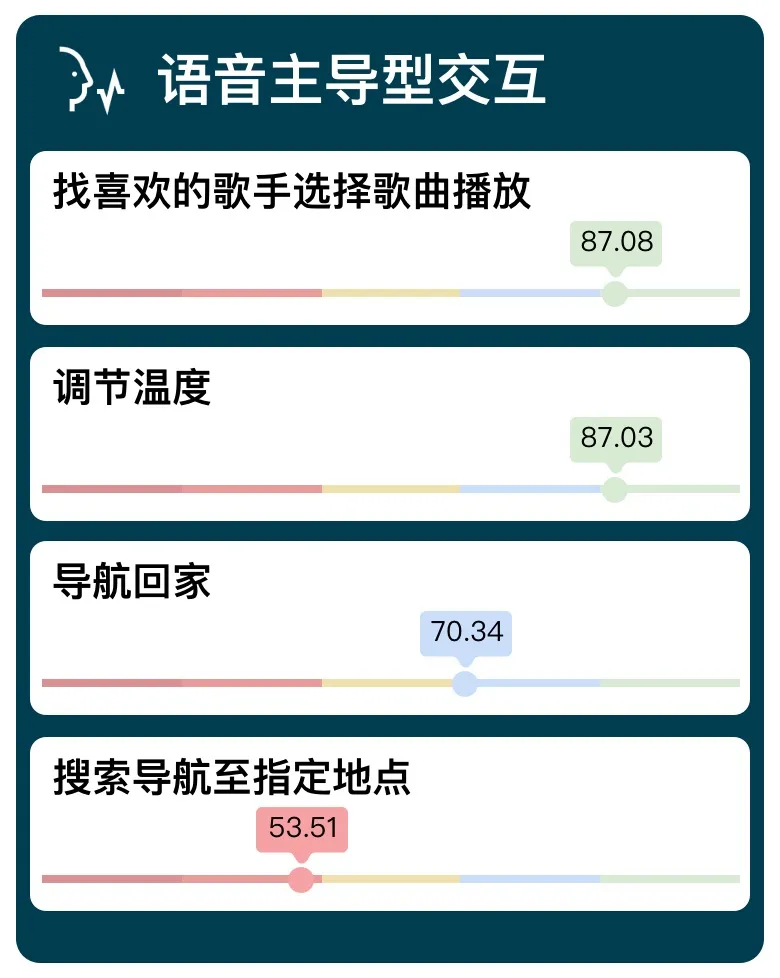

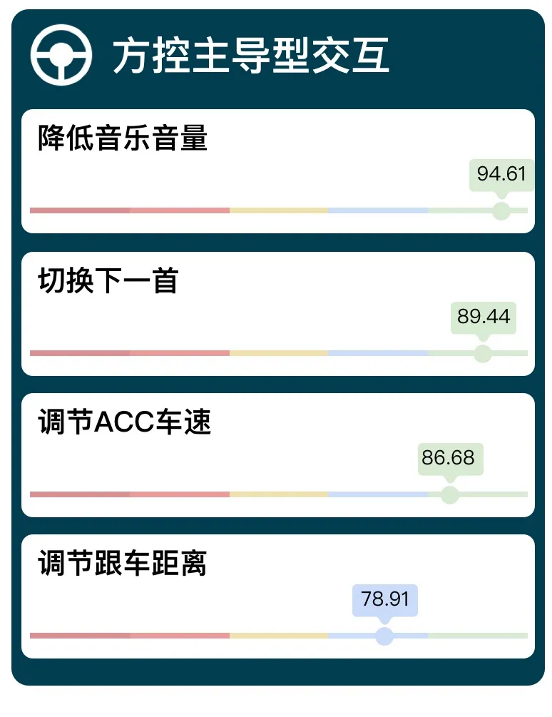
Based on these scores, we evaluated the voice interaction, touch screen, and steering wheel button control of the vehicle system. The comprehensive scores for each index under the three interaction methods are as follows:
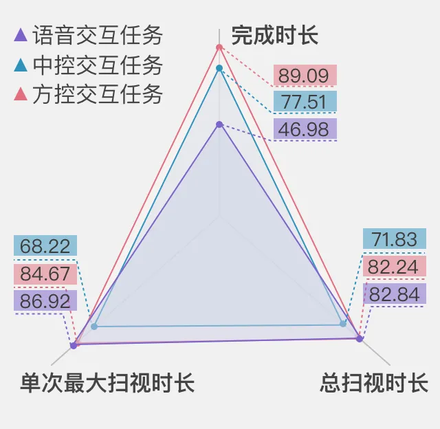 Voice Interaction: 74.49 Points – Smooth Operation
In common task scenarios, voice interaction controls four tasks, which are adjusting temperature, selecting and playing songs from favorite singers, navigating home, and searching for destination in navigation. Among them, when performing quick command tasks (such as adjusting the temperature to 25 degrees) and simple search tasks (I want to listen to songs by Deng Ziqi) through voice, the task is performed quickly, accurately, and performs well. However, the efficiency of executing complex tasks that require multi-round interaction (such as navigating to Shenzhen North Station) is significantly reduced.
Central Control Interaction: 71.44 Points – Smooth Operation
Among 20 commonly used tasks, 15 tasks can be completed through central control touch interaction, and the efficiency and accuracy of most tasks are good. However, in some complex tasks that require users to carefully browse and judge, it will be at a “relatively dangerous” level.
Take “Add a Charging Station as a Waypoint” task as an example: it takes 5 steps to complete the task by clicking on the touchscreen with a long task path and multiple steps, which requires passing through “clicking on the navigation screen”-“clicking on More “-“Click on the charging pile “-“Select an icon of a charging pile”-“Click add as a waypoint”, and each step requires the user’s visual attention to leave the front and focus on the central control screen.
Moreover, the charging stations in the map are presented in icon form, and it is necessary to click on the icon to display the specific information of the charging. It is difficult for users to browse and select the specific charging station they want to go while driving. In this case, displaying the position and distance of the charging station directly in a list will be more convenient for drivers to choose while driving.
Steering Wheel Control Interaction: 87.41 Points – Smooth Operation
Among the commonly used driving tasks, four of them are controlled by the steering wheel, and the experience level of ideal ONE steering wheel interaction tasks is excellent; for some complex tasks dominated by the steering wheel, which requires cooperation with other channels (such as adjusting ACC distance), the performance level of steering wheel tasks is still at the “smooth operation” level.
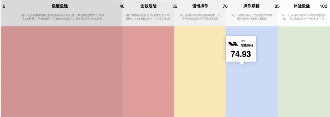
Ideal ONE HMI Usability Overall PerformanceThe overall average score of Ideal ONE HMI is 74.93, with a user experience level of “smooth operation”.
Final Thoughts
Through this quantifiable evaluation method, we identified some minor issues that are not easily noticeable during daily use.
One of the highlights of the Ideal ONE infotainment system is its “blind operation” feature. However, the data for adjusting the air conditioning temperature via “blind operation” shows a score of 66.48 – caution is advised. Without physical feedback, it’s difficult to adjust precisely and quantitatively without looking at the screen, which is a common problem with touch and gesture controls.
On the other hand, physical buttons, which have gradually been “disdained” by automakers in recent years, have remained highly rated. With a score of 87.41, steering wheel controls are the most user-friendly way to interact with the system while driving. Therefore, improving touch and voice controls before abandoning physical buttons is crucial. The Ideal ONE infotainment system still needs to enhance its abilities to handle complex and multi-step tasks with touch and voice controls. Ideal ONE has announced an OTA upgrade to its voice system in September, and it remains to be seen whether the upgrade will improve the voice control experience.
This article is a translation by ChatGPT of a Chinese report from 42HOW. If you have any questions about it, please email bd@42how.com.
