Introduction: The era of “software-defined cars” has arrived. Here, “software” does not only refer to the software for assisted driving, but also includes the “software” of in-car intelligent cabins and infotainment systems. Therefore, we have launched the “Infotainment Micro Experience” column to conduct in-depth experiences on unique in-car infotainment products in each issue.
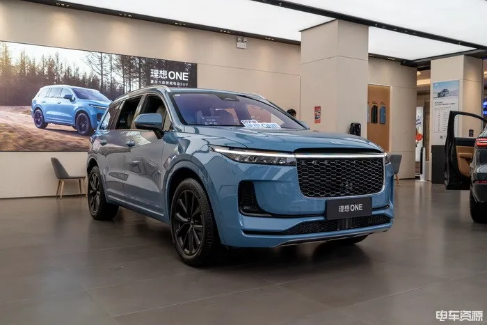
This time, we experienced the recently released 2021 model of the Ideal ONE, which comes with the latest 2.1 version of both hardware and software. Compared to the previous version, it includes up to 21 upgrades, such as the visualization interface of some functions, application scenarios of some functions, and a brand-new intelligent voice system.
You can check the detailed upgrade options in this article: “Ideal Cars to Welcome OTA 2.1 Upgrade with 21 New Functions Added”
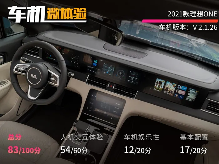
How is the user experience of this infotainment system? What is the specific score in this issue of “Infotainment Micro Experience”? Let’s take a look together.
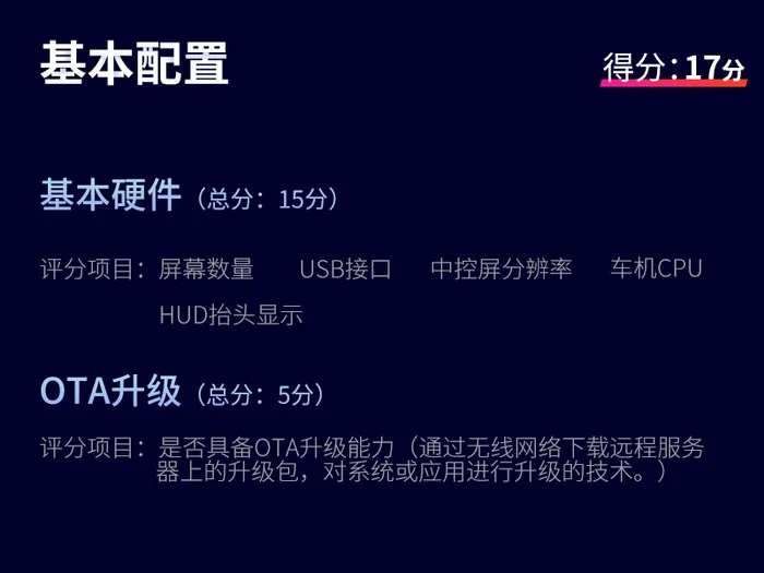
Basic configuration at mainstream level
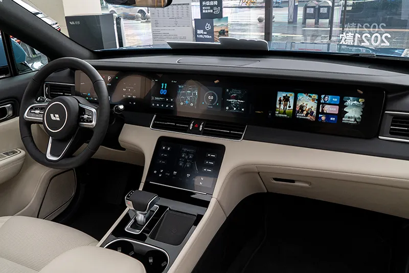
The 2021 model of the Ideal ONE continues to use the fixed four-screen interaction design, and all use the carbon-fluorine evaporation anti-fingerprint process to achieve a frosted glass-like effect, but the clarity is still guaranteed.
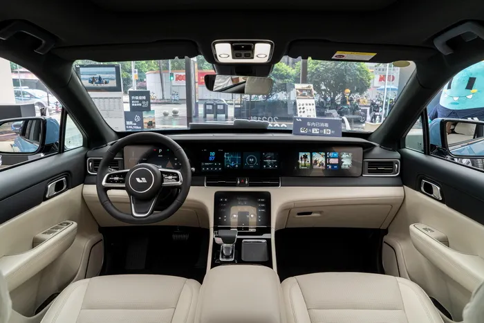
The instrument panel and bottom function control screen adopt the Texas Instruments Jacinto 6 processor, running a simple and stable Linux system. After all, the functions of these two screens are relatively single, with only pure display and pure touch operations, without requiring strong graphics computation capabilities.
The screen size and resolution are shown in the figure below:
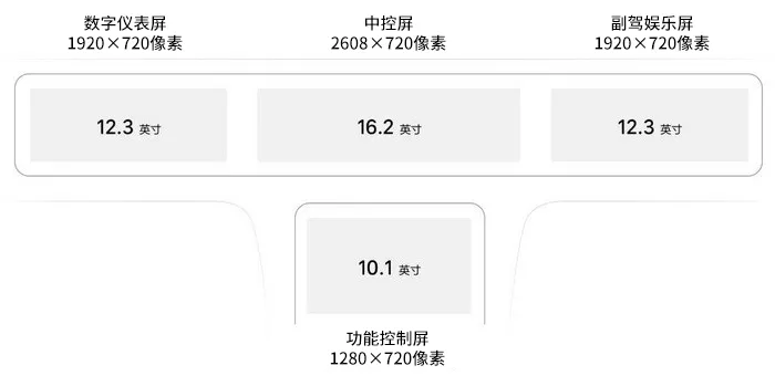
Instrument screen
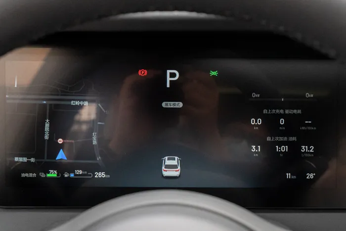 ### Instrument screen
The 12.3-inch instrument screen has no fancy design, but the displayed information and content are rich enough. On the right side are fuel consumption/electricity consumption, power meter, driving data, etc. In the middle is the visual ADAS information of driving assistance. The content on the left side can be adjusted, including music, navigation, and fuel/electricity gauge.
Central control screen & Co-pilot entertainment screen
The central control screen and co-pilot entertainment screen need to take into account touch operation, video playback, voice recognition processing, and cover more functions. Therefore, they adopt the mainstream Qualcomm Snapdragon 820A processor and run a more comprehensive Android system. This chip has been used in many new energy vehicles and fuel vehicles, such as the current XPeng P7, Audi A4L, Land Rover Discovery Sport, Lynk & Co 05, etc. Its smooth operation and application performance have been widely recognized by the market. However, it does not support 5G network signal processing.
Three screens are not completely connected, and all screens use a black background theme, which well avoids the visual effect of inconsistent black border.
The co-pilot entertainment screen is a standard 1080P screen, and the default homepage is iQiyi. If someone feels dizzy while driving, the screen can be closed in the central control.
Function control screen
At the bottom is an independent control screen, where most of the vehicle setting buttons are integrated, including air conditioning, door lock, lighting, electric tailgate, etc.
In addition, the Ideal ONE is equipped with an independent air conditioning control area in the second row, a total of 7 USB interfaces, and a wireless charging panel.
Human-vehicle interaction experience: usability is the priority
The car machine of the Ideal ONE is a fixed bar + sliding card layout, and the design is also mainly concise, without any fancy themes.The left sidebar of the adjusted new version is more concise, with time (various time themes can be switched), music, and commonly used keys. The right side displays a card where more detailed information, other function keys, and weather can be shown. The cards can be freely dragged and sorted by long press.
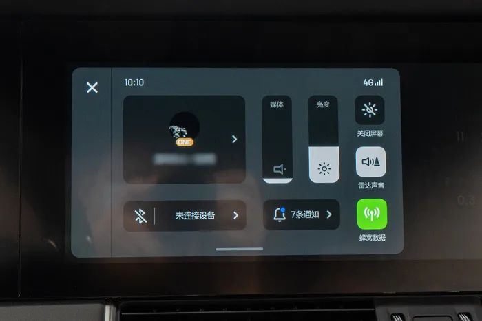
Scrolling down from the top of the left area enters the negative one screen, where there are options for adjusting volume, screen brightness (can be set to automatic adjustment), and other options. The operation logic and functional layout are basically the same as a regular smartphone, with no learning curve.
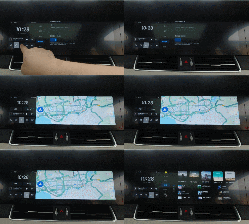
Directly entering the navigation, QQ music, and 360° panoramic image pages can be done by clicking the fixed bar at the bottom left, where third-party APPs are all specifically optimized to ensure overall style consistency. The APP’s opening speed is very satisfying, and the response during operation is very smooth. Overall, its smoothness level belongs to the first tier of mainstream car models.
The intelligent voice system is also one of the focuses of this upgrade. The original engine provided by Tencent Dingdang was relatively basic in terms of functionality, did not support continuous conversation, did not support interruption, and was relatively easy to mistakenly wake up.
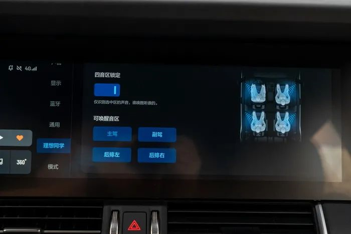
The new engine of the current version is self-developed by the manufacturer, and its underlying capability has been replaced, with comprehensive improvements in wake-up, recognition, and semantic understanding abilities. In addition, it has added 13 voice-controlled skills for car control and equipment, wake-up interruption, and four-tone zone locking. The free conversation functionality will soon be opened via OTA.
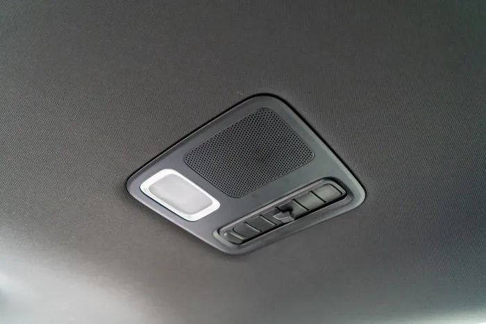
After testing, the wake-up speed of the intelligent voice system is very fast, and its understanding of ambiguous instructions is quite strong. It can be accurately awakened in the front and rear rows, and even in the third row (which has an independent microphone but uses the same sound zone as the second row). If the child in the back row keeps awakening the assistant, the recognition of the rear side can be turned off directly on the central control screen. After the free conversation function is updated, the driver can even say directly to the intelligent voice system, “Don’t listen to the back row” or “Don’t mind the back row” to close it.
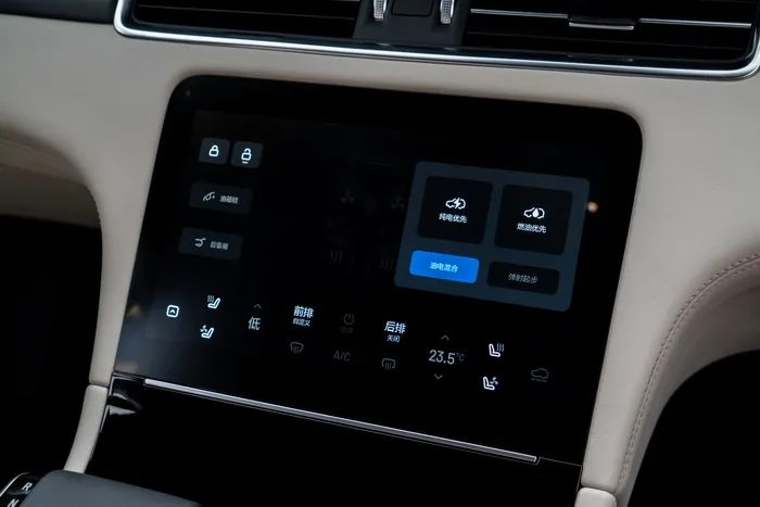 The resolution of the control screen at the bottom is not low, and the most commonly used functions are all on the homepage, while more detailed settings are all on the secondary pages. The two-layer interaction logic is very easy to understand and convenient to find.
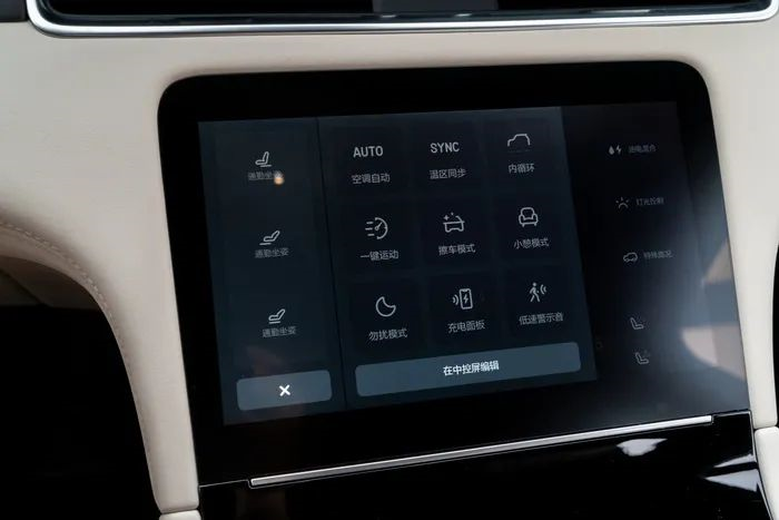
Some functions that are not particularly commonly used but always hope to be opened quickly can also be placed in the adjacent shortcut panel, supporting up to 9 buttons, and can also be customized.
Infotainment: Dual video platform + Karaoke
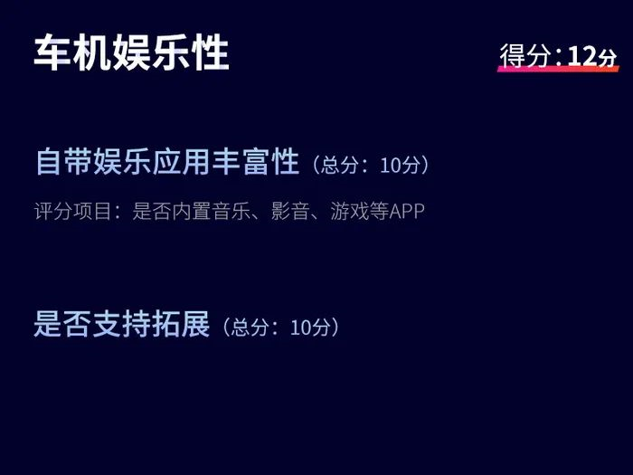
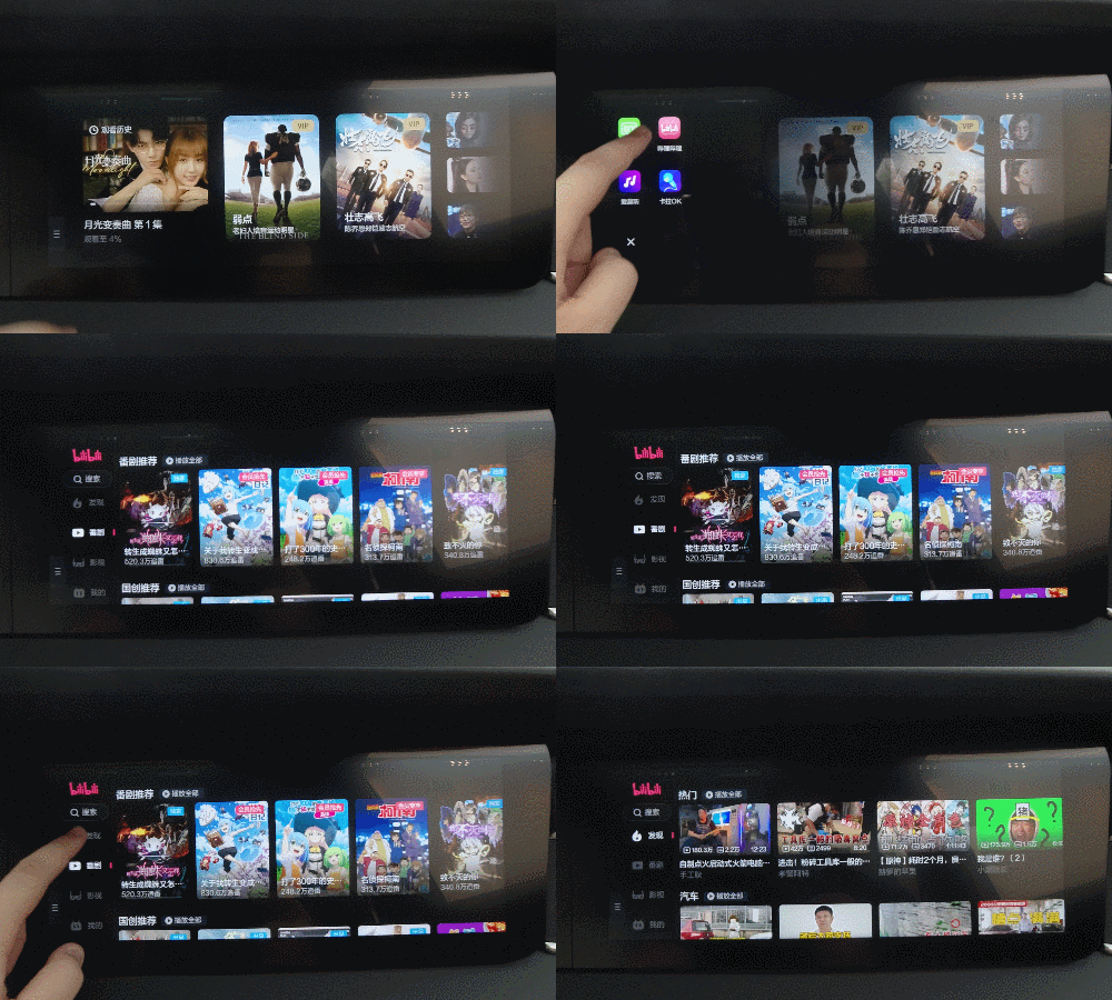
In addition to iQiyi, the entertainment screen also currently supports Bilibili, Aiqu Ting (integrated QQ music, audiobooks, radio, etc.) and Karaoke, which can meet the basic entertainment needs.
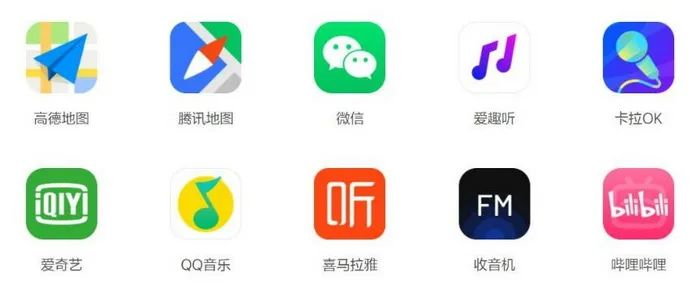
Currently, the number of third-party applications loaded on the Ideal ONE has increased to 10, but it still does not support app stores and cannot be expanded on its own. Ideals may hope to optimize each loaded software in depth, including the style of UI design and the recognition of intelligent voice systems.
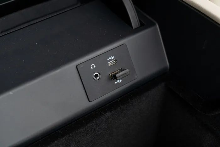
The car stereo can only choose between the central control screen and the co-pilot entertainment screen when playing, but the co-pilot entertainment screen supports the use of external headphones independently. Bluetooth headphones or extremely “advanced” 3.5mm wired headphones can be used. The old headphones at home finally have a place to be useful.
Summary
The style of the Ideal ONE car system can be said to be very consistent with the characteristics of its target consumer groups, simple, practical, and not flashy. Smooth user experience is necessary, and there is not one less required function. Moreover, it has its own ideas and understandings for certain specific scenarios. Although it is practical to use Android and Linux, its style is more like Apple’s IOS system.
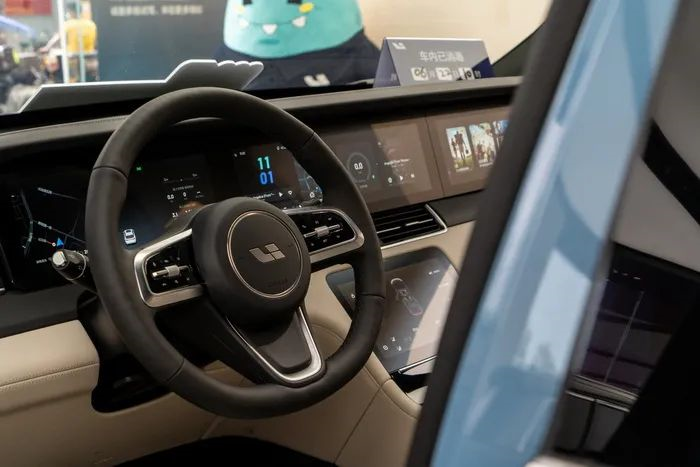 But in terms of hardware, there is still room for improvement for the ideal ONE, such as the lack of support for 5G signal reception in the current models, no equipped or support for optional HUD head-up display, and no facial recognition system as well as subsequent linkage of seat memory, rearview mirror memory, etc. through facial ID.
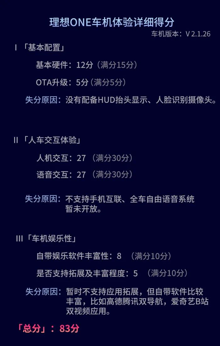
Overall, the experience of using the ideal ONE’s car system is quite good. The practice of using different chips in different regions effectively alleviates the “burden” of a single chip, ensuring the smoothness of the system. The use of an independent functional control screen also avoids the phenomenon of excessive operation layers of a single screen.
It can be foreseen that with future OTAs, the car system of the ideal ONE will become more perfect and mature, and new car usage demands generated in the era of smart cars can also be continuously met.
This article is a translation by ChatGPT of a Chinese report from 42HOW. If you have any questions about it, please email bd@42how.com.
