Hello everyone, I am @sunflowerzzz, who appeared in the “Disassembly Laboratory” of @Zhihu Automotive as an “Interactive Observer”. My job is automotive product planning. I used to work for a traditional brand OEM and participated in a pure electric platform product, which was an important research object for the localization project in China. Tesla was also an important research object at that time.
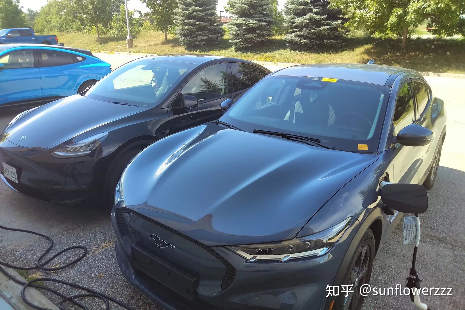
Now let’s insert the original video of the “Disassembly Laboratory”:
One of the sources of power for cutting leeks is the age-old cost advantage
In order to be able to cut leeks with real strength, in addition to having a brand image and product strength that are eye-catching enough, of course, a low enough cost is needed to reserve room for price reduction;
The source of low cost can be the same as some traditional vehicle manufacturers, who convert from oil to electricity, develop pure electric vehicle models based on existing fuel-powered vehicle models, and save development costs;
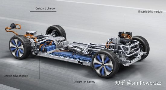
It can also be achieved through design shortcuts, integrating various functions, and fully utilizing the technical characteristics of pure electric vehicle models to reduce unit costs;
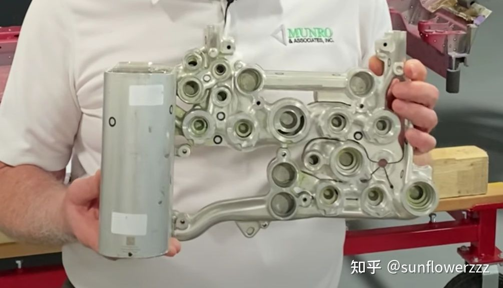 The cost saved by switching from gasoline to electricity will be reflected in the product itself. However, there are still a lot of drawbacks to this approach. The size of the battery is limited due to the constraints of the car body structure, resulting in limited endurance. Raising the floor to stack the battery leads to restricted interior space, especially legroom, resulting in uncomfortable seating. This approach has been abandoned by many traditional car manufacturers, and instead, they are developing entirely new electric platforms to launch electric cars. Even if it’s not a product that replaces traditional gasoline, the development philosophy of “switching from gasoline to electricity” will still take effect in another way.
The most obvious problem is cost control. They set the cost target for new electric cars using the subsystem cost of gasoline cars and plug-in hybrid subsystems as a reference. The cost structure of the power system changes from an internal combustion engine + gearbox to a battery + motor + electronic control. The cost increase is usually more than 20,000 to 30,000 RMB. However, the cost control targets for other departments except the power system on pure electric cars are still inherited from previous fuel-powered models.
This cost disadvantage caused by development philosophy and organizational structure is inherent in these traditional car companies when it comes to electric vehicles. Does “cutting leeks” Tesla, which seems to be rampantly reducing prices, not have this problem?
Let’s first talk about the interior that everyone can see intuitively when they get into a car.
Cost reduction brought about by integrated functions and changed designs
Tesla’s minimalist interior design, which began with the first-generation Model S, became even more radical on its mass-produced models, Model 3 and Model Y. In terms of hardware design, common interaction designs in traditional car interiors are integrated into touch screens, steering wheel knobs, and shift levers as much as possible. Using a minimalist style and a visually clean effect to attract consumers interested in this style.
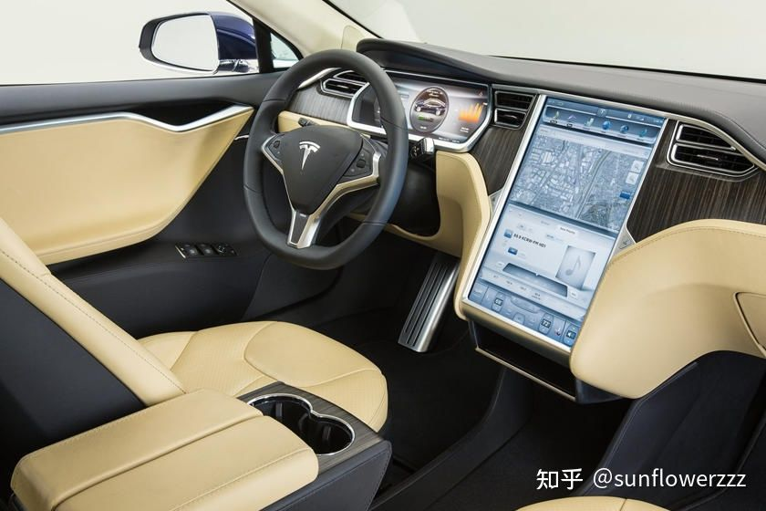
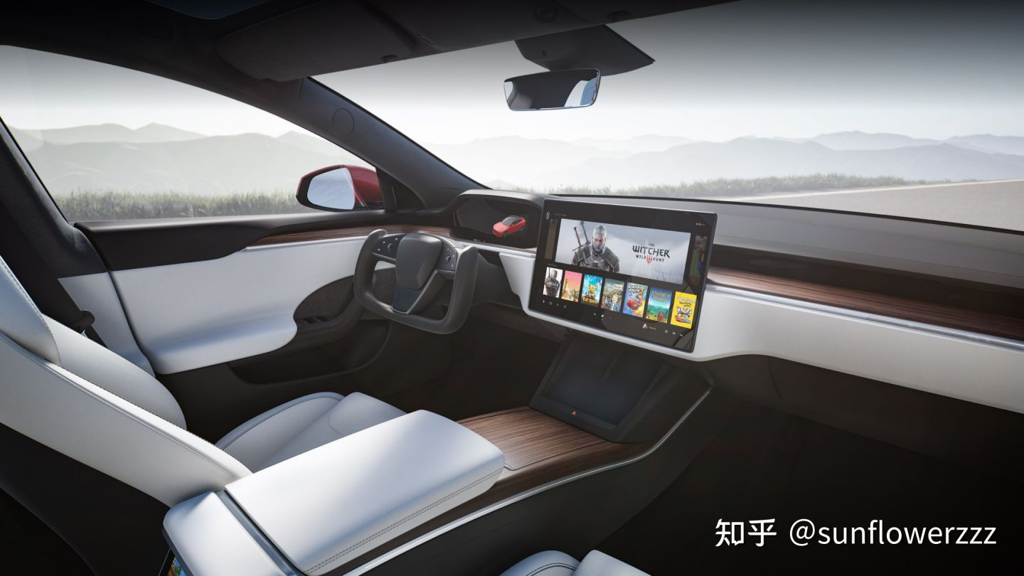
In the recently released version of the Model S, even turning, wiper and gearshift levers have been integrated into the touch area of the steering wheel, and on the Model Y, we can see that there are hardly any other hardware interaction methods other than the center screen, steering wheel control roller, several levers behind the steering wheel, the double-flashing light button on the top of the car, the door opening and window controls on the door.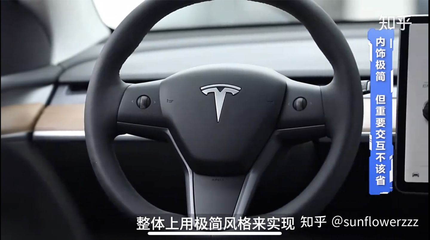
What are the common hardware interactions that are omitted here? They include:
- Headlight control
- Rearview mirror control
- Entertainment system adjustment and volume control
- Air conditioning system adjustment, air volume, temperature, and zoning
All these function blocks have been integrated into Tesla’s central control screen and adjusted in combination with the steering wheel control scroll wheel. These traditional designs of car door control modules, headlight control modules, entertainment systems and air conditioning control panels, rear control panels, common to traditional car companies or luxury brands, have disappeared. Roughly estimated, the cost difference of such parts is about 1000 to 2000 yuan. There are also reduced development costs and mold costs for these components. According to the production volume difference, the cost can vary; even though the proportion of the cost decrease is not significant when compared to cars priced at two or three hundred thousand yuan, multiply that by tens of thousands of units sold per month, and the amount is not to be underestimated.
On the basis of breaking the subsystem boundaries and without losing functionality, this approach achieves cost reduction, which has recently been adopted by many other manufacturers.
Negative Effects of Pursuing Comprehensive Cost Reduction
But is it really unnecessary to have these hardware designs?
In many of the interaction designs that traditional car companies have continued to use, aside from continuing to employ usage habits that clients have acquired, more importantly, they have considered safety in many non-driving tasks, retaining hardware interaction. This ensures that the driver can confirm the hardware position and interaction method in a glance and complete the task without having to remove their eyes from the road.
However, on Tesla, such designs have been overthrown and highly integrated into the screen, in combination with the steering wheel scroll wheel. This design is quite dangerous for drivers who are not yet proficient enough.
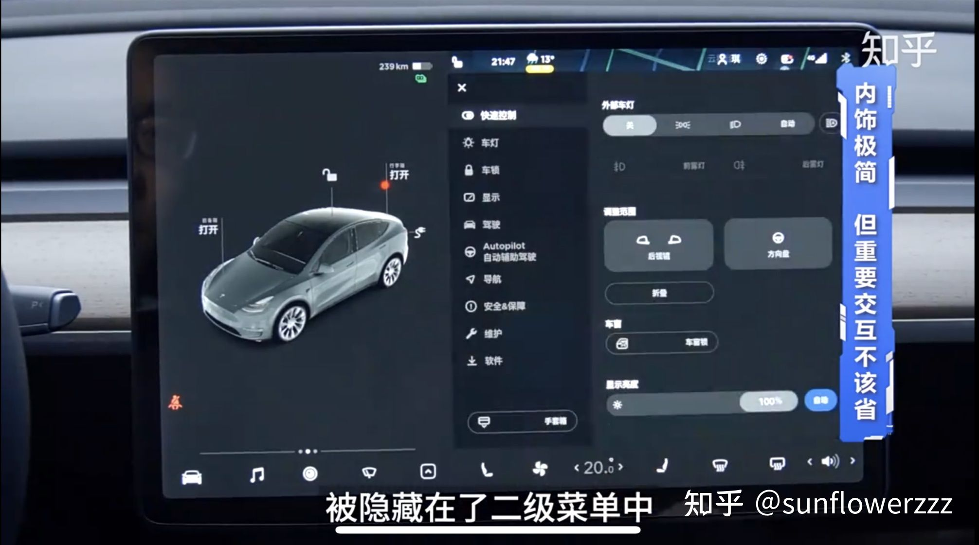
We can see that many operations that can be blindly operated and quickly completed in traditional car enterprise designs have been hidden in a secondary menu, or require multiple operations by the front row driver, including the following operations while driving:
Adjusting the rearview mirror, adjusting the volume and playback source, switching to manual wipers, adjusting the air conditioning air volume, and adjusting the internal and external circulation.
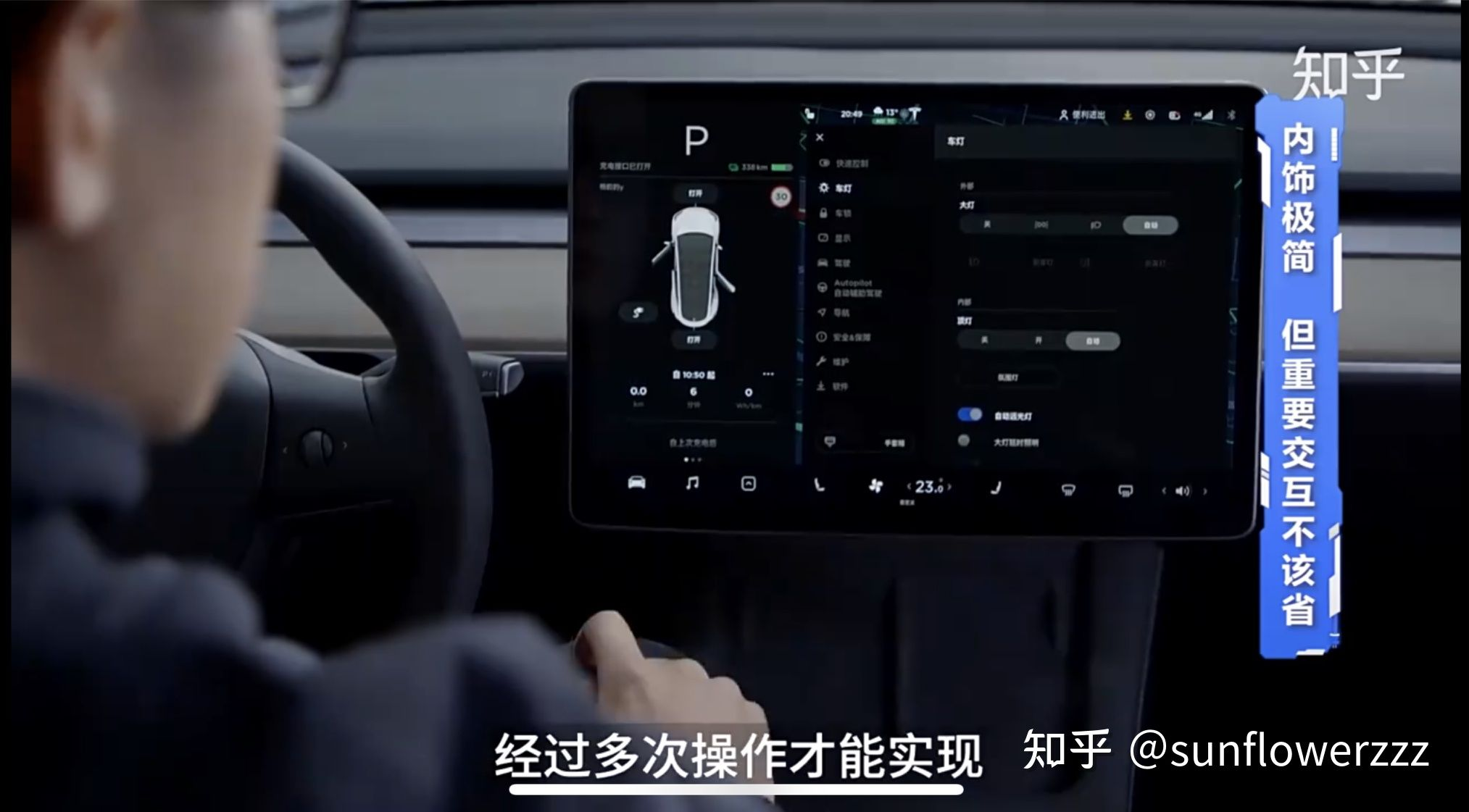
The design changes resulting from integrating these functions into secondary menus and integrating functions cannot guarantee the driver’s focus on the road conditions during use scenarios.The interactive design of traditional car manufacturers is not just a spontaneous behavior of the car industry itself. The US National Highway Traffic Safety Administration (NHTSA) has issued a document restricting and reducing driver distraction, the NHTSA Driver Distraction Guidelines. Although the document is non-binding and voluntary, it proposes many design requirements for reducing driver distraction in the car’s interface.
Factors that need to be considered in interactive interface design include:
-
Whether it is easy to view and reachable
-
The maximum angle the driver needs to lower their line of sight
-
The vertical position of the information display screen
-
One-handed operability
-
…
These design requirements, such as one-handed operability, ease of viewing and reachability, and the requirement for the time the driver’s line of sight leaves the road during non-driving tasks:
-
When completing non-driving tasks, the time the line of sight leaves the road is ≤ 2 seconds
-
The time the line of sight leaves the road during the whole task is ≤ 12 seconds
Meeting these considerations and design requirements ensures the safety of the vehicle while driving and reduces the possibility of driver distraction caused by interactive design.
If other manufacturers also follow Tesla’s example and excessively change these interactions that guarantee driving safety in order to pursue cost reduction, it is indeed a very dangerous trend.
Given the booming development of China’s new car industry and its leading global market share in pure electric vehicles, we strongly recommend that relevant regulatory standard-setting departments in China also consider introducing related standards for car interior interactive design, limiting interactive designs that may distract the driver’s attention.
This article is a translation by ChatGPT of a Chinese report from 42HOW. If you have any questions about it, please email bd@42how.com.