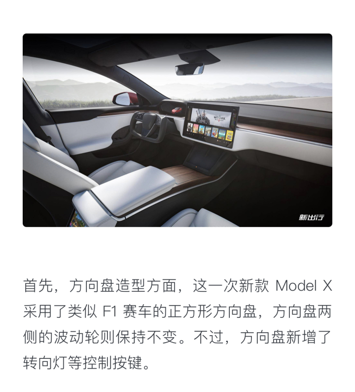
The newly released Model S and Model Y both feature a square-shaped steering wheel that resembles that of a racing car. Is it really practical to use the square-shaped steering wheel on mass-produced cars?
In fact, this square-shaped steering wheel has been previewed before. For those who cannot imagine the feel of it, you can look at the Tesla Roadster 2 real-life video in this answer that features a similar design.
In February of last year, Tesla also had an interior design patent published, previewing another design of the interior.
New Interior Design for Model S/X
When I saw the updates to Model S/X this morning, I had this idea, “This minor exterior update plus the drastic update of the three-electric interior would certainly be criticized if it were a traditional carmaker. And it would definitely be made an example of within half a year after the launch.” However, I did not expect that the “drastic” updated interior would generate more discussion than the more significant all-new Plaid powertrain.
This minor exterior update plus the drastic update of…
Since the big-screen touch control (even the crude three-screen interaction on Roadster 1 prior to that) in 2012, Tesla has been challenging the traditional cognition of the automotive industry in interior design and interaction logic. Eight years later, looking at the new cars on the market, the friends who once criticized big-screen interaction have all embraced this trend.
However, at that time, Tesla still used some traditional ideas and even directly used the gear shift lever of the Mercedes-Benz, for example, on some parts.
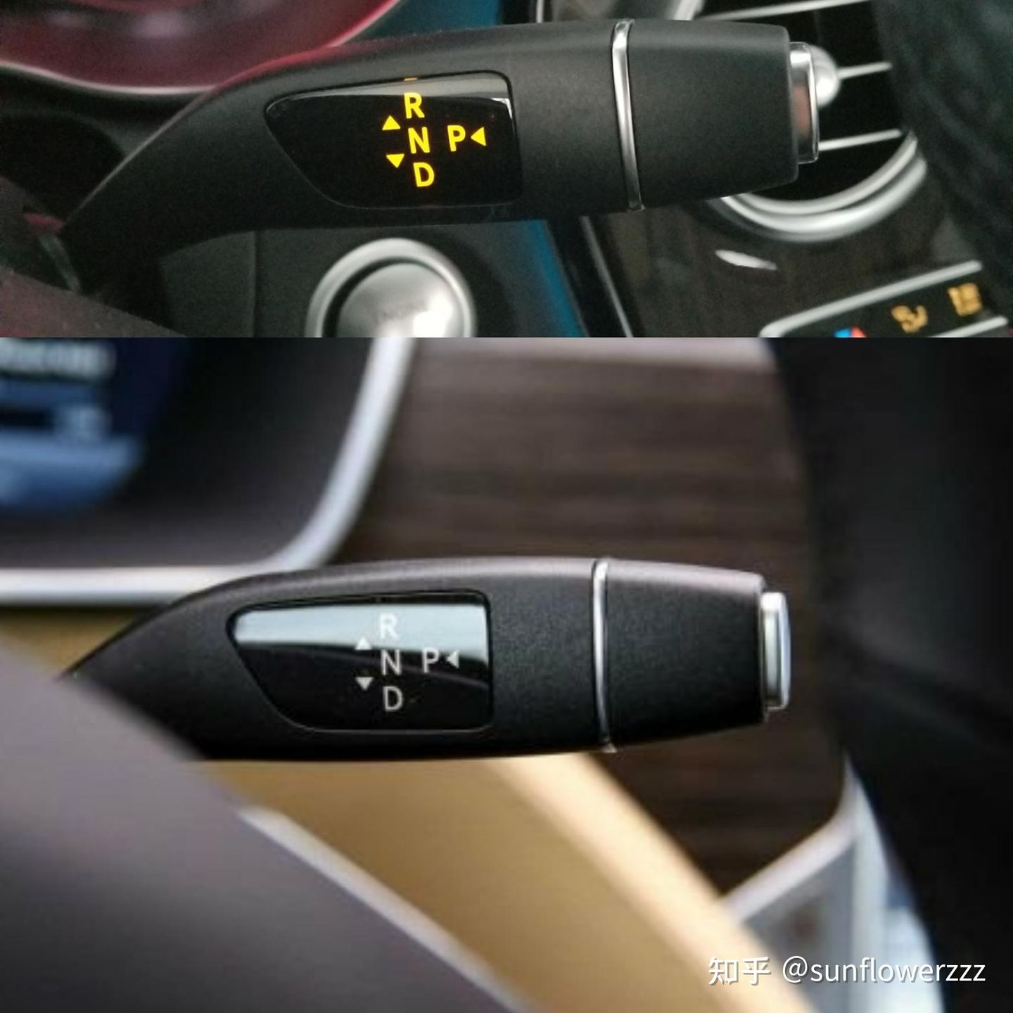
Of course, Tesla, which has already opened up a new battlefield in product definition and consumer perception, will challenge these traditional logic once again during the development of new models, leading to the scene this morning.
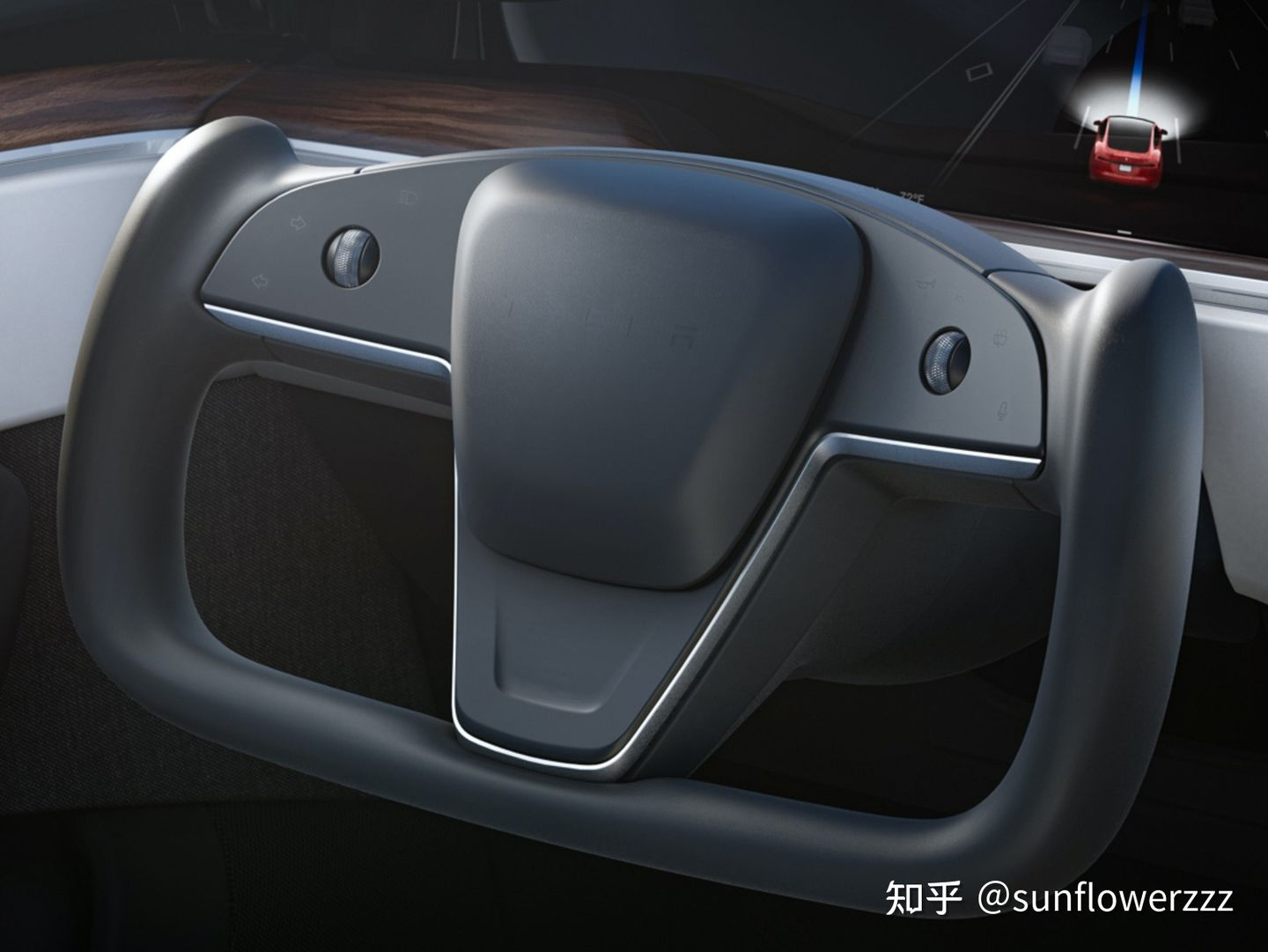
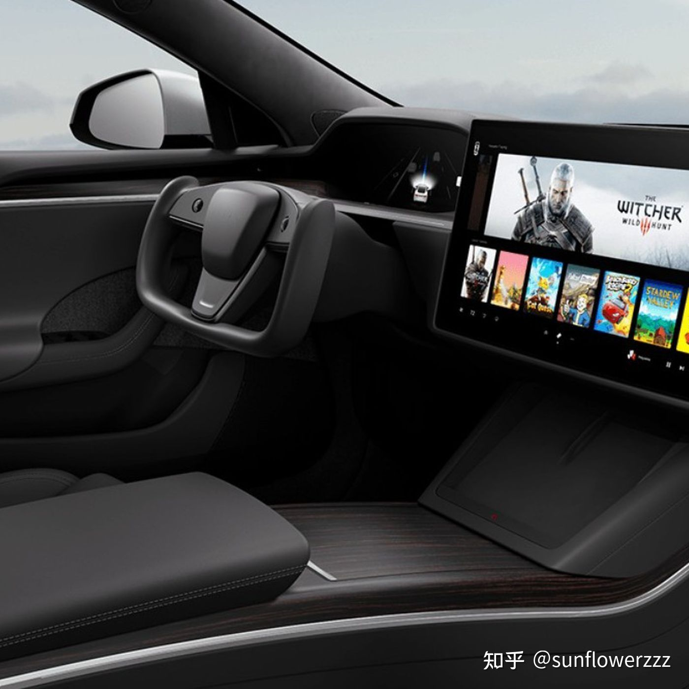
The steering wheel becomes square, and there is no longer any gear shift levers behind the steering wheel. Control buttons, such as for wipers and headlights, are integrated into the touch buttons on the steering wheel, so how is shifting achieved?Is it reasonable to question whether this is the case or not? Let’s take a look at how the similar design interior of Roadster 2, which Tesla has previewed before, actually performs.
Real shot video of the interior design of Tesla Roadster 2
The video mainly focuses on the following two points:
-
How is the turning ratio of the square steering wheel like? Is it similar to racing cars, or is it similar to existing solutions in civilian cars?
-
After the shift lever is eliminated, how is the shifting operation performed?
The source of the first video is a YouTube user named REC Anything, who uploaded several clips of real shots of Roadster 2’s interior. We can see that the steering wheel is already square on the display car of Roadster 2, and the shift lever has disappeared. How is the shifting operation performed?
At the 12-13 second mark, we can see the driver perform some operations on the touchscreen before departure, which confirms that the shifting operation of the display car is done via the touch screen;
At the same time, the turning angle for a U-turn can be seen from 13-23 seconds, and the car can turn at least 1 full circle from one end to the other, which is not too different from the design of some sporty civilian cars that emphasize control, which can turn 2 full circles end-to-end;
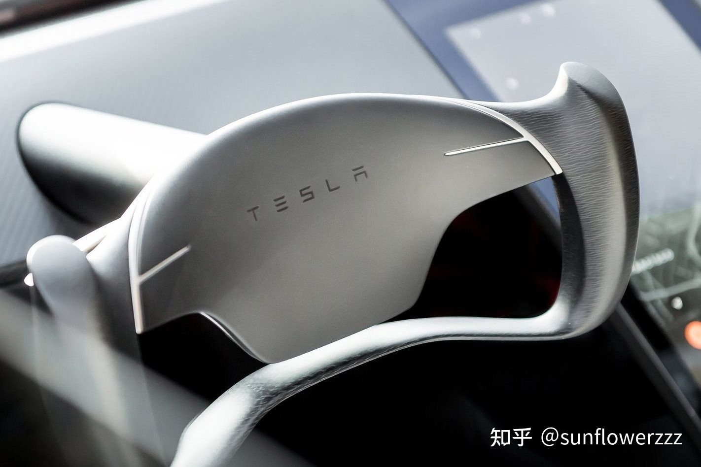
However, the surface space of the steering wheel of the display car of Roadster 2 is extremely small, and it may not be able to integrate a safety airbag. Therefore, we only discuss the turning angle and usage logic of the steering wheel here.Translate the following Markdown Chinese text into English Markdown text, in a professional manner, preserving HTML tags inside Markdown, outputting only the result.
In addition, it is not ruled out that Model S/X may have more extreme steering system designs with faster steering ratios based on online control steering. However, if it is the same design as the Roadster 2 display car, there should not be too much difference in the steering wheel angle compared to ordinary passenger cars.
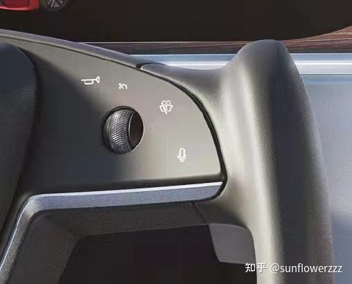
In fact, the steering wheel design of Model S/X is much more traditional than that of Roadster 2. Apart from the integration of the airbag, there is a blank area below the airbag DAB, with interactive buttons on the left and right sides, controlling the volume, wipers, and lights. So, what is the purpose of the area below?
Let’s take a look at Tesla’s steering wheel shifting interaction patent disclosed last year.
Tesla’s steering wheel shifting interaction patent disclosed in 2020
In February 2020, Tesla disclosed an interior design interaction patent, which showed the design for integrated shifting on the steering wheel.
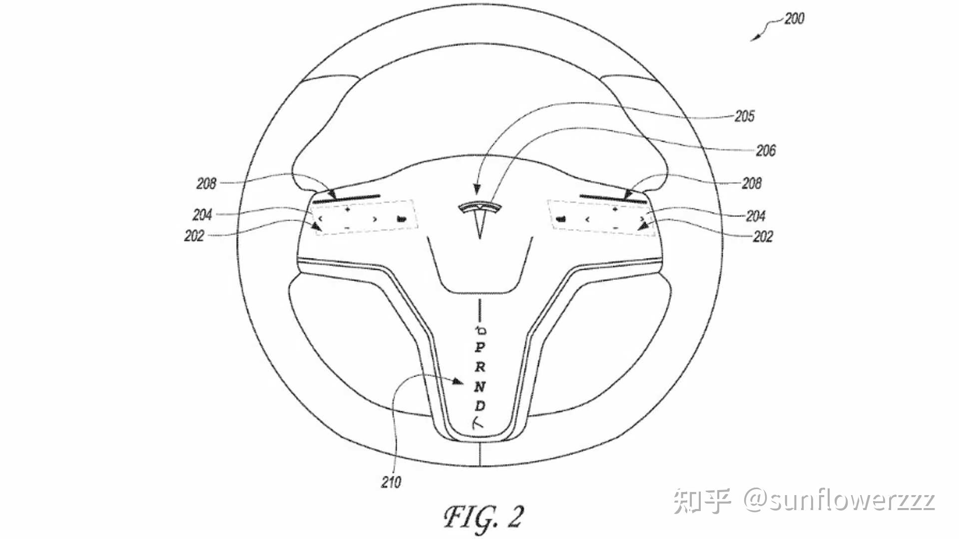
According to the interaction logic, there will also be tactile, visual, and auditory feedback.
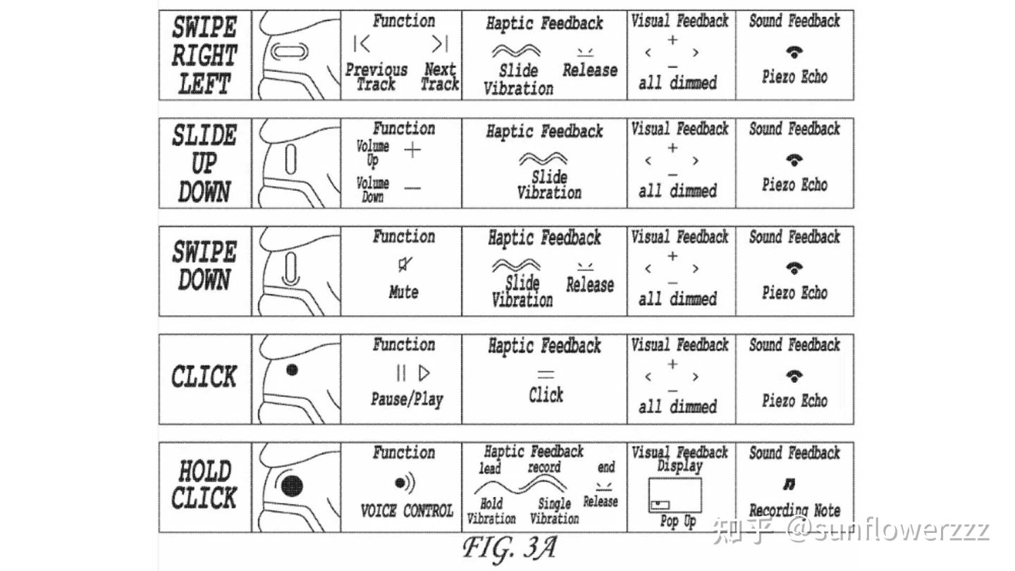
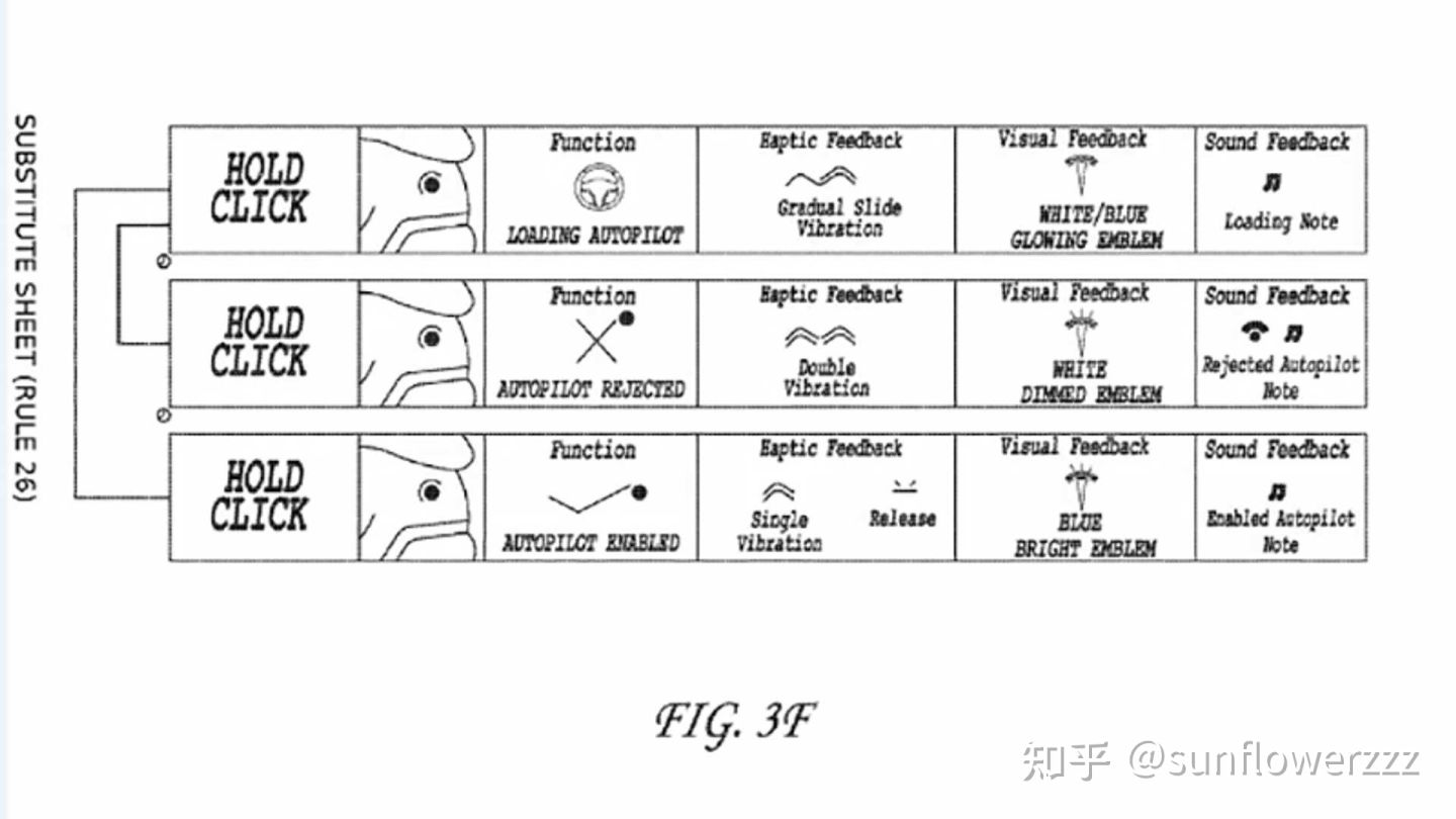
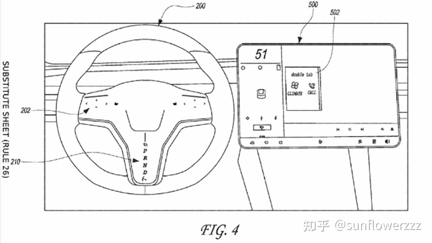
Let’s compare the new steering wheel design of Model S/X and see if you can understand where the shifting design in the patent is located.
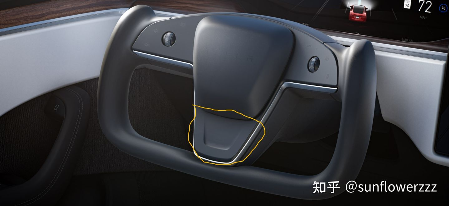
I estimate that there will definitely be people who question the reliability of touch controls, so let me give an example of a traditionally recognized excellent product in the automotive industry: Ferrari SF90 and Roma.
Both SF90 and Roma use the latest interaction scheme and software and hardware design purchased from ART System by Ferrari. Not only the steering wheel, rearview mirror control, and lighting control areas are touch-sensitive buttons that will only light up after starting the engine. If it is not started, the effect is shown below:
 The effect is shown below after starting:
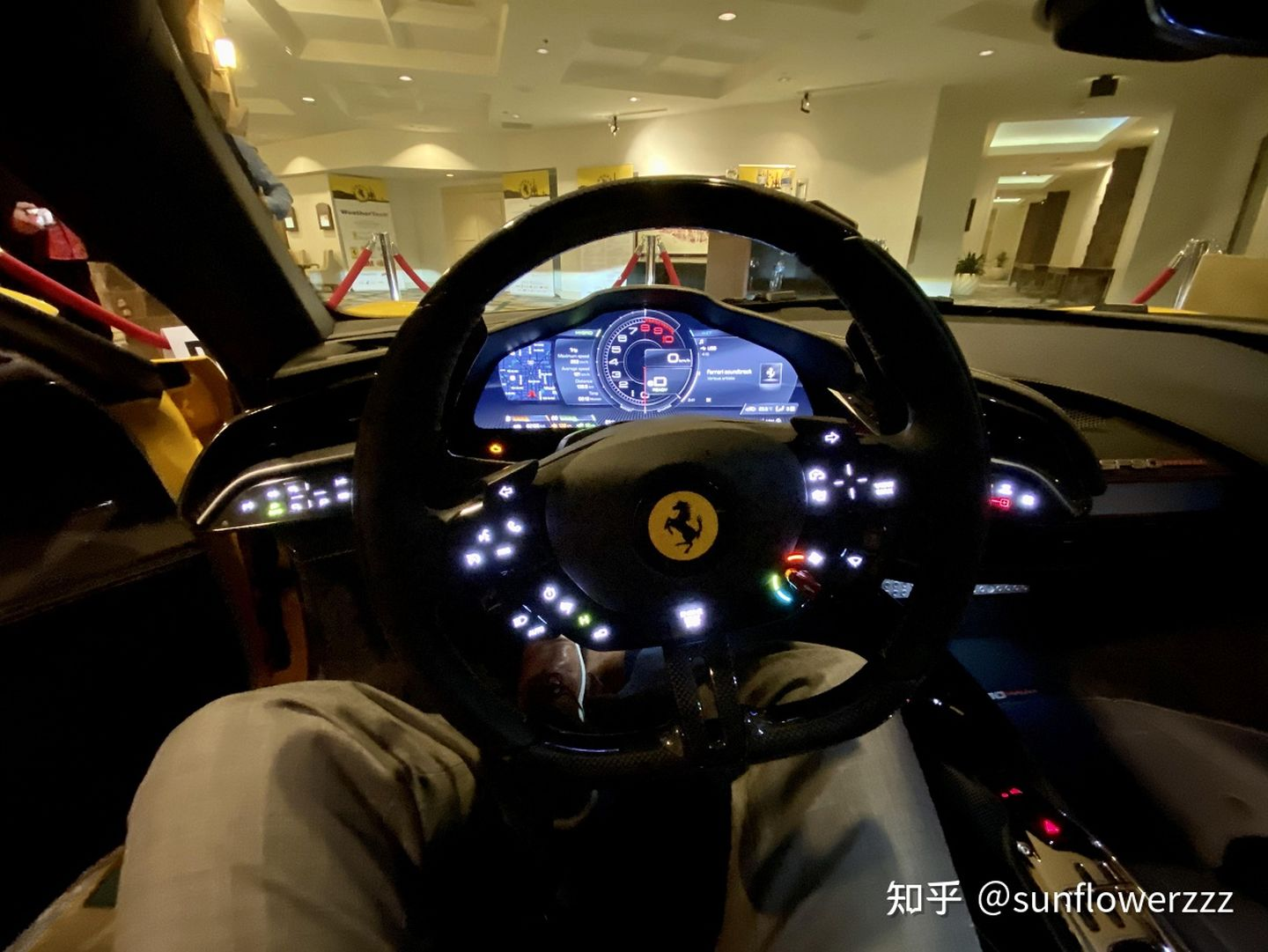
These shiny little buttons have no feedback when pressed, including the engine start button below the emblem on the steering wheel.
The traditional automotive industry can use touch interaction on a large scale, and Tesla also provides tactile feedback. Is there any problem? (Confused)
Conclusion
Tesla, which constantly challenges users’ usage habits, once again presents a design that is incomprehensible. It is actually meaningless to directly question whether it is reasonable. Against the background of the three-electric system and other aspects that are far ahead of the industry, whatever absurd design can find buyers. After all, Tesla’s core is its energy method and the use experience that challenges traditional energy power, as well as the completely rebuilt user cognitive system.
To challenge or defeat it, you have to start from its core charm and defeat Tesla in Tesla’s way. Don’t be distracted by these strange interaction designs.
—– The above is the dividing line of the original answer on January 28th —–
Update on February 18 suspected to be slapped in the face
Reddit user u/cjh6793 took a photo of the interior of the facelifted Model S in Toledo, Ohio:
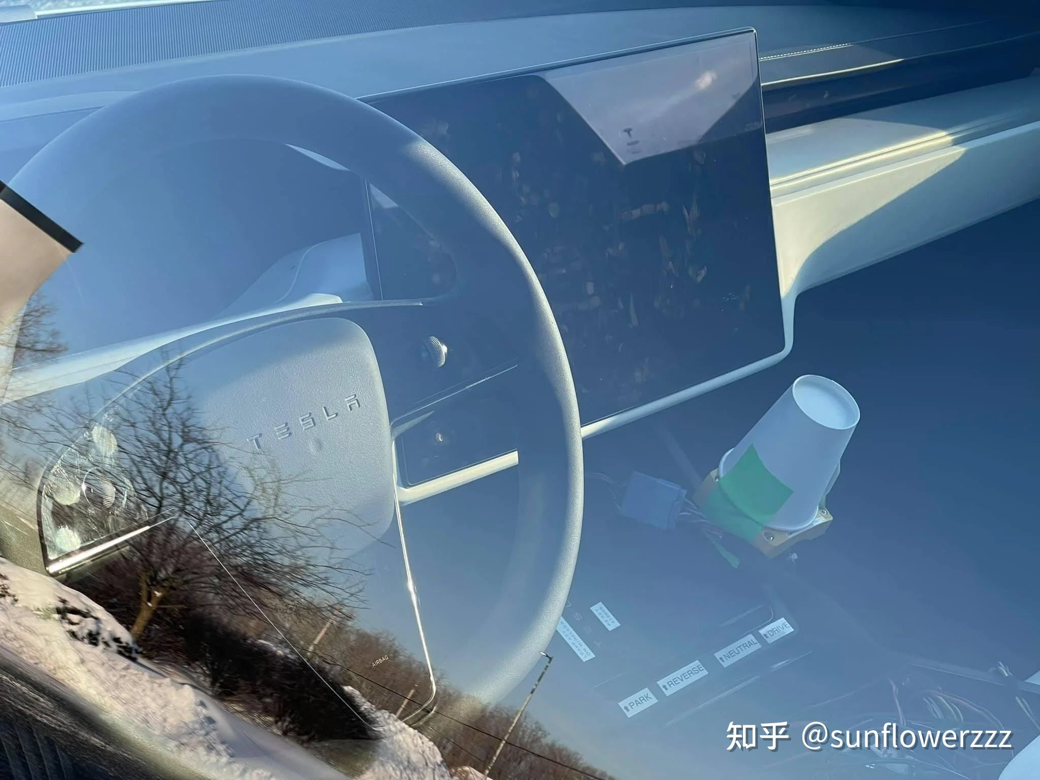
In addition to the official website’s serious circular steering wheel, there are several interesting stickers in front of the center console armrest:
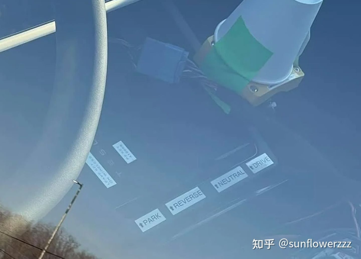
Under the wireless charging panel before, there are four shift button stickers, “PARK”, “REVERSE”, “NEUTRAL”, “DRIVE”…
It’s this position:
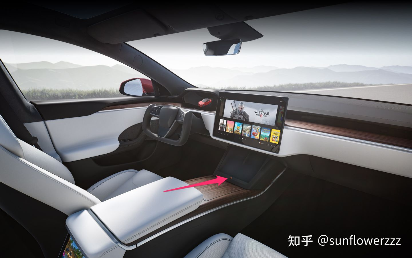
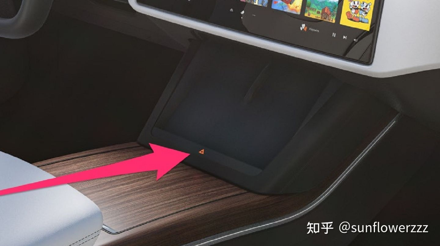
If it is really this design, it is a bit traditional.
This article is a translation by ChatGPT of a Chinese report from 42HOW. If you have any questions about it, please email bd@42how.com.
