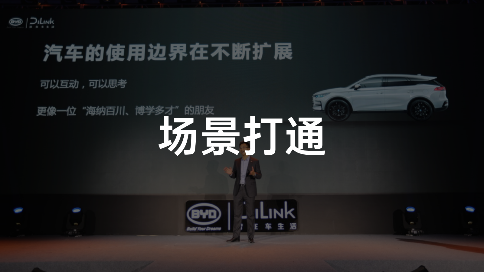
BYD Han and Huawei HiCar System in DiLink Annual Ceremony
BYD Han, the flagship vehicle representing the highest level of BYD, was officially released in July this year, and since then it has achieved very good market performance. Do you still remember Huawei’s important appearance during the Han launch event to introduce the HiCar system? On Christmas Day, they met again at the BYD DiLink annual ceremony.
Keyword: Interconnection
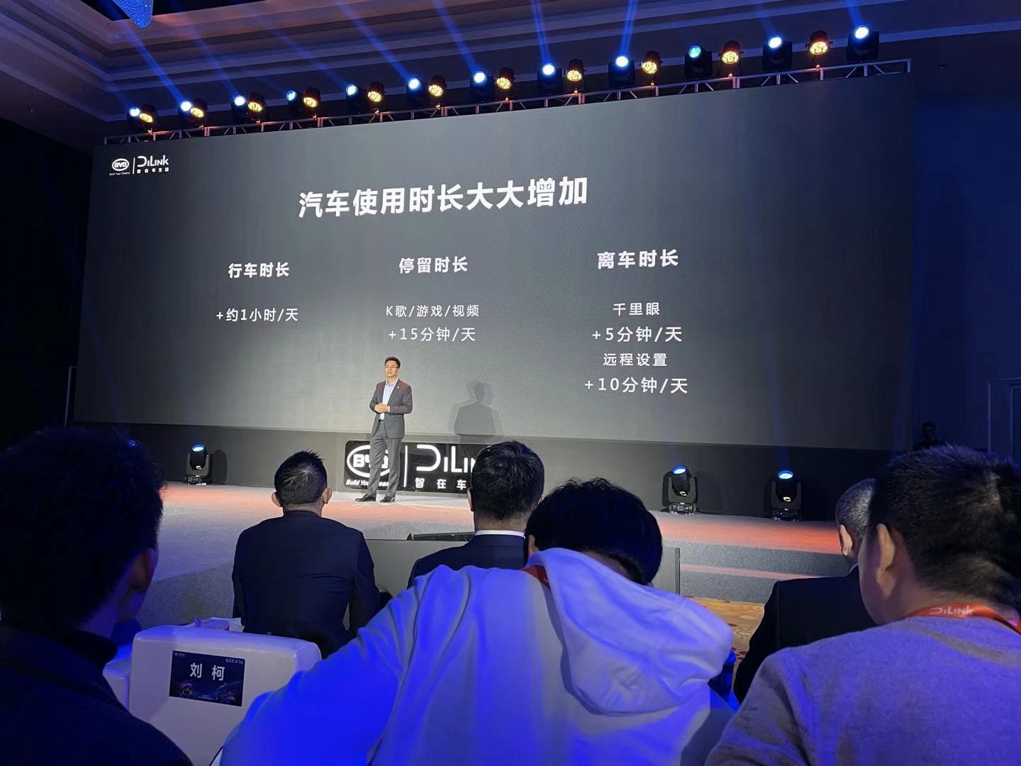
In the first half of the launch event, Yang Dongsheng, director of BYD product planning and the Research Institute of Automotive New Technologies, presented a set of data statistics showing the increase in BYD car owners’ usage time. The average stay time increased by 15 minutes per day, and the cumulative time of setting and remotely observing the vehicle after leaving the car also increased by 15 minutes per day.
Yang Dongsheng said that BYD DiLink has extended the use of the car to both inside and outside the car, expanded the usage scenarios of the car, and truly turned the car into a smart terminal.
Moreover, during this process, BYD has been adhering to an open ecology, adding rich and perfect applications to the intelligent cockpit. Currently, more than 100 products have been built in the DiLink ecosystem.
The term “ecology” appeared multiple times in the introduction of DiLink. BYD hopes to make DiLink an ecosystem centered on the car. Under the concept of “ecology”, more and broader extensions have become one of the goals pursued by DiLink. Several partners of the DiLink ecosystem also appeared on the scene that day, among whom the most heavyweight was Huawei.
HiCar Debut
The cooperation publicity between Huawei HiCar and BYD can be traced back to the BYD Han launch event. However, it seems that the general public has never been clear about what HiCar exactly is.
After more than five months, Huawei HiCar finally appeared again at this year’s launch event.
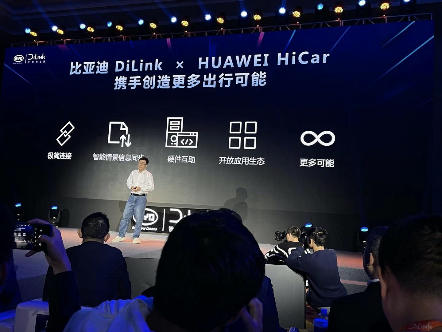
According to BYD product officials, the purpose of HiCar is to achieve interconnection between mobile phones, car machines, and other intelligent networked devices.
“Traditional car-machine products, such as Carlife and Carplay, which use point-to-point connections, can no longer meet the diverse needs of users. Therefore, we are looking for a simpler and more diverse way of connecting.”
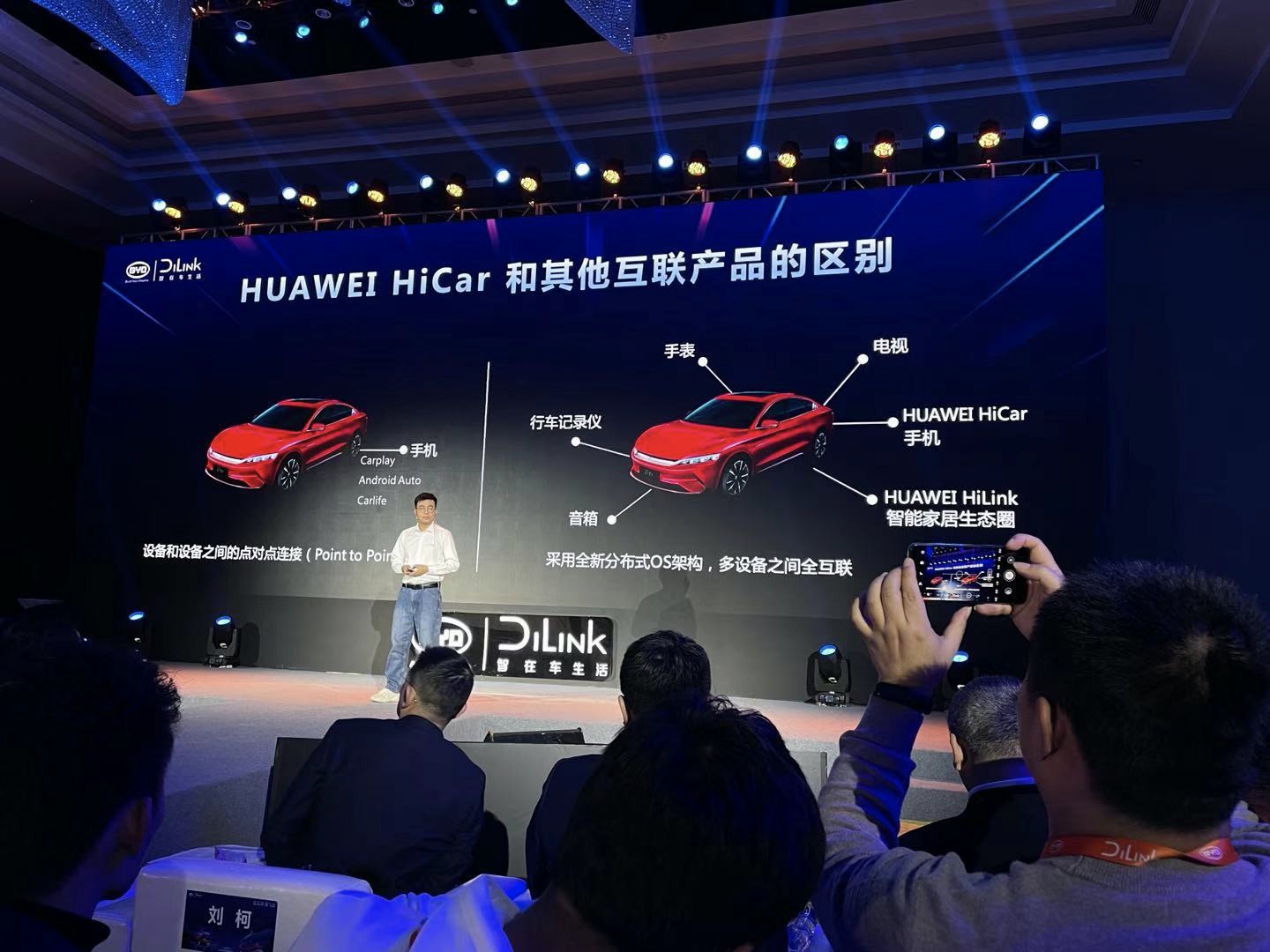
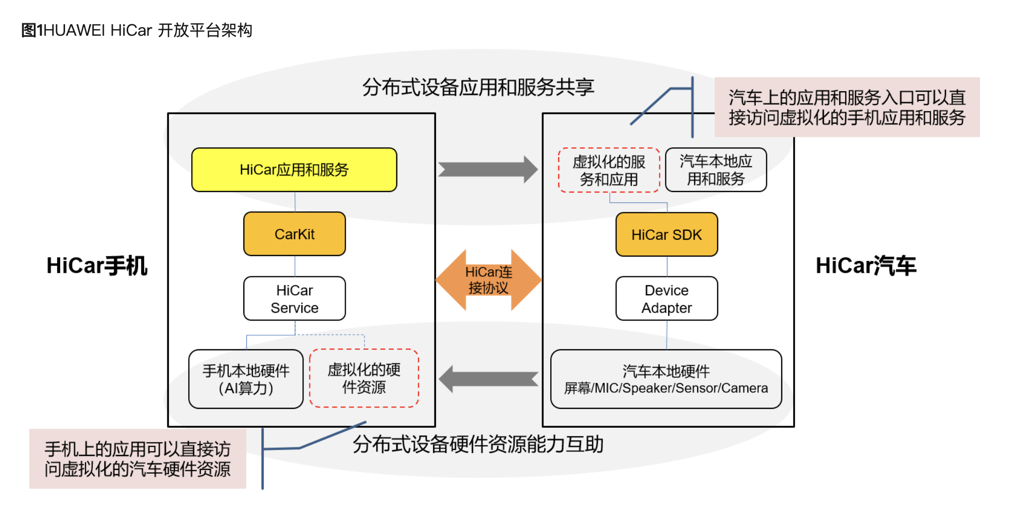
HiCar adopts a distributed OS architecture, which achieves interconnection among multiple devices, compared with point-to-point. This interconnection also has expansion space in the future, and more devices such as smartphones, driving recorders, watches, and televisions can be added in the future.
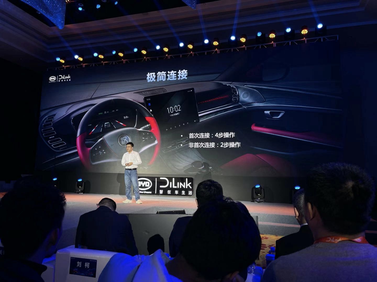
The first connection between HiCar and DiLink requires 4 steps, and the subsequent remembered connections only require two steps. It supports both USB and wireless connections.
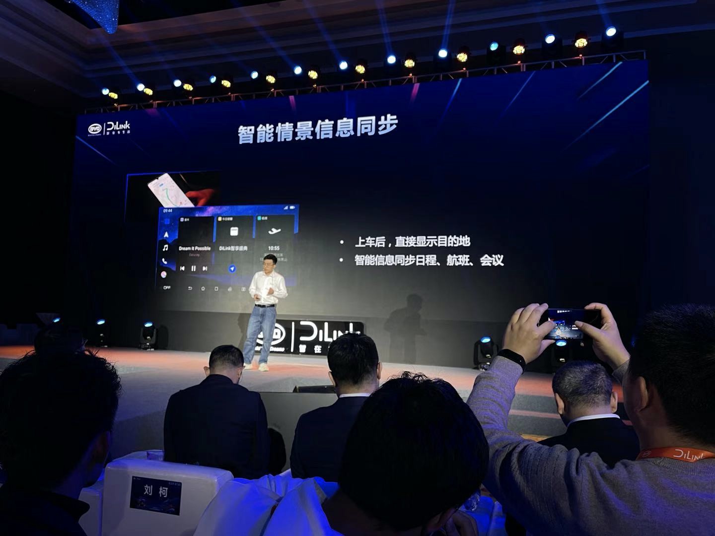
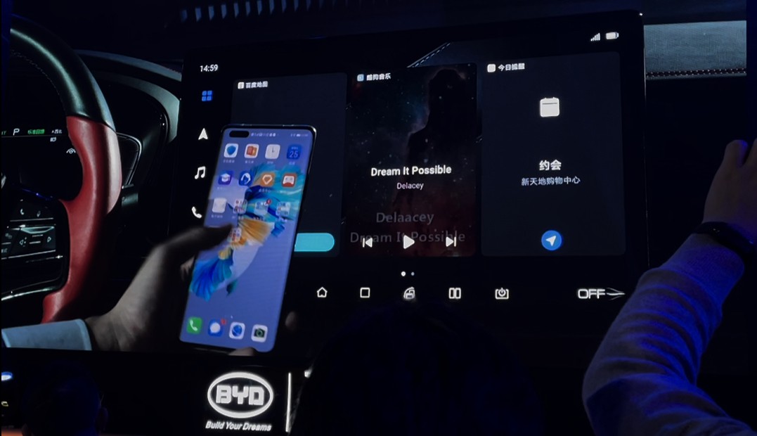
After connecting, opening HiCar in the DiLink infotainment system can jump to the corresponding interface. The navigation, calendar, music playback, and other contents on the phone can be synchronized to the infotainment system to achieve seamless switching between the phone and the car for some scenarios.
In addition, HiCar proposed a concept of “1 + 1 > 2” at the press conference. The key to this concept lies in the hardware mutual assistance between the phone and the car, including that the car can combine the vehicle antenna and the phone antenna data to provide more accurate navigation in the navigation scenario. The system can also call the car microphone and other functions.
The above is the introduction of HiCar. Later on, Huawei staff demonstrated it on the spot in the Han EV car using wireless connection. The demonstration of the navigation part went smoothly at the beginning. After receiving the new location, the infotainment system would automatically pop up a navigation bubble, and clicking on it would start the navigation with one click, which is very convenient. However, in the later part of the demonstration, there were some glitches because of poor communication conditions on the spot. The system appeared to reconnect and get stuck a few times, and the staff ended the demonstration content shortly thereafter.
Objectively speaking, the demonstration part of HiCar does have some considerations for consumers. Today, when the phone is the core intelligent terminal in our daily life, the starting point of most of our application scenarios is on the phone. It is a good idea to connect the phone and the car infotainment system. The function of synchronizing WeChat navigation seamlessly with the infotainment system seems to be a very user-oriented thing.
However, I have a question about HiCar, which most people may have—What is the difference between this application that looks like phone projection and using my phone or infotainment system directly?
I found the above information on the business introduction page of Huawei HiCar, where the content mainly elaborates the problem of long hardware iteration cycle and insufficient application richness in the current car system. Phones have advantages in this regard and are more in line with user usage habits. Taking advantage of these advantages can provide a better travel experience.
Such considerations are in line with the actual situation in the industry and also have application prospects. However, I subsequently thought of another problem: since hardware, ecology, and usage habits are all advantages of phones compared to car systems, where are the pain points for HiCar to improve the travel experience compared to using phones directly?
We’ll keep the question for now and continue to review the content of the first phase of the release.
Three Exclusive Apps Released Together
In addition to Huawei, Kugou, CRI Cloud Radio, and Midea were also invited as ecological partners for this release. Each of these three companies released a customized car version app for DiLink at the event.
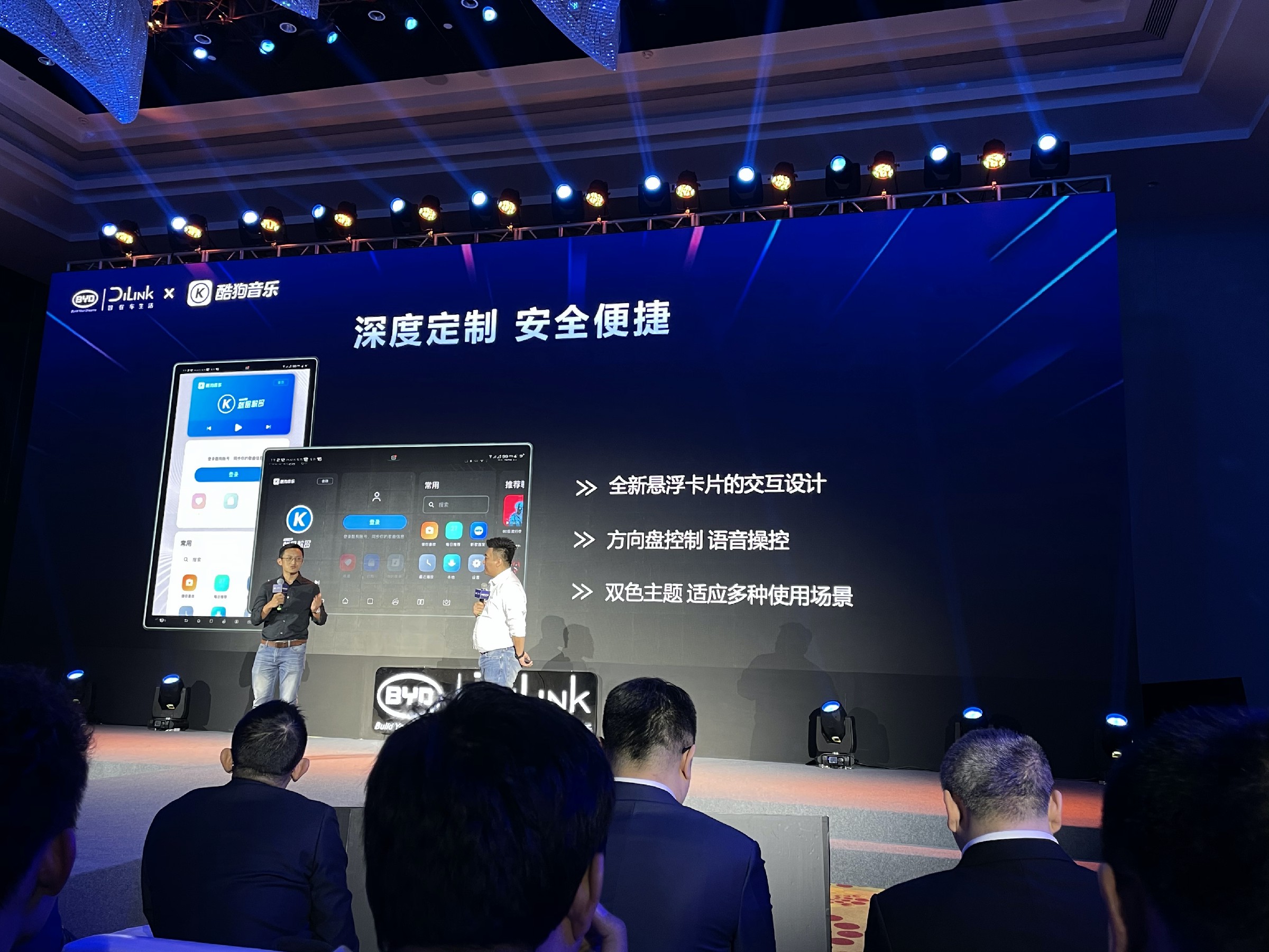
The functions of these two audio apps, Kugou and CRI Cloud Radio, will not be repeated here, while the Midea IoT App on DiLink is used to control connected smart home devices, such as air conditioners and water heaters.
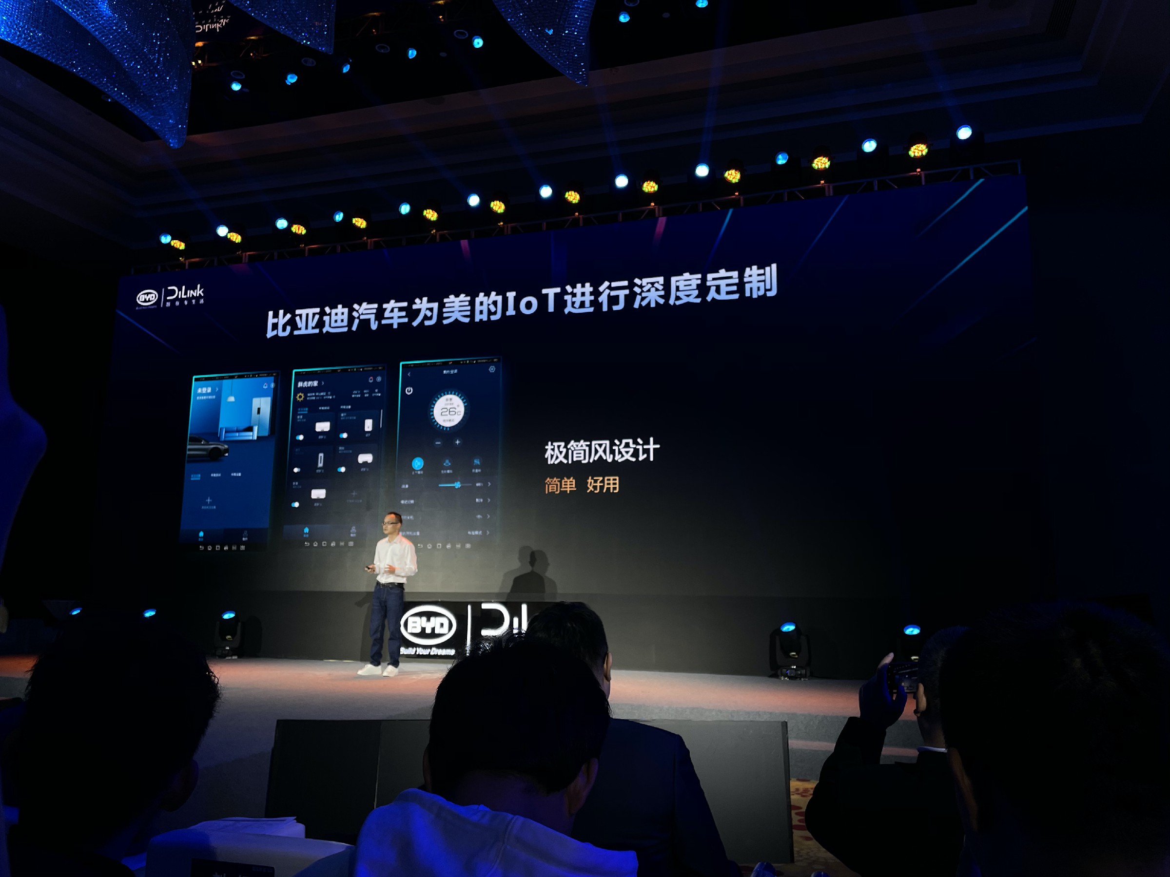
Frequent users of DiLink by BYD should know that Kugou Music was already available on DiLink before. The behavior of releasing exclusive apps again may seem “redundant,” but it is not the case.
Because there is currently a widespread problem with DiLink—many of the apps in the ecosystem have not undergone deep, specialized car-machine adaptation for DiLink. The most intuitive example is that some common apps, including Kugou Music, Amap Maps, and QQ Music, are only available in portrait mode on DiLink.
Previously, on the Han EV and Techrules X cars, I was surprised by the logic of the central control automatically entering vertical screen mode when clicking on these apps. What surprised me even more was that even after manually rotating the large screen back to horizontal, the UI of the app remained in vertical screen status, which means that the UI was facing right. I was not satisfied with this kind of interaction experience.
 The two customized audio apps released this time have all been adapted to landscape orientation and feature card-style interactive design. Furthermore, to further integrate with the entire car interaction, a part of voice command adaptation has been made. Although this improvement has come late, it can still be considered as better late than never.
After reading this part of the press conference, it is very clear that DiLink is a car system with rich applications and has a certain intersection with the Android mobile device ecosystem. Many things that can be done on a phone or tablet can also be done on DiLink. DiLink has truly integrated the car into everyday life. In terms of making the car more functional and fun, DiLink has indeed achieved certain achievements.
Reflection on the symbiosis of mobile and car systems
The significance of HiCar
Let’s go back to the first question we left earlier: “What is the difference between HiCar, an application that looks like mobile phone projection, and directly using a mobile phone or directly using a car system?”
At the press conference, although HiCar separates itself from Carplay and Carlife through the characteristics of a distributed operating system, from the perspective of in-car applications, these three give people a similarly experience, all using mobile phones on the car system screen.
Carplay and Carlife have accumulated a large number of users worldwide. An important aspect of their success is that they meet users’ attachment to the mobile ecosystem and adapt their frequently used content to the car system display.
On this basis, I believe that there is a clear and easily overlooked difference between car systems and mobile phones – the screen. The car system screen is larger and can display more content, reducing the precision requirements for touch operations. A bigger screen can also reduce the operation concentration needed for the car interaction, which is often a “distracting operation.” The car system screen is usually arranged in a place that is convenient for observation or operation, and also takes into consideration quick operation scenarios while driving. Therefore, using mobile phones on car system screens is not strange.
The reason why users would do this is that the adapted mobile projection interaction in the car is more convenient than using a mobile phone.
However, this demand is for all mobile projection applications. The success or failure of Huawei HiCar still depends on how much advantage or gap it can make up for in terms of user experience compared to the other two. Nonetheless, Huawei has indeed taken one more step than the other two in filling a long-existing gap by releasing a piece of hardware called “Car Smart Screen,” which looks like an after-installed car system screen.
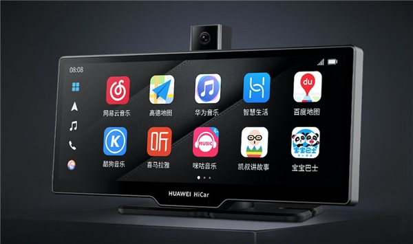 Many traditional car manufacturers have sold models that do not support mobile phone connectivity or have outdated screens and hardware, especially in low-end models.
However, there are still users who have a demand for smart car systems. They do not lack smartphones, but rather car hardware. This is a gap that has always existed but has been ignored.
The HiCar smart screen for cars fills this gap for these users. Like the other two brands, HiCar is based on the phone ecosystem, so there is no need to worry too much about the number of applications. Users can transition from their phone to HiCar without spending too much time learning to use it. However, like Apple Carplay, Huawei’s HiCar can only be connected through their own brand of smartphones.
Speaking of this, let’s take a look back at DiLink.
DiLink vs. HiCar: Potential for Changing Roles?
During a group interview, Yang Dongsheng stated that when BYD launched their intelligent rotating screen, it was for the purpose of embracing the phone ecosystem because phones are infinitely prosperous and continuously updated. However, some of the applications developed for car systems and phone versions have very different user experiences. Few developers want to spend the time to develop for car systems because there are so few users. Additionally, many apps on earlier versions of the iPad were not designed for horizontal use or performed poorly in the landscape view, leading to poor user experiences.
Given this situation, BYD uses the physical rotating screen to solve this problem and minimize the work required for developers to adapt their apps to the car system. Many apps in the DiLink ecosystem are not adapted to landscape view and are vertically oriented. BYD’s idea is to use the central control rotation to perform “physical adaptation” in reverse.
“We hope you can change less, and the rest doesn’t need to change at all. In DiLink, there is a very good user experience. Consumers will become more and more lazy. The original intention of our product is why do you need to adapt? We do not want consumers to learn a different usage habit for car software. When adapting the Kugou brand, the phone version and the car version are different, and the consumer must learn both. If it is only in DiLink, without modification and connecting, it is possible. Our unique DiLink feature is the convenient integration into the ecosystem.”
At this point, what I feel from DiLink’s ecosystem is that application migration focuses on making it more convenient for apps to be connected and integrated into the ecosystem, thus allowing the ecosystem to grow quickly. Nevertheless, there are not too many requirements put on developers with regard to adapting these applications for a car environment.In addition, HiCar in mobile projection mode is also an App used on the car screen, so there is a significant overlap between HiCar and DiLink in terms of application ecology. Using these Apps directly on DiLink may not differ essientially from using them after connecting to HiCar via mobile phone.
Moreover, if you look at the official introduction of HiCar, one of its advantages is seamless synchronization of mobile phone content, such as quickly synchronizing navigation content on WeChat to HiCar’s in-car unit. Furthermore, under the projection mode, there is no need to worry about App ID login and related account content updates. Plus, the expansion speed of HiCar’s ecology is expected to be faster than that of DiLink in the future. Therefore, for Huawei BYD dual users, I even think that to some extent, HiCar can replace DiLink.
However, these have a premise, that is, HiCar does achieve ecological coverage and the connection with DiLink is smooth and stable. This level of completion was definitely not enough for the live demonstration crash. In addition, not all BYD car owners are Huawei users, so for non-Huawei users, HiCar on DiLink doesn’t have much value. So although HiCar and DiLink have a lot of intersection, DiLink still has its meaning.
The Center of Intelligent Cockpit
“In the era of intelligent cockpit, should the car be centered around the mobile phone or the in-car unit, we believe that it should be centered around the user.” Huawei spokesperson expressed this opinion during the panel discussion at the press conference, and I think there is nothing wrong with this statement. The question is, what kind of intelligent cockpit is truly centered around the user?
Following the previous paragraph, considering the advantages that mobile phones have in terms of hardware, ecology, and usage habits, what irreplaceable features does the car have that make it necessary for the user to use the in-car unit instead of mobile projection?
If we think about this question by combining practical travel scenarios, we can easily see that the necessity of the in-car unit mainly lies in it being the interaction window between the car and the user.
You can use your phone or projection to navigate and play music, but you cannot set up the vehicle through your phone, and the vehicle’s voice interaction settings are disconnected from the phone. Therefore, a set of excellent in-car unit can replace mobile projection, but the opposite is not possible.
There are many models that claim to have intelligent cockpits, and XPeng, Ideal, and Tesla are highly rated and sought after in the industry. Let’s take a look at their highlights.
XPeng has almost universally recognized the best voice interaction, and you can control almost everything inside the car by speaking; Ideal has a 4-screen interaction, with rich direct access buttons and abundant information display contents; Tesla has a clear and concise information display layout, vivid visual UI for auxiliary driving, and a convenient and comprehensive 1st-level touch menu.Although there are different advantages, excellent interactivity is the key to the outstanding user experience of these three companies.
To put it simply, the use of car infotainment can be divided into two scenarios: driving and parking. Under the attribute of vehicle travel, the former should obviously be a higher priority interaction scenario. In the driving scenario, the key to good use of the car infotainment is whether it can help passengers solve key needs, where the driver’s needs account for the vast majority.
In fact, during driving, the driver is not interested in today’s news headlines, whether the stocks have risen or whether the smart home should be turned on in advance. Most of their energy is focused on issues related to driving and travel: driving and navigation information, auxiliary driving information, vehicle status information, commonly used settings such as air conditioning and seats, and multimedia information.
Moreover, because it is a driving scenario, the driver will not always stare at the screen while driving, so the infotainment should minimize the driver’s distractibility and reduce the cost of obtaining information and operation. To achieve this goal, the content of the above-mentioned parts should be presented as intuitively and clearly as possible, and the operation should be as simple and convenient as possible, shortening the path.
Looking back at the infotainment interaction of XPeng, Idean and Tesla, three commonalities can be summarized:
-
Most commonly used settings are shortcut key operations
-
High screen information display density and rarely have full-screen scenes
-
The center console can still set multiple commonly used functions simultaneously even in navigation mode
In addition to the poor localization of Tesla’s voice, XPeng and Idean both have good voice interaction capabilities.
This kind of interaction design allows drivers to quickly operate and set between “multiple tasks”, greatly reducing the time the driver spends finding and opening multi-level directories on the center console. This is also what I mentioned earlier, which reduces the driver’s cost of obtaining multiple types of information and their distractibility during operation.
Therefore, from this perspective, a user-centered intelligent cockpit must have efficient interaction efficiency and considerate humanized interaction experience.
Ecology and interaction can be a multiple-choice question
DiLink was officially launched in 2018, along with BYD’s flagship model, also the first model with a rotating center console screen – the Tang second generation. At that time, the design of the protruding center console was quite similar to the Model 3, and since then, BYD has emphasized the expandability of DiLink, which can run many mobile apps and has a very rich application ecosystem.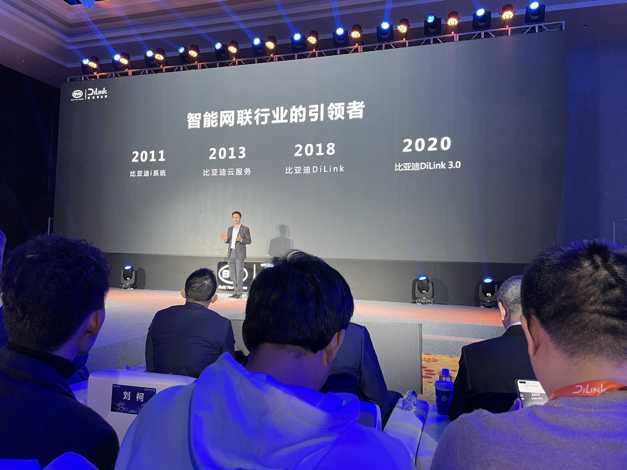
This direction continues to this day, and you can still see K-song and gaming content on the car console in DiLink’s promotion. DiLink is also described as a “car-mounted Android tablet” in some media introductions.
This year, I also had the opportunity to experience the DiLink system in depth through the Tencent X and Han EV models, the latter of which featured the latest DiLink 3.0 console. However, after using the system, I found that it did not meet my expectations.
In parking scenarios, DiLink is indeed a great personal entertainment center. Coupled with the vehicle’s excellent sound effects, larger console screen, comfortable seats, and air conditioning, sitting in the car cut off from the outside world to watch videos, sing K songs, and play games feels great. In driveless scenarios like waiting and charging, DiLink’s rich expandability does bring a more enjoyable in-car entertainment experience.
However, DiLink’s problem is that it is too “tablet-like”.
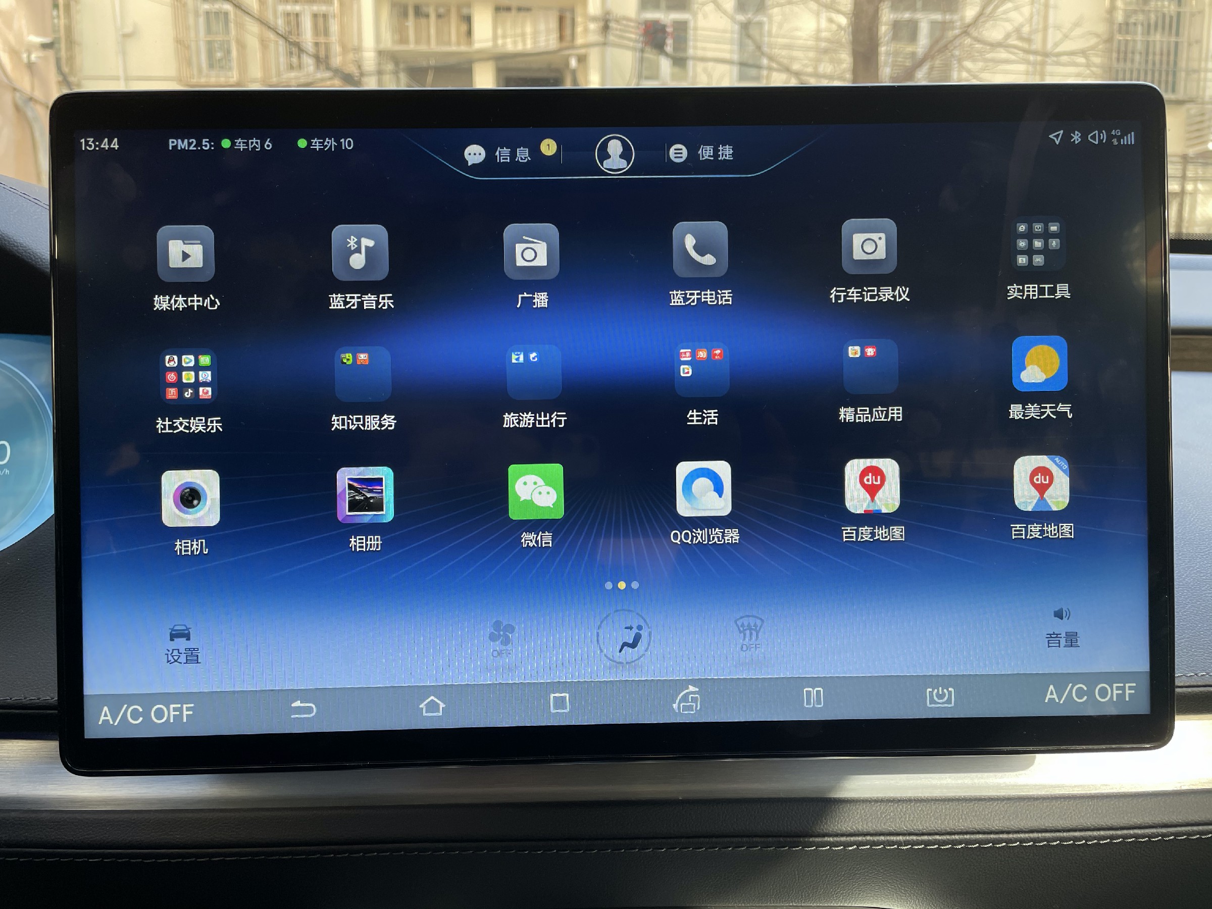
Apart from a few small widgets on the homepage, the menu hierarchy distribution of DiLink is exactly the same as that of an Android tablet. The vehicle’s settings and various apps exist on the UI interface in the form of application icons, and DiLink also has folders for apps, just like an Android tablet. At the bottom of the console is the system navigation bar, including buttons for return, home, split-screen, task management, etc. In short, the interactive form of DiLink is almost identical to that of an Android tablet that we use in our daily life.
Some people may think that this “loyalty to the Android tablet” car console design is not inappropriate and can even lower the user’s learning cost. However, the usage scenario of a car is different from that of a phone. For a car console setup like DiLink that only has one center screen, the functions of the console in driving scenarios and parking scenarios are completely different.
The first problem that the DiLink system almost identical to an Android tablet brings is the low information display density, because the system displays in full screen whenever you open an app.Under the precision of finger and touch-screen operations, large-screen single-task interaction can bring higher efficiency. In addition, switching between tasks for users in a focused state is not difficult through the task manager operation. Moreover, on mobile electronic devices, information such as the control center, notification center, taskbar, and status bar can be viewed through simple operations. Therefore, full-screen interaction logic is OK for use on tablets.
However, the full-screen logical interaction for single task processing is not suitable for driving scenarios. Because the information that the driver needs to obtain is diverse, the single-task interaction set under full-screen logic leads to frequent switching between different applications for users. At this time, DiLink’s full-screen logic will bring a lot of inconvenience.
For example, when the Tencent X navigation is in full-screen mode, if you want to listen to music, you need to accurately click the home button, find the music folder on the screen full of apps, open the music folder, and then open the music app, if you don’t use voice operation.
Opening the music app is still in full-screen mode, and you find that the tablet suddenly rotates to portrait mode. You need to wait for the screen to complete the rotation. After you have selected the music and start playing it, you need to click the task manager button in the navigation bar in portrait mode to return to the navigation app. If you are used to landscape mode, you also need to manually click the screen rotation to switch back.
During the time when you go to open the music app to play music, you cannot see the navigation road conditions. And once you return to navigation, you cannot see the track information being played.
If you use voice interaction, when you wake up DiLink’s voice assistant to play music while in navigation, the first action that the voice recognition executes is to switch from the navigation interface to the full-screen mode of Kugou Music.
Although the music is playing, the navigation interface is switched again. If you want to return to the navigation interface, you have to switch back manually through the task manager or operate using voice commands again.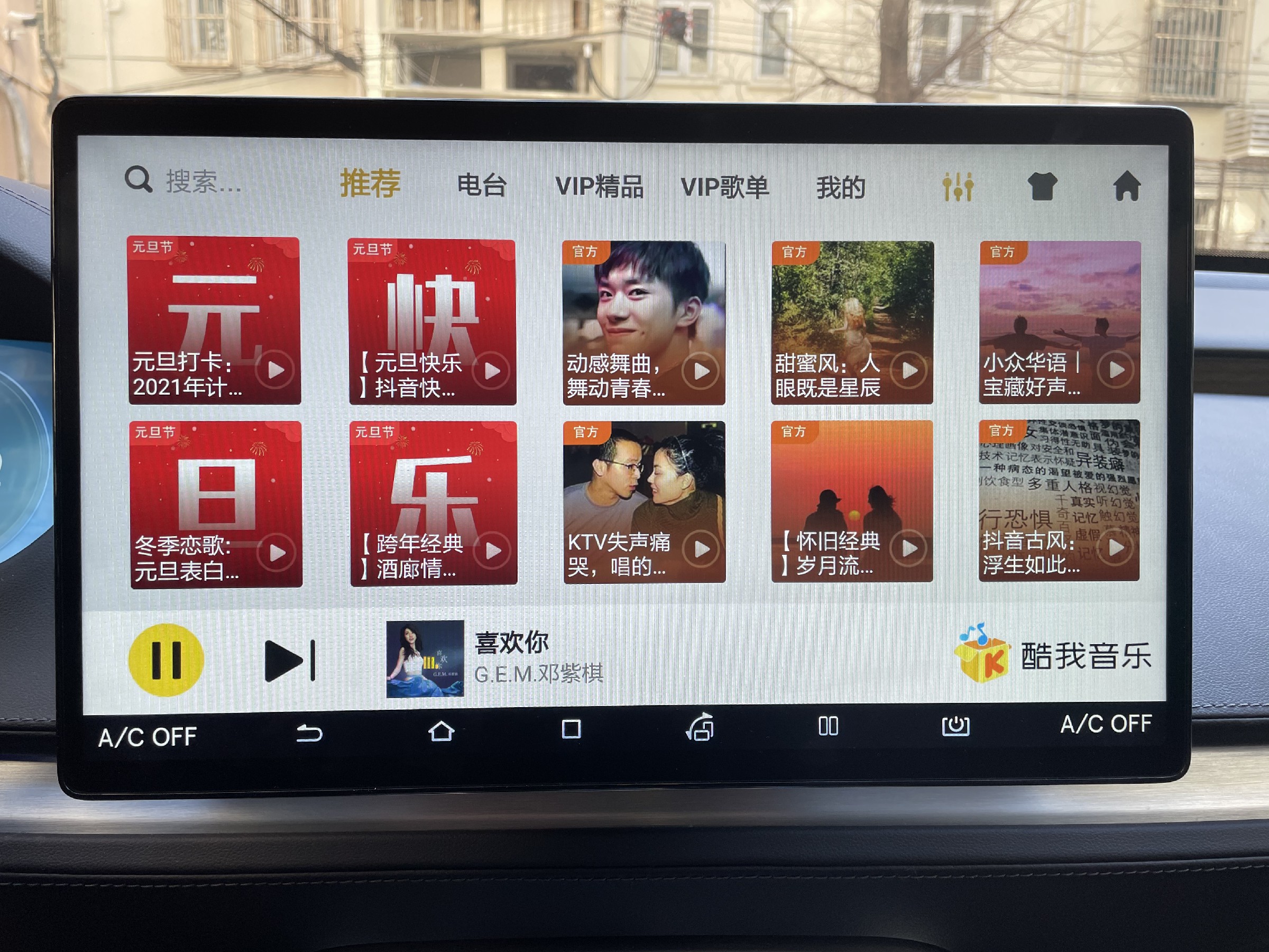
However, DiLink is not completely incapable of running on two screens. You can split the screen in half and display the navigation and music on each side. However, this operation is still inconvenient and requires effort. Therefore, this tablet-based interaction logic of DiLink increases the time users spend on setting and operating the vehicle, and also distracts the user’s attention more.
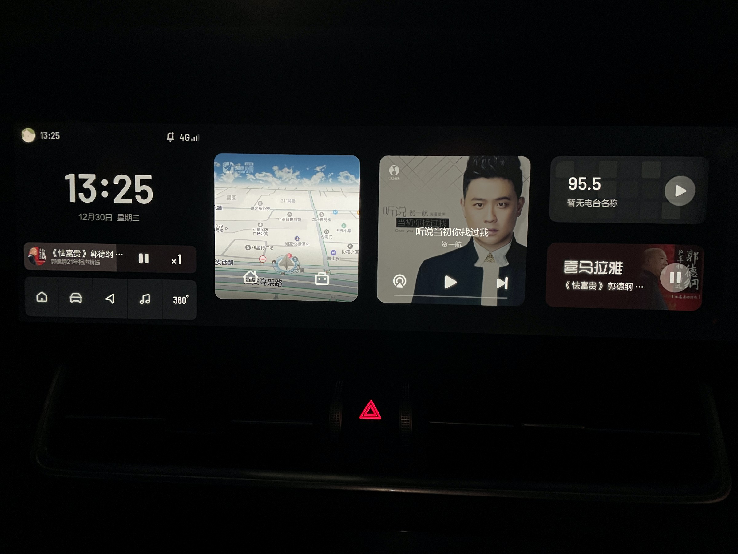
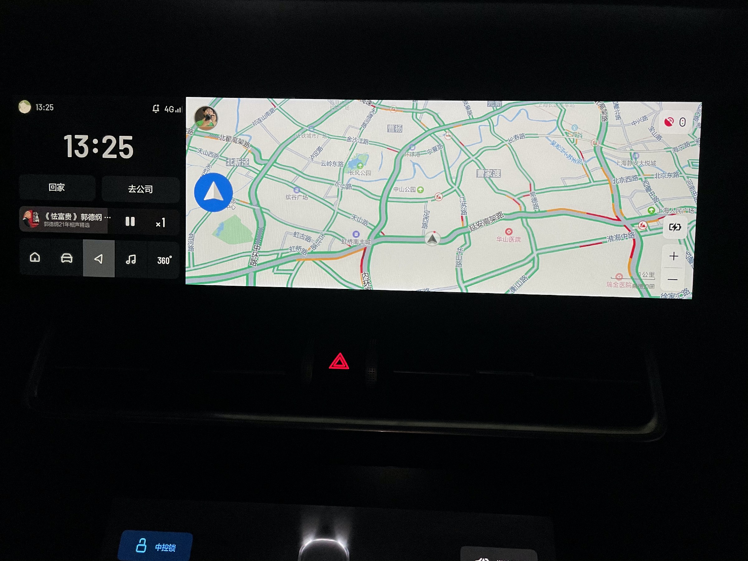
In addition, the information linkage display between the DiLink central control and the instrument screen is insufficient. Vehicle navigation information, multimedia, energy consumption, tire pressure, etc. are not displayed on the instrument screen, and there is a lack of interaction between the central control and the instrument, which means that the large instrument screen is not fully utilized.
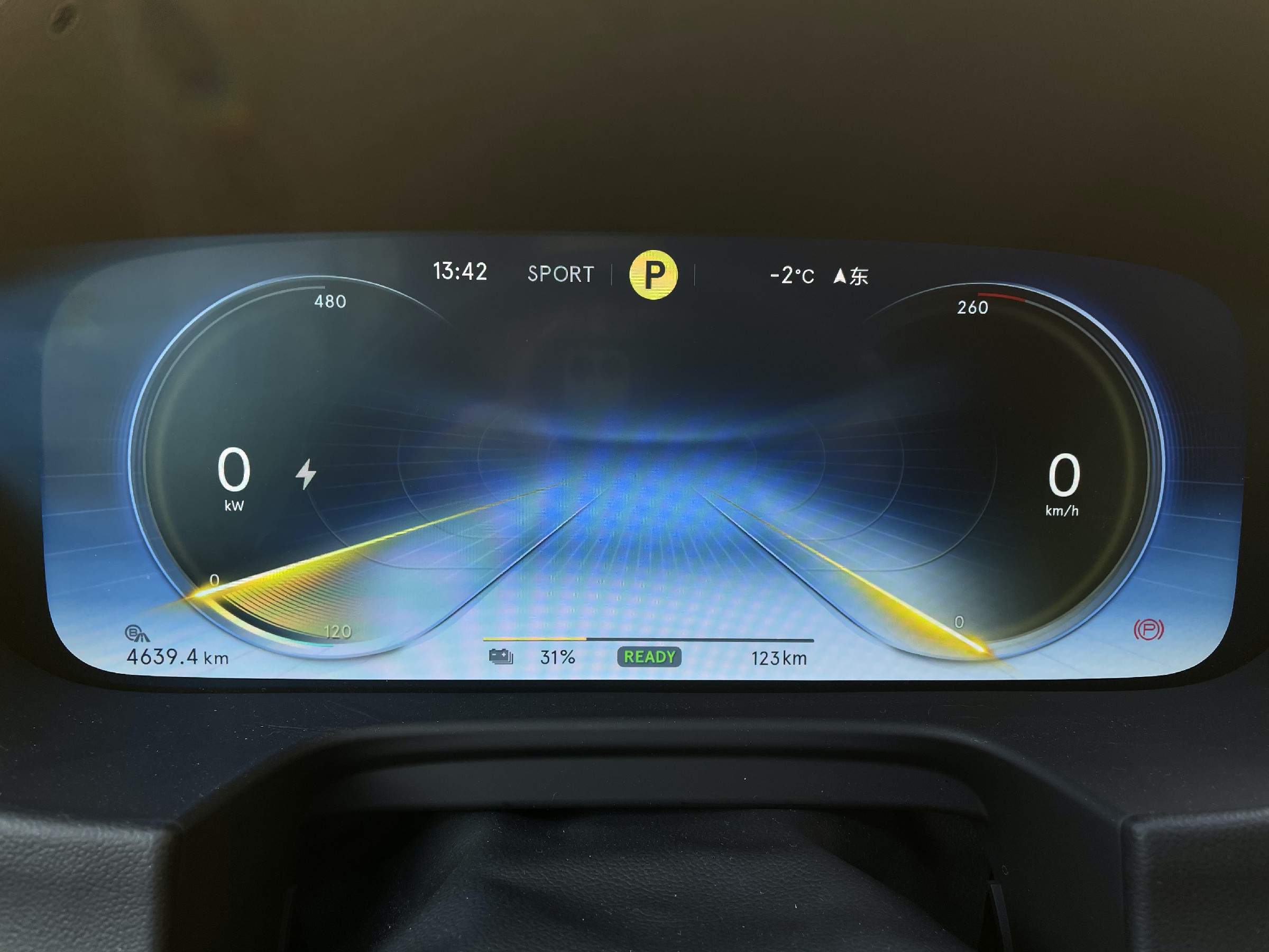
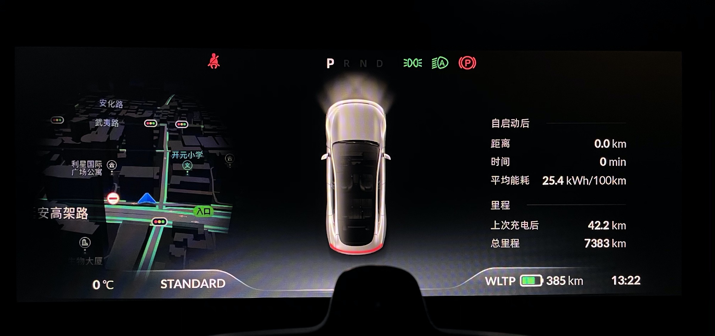
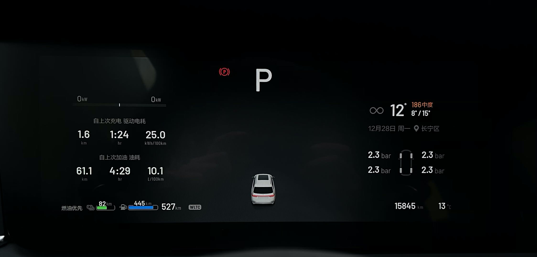
If you want to adjust the vehicle parameters, different settings may be located in different types of setting apps, and the menus in the apps are still one level after another. It takes some effort just to find the settings page.
The lack of interaction makes the DiLink system feel more like an Android entertainment system that should be placed in the rear or passenger seat, rather than an interactive hub for human-machine interaction in the front center of the vehicle.
While BYD pays attention to the development of a vehicle ecosystem, emerging electric vehicle companies also pay attention to the development and construction of an ecosystem. However, their attention to interaction is also evident.
In the process of building the DiLink ecosystem, BYD may need to spend more effort on interaction and display priority issues in the basic functions of the vehicle.
“Negative Example” – Tesla# On the ecological construction of intelligent cabins, Tesla is undoubtedly a famous negative example in the industry.
The localization of Tesla’s software in China can be described as extremely poor, with missing voice interaction functions in the Chinese version, slow navigation map updates, insufficient information, and only recently adding intersection zooming function. The only audio application in the vehicle system, QQ Music, still cannot shuffle play, and the few videos available are still web pages opened by the browser. The several local games and spoof easter eggs inside the Boombox are still interesting, but once the novelty wears off, they are rarely opened.
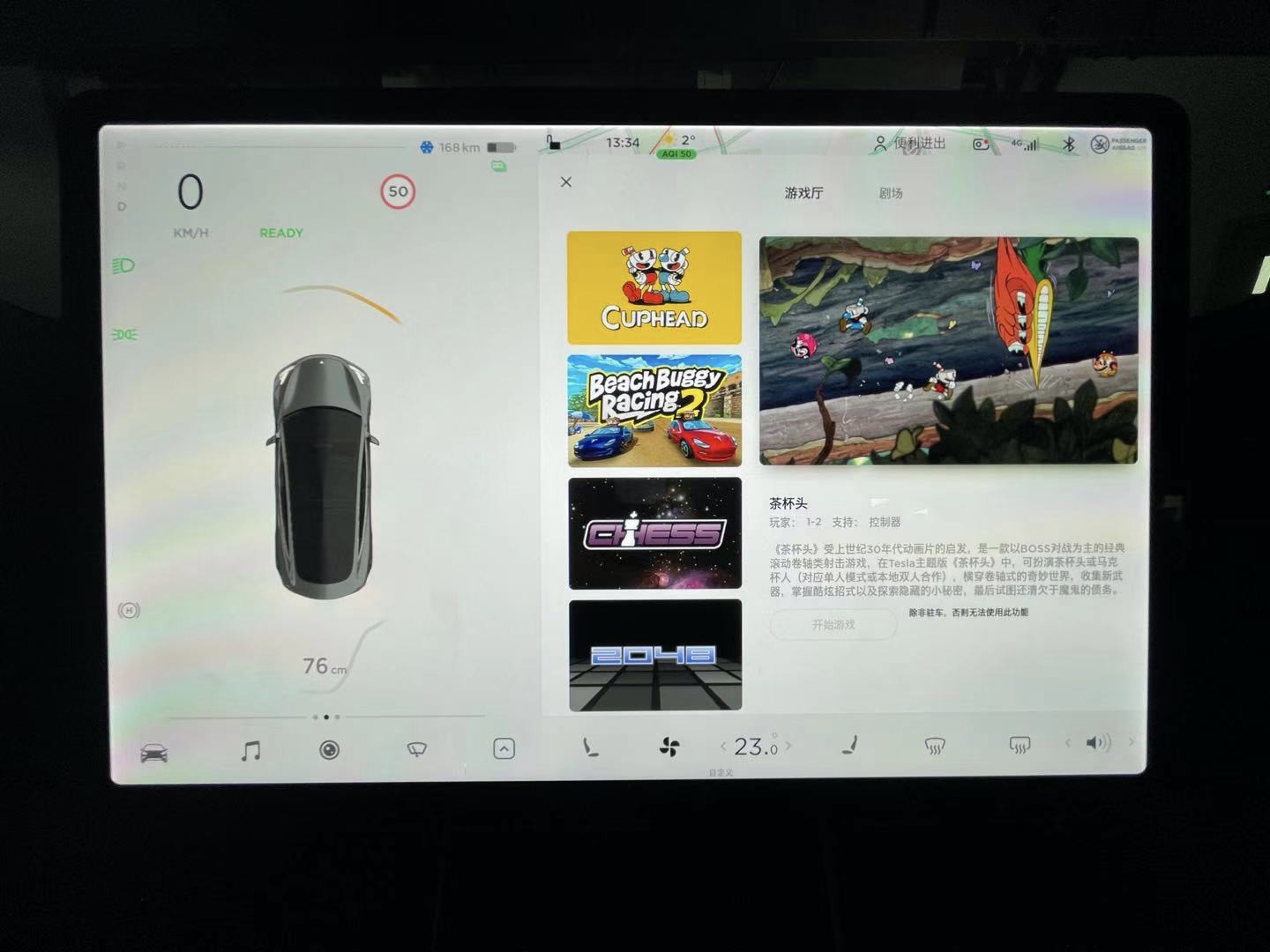
On the other hand, Tesla has advanced and in-depth considerations in terms of human-machine interactions at the system level, and this vehicle system has changed many people’s concepts of cabin interaction since its birth. Digitalization, visualization, and de-materialization have also influenced the development of intelligent cabins today to a certain extent. Innovative concepts such as visualized assistive driving UI, central control with no instrument display, card-style information bar and button-less startup have become common elements in intelligent cabins today.
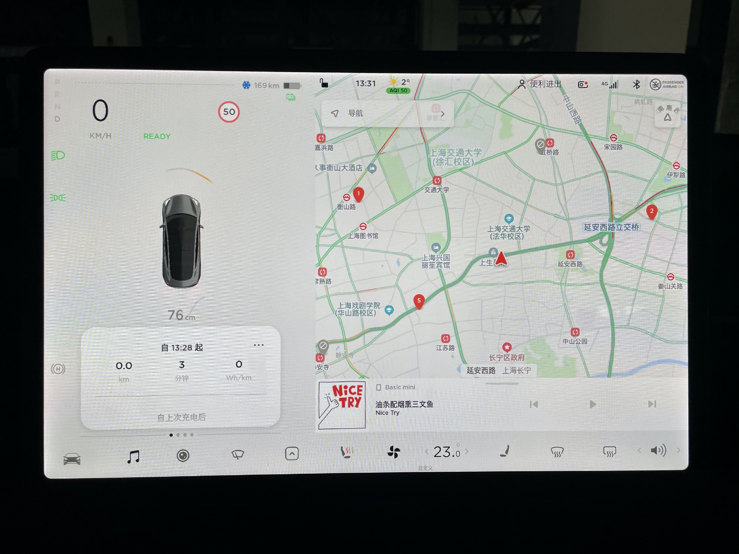
In terms of the trade-off between ecology and interaction, Tesla and BYD DILink actually represent two different extremes on two different value systems of the host factories for vehicle systems.
However, in comparison, the defects in Tesla’s vehicle system ecology have a low-threshold savior–mobile phones. As for the improvements in DILink’s interactions, it still depends on BYD itself.
In conclusion
In the second half of the press conference on the 25th, BYD officially released the BYD Automobile App, which integrates the scattered user apps such as DiFanHui, e-buy shopping mall, and BYD cloud services into one, greatly reducing the fragmented user experience under multiple accounts and platforms.
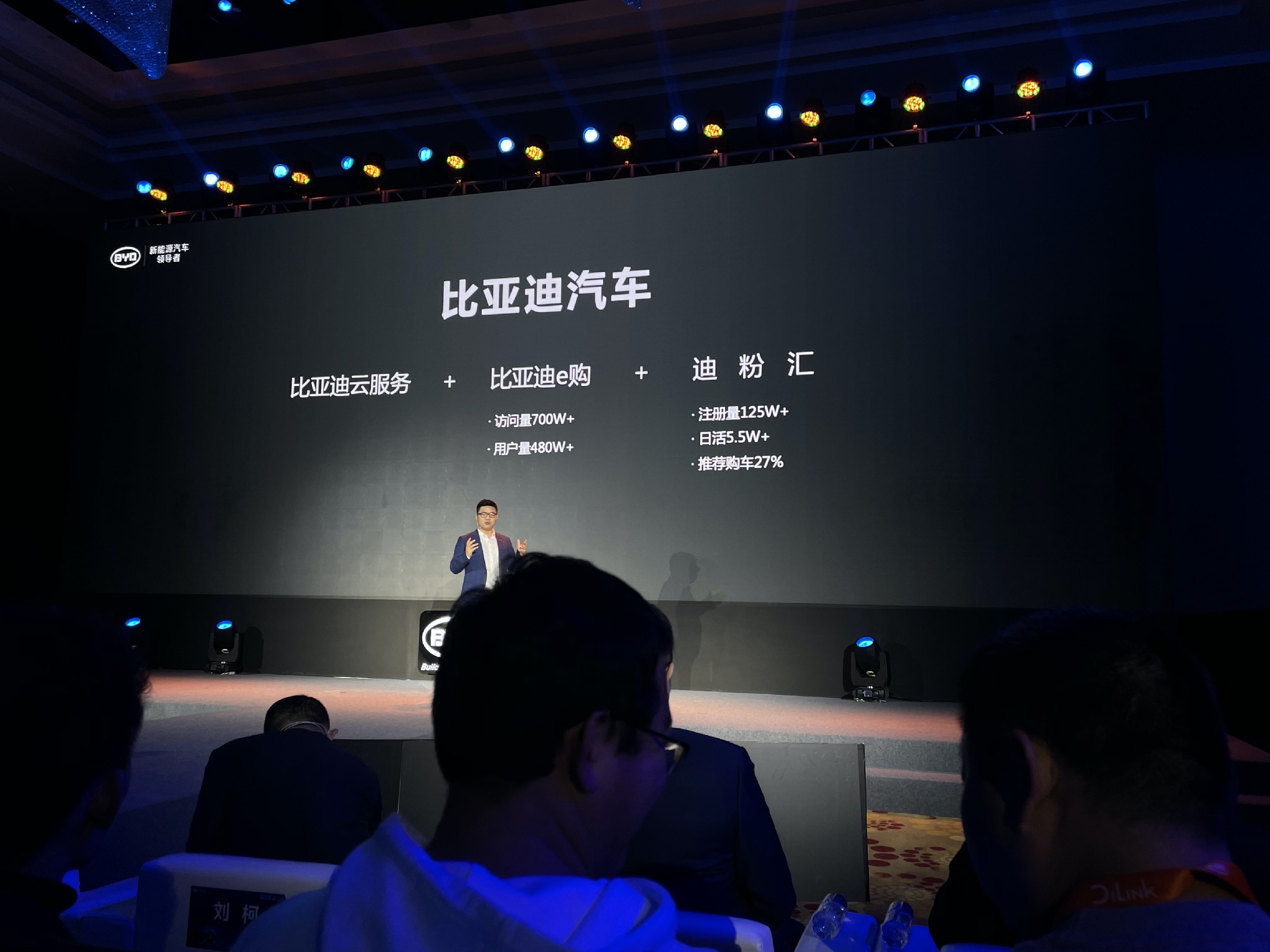
In the official product introduction, I also noticed new-style App content such as member clubs, point systems, user forums, car maintenance and repair modules, etc.
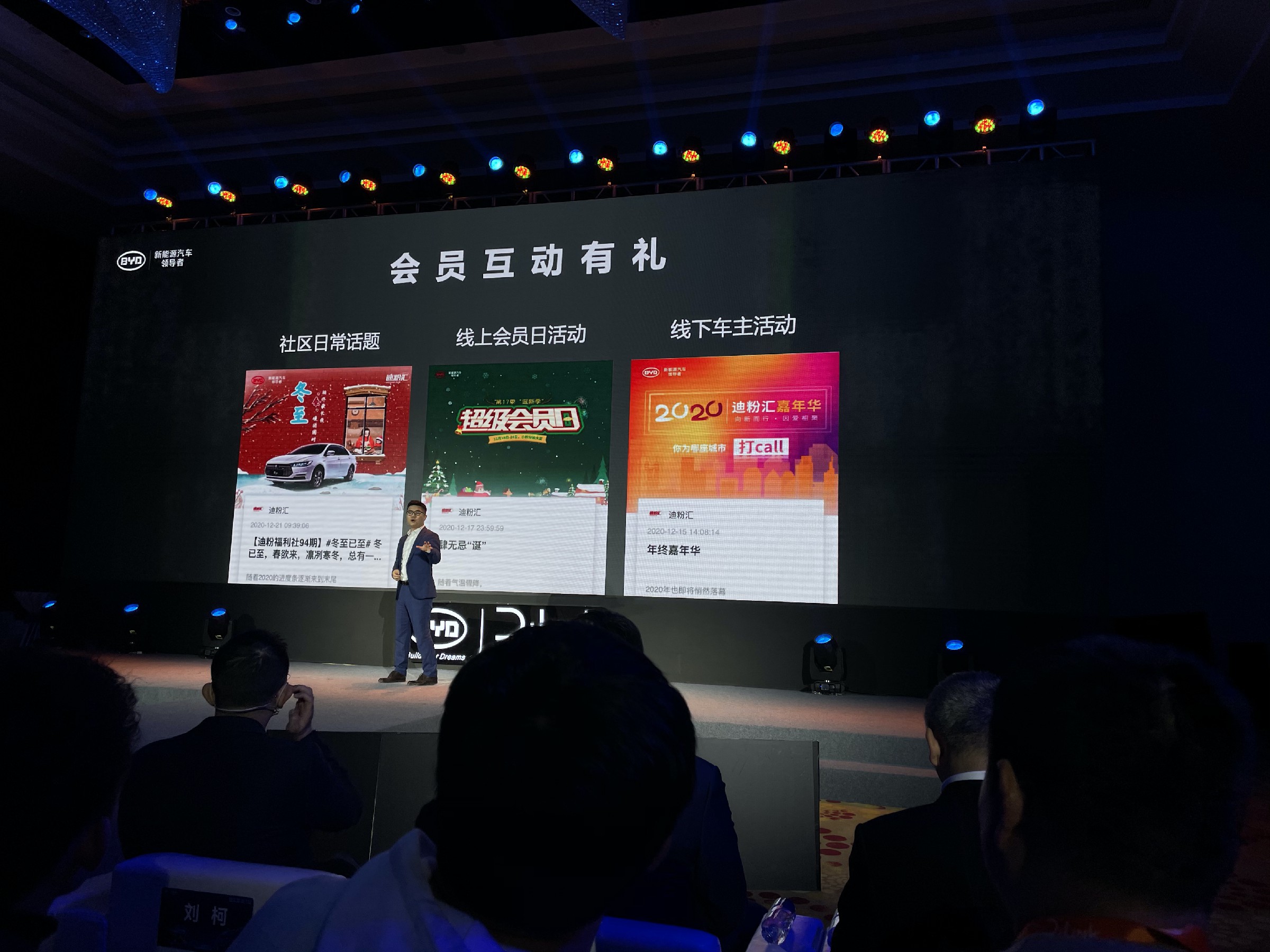
Such changes are actually eagerly welcomed by users. After our information release, there were many BYD car owners who inquired about the download link for this new App.
Zhao Changjiang said in a group interview that BYD’s shopping experience stores have achieved good results. This year, the 200 newly built stores can bring nearly 1,000 new orders per day.In its marketing, BYD has also begun to reduce the use of words such as ‘the strongest’ and ‘the most beautiful’, and pays attention to the aesthetic design from the perspective of female consumers.
These pieces of information indicate that BYD is not only becoming more comprehensive, but also striving to get closer to users and think from their perspective.
Under the mindset and attitude of BYD, I believe that the interaction deficiency in DiLink will be valued, and solutions that are more user-oriented will be welcomed.
This article is a translation by ChatGPT of a Chinese report from 42HOW. If you have any questions about it, please email bd@42how.com.
