In April this year, I bought a NIO ES6 sports version with only NIO Pilot auxiliary driving system selected. From the hardware perspective, my car is the ultimate entry-level version.
So today I want to share with you the most entry-level NIO electric vehicle, and how the three screens, the latest OTA version, and our commonly used map, air conditioning, and audio functions actually perform.
My NOMI doesn’t have a screen
The birth of technology itself is based on ensuring safety to solve efficiency problems. Therefore, when discussing the infotainment system of smart cars, the topics of convenience, efficiency, and safety cannot be avoided.
In the long run, voice interactions with the lowest interaction cost will become mainstream. However, NIO has more considerations for voice interactions. From the “personification” setting of NOMI, NIO not only affirms the priority of voice in car infotainment interactions, but also prioritizes making a more interesting and fun “emotional engine”. The use of NOMI, which comes from iFlytek’s voice system, is their first practical step.
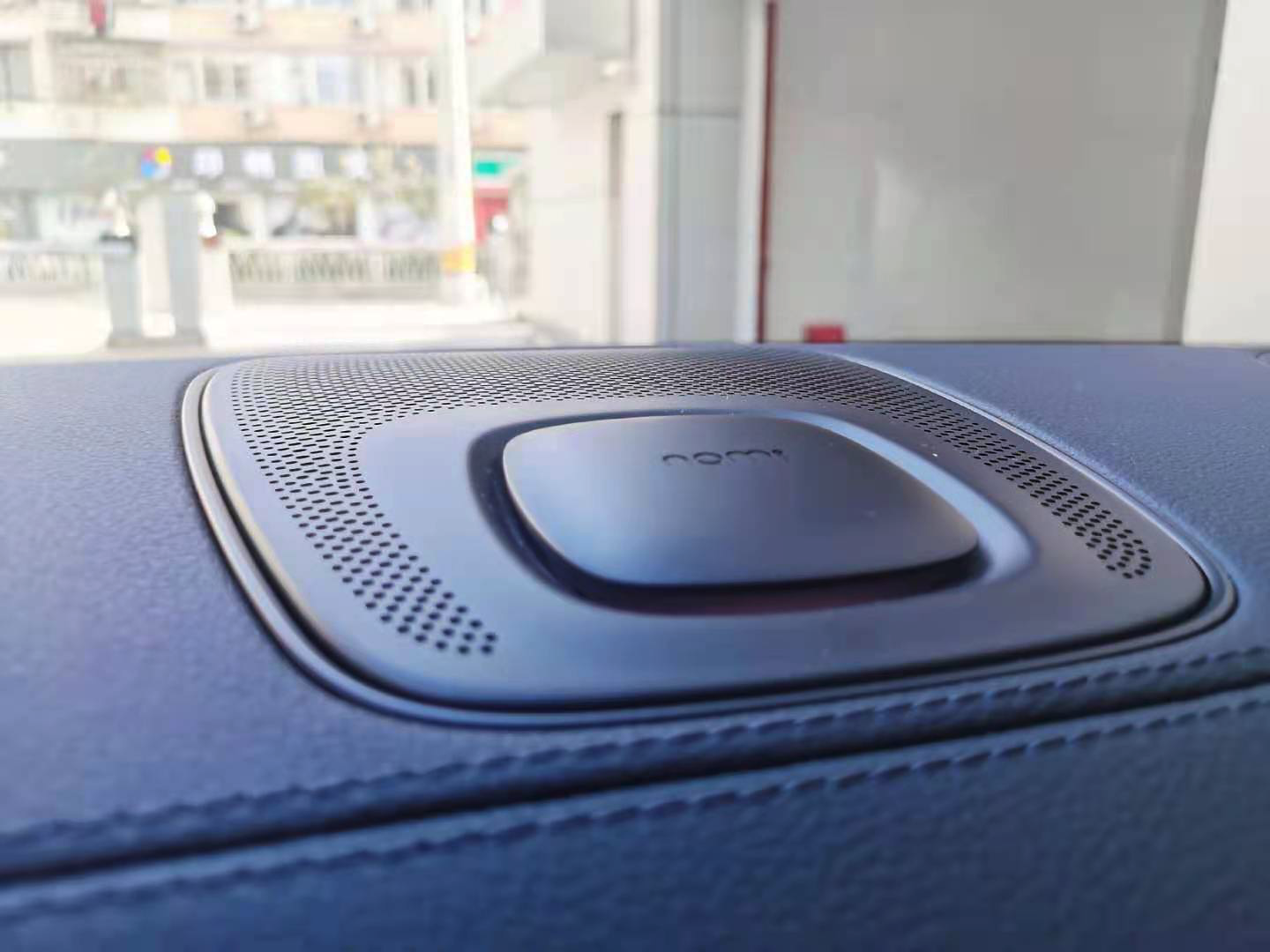
If NOMI Mate is selected, then this “little person head” must be the most eye-catching presence in the car. My car is equipped with standard NOMI Halo, although I didn’t spend more money and their basic functions are the same. But the lack of NOMI, which brings a bit of personalized interaction, is within my expectation, but the voice feedback of the infotainment system has become more awkward, which is beyond my expectation.
From the perspective of convenience, NOMI has the function of “one-touch command”. After waking up, voice commands can be directly spoken. Currently, the main application scenarios are entertainment information and temperature control, and in scenarios like “I’m a bit hot” that require semantic extension and understanding, it performs relatively well. In addition, NOMI can accurately identify which seat the command comes from in terms of sound source positioning.
From the perspective of efficiency, the advantage it brings is that it can be relatively effortless, and many tasks that should have been manually done can be solved through voice commands. Moreover, from the delay of issuing voice commands to NOMI executing the commands, the response time is also relatively smooth.
However, NOMI has certain requirements for the usage environment. It will be affected by voice interference from non-awakened persons when waking up. Moreover, every time NOMI is woken up, it will be accompanied by “hijacking the entire central control screen“. This phenomenon not only pauses music playback, but also directly affects the usage effect of the most important navigation maps in driving scenes, which is not a very good experience.
In summary, although NOMI does have many commendable features, the interference of other sound sources during NOMI voice wake-up and the problem of “hijacking the entire screen” are relatively poor experiences in the use of the entire NIO infotainment system, and the specific reasons can be seen in the following text.## Temperature-controlled Dashboard
The 8.8-inch dashboard, based on the QNX system design, has the innate advantages of a small kernel and fast running speed. With a screen resolution of 1400*1600 and a maximum brightness of 1000 nit, it can be clearly seen even in direct sunlight, making it the “first screen” for drivers to obtain driving information. The importance of stability and real-time performance is self-evident.
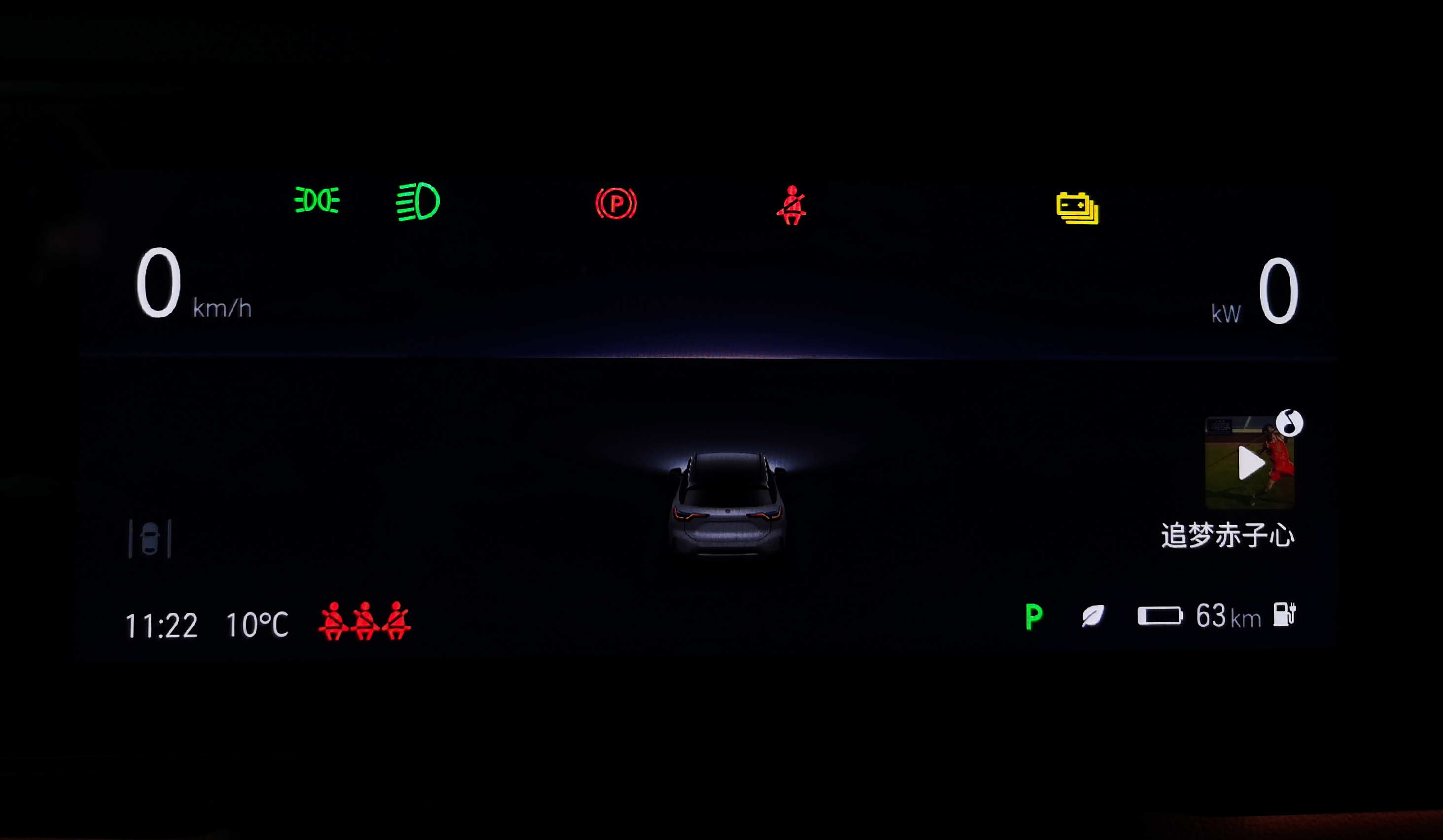
In addition, as the lowest-cost screen for drivers to obtain driving information, the dashboard displays more effective information in limited space, which is a process of “trade-offs” for automakers.
The upper half of the screen mainly displays the speed, motor power, and some vehicle warning lights. Here, I want to mention my favorite “real-time motor power display”, which displays speed on the left and power on the right with the same size icon. I believe that besides being symmetrical in design, NIO thinks that the weight ratio of the two is also the same.
Because this “real-time motor power display” not only allows the driver to intuitively know whether the current vehicle belongs to kinetic energy recovery or output power state, but also can know how much output power is currently displayed, which is very similar to the real-time speed displayed on the traditional oil car tachometer.
Although many people around me think that this feature is “superfluous”, this is the problem of “trade-offs” I mentioned earlier. For me, this feature gives me a sense of “participation” in driving.
In addition, NIO reserves the most core screen space for assisted driving visualization, displaying three lanes by default, and surrounding traffic participants can be displayed relatively intuitively. However, due to the perception of millimeter wave radar, the algorithm of this visualization system will uniformly judge the “two-wheeled vehicles” coming from behind as “four-wheeled vehicles”, but this is not a big problem.
Moreover, in the NOP navigation-assisted driving state, the UI of this interface will present different images with time, such as sunrise and sunset. If Nomi is the “emotional engine” for communication between humans and cars, then such “little ideas” highlight the “humanistic temperature” of NIO as a company.
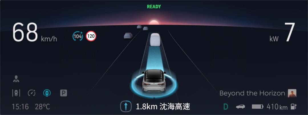 The information display after the conventional gear and mode display on the screen on the right bottom corner shows the remaining range. However, the information shown still uses the NEDC calculation logic, which deviates from the actual driving scene needs. I firmly believe that the cause of user range anxiety is not only the remaining range but more importantly, the accuracy of the remaining range calculation. It is like how the convenience of the “energy supplement system” outweighs the “absolute range” factor in consumers’ purchase decisions on pure electric vehicles.
The weighty central control screen
Let’s take a look at the 11.3-inch full LCD central control screen provided by Desay SV. The screen manufacturing process adopted a full lamination technology to avoid producing reflection and used Corning Gorilla Glass as the panel, with a resolution of 1600 * 1400 and supports multi-touch. The luxurious hardware configuration and manufacturing process also reflect NIO’s consistent corporate style of “never hesitate to spend money to solve things.”
Due to NIO’s own understanding and persistence regarding “user experience” and “safety,” they make this Android-powered car machine a “semi-closed system.”
In terms of experience, NIO believes that most apps are not suitable for driving scenarios, and their UI cannot blend into the current design style of the car machine. If they are forcibly added, it will not be a good experience.
Regarding safety, NIO’s explanation is that they have done isolation and prevention, and safety issues can be overcome, but there is no absolute safety in this world.
Regarding the weight between the two, NIO’s answer is that 95% is due to “experience,” and 5% is due to “safety.”
However, the result is that the application ecology only includes QQ Music, iQiyi, and Himalayan. Frankly speaking, NIO and users both understand that there are still many deficiencies in this car machine system for now.
Regarding this, of course, you can say that it is “cowardly,” or you can say that it is “stubborn.” Different scenarios determine the basis for judgment. But what I want to say is that NIO knows best what they are doing.
Regarding this “semi-closed system,” NIO definitely invested a lot of effort and indeed applied the UI design of the homepage to various scenarios, including QQ Music and iQiyi. When opening these third-party apps, the background UI design does not contradict the overall car machine interface.
The functionality of this car machine system is also very rich, and there are many ways of interaction, including physical buttons, touch screen, steering wheel, blind operation gestures, and voice interaction. However, this is “both good and bad.”
The good thing is that:
First, the functionality is rich. Regardless of the desired or undesired function, you can find it on the settings page and set it according to your preferences. Also, the system can remember each user’s habit through an authorized account.Translate the following Markdown Chinese text into English Markdown text, in a professional way, keeping the HTML tags inside the Markdown, outputting only the corrections and improvements.
The good points are:
-
The primary and secondary are distinct. The frequently used functions in the music and map driving scenes on the homepage are set in very prominent places, and the operation is relatively convenient.
-
The retained entity keys are all “just needed.” In addition to the assisted driving and audio control keys on the steering wheel, the Home key under the central control is the most important, and the layout near the driver’s position makes it easy and quick to switch back to the map homepage no matter what page the car machine is currently on.
The bad points are:
-
There are too many interactive pages. The system’s operating logic is similar to the Android system on mobile phones, mainly completed by the homepage + function List page + operating page. But such a logic requires a three-level page to reach the terminal operating page. Such a complex interactive process is not friendly in terms of convenience and efficiency.
-
Almost every page is a “full-screen.” First of all, “full-screen” will inevitably bring slower application opening time, and secondly, it affects the use of maps in driving scenes.
-
The quick menu is not so quick. NIO obviously attaches great importance to the interaction problems caused by the complexity of the pages. Therefore, the homepage supports sliding from left to right with your finger, pulling out a quick operation page that supports customizing 12 functions. Combined with the problem of low recognition rate of sliding from left to right, this makes the cost of sliding the screen higher than clicking the screen for the driver.
Although the richness of functions is one of the standards for measuring the excellence of car machines, if it is divorced from good interaction, it will only make efficiency lower. In this regard, I insist that the future interaction logic of car machines must develop towards less interactive steps and simpler interaction logic.
Version 2.8.0 Update
Looking at the main content of this NIO OS 2.8.0 update, the long-awaited “automatic lock when leaving the car” finally appeared, forming an experiential closed loop with the previously available “automatic unlock when approaching the car.” The principle of this technology is to judge the relative position between the user and the vehicle through continuous communication between the in-car antenna and the key. After nearly a year, the “Queen” on the NIO car can finally get the same treatment as the “driver” with the memory of the front passenger seat and the easy entry and exit function.
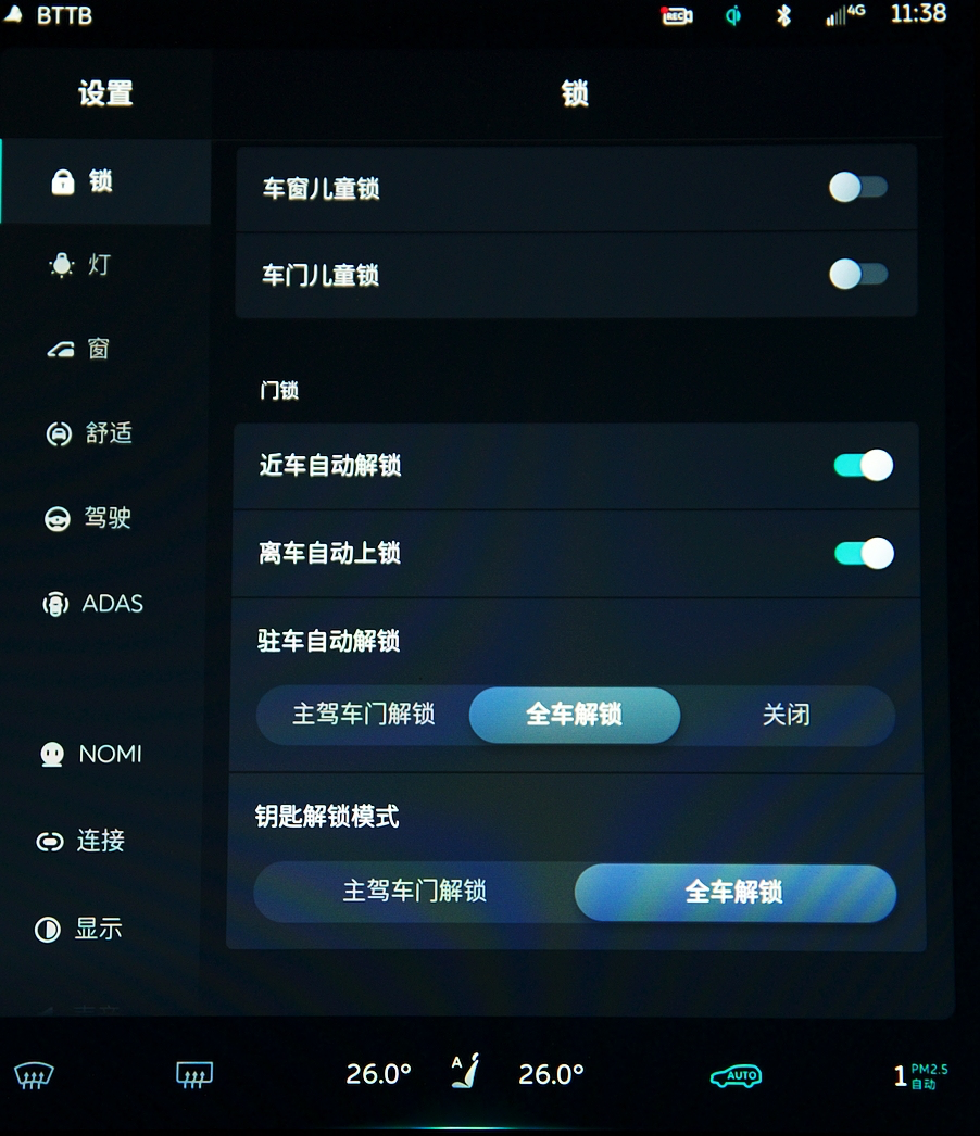 The main point to discuss is the “automatic locking when leaving the car”. NIO never intended to create a Bluetooth key from the beginning. The original NFC key was developed more for the B2B market, for scenarios such as instant charging and worry-free service. However, due to high demand from users, NIO launched an NFC key that can be used on users’ mobile phones. However, it still requires users to take out their phones and “randomly sense” the NFC, which is not ideal.
It’s like the concept of “automatic locking when leaving the car” is good, but as a “smart electric car”, it has not completely eliminated the need for a physical key. It’s like buying a smartphone that doesn’t support caller ID display, and still having to carry a feature phone to check the caller’s number. Thus, I still believe that “Bluetooth phone key” is the “ultimate solution” for user experience.
Also, the easy access steering wheel linkage for entering and exiting is currently triggered by opening the car door, but it’s not very noticeable when getting out of the car. The experience would be better when getting into the car, as people don’t usually wait for the steering wheel to move into position when getting out of the car.
Actually, I had a question before as to why “Park mode” wasn’t used as the trigger for easy access. It wasn’t until I found NIO’s official explanation that they believe that many times when users arrive at their destination and put their car in “Park”, they don’t necessarily leave immediately. They may want to finish listening to a song or program, which is “precious” in the world of adults who value their alone time. In this regard, NIO has completely convinced me.
As for the charging port illumination and Nio Radio, I have hardly experienced them, so I won’t comment. The “Summoning Function” that was supposed to appear in version 2.8.0 was delayed according to NIO because the “Leading Navigation Team” received a lot of feedback from users during the testing phase, and in order to provide users with a more complete experience, the launch was postponed. Regarding this, I actually wonder whether the delay was due to “the pursuit of better experiences” or “slow software development progress”.
Now let’s talk about NIO’s unique disconnection issue. In the three normal network connection elements, if both the carrier base station and the service provider are normal, then it is only possible that there is a problem with communication between the vehicle and the carrier base station.
Because our cars are mobile, they are known as “roaming” in the world of network connections. Therefore, when moving between different base station coverage areas, a “vehicle baseband” is required to constantly switch and accept base station signals. The disconnection problem occurs when the car leaves the coverage area of one base station and fails to connect to the signal of the next base station in time.The problem has been identified, and the focus has shifted from assigning blame to finding a solution. First of all, NIO’s communication network hardware module, although four years old, has ample redundancy and uses Intel’s baseband, making it still an advanced mass production solution today. If the hardware is not the issue, then it must be a software problem. Hopefully, this OTA update will be the last version related to network disconnection.
This update adjusts the NOP and vehicle automatic restart time to 60 seconds, making the continuity of assisted driving better in congested traffic. However, the startup time in the NP state has not been adjusted. If it is still limited by the inability to recognise sudden pedestrians and animals and take braking measures, it highlights the slow progress in R&D. Frankly speaking, users may get tired of hearing the “conservative strategy” rhetoric one day.
It is worth mentioning that the automatic locking when leaving the car, easy access for the co-pilot, and memory functions are not technically difficult, so why did it take so long to come out? In fact, looking back at the previous 2.7.0 OTA upgrade, it can be seen that NIO gave higher priority to the NOP push in terms of strategy.
Of course, if you think this only represents NIO’s emphasis on assisted driving iteration, it may be a bit “one-sided”. This is because of the more interesting fact that NIO started pushing the 2.7.0 version with the NOP navigation assistance to users on October 10, 2020, which was only two days after NIO cancelled the lifetime free battery exchange service. Whether this is a coincidence or not, only NIO knows.
Experience of Maps, Audio, and Air Conditioning
Maps
NIO’s onboard computer uses Baidu maps, which can be interacted with using voice and touch, making it relatively easy to use. Navigation information can be obtained through voice broadcasts, the dashboard, and the central control screen. It is worth mentioning that from waking up NOMI to successful navigation, I tested it and took about 16 seconds, which is quite close to the smartphone experience.
As for the topic of which is better between Baidu Maps and Amap, that is not what I want to talk about today.
What I want to say is that this system is based on the Baidu Map car version SDK and was redeveloped by NIO’s software team, including testing the map, discovering and reproducing problems, etc. In other words, this map system incorporates many elements of NIO.
As an electric vehicle, the map system’s top priority is to integrate the information of charging piles. As a NIO-branded electric vehicle, integrating the information of swap stations is a necessity for “non-pile users” in their daily lives.
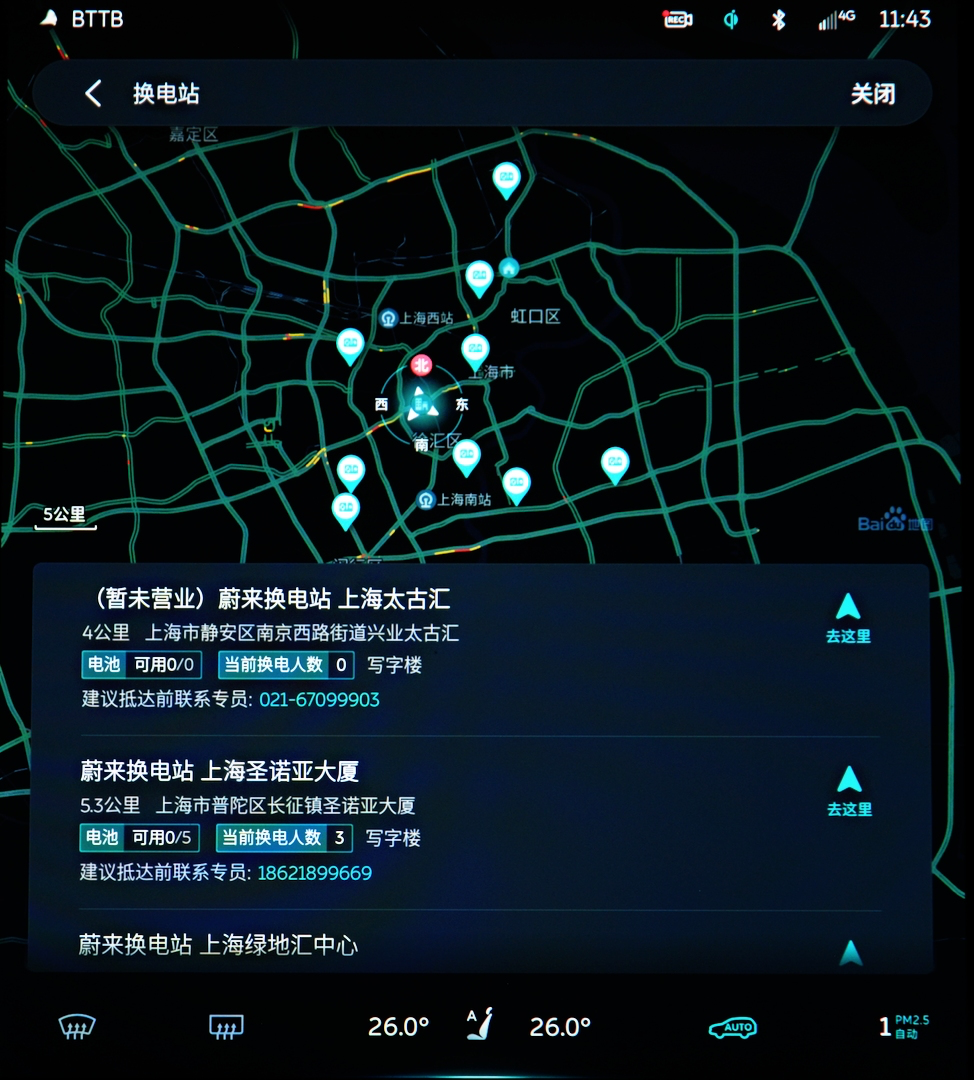 If you take a closer look at the car map, you’ll find that in addition to replenishing energy resources, Nio even integrates information from Nio Houses. This also indicates that Nio hopes to penetrate more into users’ daily lives through the energy replenishment system and offline activities, enhance brand reputation, and expand word-of-mouth promotion with “little tricks”.
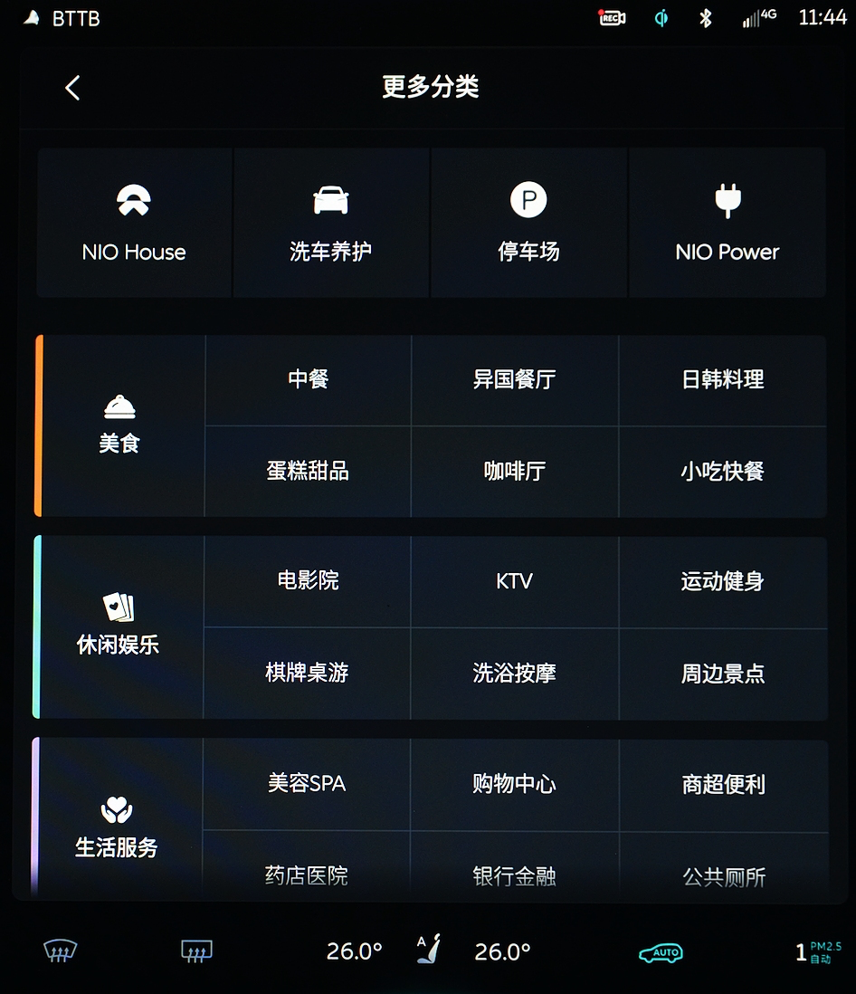
That being said, while the brand elements themselves are certainly important, the essence of the map is still to meet navigation needs. In actual use, this set of Baidu maps still has some minor flaws, such as insufficiently intelligent path planning and screens that don’t follow user input quickly enough. There is also a “map display delay” bug that urgently needs to be fixed. Frankly speaking, I often miss many intersections because of this, which results in using mobile navigation to alleviate the embarrassment.
Air conditioning
As new energy cars with electric drives have eliminated traditional combustion engines, the frequency of using air conditioning in the vehicle has further increased, and whether the air conditioning adjustment is convenient or not has a significant impact on the overall vehicle experience.
Nio opens the air conditioning by voice and touch. Adjusting air conditioning by voice is relatively convenient since almost all operations can be easily completed.
However, the experience of touch control adjustment is relatively unremarkable.
First of all, you cannot find the option to directly adjust the air conditioning on the homepage and must take an “unnecessary” step to enter the secondary air conditioning adjustment page.
Secondly, whether you touch or swipe to adjust the temperature and wind speed, the operation area is too small, which makes it difficult and costly to perform.
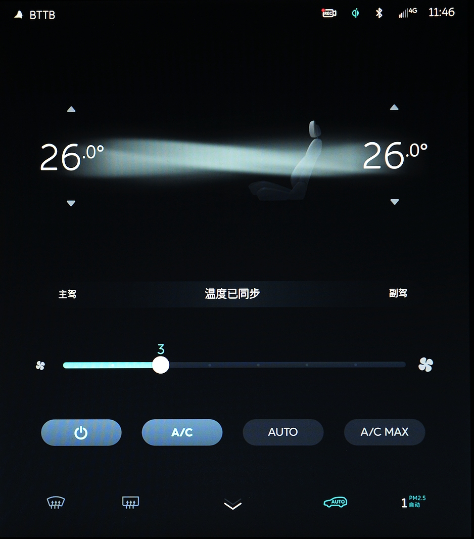
As for why touch control is still needed when voice is so convenient, as mentioned at the beginning, I cannot let others in the car stay silent and wait for me to awaken “Nomi, the screen hog”, adjust the air conditioning temperature, and then start the idle chat mode.
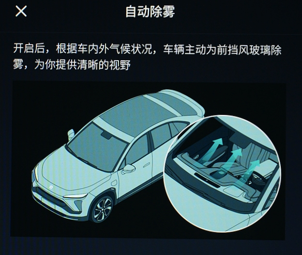
It is worth mentioning that this air conditioning system has an “automatic defrosting” function. The working principle is that it will automatically defrost according to the temperature difference between the inside and outside of the car. Although there may be some occasional “accidents,” the overall performance is still acceptable. For a feature that does not have any interaction cost, who would refuse it unless it is extremely bad?
Audio## NIO’s Audio System
In terms of audio interaction, NIO has provided multiple ways to control their audio system, including steering wheel buttons, touchscreen, center console buttons, and voice control. On the homepage, the “Driver’s most convenient” area is reserved for the audio system. It can be seen that NIO values the importance of audio more than air conditioning since its icons are arranged accordingly.
In terms of sound quality, the NIO OS 2.7.0 update includes a 5.1 channel surround sound system. In addition to supporting regular music sources such as QQ Music, radio, Bluetooth, USB external music, and Himalaya App, NIO has even developed a dedicated radio station called “Nio Radio” specifically for its car owners. As the saying goes, for NIO users, delivery is just the beginning.
The entire audio system, including the audio source input ports and usage logic, is commendable. However, if we have to criticize, there are still some “dominant screen” scenes during usage. The experience would be better without them.
Final Thoughts
Based on strategic choices, some of the better experiences are not included in NIO’s current models. However, the most impressive aspect since taking delivery of the vehicle six months ago is NIO’s emphasis on user feedback. Through Nomi voice interaction or the NIO App, NIO accepts feedback and suggestions from users and responds within 24 hours.
This attitude of listening to user needs has led to significant improvements in the user experience of the entire NIO vehicle system after several OTA updates, including the NIO OS 2.8.0.
Objectively speaking, NIO’s software development progress in the “invisible technology” aspect lags behind some of its new rivals. Nevertheless, compared with most traditional car models that still use CarPlay as the in-car solution, NIO’s system is still user-friendly and technologically advanced.
However, how NIO can develop software faster and better is worth considering. The question remains whether the frequent changes in the NIO software team have impacted their software development progress.
This article is a translation by ChatGPT of a Chinese report from 42HOW. If you have any questions about it, please email bd@42how.com.
