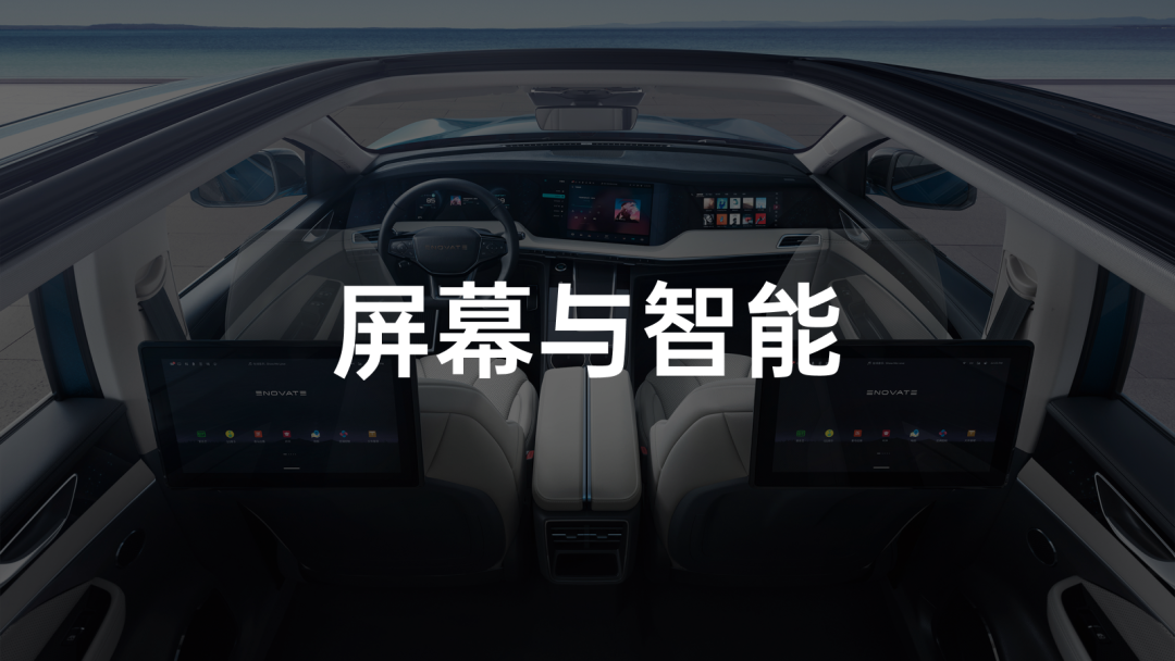
It is not difficult to see that nowadays, whether it’s from new car makers or traditional car manufacturers, the screens inside cars are getting bigger and more numerous. But is it really necessary for us?
In fact, discussing this issue now is not of great significance, because once people have used a large screen, no one wants to go back to the small screen era.
Multiple screens are not necessarily just a gimmick, but more about how to make them practical enough.
The two words practical enough seem light and breezy, but in fact they put extremely high demands on the research and development capabilities and thinking of car companies. Moreover, in order to make the screen more practical, features such as voice assistants, facial recognition, and gesture control also play an important role.
Although there are more and more models on the market with large screens and multiple screens, everyone is still in a state of chaos, and has not yet figured out a final form.
Since there is not even a reference answer, why don’t we take a look at what interesting solutions everyone has. Today, we will focus on the 5+X intelligent cockpit of the Sky ME7.
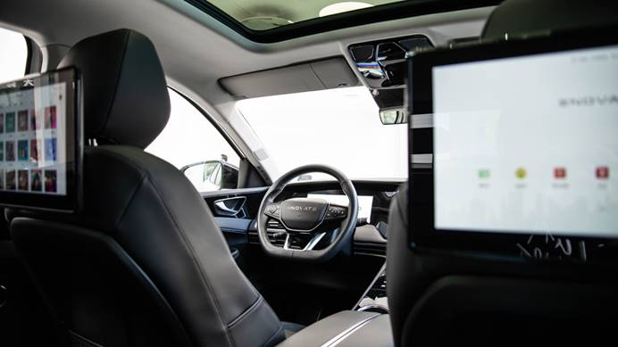
The rich animation makes me feel the designers are not underworked
The “large pieces” of the Sky ME7 intelligent cockpit consist of the following seven parts:
-
12.3-inch full LCD instrument panel
-
15.6-inch central control screen
-
12.3-inch passenger entertainment screen
-
12.8-inch rear passenger dual entertainment screens
-
AI intelligent assistant “Xiao Tian”
-
Face ME facial recognition
As usual, let’s first take a look at the most commonly used instrument panel and central control screen.
When evaluating whether a car’s system is easy to use or not, we often approach it from four angles: clarity, fluency, ease of use, and functionality.
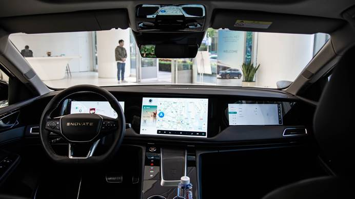
A useful car system first needs to meet the requirements of clarity and fluency. Only after satisfying this basic requirement, can we discuss the usability and functionality.
This is not a big challenge for ME7, which is equipped with the Snapdragon S820A Prem. Both the smoothness of menu sliding and the speed of switching between apps can meet our basic needs.
Next, let’s talk about usability.
On this point, I often criticize traditional car manufacturers. Although their in-car screens are getting bigger and more functional, there has been no innovation in setting menu interaction logic. They just keep putting things into the original framework, resulting in an incredibly complex and confusing menu that wastes the user’s time when looking for relevant settings.When the functions carried by the in-car system reach a certain number, automakers must start reducing them, and the UI design of the in-car system becomes a decisive factor.
At this point, Tesla and new automakers are not bound by traditional thinking, and most of their founders come from the internet industry, so they have a very good understanding of user needs in terms of in-car systems.
What surprised me was that although the founders of Skywell Automotive all have many years of experience in the auto industry, they have not been influenced by old ideas in terms of in-car systems. They have established a connected car team in Beijing, which is innovative enough.
Take the in-car system of the Skywell ME7 as an example, the good experience can be summarized in 3 points.
Reasonable layout of the home page
The Skywell’s home page is composed of four areas:
-
Real-time information display at the top
-
Card area on the left
-
Navigation display area in the middle
-
Dock bar at the bottom
As a car owner who frequently uses Tesla Model 3 and Xpeng P7, the in-car system in Skywell seems familiar and easy to use with the most commonly used navigation, commonly used functions in the Dock bar at the bottom, and swappable function entry points in the left card area…
If you want to say “this is copied,” I think it is unnecessary. From the user’s point of view, car companies do not need to deliberately avoid some very good designs because they have the suspicion of copying, and good designs often converge in the end, just like the current mobile UI design, the overall structure is already very similar.
However, there is also a small problem, which I hope Skywell can optimize through OTA in the future. The size of a single card in the left card area can be smaller. In the current home page state, only one card can be displayed, and there is not much valuable information, the use of resources is not compact enough, and switching back and forth between a few cards is also a bit redundant.

Clear menu hierarchy
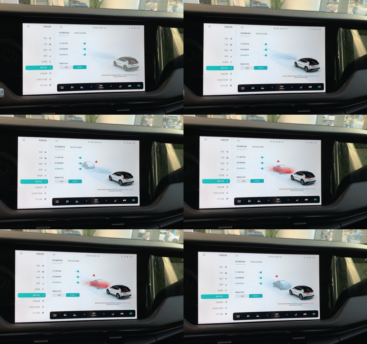
After opening the settings of the ME7, you can find that the menu of Skywell ME7 only has 2 levels. The first-level menu clearly displays all the categories, and the second-level menu can adjust all related settings. Even for users who are using it for the first time, they can quickly find the settings they want to adjust.
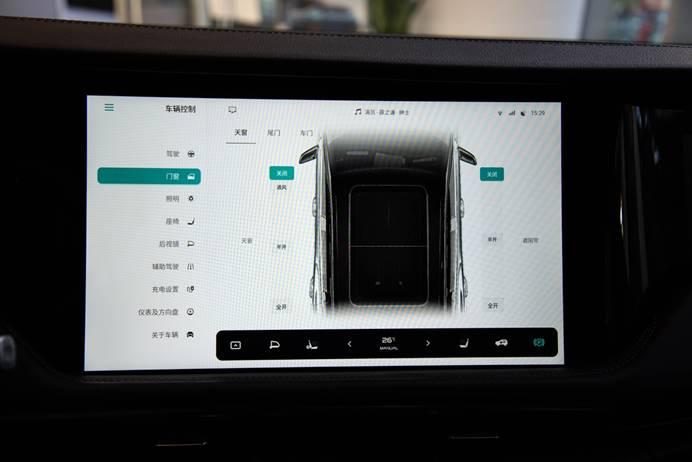 The most surprising thing is that Skyworth ME7 has created a very exquisite animation on each subfunction to demonstrate the purpose of its use. This is very user-friendly for first-time users who are not familiar with the functions.
Appropriate button size
After transitioning from physical buttons to touch screen operation, blind operation is already difficult to achieve. However, it is difficult to avoid operating the car machine during driving. At this time, a button size that is large enough can greatly improve the usability of the car machine during driving.
In addition to the above three points, Skyworth also has an AI intelligent assistant – Xiao Tian and Face ME face recognition technology to further improve the usability of the car machine.
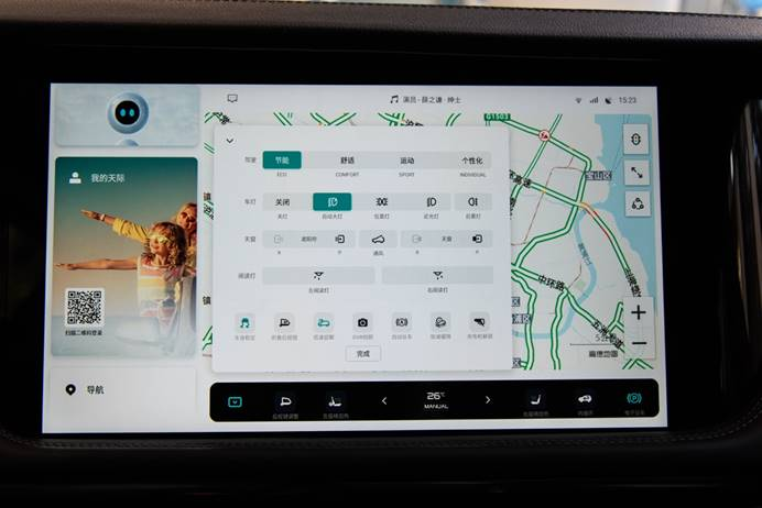
Through simple testing, Xiao Tian’s recognition and execution capabilities are satisfactory, and Xiao Tian’s voice can be considered as one of the best sounding car machine voices I have ever heard.
As for Face ME, although we were not able to experience it on-site, according to the official introduction, after recognizing the facial information, the system can automatically restore the user’s preset information, including not only seat memory, but also rearview mirror information, driving mode, kinetic energy recovery mode, etc.
From this perspective, with the addition of Face ME, the usability of the car machine is higher, and the user experience is also more seamless. However, all of this depends on the success rate of face recognition.
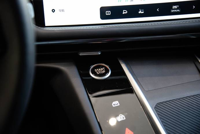
Finally, let’s take a look at the functionality.
The most commonly used navigation is Gaode Map, and multimedia includes QQ Music and Himalaya. Therefore, the two most commonly used demands for navigation and multimedia are guaranteed at a basic level.
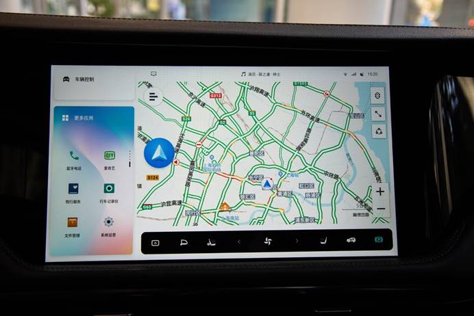
After functions such as QQ Music and iQiyi are integrated, Skyworth also carefully optimized the UI design to adapt to the overall UI design of the car machine, without users experiencing strong jumps.
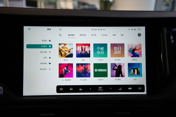
However, we also hope that in future OTA updates, the display ratio of Gaode Map can be adapted more perfectly.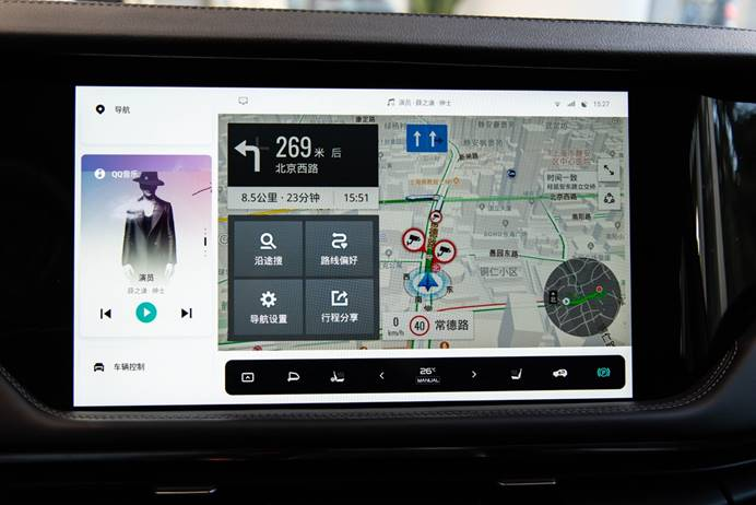
From the above experience, Skyline, as a new force in the waist-making car industry, although it entered the market relatively late, has a very good understanding of car machines and its products are also satisfactory, which makes me have higher expectations for the remaining screens.
5+X screens, with a focus on functionality and interaction
There are more than a few car companies that have launched rear entertainment screens in the early market, but the user feedback is quite consistent: they are mediocre, not very useful, and it’s better to remove the screens to make more space in the back seats.
If we put these rear screens of these car models into the formula of “clarity, fluency, usability, and functionality,” we can find that these screens are not very clear and not very useful, and the key is that they don’t have many functions, so users criticize them as being mediocre.
Therefore, for many people, mediocrity is not entirely a concept of multiple screens, but rather valuable solutions provided by car companies.
On the ME7, Skyline has boldly set up a co-driver’s screen and two rear entertainment screens, which means that almost every passenger sitting in the car can have their own screen.
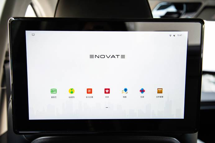
After a simple experience, these three screens are all driven by independent CPUs, and they have very consistent functions. They are all android pads that can watch iQiyi, listen to QQ Music, and browse Google Chrome.
So the issue of fluency and functionality has naturally passed.
However, if it is just the function of a pad, it is more comfortable for everyone to watch their own phones or bring a real pad.
On this basis, Skyline has added the ability of car control and screen projection to the screens.
The so-called car control means that even if you are sitting in the back seat, passengers can control the air conditioning, multimedia, and other functions related to their own comfort through the screen, which greatly improves the feeling of happiness as a “passenger.”
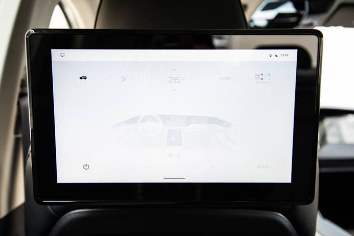
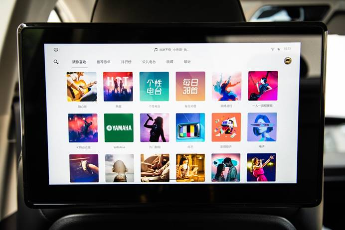
From the car control function alone, we can feel that each screen is no longer an independent entity. However, how to make them more interconnected and achieve the effect that 1+1+1+1+1>5, Skyline has given the function of screen sharing.Translate the following Chinese Markdown text to English Markdown text professionally, keeping the HTML tags in Markdown and outputting only the results:
通过五指长按屏幕的方式,可以唤出屏幕分享界面,除了仪表屏以外,每块屏幕都可以把当前的内容分享给其他几块屏幕,比如导航信息、一张漂亮的美图或者一部好看的电影。
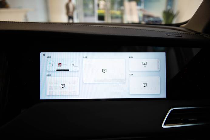
试完之后我坐在车里思考了很久,这个功能的实际意义是什么?
除了可以更方便地看到中控屏上的导航信息,或者把你想看的内容分享给车内其他成员,此外好像也没有什么更有意思的玩法了。
虽然这两项在短途驾驶中并没有太大的意义,或者说副驾及后排的屏幕也只是在多人、长途出行的时候更有价值,但是有的功能,只要给你带来一点点幸福感,就已经实现了它自身的价值了。
畅想一下,带着一家人出门长途旅行,孩子可以在后排看自己想看的动画片,坐在副驾的妻子可以把自己找到的沿途风景通过投屏分享给朋友看,这些看似不起眼的小细节,却是幸福感来源的基础。
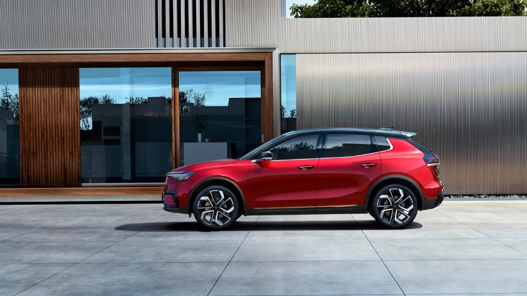
话说回来,在最后,我们也希望天际能够给予这些丰富的硬件和 OTA 的能力,在未来给我们带来更有价值的功能,智能座舱的这条路,总有人需要迈出尝试的第一步。
By long pressing the screen with five fingers, you can bring up the screen sharing interface. Except for the instrument panel, each screen can share the current content with other screens, such as navigation information, a beautiful picture, or a good movie.

After trying it out, I sat in the car thinking for a long time, what is the practical significance of this function?
In addition to being able to conveniently view the navigation information on the central control screen or share the content you want to see with other passengers in the car, there doesn’t seem to be any more interesting gameplay.
Although these two items are not very meaningful for short trips, or the screens in the co-pilot and rear seats only provide more value when travelling with multiple people on long trips, some functions, as long as they bring you a little bit of happiness, have already realized their own value.
Imagine taking the whole family on a long trip, the child can watch their favorite animated cartoons in the rear seats, and the wife sitting in the co-pilot can share the scenery she found along the way with friends through screen sharing. These seemingly insignificant details are the foundation of happiness.

Having said that, in the end, we also hope the sky can provide these rich hardware and OTA capabilities and bring us more valuable functions in the future. The road of the smart cabin, there will always be someone who needs to take the first step to try it out.
This article is a translation by ChatGPT of a Chinese report from 42HOW. If you have any questions about it, please email bd@42how.com.
