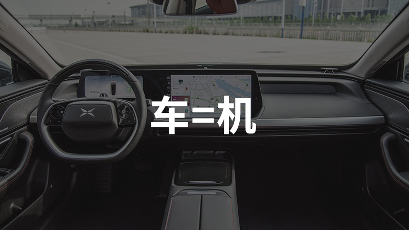
Why are car infotainment systems moving towards large screens?
I asked many of my friends around me, including car owners and non-car owners. Among car owners, there are those who have used large screens for many years, and others who still prefer traditional physical buttons. Their answers mostly include “it looks cool”, “more high-tech”, “as screens on mobile phones, tablets, and computers are getting bigger, so should the car infotainment screens”. There are also some who believe that replacing physical buttons with large screens is only to reduce costs and not very user-friendly.
It seems that many people do not consider the development of large screens in car infotainment systems to be a very necessary thing, but just following the trend of the times.
In order to have a more clear answer to this question, I was fortunate enough to have a 2-hour conversation with Rocky Liu, the Vice President of XPeng Motors Internet Center, in XPeng Motors’ Shanghai office. We gained some new insights into the future development of car infotainment systems and what XPeng Motors will do next.
Physic buttons have reached the limit of functionality
Let’s take a look at some pictures.
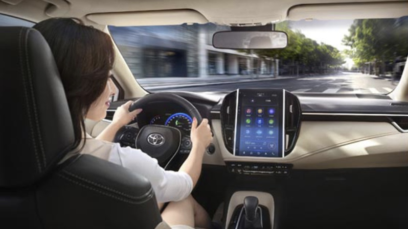
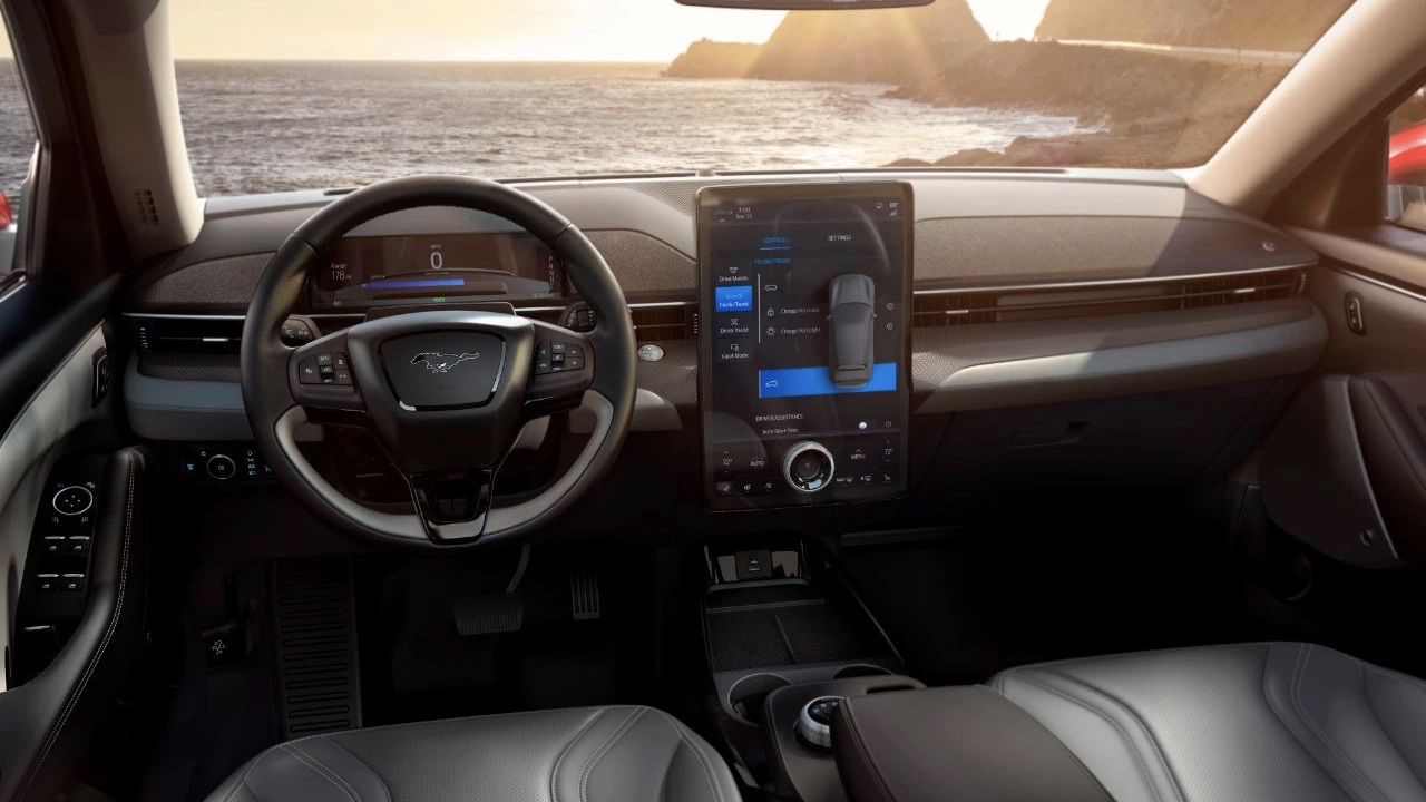
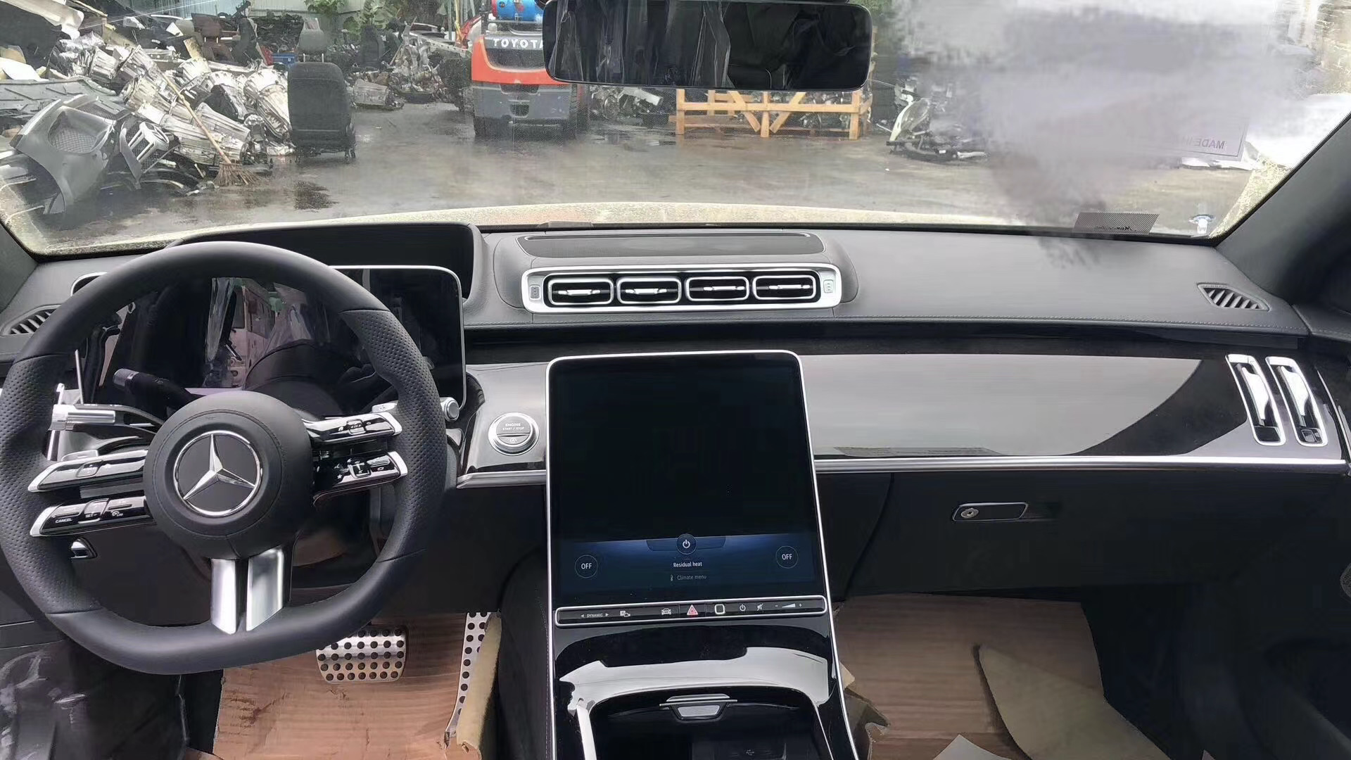
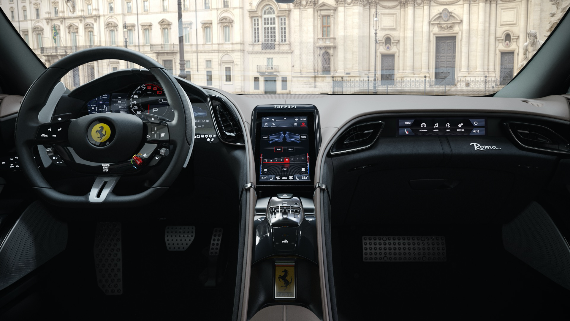
The above pictures show the interiors of Toyota entry-level cars, Ford’s all-electric Mustang Mach E released in November 2019, Mercedes-Benz’s latest generation (W223) S-Class, and Ferrari’s new Roma released in November 2019, respectively.
The most significant similarity among these 4 cars is that they all have a central touch screen that is close in size to a tablet.
It can be seen that whether it is a cheap family car, a luxury car with a million-dollar price tag, or a sports car focused on performance, in 2020, all have switched to larger touch screens for their car infotainment systems.
Therefore, it is evident that the entire industry has reached a consensus to move towards larger screens.
And there are two reasons for everyone doing so: firstly, the visual experience of a large screen is better; secondly, a large screen can accommodate more functions.If we go back 10 years, determining whether a car is high-end or low-end is as simple as looking at the number of buttons inside the car. The more buttons, the higher the configuration.
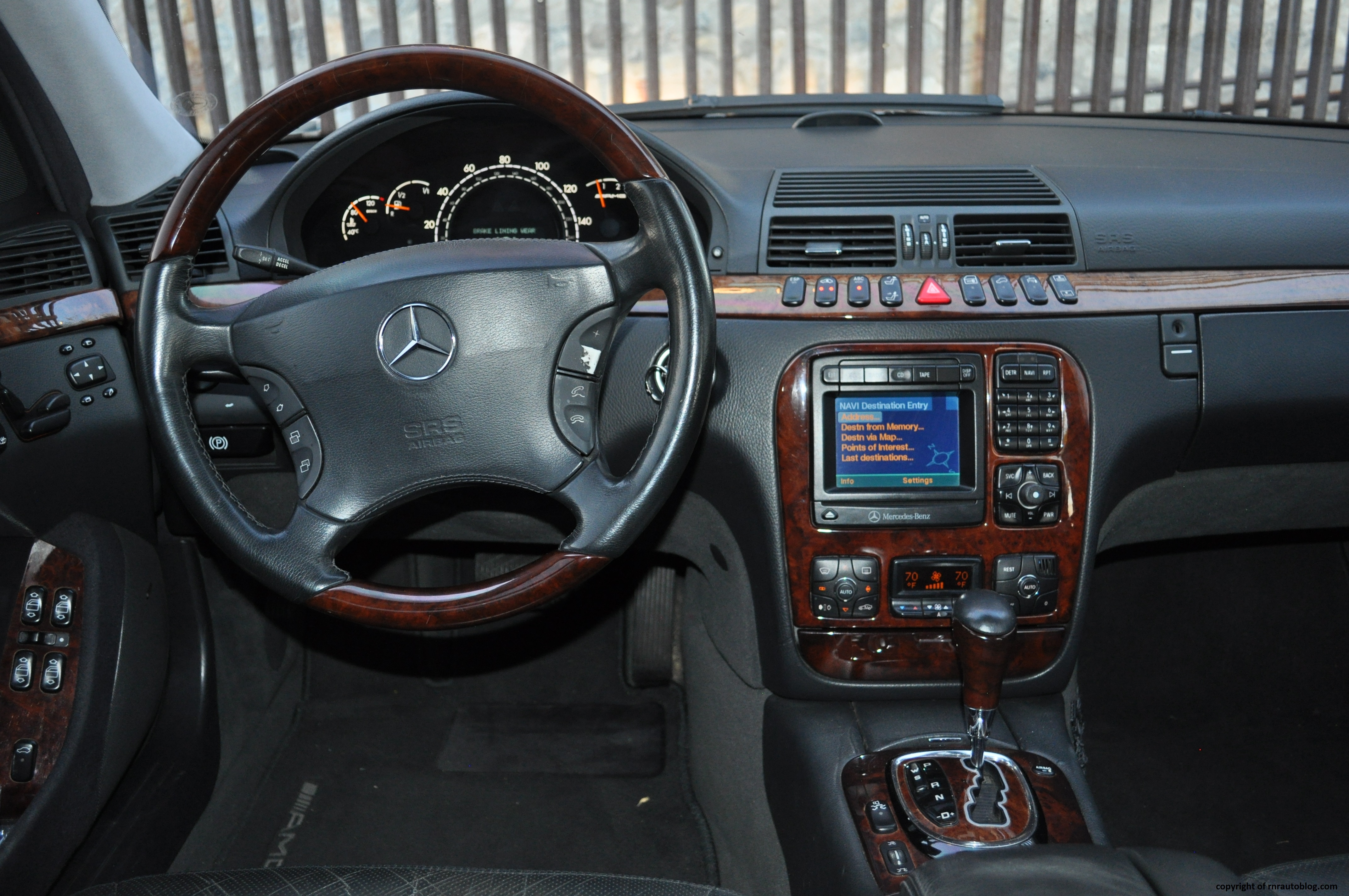
However, over these 10 years, with the joint improvement of terminal device performance, software development capabilities, and network speed, the functions in the car have also been constantly increasing, but as the functions increase, car manufacturers cannot continue to increase the number of physical buttons without limit. From the previous 20 functions to now 80 functions, if physical buttons are still retained, the central control will be overly complicated, and the purpose of adopting a “large screen” is to carry more functions.
In Rocky’s words, “If this is still an era of reading paper maps and listening to CDs, such a large screen is unnecessary.”
You can imagine that if the screen of the XPeng P7 was replaced with dozens of physical buttons and compared to the interior of the current XPeng P7, what would be even more confusing is the densely packed physical buttons. So the replacement of “physical buttons” with “large screens” is actually a positive optimization in terms of experience.
Moreover, the “large screen” form also has greater imagination space in terms of function, and the setting of functions can change with the iteration of software, and the display of functions will not be restricted by rigid buttons.
To give a simple example, in the Model 3, a car can have 10 seat memory positions, and each person can set multiple seat poses according to their needs, while traditional car models can only have a maximum of 3 memory positions for seats, not because of technological limitations but because 10 memory positions may occupy most of the car door panels.
If we shift our focus from cars to other electronic products, we can also find this rule.
10 years ago, washing machines mainly used buttons and LED indicators to set and adjust functions, but now washing machines have been replaced with LCD touch screens to adapt to richer functions and achieve simpler operation.
So the large-screen trend is inevitable in order to carry more functions and display more information.
Having clarified this trend, let’s talk about another issue.
Why is there still controversy over the “large screen” form + “touch screen” interaction method, which has already been widely used in every scene of our lives, but has always been controversial in cars?
To be clear, the controversy mainly revolves around the “touch” interaction method rather than the “large screen” form.
Two problems of touch: multi-level and difficult blind operation
In the era when physical buttons were universal, the vast majority of functions were tiled on the central control. With a large screen, function menus began to have levels.The core reason why touchscreens are not well-recognized is that there are too many functions for car control to be contained in a single menu. As a result, secondary, tertiary, and even quaternary menus are needed to locate the required functions through multilevel menus in a way that requires one hundred percent focus, which conflicts directly with driving scenarios.
A good menu layout can greatly improve the user experience. However, what is a good menu layout? Or, how do we judge the quality of a UI design? Rocky’s answer is, “letting users find the desired function in the shortest possible time is the measure of success.”
After experiencing the XPeng P7 for an extended period, we believe that the P7’s UI design is commendable. The Dock bar on the left side is positioned to be within reach of the driver and contains the most commonly used features. The first, second, and third level menus are displayed clearly enough to guide users to find what they are looking for quickly. Furthermore, some quick operation buttons are designed by aggregating frequently used functions.
Moreover, the button sizes are appropriate, making them easy to click on even when driving, with very few cases of accidental touch.
However, there are also some design flaws, such as setting up “vehicle settings” and “system settings” separately, while the ambient light is placed in “vehicle settings,” requiring some users to give it some thought to figure out where to find it.
Some users have also given feedback that some functions are too deeply buried and challenging to find after test driving.
In response to these issues, Rocky provided two explanations:
First, every user has different cognitive abilities, and many first-time drivers do not know what ESP is, making it challenging to cater to everyone’s usage habits. However, we can make it as simple and easy to understand as possible.
Second, XPeng faces a major challenge because the vehicle’s functionalities are too numerous. Tesla only has more than 80 functions, while XPeng has 140, all of which are specific.Everything should be based on this overall volume, when the first-level menu increases, the second-level menu decreases; when the second-level menu increases, the third-level menu decreases.
Here we consider more of the users’ cognitive cost. If I have a total of four-level menus now, and each level can solve the problem in 0.5 seconds, it is not cost-effective to change it to two-level menus and spend 4 seconds to solve each level.
I (Rocky) also think we haven’t done a good enough job. We will also iterate and optimize based on user feedback. Our vehicle control module has been changed three or four times, why? Because we are putting different things in different combinations to see if everyone can understand it.
We also experienced the latest version of XPeng P7’s car system on site, which has new optimization in UI design.
When we asked Rocky for his opinion on the Model 3 car layout, Rocky couldn’t help but praise it:
“We have carefully looked at all the car systems that we think are well designed on the market. Tesla is currently very forward-looking in terms of interactive structure, we have been joking all the time that Tesla has experts, doing something extremely remarkable, and suddenly enlightenment came. After making a great subtraction, it did not make too much addition, which is very powerful.“
Talking about the G3 car system imitating the design of Model S/X and the P7 air conditioning interface imitating Model 3, Rocky also expressed his opinion without hesitation:
“I think you shouldn’t reject something right away. When you see the right thing, you still have to choose a wrong solution. You have a problem. You obviously know that this is the right answer, but you have to be different from others. There is no value in that.
Tesla has done many intuitive interactions, but actually it is not enough and it is slow. If it has enough manpower, it can do better.
We have also done something more than just air conditioning function interaction, but your conditions are different from others’, so you have to build based on your own conditions, but there will be convergent points in some answers, which cannot be avoided.“
Optimizing UI layout can indeed make functions easier to find, but even if the UI interaction is excellent, it is difficult to avoid the problems caused by the “touch” interaction method.
This leads to the second question.
Before fully automatic driving is realized, the driver needs to operate blindly in most scenarios, but it is almost impossible to operate blindly with “touch”.In an interview, Rocky admitted, “First of all, we cannot avoid the fact that touchscreens in the driving environment are not absolutely safe. Blind operation is far less reliable than physical buttons. However, if we were to use physical buttons on a large scale now, the only possibility left is computers, right?”
Therefore, the issue of in-car interaction in the era of large screens has become a problem that every automaker must face.
If no particularly good solution can be found for the time being, it is better to put this problem aside and focus on the vehicle itself. If the car is viewed as a mobile vehicle, the best way to interact is through “voice.” This is exactly what XPeng thinks.
There are three reasons for this:
First, “voice” is an operation that can be synchronized with driving; second, “voice” is a very efficient way of interaction that does not require one-level or two-level menus and can directly reach the desired functionality. Third, “voice” is an interactive way that is not limited by space or distance.
Before implementing L4, “voice interaction” can be a good substitute for “touch interaction”. After implementing L4, the car becomes the second space outside of home, and “voice” is an interactive way that is not limited by space or distance. The change in screen size and location will affect the interaction experience of touch, but not the voice interaction experience. Therefore, “voice” has become the optimal solution for the era of “intelligence”.
Voice is the underlying interaction logic of intelligent cars
In terms of how to create a user-friendly voice interaction system, Rocky has his own understanding.
In Rocky’s view, the basis of voice interaction is “voice,” and the core is “interaction”. “Voice interaction” is not a “function,” but the underlying “logic” of intelligent cars.
The first step is to solve the efficiency problem of human-computer communication.
On many car models, it takes at least four dialogues to adjust the air conditioner to 16 degrees:
- “Hi, xxx”
- “Here”
- “Change the air conditioner to 16 degrees”
- “Air conditioning set to 16 degrees”
The whole process takes more than 10 seconds, but it only takes 3 seconds to manually press a button. Voice interaction is complicated and inefficient.
When using the XPeng P7 voice control system, it can be found that XPeng is working hard to improve the efficiency of interaction. For example, it is not necessary to wait for XPeng’s response after waking up XPeng. You can directly give orders, reducing an unnecessary response.
In addition, after the command is given, XPeng can efficiently inform the driver that the system has received the command.After issuing the command “turn the air conditioning to 16 degrees”, the car machine will directly display the interface of the air conditioning adjusted to 16 degrees. Drivers can confirm it with just a glance, which is much more efficient than voice feedback “air conditioning adjusted to 16 degrees”.
Rocky used Tang Seng from “A Chinese Odyssey” as an analogy. Before his reincarnation, Tang Seng was very talkative, but after reincarnation, he only answered with one or two words.
XPeng’s goal is the latter.
The second step is to solve the limitations of using voice functions.
At present, the functions that voice can achieve are basically the same. People give instructions, and the vehicle completes the operation. It’s just a simple connection process. Rocky believes that voice can have greater imagination space. XPeng will be divided into two stages to achieve this.
In the first stage, a concept of “everything you see can be said” is established in the user’s mind. That means the functions and interface of the vehicle can be controlled by voice. This not only requires the ability of voice control but also certain requirements for the vehicle’s underlying electronic and electrical architecture.
In the second stage, Rocky is very cautious and says that he wants to keep it confidential for the time being because the team believes it’s very difficult to achieve. However, in the exchange after the interview, Rocky mentioned duplex for web displayed at the 2019 Google I/O conference is his pursuit of voice interaction.
In my opinion, duplex for the web can be understood as “everything you say can be done”. For example, when you give an instruction to call a driver to go home, the vehicle can automatically call a good driver based on the “vehicle location” and the location of “home” in the car machine. The driver only needs to wait in the car for the driver to arrive home and pay. It saves the operation of filling in the location and improves efficiency.
The car machine is not a replica extension of the smartphone.
After talking so much, let’s think about a current issue. What is the role of the car machine? To replace the phone?
The answer is definitely no. Nowadays, the core reason why we use mobile phones while driving is that the “car machine” cannot meet the needs of this era. However, the information that the car knows must be far more than the phone, so the car can definitely do better than the phone.
In the intelligent era, the car machine will also become smarter, but it’s not to copy the functions on the mobile phone to the car machine. Instead, according to the hardware and usage scenarios of the vehicle, more targeted functions will be developed to create a smart car ecosystem. This is what XPeng is trying to do.
Based on this reason, we now talk less about car machines and more about “smart cabins” to distinguish between the two concepts of car machines and mobile phones in the car.Recently, XPeng announced a strategic cooperation with Alipay, planning to build a strong location and scene-awareness car services based on the Alipay mini-program ecosystem. From this, we can see that XPeng aims to create a more expandable usage scenario based on the new interaction mode of “voice”, which is XPeng’s understanding of the “smart cockpit”.
In this era, “intelligence” is a frequently mentioned term, which is mostly used in “automatic driving assistance”. The technical difficulty of the “smart cockpit” seems to be less challenging than that of automatic driving, but the development path of the smart cockpit is not clearer than that of automatic driving in the mainstream view. I am pleased to see some new directions in the exchange with Rocky, the Deputy General Manager of XPeng Automotive Internet Center.
This article is a translation by ChatGPT of a Chinese report from 42HOW. If you have any questions about it, please email bd@42how.com.
