“After the 2018 CES, we realized that the era of autonomous driving had not yet arrived, and the interior space of the car still revolves around the driver. Therefore, we added a touch screen for the co-driver and reduced the resources invested in gesture controls.”
During an interview at the Frankfurt Auto Show, Baiceng’s vice-president of digital engineering, Cong Haoren, admitted for the first time that there were misjudgments in the overall interaction logic of Baiceng’s concept car. This was 18 months after the debut of Baiceng’s concept car at CES.
In contrast, the 48-inch shared full screen remains a highlight of Baiceng’s design.
After interviews with Baiceng’s CEO, Daniel Kirchert, former CEO Carsten Breitfeld, CTO David Twohig, Senior Vice President of Design Benoît Jacob, Design Director Chen Chen, Vice President of Digital Engineering Cong Haoren, and Digital Product Design Director Dré, Garage 42 will reveal the decision-making process behind Baiceng’s big screen.
Because the big screen is where everything starts.
“Just as some manufacturers design a car based on batteries, Baiceng designs a car based on a screen,” said Tan Wentao.
“The 48-inch shared full screen, as well as the non-touchable setting, is the core entrance to understanding Baiceng’s product concept. If you only look at photos or videos, you may think that the screen is just big and the gesture operation seems not very flexible.
In fact, the shared full screen is not just big. The shared screen and the non-touchable setting are both part of the setting logic and are more important parts where the deeper reason behind both logics is the distance.
So, why say that?
First, Baiceng’s goal is to design the next generation of intelligent terminals, not just a regular car. Therefore, Baiceng’s design process revolves around the shared full screen.”BYTON believes that in the future, the interior space of cars will be like a living room. Passengers sitting in the car will feel like they are sitting on a sofa in a living room with friends and watching the screen inside the car just like watching TV. If the screen is too close to the driver, the touch range is limited. Therefore, BYTON firstly set the position of the large screen to be forward to obtain the distance between the screen and the audience, just like a TV.
BYTON moved the air conditioning system to the engine hood by utilizing the layout of the pure electric vehicle chassis, making the dashboard lower and forward. The front passengers have more legroom, and the front windshield is specially designed to prevent glare from the screen. In order to meet the atmosphere of the living room, BYTON even retained the front seats that can rotate inward by 10 degrees on the production car.
Secondly, affected by the large screen and the front rotating seats, BYTON designed a new collision architecture.
As Tan Wentao put it, for a conventional car model, there is an energy transfer path from the front to the rear of the car, which will transmit about 30% of the front impact load. When a front-end collision occurs, the impact is transmitted from the front end through the energy path to the rear end. However, for BYTON, the impact needs to be transferred from the front end to the door and then dispersed through the roof.
Therefore, BYTON redesigned the car body architecture, the chassis layout, and the only vehicle interaction program in the industry for the large screen, and, as the performance differential of electric vehicles becomes smaller and smaller today, established smart car networking as the core technology advantage of the brand.
Under such conditions, is it possible for BYTON to give up the large screen? Absolutely not.
BYTON will persist in its original judgment based on the perspective of the next five years no matter what. Ye Binghuan said that even in the circle of designers, many designers don’t believe that BYTON can turn its conceptual design into reality. In the end, they will prove themselves.
The Core Focus of the Large Screen
So what results will this setting trigger?
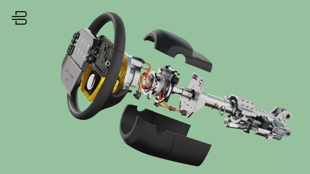
First of all, the driver must have his own operating platform outside of the large screen, just like a remote control to a smart TV or a touchpad to a laptop. BYTON must add a screen in the center of the steering wheel for the driver to conduct touch operations. And between the screen and the steering wheel, BYTON has carefully left space for the safety airbag.
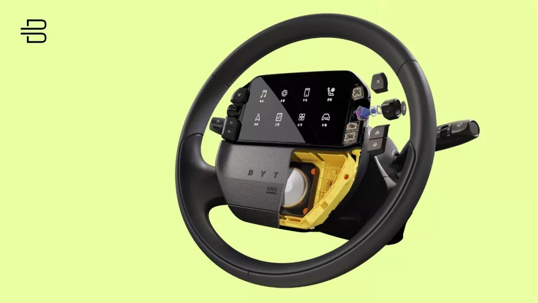
On BYTON’s current touch screen setting, you need to enter a primary menu first before you can perform various operations, such as adjusting the air conditioning and wind speed, which cannot be operated directly on the primary menu. Compared with the shortcut menu of a touch screen, it increases the level of operation.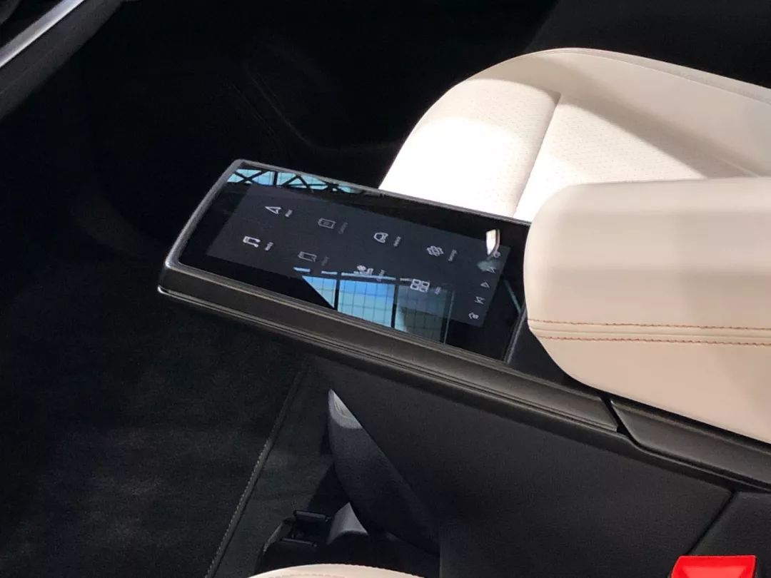
Due to the position of the central screen and the airbag of Byton’s steering wheel, it’s difficult to reduce the size of the steering wheel. Do you remember that the dashboard of Byton is lower than traditional ones? The problem is that the screen above the steering wheel may block the big screen. Cong Hao Ren said that they are still optimizing the solution to this problem.
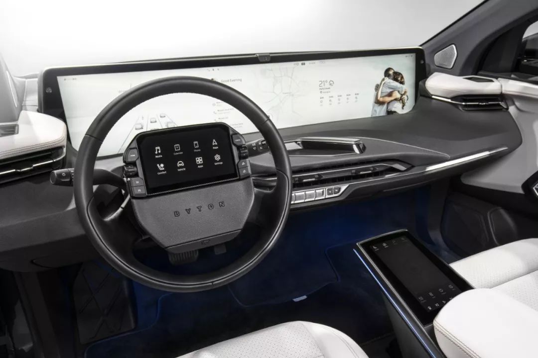
Secondly, there are four screens including the driver’s touch screen, the passenger’s touch screen, and optional backseat passenger touch screens that act as four “remote controls” for the big screen. Byton’s full vehicle interaction not only needs to solve the interaction between the touch screens and the big screen, but also needs to solve the authorization relationship among the four touch screens.
When the driver and the passenger operate the screens at the same time, the driver’s commands take priority. If the backseat screens operate, they will send an authorization command to the driver, who can grant the authorization for entertainment functionality.
When talking with Byton’s Digital Product Design Director Dré, he mentioned that the interaction between the four touch screens is the most complicated part of the full vehicle interaction solution. However, I think he’s worrying too much about it. There won’t be as many car owners with backseat touch screens as he expected, so let’s first solve the relationship between the driver and the passenger.
Thirdly, the comprehensive screen can display information freely. The big screen is divided into three areas. The first area replaces the function of a dashboard, and the second and third areas are for entertainment functions. Four different application components can be arranged horizontally between the second and third screen. When using the map function, the map can be displayed on the second and third screens or minimized to the first screen.
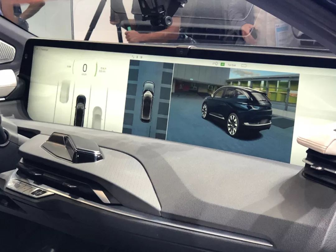
However, even with the freedom of information display, users still need to have a certain learning cost. After at least trying it once, I still can’t master the use of the entire system proficiently.# Translation
Dré says that all of our actions are extensions of the existing smart device interaction relationship, and do not add learning difficulties for users. After experiencing the static mass production version display car, I can confirm that the operation difficulty is not that high, especially after adding solutions such as the co-driver screen, the usability of the large screen has been improved. However, a familiarization process needs to be established, or in other words, users’ habits need to be rebuilt.
Fourthly, the priority of the BYTON car’s interaction is touchpad, voice, and gesture respectively. BYTON has invested more resources in gesture operation than other car manufacturers. The good news is that the accuracy and sensitivity of this gesture recognition have both improved greatly compared to a year ago. As for the voice interaction, BYTON will showcase it to the public in November, which I did not experience this time.
In the BYTON interest group of Garage 42, a friend asked a soul-searching question, “Does BYTON’s current interaction mode have revolutionary significance?” He added, “To be precise, I think BYTON’s idea has the significance of crossing the era, but I don’t know if they have achieved it or not.”
We can view the selection of different paths for the landing of new technologies with a more open attitude, but choosing a path that nobody has taken is bound to pay higher costs and prices.
For example, the delivery time of BYTON’s mass production was delayed.
Can they deliver on time?
At the Frankfurt Motor Show in 2019, BYTON announced that the delivery time in the Chinese market would be mid-2020, and the delivery time in Europe and America would be in the first half of 2021. In addition, BYTON is about to complete its C-round financing, led by well-known companies such as China FAW and the Industrial Investment Fund under the Nanjing Municipal Government, with expected fundraising of 400-500 million U.S. dollars.
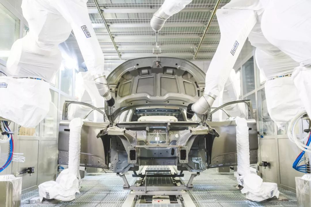
Looking back at the press conference in June 2018, BYTON announced that the production time would be at the end of 2019. On this issue, Dré explained that the original plan was to start production in December 2019 and deliver in March 2020, and the actual delay was three months, not the six months everyone thought. As for the reason for the delay in mass production, Dré replied that it was to ensure better quality and quality control.
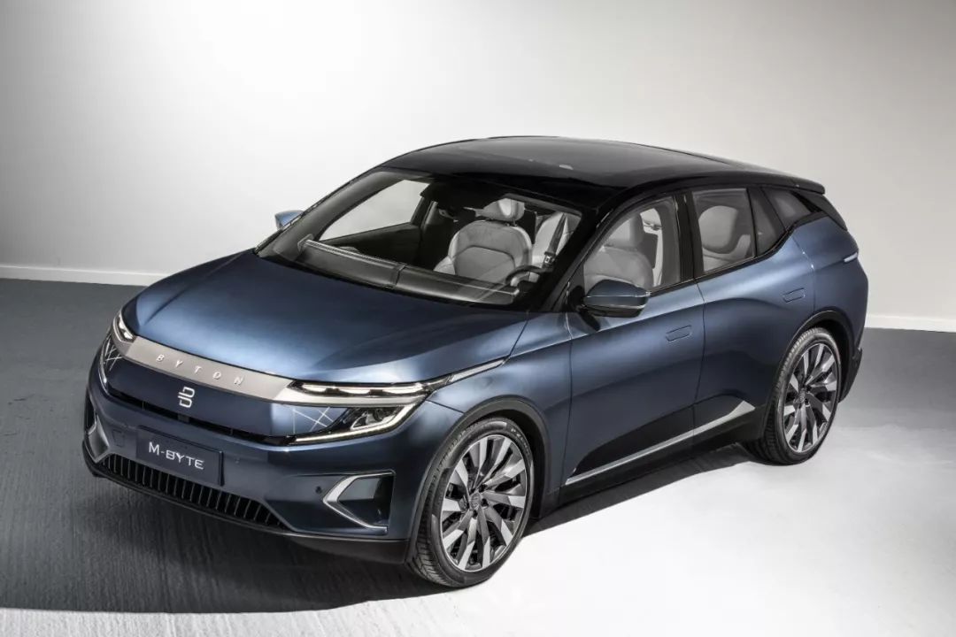
The BYTON M-Byte production version on display at the Frankfurt Motor Show retained 90% of the design elements of the concept car. The core changes are summarized as follows: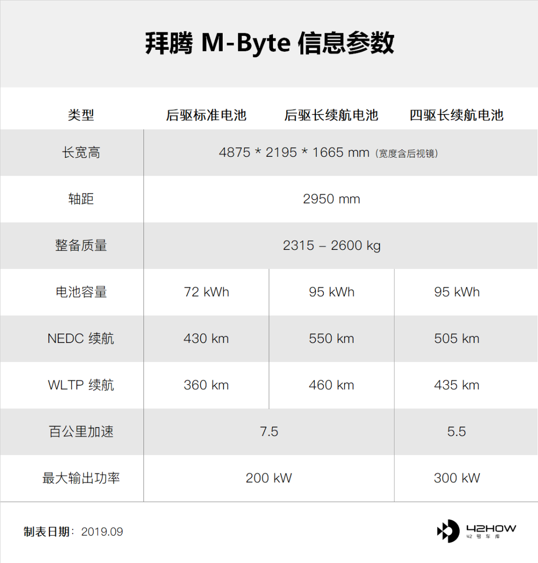
-
The exterior dimensions of the vehicle have changed from 4850/1960/1650 cm to 4875/2195/1665 cm respectively, with an increase in width due to the addition of rearview mirrors. The wheelbase has also increased from 2945 cm to 2950 cm, making it longer, wider, and taller.
-
The shared full screen has reduced from 49 inches to 48 inches, while the driver’s touchscreen has decreased from 8 inches to 7 inches. An 8-inch touchscreen has also been added for the passenger with the driver.
-
The rotation of the driver and front passenger seats has decreased from 12 degrees to 10 degrees.
-
The car now has physical rearview mirrors on both sides, with additional surround-view cameras.
-
The feature of unlocking the car door through facial recognition has been canceled, and hidden door handles have been added.
-
The console has adopted a surround design scheme. The interior has added air conditioning vents, gear shift keys, front and rear window defrost buttons, cup holders, and a central armrest storage box.
-
Equipped with matrix LED headlights, the front headlights have been moved to the sides of the intelligent expression, while the diamond-shaped taillights have been retained.
-
The car has a suspended D-pillar design that includes an air duct.
The Senior Vice President of Design of BYTON mentioned in an interview that this is the fastest production car I have ever participated in, from concept to mass production. I do not want to underestimate his words because of BYTON’s production delay. The real meaning behind this sentence is that the situation in the car manufacturing industry is really tough.
BYTON has received over 50,000 orders, half from China and the other half from Europe and the United States. Their sales target for 2021 is 100,000 vehicles. This target presents immense pressure.
Therefore, Daniel Kirchert, co-founder and CEO of BYTON, mentioned that BYTON currently has 1,600 employees and is not planning to expand further this year. Instead, they will focus on cost reduction and efficiency optimization while cooperating with more automakers such as FAW to share electric vehicle platform technologies.
When it comes to choosing the future trend, some choose to go to L2, some to L4, and some to L5. Behind every bet, precise judgments on technology, time, and trends must be made. After taking a big step forward, BYTON has begun to converge, paying tribute to everyone who dares to take risks.


This article is a translation by ChatGPT of a Chinese report from 42HOW. If you have any questions about it, please email bd@42how.com.
