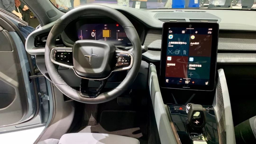
Since no one knows when, more and more car manufacturers have appeared at CES Consumer Electronics Show. This year’s CES Asia has occupied five halls of Shanghai New International Expo Center, two of which were contracted by car manufacturers, indicating that cars have gained more and more attributes of “electronic products”.
However, since it is a consumer electronics show, we will not talk about performance, space, or materials today. The focus is on the Polestar 2’s onboard system.
Android System for Standardized Automotive Design
Screens are getting bigger and bigger, while physical buttons are getting fewer and fewer. Although this approach has been wildly successful on smartphones, is it really the future of cars? You may not agree, but looking at the latest leaked pictures of the interior of the Mercedes-Benz S-class, I think this is an undeniable trend.
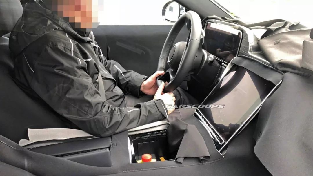
There are many products on the market that combine large screens and buttons, but there are also products like the Tesla Model 3 that cancel all physical buttons and retain only one large screen.
You cannot say that retaining physical buttons means a good onboard system, nor can you say that an all-touch onboard system is difficult to use. The core issue here is whether the onboard system has been optimized specifically for different usage scenarios and purposes.
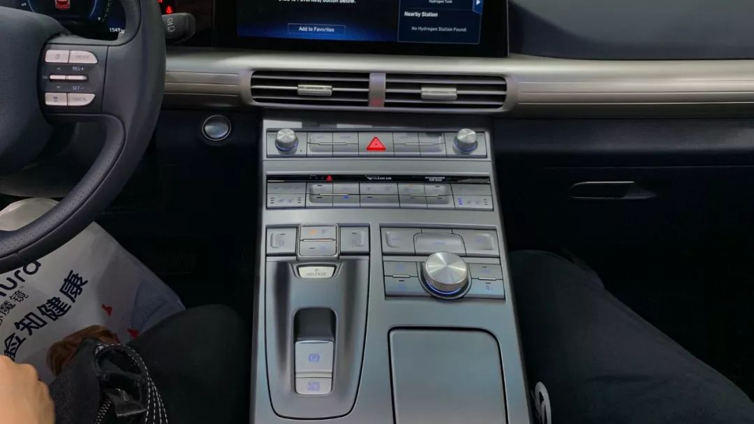
Although big screens are everywhere in cars now, the truly usable large screens are few and far between. After all, transplanting a mobile operating system directly onto the onboard system or forcing ancient onboard systems to a large screen can only lead to a soulless onboard system.
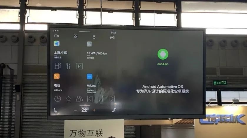
During the CES Polestar booth presentation, a sentence appeared in the onboard system PPT: “Android system for standardized automotive design.” This means that Google has developed a special system for onboard systems. The Polestar 2 is the world’s first official car model to run Android Automotive OS, a system designed by Google specifically for cars.
 Currently, the market share of Android system mobile phones worldwide exceeds 80%, with more than 2 billion users. This success in the mobile operating system field is huge, but the automotive market urgently needs an excellent in-car system. Now that Google has entered, can it bring us a brand new car interaction experience?
Insufficient touch experience, surplus in voice and function experience
The evaluation criteria of whether a car system is easy to use at Garage 42 are mainly based on operability and functionality. I will introduce the car system on the Polestar 2 from these two aspects.
Before introducing, it needs to be clarified that this is only the Beta version of the system, and there are still many detailed functions being improved, so there will be some differences between this and the final mass-produced version.
Operability
The size of the Polestar 2’s center console screen is 11 inches, the same as the new iPad Pro, and the screen is slightly tilted towards the driver. There are only a few physical buttons near the center console, and the main interaction is replaced by touch and voice. Therefore, we will focus on these two experiences. First, let’s talk about the touch experience.
- Touch experience
The touch response speed and smoothness of the Polestar 2 screen is very good, and there is no difference with the experience on a mobile phone. The area of individual buttons is very large, and there are basically no mis-touch situations. The main interface is similar to an Android phone, and is roughly composed of 4 areas.
-
The top is the status bar, which displays time and other information
-
The four icons below are the menu bar on the desktop
-
The four blocks in the middle are commonly used applications on the custom homepage
-
The bottom is the air conditioning settings
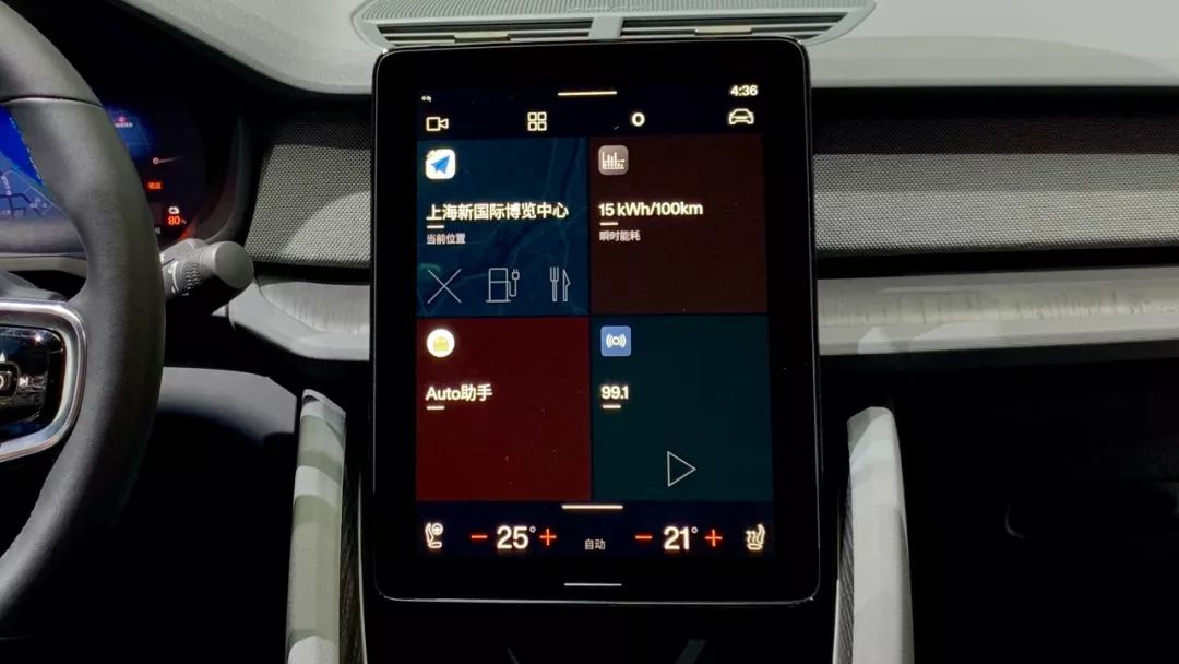
Among them, the top four buttons are the Dock bar, which are four buttons that are always on the screen. In other words, you can quickly enter the corresponding function by clicking these four buttons no matter which interface you are in. In a sense, these four functions are the most frequently used buttons that Polestar’s software designers think.
Let’s look at them one by one. The first one is 360-degree surround view, which is very useful when passing through some narrow areas, but the frequency of use varies from person to person. If you frequently use this function, then placing this button in this position is very suitable, but if you do not use it frequently, occupying this position would be a waste.The second drawer for different applications shows all available applications, which can be roughly divided into four sections that can be categorized according to personal preferences. The first app in these four sections will be displayed on the main interface by default.
The third user settings enables you to select your username and adjust the car’s settings such as seats and mirrors to your familiar preferences, which can greatly improve user experience especially when the car is shared by multiple people.
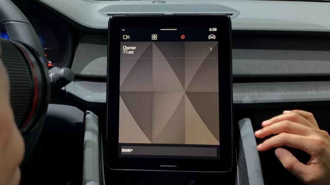
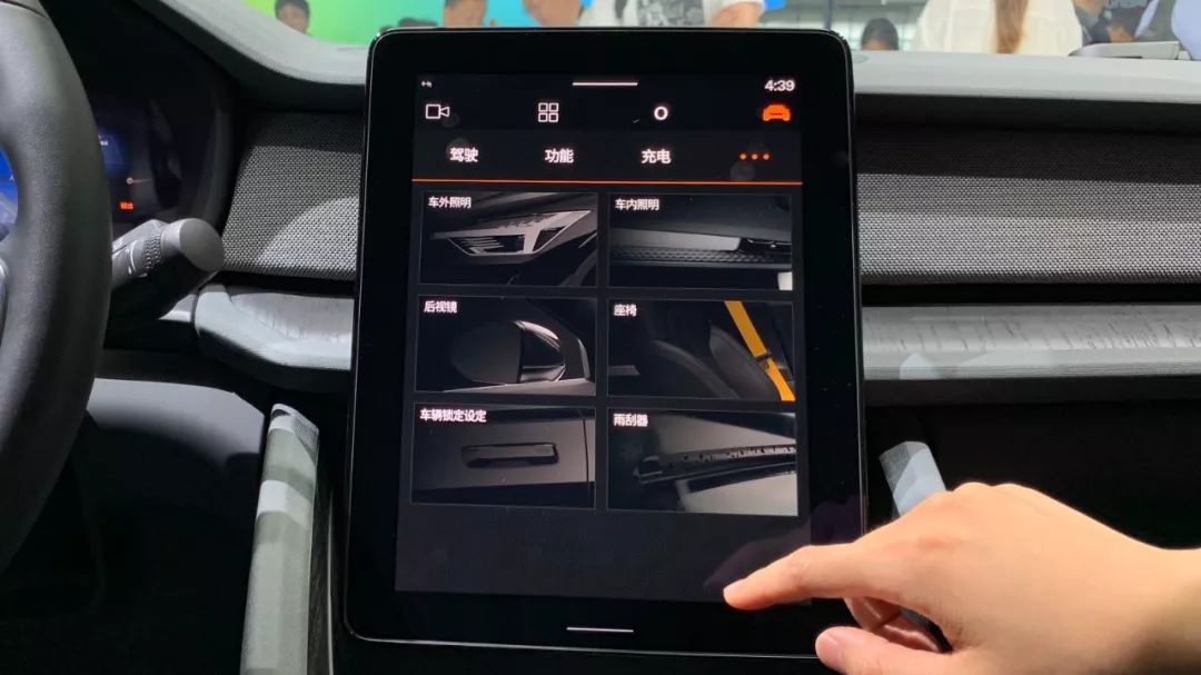
The last one is vehicle settings, a frequently used feature where you can find all car-related settings, and the categories are classified in a meticulous way. However, the naming and classification of the categories can still be further optimized to avoid confusion.

Upon entering the vehicle settings page, you will encounter a secondary menu where you can choose different types of vehicle settings, but it only displays up to 3 categories. Therefore, if you want to adjust settings outside of driving, functions, and charging, you need to click on the screen again.
Finally, let’s take a look at the bottom part of the screen – Customized Homepage Common Applications. You can set four commonly used functions here, making them immediately accessible on the home screen.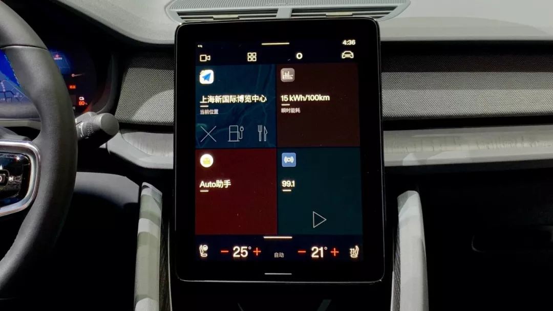
The bottom air conditioning settings are not very different from other large-screen vehicles, so I won’t go into too much detail.
You must have a question when you see this, how to return to the main interface? The logic is the same as most tablets. There is a white bar at the bottom of the screen, which is the return button.
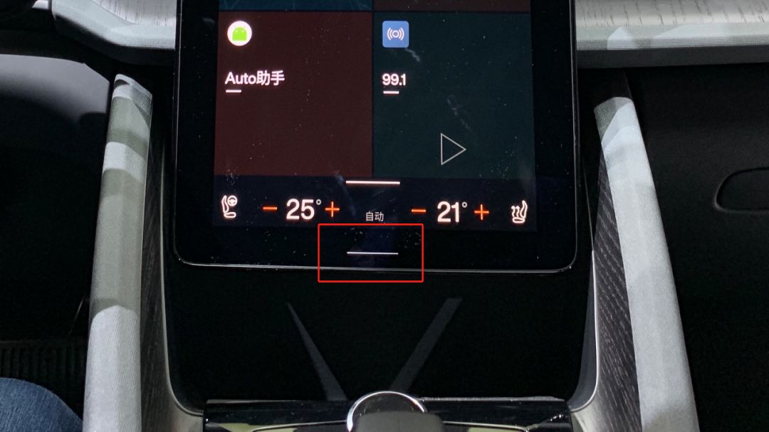
Finally, some conclusions about touch operation and some suggestions about software layout are given.
Conclusion: Although this car stereo has been optimized for the use scenario inside the car, it is not enough. It still has traces of mobile Android, and the changes can be even greater.
Suggestion 1: The 4 commonly used programs on the main interface can be directly changed to the default map interface. After all, the most frequently used function while driving is navigation, especially in large cities. Even if you don’t use navigation, you can use it to see the current road congestion. After the default main interface is changed to the navigation interface, multimedia, energy consumption, and other settings can be placed in the top Dock bar, which is also my second suggestion.
Suggestion 2: There can be more buttons in the Dock bar, and users can have the right to set their own frequently used functions according to their usage habits.
- Voice Experience
In addition to adjusting vehicle settings by touch, issuing commands through voice is also a popular way of adjustment nowadays, and it is also a very suitable way to adjust in the driving state.
Polestar 2’s car stereo built-in the voice assistant of iFlytek, and two microphones are set on the A pillar and B pillar in the car. They not only ensure the pick-up effect but also determine whether the primary driver or the secondary driver is issuing instructions.
Regarding the points that are the same as other vehicle voice controls, such as controlling windows or turning on air conditioning, I won’t elaborate further. Let’s focus on two relatively unique points.
- Recognizing continuous instructions with one wake-up, which means that after waking up the vehicle by saying “Hey, Polestar” and asking about today’s weather in Shanghai, I don’t need to wake up the vehicle again by saying “Hey, Polestar” to ask about tomorrow’s weather. The system can make the correct response immediately, providing a relatively natural communication experience.
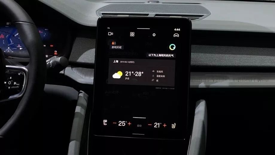
- Context-based Semantic Recognition: If I give instructions to the vehicle and other members on the vehicle interrupt with unrelated remarks, the system can recognize and extract the relevant statements related to the instruction automatically.
This is an introduction to the speech control system developed by iFlytek. Apart from this, you can also use Tmall Genie to control the Polestar 2 to play music or control some internet-enabled devices in your home. In other words, Polestar 2 has two speech control systems. The iFlytek-based system can control all settings related to the vehicle, while Tmall Genie can control audio and smart home settings.
As the algorithm improves with more sentence training, the user experience of the in-vehicle speech control system is continuously rising. However, it’s still a gradual process of quantitative changes, and I expect the day when speech recognition undergoes a qualitative change.
Functionality
After discussing the operational aspect of the in-vehicle system, let’s move on to the functionality aspect.
The most commonly used functions in our daily driving routine are navigation, multimedia, and energy consumption display. Since the current in-vehicle system is still in beta versions, the official documents have not shown much information about multimedia and energy consumption display, so the only aspect worth discussing is navigation.
Do not assume that this is just a simple in-vehicle version of Gaode Maps. First of all, all functions achievable on the Gaode Maps app on your phone can be realized on Polestar 2’s in-vehicle system. In addition, Polestar 2 deeply integrates the use of the vehicle with the maps.
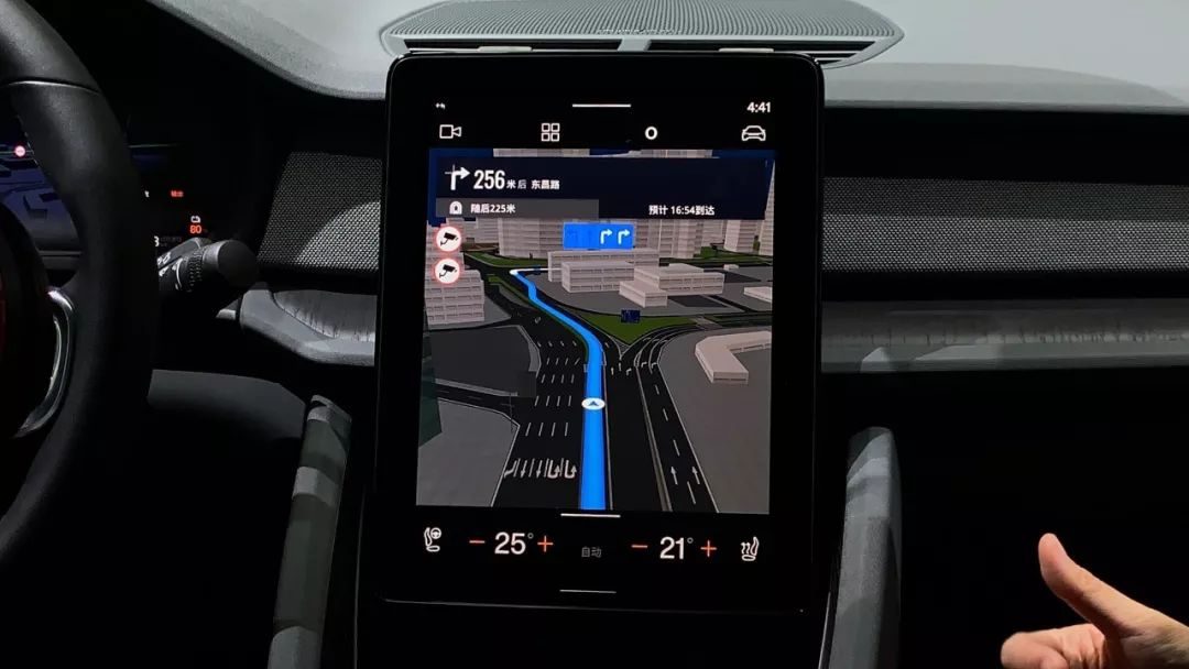
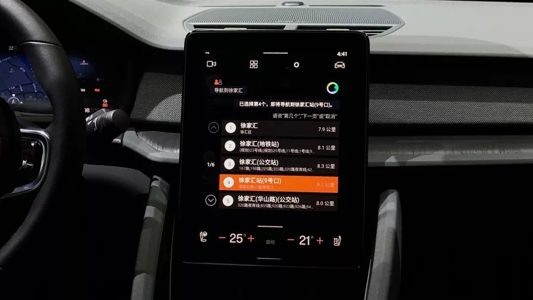
Firstly, this is a map merged with Gaode Map and iFlytek. How is the deep integration reflected? When you give specific instructions and the screen displays the retrieved information, you do not need to rigidly say which number result you want or state the specific name of the location. You only need to say the unique letter or word in the name of the place to complete the instruction.
Secondly, since Polestar 2 is a pure electric vehicle, Gaode Maps also integrates the relevant power and energy consumption information of the vehicle, and suggests charging-related advice when determining the route.
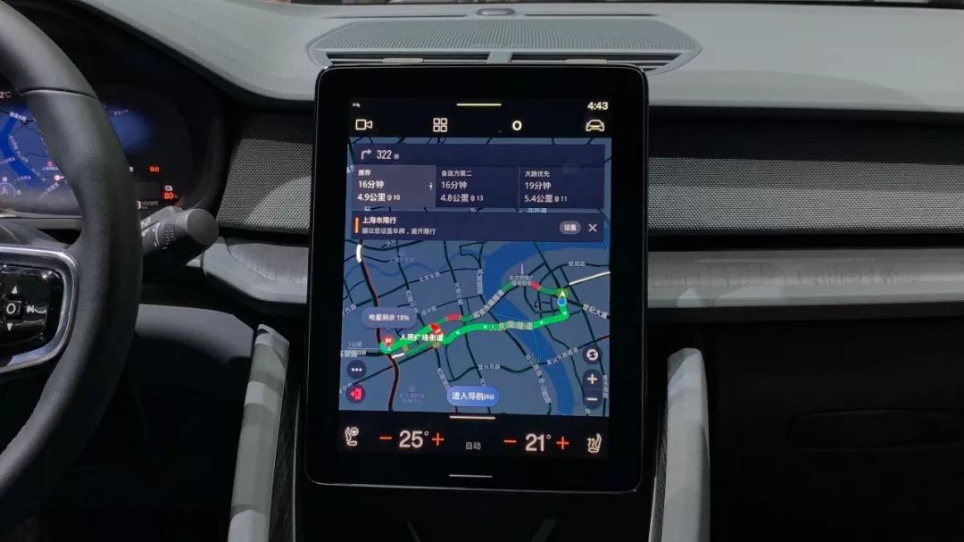 The system will display the estimated remaining power of the vehicle after arriving at the destination once the destination is set. If the journey is beyond the current range capability, the system will recommend charging stations along the way.
Additionally, the Gaode map on the Polestar 2 integrates information for the vast majority of charging stations in the market. Users can search for charging stations in the system to view detailed information on nearby charging stations and charging piles.
This feature brings great convenience to electric vehicle owners.
Although the native Android vehicle console system on the Polestar 2 still embodies some mobile operating system concepts, I have also seen the efforts of automakers and Google to create a large-screen operating system suitable for use in vehicles. Although the console still has some imperfections, after all, it is a novel thing. Looking back at the first-generation Android 1.1 system, it also had a series of problems, didn’t it?
Polestar 2 launched, what can a large screen do?* Polestar 2: A Worthy Competitor for Model 3?

This article is a translation by ChatGPT of a Chinese report from 42HOW. If you have any questions about it, please email bd@42how.com.
